You can make a tennis ball feel friendly, funny, or even legendary with the right character choices. Get a few things wrong, and the design stops reading as a tennis ball at all.
Below are common missteps that designers run into when turning something simple into something with personality. Use these to keep your character clear, usable, and genuinely fun.
1. Ignoring the tennis ball identity from the start
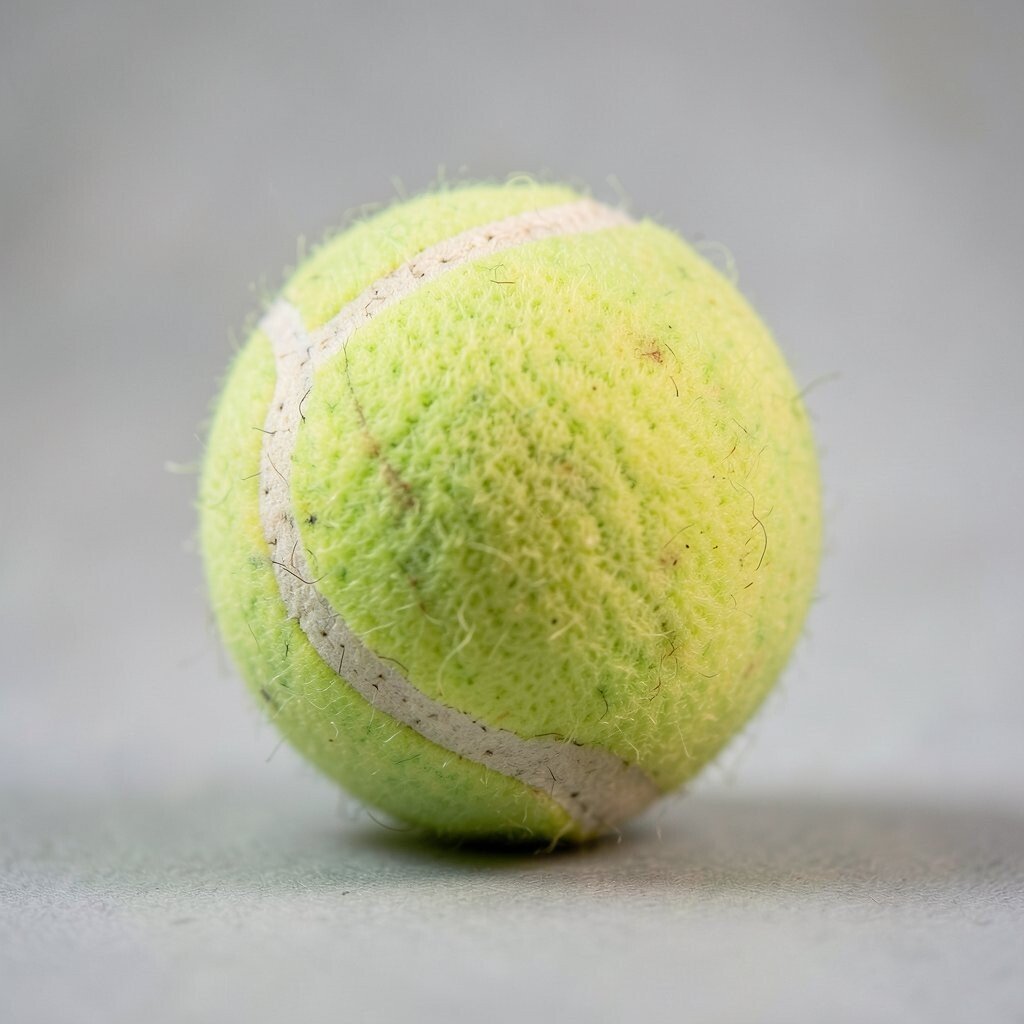
A tennis ball has a specific look, texture, and bounce energy that your character should keep. If your design forgets the fuzzy surface, the viewer will feel confused before they even enjoy the personality.
Keep the basic form round and readable, then style the surface with small texture cues instead of replacing it completely. Use color choices that still feel ball-like, like classic greens, yellows, or warm vintage tones that look like sports gear. When the ball reads instantly, the character gets a stronger connection and better storytelling power.
2. Making the face too tiny or too busy
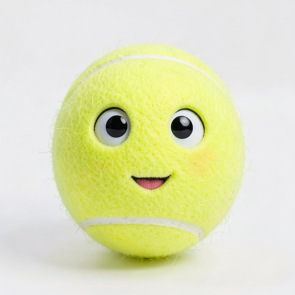
Small faces can vanish at key sizes, like stickers, keychains, and social icons. Busy details also pull attention away from the expression, which is the heart of character design.
Use larger eyes or a clear mouth shape, and limit the number of shapes around the face. When you simplify, the character stays expressive even when it’s printed small. This also helps with cost, because fewer complex shapes usually means easier production and cleaner printing.
Try testing your design at thumbnail size and at real-world print size before you lock it in. If you have to zoom a lot to see the emotion, the design will likely feel flat to the audience.
3. Choosing colors that clash with sports reality
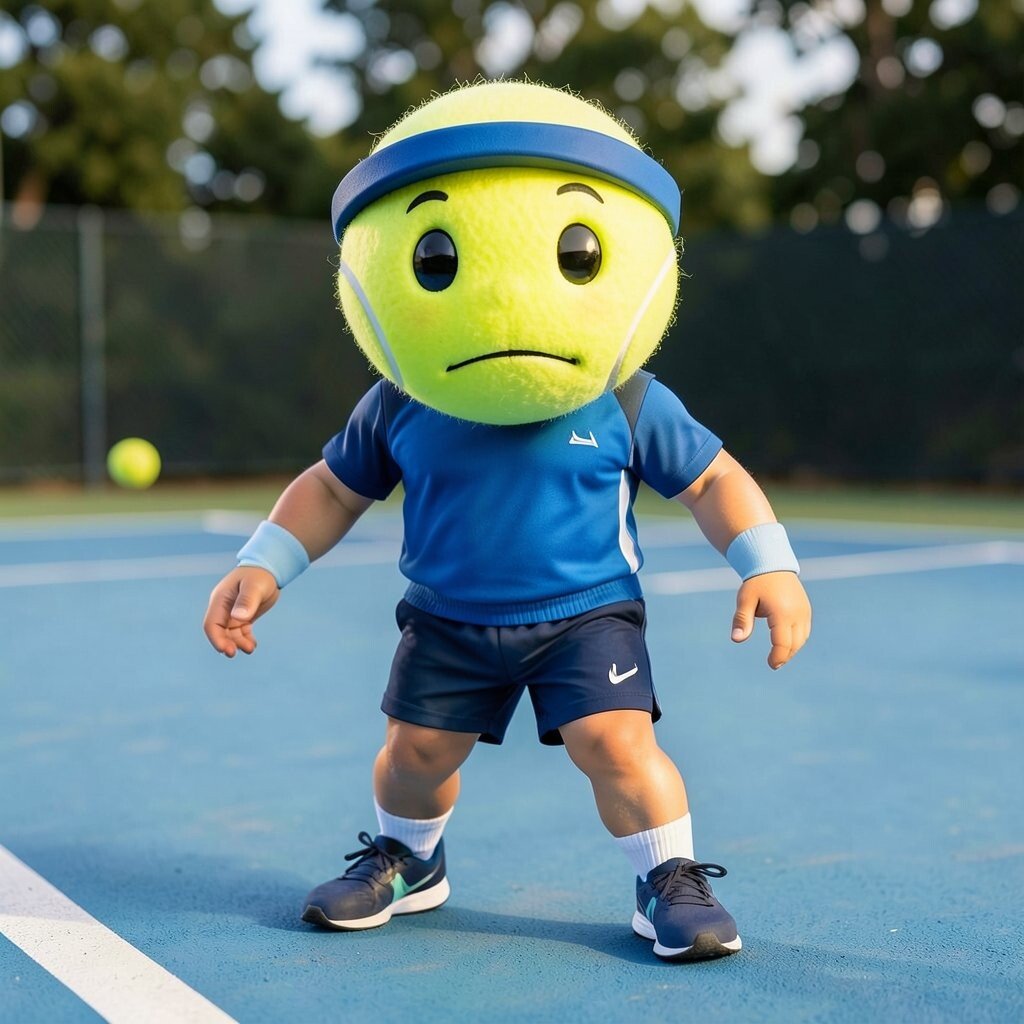
High-saturation palettes can be cool, but they may feel like a toy unrelated to tennis. Sports designs often work best when the colors still suggest balls, courts, and outdoor light.
Pick a base color that matches the tennis ball world, then add accents like stripe shades, shadowy gradients, or matching gear colors. Warm highlights and realistic shadowing make the character feel grounded, which boosts trust and charm.
4. Forgetting the value of clear silhouettes
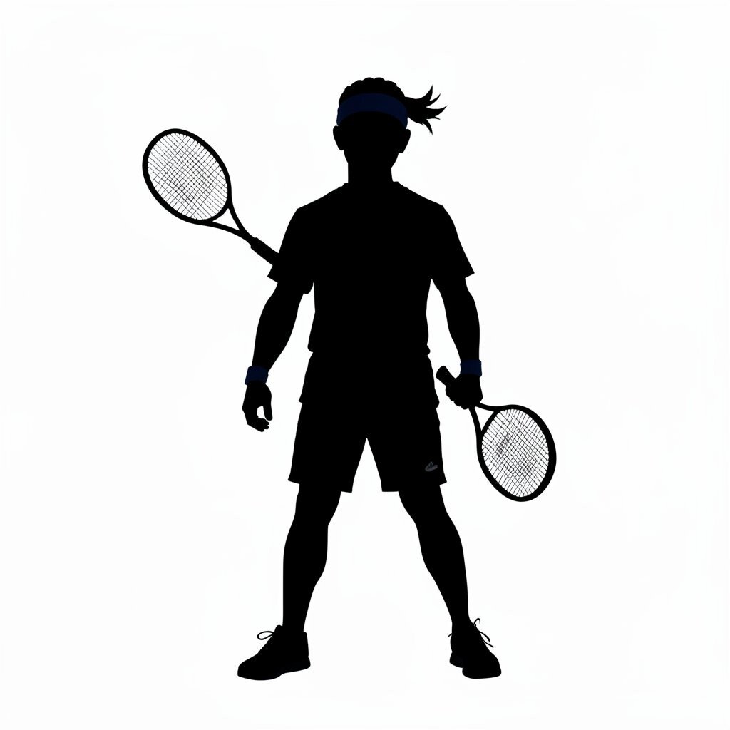
A silhouette is how your character looks from far away. If the shape blends into the background or loses its ball identity, people won’t remember it.
Keep the outline simple and consistent, even when you add accessories like sweat bands, tiny rackets, or headbands. Strong contrast helps too, especially on dark shirts or packaging where readability matters. Clear silhouettes also make it easier to scale your design across many products without losing the vibe.
5. Overusing clever gimmicks that hide the character
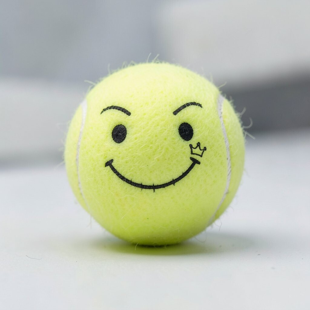
A gimmick can be fun, but too many gimmicks start to feel like clutter. When everything is special, nothing feels special anymore.
Choose one signature feature that sticks in the mind, like a stitched smile, a hero lightning seam, or a tiny crown mark. Then let the rest support it with simple styling and consistent spacing.
This approach keeps the design unique while still making it practical for real printing. It can also reduce cost because fewer special elements usually mean fewer production challenges.
6. Relying on one style and ignoring future uses
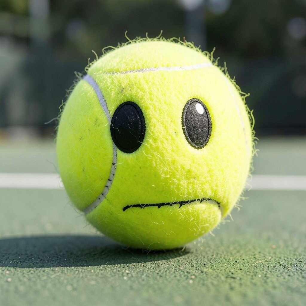
Your tennis ball character might start as a poster idea, but it will likely need to live in many places. Stickers, decals, animation frames, and merch all demand consistent style choices.
Create your character in a way that can shift from flat to shaded without breaking the look. That means you should build around a few stable features like the eye shape, stitch pattern, and stripe placement. When the style stays flexible, you get smoother updates later and fewer redesign headaches.
7. Ignoring where the light will hit the ball
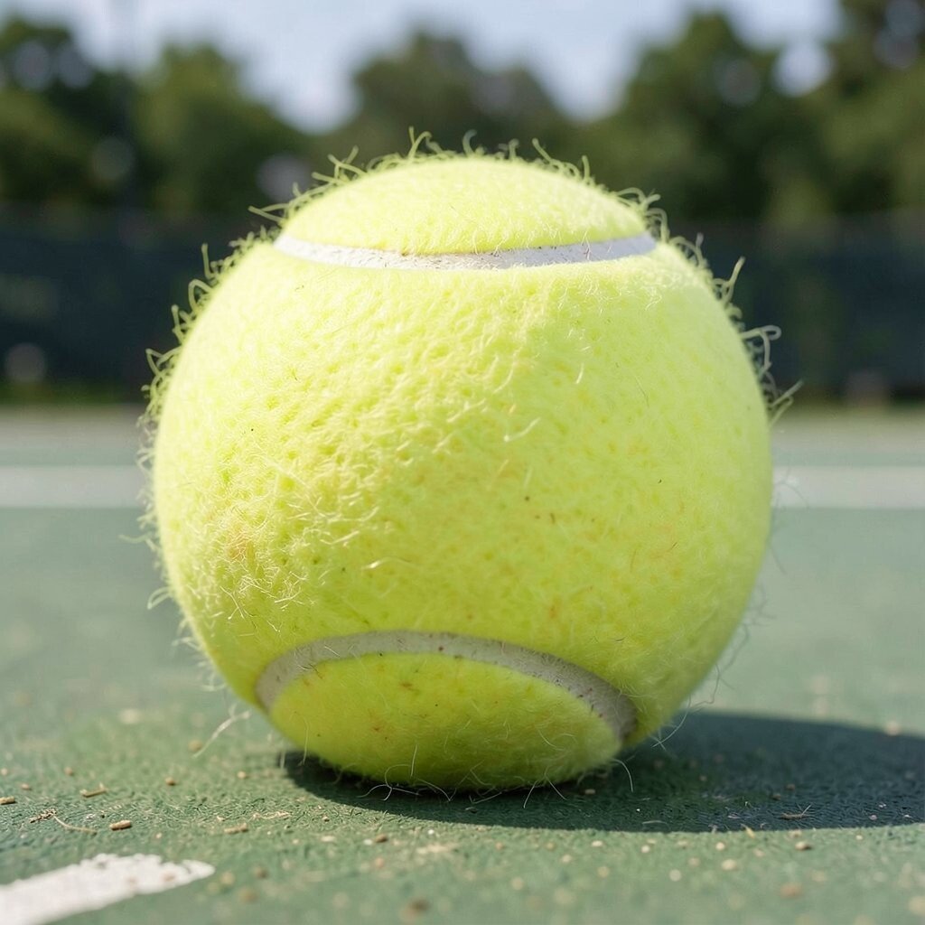
Lighting mistakes can make a character feel pasted on rather than formed. If shadows and highlights don’t match the curve, the face may look weird or floaty.
Use gentle highlights along the ball’s top curve and soft shadows under stripes or facial elements. Even basic shading can boost realism and make the design feel like it belongs on a court. This also helps with uniqueness, because good lighting becomes a subtle signature of your style.
8. Designing without comfort for real production
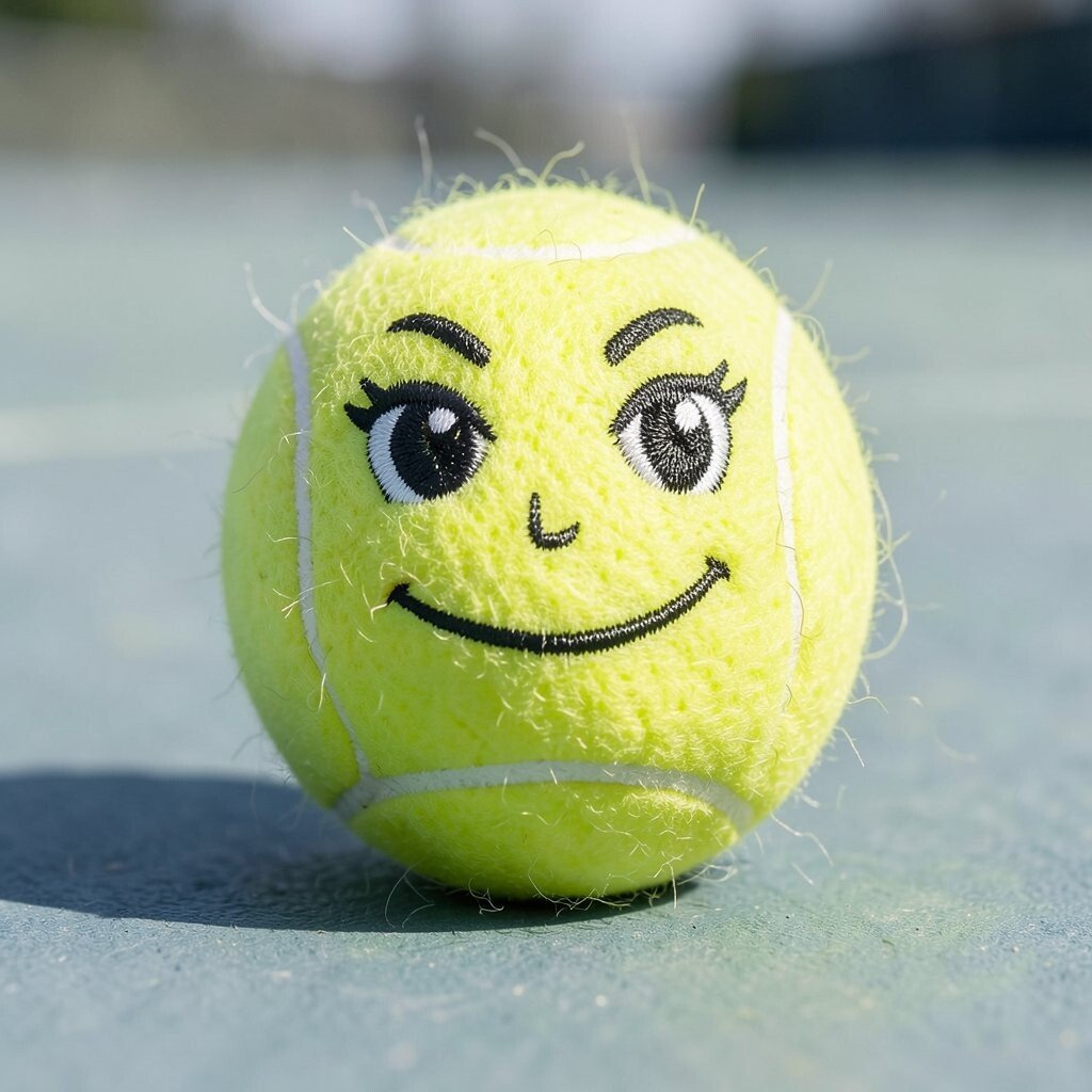
Some designs look amazing on screen but fail in real life because of line thickness, spacing, and print limits. Thin strokes and tiny textures can disappear when printed or stitched.
Use thicker lines for key facial features, and keep small text out of the face area unless you know the production method. If you plan to embroider, simplify the surface markings into clear shapes. Thinking about production early saves money and reduces the risk of wasted prototypes.
9. Forgetting the emotional range of an expressive face
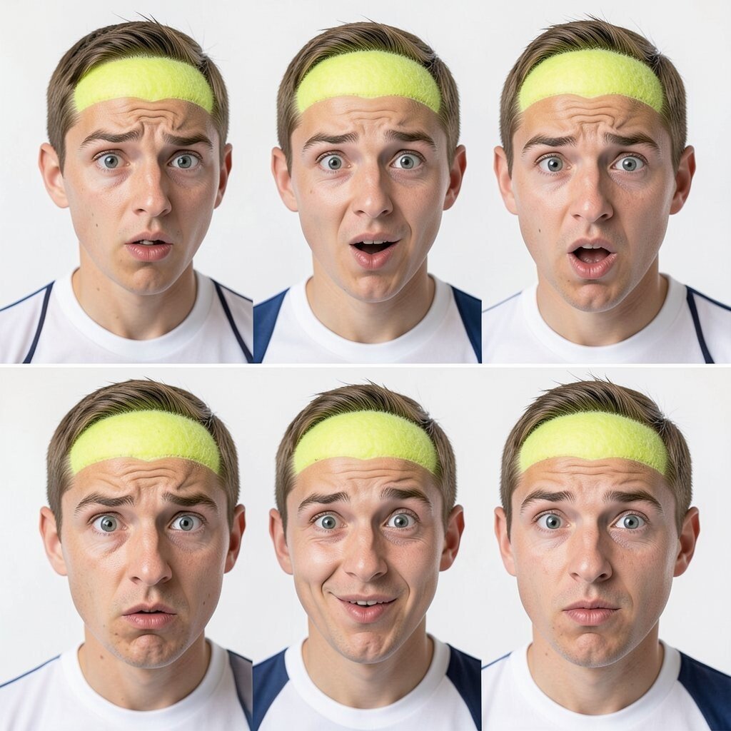
Characters feel alive when they can show multiple moods, like focused, playful, surprised, or proud. If the face design only works in one emotion, the character becomes harder to use across campaigns.
Build your expressions with the same eye spacing and mouth system so you can swap moods without starting over. Try making a few expression sheets that share the same design rules. This gives you practical momentum and makes personalization easy for different players, teams, or seasons.
Current trends often lean toward big, readable emotion in short animations, so a flexible face works across styles. When people can recognize the mood instantly, they share it more.
10. Copying existing tennis ball mascots too closely
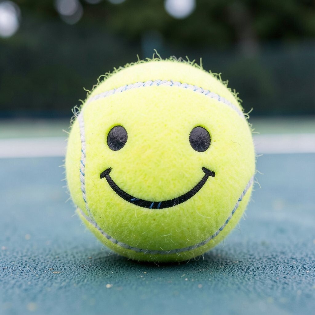
Borrowing references is normal, but copying too closely can make your character feel generic or risky to reuse. Viewers should feel a spark of “Oh, that’s theirs,” not “I’ve seen this already.”
Use a familiar tennis ball baseline, then add a unique identity through color accents, stitch patterns, or a signature emblem. Maybe your character always has two stripe lines that curve like a smile, or a tiny pattern on the seam. Unique details also help with branding, because they stand out in photos and feeds.
Before you commit, do a quick visual scan of common mascot styles to see what you’re matching. If your design could be swapped into someone else’s brand without change, it needs a stronger personal stamp.
11. Overcomplicating personalization with too many variables
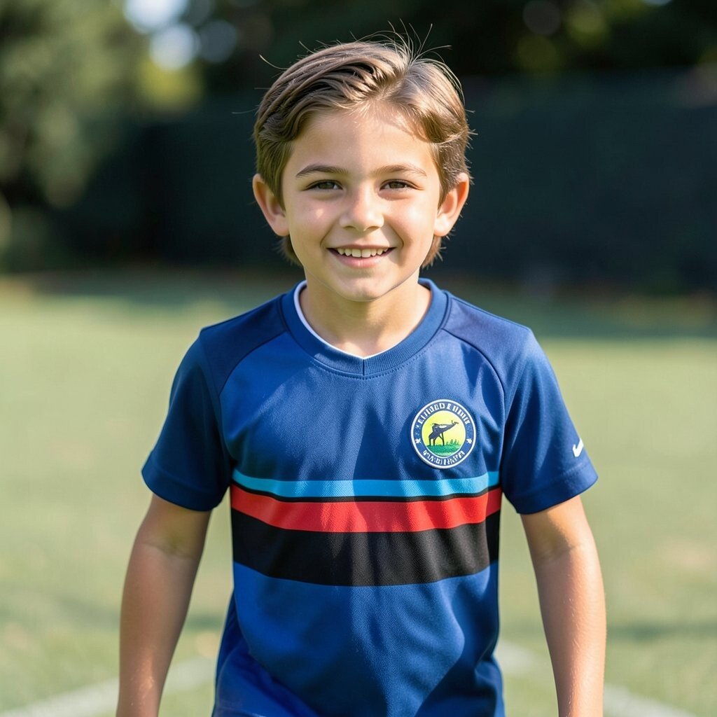
Personalization is great, but too many customization parts can slow you down. If you need a full redesign every time you change a team color or player name, you’ll burn time and budget.
Plan a simple system that lets you swap a small set of elements, like a stripe color, a jersey tint, and a single emblem. Keep the base face and core textures consistent so updates look official instead of patchy. This makes personalization practical for youth leagues, tournaments, and small merch runs.
12. Using “cool” fonts or graphics that don’t feel sporty
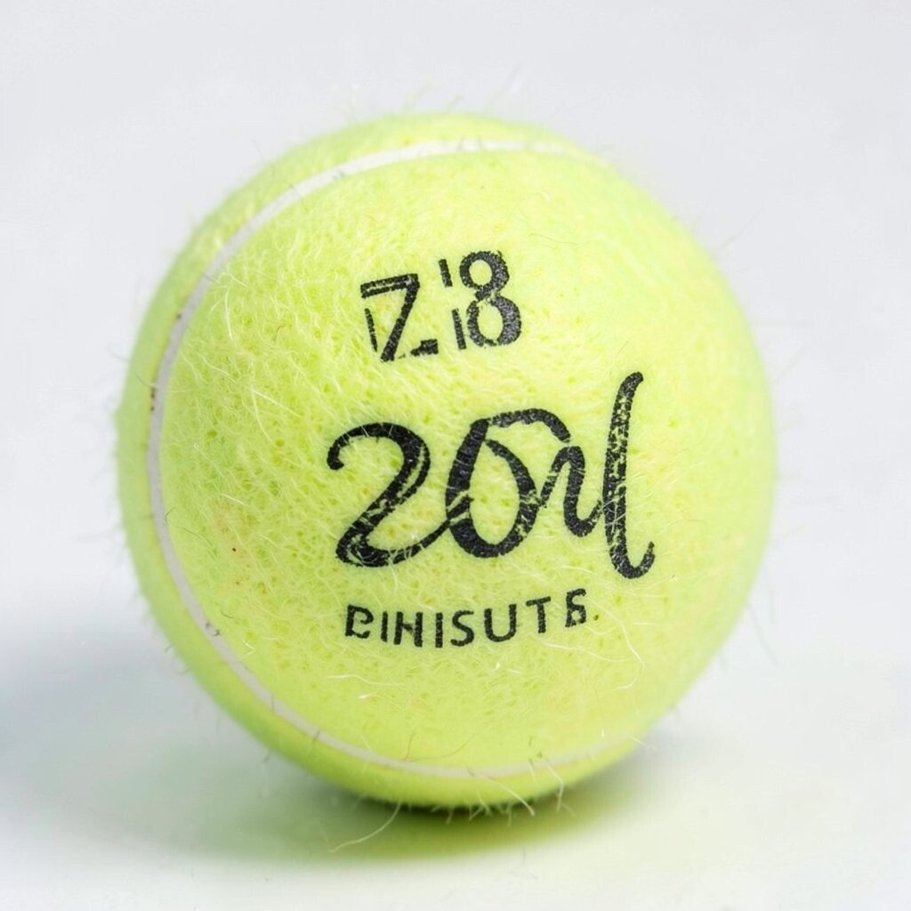
Text and graphic marks can help, but they can also break the tennis ball world if they feel random. If the font looks like it belongs on a tech app, it might clash with sports energy.
When you add numbers, initials, or tiny slogans, choose shapes that look stitched, painted, or stamped like sports gear. Keep text minimal and aligned with the ball’s curve so it feels natural. This keeps the character unique without turning it into a chaotic poster.
Consider trends like subtle typography and small badges, which often look better than large blocky lettering on small items. The cleaner the mark, the more cost-effective it tends to be in print.
13. Forgetting texture realism and the tactile feel
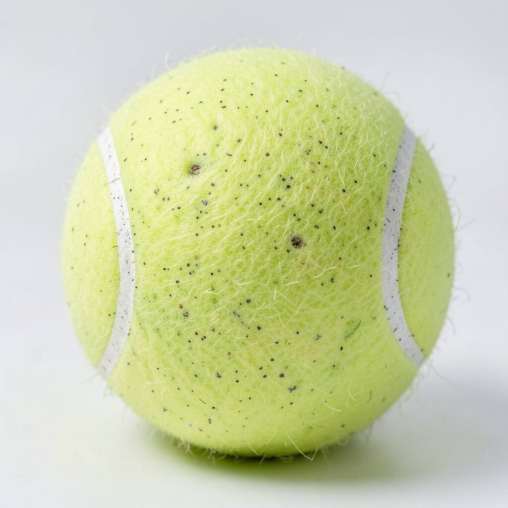
The fuzz and tiny pockmarks of a tennis ball give it a natural texture that viewers can almost feel. If your design replaces texture with flat paint everywhere, it loses that tactile charm.
Use texture cues like dotted shading, light speckling, or a simplified fuzzy overlay that stays consistent. Even a stylized texture can make the character feel more playful and more believable. This adds uniqueness without demanding complicated production steps.
If you plan to animate, keep texture patterns consistent so movement looks smooth rather than noisy. A tidy texture rule can improve both quality and turnaround time.
14. Not testing the character in real sizes and real backgrounds
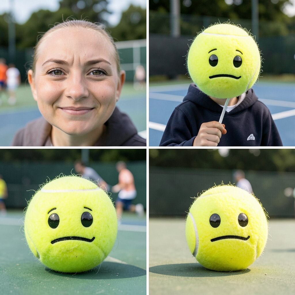
Design screens can trick you, because real life includes lighting, cropping, and background chaos. Your character must still read clearly on a court photo, a dark hoodie, or a tiny phone icon.
Test your design on several mockups, including close-up face shots and full-ball views. Check how the eyes, stripe contrast, and expression work at small sizes, then adjust what fails first. This saves money by catching issues early and improves personalization outcomes because it’s easier to keep everything consistent.
Also pay attention to current trends like bold, clean character readability in short-form visuals. Your tennis ball character will perform better when it remains recognizable in one second.