There’s something magical about a shelf backdrop that makes your everyday items feel special. The right texture can warm up a room, spark creativity, and make your display look intentional.
Even small changes can make your books, plants, and keepsakes stand out like they belong in a photo. Below are background textures you can use to create bright, eye-catching shelf moments.
1. Chalkboard Paint With Soft Color Dust
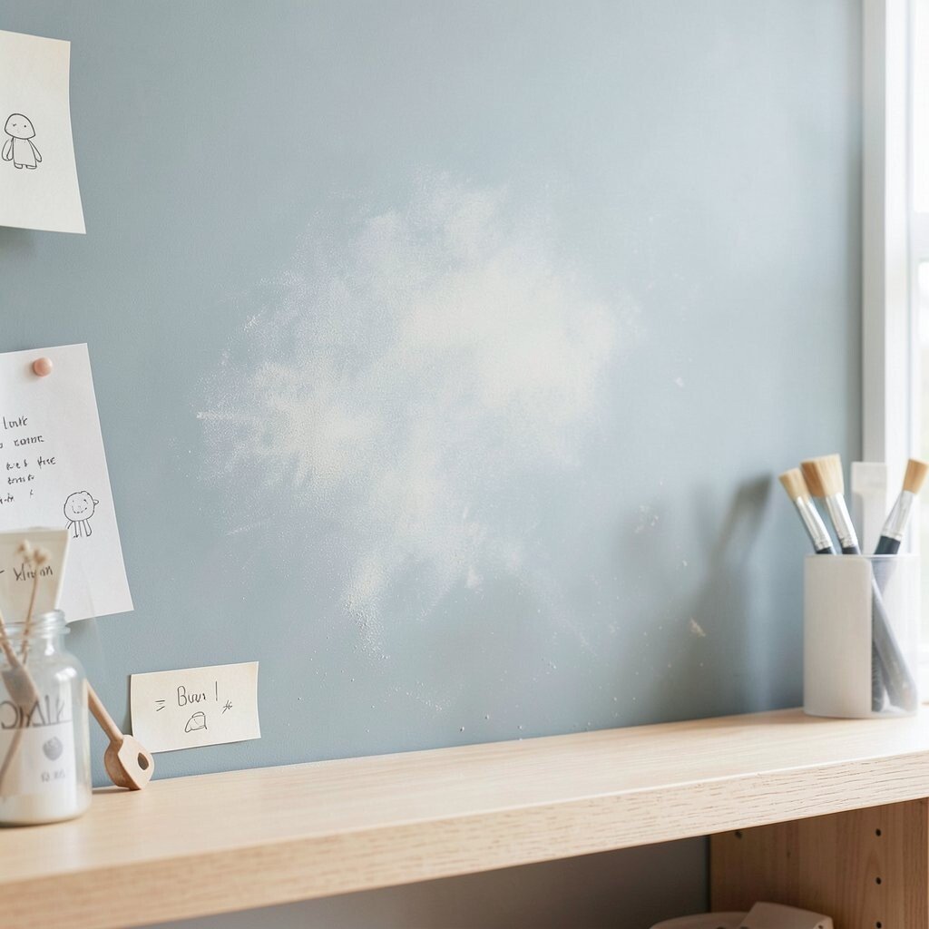
Chalkboard paint gives a matte, slightly velvety look that feels cozy and calm. When you add a light sanding, the surface looks like it has gentle “dust” that catches the light.
You can use it behind small collections so labels, notes, or doodles feel like part of the decor. If you want a bright vibe, choose a lighter chalkboard color and keep the chalk marks minimal for a clean look.
2. Linen Weave Fabric Backer
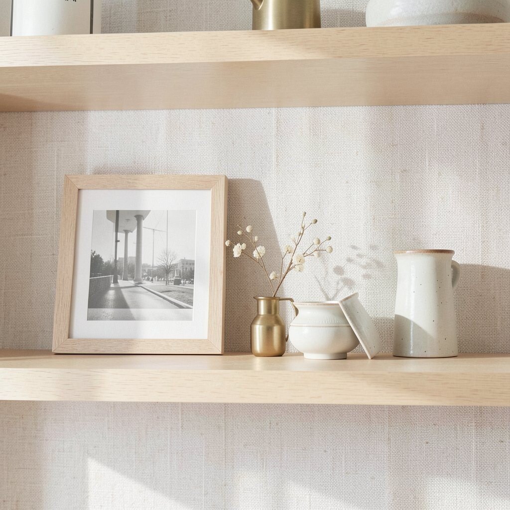
Linen weave fabric creates a natural, lived-in texture that instantly softens a shelf. From across the room, it reads like warm cloth, while up close it shows tiny threads that add depth.
It works great behind framed photos or delicate ceramics because it won’t steal attention from the main pieces. For practical use, stretch fabric tight over a panel so the surface stays smooth and wrinkle-free.
To keep it bright, pick near-white or pale sunshine tones and add a few matching accents like light wood or brass. Fabric is usually budget-friendly, and you can reuse offcuts by cutting them to fit your shelf back.
3. Cork Sheet For Gentle Shadow Play
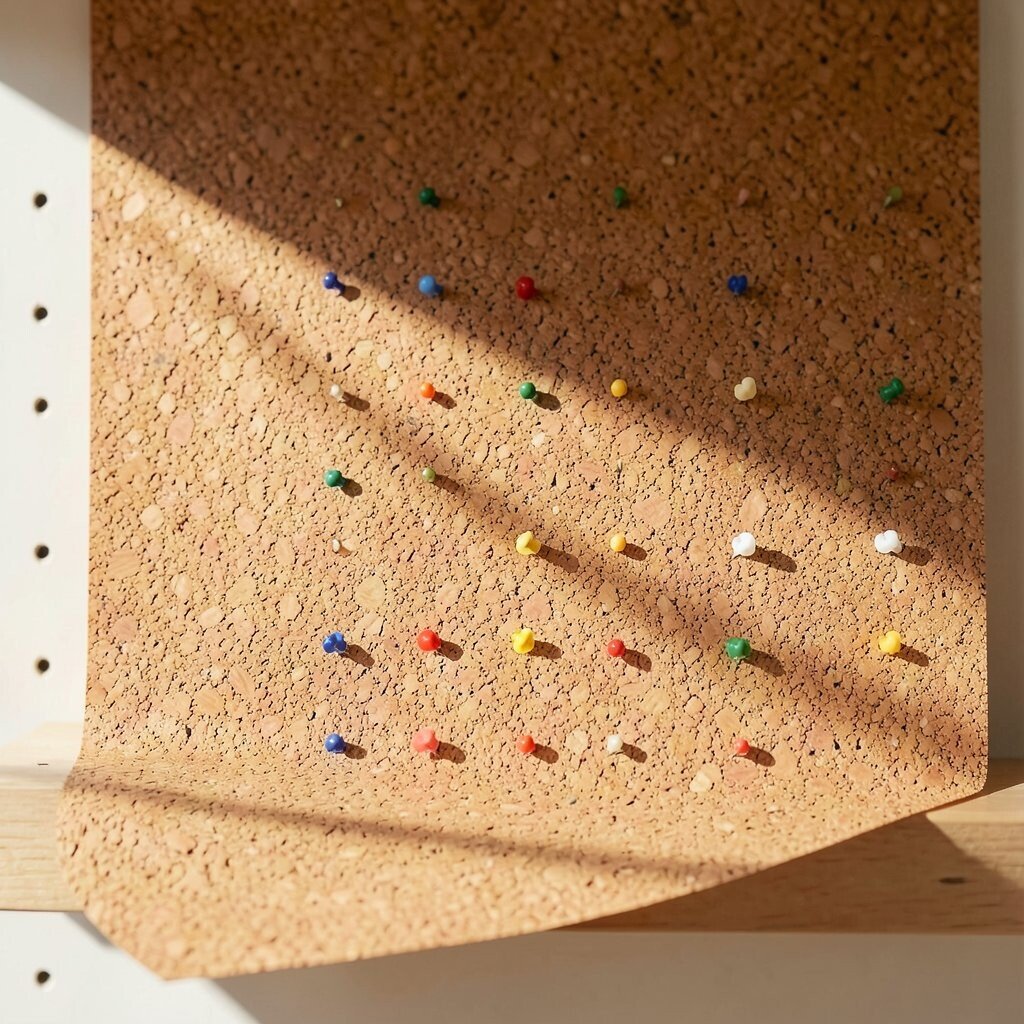
Cork has a bumpy, organic texture that creates soft shadows when light hits it. The result is a background that feels warm, natural, and a little artsy.
It’s uniquely practical because cork is forgiving and hides small imperfections on the shelf. If you want a polished look, seal the cork with a clear matte finish so it feels tidy and easy to maintain.
For personalization, try a grid of small pins with color-coordinated pushpins for notes or reminders. Cork also tends to stay comfortable in a room, and it can be a mid-range option depending on thickness and whether you choose sheet or roll.
4. Weathered Wood Slats In Sunlight Tones
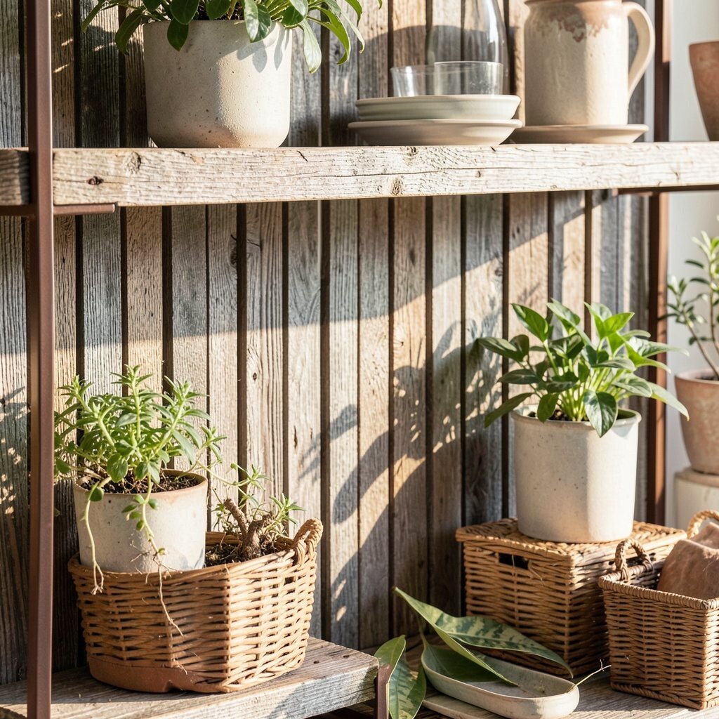
Weathered wood slats give you that vintage “found object” look right away. You can see the grain lines and tiny wear marks, which makes your shelf feel storied.
Since wood adds warmth, it pairs well with plants, baskets, and warm metal frames. Use thin strips for a light texture so the background doesn’t overpower bright items, and secure each strip carefully to avoid gaps.
5. Glossy Ceramic Tile Pattern
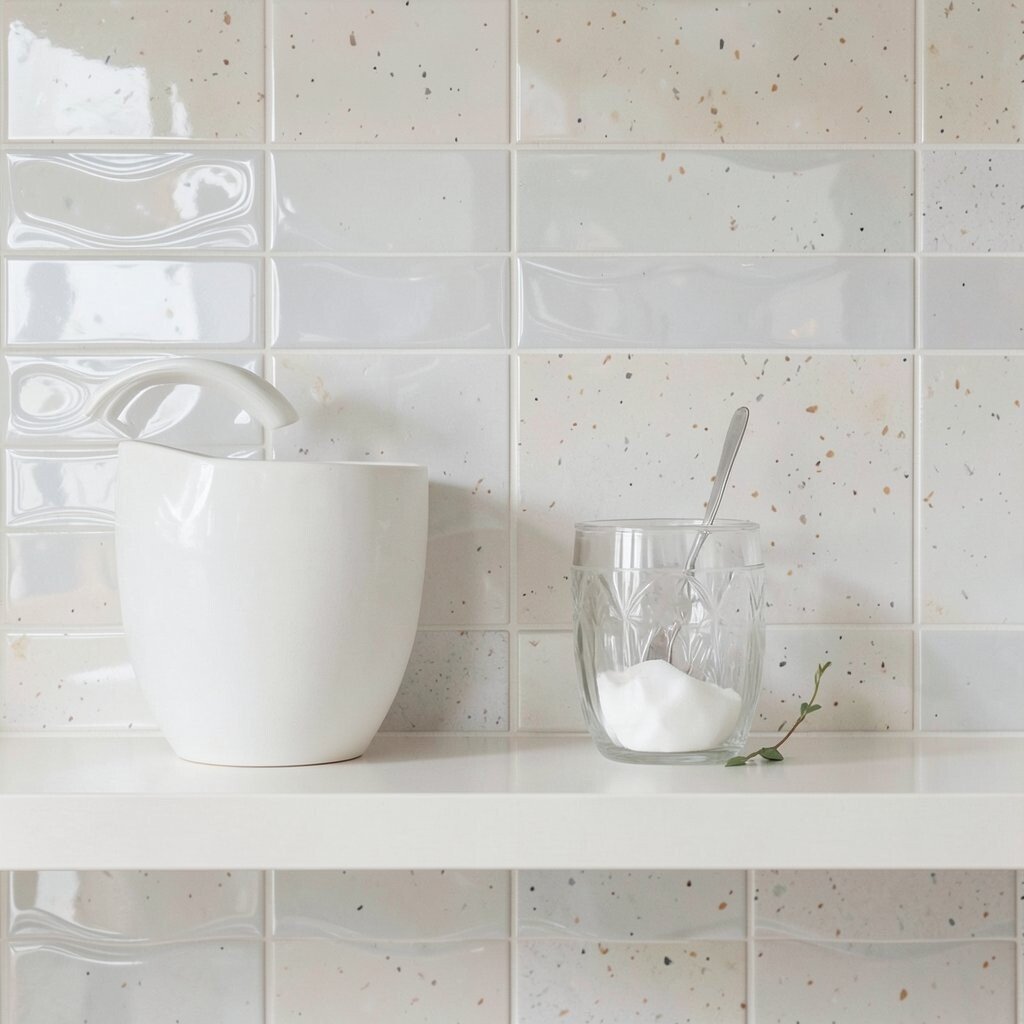
Ceramic tile brings bold texture with crisp edges and reflective highlights. Even simple repeating shapes create movement, like little waves of shine behind your items.
This is a strong choice when you want your shelf to look fresh and modern. Wipe-clean surfaces are a big benefit for busy spaces, and you can choose matte or semi-gloss for a less flashy finish.
For a bright twist, choose pale tiles with subtle color specks so the background stays lively without looking loud. Tile can be pricier, but peel-and-stick options reduce cost and effort while keeping the look crisp.
6. Rusted Metal Sheet With a Controlled Patina
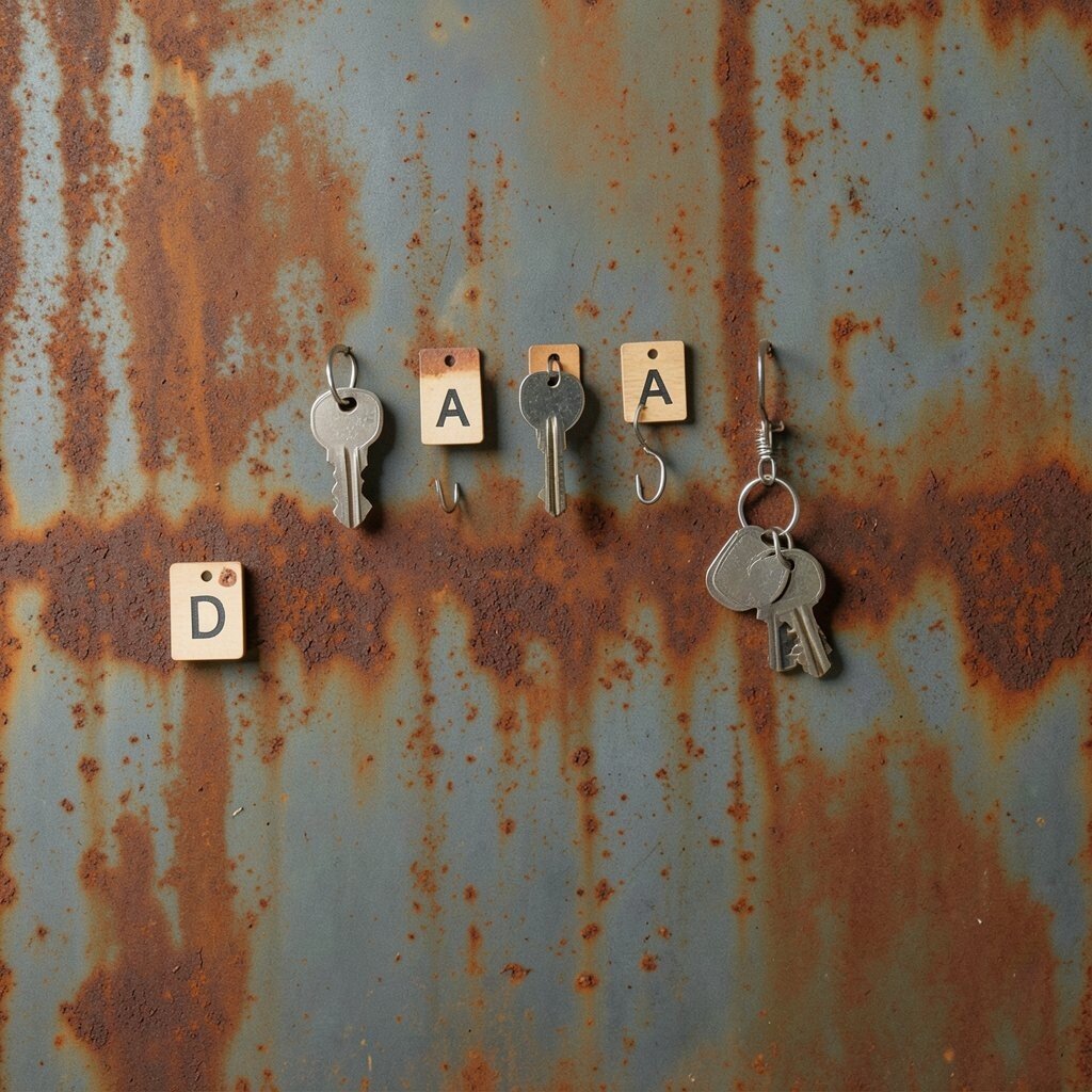
A thin rusted metal sheet creates a dramatic, textured backdrop that feels industrial and bold. You’ll notice layered tones like amber, smoke gray, and copper that shift as the light changes.
It’s unique in how it makes even simple objects look styled. To make it practical, choose a sealed metal finish so it won’t flake, and keep it away from places where you handle the surface a lot.
Personalize it with small magnets, letter tiles, or tiny hanging hooks for tools, keys, or little charms. Metal is often a mid to high cost, but using a smaller panel keeps your budget in check.
7. Soft Felt Panels In Pastel Blocks

Felt panels add a gentle, fluffy texture that makes shelves look cozy and calm. The surface absorbs light, so your items feel cushioned and the whole display looks friendly.
Felt is also forgiving when you’re cutting or fitting shapes, which makes it easier for DIY projects. Pick pastel blocks behind themed sets like books and stationery so the color helps your arrangement feel planned.
8. Handmade Paper With Deckled Edges

Handmade paper brings a tactile, speckled texture with natural fibers visible at the surface. Deckled edges look artsy, and the subtle irregularities make the backdrop feel one-of-a-kind.
This texture helps your shelf look thoughtful, especially behind journals, small sculptures, or framed quotes. Try layering two papers, one lighter and one slightly deeper, so you get dimension without clutter.
For personalization, add pressed leaves or tiny fabric scraps into the layered look if the paper is thick enough to hold them. Handmade paper can vary widely in cost, so consider sourcing smaller sheets and trimming them to size.
9. Watercolor Wash on Heavy Cardboard

A watercolor wash on thick cardboard gives a dreamy, painted texture that looks soft and bright. You get cloudy pigment, gentle streaks, and paper grain in a way printed color can’t match.
It’s ideal when you want a background that feels creative but not busy. Use it behind small vases or stacks of books, and protect it with a clear matte spray so it stays vibrant.
Personalize by matching the wash to your room palette, like teal for a fresh feel or warm peach for a sunny mood. Cost stays low because thick paper and paints are usually affordable, and you can make multiple versions for different seasons.
10. Fabric Wallpaper With Light Florals
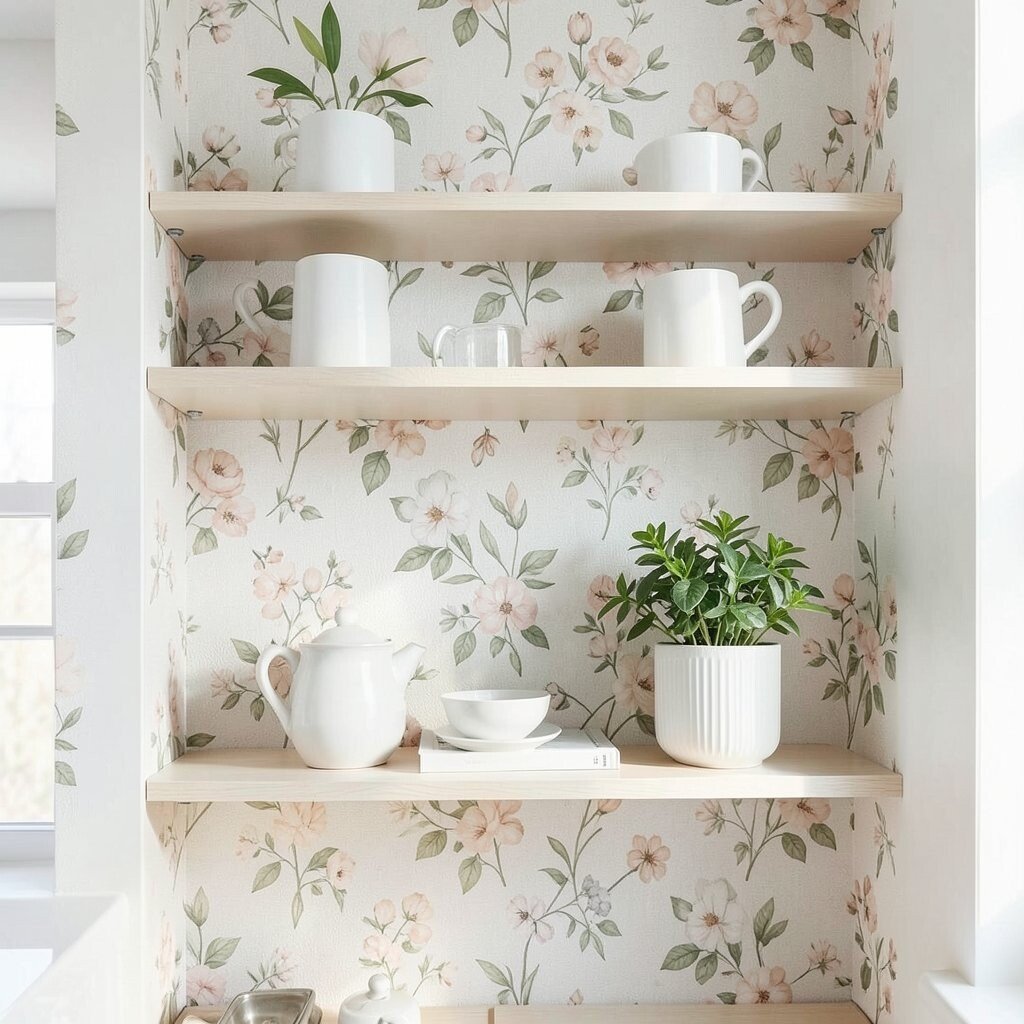
Fabric wallpaper adds texture and pattern while still feeling warm and designed. Light florals create a bright backdrop that moves visually without being too harsh.
This texture is unique because it blends softness with print, giving your shelves a “room upgrade” feel. If you want practicality, choose washable fabric wallpaper or a removable version if you like changing things up often.
Personalize by keeping your shelf color scheme tight, like white ceramics and green plants, so the floral pattern becomes a calm stage. Wallpaper can be mid-range to higher cost, but using it only on the back panel keeps the price under control.
11. Sand Texture Coating With Subtle Sparkle

A sand-texture coating looks like tiny grains under a smooth top layer, and it creates a beachy, tactile feel. When you add a very light sparkle, the backdrop catches light in small, joyful flashes.
This is a great pick for bright ideas because it adds movement and depth without requiring patterns. Keep your objects in the foreground simple, and the grain will do the styling for you.
12. Embossed Leatherette In Warm Neutral Tones
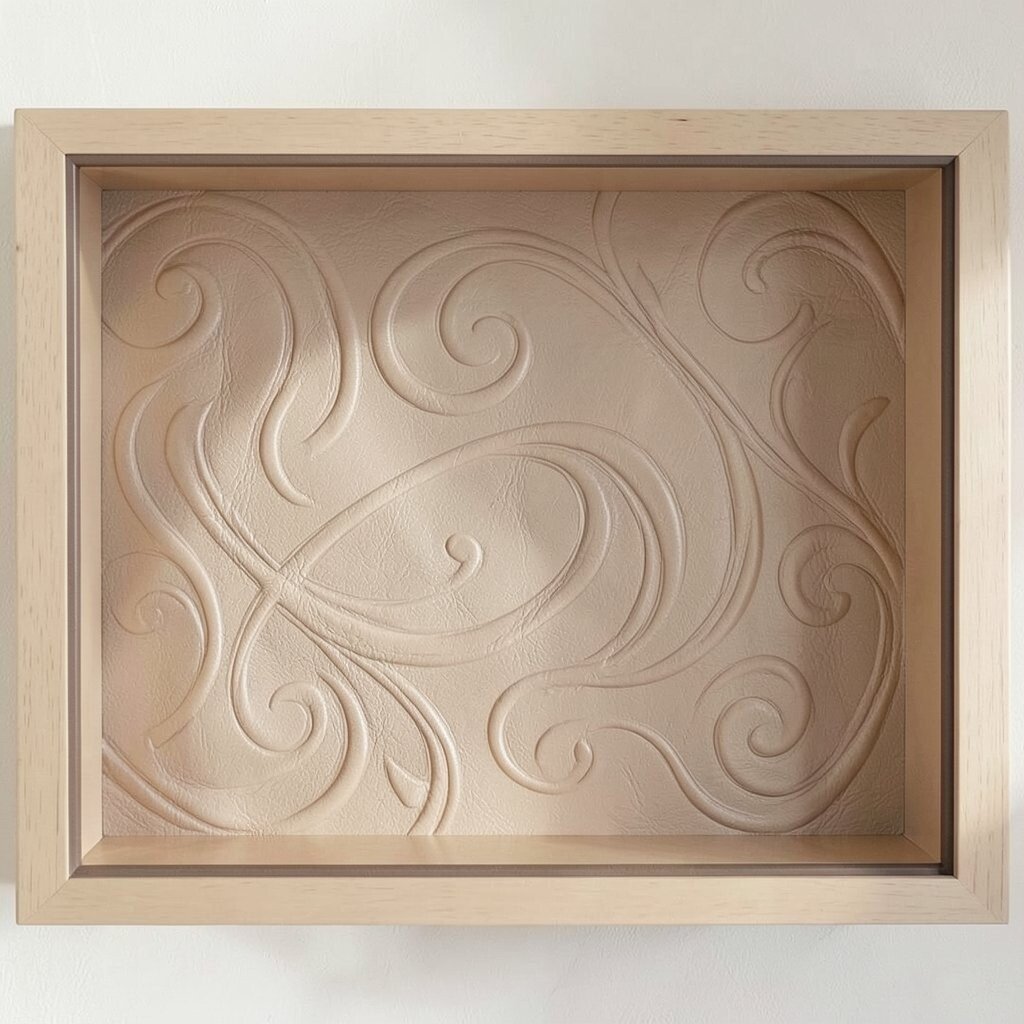
Embossed leatherette offers a rich, raised texture with a smooth, polished look. The pattern can be subtle, like a light grain, or more dramatic with swirling emboss lines.
This option feels unique because it gives your shelf a luxury vibe without the high maintenance of real leather. For practical use, choose a wipeable finish and stick to warm neutrals so it pairs with almost any decor style.
To personalize, you can stamp small shapes with craft tools or add a thin border in a contrasting color. Leatherette panels are often budget-friendly, especially when compared to real leather, and you can find roll sizes that fit common shelf backs.
13. Faux Stone Panels In Limestone Whites

Faux stone panels add a sturdy, textured background that makes your shelf feel architectural. Limestone whites and soft grays create a clean, bright stage for colorful items.
They’re practical because they usually wipe clean and resist stains, which matters in real homes. For a lighter look, pick small-scale stone patterns rather than huge chunks so your shelf stays airy.
14. Woven Rattan Or Cane Texture Sheet

Woven rattan or cane texture brings an airy, basket-like look that feels natural and bright. The interlaced lines create tiny shadows that make your shelf feel lively even on a plain day.
This texture is uniquely good for organizing visually, because the pattern helps separate items into neat zones. Use it behind one color family, like warm browns and cream ceramics, so the weave supports the theme.
For personalization, attach small clip hooks to hang tags, cards, or mini art prints. Depending on where you source it, woven sheets can be mid-range, and the cost improves when you cut only the panel size you need.
15. Acrylic Paint Pour Background On Clear Panel
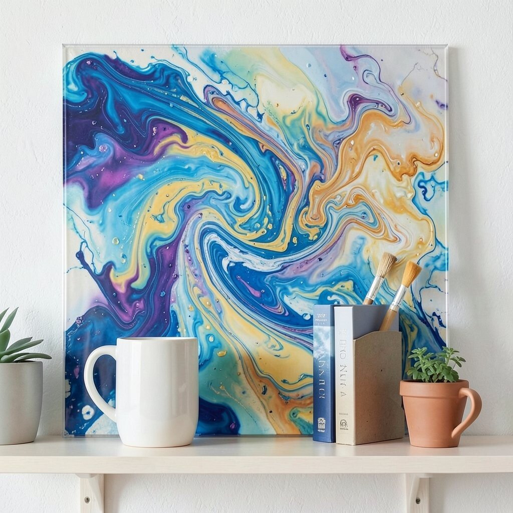
An acrylic paint pour gives you swirls, cells, and marbled layers that look like liquid art. When you pour over a clear or glossy base, the texture feels deeper and brighter.
This background is uniquely energetic, perfect when you want your shelf to feel like a creative studio. Keep the shelf items more neutral so the color energy has room to shine.
Personalize by using colors pulled from your favorite mug, book cover, or plant pot so it feels connected. Paint pours can be low cost if you already have supplies, though premium metallics can raise price, so mix one or two special colors for impact.
16. Vintage Fabric Scrap Quilt Backdrop
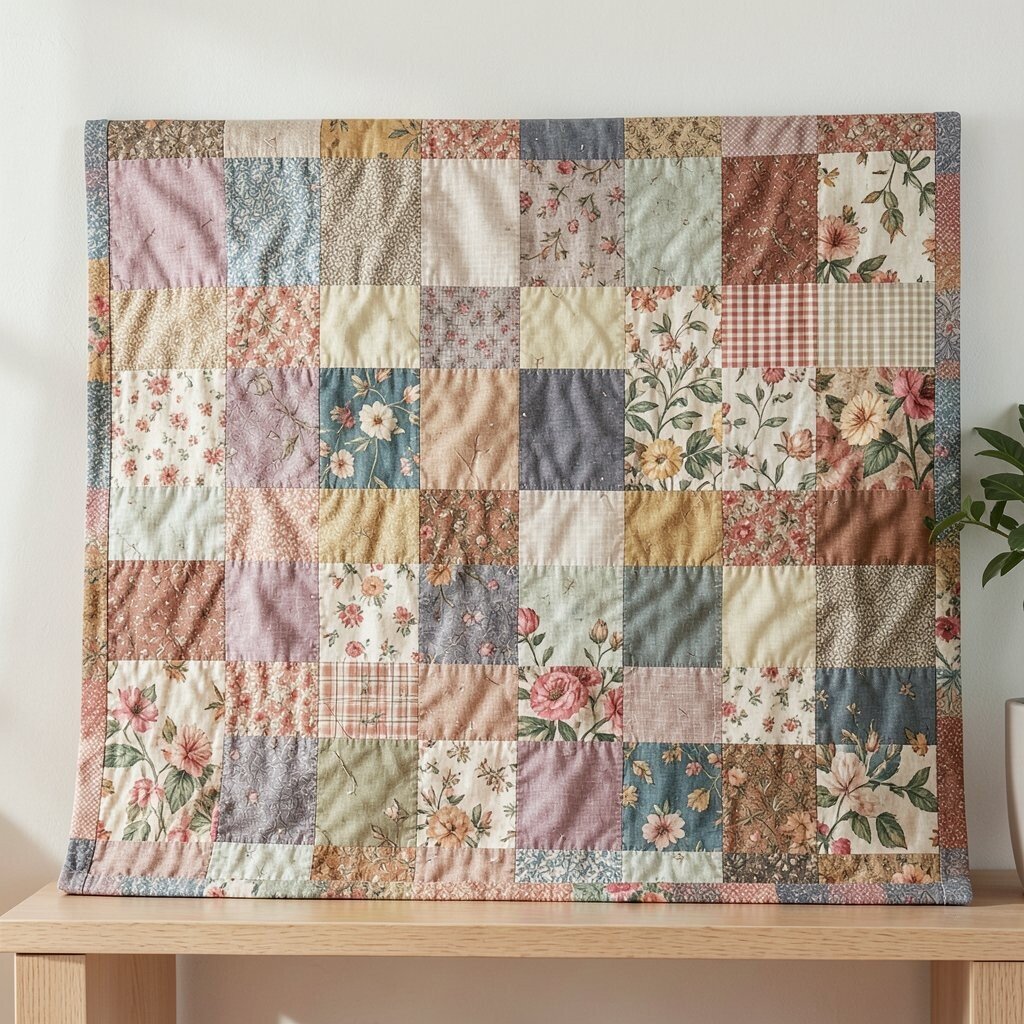
A quilt-style scrap backdrop makes your shelf feel playful and personal. You can see the different fabrics, seams, and color patches that create a cozy patchwork texture.
This is a practical way to use what you already have, like old shirts, curtains, or leftover craft fabric. To keep it from looking messy, choose a limited color palette and use consistent seams or backing paper to keep the panel flat.
17. Striped Washi Tape Layering
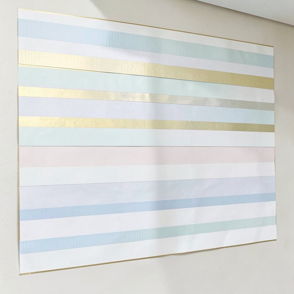
Washi tape layering creates a neat, customizable texture that’s surprisingly bold. The tape lines overlap to form raised edges and soft patterns, like mini stripes and grid textures.
It’s great for bright shelves because you can swap the tape easily when you change your theme. For practical steps, press the tape down firmly and trim clean edges so the background looks intentional.
Personalize by adding a thin gold or pale pastel border and leaving a few negative spaces for items to breathe. Washi tape is usually budget-friendly, and you can start with a small roll set and build gradually.
18. Embroidered Canvas With Simple Stitch Motifs

Embroidered canvas adds a textured, handcrafted feel that looks warm and thoughtful. Even simple stitch motifs can create dimension, especially when the thread catches light.
This works well when your shelf includes calm objects like books, ceramics, or small framed prints. To keep it bright, choose light canvas and use colorful thread sparingly so the texture supports the display instead of competing with it.
Personalize by matching the thread colors to your living room accents, like matching curtain tones or a favorite cushion. Embroidered panels can cost more than paint or tape, but you can often buy small craft pieces and mount them to a backing.
19. Matte Spray Painted Wallpaper With Clear Finish

Matte spray painted wallpaper gives you a smooth-but-textured look with depth from the underlying pattern. The matte finish reduces glare, so colors look gentle and bright at the same time.
This texture is unique because it blends print structure with a custom solid color, making it easy to tailor to your space. For practical results, apply light coats and let each layer dry fully before you add a protective clear finish.
Personalize by choosing a color that supports your shelf theme, like sunny yellow behind neutral ceramics or cool green behind books. Cost considerations are usually reasonable since spray paint is flexible, and you can update the look later without replacing everything.