A room can feel brand new just by shifting its colors. Small choices can make everyday life look and feel calmer.
1. Warm Greige With Soft Ivory
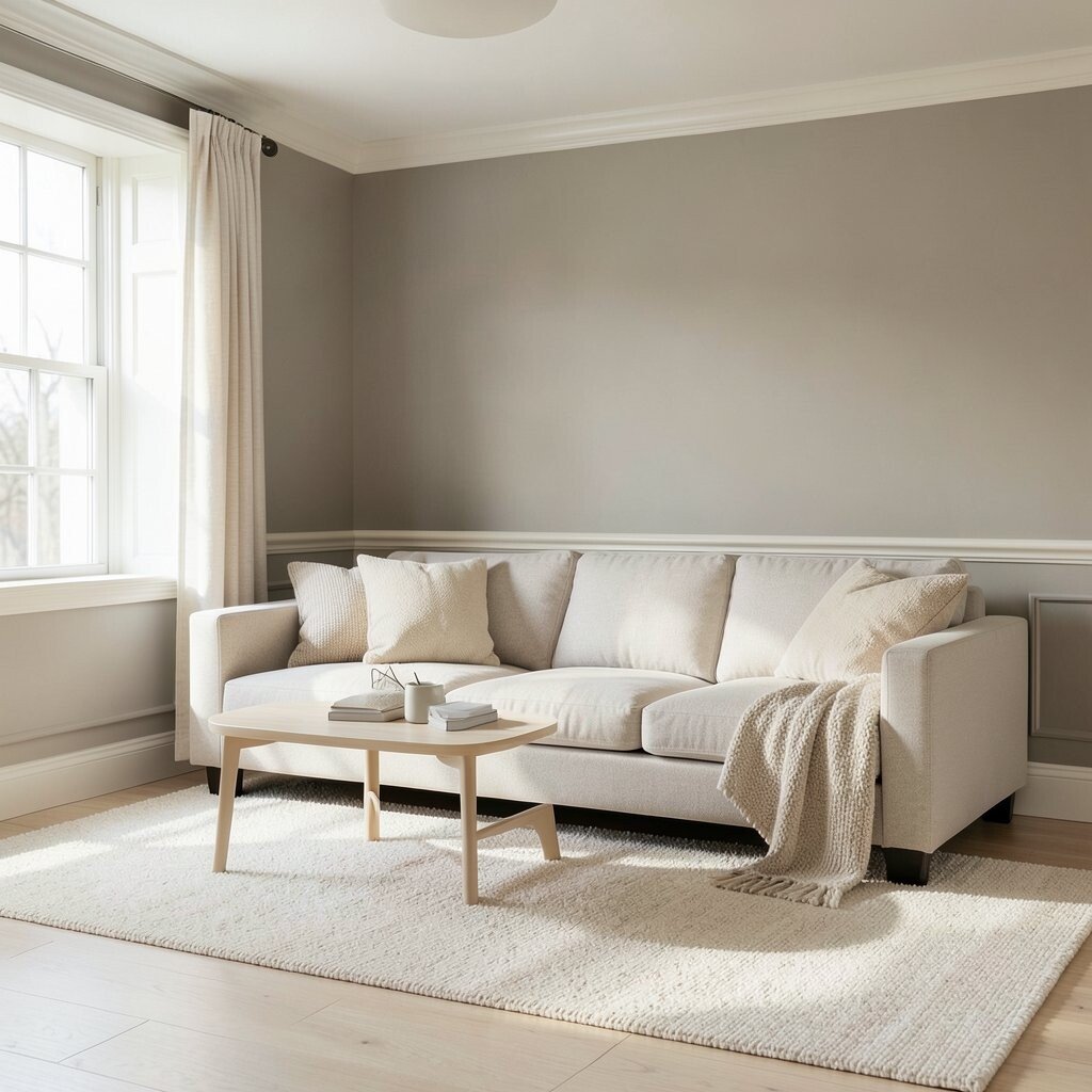
Warm greige walls act like a gentle buffer between modern and cozy. Pair them with soft ivory trim so the whole space feels bright without being harsh.
Look for a greige that leans slightly beige rather than gray for a friendlier mood. You can spot this palette working in daylight, where the tones blend smoothly across floors, furniture, and textiles. For practical results, paint large areas first and compare samples next to your sofa fabric before committing.
2. Charcoal and Cream Contrast
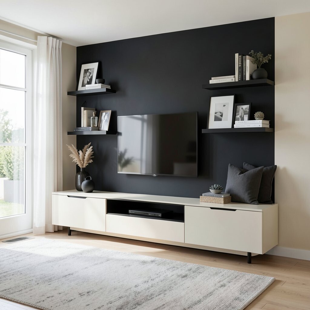
Charcoal accents bring a sleek, modern edge that instantly sharpens the look. Cream surfaces keep the room welcoming so it never feels too heavy.
Try a charcoal feature wall behind a media console or use charcoal shelving brackets for a crisp frame. This contrast photographs beautifully, which is a real plus if you like updating photos for friends. If you want a cost-friendly approach, stick to paint for the main wall and reserve darker tones for removable decor like cushions, frames, and rugs.
3. Cool Blue Gray With Cloud White
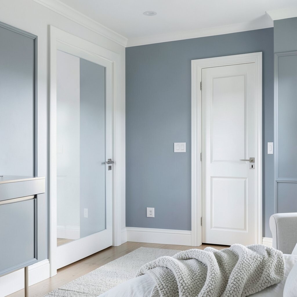
Cool blue gray makes a space feel airy, like the air is a little cleaner. Cloud white softens the contrast and helps light bounce around the room.
Choose a blue gray with a subtle hint of green if you want a calm, modern feel that still reads warm. Use cloud white for ceilings, door frames, and trim so lines stay crisp. To personalize it, add one or two pieces in brushed metal or pale wood so the palette feels designed, not borrowed.
For practical tip number one, test paint in the same direction the room gets light, because morning and evening can shift the tone. Second, balance the cool colors with texture like boucle, linen, or a knit throw. Third, keep hardware consistent, such as silver or matte nickel, so the color story feels intentional.
4. Earthy Clay and Natural Wood
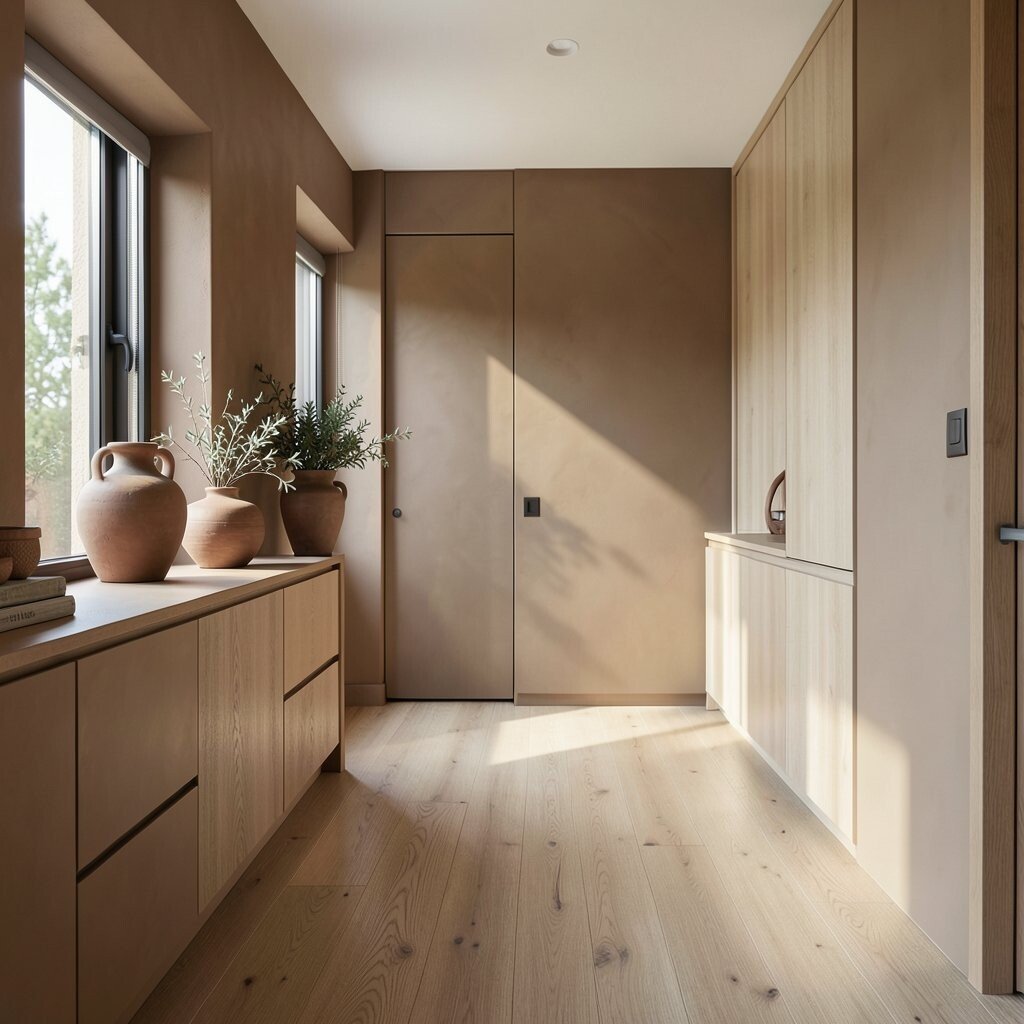
Clay tones remind you of pottery, sunlight, and grounded calm. Natural wood amplifies that feeling and makes the room look lived-in in a good way.
Use clay on cabinetry, an accent wall, or even a hallway runner backdrop so it feels modern but still warm. Try pairing it with oak, walnut, or light ash to keep the palette from turning dull. This combination is unique because it looks like a design studio while staying friendly for daily routines.
5. Sage Green With Warm Sand
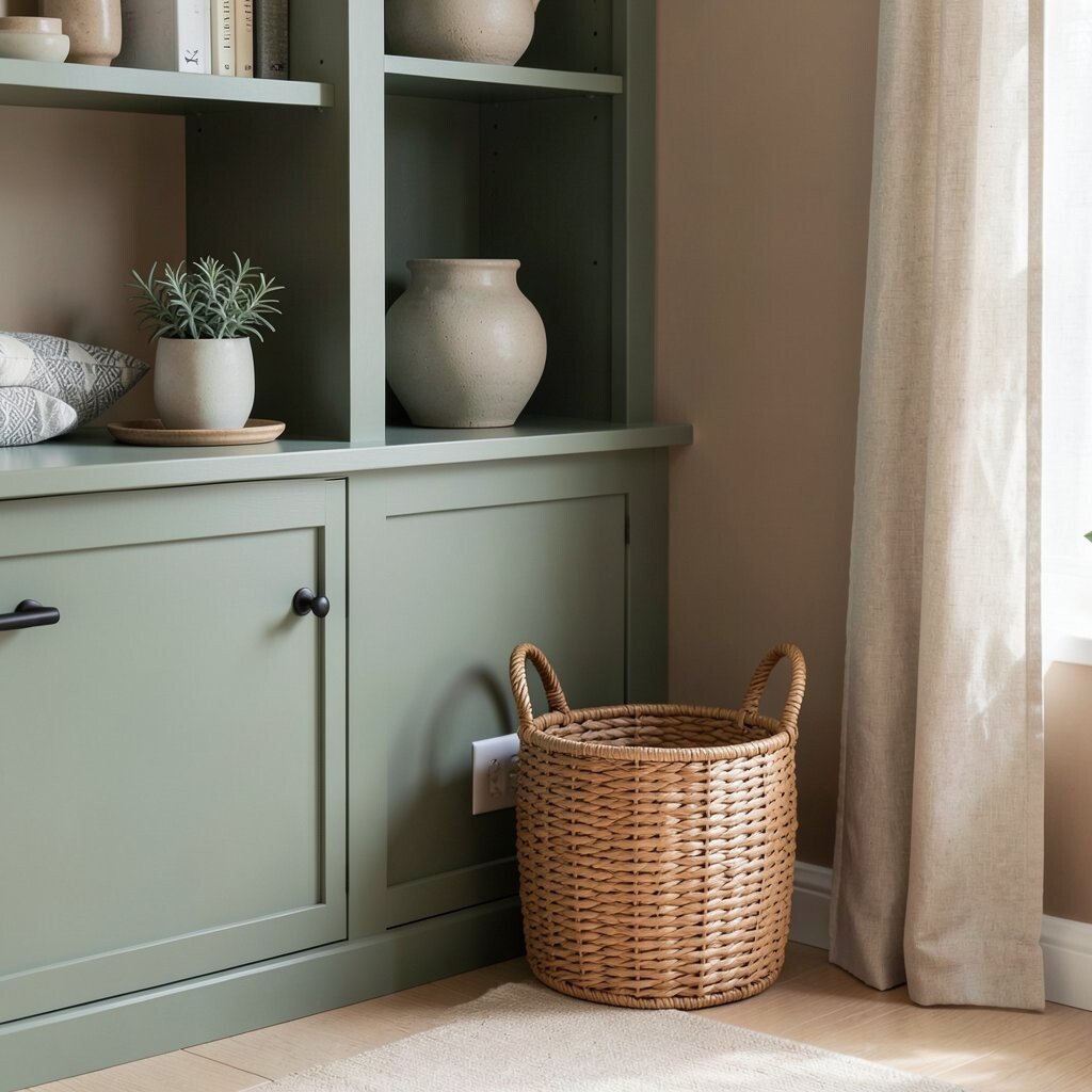
Sage green adds softness without turning the room into a garden. Warm sand tones bring balance, creating a relaxed, coastal-modern vibe.
Paint one room element sage, like the built-in bookshelf or a dining chair rail, and keep the rest in warm sand. The benefit is a calm backdrop that works with both minimal furniture and patterned textiles. For personalization, add ceramic planters, rattan baskets, or a linen curtain to echo the natural theme.
If you’re watching costs, start with paint only and update small items later. Sage pairs well with brass or matte black hardware, so you can choose the look you like before buying new fixtures.
6. Bold Teal With Linen Neutrals
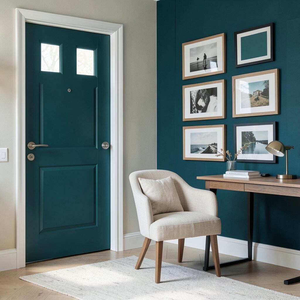
Teal feels confident and fresh, especially when it’s paired with linen-like neutrals. The result is modern energy with a soft, breathable background.
Use teal for a front door, an upholstered chair, or a gallery wall with bold frames. This palette stands out because teal has depth, while linen neutrals prevent the space from feeling loud. If you’re not ready for a big paint move, try teal wallpaper on just one wall panel or behind a desk.
7. Sunlit Mustard and Soft White
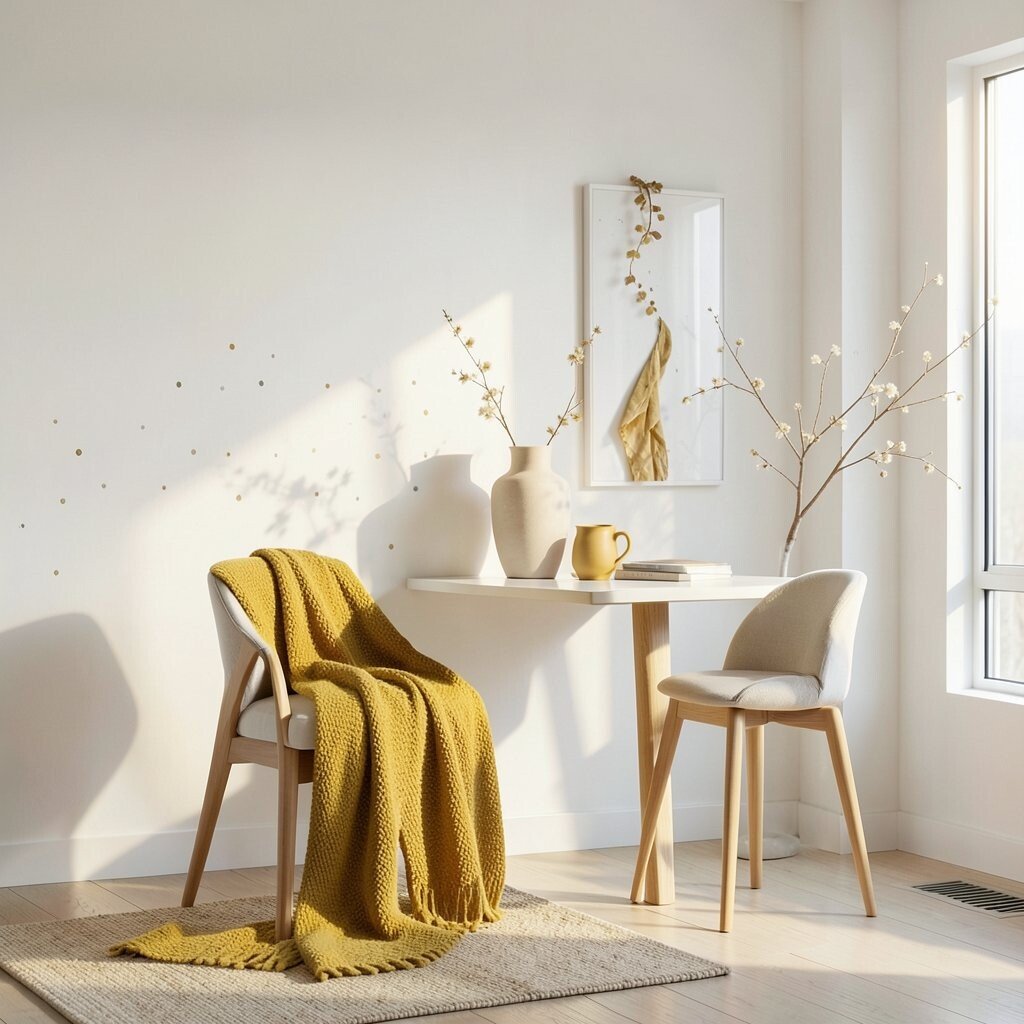
Mustard adds a warm spark that feels like golden hour. Soft white makes that warmth feel clean and current instead of vintage.
Choose a mellow mustard, not neon, so it stays friendly. You can use it in small doses, like a throw blanket, ceramic vases, or bar stools, while keeping walls soft white. For personalization, mix in subtle patterns such as tiny dots or light stripes to keep the room looking stylish.
If you want practical guidance, keep the rest of the palette simple and let mustard be the main character. This approach also helps with cost because accessories are easier to swap than major renovations.
8. Black Accent With Off-White Layers
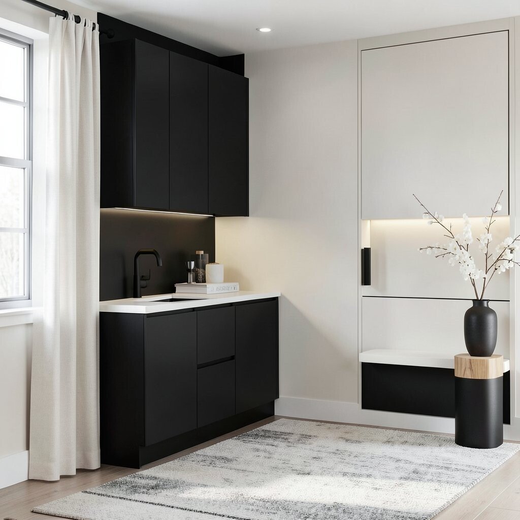
Black accents create crisp lines that instantly look modern. Off-white layers keep the room bright and prevent the black from feeling too stark.
Try matte black in lighting, curtain rods, faucets, and cabinet pulls. The benefit is a strong, consistent look even when you change rugs or seasonal decor. If you want to lower cost, focus on hardware and lighting first, because those upgrades make the biggest visual impact.
9. Blush Rose With Light Gray
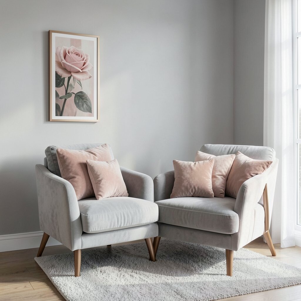
Blush rose feels romantic, but modern when paired with light gray. The softness of rose makes the room feel gentle, while gray keeps it grounded.
Use blush in accent pieces like pillows, art prints, or a small wall panel behind a reading chair. Light gray works well for walls because it reflects light without looking cold. To personalize, add warmer finishes like brushed bronze or light wood, so the rose reads fresh instead of dusty.
For practical tips, keep blush tones consistent across rooms so your home feels connected. Also consider mixing different blush textures, like velvet, cotton, and ceramic, so the look feels richer without extra color noise.
10. Olive Green With Charcoal Comfort
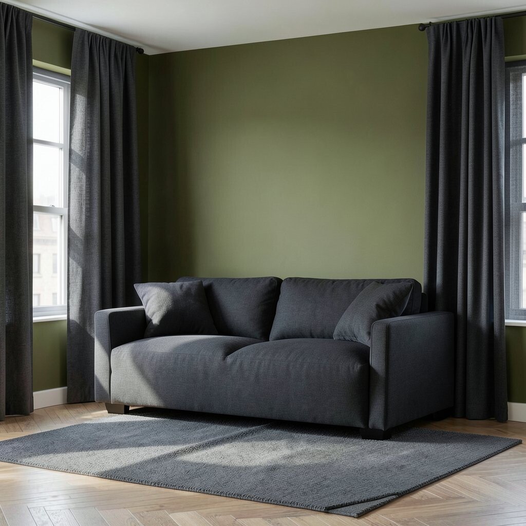
Olive green brings natural depth and a modern, grounded mood. Charcoal comforts the palette by adding structure and contrast.
Paint an accent wall olive and use charcoal in curtains, area rugs, or an upholstered sofa base. This combo feels unique because it balances an earthy color with a sleek, city-like shade. To keep it practical, use olive where you want warmth and use charcoal where you want definition.
11. Monochrome Taupe With Soft Leather
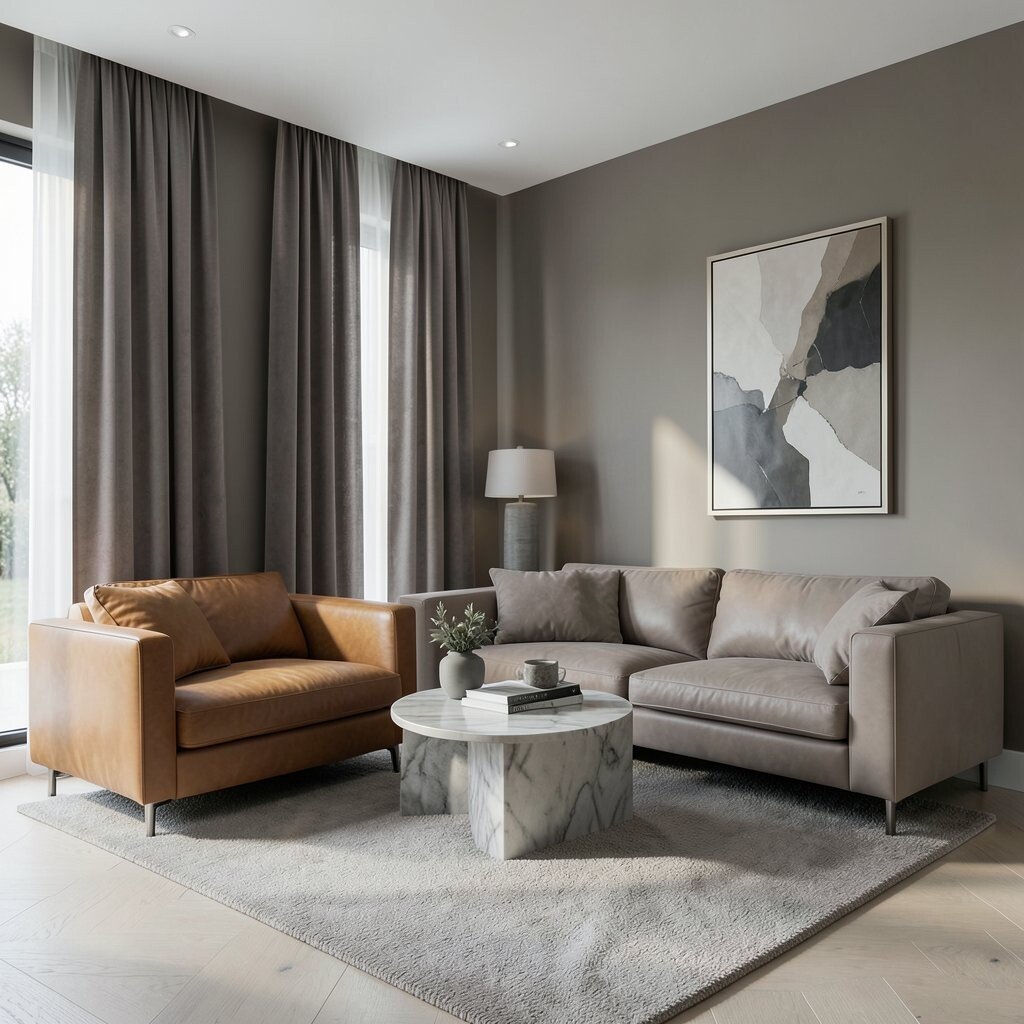
Taupe is the quiet hero of modern homes, and it looks great in monochrome. When you add soft leather, the palette becomes rich without needing bold colors.
Try taupe walls, taupe curtains, and vary the shades with lighter and darker pieces. The benefit is a seamless look that makes rooms feel larger and more relaxed. For personalization, choose leather in caramel, cognac, or light taupe, and pair it with matte finishes like brushed nickel or stoneware.
Practical tip is to pay attention to undertones, since taupe can swing warm or cool. Test swatches in the room so you can see if it flatters your flooring and artwork before you commit.
12. Fresh Mint With White and Natural Linen
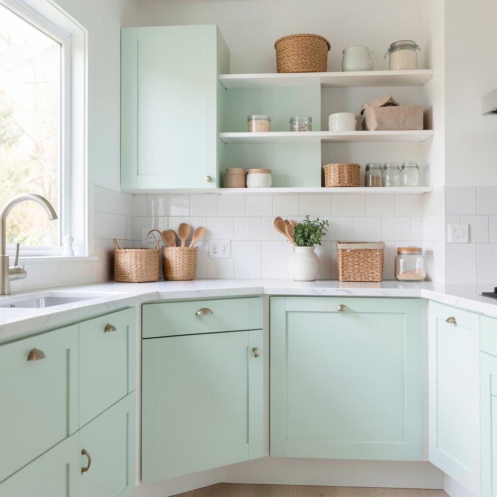
Mint feels light and playful, perfect for kitchens and breakfast nooks. When you keep the rest in white and natural linen, it reads modern instead of childish.
Use mint in cabinet doors, a backsplash, or small wall sections around open shelving. The advantage is that mint brings freshness while staying subtle enough for everyday living. Personalize by adding woven baskets, light wood utensils, and simple glass jars to match the airy vibe.
13. Deep Navy With Brass Highlights
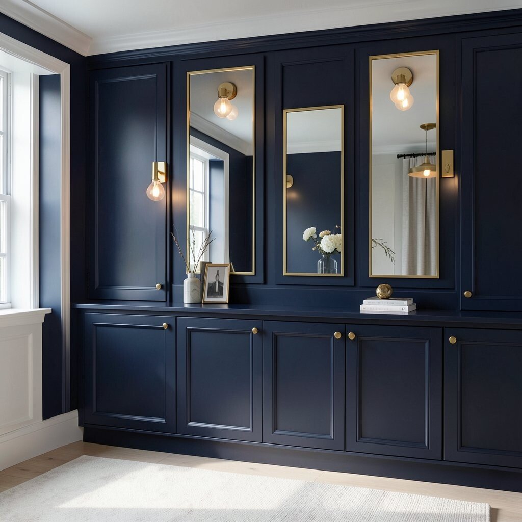
Deep navy makes a room feel elegant and calm. Brass highlights add a warm glow that feels upscale without being complicated.
Consider navy for built-ins, a feature wall, or accent cabinetry, then bring in brass with mirrors, picture frames, and light fixtures. This palette is unique because the navy acts like a dark canvas while brass keeps it from feeling heavy. For cost considerations, you can paint once and then update hardware and lighting gradually.
To keep it balanced, choose light flooring or pale rugs so the navy has breathing room. Also keep metallic finishes consistent so the room feels carefully styled.
14. Terracotta Clay With Creamy Beige
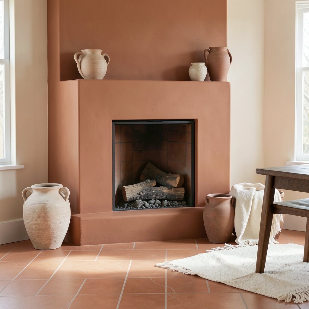
Terracotta adds warmth like a sun-baked tile. Creamy beige tones soften it so the overall look stays modern and not too rustic.
Try terracotta on a fireplace surround, a dining accent wall, or a set of statement planters. This palette feels personal because it naturally pairs with natural textiles and handmade-looking decor. Personalize with textured ceramics, off-white linens, and a few dark wooden elements to anchor the warmth.
For practical planning, test terracotta paint with the flooring and countertop colors you already have. Terracotta can shift dramatically depending on lighting, so sampling helps you pick the best shade.
15. Monochrome White With Texture Play
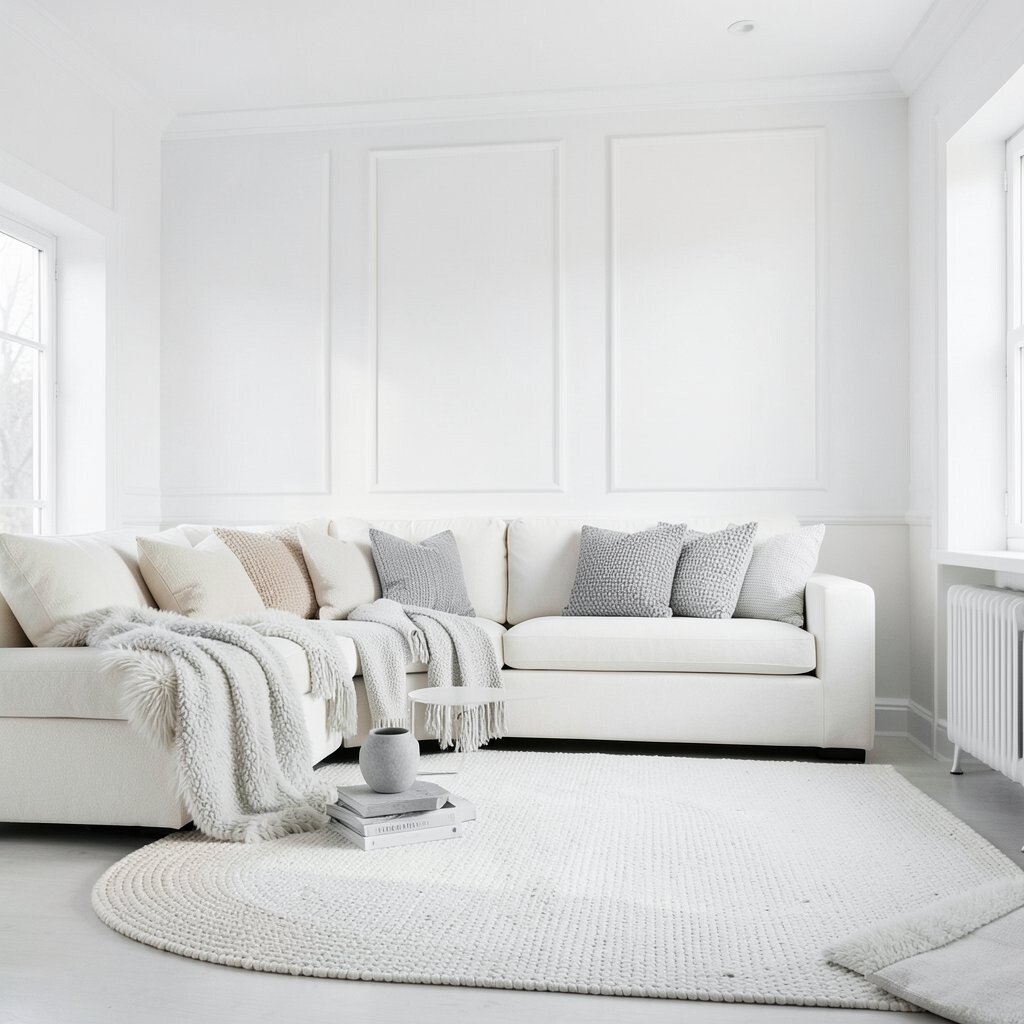
A monochrome white room can look incredibly modern when you focus on texture. Instead of adding new colors, you create interest through layers and materials.
Use different whites like warm white, bright white, and soft ivory across walls, trim, and furniture. The benefit is a clean look that makes spaces feel open and calm. To personalize, add variety with wool throws, ceramic decor, woven rugs, and matte finishes that catch light gently.
If you’re keeping costs in check, start with paint and textiles, since large furniture buys aren’t always necessary. Swapping a rug and adding a few textured cushions can change the entire mood quickly.
16. Periwinkle and Light Walnut
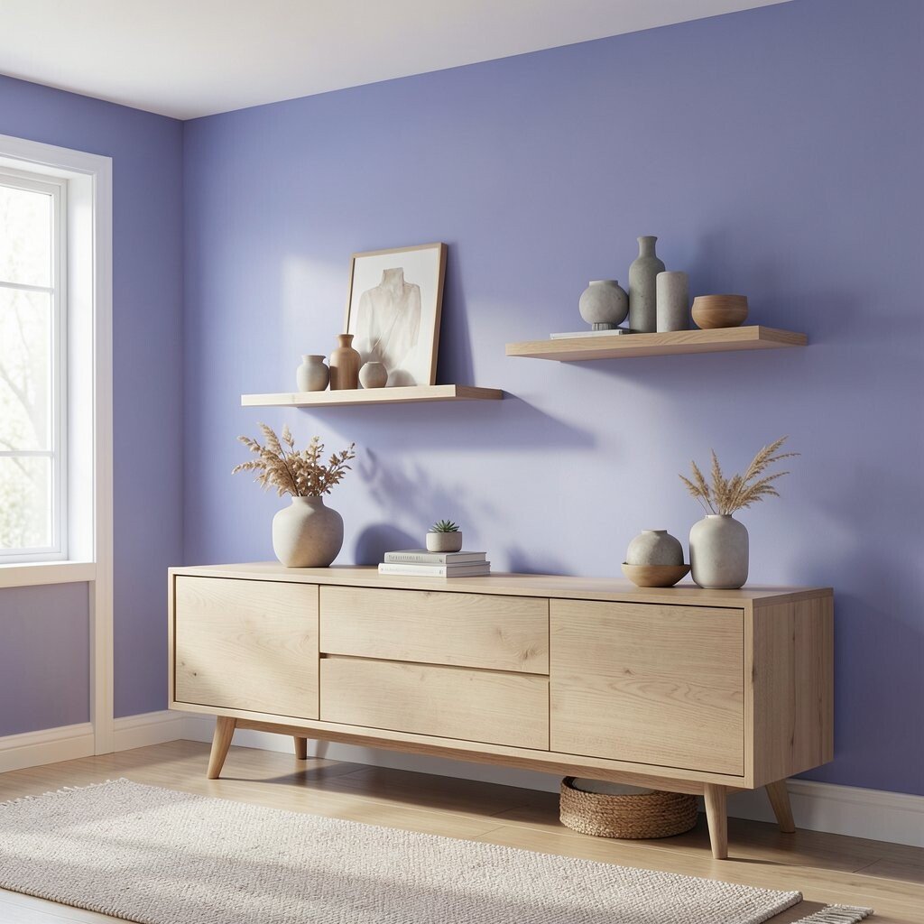
Periwinkle brings a dreamy, modern calm that still feels playful. Light walnut adds warmth so the cool tone stays cozy.
Pair periwinkle walls with light walnut furniture, floating shelves, and a few wooden accessories. This palette is unique because it mixes a soft color with a warm wood tone, creating visual harmony. For practical tips, keep the rest of the decor neutral and focus on one or two standout pieces in periwinkle to avoid overwhelm.
17. Coral Blush With Soft Charcoal
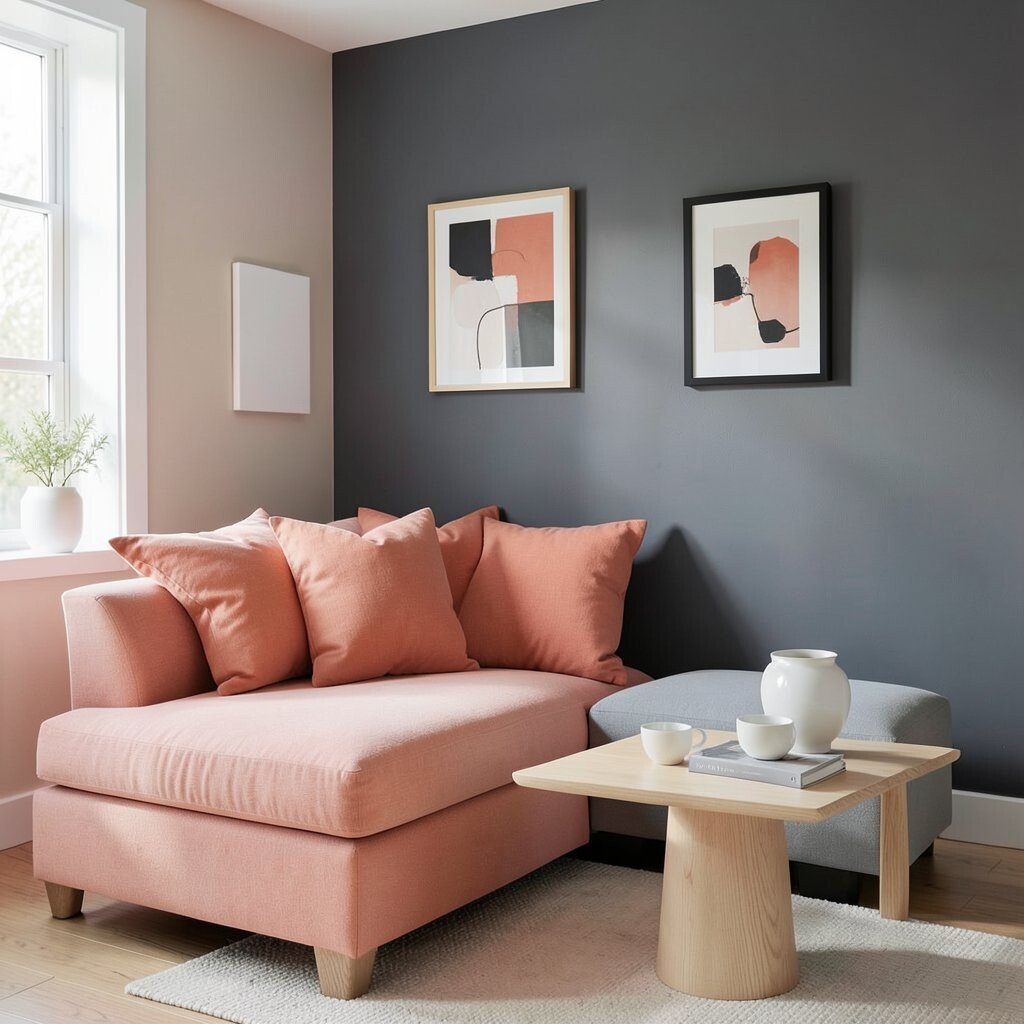
Coral blush adds energy without going fully bright. Soft charcoal gives the palette a modern edge and helps coral look balanced.
Use coral in throw pillows, art frames, or a small wall section near a doorway. The benefit is a pop of color that feels friendly and current, especially in rooms that get lots of natural light. Personalize with pale wood, white ceramics, and a few black-framed elements so everything connects visually.
If you’re planning a budget-friendly refresh, repainting just a small accent wall can be a smart move. Then add decor that you can move to a new room later when you want a change.
18. Cocoa Brown and Creamy Beige
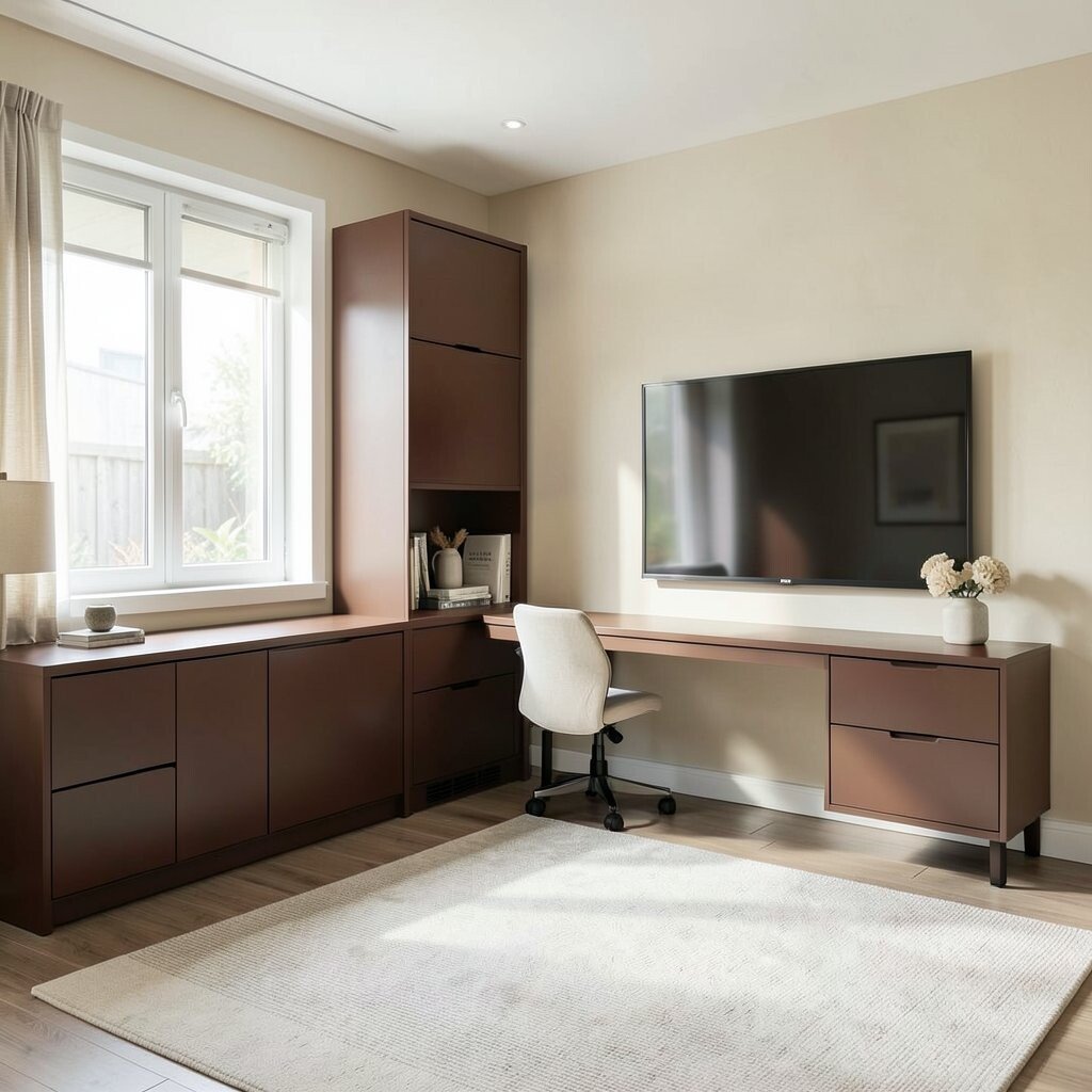
Cocoa brown makes a home feel comforting and grounded. Creamy beige keeps the look bright and modern so it doesn’t feel too dark.
Consider cocoa for lower cabinets, a built-in desk, or a statement media wall. Creamy beige can be used on walls, ceiling areas, and larger textiles so the room stays airy. This palette is practical because both colors are forgiving and hide everyday wear well.
19. Pastel Lavender With Warm White Trim
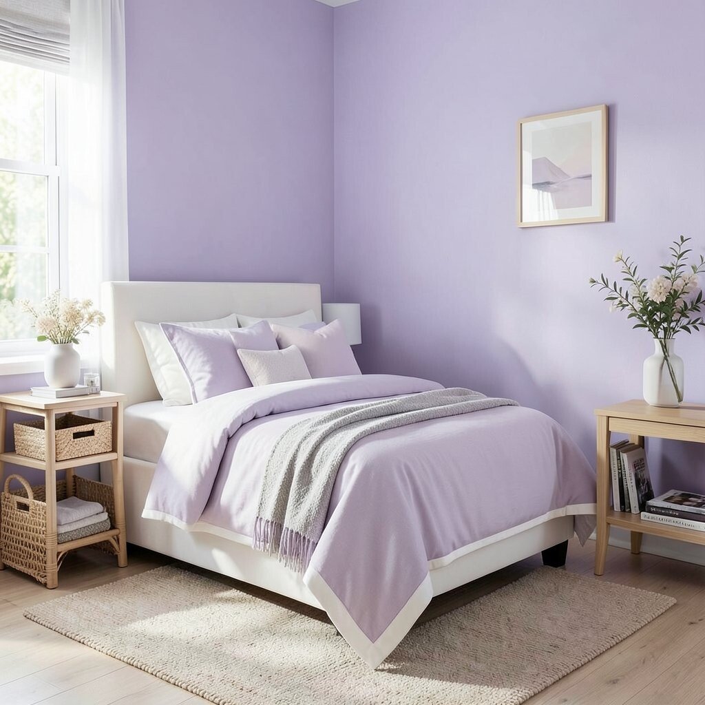
Lavender, when kept pastel, can feel calm and quietly stylish. Warm white trim adds crispness so the softness stays elegant.
Try pastel lavender in a bedroom, a small reading nook, or a powder room for a surprising modern touch. The benefit is a soothing atmosphere that still feels fresh and design-forward. Personalize by adding natural textures like linen, rattan, and light wood so lavender reads gentle instead of cold.
For cost considerations, look for washable paint and easy-to-change decor, like removable wallpaper or soft furnishings. Those choices help you test the vibe without major spending.
20. Forest Green With Light Limestone

Forest green brings richness, and light limestone tones keep the room feeling bright. This palette looks high-end because the contrast feels natural and architectural.
Use forest green for cabinetry, accent walls, or large furniture pieces, then anchor the room with light limestone paint or stone-like surfaces. The uniqueness comes from the way deep green pairs with clean, pale backgrounds. For practical tips, choose a finish that suits your lifestyle, like eggshell for walls that see daily activity.
21. Bright Red Accent With Soft Neutrals
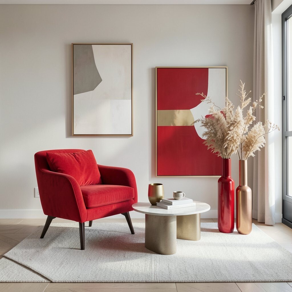
A bright red accent can make a modern room feel instantly lively. Soft neutrals keep it elegant and prevent it from taking over the entire space.
Use red sparingly, such as a single accent chair, a bold art piece, or a set of red-toned vases. The benefit is focus, because the eye knows exactly where to rest. Personalize the look by coordinating red with warm metals like gold or copper, and by choosing neutral textiles that support the red without competing.
If you’re cost-conscious, prioritize removable items first, since accents are easier to swap when trends change. Red also pairs well with current minimalist styles because it adds one clear statement color.
22. Charcoal, Stone Gray, and Sage Layers
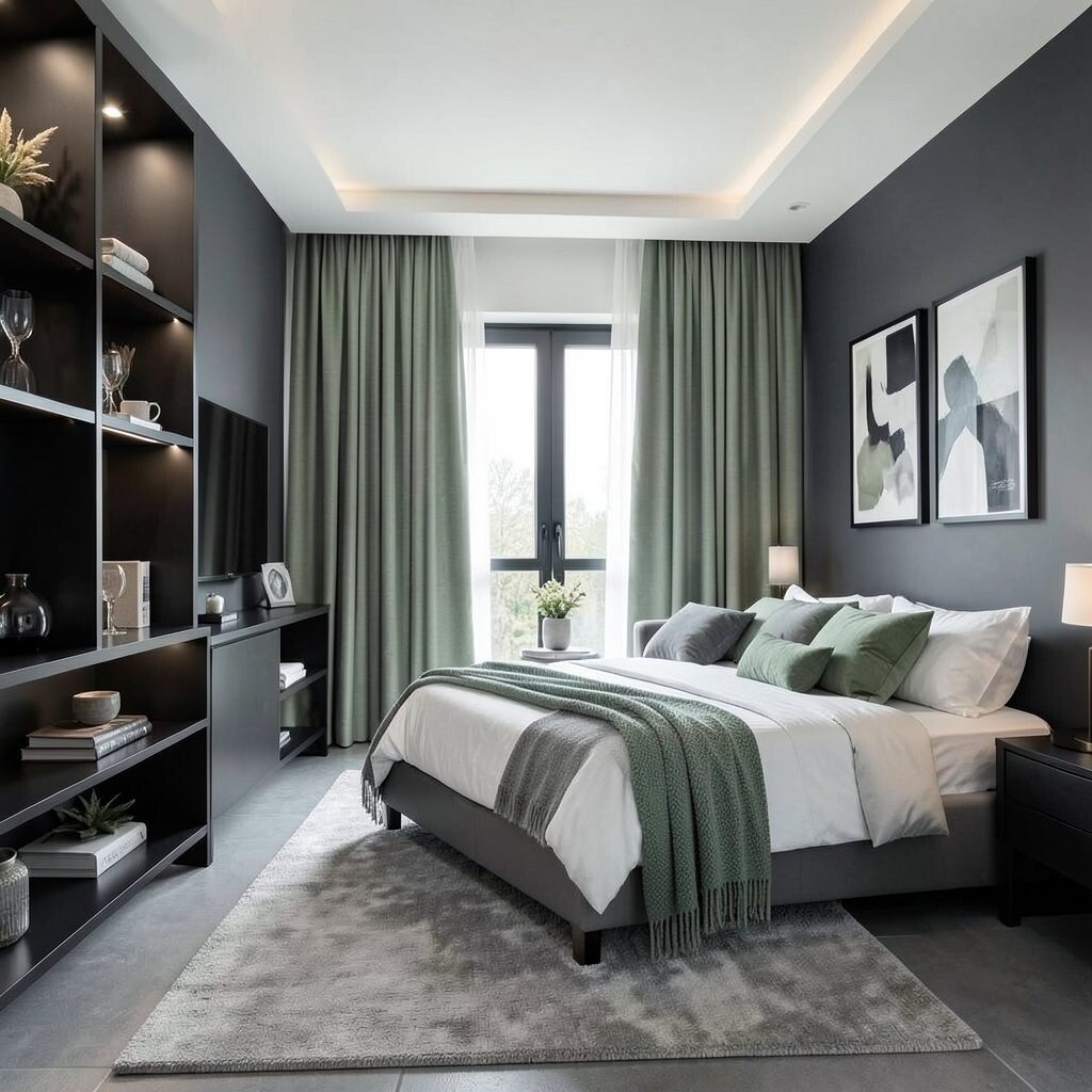
This layered palette combines charcoal depth with stone gray calm and sage softness. The result feels modern, balanced, and natural, like a well-designed hotel suite.
Start with stone gray on large surfaces, add charcoal for structure like shelving or seating bases, and bring in sage through textiles and plants. This combination is unique because it creates variety without random color jumps, so the room feels cohesive. Personalize by selecting one sage shade to repeat across curtains, cushions, and small decor so it looks intentional.
For practical guidance, keep lighting in mind since charcoal can absorb light and stone gray can brighten it. If the room is darker, use reflective finishes like satin paint, glass decor, and a brighter ceiling tone. When considering costs, paint provides the biggest shift, while plants, rugs, and artwork offer the easiest personalization afterward.