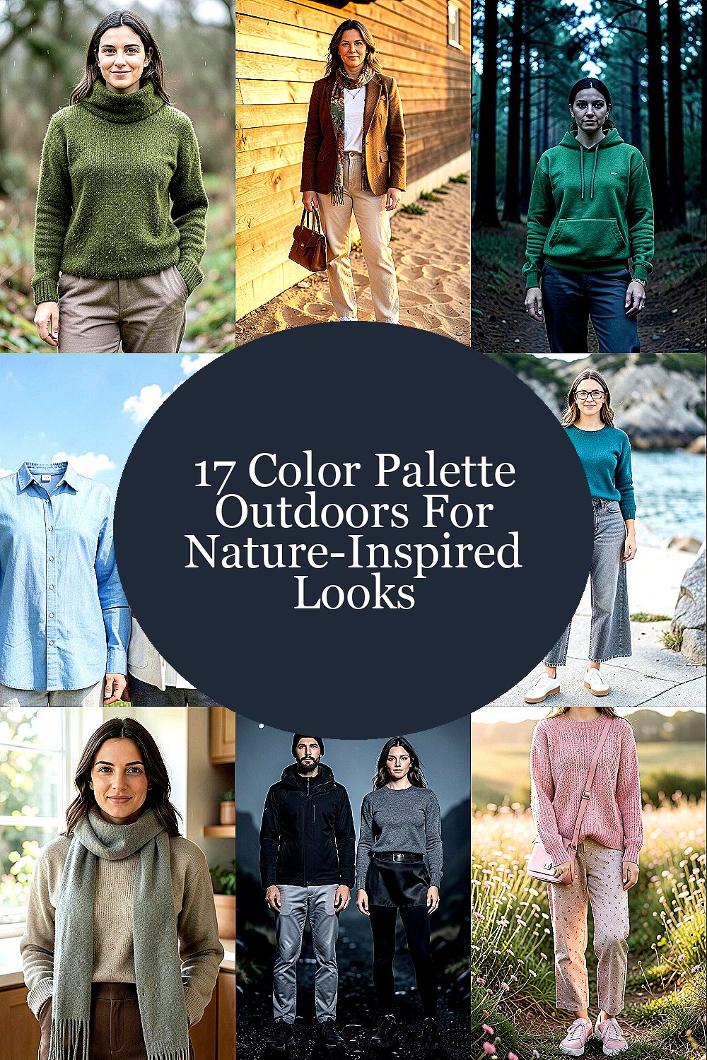
The outdoors has a way of telling stories with color. Wearing those shades can make your everyday style feel calmer and more alive.
When you pull tones from forests, deserts, coastlines, and mountain skies, you get looks that feel intentional without trying too hard.
1. Mossy Olive and Grounded Neutrals
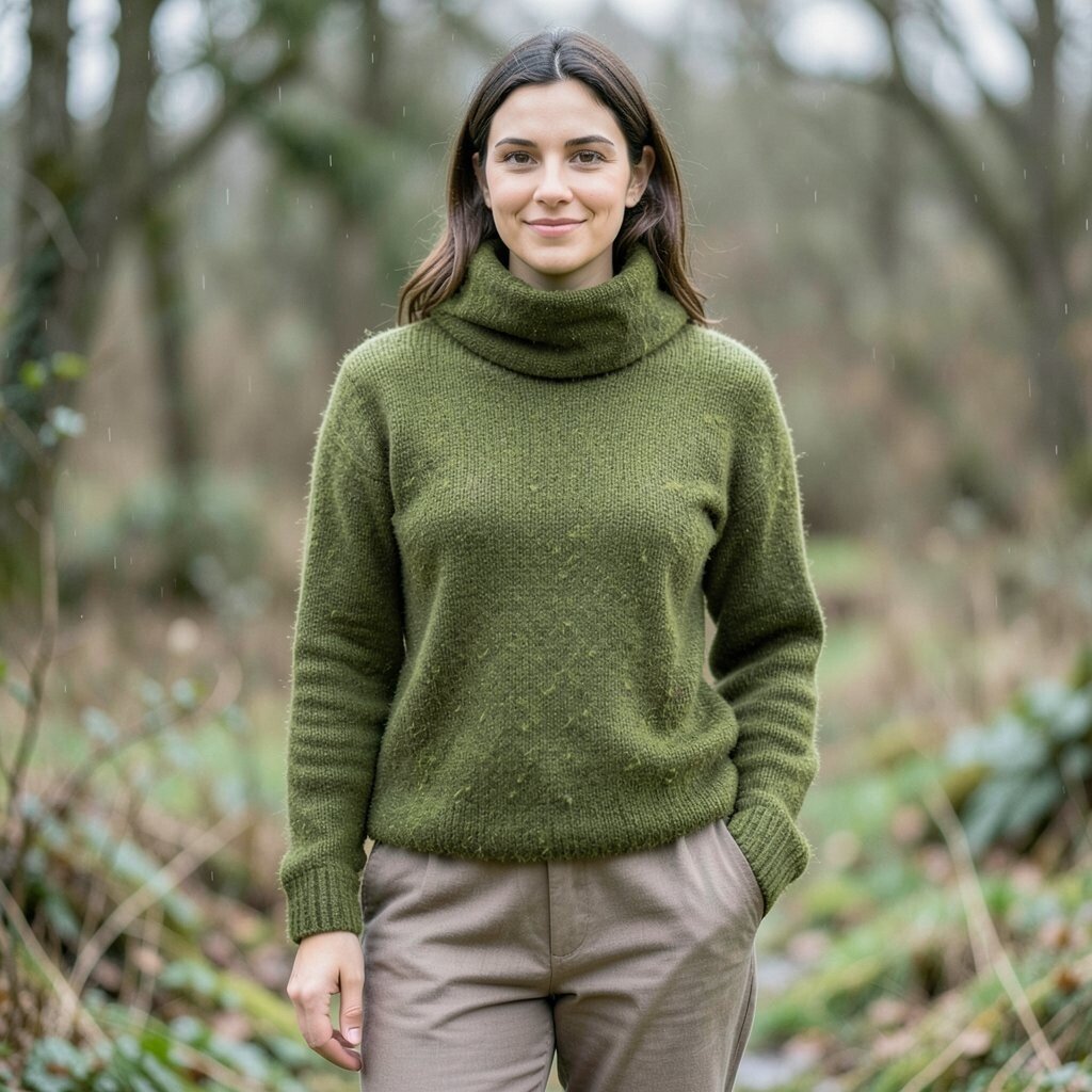
Picture a soft green that looks like moss after a light rain. Pair it with warm taupe and creamy off-white for a grounded feel that still looks fresh.
Olive and earth tones are great at balancing strong patterns, so your outfit feels put together even when you mix textures. Choose a moss sweater, then let the rest stay neutral with breathable fabrics like cotton or linen.
For a practical touch, wear olive near your face with a scarf or top, and keep bottoms in taupe to stretch your look visually. This palette also works year-round because it reads natural even in cold weather layers.
2. Cedar Brown and Toasted Sand
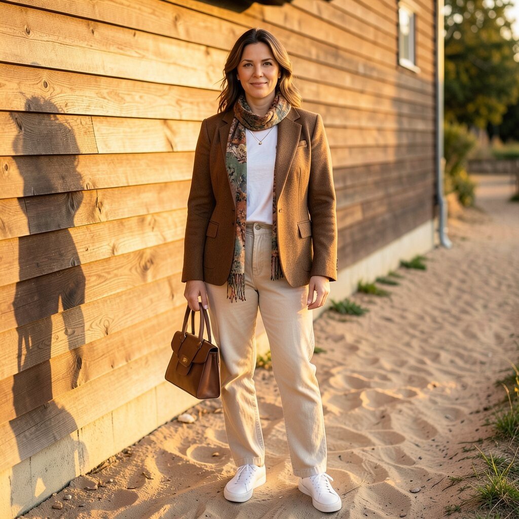
Think of cedar siding warmed by sun, along with sandy paths that glow at golden hour. Cedar brown adds depth, while toasted sand keeps everything light and wearable.
This combo is uniquely flattering because it leans into warm skin tones and soft highlights in hair and eyes. You can dress it up with a tailored jacket or down with a simple tee and relaxed pants.
To make it feel modern, use one rich shade as the main piece and keep the other color for accessories like belts, shoes, or bags. If you’re shopping on a budget, look for a high-impact scarf or handbag, since a small item can carry the whole look.
3. Pine Needle Green and Charcoal Night
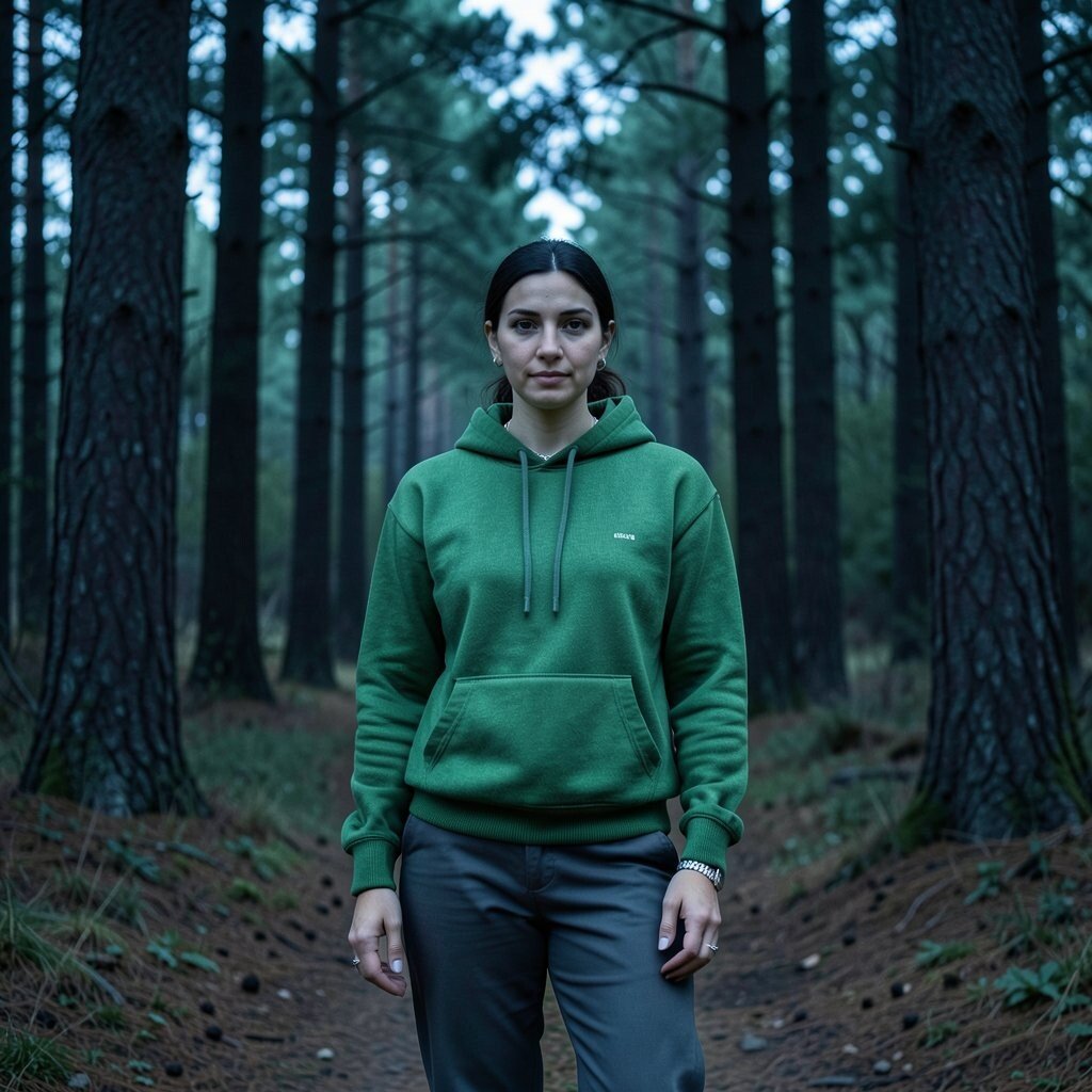
Imagine walking under tall pines where the light turns cool and the shadows feel deep. Pine needle green paired with charcoal gives that crisp outdoors mood without looking too dark.
This palette offers a clear benefit for styling because charcoal acts like a “frame” for brighter greens. When you want to stand out, let green be the accent on a hoodie, knit, or jacket.
Try combining a pine top with charcoal trousers, then add silver jewelry for a clean contrast that feels current. If you’re experimenting, start with one green piece you already own and build around it with charcoal basics.
For personalization, choose pine in a slightly brighter shade if you like energy, or go deeper for a moody, evening-ready look. Current trends also favor darker, saturated color blocks, which makes this pairing feel right at home.
4. Sky Blue and Cloud White
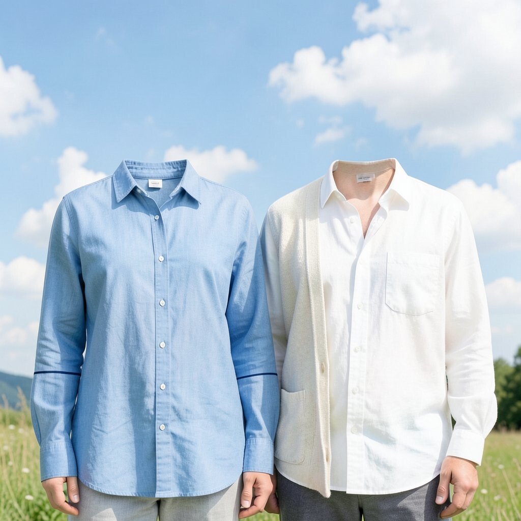
Sky blue is like fresh air in clothing form, and cloud white keeps it soft and friendly. Together they bring a light, open vibe that works for daytime errands and casual meetings.
One benefit of this palette is how easy it is to match with almost any neutral, like denim blue or light gray. If you love clean outfits, stick to simple shapes and let the color duo do the work.
To keep it practical, choose breathable tops in summer and layer with a light cardigan in cooler weather. You can personalize the look by adding a small pop of navy or a thin stripe pattern for extra character.
As for cost, you can get a similar effect without buying everything new by dyeing basics or shopping for one standout blue top. Thrift finds often include great “cloud white” pieces like button-down shirts or linen tees.
5. Redwood Orange and Warm Linen
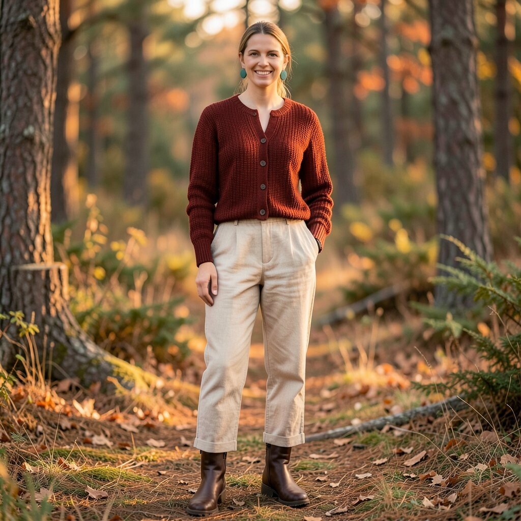
Redwood orange feels like a campfire glow, while warm linen looks like the calm before evening gets cozy. This palette brings energy without needing loud prints.
It’s a great choice if you want uniqueness, because orange can look too bright on its own but turns wearable when grounded with soft beige. Pair a redwood cardigan with linen trousers or a skirt for a look that feels both relaxed and stylish.
For practical styling, balance the warmth by adding cool accessories like dark brown boots or muted teal earrings. Personalize it by choosing deeper redwood for fall moods and lighter orange for spring freshness.
If you’re thinking about cost, one quality knit in redwood can replace several “trend colors,” since it mixes well with many neutrals. Look for timeless fabrics like cotton blends or wool knits that hold their color.
6. Ocean Teal and Sea Glass Gray
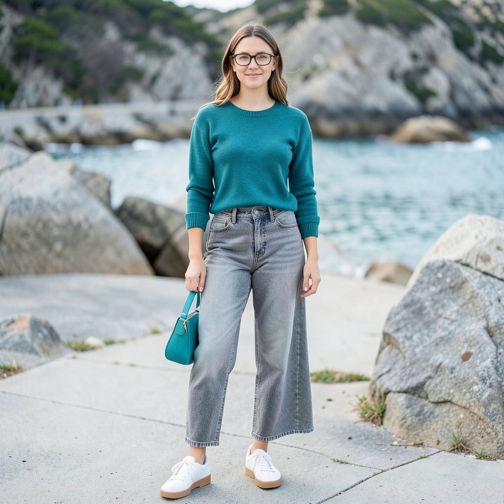
Ocean teal reminds you of deep water, and sea glass gray adds a soft, weathered calm. This combination feels cool, clean, and soothing in a way that’s hard to ignore.
Teal brings attention to the outfit without shouting, and gray keeps it wearable for work and weekends. If you wear glasses or have cool-toned highlights, teal is especially friendly because it makes your features feel brighter.
Try a teal top with gray denim, then finish with white sneakers or salt-tan sandals. For personalization, choose sea glass gray in different textures, like a sweater with a ribbed knit or a skirt with a soft drape.
Cost-wise, you can build this look with layering basics, like a gray tank and a teal overshirt, instead of buying a full set. Current trends also favor ocean tones in accessories, so a teal bag or belt can do a lot.
7. Sage Green and Soft Mocha
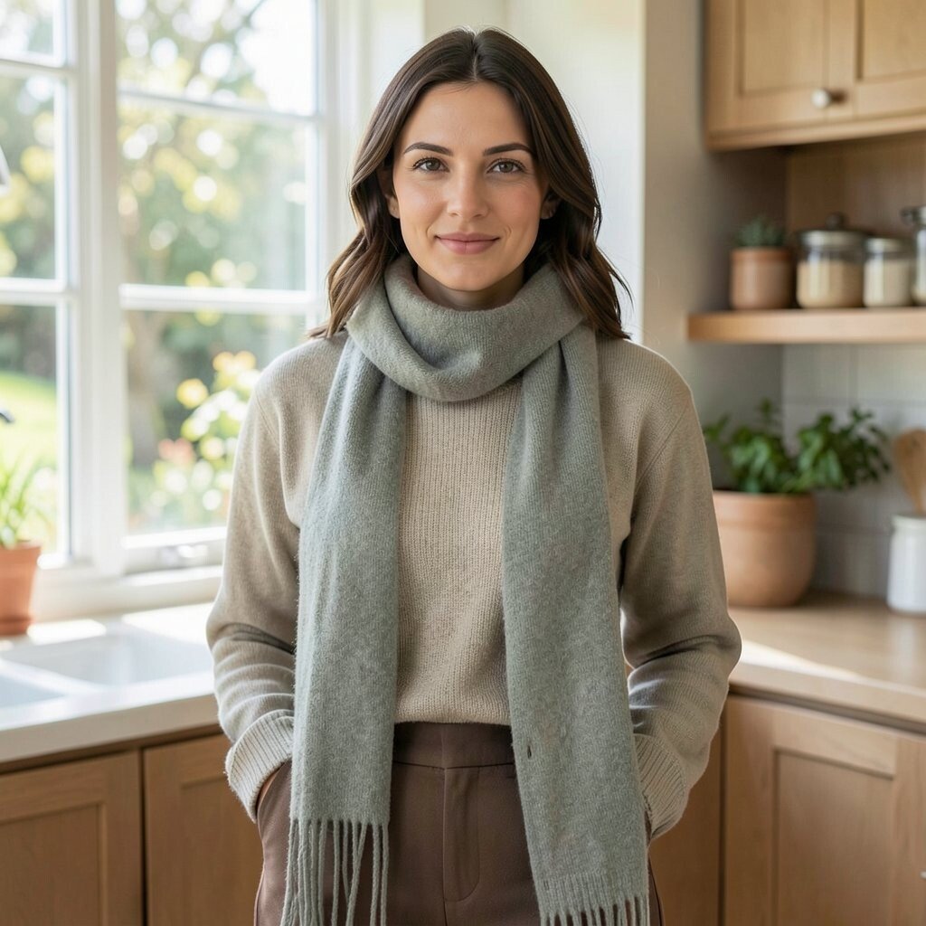
Sage green is gentle and balanced, like herbs drying in a sunny kitchen. Soft mocha adds warmth, making the outfit feel cozy and grounded rather than icy.
This palette has a major benefit for everyday wear because sage works with many skin tones and looks good in both casual and dressed-up outfits. Mocha grounds the look, so you don’t need heavy layers or complicated styling.
For a practical approach, wear sage near your face, then use mocha for bottoms or outerwear. If you want an easy upgrade, add a scarf in sage and keep the rest in simple mocha browns.
Personalize by switching the contrast level, using lighter sage with deeper mocha for a bold look or matching close shades for a quiet monochrome moment. This kind of subtle color harmony is showing up a lot in modern capsule wardrobes.
8. Volcanic Black and Misty Silver
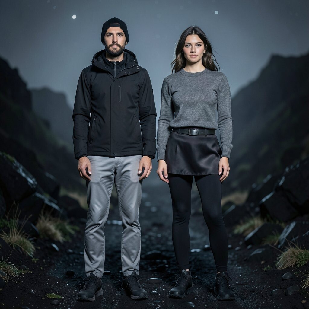
Volcanic black is dramatic, while misty silver feels like moonlight on metal. Together they create a sleek, outdoor-night vibe that still feels wearable.
This combo is unique because it gives you a “night hike” aesthetic without needing neon colors. It also helps hide wrinkles and daily wear, which is a real practical advantage for busy schedules.
Try a black jacket with silver-gray pants, then add matte black accessories for a clean finish. If silver feels too icy, choose heather gray instead for a softer look.
For personalization, look for subtle texture differences like a satin skirt with matte black leggings, or a knit top with a metallic belt. Cost considerations are simple here since black basics are often affordable and easy to find in many styles.
9. Wildflower Pink and Dusty Rose
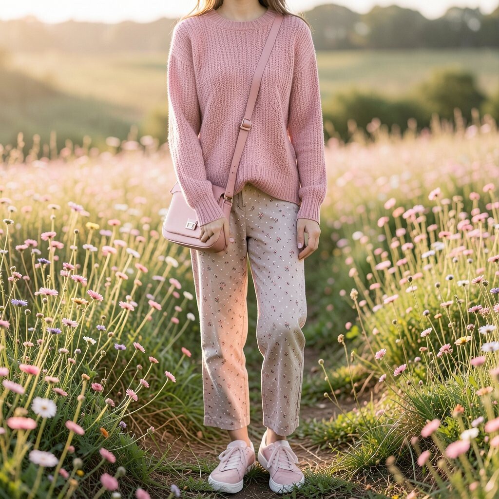
Wildflower pink is playful and bright, while dusty rose brings a gentle, grown-up softness. The pair feels like a meadow in early morning light.
A benefit of this palette is that it makes outfits feel romantic without turning them into “only pink” looks. If you’re unsure about pink, dusty rose is the easier entry, and wildflower pink works best as an accent.
Make it practical by choosing one pink shade for the top and letting the other move into accessories like shoes or a crossbody bag. Personalize with patterns, such as small florals or subtle polka dots, if that fits your style.
For current trends, muted rose tones are popular in knitwear and bags, so you can lean into that without going full fashion-forward. You can also save money by grabbing one standout pink accessory instead of multiple full outfits.
10. Mountain Heather and Pine Brown
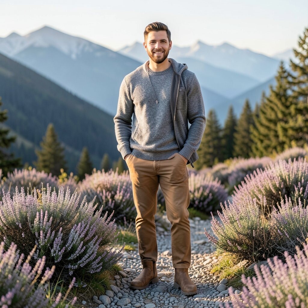
Mountain heather looks like soft gray-purple stones, and pine brown feels like a tree trunk warmed by sun. This palette feels outdoorsy yet smooth, like layers of mountains stacked in the distance.
It’s helpful for styling because the colors are both earthy and calm, so you won’t struggle to find matching neutrals. Pair a heather knit with pine brown pants for an outfit that looks intentional in photos.
To make it actionable, choose heather for a sweater or sweatshirt, then add pine brown boots or a jacket. Personalize it by adjusting depth, using lighter heather for daytime and deeper purple-gray for evenings.
If you’re cost-conscious, shop for a single statement knit, since knitwear shows color well and lasts through multiple seasons. This palette also aligns with current interest in “quiet color,” where muted tones look elevated and modern.
11. Desert Gold and Clay Beige
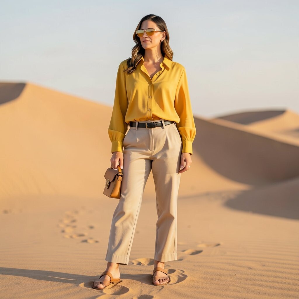
Desert gold glows like sunlight on dunes, and clay beige feels like warm earth after a gentle rain. Together, they create a sun-kissed look that still feels classy.
This palette offers a benefit for people who want warm tones without looking overly orange or flashy. Desert gold in small doses can brighten your outfit, while clay beige keeps everything balanced and easy to wear.
For practical tips, use desert gold in a top, then keep the rest in clay beige, cream, or soft brown. Add a dark leather belt or tan sandals to keep the look grounded.
Personalize with fabric choices, like a flowing blouse for desert gold or a structured jacket for clay beige. When you think about cost, consider a golden accessory like sunglasses or a small bag, because warmth in accessories can change the whole outfit.
12. Coral Reef and Driftwood Tan
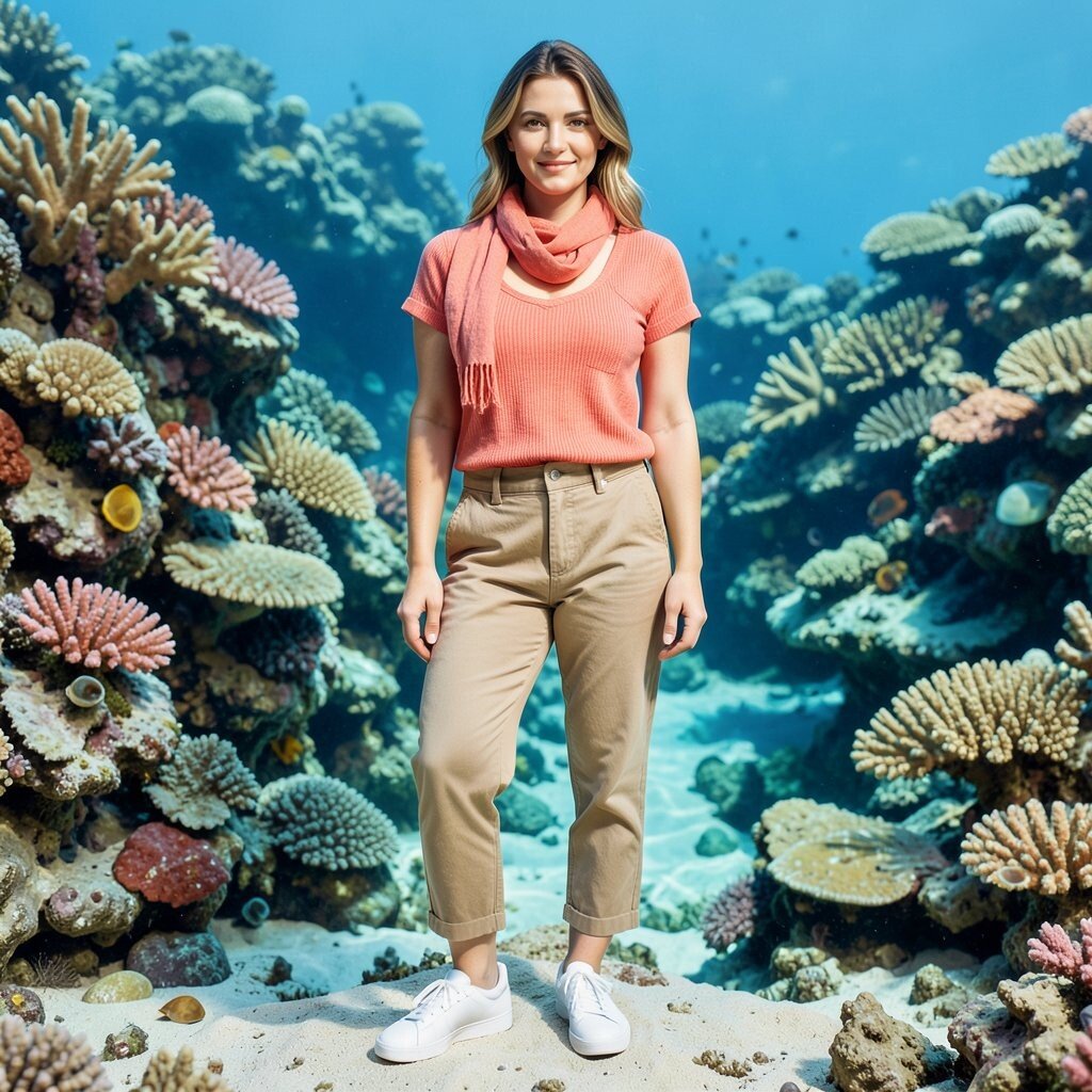
Coral reef color feels lively, like a tide pool with bright life underneath. Driftwood tan softens the intensity, making the outfit feel natural rather than loud.
This combo is unique because it mixes a playful warm pop with a calm, beach-worn neutral. It also flatters many wardrobes since coral pairs beautifully with denim, cream, and soft blues.
Try a coral blouse with driftwood chinos, then add simple white sneakers for an easy clean finish. Personalize it by choosing coral in different styles, like a ribbed tank for summer or a knit tee for cooler days.
For cost considerations, look for coral in lightweight items like scarves, tees, or tank tops that are often easier to find at lower prices. Current trends favor warm coral accents in summer sets, so this palette feels fresh and current.
13. River Green and River Stone Gray
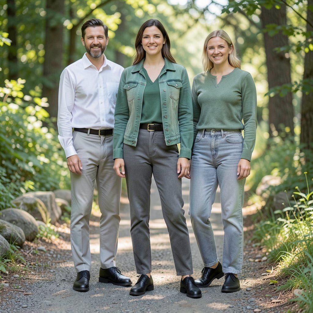
River green carries that leafy freshness, and river stone gray looks like smooth stones you’d find along a path. This palette feels calm, steady, and quietly confident.
A benefit here is that both shades work with everyday wardrobe staples like white shirts, black shoes, and light denim. You get an outdoors look without needing complicated styling.
To keep it practical, start with a river stone base like gray pants, then add river green through a top, belt, or jacket. Personalize with different greens, because some people love more blue-green while others prefer yellow-green.
Cost-wise, you can build this look gradually by first buying one green item and pairing it with gray basics you already have. This kind of nature palette is also popular in capsule wardrobes since it stays cohesive across many outfits.
14. Limestone Ivory and Sage Whisper
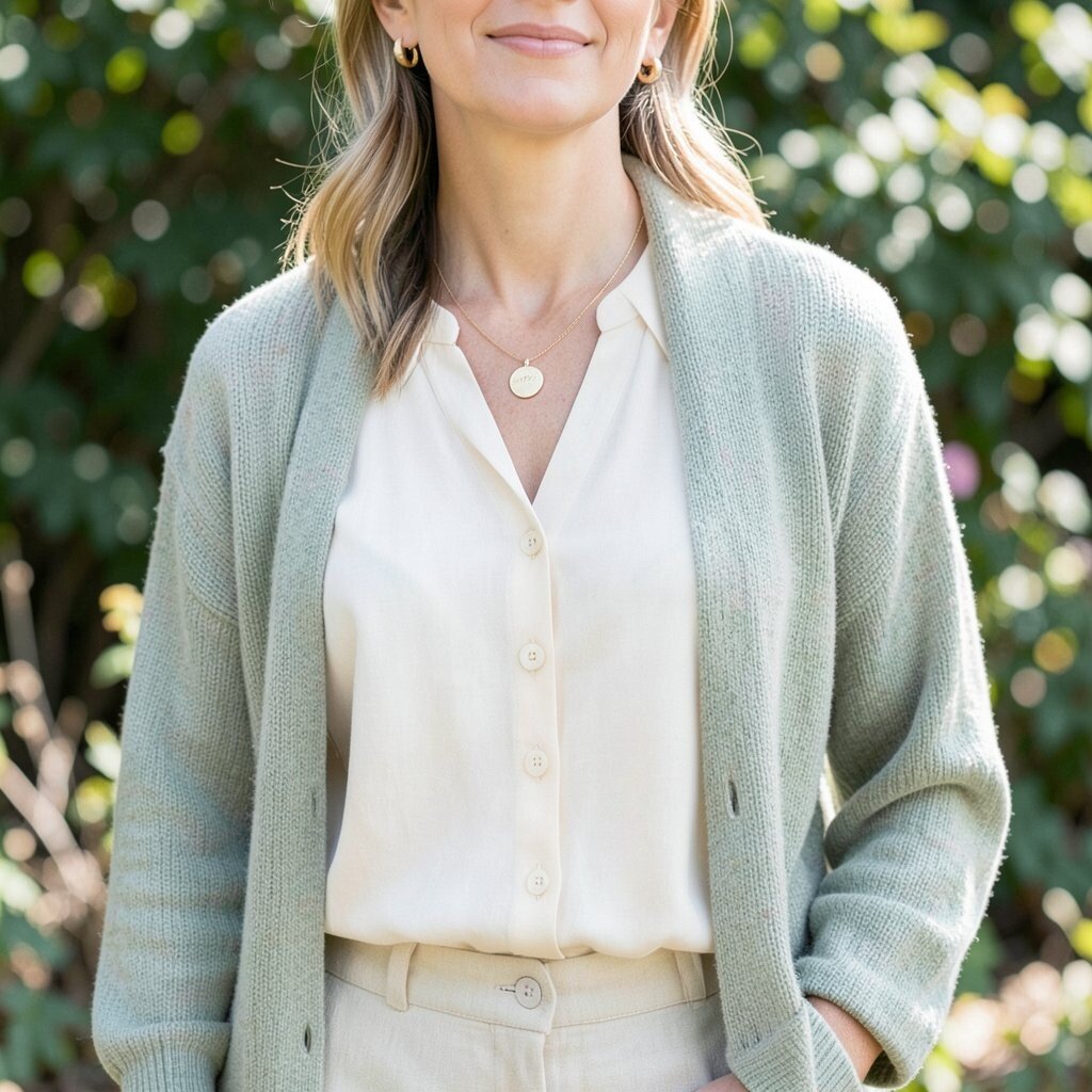
Limestone ivory feels like smooth stone, and sage whisper brings that gentle herbal calm. The two shades create a soft, elegant outfit that looks high-end even when it’s simple.
This palette’s benefit is how clean it looks on camera, especially in daylight. It also works well for people who want subtle color instead of bold contrast.
Try ivory as a blouse or dress, then layer sage with a cardigan or light jacket. For practical tips, keep the fabrics breathable and textured, like linen, cotton, or a lightly knit blend.
Personalize by adding small details, like shell buttons, natural leather, or simple gold jewelry. If you’re watching your spending, ivory basics are often versatile, so one good-quality top can carry you through many seasons.
15. Moss Fern and Olive Drab
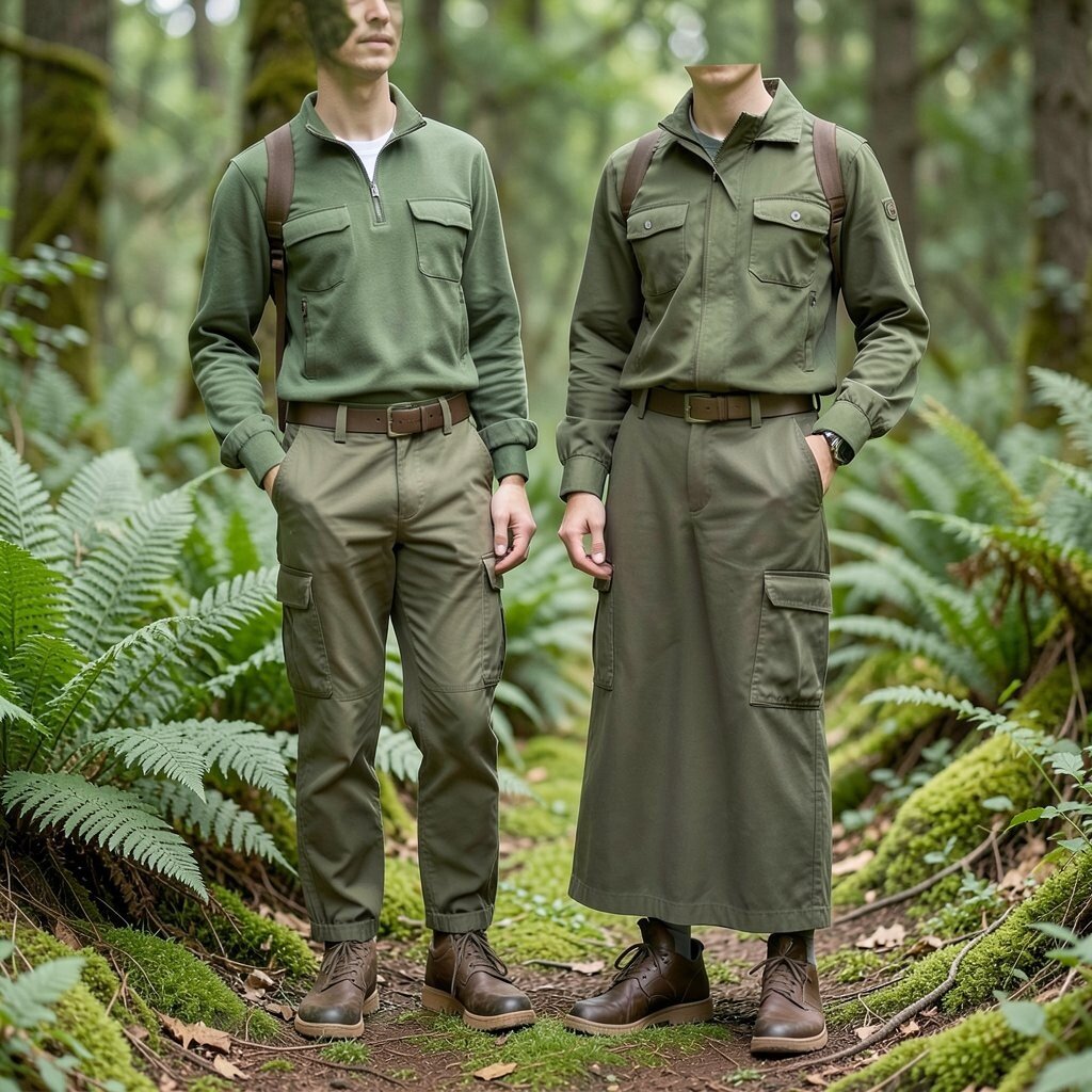
Moss fern is lively and fresh, while olive drab feels practical and tough like outdoor gear. Put them together and you get a look that feels ready for a trail but stylish for daily life.
This palette is uniquely wearable because both colors live in the same family, which makes coordination easy. You can also play with layering, since drab tones look great under structured outerwear.
For practical style, choose moss fern as your top or accessory and olive drab for bottoms, like utility pants or a long skirt. Personalize with cuffed sleeves, subtle cargo details, or a belt that matches your shoe color.
Cost considerations are friendly here because utility-style pieces often go on sale, and muted greens are common in many collections. Current trends also lean toward functional fashion, so drab and fern shades feel right now.
16. Thunderstorm Blue and Wet Asphalt
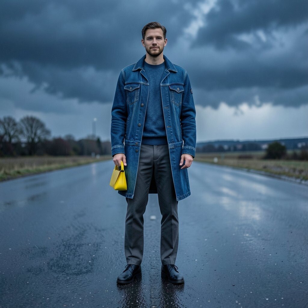
Thunderstorm blue looks like storm clouds rolling in, and wet asphalt gray feels like pavement after rain. This palette gives you a moody, modern look with strong depth.
It’s a benefit for styling because the colors feel bold but not neon, which makes it easier to wear than bright blues. If you like dramatic outfits, this combination delivers without needing heavy prints.
Try thunderstorm blue in a coat, denim jacket, or sweater, then pair with wet asphalt trousers for a sleek finish. Personalize by adding a bright accent, like a small yellow bag, to mimic a flash of sun after rain.
For cost, choose one hero piece like a jacket since outerwear sets the tone for the whole outfit. This palette also matches current interest in “stormy” colors that show up in streetwear and casual tailoring.
17. Sunset Marigold and Evergreen Pine
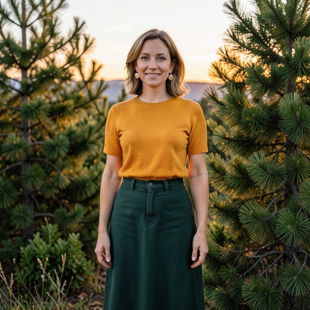
Sunset marigold feels like late-day sunlight on leaves, and evergreen pine adds a deep, refreshing contrast. The blend is energetic yet grounded, like color on a horizon line.
This palette is unique because it combines a warm flare with a cool, stable base. It helps your outfit look lively while still feeling nature-inspired and balanced.
For practical tips, pick marigold for a top, then ground it with evergreen bottoms, like dark green jeans or a long skirt. Personalize by choosing marigold in different intensities, from soft yellow-orange for daytime to deeper amber for evening.
If you’re thinking about cost, start with marigold through accessories like earrings or a scarf, since warm accents can be cheaper than full garments. Current trends also favor warm-meets-cool contrasts, which makes this pairing feel fresh and desirable.