The right wall finish can make a room feel freshly lit even when the sun is shy. Texture plaster brings depth, warmth, and a personal style you can actually live with.
From soft, creamy looks to bold sculpted patterns, there are plenty of ways to add charm without heavy renovations. Keep reading for practical ideas that fit real homes and real budgets.
1. Velvet Cloud Plaster Walls
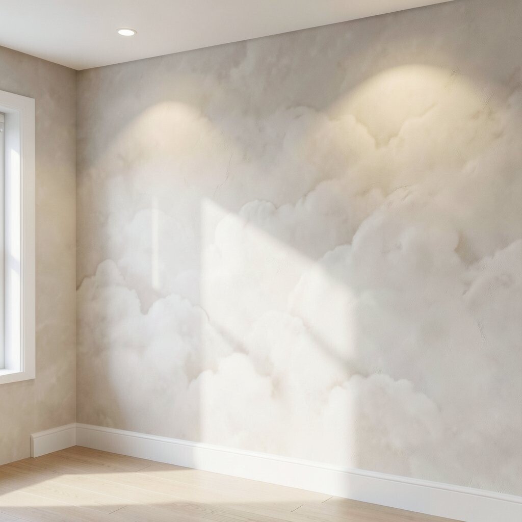
Imagine walking into a room where the walls look like soft fabric, smooth but never flat. The surface catches light gently and makes shadows feel calm instead of harsh.
Velvet cloud plaster is great for brightening because it creates a subtle glow, especially under warm bulbs. For a practical finish, ask for a trowel technique that keeps the texture fine, and choose a light neutral that still has a hint of color. If you want it to feel even brighter, add matte lighting fixtures and keep the wall trim simple so the texture stays in charge.
2. Limewash With Sunlit Variation
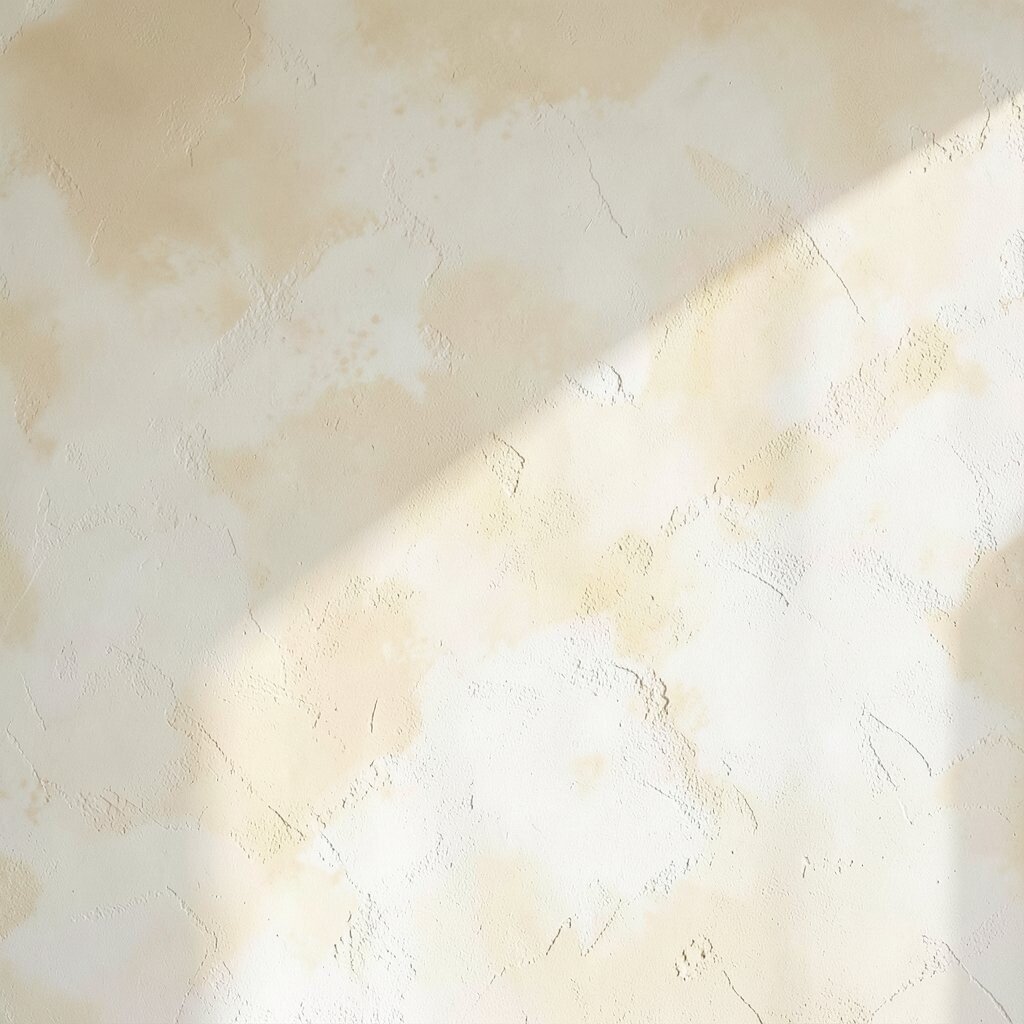
Limewash texture looks airy and natural, like mineral paint that wears in beautifully over time. You’ll notice small variations that make each wall feel hand-finished.
This is a smart choice when you want brightness with character, because the light reflects in many tiny ways. For the best look, apply in thin layers and let the plaster breathe, then seal only if your space needs extra durability. Choose warm whites or pale sand tones for a current, relaxed look that pairs well with modern furniture.
To personalize it, pick a color family and then vary the dilution so some areas stay softer. Consider cost too, since limewash often uses simpler materials, but labor depends on how much movement you want in the finish.
3. Sponged Pearl Texture in Small Rooms
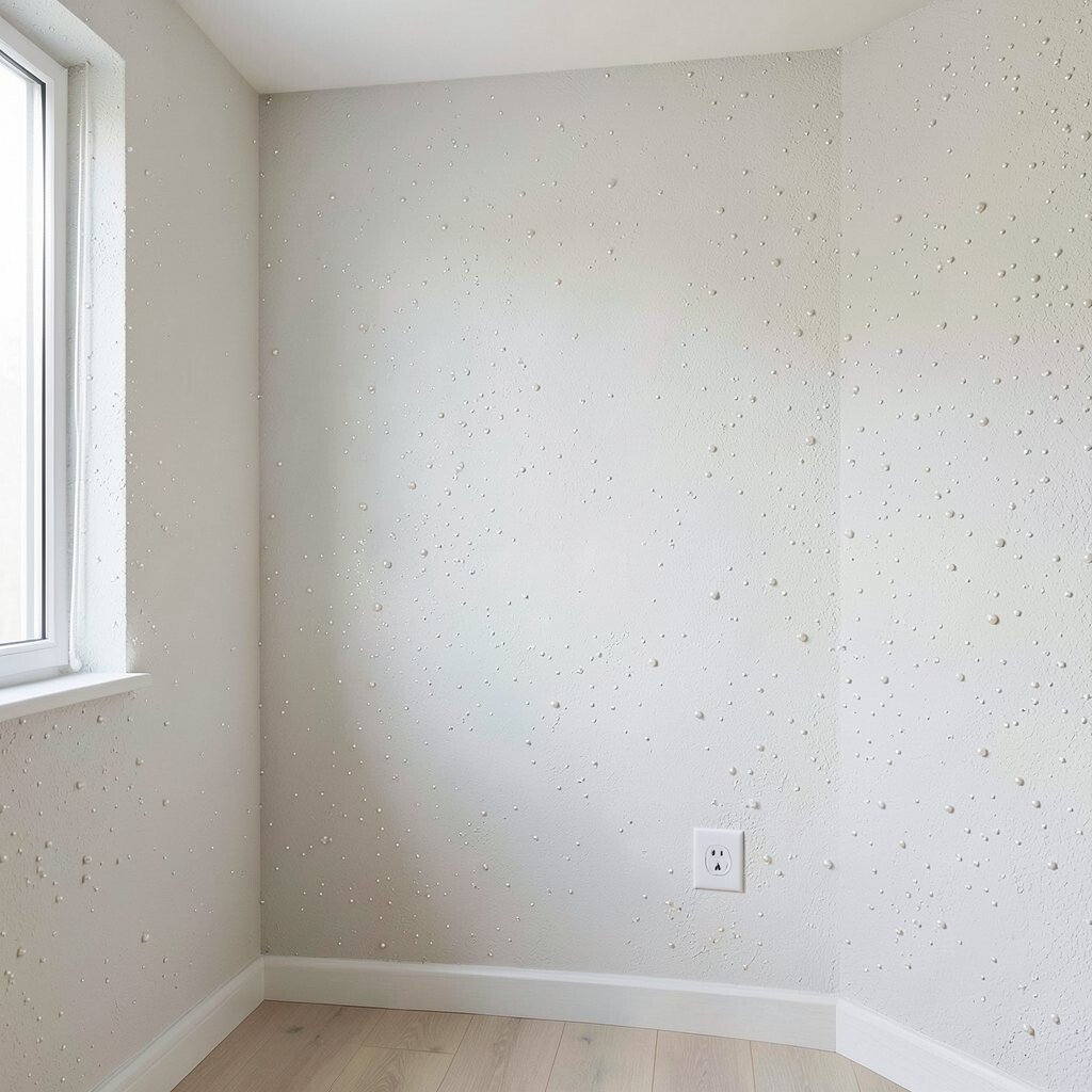
Sponged pearl plaster gives walls a playful sparkle without going shiny. The mottled pattern adds depth, and it’s easy to see why it photographs so well.
In smaller rooms, this texture helps light bounce around and makes the space feel less boxed in. Use a light base and a slightly tinted top coat so the sponging looks intentional, not patchy. If you’re working on a tight budget, cover only feature walls and keep the rest smooth to balance costs.
For personalization, match the undertone to your décor, like a cool pearl for gray accents or a warm pearl for wood tones. Keep the tools consistent across the wall so the pattern stays tidy and inviting.
4. Venetian-Style Satin Plaster
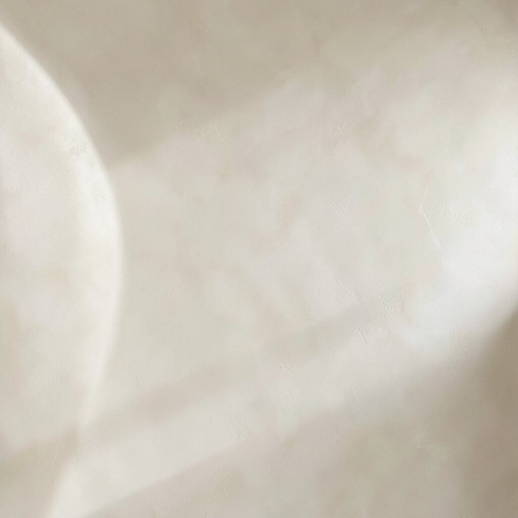
Venetian-style satin plaster creates an elegant, polished look with a silky feel and gentle shine. You’ll see curved highlights that make the wall look deeper than it really is.
This finish brightens because the surface reflects light more evenly than many matte coatings. For practicality, ensure good base leveling and choose a sealer that suits your room, especially kitchens and bathrooms. A skilled applicator can make color blend smoothly, which is where the extra money often pays off.
5. Deep Kiln Render With Soft Highlights
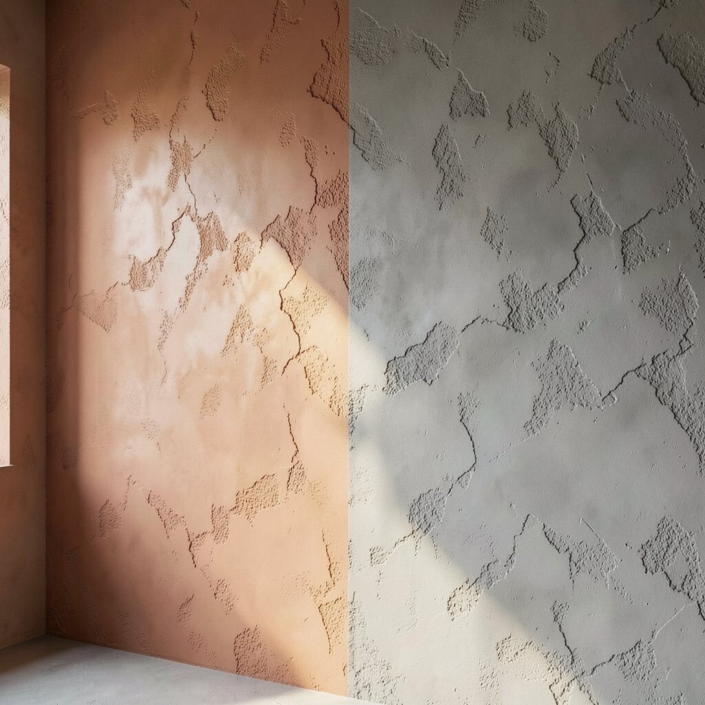
Think of kiln-like render with pockets of depth and a warm, earthy mood. The texture looks rugged but still inviting when the highlights are controlled.
This idea works well if you want a bold look that still brightens, because highlights can be placed where light naturally lands. Ask for a light-toned base with a darker wash only in the recesses. For cost control, keep the texture moderate and focus on one or two walls so you get the impact without paying for full-room coverage.
To personalize, choose terracotta-leaning neutrals for cozy spaces or cool stone grays for a sharper, modern feel. A matte top coat helps it look sophisticated instead of messy.
6. Trowel-Swirl Motion on Feature Walls
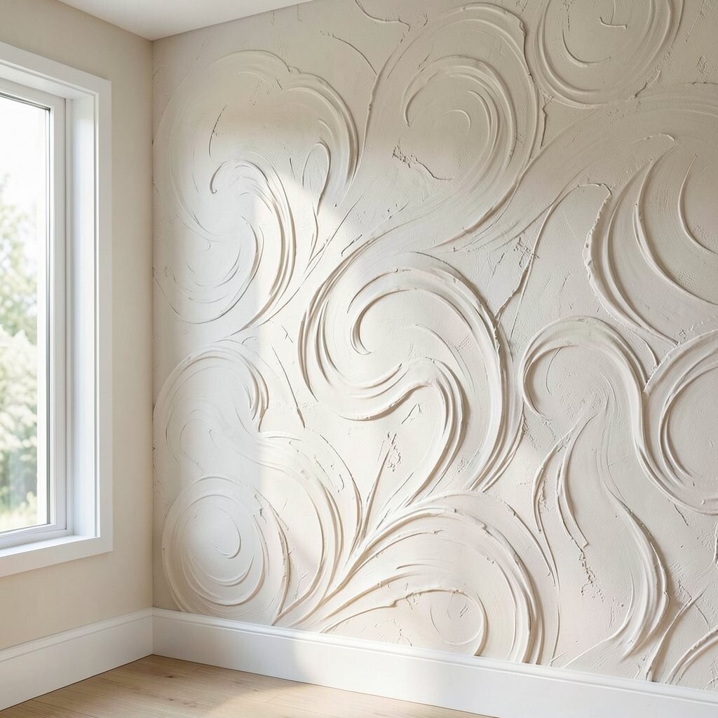
Trowel-swirl motion plaster looks like gentle waves frozen in time. The movement catches light differently as you walk past, so the wall feels alive.
It brightens by turning flat light into flowing highlights, which makes rooms feel less still. For practical results, keep the swirl size consistent and plan your direction so it works with the room’s natural flow. If you’re doing it yourself, practice on a scrap board first so you don’t overwork the material.
Personalize by matching the swirl direction to your décor, like vertical swirls to add height. If you want a current look, pair the finish with clean lines and warm white trim so the texture stays the star.
7. Micro-Terrazzo Speckled Plaster
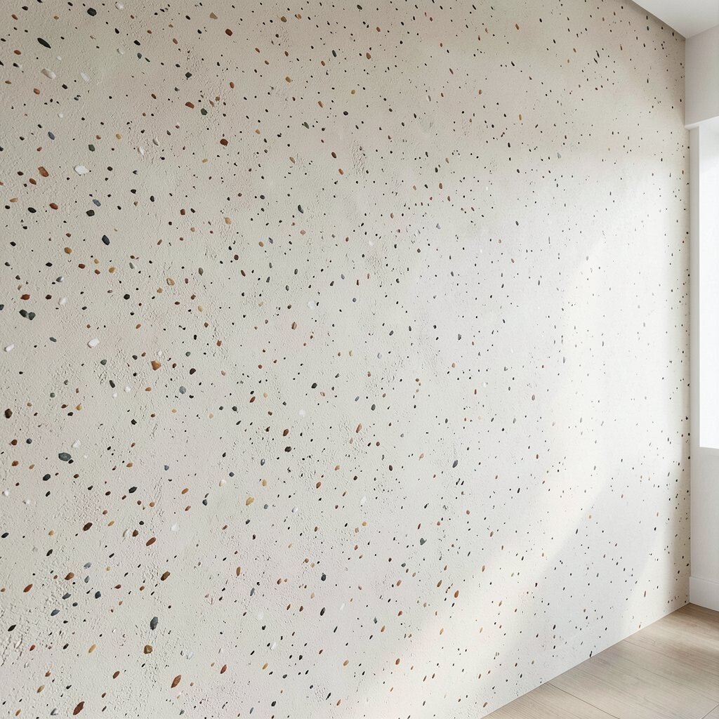
Micro-terrazzo speckled plaster brings tiny flecks that resemble polished stone. From a distance it looks refined, and up close it feels richly detailed.
This type of finish brightens because light hits the speckles and scatters across the wall. Choose smaller aggregate for a softer look, especially in bedrooms where you want calm. For a practical approach, seal it properly so it stays easy to wipe and doesn’t dull over time.
To keep cost in check, limit this finish to a hallway, entry nook, or behind a console table. You can also mix a similar color palette by using one main base tone and letting the specks do the work.
8. Ombre Stipple Texture for Staircases
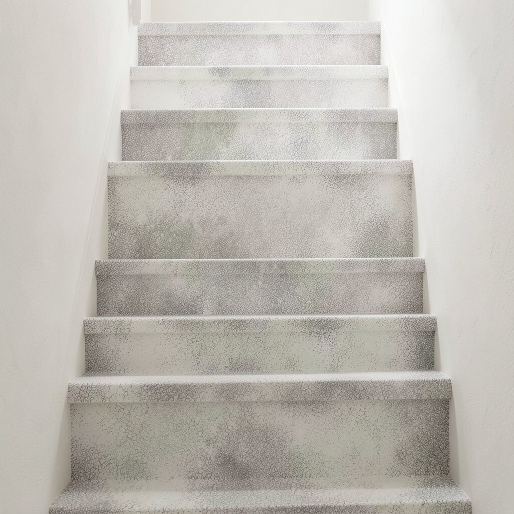
Ombre stipple plaster on a staircase makes light feel like it’s moving upward. The pattern is subtle but it adds a stylish rhythm to an area that often feels plain.
This idea brightens because the lighter shade sits where the eye meets it, and the texture softens the transition. Use a top-down plan before you start so the gradient looks smooth, then keep the stipple density consistent. If you’re budgeting, consider doing only the risers or a single wall plane rather than every surface.
9. Raked Clay Lines for Modern Warmth
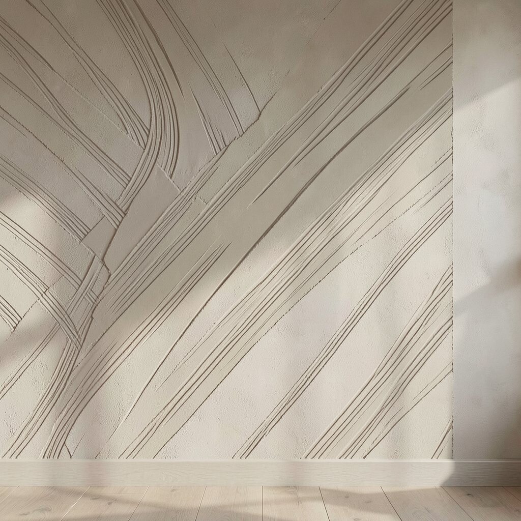
Raked clay lines create a modern texture that looks both structured and natural. You’ll notice thin ridges that pull the eye and add depth without heavy bulk.
It brightens because the ridges catch light like fine comb marks, especially in rooms with good side lighting. For practical tips, keep the lines parallel for a clean look, and use a light clay color with a tinted glaze for gentle contrast. If you’re unsure about color, choose a warm greige that complements most floors and cabinetry.
Personalize by slightly varying the glaze in the center of the wall so the look feels more custom. Consider the finish cost too, since a crisp rake usually takes careful timing from the applicator.
10. Aged Plaster With Cracked-Look Depth
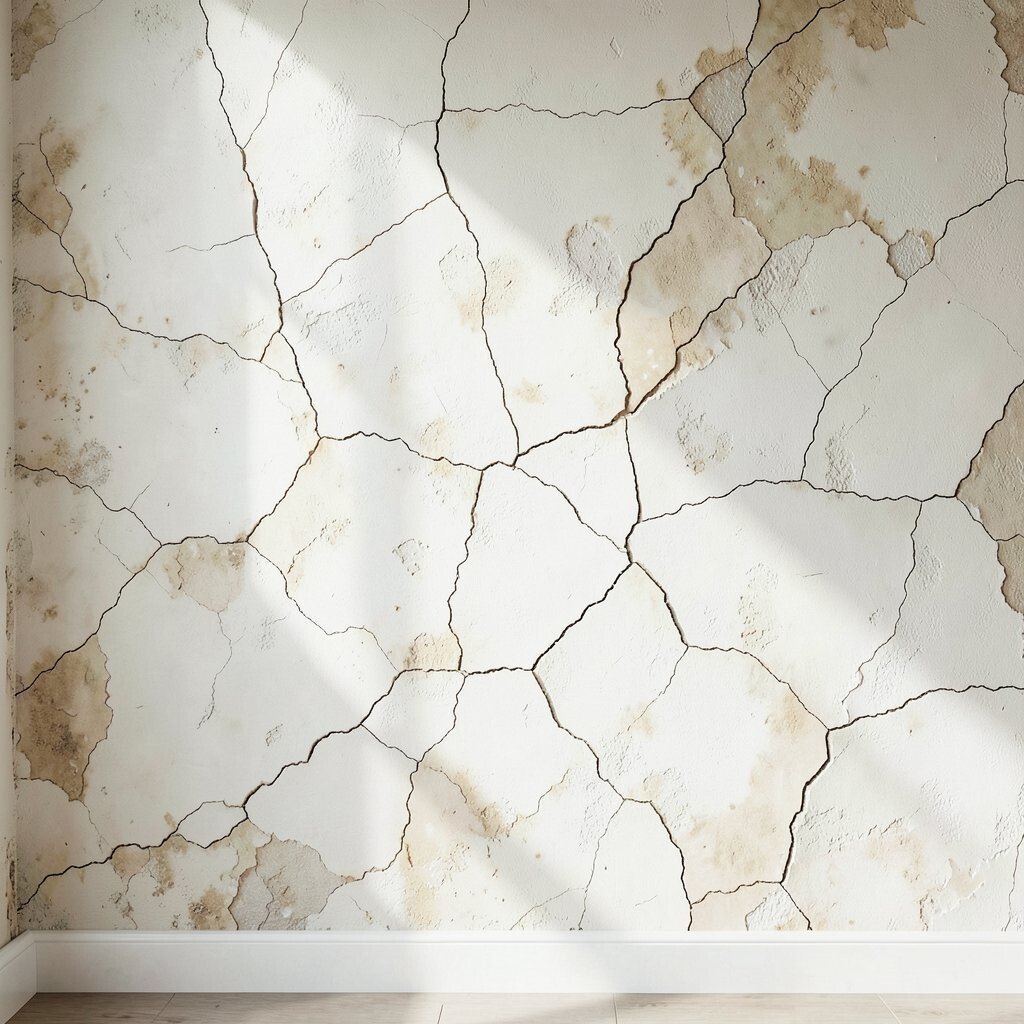
Aged plaster with a cracked-look effect brings old-world charm while still feeling stylish. The surface shows delicate lines that make the wall look storied and full of character.
It brightens when you keep the base light and let the crack effect be softer in contrast. Ask your installer to focus on a natural, patchy placement so it doesn’t look like a printed pattern. For practicality, sealing matters, so choose the right protective coat for your room’s moisture level.
11. Soft Brush Strokes for Cozy Radiance
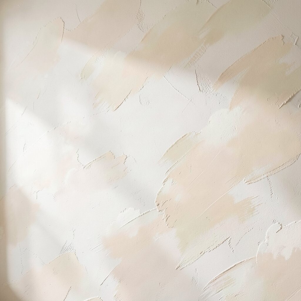
Brush-stroke texture plaster feels handmade and gentle, with airy swaths that resemble painted clouds. The finish adds warmth because it holds light in a casual way.
This option brightens living rooms and reading corners without turning the wall too shiny. To make it practical, keep the strokes broad and avoid tiny scribbles that can look fussy up close. Personalize by selecting a creamy shade that echoes your textiles, like oatmeal for linen sofas or pale peach for warm lamps.
If you’re thinking about cost, know that broader strokes can be quicker to apply, which may help with labor. A well-prepped wall is key, so budget time for smoothing before texture goes on.
12. 3D Wave Tiles Without the Tile Look
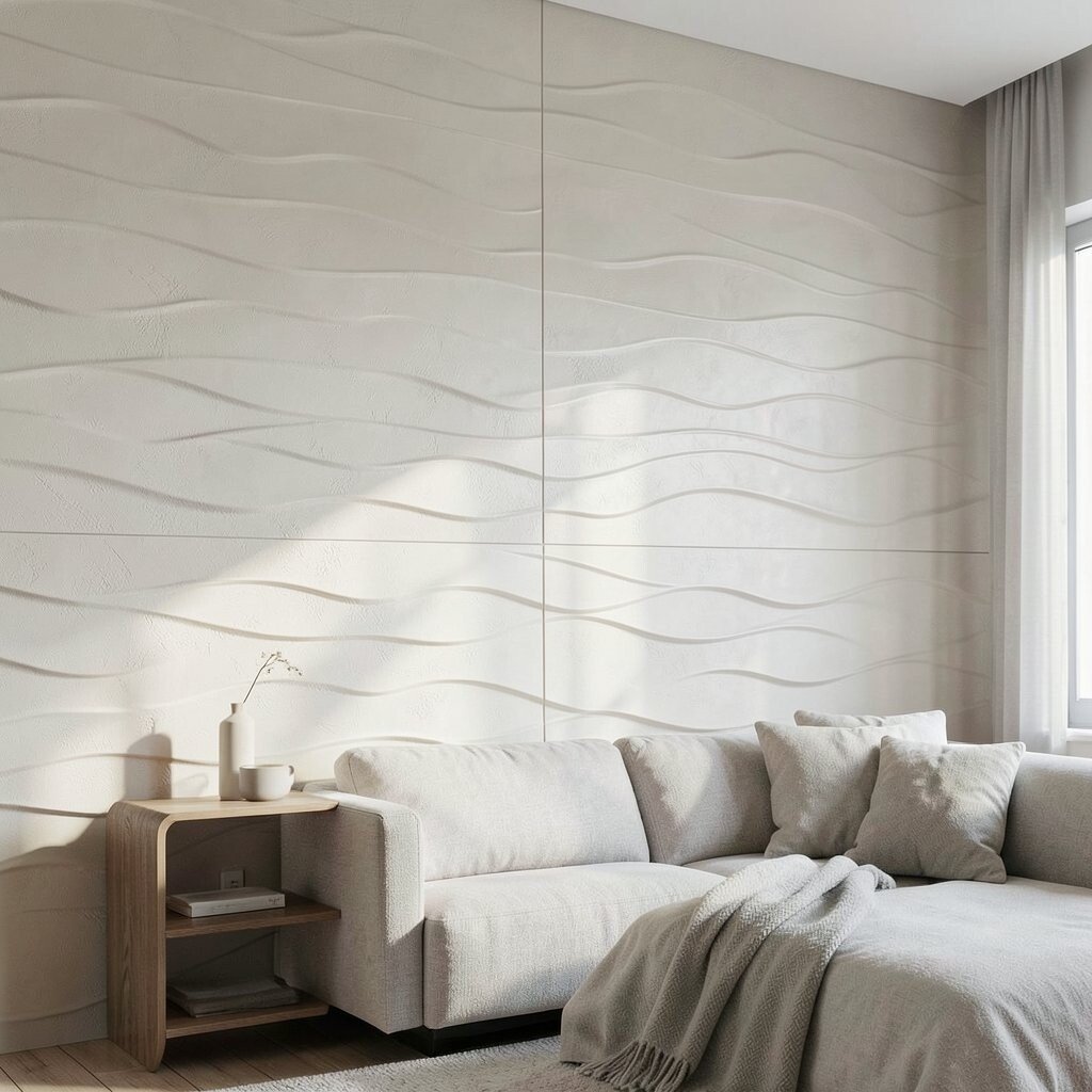
3D wave texture plaster creates the feel of sculpted tiles, but it’s seamless like plaster. The ripples cast shadows that look dynamic from every angle.
This finish brightens because the wave pattern breaks up flat lighting and adds visual depth. Use a satin sealer so it doesn’t look chalky, then choose a light color that works with your room temperature. For practical planning, measure the wall carefully and keep the wave width consistent for a calm, modern result.
To personalize, align the waves horizontally for a spa-like vibe or vertically for a taller look. If cost is a concern, do this on a single accent wall behind a sofa or bed instead of all four walls.
13. Coastal Pebble Dash in Pale Tones
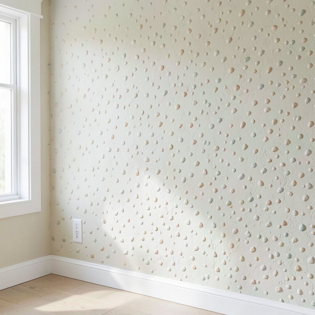
Coastal pebble dash texture plaster looks like tiny stones settled into a smooth background. The surface feels tactile and playful, like a beach walk turned into a design.
It brightens when you choose pale tones and keep the pebble size small, so it doesn’t overpower the room. For practical tips, confirm the finish is sealed properly because textured walls can collect dust if left unprotected. Pair it with crisp white trim and light wood for a fresh, airy style that still feels cozy.
Personalize by adding a tint wash that matches your accent colors, like seafoam for bathrooms or warm sand for kitchens. Cost varies with pebble size and labor, so ask about options that give the look with less material waste.
14. Board-Trowel Linear Texture for Hallways
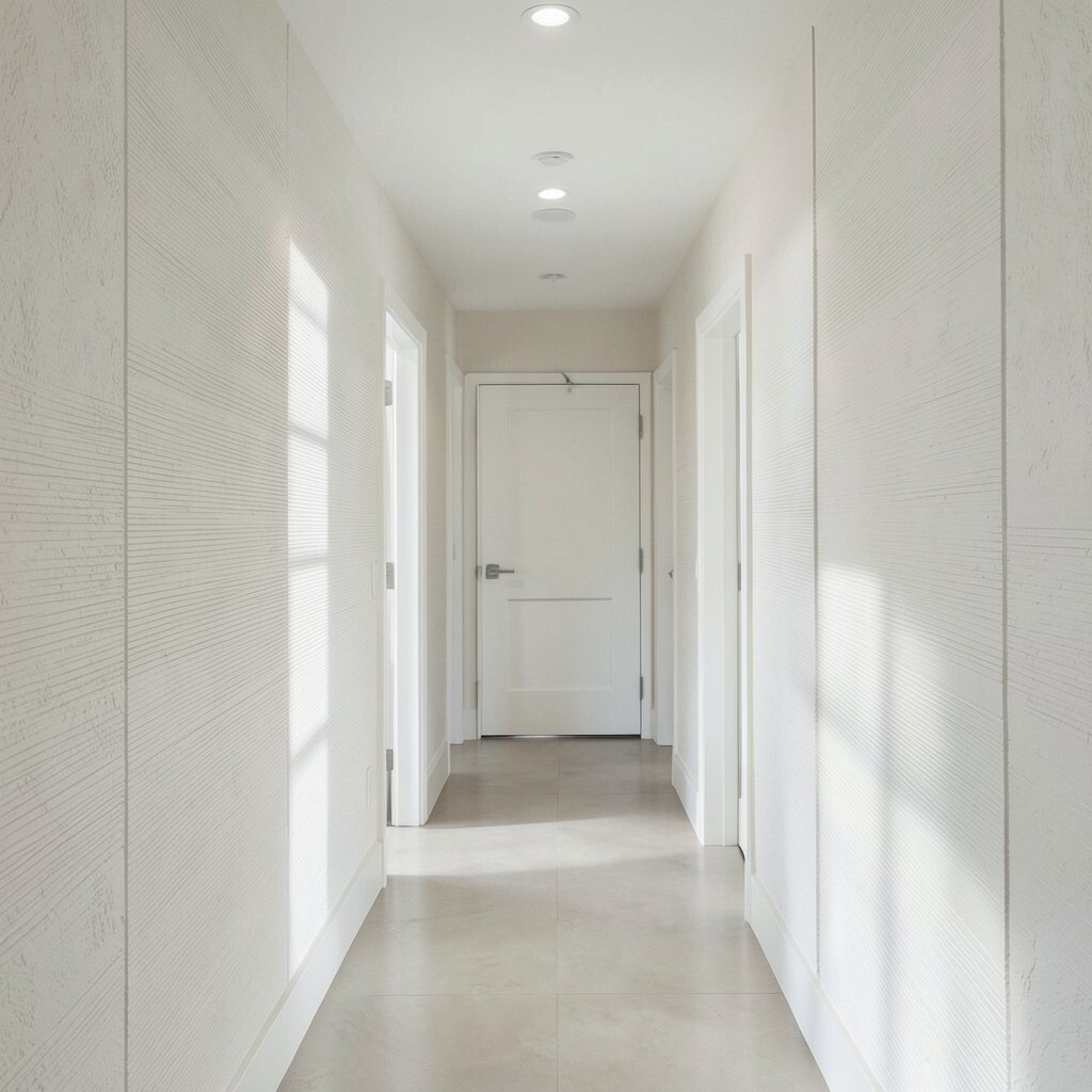
Board-trowel linear texture plaster uses straight passes that create clean, architectural lines. The walls look organized, and the light reflects in neat bands.
This brightens hallways because the lines can guide the eye toward a doorway and make the space feel longer. Keep the linear direction consistent, and use a light base with a very subtle glaze for dimension. If you’re working with limited funds, apply this finish to the main hallway wall and keep side walls smoother to balance the overall cost.
15. Stamped Basketweave for Warm Charm
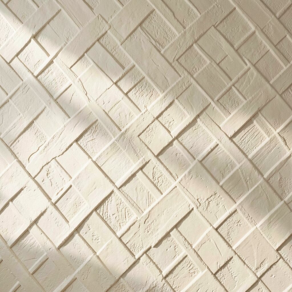
Stamped basketweave texture plaster brings a cozy pattern that feels rustic but refined. It creates a gentle crisscross shadow that looks inviting, not busy.
This finish brightens by adding texture contrast while staying soft in tone, especially when you avoid dark base colors. For practical results, use a stamp size that matches your wall scale and practice on a sample so the pattern doesn’t look misaligned. Personalize by choosing warmer creams for farmhouse vibes or cooler whites for a modern twist.
When planning cost, remember that stamping can add labor time, so limit it to a dining room wall or a powder room for best value. Sealing helps it stay clean without flattening the look.
16. Color-Blocked Sgraffito Cutouts
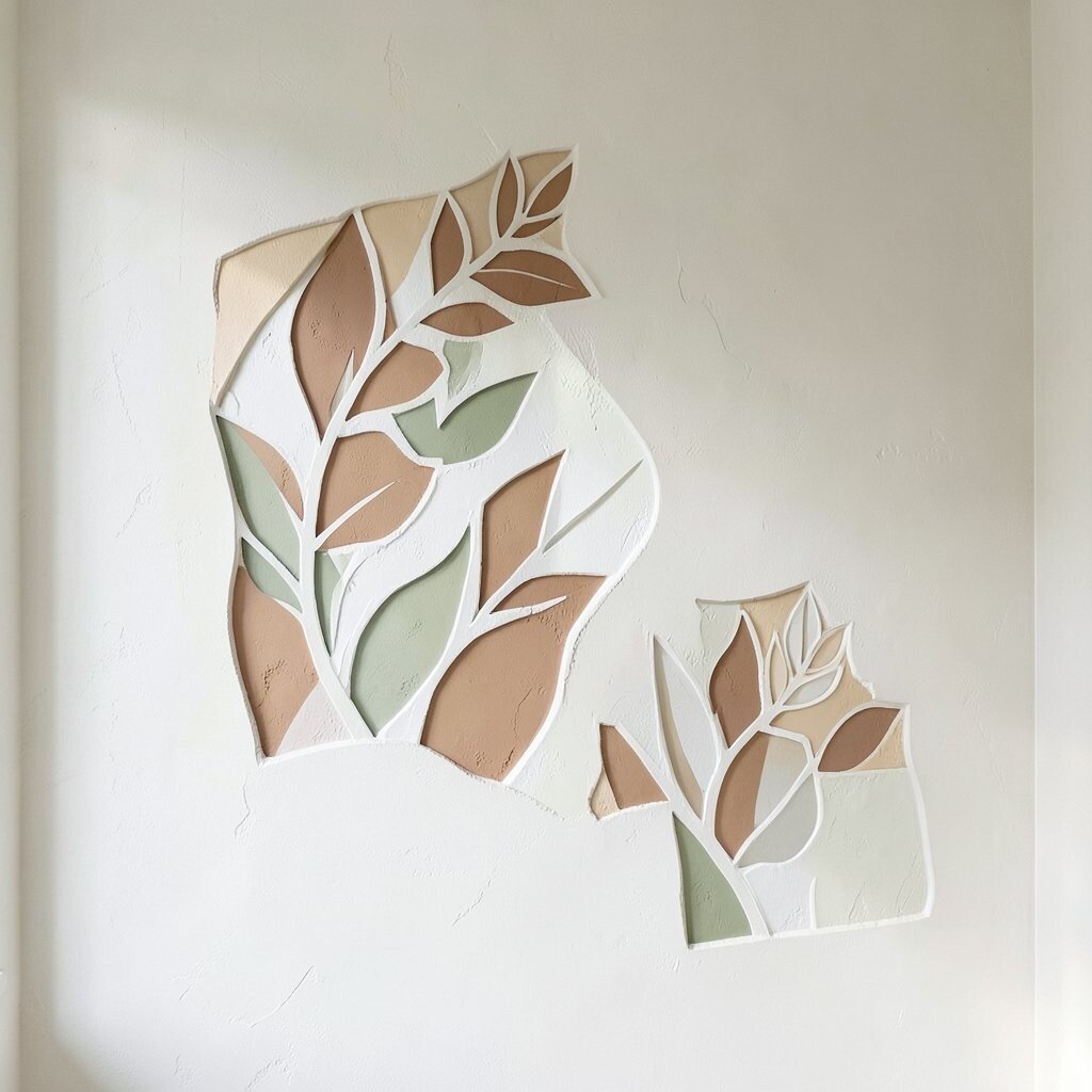
Sgraffito cutouts let you scratch through a top layer to reveal a contrasting color underneath. The result feels artsy and layered, like a mural made from plaster.
It brightens because you control where the lighter color shows, guiding attention across the wall. For practicality, keep the design simple at first, and use stencils if you want cleaner edges. Choose two harmonizing tones, such as warm white over soft clay, so the contrast feels stylish instead of harsh.
Personalize with a motif that fits your life, like botanical shapes or gentle geometric lines. If cost matters, consider doing a smaller panel section and letting surrounding walls stay smooth so your budget goes further.
17. Metallic Wash Over Textured Base
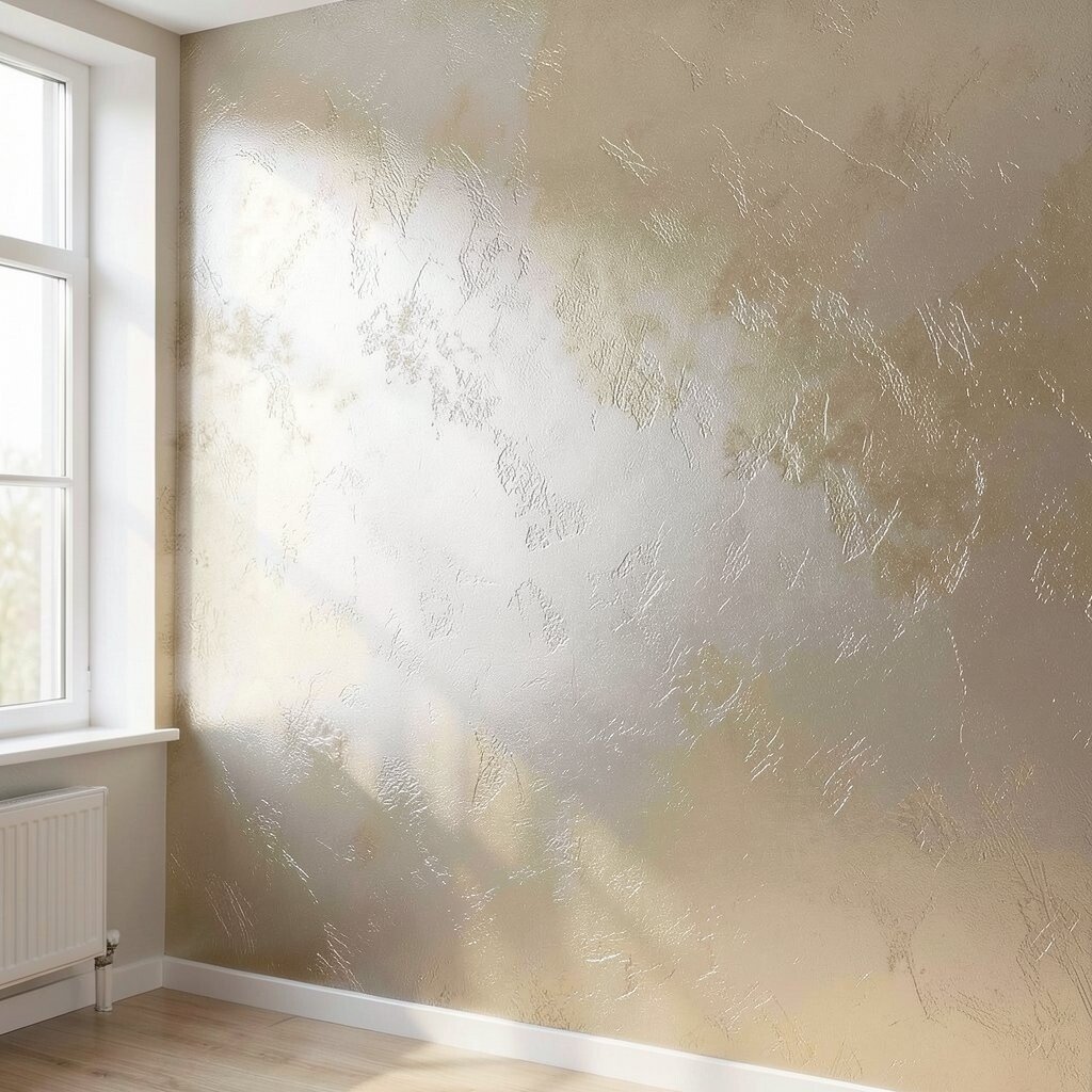
A metallic wash over textured plaster gives a luminous finish without turning your room into a disco ball. The shimmer shows up only in certain light, which makes it feel classy.
This brightens by reflecting light points, especially near windows and lamps. To keep it practical, choose a fine metallic and a clear protective coat so it’s easier to maintain. Personalize by selecting gold-leaning warmth for cozy rooms or silver-leaning coolness for crisp, modern spaces.
For cost considerations, start with a small accent wall since metallic work can add expense. If you want the look for less, use a lighter metallic wash and rely on the plaster texture itself for depth.
18. Soft Brick-Shadow Faux Plaster
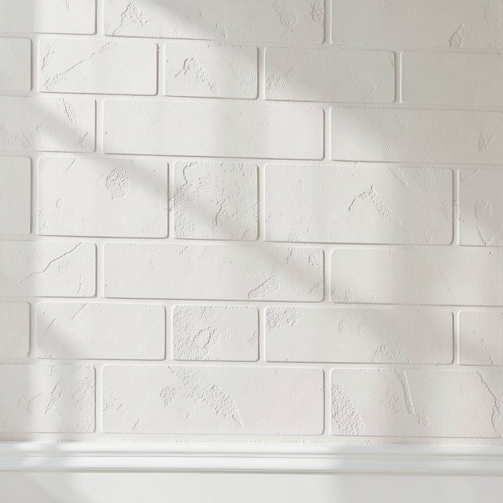
Soft brick-shadow faux plaster mimics brick outlines without making the wall feel heavy. The design looks like delicate shadows rather than full, raised bricks.
It brightens because the “bricks” are implied, so you get structure while keeping the surface light. For practical tips, use thin relief so the wall doesn’t feel cramped in smaller rooms. Pick a light grout-like tone for the lines and match the base to your trim so everything blends smoothly.
19. Prism Facet Plaster With Light-Catching Peaks
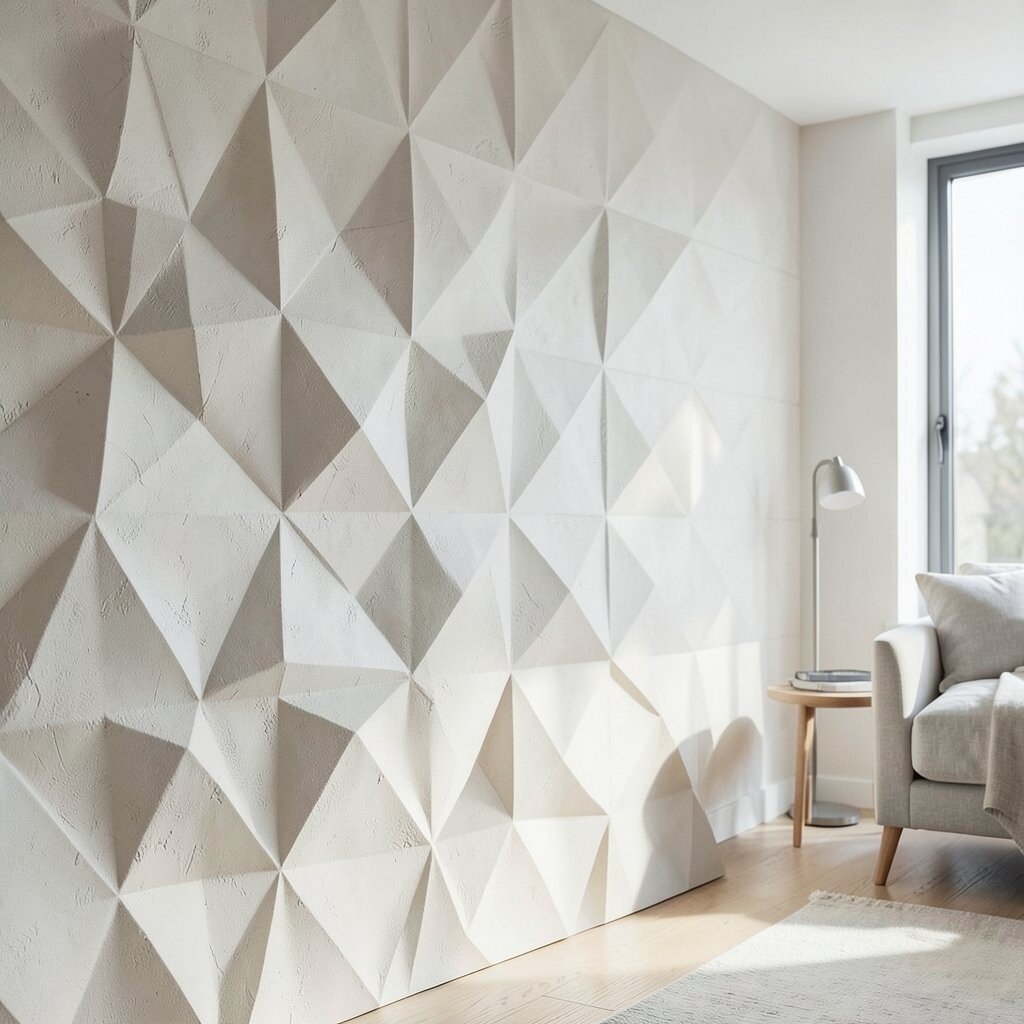
Prism facet texture creates sharp, tasteful angles that catch the light like tiny facets. From across the room, it looks sculptural; up close, it looks crafted and modern.
This brightens because the peaks create highlights that change as you move. Keep the facet pattern balanced so it doesn’t feel chaotic, and use a light base with a gentle contrasting tint in the creases. If you want a trend-forward look, pair it with simple decor, sleek hardware, and calm color palettes.
Personalize by adjusting the facet depth, which also affects cost and complexity. Choose shallow facets for easier maintenance and a softer look in bedrooms and living rooms.
20. Frosted Marble Vein Texture
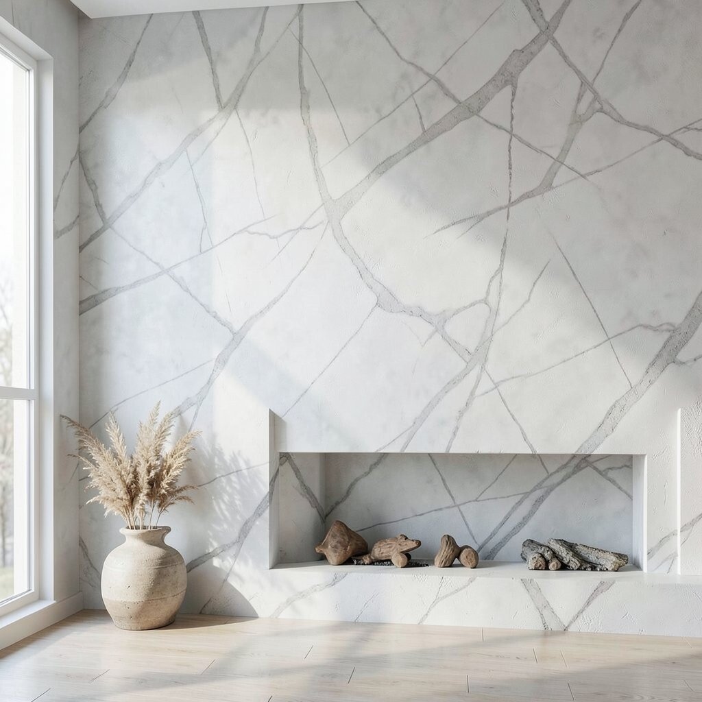
Frosted marble vein texture plaster gives the dreamy look of marble with a softer, modern finish. The veining feels gentle and elegant, like chilled stone under diffused light.
This brightens because the frosted effect reflects light softly rather than glarey shine. For practical tips, choose a color family that matches your floors or countertops and decide whether you want bold veining or airy, subtle lines. Personalize the pattern by working with your installer to map the veining direction so it flows with the room.
Cost can vary based on how intricate the veining is, so consider doing it on an accent wall behind a vanity or fireplace for the best value. Sealing helps maintain the finish and keeps the surface looking fresh for years.