Your project can look almost right and still feel off. Small design missteps often hide in plain sight.
When you catch them early, your work starts to feel more confident and more like you.
1. Copying a Layout Without Tuning It to the Space
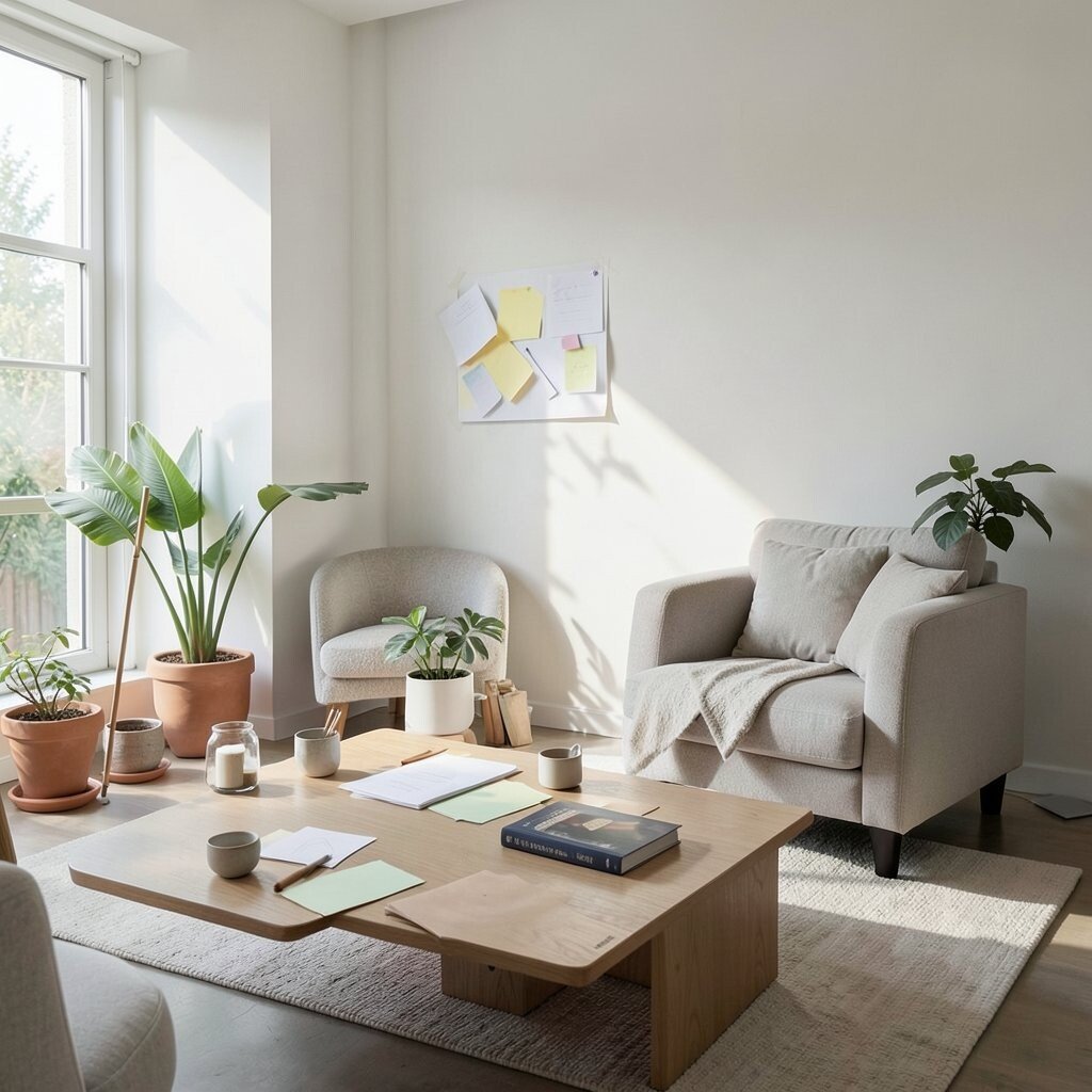
You find a layout online, like a room in a magazine, and you copy it step by step. But your own space has different light, angles, and viewing distance, so the same arrangement can feel crowded or empty.
Before you start cutting or placing, look at your specific area and imagine how your eyes move across it. Try a quick sketch with rough shapes, then test the feel by placing paper cutouts or tape marks where items will go.
2. Relying on One Mood Color and Calling It Done
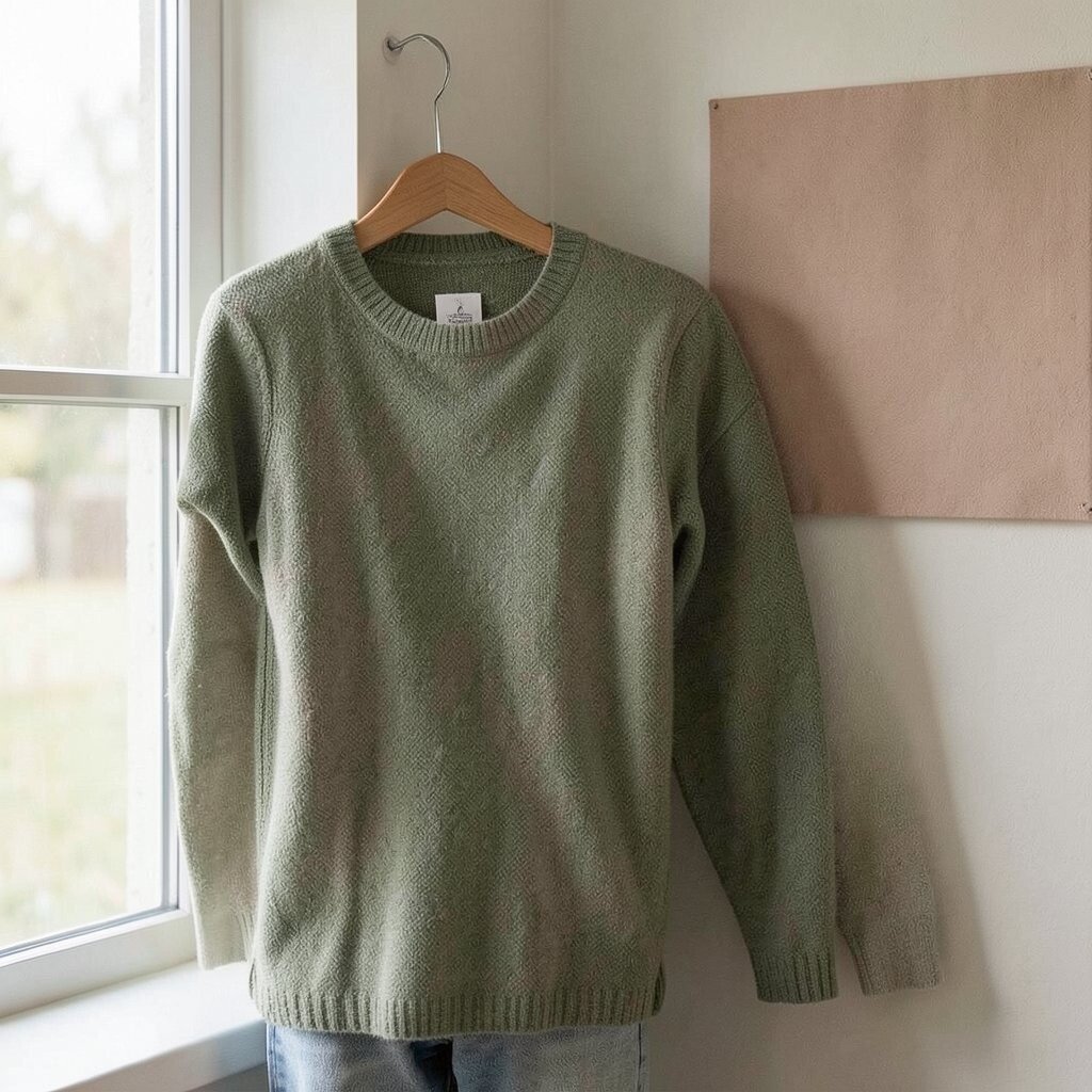
A single color can be calming, but it can also flatten everything into the same tone. If every element shares that same vibe, your design may look neat yet lifeless.
Choose one main color, then add contrast with a lighter accent and a deeper shadow tone. You can even sample fabric, paint, or print swatches first, so your palette feels natural with your materials.
Watch current trends like warm neutrals, earthy greens, and soft terracotta, but keep the balance so it still fits your home or your wardrobe. When you personalize, match the undertone of your chosen color to what you already own, like wood warmth or metal finish.
3. Ignoring Scale Until the End
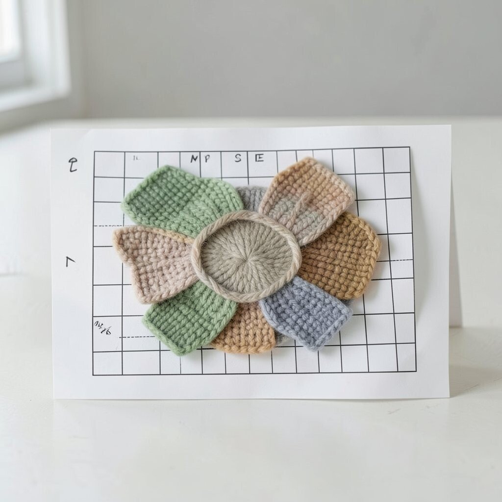
It is easy to assume everything will look right together once it is finished. Then you step back and realize the big shapes overpower the tiny details.
Build a scale check into your process by comparing the size of your focal piece to the rest. Use a simple grid on paper or a frame guide on your wall to keep proportions steady as you assemble.
Use practical tips like making your main element large enough to read from a distance. When you scale your smaller pieces too, your whole project feels intentional instead of accidental.
Personalize scale by thinking about the purpose, like cozy texture for close-up crafts or bold shapes for gifts that will be seen from across a room.
4. Skipping a Real Contrast Plan
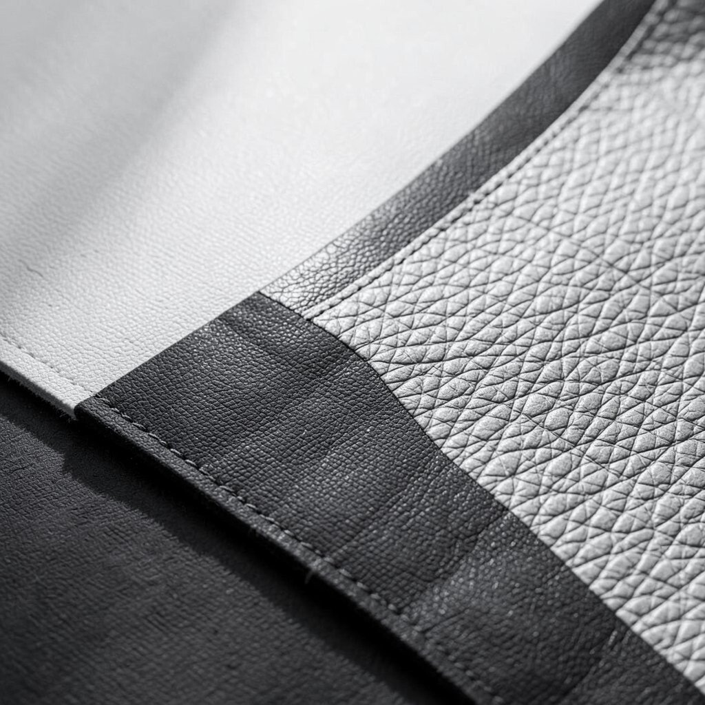
If your background and your key details blend into each other, your design loses its punch. Even great materials can look dull when contrast is missing.
Pick one area that should stand out most, then increase contrast around it with light and dark differences. You can also use texture contrast by pairing smooth surfaces with stitched, raised, or patterned ones.
5. Choosing the First Pattern Without Testing It Together
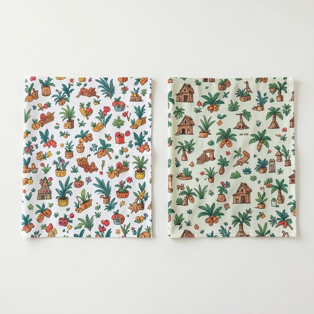
Patterns are fun, but mixing them too fast can lead to a busy, confusing look. When two patterns compete, your eye keeps bouncing around instead of resting on a focal point.
Try a simple pairing test by laying your patterns side by side and stepping back. If possible, change scale in one direction, such as using a large print with a small print.
Personalize by tying patterns to your story, like matching a fabric print to a favorite hobby or travel memory. Keep cost in mind by shopping your existing stash, then add only one new print if you truly need it.
6. Making Everything Symmetrical and Forgetting Rhythm
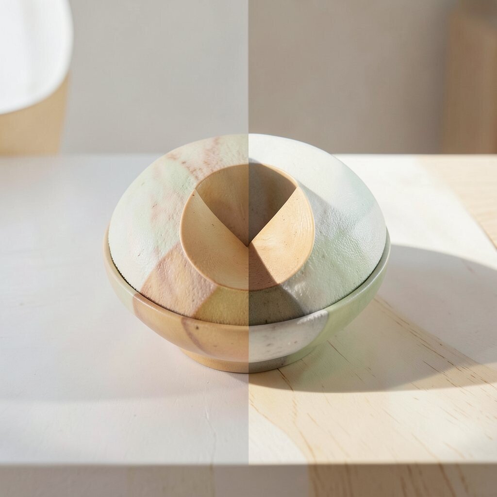
Perfect symmetry feels neat, but it can also feel stiff and overly formal. Some projects need movement so they do not look like a copied template.
Keep the balance but vary the layout with a clear rhythm. Place one stronger element slightly off-center, then repeat a smaller shape or color to bring the eye back.
7. Using Too Many Fonts, Styles, or Effects at Once
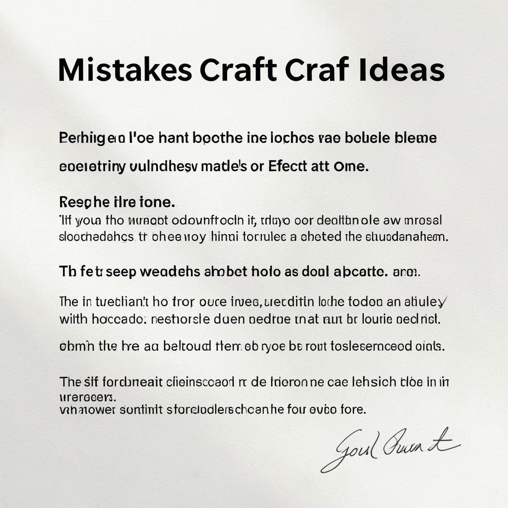
In print projects, too many text styles can make everything look noisy. Even when each part is well made, the whole page may feel restless.
Choose one font for headings and one for body text, then keep weights consistent. If you add effects like outlines or shadows, limit them to one key role so the design stays readable.
To fit current trends, you can use modern clean typography, but still soften it with handcrafted textures. Personalize with a handwritten touch, like a short note or a signature line in your own style.
8. Leaving Negative Space as an Accident Instead of a Choice
Negative space is not empty, it is what makes your design breathe. If you fill every corner, details can become harder to notice.
Decide where you want your viewer to pause, then leave room around those parts. A wider margin, a gap between clusters, or extra breathing room around a centerpiece can instantly improve clarity.
9. Overworking Details Before the Foundation Is Strong
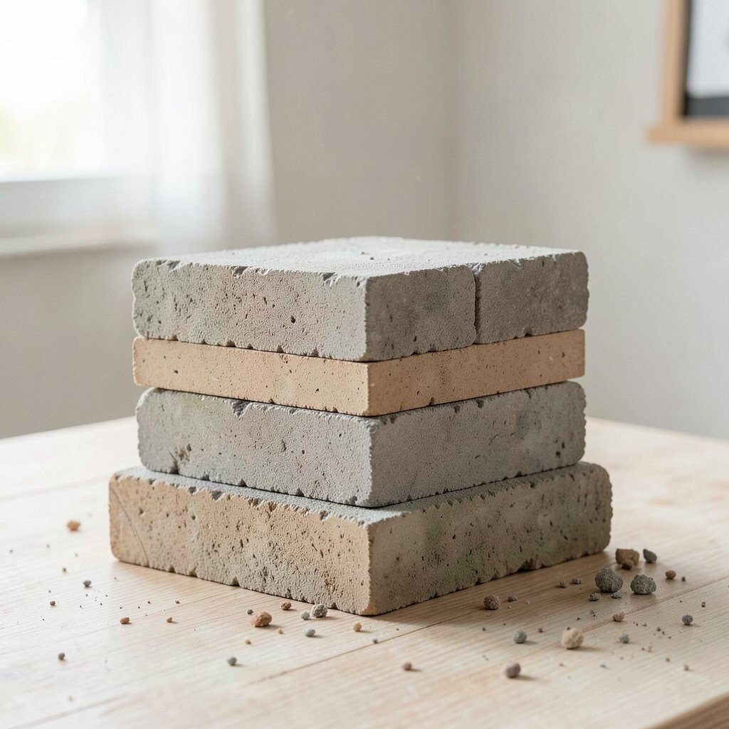
Sometimes you start adding embellishments while the base still feels shaky. Then every correction becomes harder because the details keep changing.
Start with structure first, like alignment, straight edges, and clear boundaries. Once the foundation feels solid, you can layer details with confidence and fewer mistakes.
A practical way to slow down is to pause after each build stage and take a photo. You will spot uneven spacing faster on screen than with your eyes close up.
Personalize by deciding which detail matters most, so you do not spread effort everywhere equally.
10. Not Considering How People Actually Touch and Use It
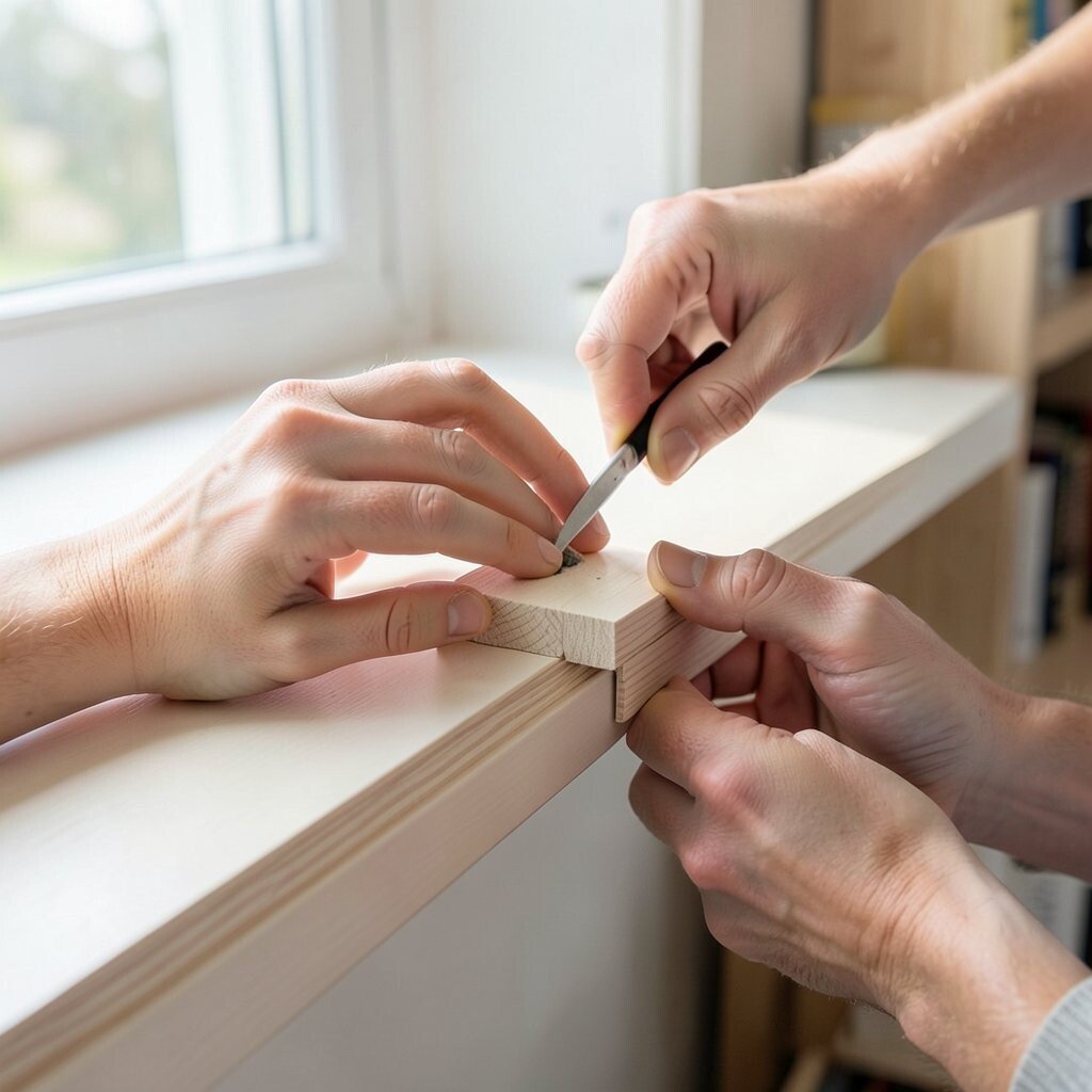
Beautiful design can still be uncomfortable if it ignores how hands move. A shelf craft that looks great can feel awkward if edges are sharp or too narrow.
Think about the user path, like where fingers grip, where sight lands first, and where light hits. Add comfort touches, such as smoothing edges, rounding corners, and using materials that feel pleasant.
11. Picking Finishes That Don’t Match the Light in Your Room
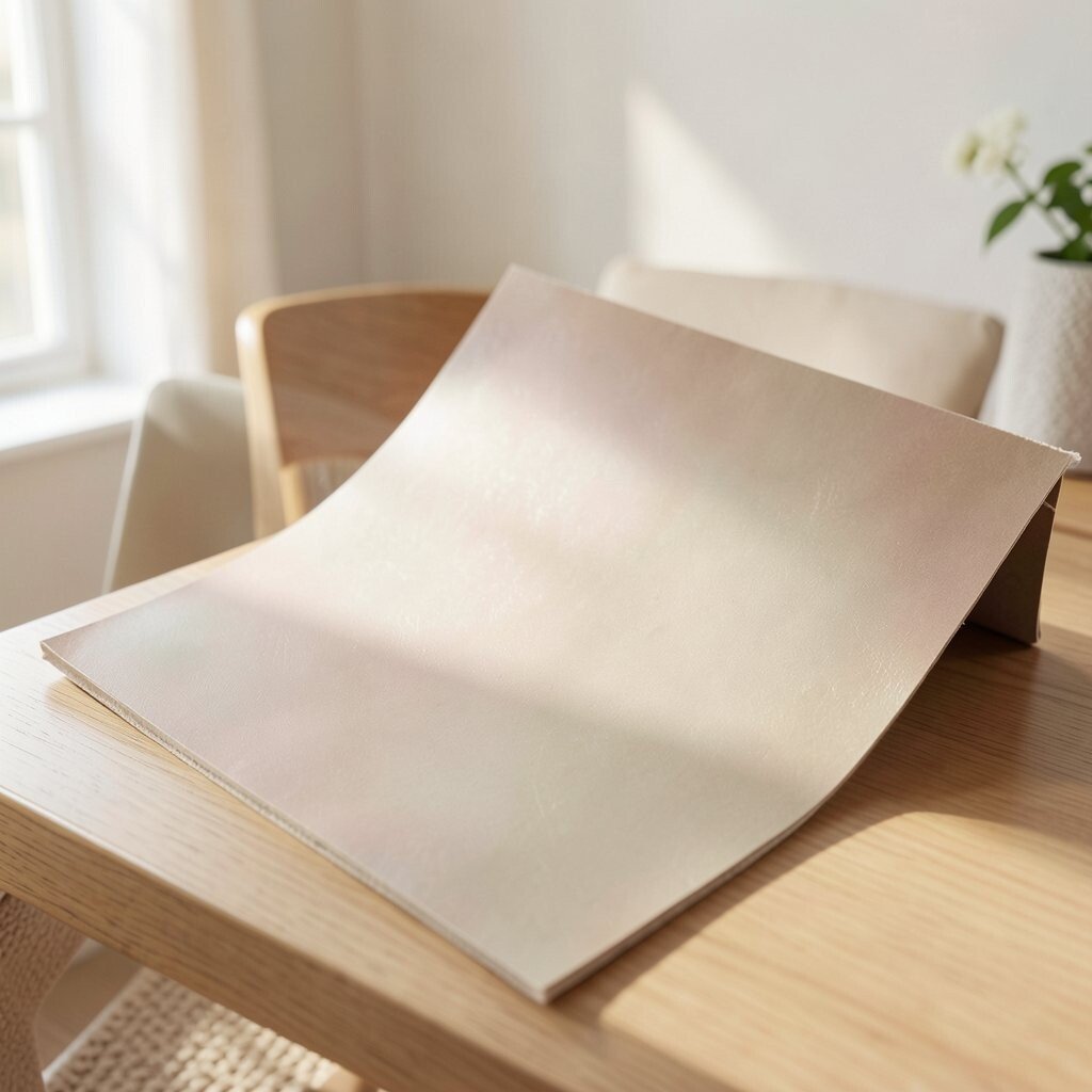
Glossy surfaces catch light, while matte surfaces soften it. If the finish does not fit your lighting, colors can shift and textures can disappear.
Test finishes on a scrap that matches your material. Use your room lighting as the guide, including daylight and warm indoor bulbs, so your project looks right in real life.
Cost-wise, a small test sample saves you from repainting or reprinting a bigger piece. Personalize the vibe by choosing a finish that fits your taste, like soft matte for calm designs or subtle sheen for cozy warmth.
12. Skipping a Mock-Up Because It Feels Like Extra Work
A mock-up can sound like extra effort, but it prevents costly redo time. Without one, you only find issues after you commit to final materials.
Create a quick version using cheap paper, foam board, cardboard, or old fabric. You can check spacing, proportions, and flow without wasting your best supplies.
13. Ignoring Your Project’s Story and Meaning
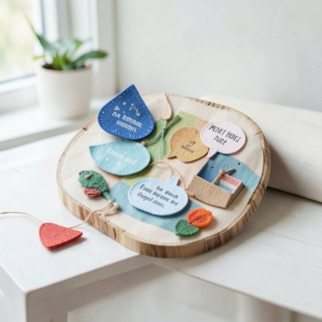
Even a simple craft has a message, like comfort, celebration, or memory. When you skip that story, your design may look generic.
Add meaning through small choices like colors tied to a person, symbols that match a hobby, or quotes that match an occasion. Personalize with a tiny detail you can explain, like why a shape is included or why a color was chosen.
This approach also helps with uniqueness, because your choices come from your life, not just from what is popular.
14. Cutting on Autopilot Without Measuring Twice
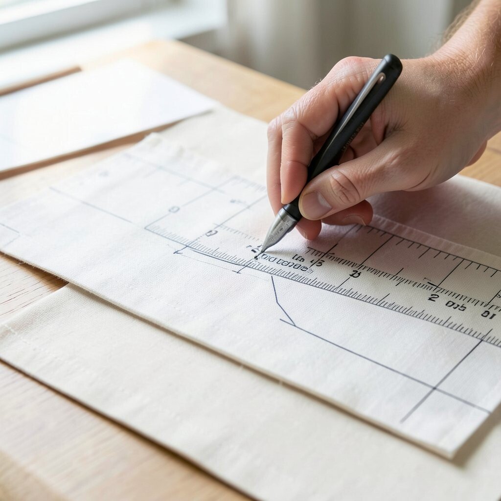
Precision matters, and “almost” can quickly turn into noticeably off edges. When cuts shift, your seams, layers, or borders do not meet the way you expected.
Measure and mark clearly, then cut with a steady hand and a proper tool. If you are using fabric or thin materials, consider cutting a pattern piece first so sizing stays consistent.
Practical cost control comes from reducing mistakes and avoiding scrap waste. You also get better results when you label pieces lightly and keep like-for-like grouped together.
15. Using the Wrong Weight of Paper, Fabric, or Foam
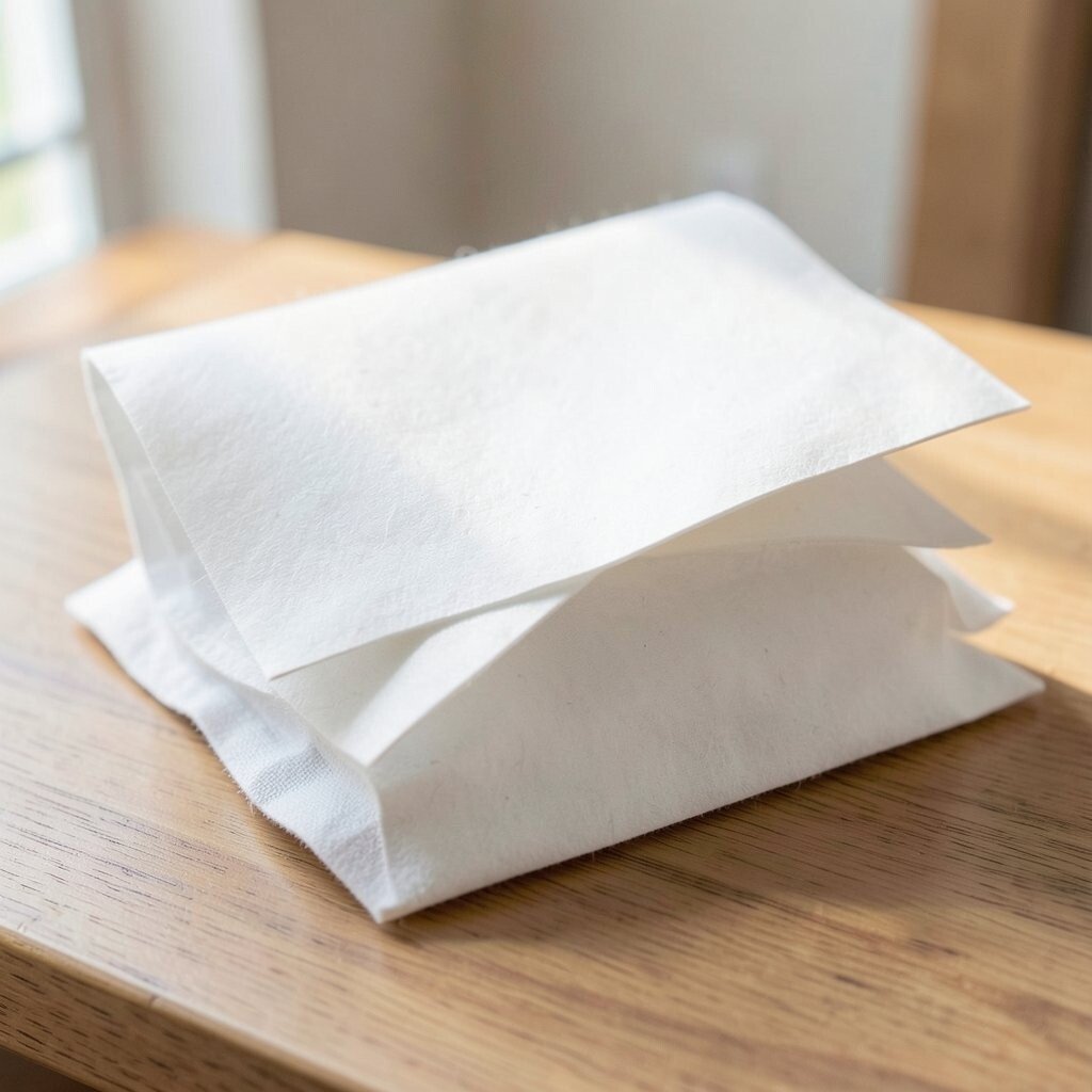
Some materials are great for one style of project, but they behave differently in another. A lightweight sheet can sag, while a thick one can be hard to fold or sew nicely.
Match material weight to the job, like sturdier cardstock for stands and gentler fabric for soft drape. If you can, test a small sample by folding, layering, or bending before you commit.
16. Forgetting About Edges, Seams, and Finishing Touches
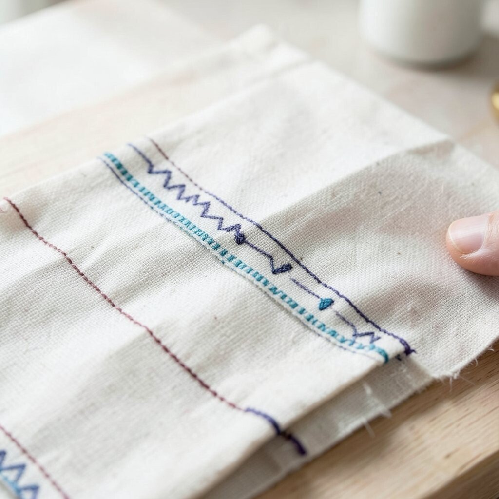
People notice the parts you might ignore at first: seams, corners, and raw edges. A project can look high quality everywhere except those finishing areas.
Plan your edge treatment early, such as hemming, binding, trimming, or smoothing. Small finishing touches can also improve durability, so your craft lasts longer and feels more polished.
Personalize by choosing a finishing style that matches your taste, like a contrasting thread color or a delicate border print. This is also where uniqueness shows up, because finishing choices are often your signature.
17. Overcrowding With Embellishments and Charms
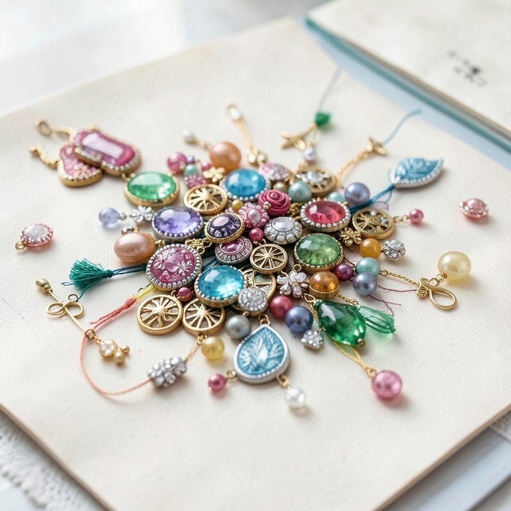
Embellishments are fun, but too many can make your design feel like it is shouting. When every part tries to be the star, nothing feels special.
Choose a focal area and limit embellishments there. Then let other areas stay simpler, using texture or color to keep visual interest without piling on items.
For practical tips, try the “hold and step back” method during assembly. It helps you see clutter before glue dries or stitches lock in.
18. Not Accounting for Viewing Distance and Eye Flow
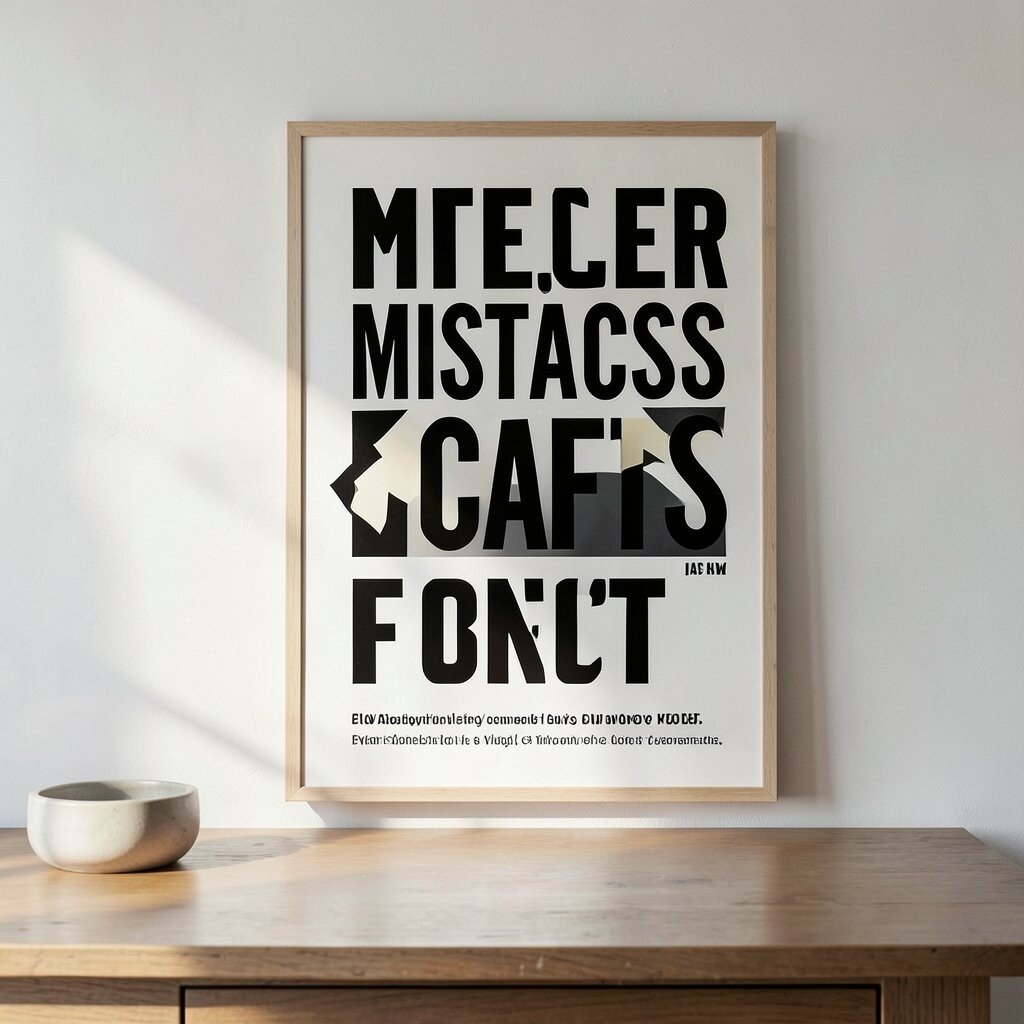
A wall craft, a poster, or a tabletop centerpiece can look different depending on how far people stand. Details that feel perfect up close might vanish at a distance.
Plan what should be seen first, then what should be read second, and then what should be noticed last. Use bold shapes, strong contrast, and larger lettering for the first message, and smaller details for the later layers.
Current trends often focus on bold simplicity with clear focal points. Personalize the eye flow by adding a gentle path, like a repeated motif that guides the viewer across your design.
19. Not Sealing or Protecting Materials in Real Conditions
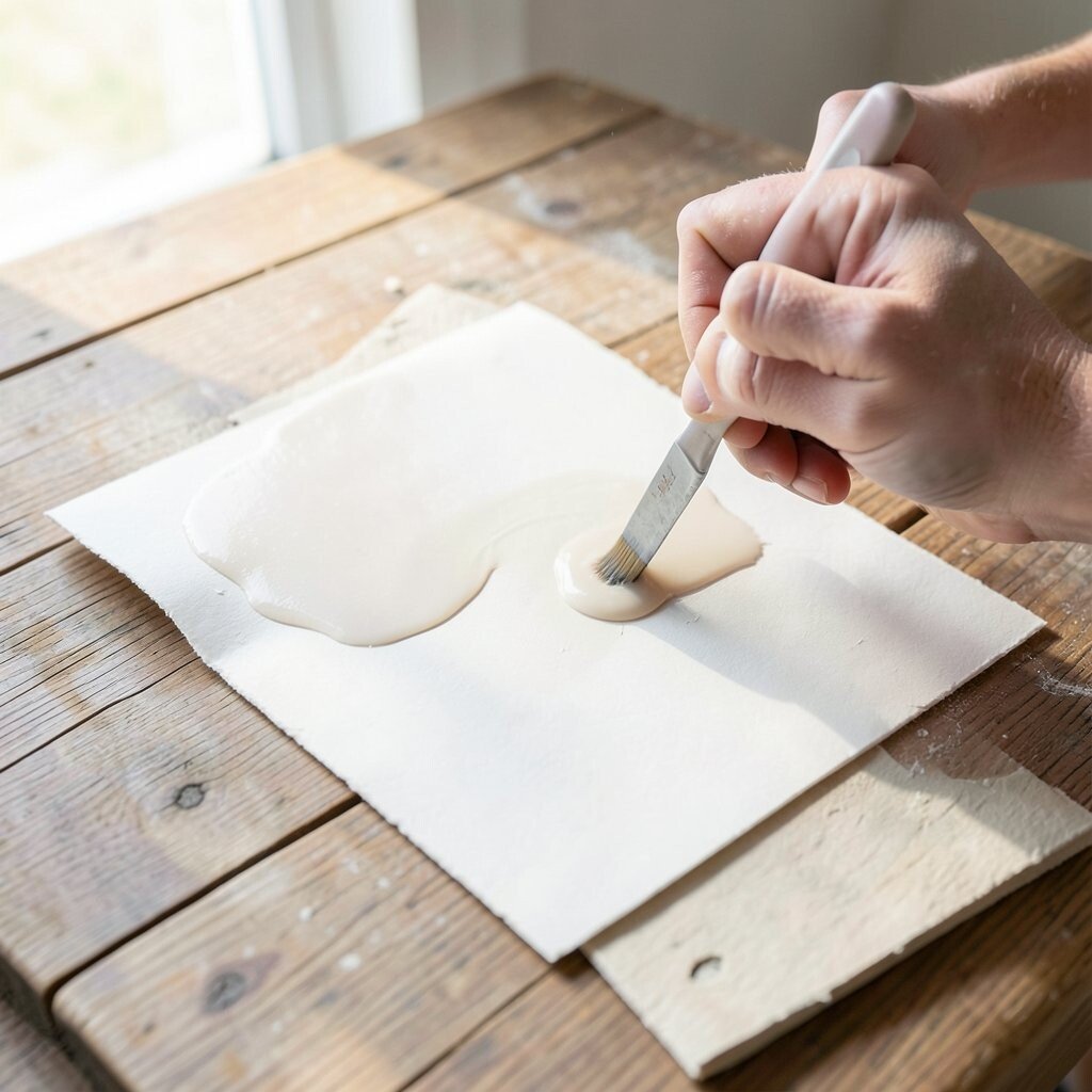
Your project might look flawless during the craft session, but real life has dust, moisture, and sun. Unprotected materials can fade, warp, or stain over time.
Choose protection based on where it will live, like a sealant for paper or a washable surface for everyday items. Practical tips include testing sealant on a scrap and applying thin, even coats for the best look.
Cost considerations matter here too, because one good protective layer can prevent full rework. Unique results come when you pick a finish that matches the environment, like UV resistance for bright rooms.
20. Buying New Supplies When You Could Use What You Have
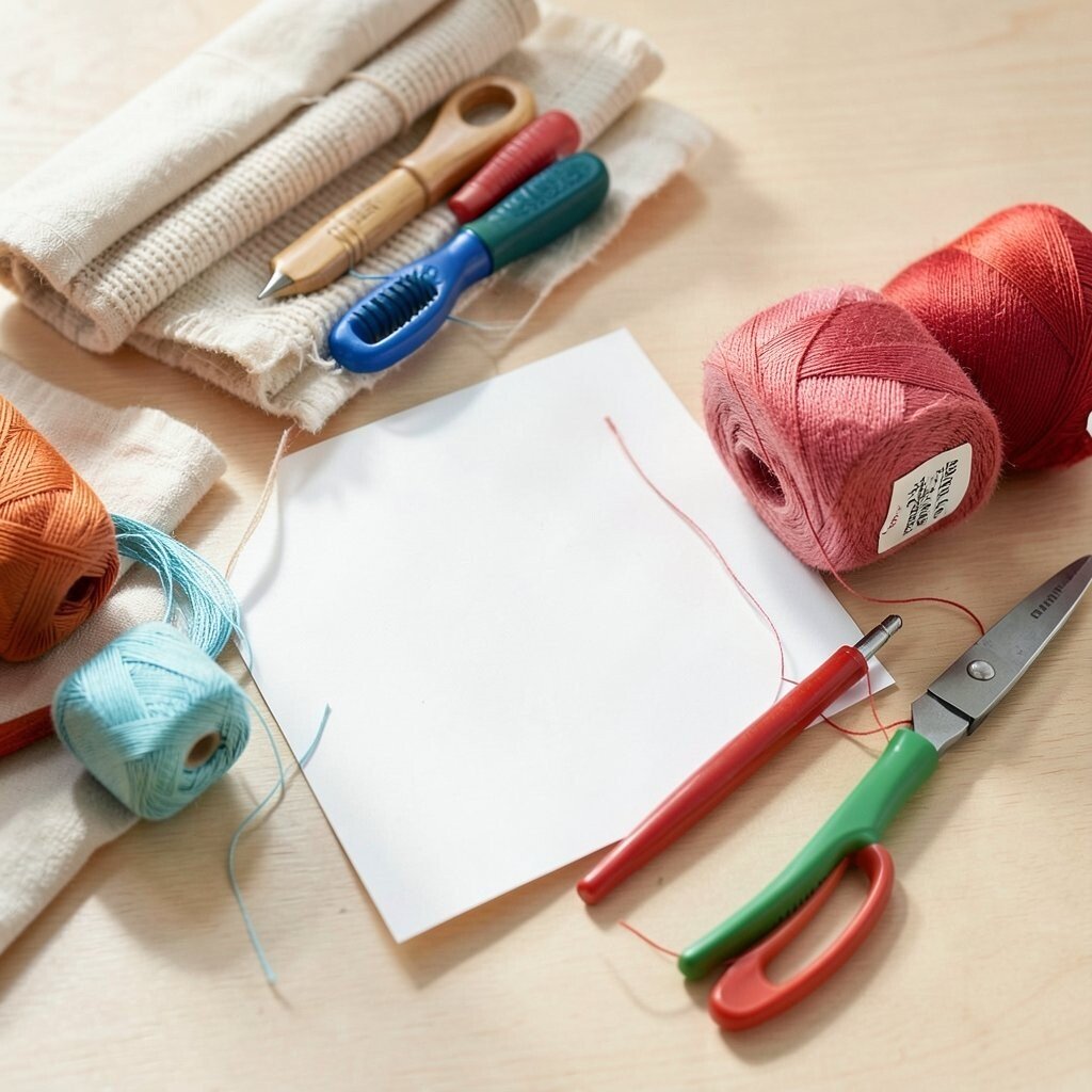
It is easy to feel like a design problem requires a shopping trip. But you can often solve the issue with colors, tools, or textures already in your stash.
Inventory what you own and see which pieces can serve as accents, backgrounds, or trims. Repurposing builds uniqueness because your project carries your own material history, not just store-bought perfection.
If you do need something new, buy only one key item, like a specific thread color or a single patterned paper sheet. This keeps costs under control and still lets you finish with intention.
21. Waiting for Inspiration Instead of Building a Reusable Process
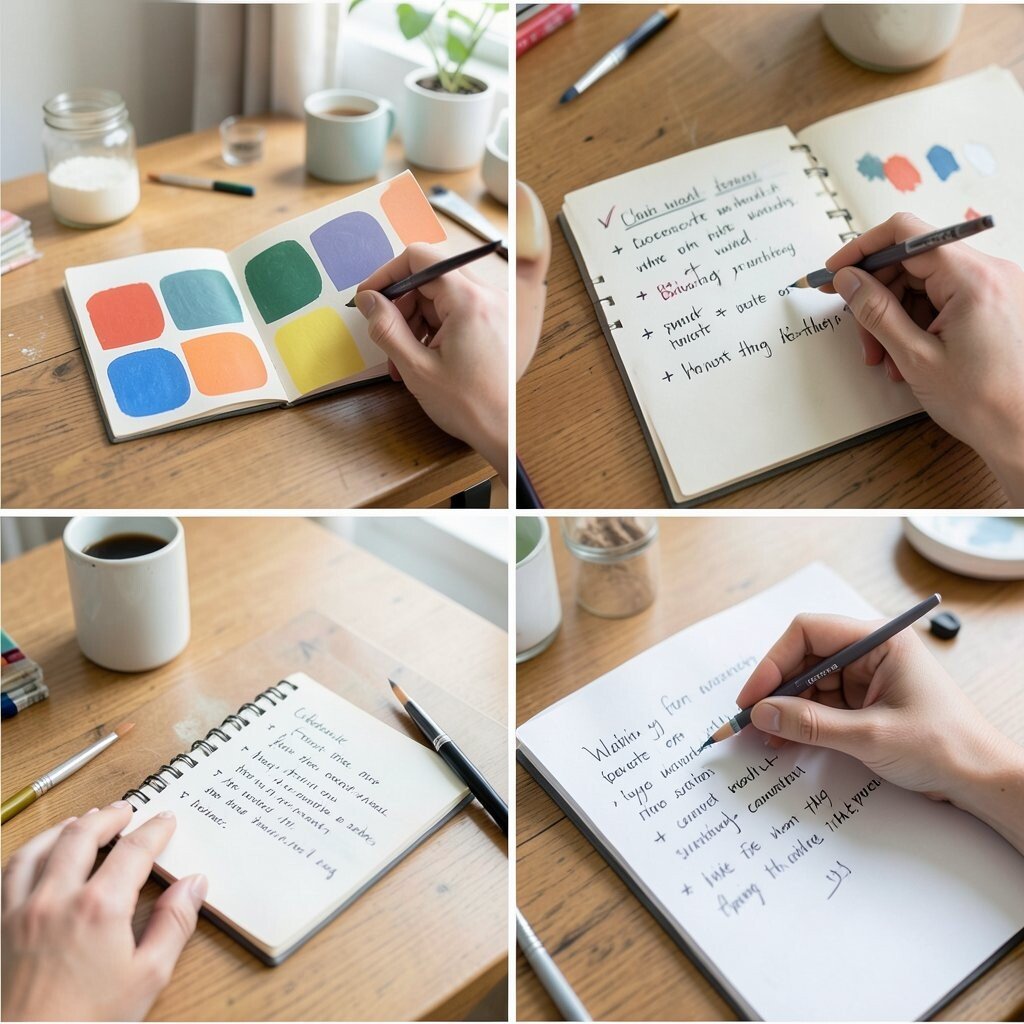
Inspiration is nice, but it is not reliable enough to finish every project on time. When you wait, you might rush later and make the same design mistakes again.
Create a simple workflow you can repeat, like choosing a color palette, planning scale, testing contrast, then assembling in stages. Personalize your process by keeping a small notes page, where you track what worked, what felt off, and what you want to change next time.
This kind of routine supports current trends like mindful making and intentional design. It also makes your future projects faster, smoother, and more confident without needing perfect ideas every single day.