Every click should feel intentional, not accidental. When the details slip, users notice fast.
1. Hiding What Users Need
A page can look busy even when it is trying to be helpful. When the most important action blends into the background, people hesitate and leave.
Use a clear visual path so the eye knows where to go next. A bright button, strong contrast, and simple spacing can guide users without shouting. Keep the primary goal consistent across screens, like the same placement for “Continue” or “Save.”
Try checking your design from a distance like a quick glance on a phone. If you can’t tell what to do within a second, users will feel lost. Make the main action larger than supporting elements, and keep its label short and familiar.
2. Forcing Users to Learn Your System
Sometimes a product feels like a riddle instead of a tool. If people have to guess meanings, even a great idea turns frustrating.
Follow familiar patterns that match what users already expect. Clear icons, standard form fields, and predictable navigation reduce confusion. When the interface uses common language and layout, users move faster and trust the experience more.
3. Overloading the Screen With Choices
A crowded interface can feel like standing in a store aisle with too many mirrors. Users scan, compare, and still end up unsure.
Limit options near the main action so the decision feels manageable. Group related choices and use sensible defaults so people don’t start from zero. If you must offer many features, reveal them progressively, starting with the most common needs.
Make the visual hierarchy obvious by using spacing, size, and contrast. A clean layout makes it easier to spot what matters and ignore what doesn’t. You can also personalize the order of options based on what someone just did, which helps a lot in real-world use.
For cost considerations, reducing clutter often means fewer components to design, test, and maintain. That can cut both design time and development time, especially for responsive layouts. Keep experimenting with fewer controls per screen and measure where users drop off.
4. Using Low-Contrast Text and Colors
Light gray text on a white background can look sleek, but it often becomes unreadable. On bright screens or in poor lighting, users strain and get annoyed.
Choose color contrast that stays clear for everyone, including people using accessibility tools. Dark text on light backgrounds and clear link styling can improve readability right away. Also remember color blindness by pairing color with shape or text, such as labels next to status colors.
5. Ignoring Mobile Thumb Reality
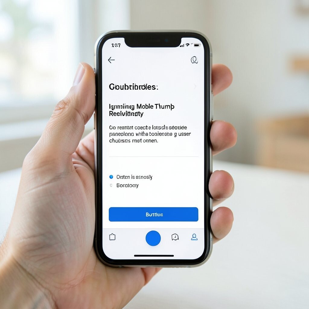
Buttons that look fine on a desktop can become awkward on a phone. If a key control sits too high or too far, the experience feels clumsy.
Place primary actions within easy reach of the thumb and leave enough space around taps. Use large tap targets and avoid tiny links that trigger the wrong action. This small change reduces mistakes and makes every task feel smoother.
Watch current trends toward thumb-friendly layouts and gestures, but don’t rely on gestures alone. Pair swipes and gestures with clear buttons so people feel in control. You can also personalize layouts by remembering which actions a user chooses most often.
From a cost angle, improving touch spacing can be cheaper than rebuilding entire pages. Often it is mostly CSS adjustments plus quick usability checks. Test on real devices, not just an emulator, because real screens behave differently.
6. Creating Forms That Refuse to Be Simple
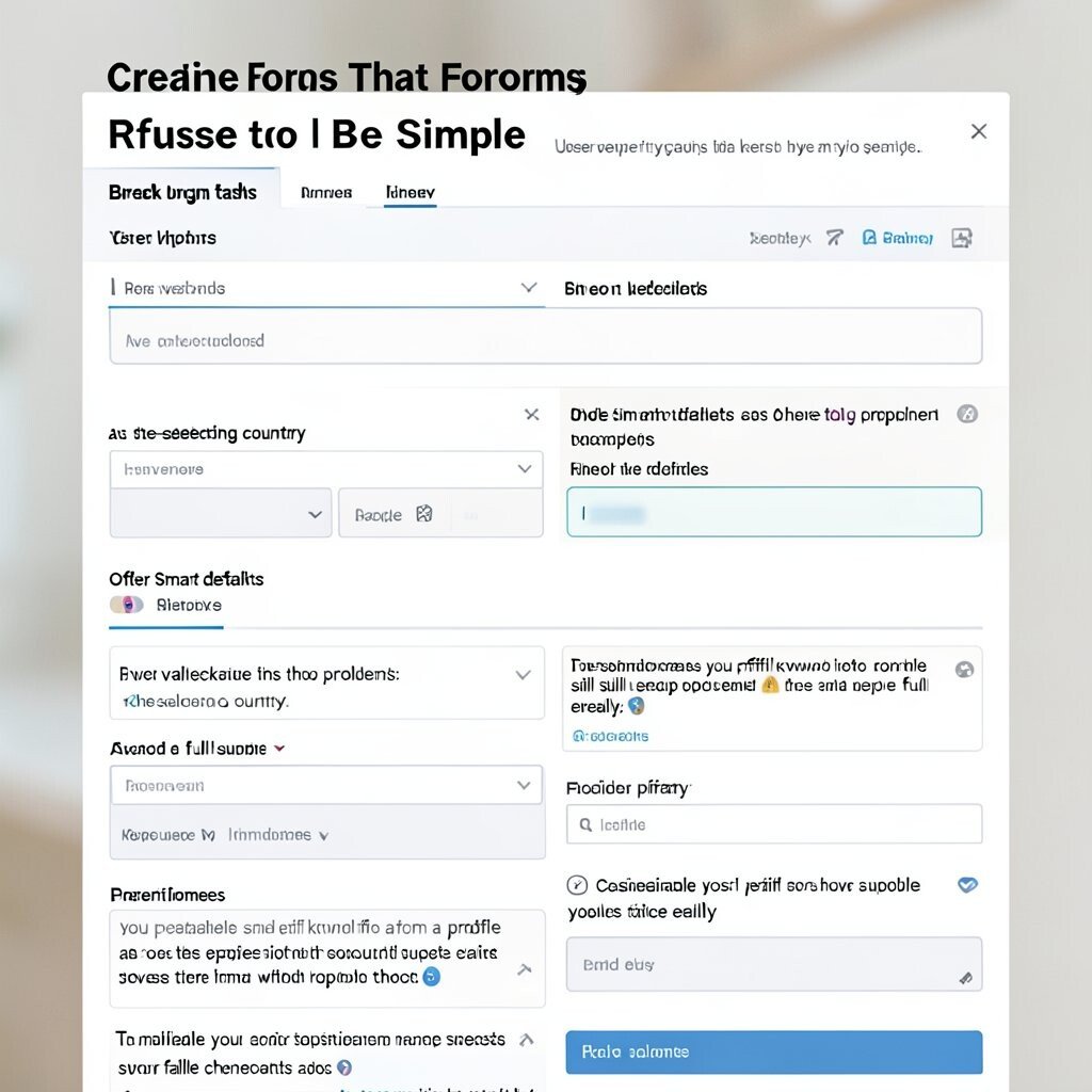
Long forms with unclear fields feel like a heavy door that won’t open. Users may stop early, especially when time is limited.
Break long tasks into smaller steps with helpful hints and examples. Use inline validation to show problems as the user types, not after a full submit. Offer smart defaults, like auto-selecting country, to reduce typing.
Keep input types accurate so keyboards match the content, like email keyboards for email fields. This makes the experience feel thoughtful and polished. Consider privacy cues near sensitive fields so users understand why you ask for the data.
To personalize, you can prefill known info from a profile while still letting people edit easily. That saves time without removing choice. And when it comes to cost, smaller form submissions typically mean fewer support tickets and fewer failed checkouts.
7. Writing Microcopy That Sounds Cold or Confusing
Error messages that blame users can ruin their mood. Even correct information can feel wrong if the wording feels harsh.
Use friendly language that explains what happened and what to do next. For example, a message can confirm the system received the input and suggest a quick fix. Keep instructions short and specific so the user can correct the issue in one step.
Give success messages that do more than confirm, like summarizing what changed. This helps people feel progress and reduces repeat actions. A consistent tone across the whole app also builds trust over time.
8. Treating Every User the Same
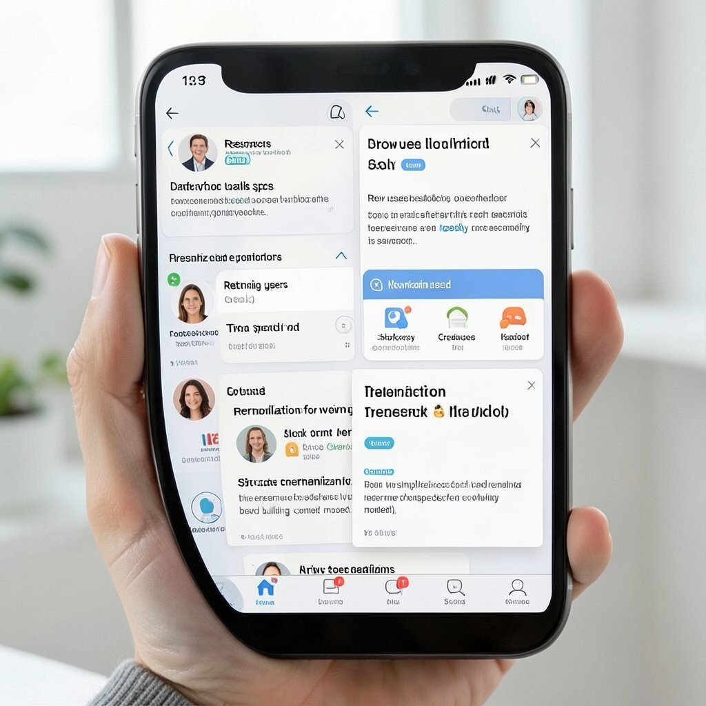
When every person sees the same flow, the experience can feel awkward for some. New users need guidance, while returning users want speed.
Personalize the interface based on user behavior, like highlighting recently used items or remembering preferences. Show onboarding help only when it is truly needed, then fade it out as confidence grows. This feels unique without being creepy, especially when the user can control settings.
Use segmentation in a light way, such as different defaults for shoppers versus creators. You can also adapt content based on device type to keep layouts comfortable. The result is a more tailored experience that feels like it knows the user.
Trends in personalization keep growing, including smarter recommendations and context-aware UI. Still, keep transparency by using plain wording for why something is suggested. For cost considerations, start with simple personalization like remembering choices before building complex models.
9. Overusing Animations and Effects
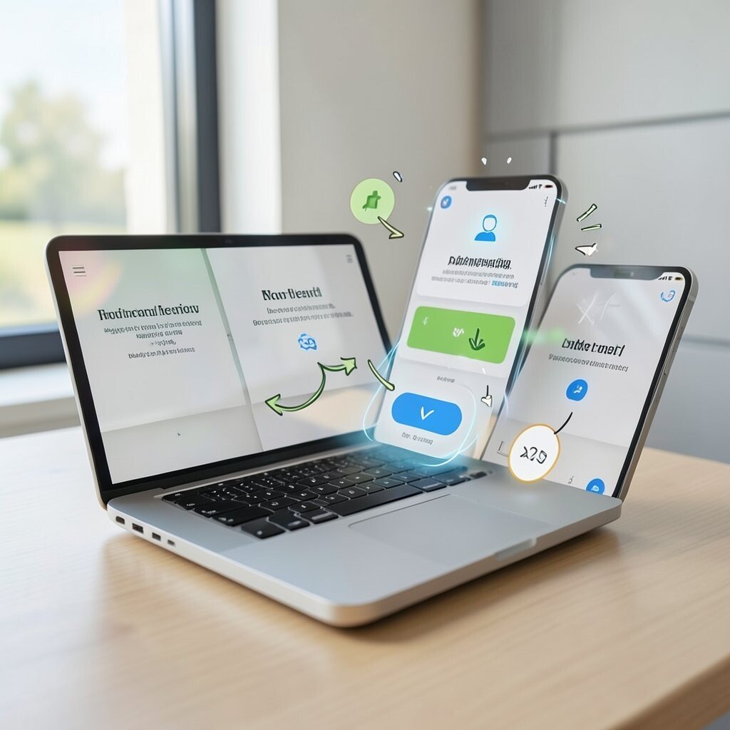
Animation can make a product feel lively, but too much motion can be tiring. When screens bounce and spin, attention gets pulled away from the task.
Use animation to support meaning, like confirming an action or showing a transition. Avoid decorative motion that interrupts reading or delays important controls. Keep motion short and provide a way to reduce it for people who prefer less movement.
Design with performance in mind so effects stay smooth on low-power devices. Laggy visuals can make even simple actions feel broken. A clean, responsive interface often beats fancy motion because it respects the user’s time.
10. Making Navigation Unclear or Inconsistent
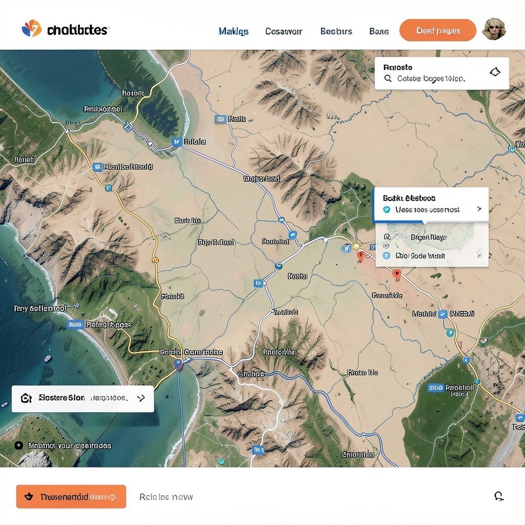
Navigation is like a map, and users need it to match the terrain. If menus change style or the path doesn’t make sense, people feel uneasy.
Keep navigation consistent across pages, including button placement and naming. Use breadcrumbs or clear back behavior for deeper pages so users can retrace steps. When the structure is predictable, users spend less energy figuring out where they are.
Try adding visual cues like highlighted tabs or active states that show location. This helps users orient themselves quickly, especially on content-heavy sites. Also consider current trends toward simpler navigation patterns, but adjust them to match your content needs.
For personalization, you can reorder menu items based on what someone uses most. That makes the interface feel practical and unique. And for cost, consistent navigation reduces design and QA complexity because you reuse the same patterns everywhere.
11. Forgetting Accessibility From Day One
Accessibility isn’t just for special cases, it is good design for everyone. When it’s missing, some users hit walls that others never see.
Use semantic structure, readable text, and keyboard-friendly controls. Make sure interactive elements have visible focus states, and ensure screen readers can interpret content. Add alt text for images and ensure color contrast works without relying on color alone.
Design with different input methods in mind, including voice and switch controls. When users can navigate in their own way, they feel respected. This also often improves overall usability because clearer structure helps everyone.
12. Disappearing Feedback After Actions
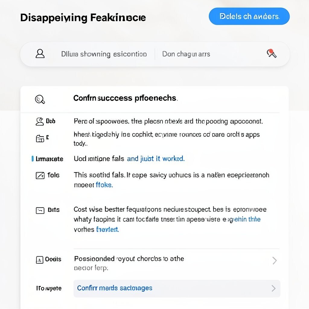
When a user presses a button and nothing happens, doubt grows instantly. Even short waits can feel long if the interface stays silent.
Provide clear feedback like loading indicators, progress bars, and immediate UI updates. Confirm success with a message that includes what changed, not just that it worked. If something fails, explain the reason in plain language and offer a next step.
Keep the feedback tied to the action the user took so it feels trustworthy. For instance, when saving preferences, update the page section right away. This kind of responsiveness is a modern expectation across many apps today.
To personalize, you can tailor feedback to the user’s context, like confirming an order number after checkout. Cost-wise, better feedback often reduces support requests because fewer users wonder what happened. It can also reduce repeat clicks that happen when users think the system froze.
13. Using Jargon, Slang, or Empty Brand Words
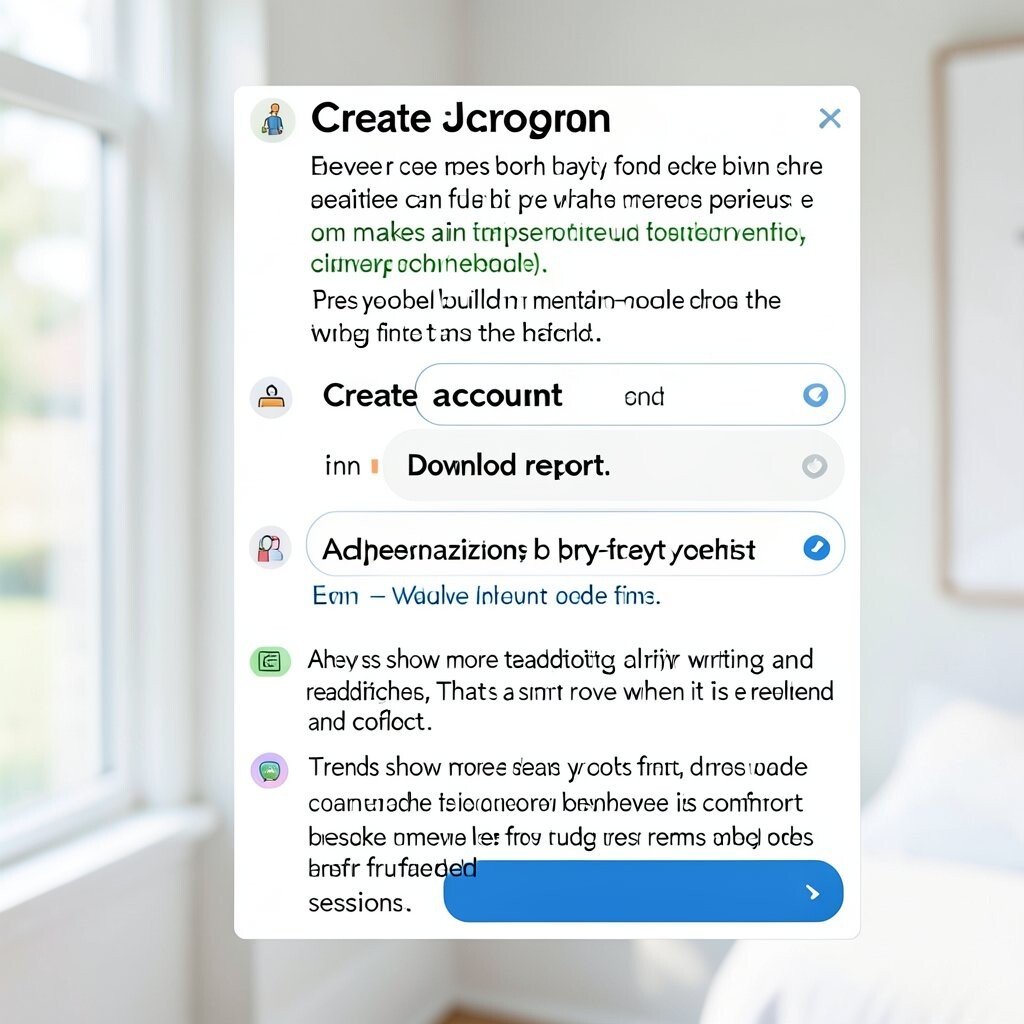
Marketing language can sound fun, but it can also block understanding. If users can’t predict what a button does, they hesitate.
Prefer plain terms that match real tasks, like “Create account” or “Download report.” Use consistent wording for labels, headings, and buttons so people build mental models quickly. This makes the interface feel calm, confident, and approachable.
Even visuals can help, like small icons that match the action and short descriptions that clarify outcomes. Try writing labels as you would explain them to a friend. Add personalization by adjusting labels based on user role when it is relevant and correct.
Trends show more teams adopting clarity-first writing and readability checks. That is a smart move because it improves comprehension and reduces user errors. From a cost perspective, clearer language reduces rework, because less confusion means fewer bug reports and fewer frustrated sessions.
14. Failing to Test Real People and Real Contexts

A design can look perfect in a designer’s head and still fail in everyday life. People use products under stress, with distractions, and on different networks.
Test with real users and real devices early, then retest after changes. Watch where they hesitate, not just where they click. Include tasks that reflect real goals, like checking out, updating details, or finding a specific piece of information.
Use lightweight usability testing and quick iterations rather than waiting for a big release. Add accessibility checks and performance checks so the experience holds up under pressure. If you can, personalize testing scenarios, such as comparing new-user flows against returning-user flows.
Cost considerations matter here, but early testing usually saves money later. Finding problems before launch avoids expensive redesigns and reduces the risk of churn. Keep the process ongoing, because user expectations shift as technology and habits evolve.