The room feels calmer when everything speaks the same visual language. Monochrome styling can still look rich, warm, and full of personality.
1. Soft Ivory With Charcoal Lines
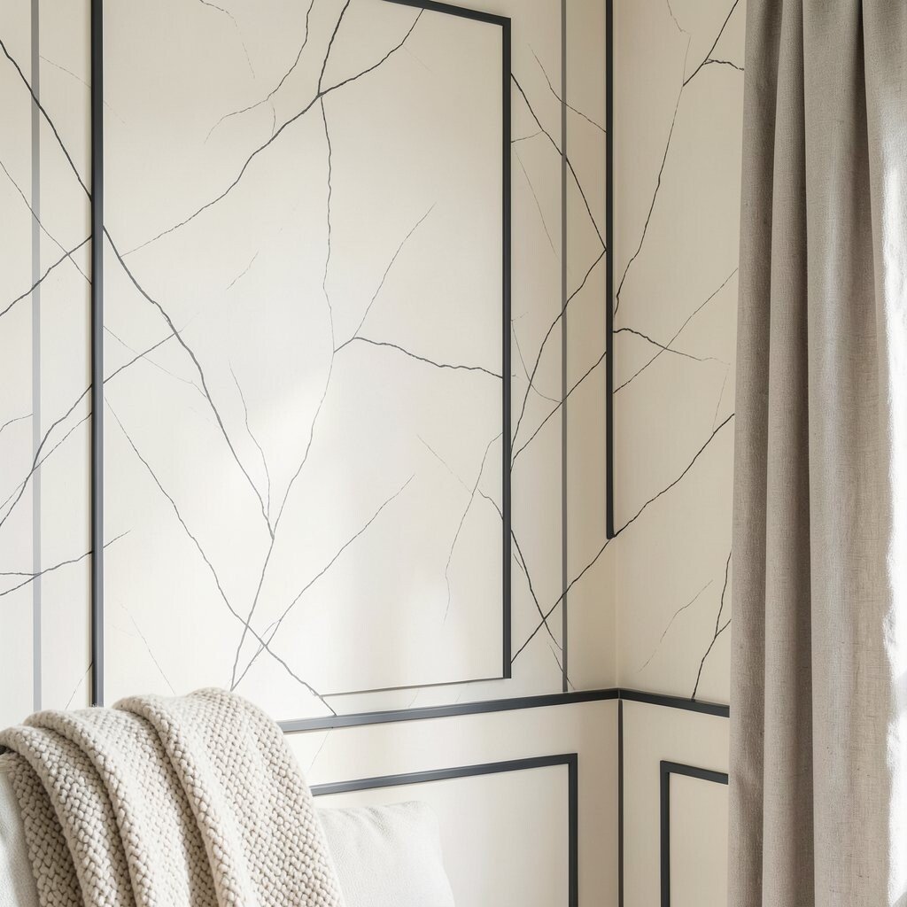
Imagine walls in creamy ivory with hairline charcoal marks that catch the light. The contrast feels like elegant handwriting on a blank page.
To get this look, choose a warm off-white paint and pair it with charcoal for trim, picture frames, and slim shelving. Keep the charcoal accents thin so the space stays airy, not heavy. You can personalize by adding one or two textured pieces, like a wool throw or a linen curtain panel, to make the monochrome feel lived in.
2. Pearl Greys With Sleek Black Hardware
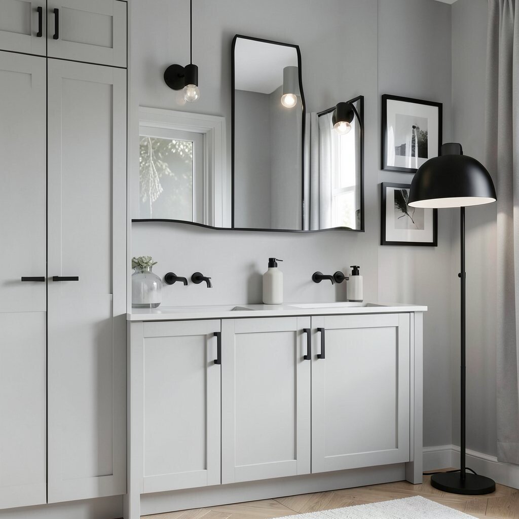
Picture a calm pearl grey backdrop with crisp black handles, faucets, and cabinet pulls. The whole room looks coordinated, even when you change decor season to season.
For practical styling, stick to pearl greys for large surfaces and save black for small, repeatable details like doors, lighting, and mirror frames. This keeps the palette intentional and makes everyday items look sharper. If you want a twist, add a matte black floor lamp or a black-framed gallery wall to create a focal point without adding extra colors.
In terms of cost, you can update the look quickly by swapping hardware and light fixtures before repainting anything. Current design trends lean toward matte finishes and clean shapes, so this combo fits right in without feeling too trendy or too permanent.
3. Classic White Walls With Graphite Depth
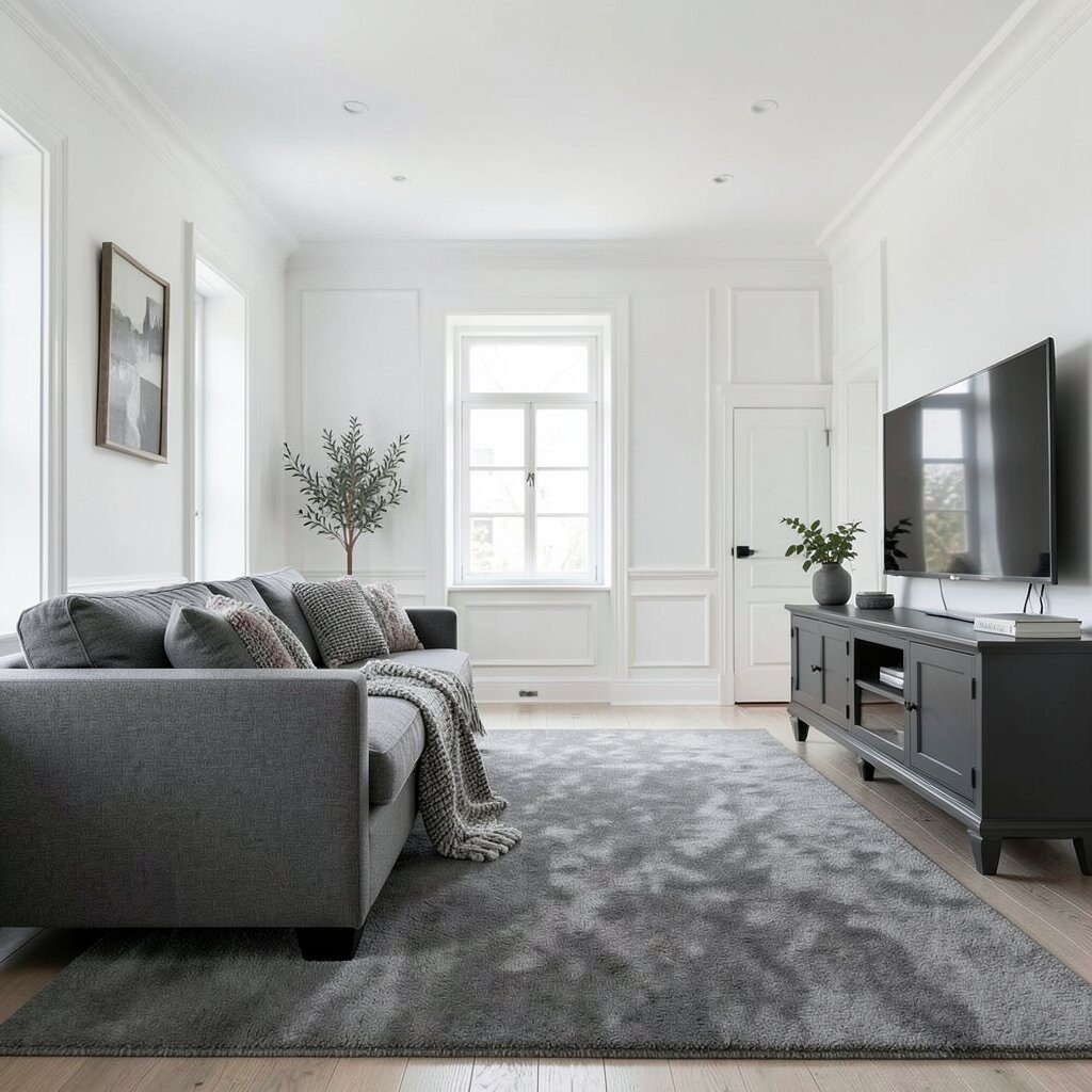
Think of crisp white walls that feel open, with graphite pieces adding quiet depth. The contrast is subtle enough for relaxing evenings, yet bold enough for modern styling.
Use graphite in thicker forms like a sofa base, a large area rug, or a statement media console. For a practical balance, leave the walls bright and let the darker tones show up mainly at seating and grounding spots. Personalize the texture by mixing smooth surfaces with something tactile, like a boucle cushion or a softly nubby throw.
If you enjoy DIY, you can repaint an older cabinet in graphite using a durable enamel, which often costs less than replacing it. This palette is also popular right now because it photographs beautifully and works in both small rooms and larger open plans.
4. Warm Beige With Dark Umber Flooring
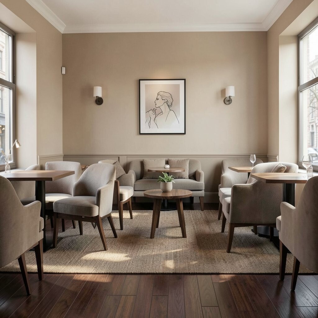
Picture warm beige walls paired with umber or cocoa-toned flooring that looks rich under daylight. The room feels inviting, like a sunlit café, even when the palette stays monochrome.
Choose beige for walls and larger furniture upholstery, then let umber appear in flooring, rugs, or deep wood tones. A practical trick is to keep your darker shades consistent across the room so you avoid random patches of tone. You can personalize with monochrome art that includes line drawings or soft gradients, which adds interest without color clutter.
5. Cool Slate Walls With Steel Accents
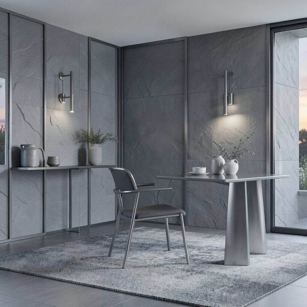
Imagine cool slate on the walls with steel grey elements that glint in the evening. It looks crisp, modern, and slightly industrial in a way that still feels comfortable.
Paint the walls a slate grey and bring in steel accents through metal frames, light fixtures, and vases. Keep the steel finishes mostly consistent, like all brushed or all matte, so the look stays calm. Add uniqueness by choosing a rug with a barely-there pattern, such as a tonal weave, so the room feels layered but still monochrome.
For cost considerations, try replacing just one major piece, like a dining chair set or a side table, in a steel finish. This follows current trends that favor elevated neutrals and mixed metal textures that do not require bright colors to feel styled.
6. Charcoal Walls With Off-White Furniture
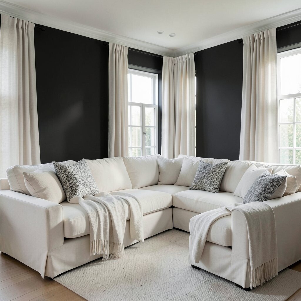
Picture a dramatic charcoal backdrop with off-white upholstery and airy window treatments. The contrast feels like a gallery, but it can still feel cozy when you soften it with the right fabrics.
To make charcoal walls practical, use them in rooms with good natural light or pair them with lighter ceiling paint to keep the space from feeling cramped. Off-white furniture, like a sectional or armchairs, creates a clear visual path for the eye. Personalize the look by layering throw blankets and curtains in off-white linen, then add a few monochrome cushions with subtle pattern differences.
7. Misty Lavender Grey With Black-and-White Art
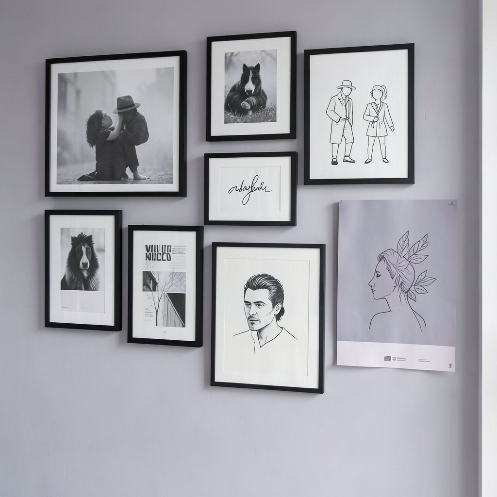
Imagine a misty lavender-grey tone that feels gentle, with black-and-white wall art that adds a crisp graphic edge. The palette stays monochrome, but it still feels creative and a little dreamy.
Pick a grey paint with a slight cool undertone, then choose art prints that mix black frames with white matting. This keeps the look organized and lets the art become the personality part of the room. For a practical tip, limit the art types to a consistent style, like all photography or all simple line illustrations, so the monochrome theme remains clear.
You can personalize further by mixing paper textures, such as framed prints and unframed matte posters, as long as the tones stay in the same family. This idea fits current trends that celebrate softer greys and gallery-style walls without bright color interruptions.
8. Cement Grey With Concrete-Like Textures
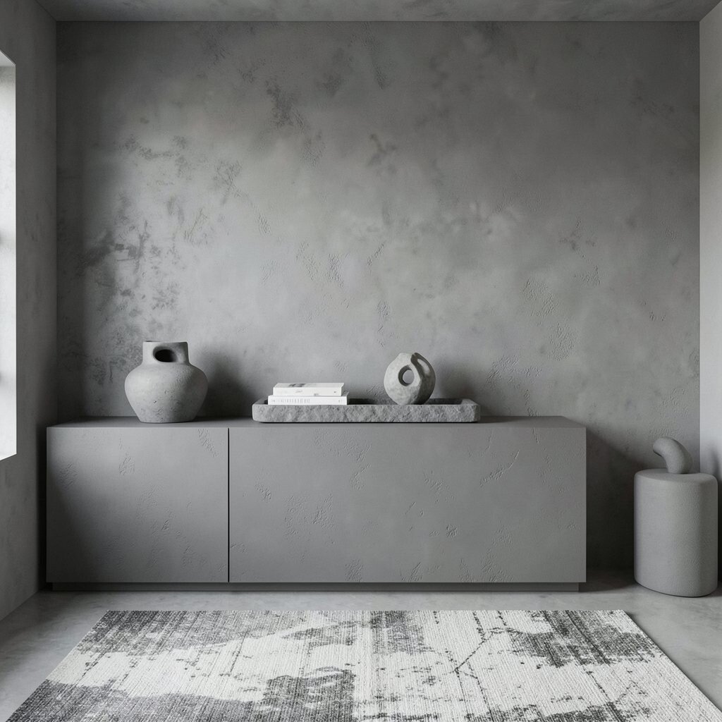
Think of cement grey walls that mimic the feel of construction materials, paired with concrete-like textures in decor. The room feels grounded, modern, and quietly dramatic.
Choose a cement grey paint or a textured finish, then add decor that echoes the same look, like a sculptural vase, a matte stone tray, or a rug with a concrete-inspired pattern. Practical styling works best when you keep furniture shapes smooth, because rough texture already brings visual energy. Personalize by placing one or two sculptural items in the center of shelving, so the room looks intentional instead of just “unfinished.”
9. Night Black With Soft White Layering
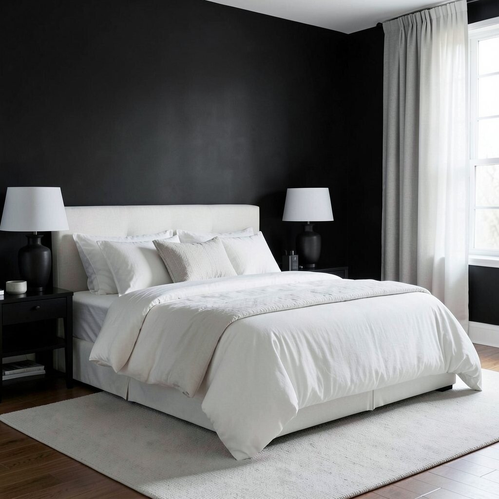
Picture deep night black walls or a black accent wall, softened by soft white bedding, curtains, and ceramic decor. The contrast is bold, yet it feels elegant when you layer the textures well.
To keep it livable, use black on one or two surfaces and rely on soft white for bedding, rugs, and lighting shades. A practical trick is to choose matte finishes for large black areas, because glossy surfaces can feel too harsh. Personalize with monochrome lampshades, like a white drum shade on a dark base, to keep the lighting flattering.
If you want to keep costs down, consider painting only the wall behind a bed or a focal feature instead of repainting the entire room. This kind of high-contrast styling is trending because it looks luxurious and feels intentional in photos and in person.
10. Warm White With Pewter Accents
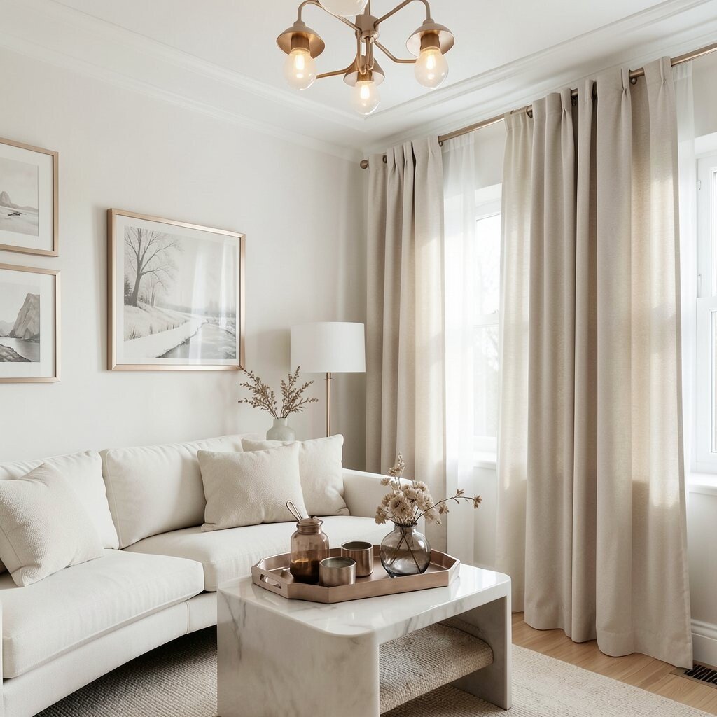
Imagine warm white walls and furniture tones that feel gentle, paired with pewter accents that look like softened metal. It creates a calm, polished vibe that works almost anywhere.
Use warm white as your main color, then add pewter through picture frames, ceiling lights, and decorative trays. This palette looks especially good when you choose a few matching materials, like pewter-toned metal and smoked glass. Personalize by selecting curtains with a subtle sheen, since warm white and gentle shine can make a monochrome room feel more expensive.
11. Greige Walls With Linen-Black Contrast
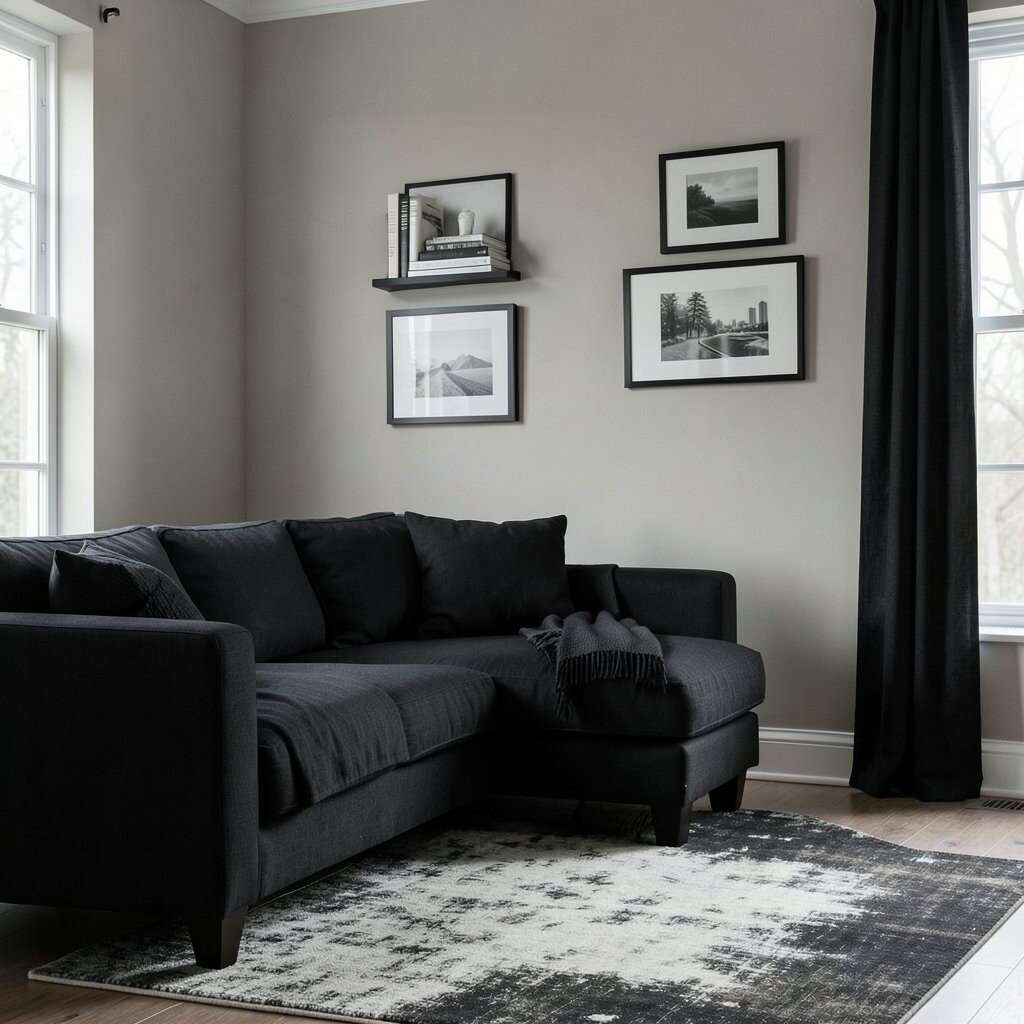
Picture greige walls that sit between beige and grey, then a mix of linen-like textures in black. The room feels natural and modern at the same time.
Start with greige for walls, then add black through upholstery, stacked books, and black picture frames. Keep the black in breathable textures like linen or woven cotton so it feels soft rather than severe. For personalization, try a monochrome rug that has a slightly faded look, which makes the contrast feel relaxed instead of stark.
On the cost side, greige is a forgiving paint color, so you often need fewer touch-ups than with very bright whites. Current trends favor warm neutrals like greige, and pairing it with gentle black textures feels current without chasing anything too dramatic.
12. Monochrome Denim Grey With White Stitch Details
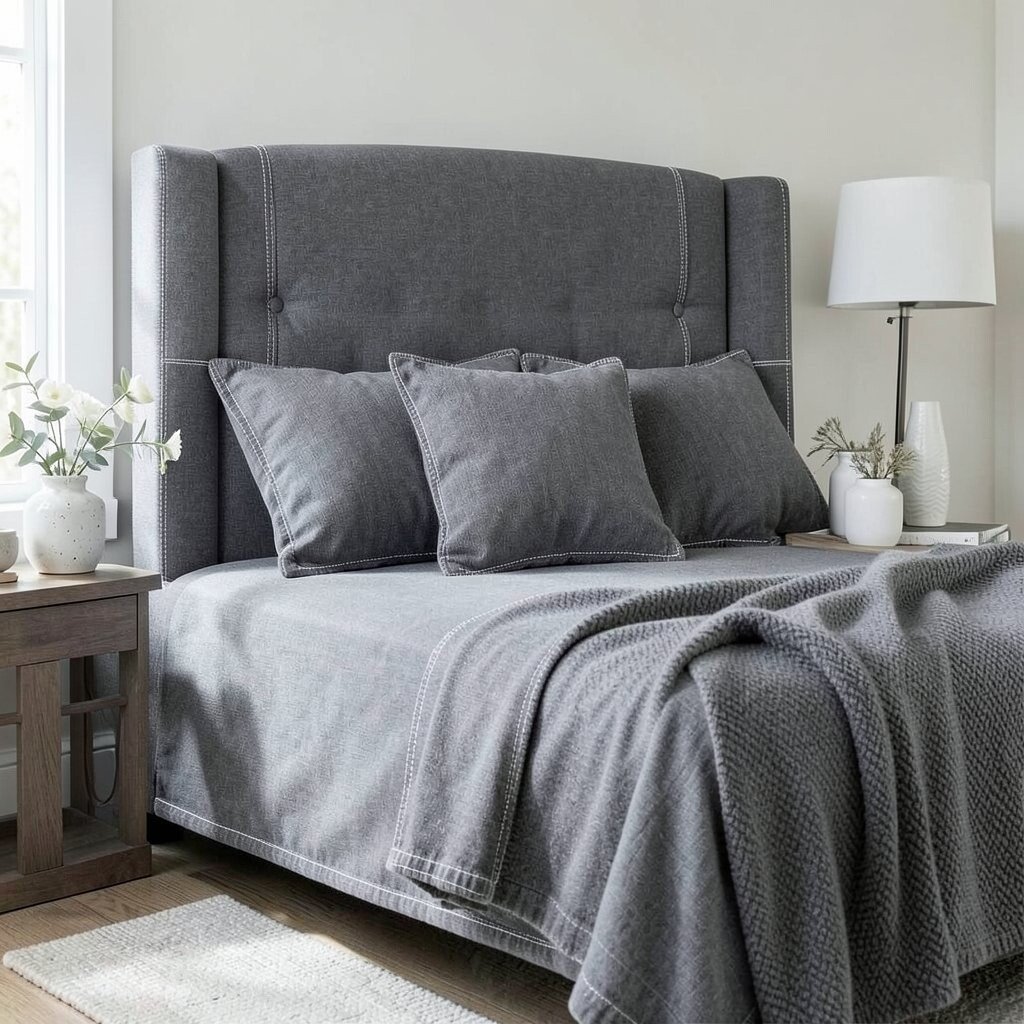
Imagine a denim-like grey palette with crisp white stitching details echoing the look of classic jeans. The room feels casual, fresh, and surprisingly elegant.
Choose denim grey textiles for throw pillows, a slipcover, or even a tall upholstered headboard, then bring in white through stitching accents, ceramics, and light fixtures. A practical tip is to repeat the white detail in more than one place so it doesn’t feel like a random contrast. Personalize by using a throw blanket with a visible weave pattern, which gives the monochrome scheme extra character.
13. Smoke Grey With Oat-White Textiles
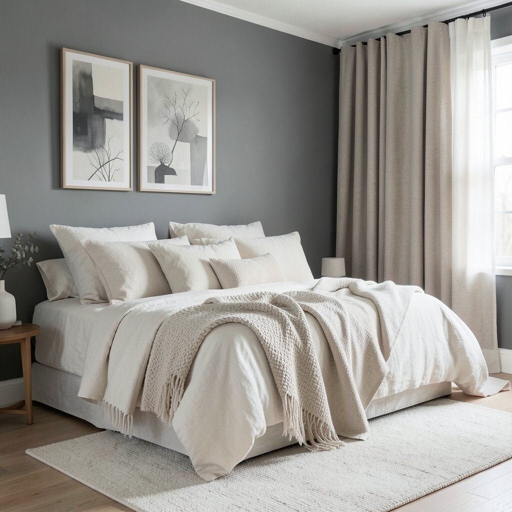
Picture smoke grey walls paired with oat-white fabrics that feel soft and cozy. The look balances modern style with warm comfort, like a calm winter morning.
Use smoke grey for walls or large furniture surfaces, then bring oat-white into throws, curtains, and layered rugs. This combination helps hide minor imperfections, which is practical if you have kids, pets, or busy mornings. Personalize with monochrome artwork that uses different shades of grey and cream so the walls feel curated without adding colors.
For cost considerations, you can often refresh the whole mood by updating textiles first, since rugs and curtains change the room faster than paint. This kind of layered neutral styling remains popular because it feels tidy yet lived in.
14. White On White With Tonal Patterns
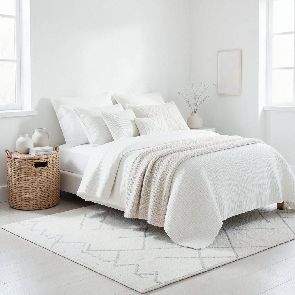
Imagine a room that stays nearly all white, but nothing looks flat because every surface has a different texture. Tonal patterns bring depth without needing a single bold color.
Choose a mix of whites, like creamy white, bright white, and soft off-white, and then layer them across bedding, rugs, and decor. For practical success, aim for varied textures, such as ribbed knits, woven baskets, and matte ceramics. Personalize by selecting one patterned piece, like a subtle geometric rug, then keep the rest of the room plain so the pattern feels intentional.
15. Black Accents With Silver-Grey Veins
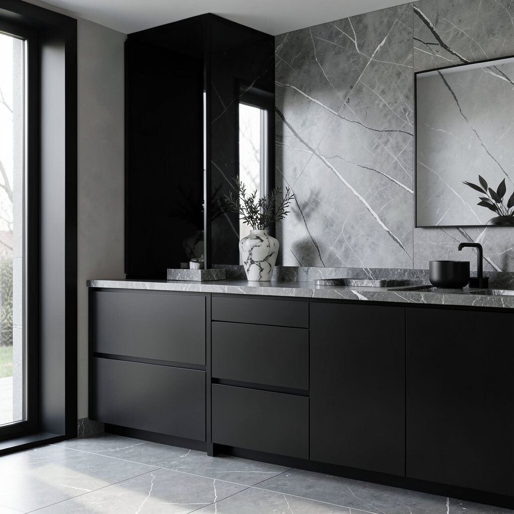
Picture black furniture lines paired with silver-grey surfaces that look like stone with fine veins. The room feels sleek and high-end while staying monochrome.
Use black for frames and furniture bases, then add silver-grey through stone-inspired countertops, trays, or decorative objects. A practical tip is to match the undertone of the silver, either cool or warm, so everything looks connected instead of mismatched. Personalize by choosing one statement piece, like a monochrome marble-style vase or a sleek mirror, to anchor the room.
In terms of cost, stone-inspired peel-and-stick backsplashes and affordable resin decor can help you achieve the look without a full remodel. Current trends lean into “natural materials” vibes, and this palette delivers that luxe feel using only monochrome tones.
16. Silver Grey With Soft Charcoal Cushions
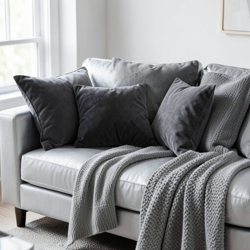
Imagine a silver-grey sofa or seating area with soft charcoal cushions that look plush and inviting. The contrast feels gentle because the shades are close, not harsh.
Pick a larger anchor piece in silver grey, then layer charcoal through pillows, blankets, and small decor items. This approach is practical because it hides stains a bit better than bright white while still looking clean. Personalize by adding a few cushions in different weaves, like velvet, knit, and woven cotton, so the monochrome palette feels rich.
17. Sandstone Beige With Ink Black Outlines
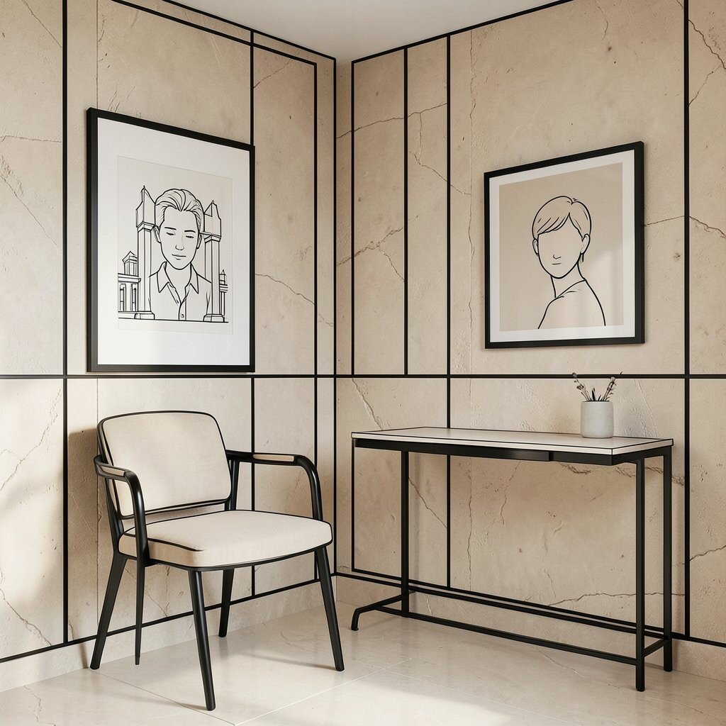
Picture sandstone beige walls with ink black outlines in art, frames, and slim furniture details. The room looks artsy and intentional without adding extra colors.
Choose beige as your main tone, then use ink black sparingly for bold outlines, like in framed prints, chair legs, and a single mirror frame. A practical tip is to repeat the black outline style across the room, which makes the space feel designed rather than random. Personalize by picking art with line work, such as architectural sketches or minimal portrait prints, so the uniqueness comes from style, not color.
18. Porcelain White With Matte Black Lighting
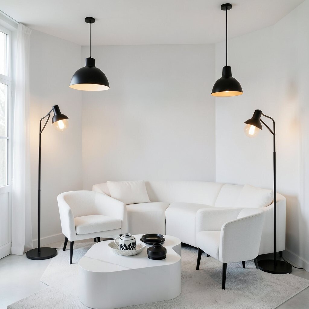
Imagine porcelain white walls and furniture that look smooth and bright, paired with matte black lighting that feels modern and grounded. This combo is crisp, stylish, and easy to keep looking neat.
Choose matte black pendant lights, floor lamps, or sconces and let them frame the room’s main activity zones. Porcelain white works best when you use washable finishes, because practicality matters in real life. Personalize the look by selecting bulbs with warm tones and adding one monochrome decorative object, like a black-and-white ceramic set, to create a small moment of charm.
19. Pewter Grey With Brushed Nickel Feel
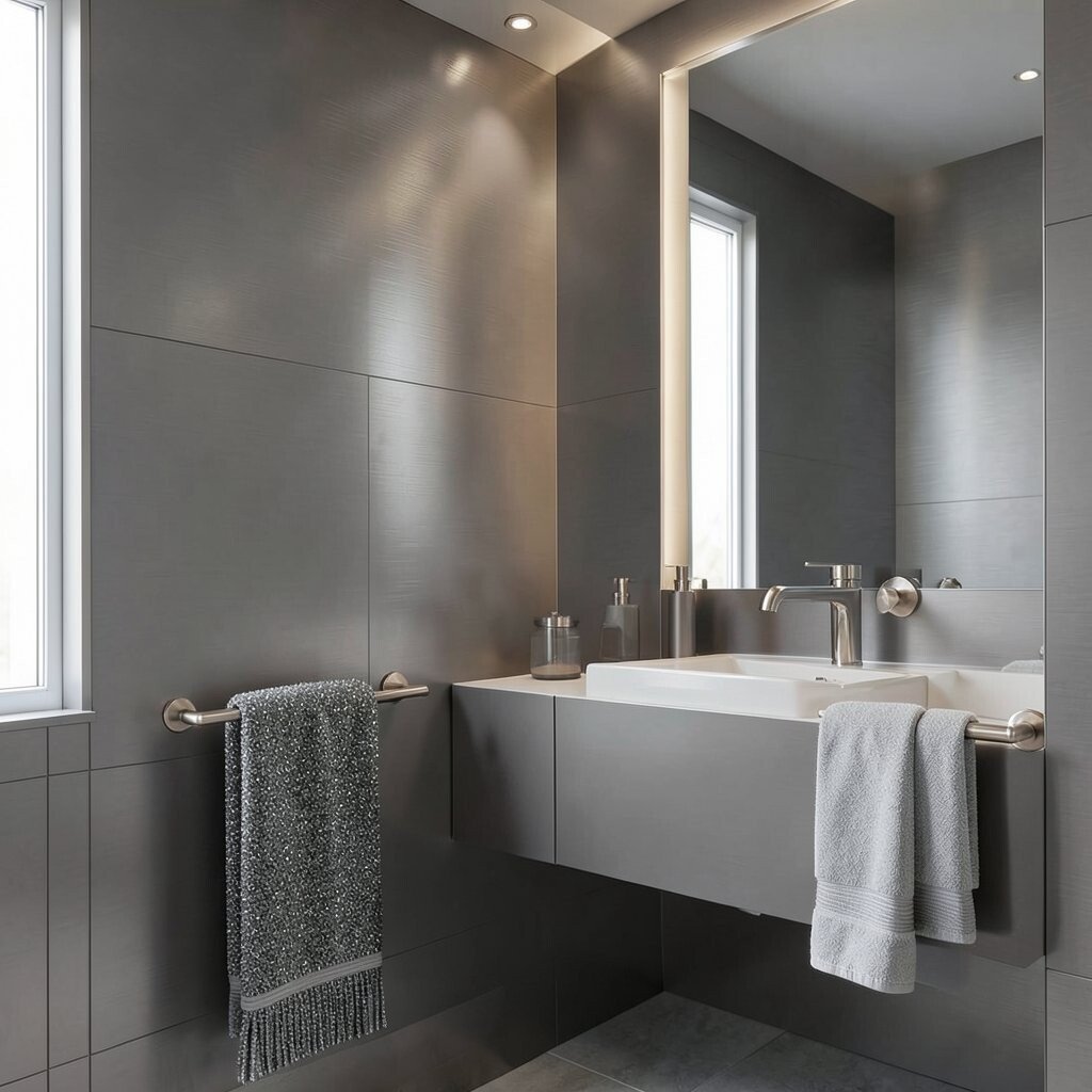
Picture pewter grey walls with a brushed nickel feel that gives off a subtle glow. The room feels refined, like a boutique hotel suite.
Use pewter grey for large surfaces and keep brushed nickel for hardware, lighting, and bathroom fixtures. A practical tip is to choose fixtures with similar reflective levels, since some pieces look shinier than others and can disrupt the monochrome calm. Personalize by adding monochrome textiles with tiny shimmer threads, which echo the metal without adding actual colors.
For cost considerations, upgrading faucets, cabinet pulls, and lighting is often less expensive than replacing furniture. This fits current trends that favor “soft metal” looks over highly polished chrome, especially in monochrome homes.
20. Charcoal And Cream With Vintage-Style Charm
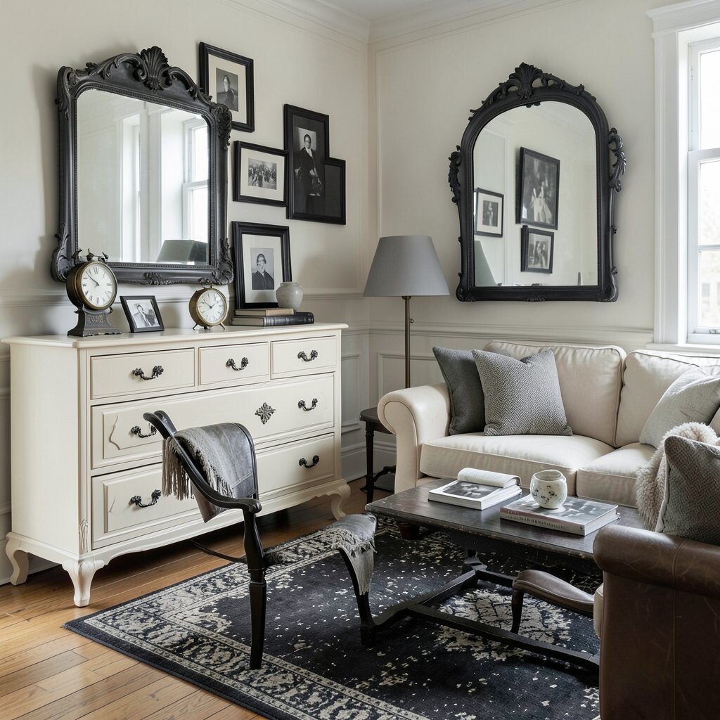
Imagine creamy furniture tones paired with charcoal accents and vintage-inspired details. The room feels timeless and elegant, not cold or flat.
Use cream for larger pieces like a dresser, sofa, or bookcase, then add charcoal through a distressed rug, dark picture frames, or a wrought-style mirror. A practical approach is to mix old and new textures, such as a classic leather chair with a modern matte lamp. Personalize by adding a few monochrome vintage finds, like a clock, framed black-and-white photos, or ceramic pieces with subtle aging.