The floor plan can quietly steer your whole day. Small layout choices can make rooms feel easier to use, calmer to live in, and nicer to come home to.
When you adjust how things meet the eye and move through the space, everything starts working harder for you.
1. The Doorway Buffer Zone
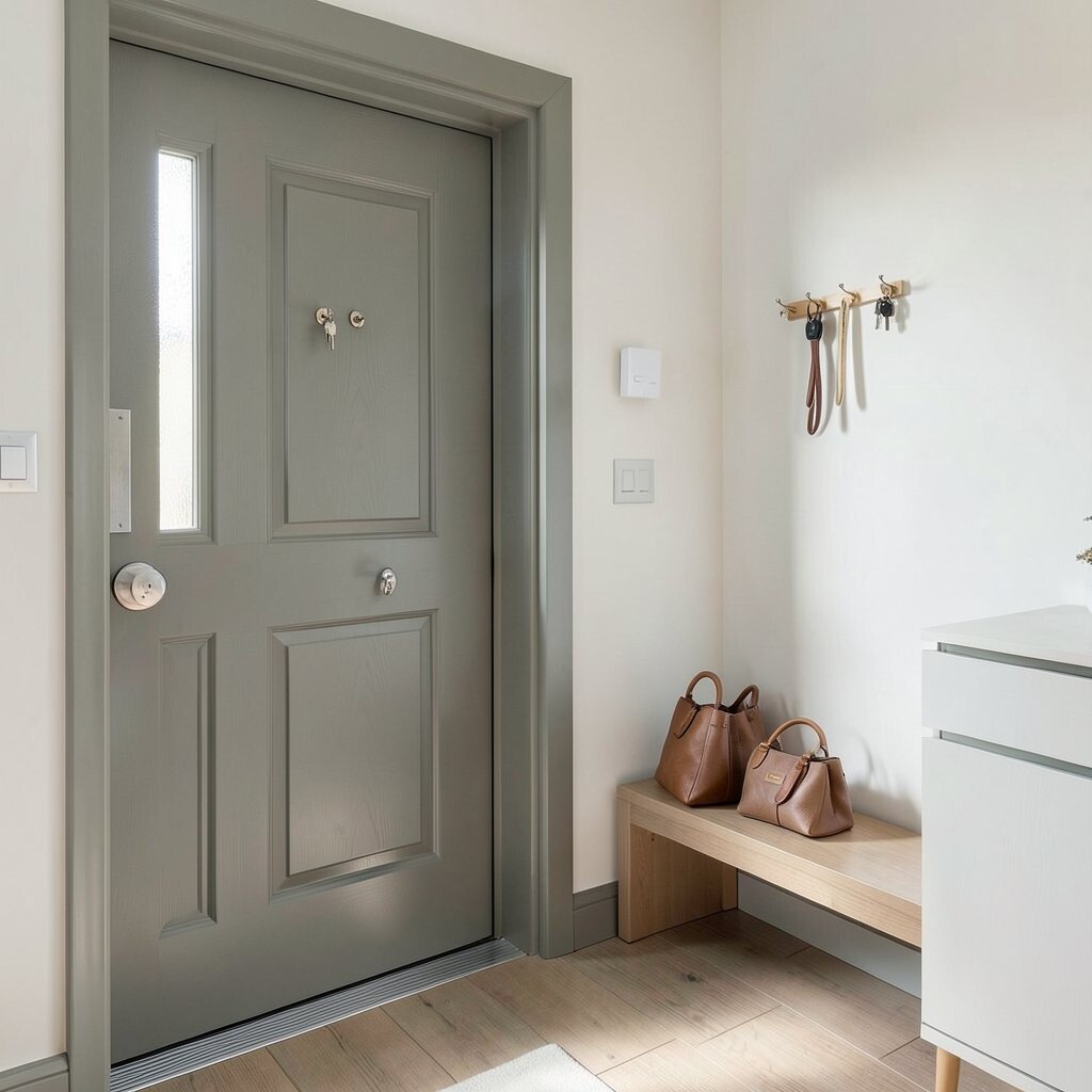
Instead of opening straight into the main room, build a small “buffer” right past the door. You can use a narrow console, a bench, or a slim cabinet so coats and bags have a calm place to land.
In a visual sense, this creates a soft welcome that looks intentional, not cluttered. It also helps traffic flow because people can stop briefly without blocking walkways, and that means fewer awkward jams. For personalization, match the surface color to your front door trim and add hooks that match your daily habits, like keys near eye level for mornings.
2. Walkway Loops Instead of Dead Ends
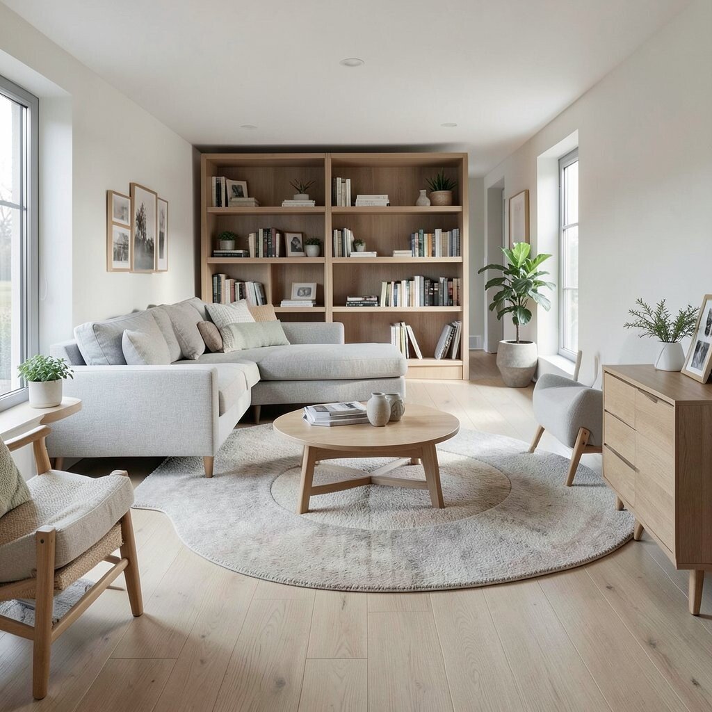
Design paths that curve gently or form a simple loop rather than pushing everyone into a dead-end hallway. A sofa, bookshelf, or low divider can guide movement so the room feels connected from multiple angles.
Visually, loops create a sense of rhythm, like the space has its own flow. You’ll feel it when cleaning is easier and furniture placement stays comfortable because people can circle without squeezing. If you live in a small home, try using consistent spacing from wall edges to keep the loop wide enough for everyday movement.
To keep cost in mind, work with what you already own by shifting one or two pieces to open sightlines. This layout idea also fits a current trend toward “living paths,” where furniture clusters encourage wandering and conversation rather than strict routes. Choose a rug that follows the loop shape so the path feels defined even with minimal changes.
3. Zoned Lighting That Follows Real Habits
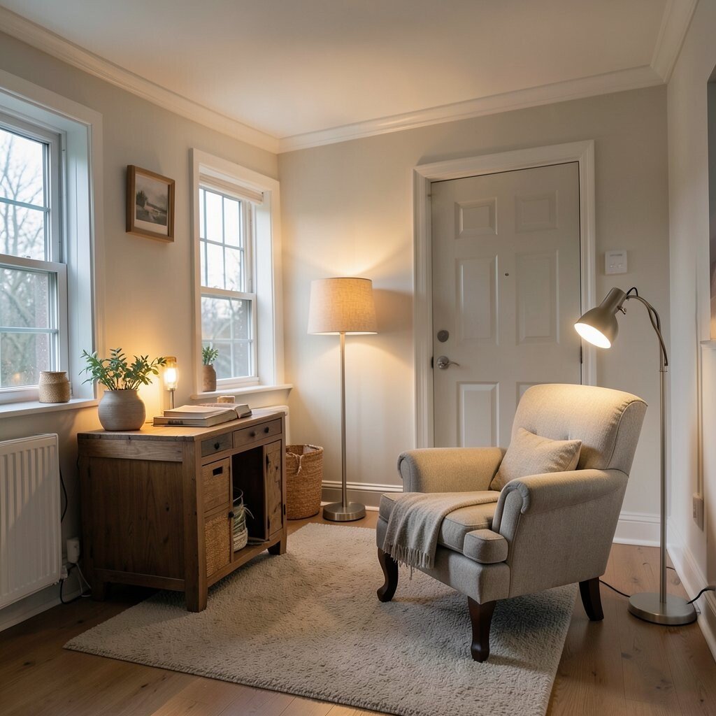
Place lights by task and mood, not by ceiling fixtures alone. Add a warm floor lamp near where you sit, a brighter reading light beside your favorite chair, and softer lighting around the entry.
When the room lights up in layers, it looks inviting and helps your eyes relax. You get practical benefits too, like less glare when you read and better visibility when you cook. For uniqueness, mix shades or materials, such as a fabric drum shade paired with a simple metal lamp base.
To personalize, map your routine and then decide where you want your brightest moment. Even on a budget, swapping bulbs for warmer tones and adding a couple of plug-in lamps can upgrade the feel fast. Current interior trends lean into warm, dimmable lighting because it supports both focus and unwinding.
Try using dimmers or smart bulbs if you want flexibility without moving furniture. Keep cords tidy by routing them along baseboards or using cord covers so the look stays clean.
4. The Multi-Height Seating Wall
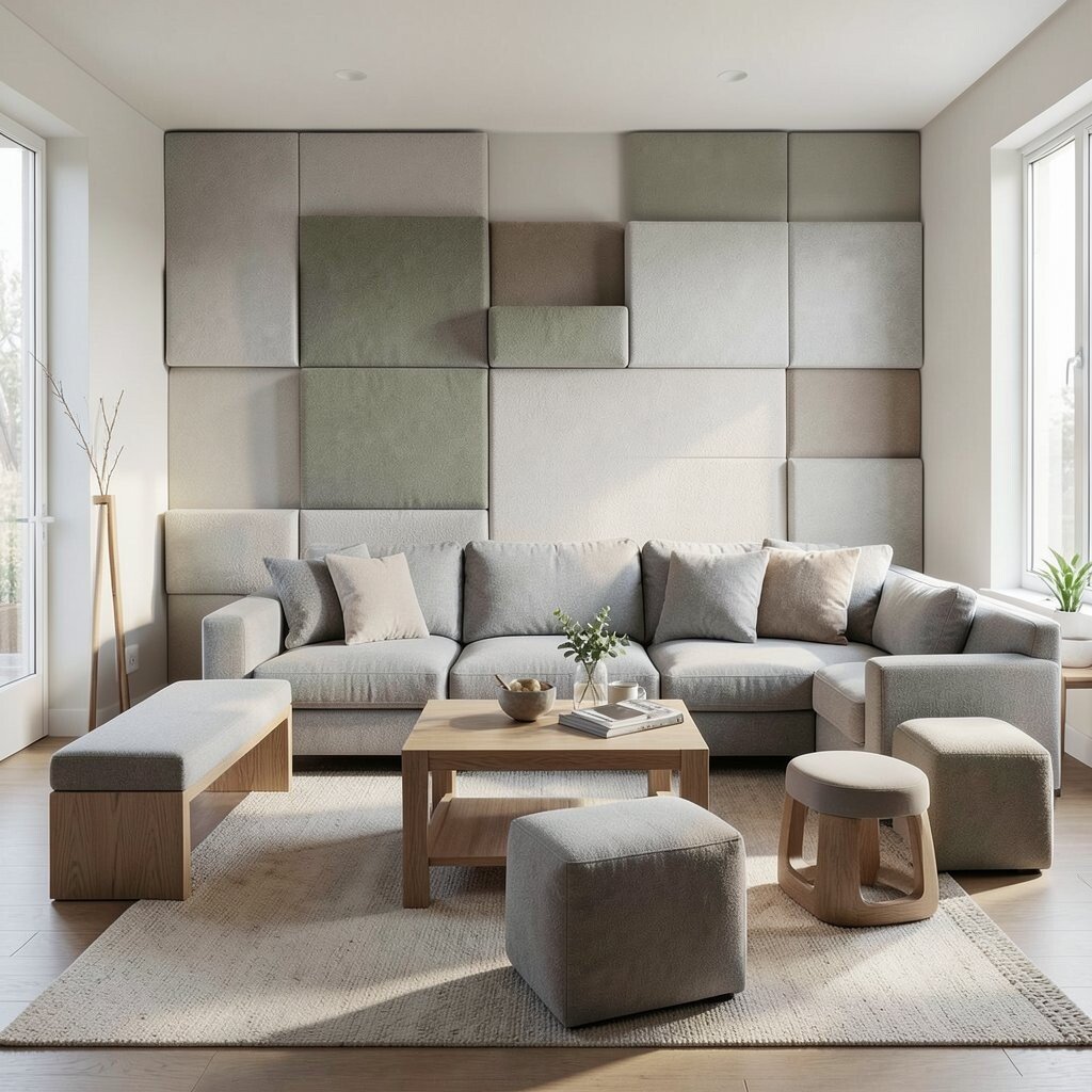
Create a seating zone using different heights instead of one uniform line of chairs. A low bench, a standard sofa, and a couple of accent stools can surround a shared coffee table without making the room feel tight.
This layout feels unique because it adds visual texture and creates natural “perches” for different moods. It also benefits daily life by giving you options for kids, guests, and quick chats. Keep practical comfort in mind by matching seat heights to how you actually use the space, such as adding a slightly higher stool for reading.
5. Storage That Hides and Reveals
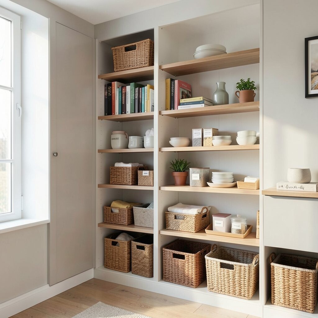
Mix closed storage with open displays so the room looks organized but not sterile. Cabinets for daily clutter can sit beside open shelves for things you love to see, like books, ceramics, or a small plant.
Visually, this keeps walls from feeling flat while still protecting your calm. It offers practical advantages too, because you can store what needs to be out of sight and style what can be on display. A useful personalization idea is to group items by color or by function so shelves look neat without constant reworking.
To control cost, start with one wall or one console, then expand later as your needs change. This matches current trends toward “lived-in beauty,” where storage doesn’t erase personality, it frames it. Use baskets, small trays, and labeled containers to keep open shelves tidy with less effort.
6. A Service Counter Between Zones
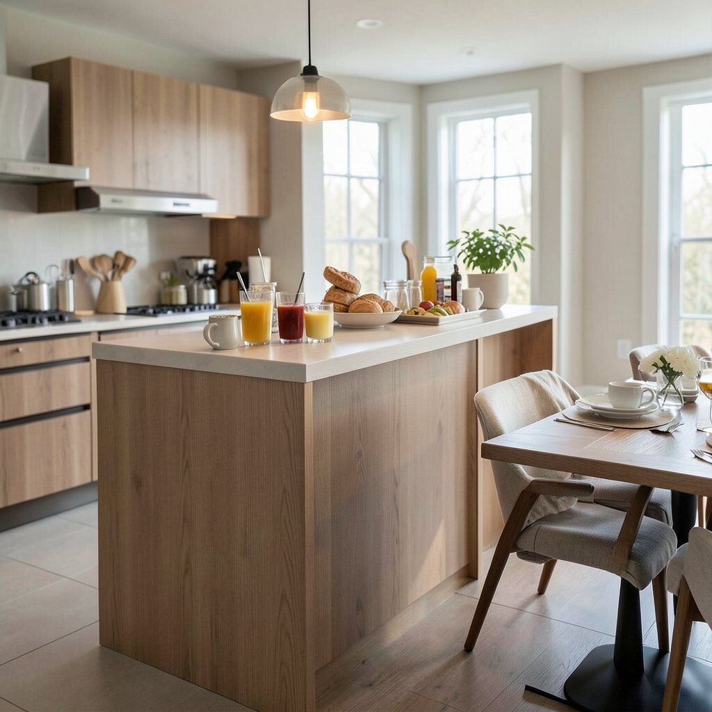
When two rooms feel like separate worlds, add a shared service counter that acts as a bridge. For example, position a narrow bar height surface between a kitchen and dining area to stage drinks, snacks, and daily items.
In a visual sense, the counter creates a clear boundary without fully closing off the space. It helps daily flow because you can prep and serve while still staying part of the conversation. For uniqueness, choose a countertop edge style, like a waterfall finish or a simple mitered edge, so the bridge looks designed.
Personalize it with a rail for mugs, a small drawer for napkins, and a tray for frequently used items. Keep costs reasonable by using a ready-made table top or repurposed furniture base instead of a full custom build. This also aligns with a trend toward flexible entertaining zones where cooking stays social.
7. The Focal Wall That Works Both Ways
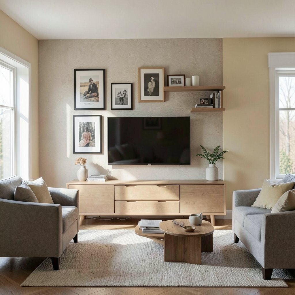
Pick one wall as the focal point, then plan furniture around it so the room looks intentional from many corners. A media wall, gallery wall, or feature color can anchor a space while storage and seating wrap around it.
Visually, your eyes land there first, and that makes the whole room feel calmer and more organized. The practical benefit is that you reduce random placement and make cleaning simpler because furniture can be arranged in a clear layout. For personalization, combine framed art with open shelving so the wall reflects your style, not just the TV or just the decor.
Cost considerations can be friendly here because you can start with paint, a few frames, and one well-chosen shelf. Current trends favor feature walls that mix warmth and function, such as textured finishes paired with practical units. If you rent, try removable wallpaper and a freestanding console to get the look without major changes.
8. Two-Sided Storage for Shared Rooms
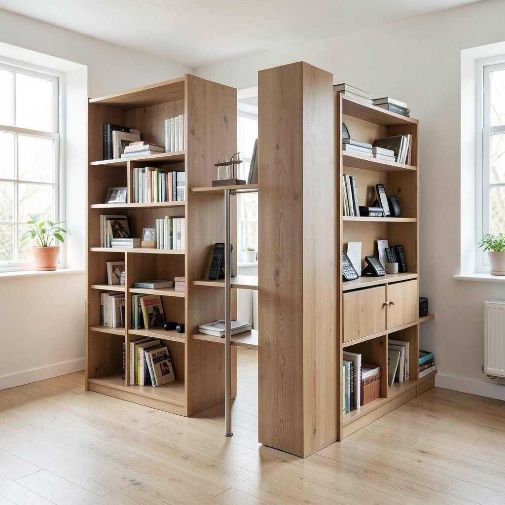
In spaces like studios or shared living rooms, use storage that can be used from both sides. A bookcase divider, a half-height wardrobe, or a sideboard with shelves facing two directions helps separate areas while keeping access easy.
This design looks smart because it turns storage into structure instead of extra furniture. It benefits you by cutting down on duplicated items and keeping things reachable without walking around the room. For personalization, place one side as a display and the other side as a “drop zone” for mail, small devices, or remote controls.
If budget is a concern, search for slim vintage pieces or modular shelving systems that you can start with and expand later. This layout matches current interest in “multi-use partitions” that maintain openness while improving order. Keep measurements tight so the divider still leaves comfortable walking space.
9. Ceiling-Mounted Zones for Clean Floors
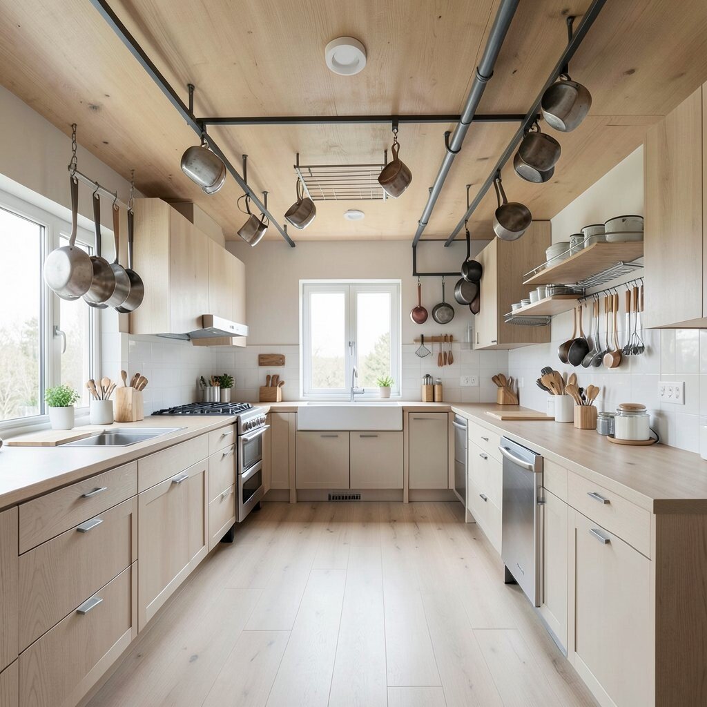
Use the ceiling plane to keep the floor clear by adding rails, hanging storage, or mounted hooks. In a kitchen, this can mean pot racks or a rail for cups; in a workspace, it can mean a hanging peg system for tools and supplies.
When you move storage upward, the room visually feels lighter and less crowded. The practical benefit is easier cleaning because you reduce clutter on surfaces and corners. For uniqueness, blend materials like wood and metal so the overhead structure looks like part of the decor.
10. Reconfigurable Furniture for Seasonal Life
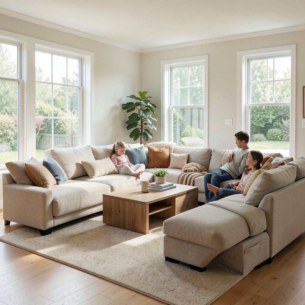
Choose furniture that can change roles as your needs shift across the year. A storage ottoman can become extra seating, a table can expand for gatherings, and a sectional can be rearranged to fit different layouts.
Visually, flexibility keeps the space from feeling stuck, and that can make it feel fresher without constant decorating. You gain practical benefits because you can adjust for parties, quiet nights, or family routines without starting over. For personalization, pick pieces in colors that work in multiple moods, like warm neutrals with one bold accent.
To manage cost, prioritize one or two flexible items instead of replacing everything. Current trends highlight adaptable living, because people want comfort that keeps up with real life, not a one-size plan. Look for modular designs and make sure the movement is easy enough that you will actually use it.
11. Mirrors Positioned for Gentle Light Stretching
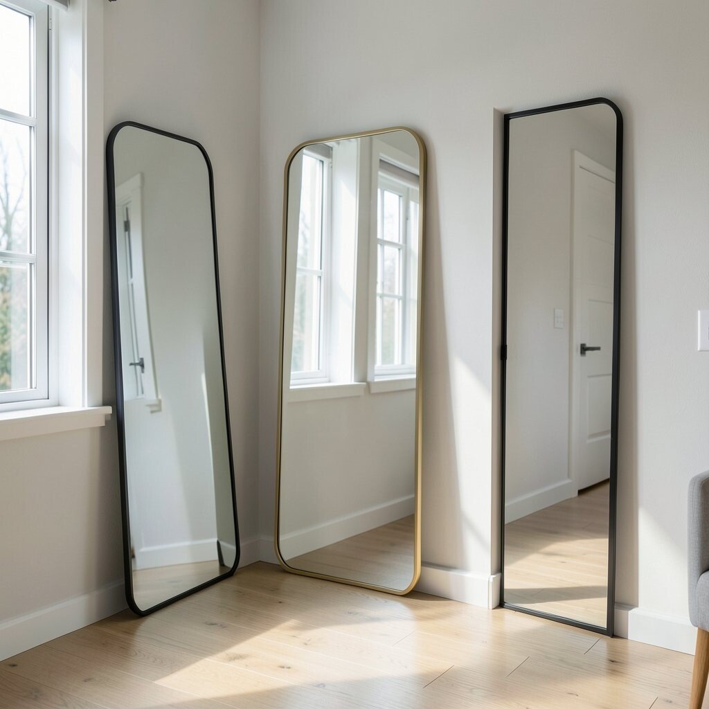
Place mirrors where they bounce natural light and extend the visual reach of a room. A tall mirror near a window can make a corner feel less tucked away, while a smaller mirror beside a doorway can make movement feel smoother.
Visually, mirrors add depth and a soft glow that makes spaces feel more open. The practical benefit is psychological comfort, because rooms with brighter light cues often feel calmer. For uniqueness, choose a frame style that matches your furniture, such as rounded edges for a softer look or dark metal for a modern feel.
Cost considerations are realistic too, because you can start with one mirror and build from there. This layout approach fits current trends toward “light management,” where design works with what you already have. Keep the mirror clean and avoid placing it where it reflects obvious clutter, since that can defeat the calming effect.
If you want a personalized touch, use a frame color that echoes your cabinet hardware or curtain rods.
12. The Appliance and Tool Landing Strip
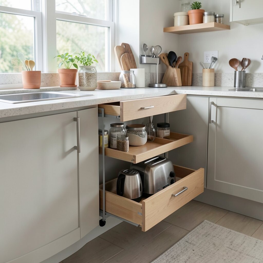
Plan one clear landing strip for tools and small appliances so counters stay tidy. You can use a slim cart, a wall shelf, or a dedicated drawer system near where you cook and prep.
Visually, this creates order by keeping the “busy zone” organized and consistent. It offers practical benefits because you find what you need faster, and you reduce the stress of searching while you cook. For personalization, design the strip around your most-used items, like a coffee scoop, a toaster, or a phone charging dock.
For cost considerations, think in upgrades rather than replacements, such as adding a drawer divider or mounting a small shelf instead of buying new furniture. Current trends favor countertop reduction and smarter storage, because small spaces especially benefit from less surface chaos. If your budget is tight, start with a single tray system and build the strip over time.
13. Micro-Privacy Niches in Open Plans
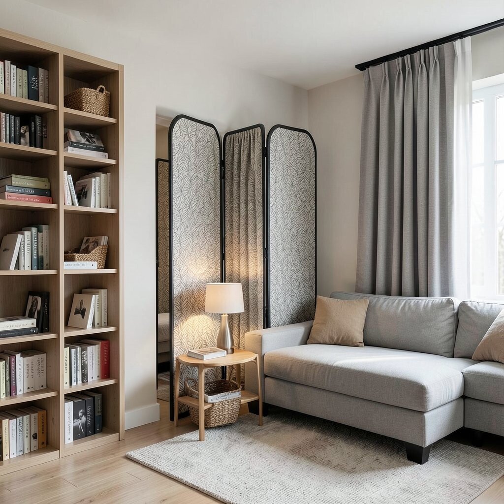
Even in open spaces, you can create micro-privacy niches for reading, calls, or quiet time. A tall bookcase, a folding screen, a curtain on ceiling track, or a corner sofa with a slight backing can define a calm pocket.
Visually, a niche breaks up the openness so the room feels layered instead of wide and empty. The practical benefit is that you can control sound and attention a little, which helps everyone feel more comfortable. For uniqueness, use fabric panels with patterns that echo your art or bedding so the niche becomes part of your style.
Personalization can be simple, like adding a small lamp, a side table, and a basket for your “current read” so the niche is always ready. To keep cost in check, choose movable dividers or curtain systems that you can install without major renovation. This matches current trends toward flexible home zones that support focus, rest, and everyday life without walls everywhere.
Consider sound too by adding a soft rug or curtains, since softness in the room helps conversations and quiet moments feel better.