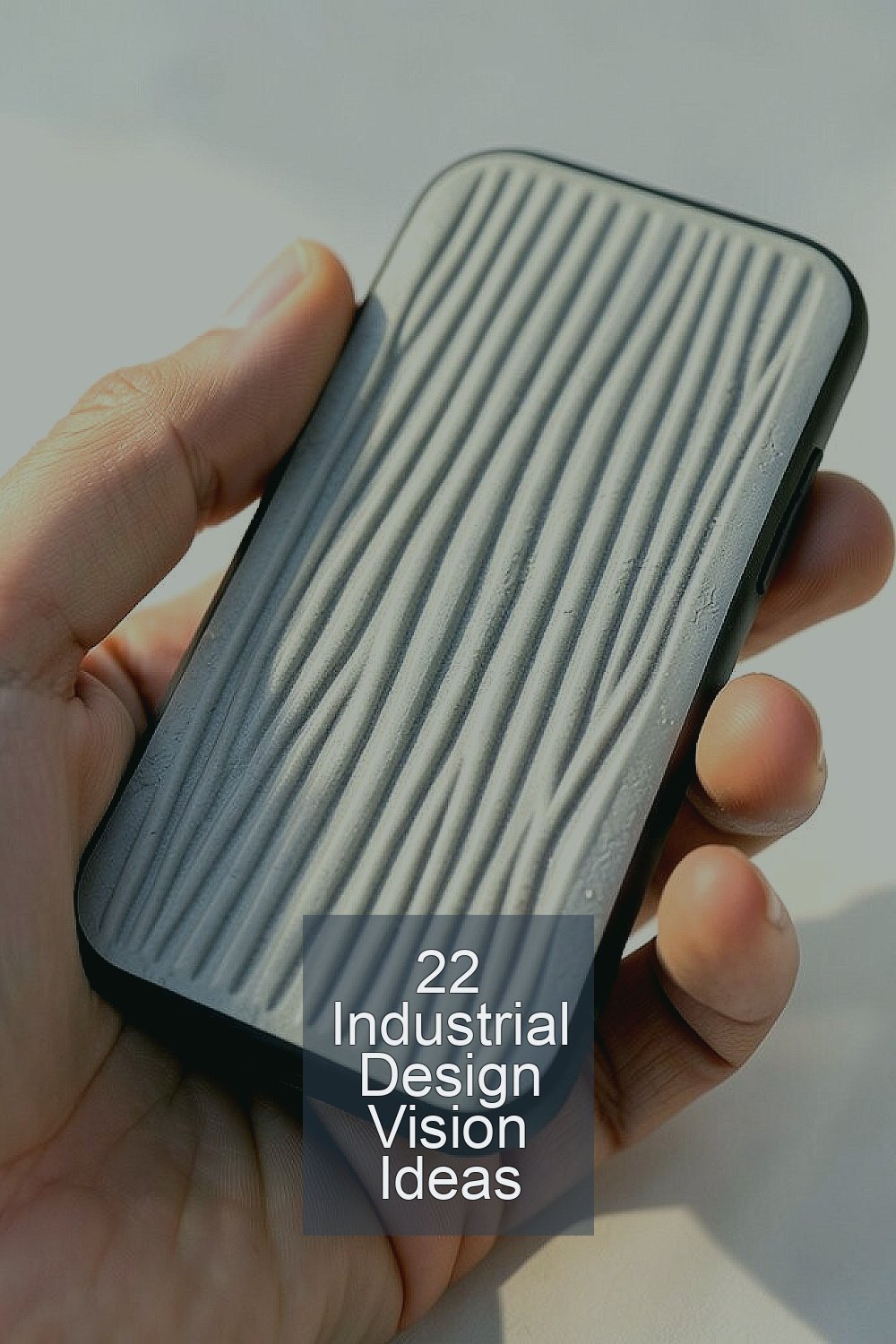
Great industrial design can make everyday objects feel like they belong in a future museum. It starts with small choices you can see, touch, and use.
When you mix style with smart function, your work looks bold without getting in the way. The ideas below help you build creative looks that also live well in real life.
1. Wind-Tunnel Groove Surfaces
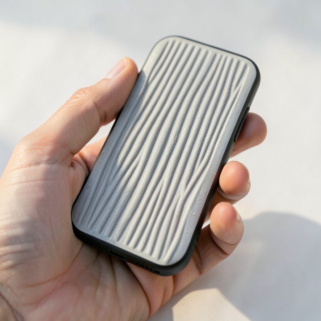
Imagine a handheld device whose skin has gentle channel lines like tiny airflow paths. The grooves catch light in soft streaks as you move it.
For a practical win, these channels can help hide fingerprints and reduce glare when you use the object outdoors. Keep the groove depth shallow and space them evenly so cleaning stays easy and the edges don’t feel sharp. To personalize, choose a groove pattern inspired by bicycles, skateboards, or even rain textures you like.
2. Magnetic Glow Edge Accents
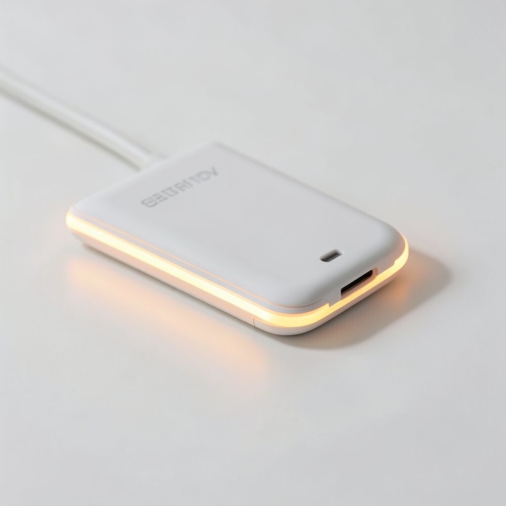
Picture a product with slim edge highlights that look like they glow, even when they are off. The effect comes from layered materials that reflect light in a warm halo.
Using magnetic edge accents also makes repair and upgrades much easier. You can swap the glow strips for different moods, like a calm tone for home and a higher contrast look for travel.
Start with widely available LED strip sizes and simple diffuser films so the build stays realistic. Keep power needs in mind, and plan where the battery or charging contacts will sit to avoid bulky spots.
3. Matter-Stacked Color Blocks
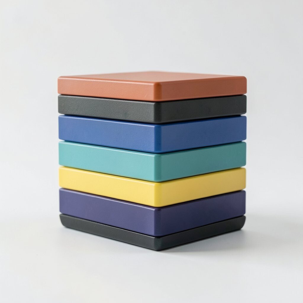
Think of a device shell built like stacked slabs, with each layer showing a different shade. The blocks create a strong silhouette from far away.
This approach adds uniqueness because the color is part of the structure, not just a sticker. You can also improve durability by using tough outer layers that take scratches while inner layers stay protected.
If you want it to feel modern, use a limited color family and vary the saturation instead of adding many unrelated colors. For cost control, choose two base materials and create the block look with surface finishes that are inexpensive to apply.
Personalize by matching the layers to your room palette or your brand mood, then keep the block angles consistent for a tidy design system.
4. Biophilic Texture with Leaf Vein Routing
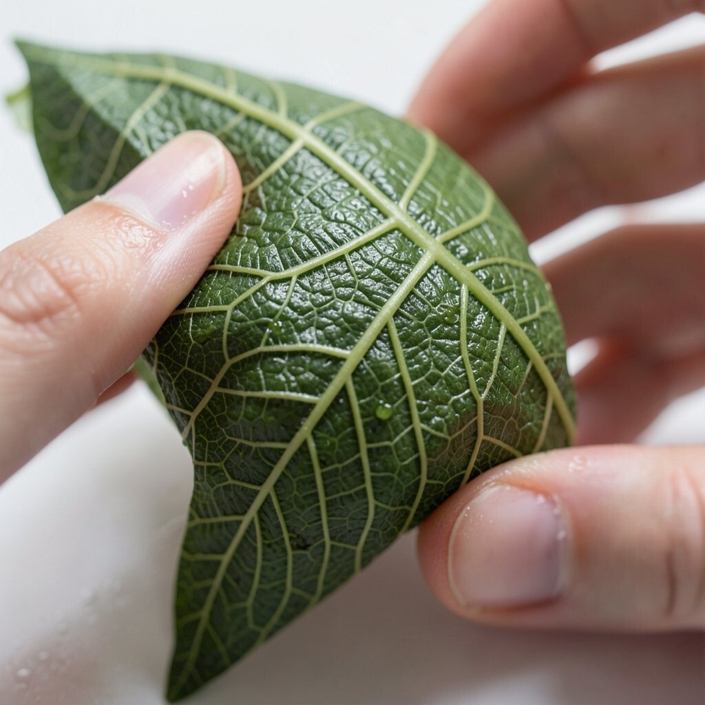
Imagine a grip area that follows leaf-like vein patterns, embossed into the surface. The texture feels alive, and it makes the object easier to hold.
This design can improve comfort because the raised micro-structure gives more control, especially when hands are slightly wet. It also stands out visually without needing loud colors, which helps it look premium.
Use a shallow pattern with rounded peaks so it won’t irritate skin or snag fabric. If you are prototyping, test several depths and spacing, then stick to the one that feels best in real use.
To personalize, borrow vein styles from plants you love, and keep the pattern scale tuned to the size of the grip.
5. Shadow-Layer Typography Panels
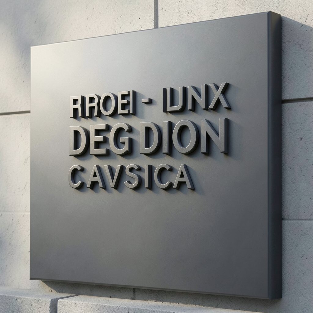
Picture engraved or raised text that seems to float above a panel. When light hits the letters, the shadow becomes part of the design.
This works well for practical labeling like model names, safety info, or usage icons that remain readable in different lighting. It also adds uniqueness because the typography becomes a visual texture, not just an afterthought.
Try contrast carefully so the text stays legible, especially outdoors. For cost, use one panel material and vary the finishing method, like matte plus gloss highlights, rather than making many parts.
6. Modular Dial Ecosystem
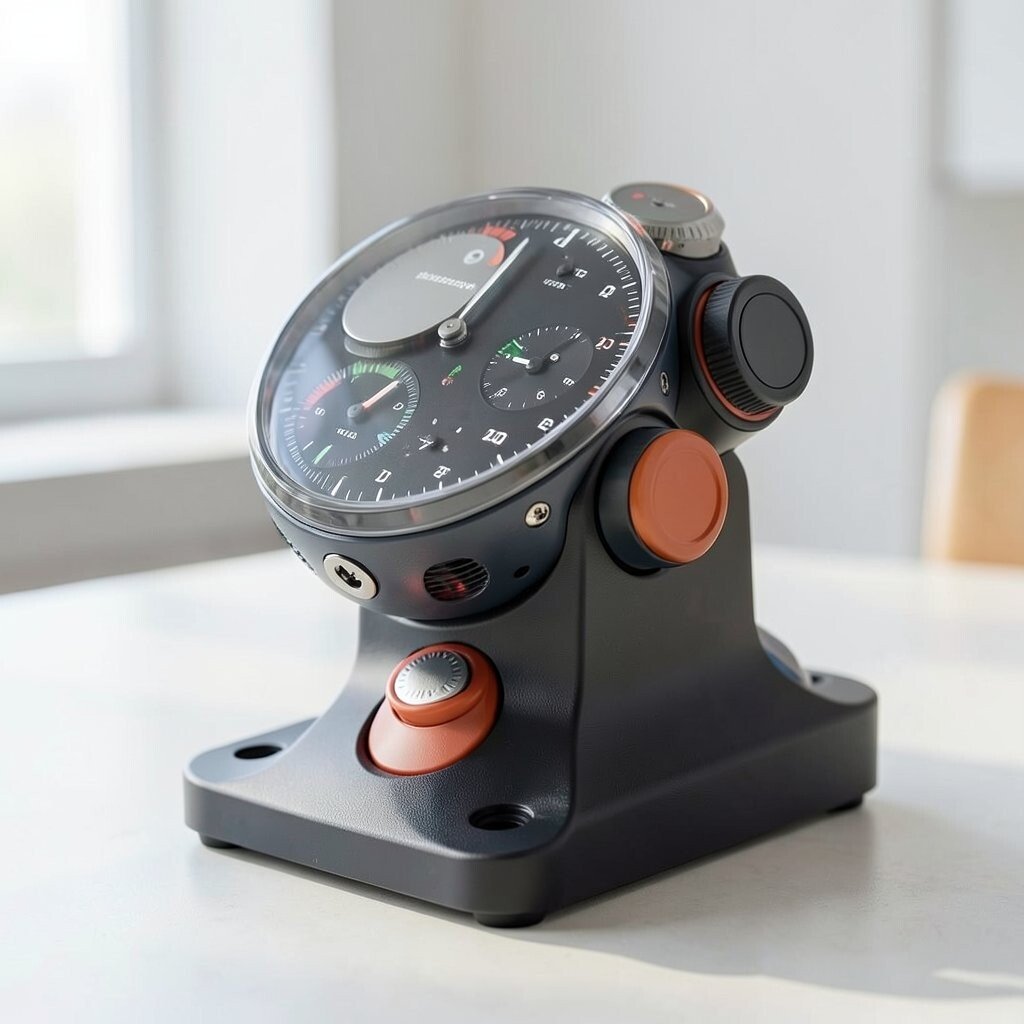
Think of a main body with docking points for different dials and knobs. The face looks clean, but it can change for new tasks.
Modularity is useful because you can update the look without replacing the whole product. It also supports personalization, since people can mix materials, colors, and knob shapes to match their style.
Keep the dial interface simple with magnets or a consistent mechanical connector so users don’t struggle. If cost matters, design one strong base housing and let only the dial modules vary.
7. Halo Vent Recesses with Hidden Airflow
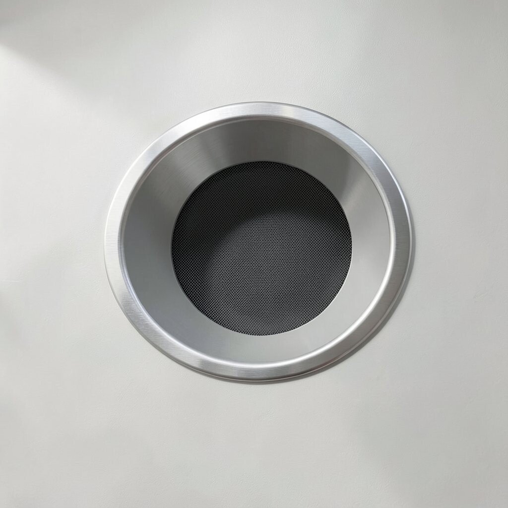
Picture vents as smooth rings that sit slightly recessed, like a calm halo around a hidden airflow path. The surface stays tidy while the inside does the work.
This look fits current trends toward cleaner faces and fewer visible moving parts. The benefits include better cooling performance and less dust buildup compared with wide open vent holes.
For practical tips, add a fine dust screen and test airflow with real conditions, not just a model. Personalize by varying ring diameter and the sheen finish, like brushed metal or soft powder coat.
When budgeting, focus on good airflow design first, because a pretty vent that underperforms won’t feel worth it.
8. Switchback Handle Geometry
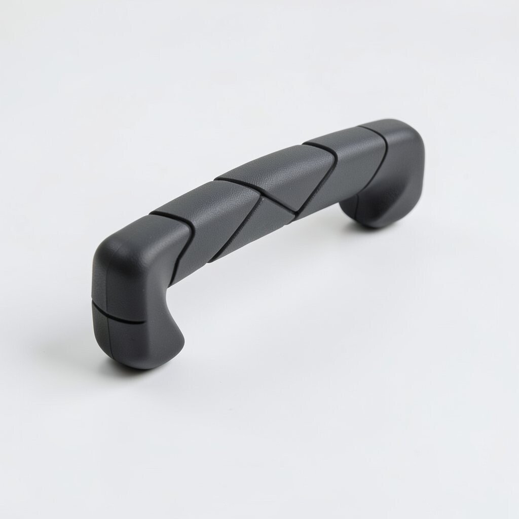
Imagine a handle that alternates angle direction along its length, like a subtle switchback trail. The design feels dynamic even when the object is still.
This geometry can improve grip because the shifting facets guide fingers naturally. It also looks unique, since most products use straight cylinders that feel predictable.
Use gentle angles and rounded corners so the handle stays comfortable. If you want to keep costs down, stick to one consistent moldable shape and refine the edges rather than adding many separate parts.
9. Ceramic-Like Coatings with Sanded Depth
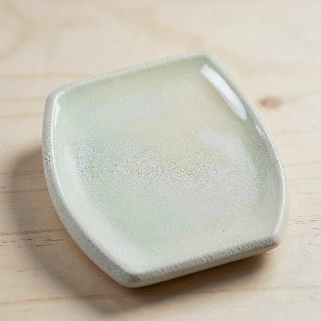
Picture a finish that looks like ceramic but feels soft and slightly warm to the touch. The surface shows micro depth from light sanding and clear coat layers.
Such coatings can hide small scuffs and reduce glare, which helps the product look fresh longer. For uniqueness, aim for a semi-opaque tone that changes slightly under different lighting.
Practical tip for makers is to test on scrap pieces, because the topcoat can shift color after curing. Personalize by choosing colorways that match seasons, teams, or your own photos, then keep the pigment system consistent for easy reordering.
10. Chain-Link Lanyard Attachment Points
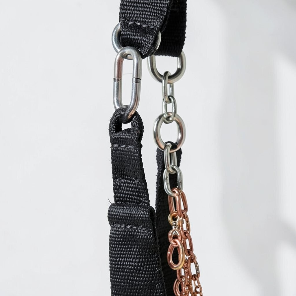
Think of a product that can hang, clip, or connect through decorative chain-link loops. The links become both a style feature and a real use tool.
This is a smart way to add uniqueness because many devices hide attachment points under covers. Benefits include easier carrying, quick swaps for straps, and less risk of losing small items.
For practical tips, use strong materials and design the opening so it won’t stress the hinge during daily movement. Cost considerations matter here, so use fewer metal pieces and focus on one reliable connection method that works with many accessories.
Personalization can be simple, like offering link colors or letting users add their own charms.
11. Fold-Down Stand with Origami Corners
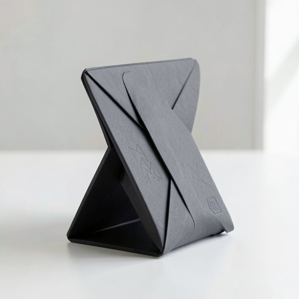
Imagine a device that stands upright using sharp, satisfying fold lines. The corners feel like origami, but they still stay durable.
A fold-down stand boosts usability for watching, calling, and working on the go. It also brings a current look because consumers like devices that feel clever and multi-use.
Keep the fold angles consistent and add a soft-release hinge so repeated use doesn’t squeak or wear out quickly. To manage cost, limit the number of materials in the stand and design it so it can ship flat for lower volume.
Personalize by offering different stand colors, or by embossing subtle patterns on the fold faces.
12. Gradient Lens-Like Faceplates
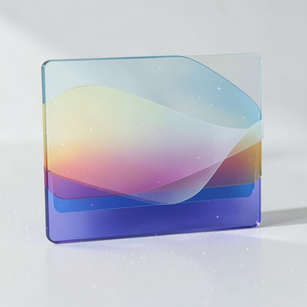
Picture the front panel as a gradient that looks like it’s made from stacked glass. From one angle it’s calm, and from another it sparkles.
Lens-like faceplates can add premium vibes without making the device feel fragile. Benefits include better visual depth and the ability to hide minor imperfections under the gradient layers.
Use layered transparent films or a controlled dye process so the gradient looks even across the whole surface. Practical tip is to match the gradient direction to the product’s motion, like making the brightest area where the user naturally looks.
Cost considerations depend on the finishing method, so compare suppliers early and request sample swatches before committing.
13. Reclaimed-Wood Look with Composite Strength
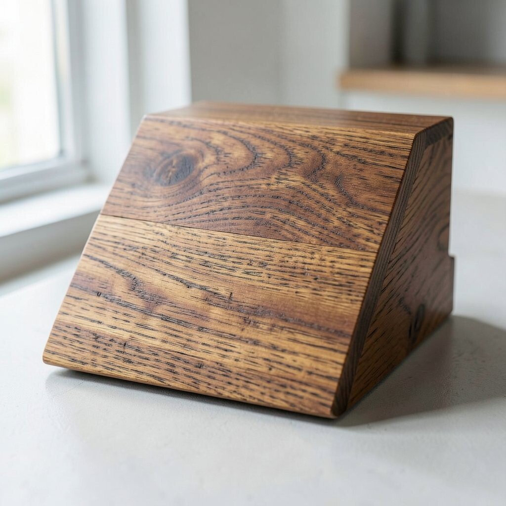
Imagine a modern object with a wood-like pattern that still feels tough and water resistant. The grain looks warm, but the material is engineered for daily life.
This gives uniqueness through contrast, mixing nature vibes with industrial clarity. The practical benefit is that it can take knocks and clean up easily compared with real wood.
Personalize by selecting grain direction, tone, and contrast level so each batch feels slightly different. For cost control, use a repeatable pattern on composite panels rather than custom wood cuts for every unit.
Also check current trends in sustainability storytelling, because buyers often appreciate designs that look natural while staying durable.
14. Tension-Rib Internal Frames Visible on Purpose
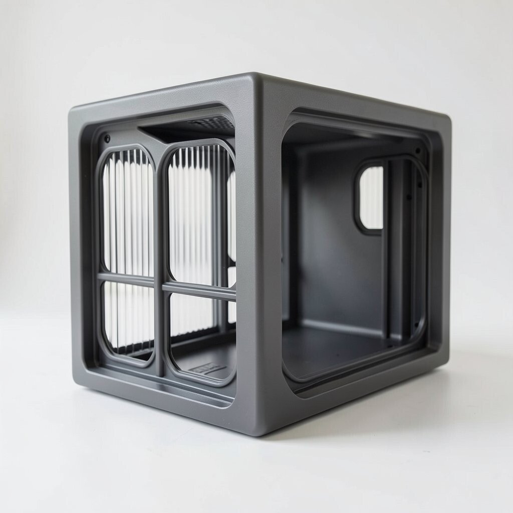
Picture a product shell with purposeful windows that reveal internal ribs like a skeleton. The frame looks strong, and the design tells you how it works.
Showing internal structure can improve trust because people can see build quality. It also offers uniqueness since many products hide everything behind smooth covers.
Keep the windows small and rounded so they don’t weaken the body or collect dust. Practical tips include using a matte interior finish to reduce glare and adding stabilizing ribs that meet real strength needs, not just design photos.
15. Soft-Touch Micro-Honeycomb Grips
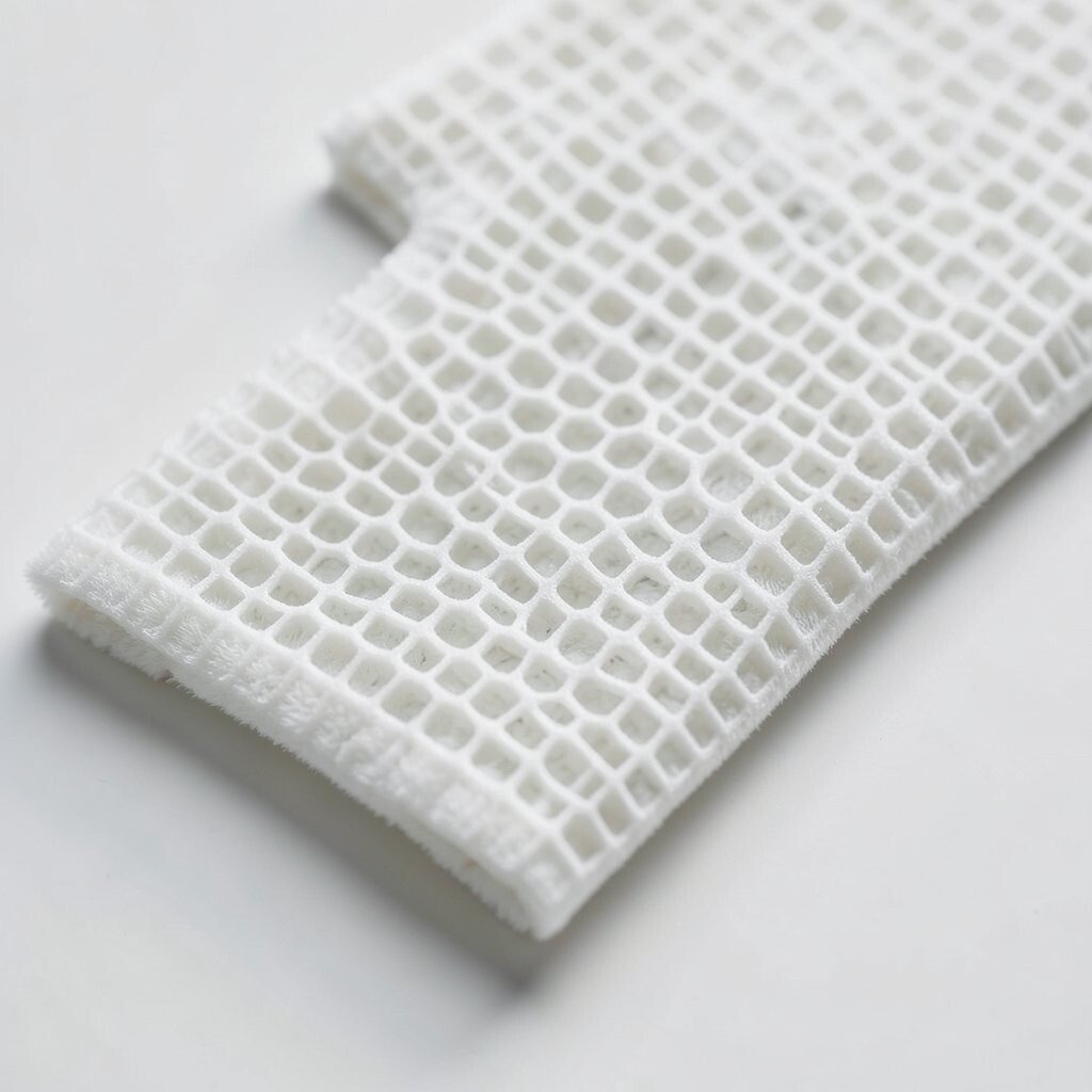
Imagine a grip surface that feels cushy but still has a crisp pattern underneath. The honeycomb texture makes the surface look almost woven.
This can improve comfort and traction, especially during longer use sessions. Benefits include reduced sweat feel and less sliding, and the honeycomb pattern hides tiny marks better than smooth plastic.
To personalize, change the cell size or align the grid diagonally for a more energetic vibe. Keep manufacturing in mind by testing how deep the pattern can go without creating weak points or difficult cleaning areas.
16. Tool-Free Snap-Lid with Patterned Seal Rings
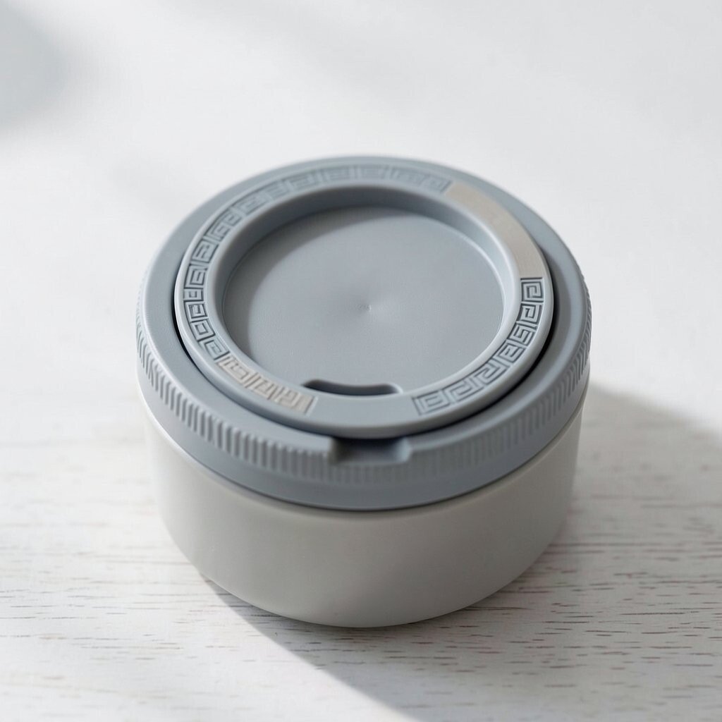
Picture a lid that clicks shut with a satisfying snap, no tools needed. The seal ring around it has a repeating pattern that looks intentional.
This design adds uniqueness because the closure becomes a visual signature. It also has practical benefits, like faster cleaning and easier access for refills, batteries, or inserts.
Plan for cost by using one main lid part and keeping the seal ring as a simple replaceable component. Personalize the seal ring pattern so users can swap it for different color themes without changing the whole lid.
Also consider trends toward quick-service and easy maintenance, since many people prefer products they can keep running.
17. Compass-Step Surface for Guided Finger Placement
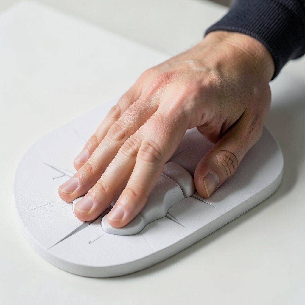
Imagine a surface with tiny steps like compass points that guide where your fingers rest. The object feels stable because your hand naturally finds the right spot.
Benefits include better ergonomics and a more confident grip for tasks that require precision. It also looks unique when the steps are subtle enough to feel tactile, not messy.
Use rounded steps and keep them low so they don’t catch on gloves or fabric sleeves. For personalization, rotate the step pattern around the product so each user can align it with their dominant hand.
18. Floating Keypad Tiles with Magnetic Alignment
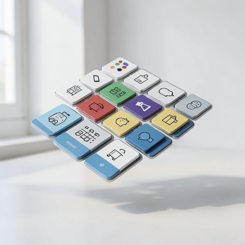
Picture a keypad made of separate tiles that appear to float slightly above the body. Each key clicks into place with a magnetic alignment feel.
This can feel playful and premium because users can swap tiles for different languages, icons, or difficulty levels. The practical benefit is also repair friendliness, since you can replace only worn tiles.
To keep costs in check, design tile layouts that share the same base shape even if icons differ. Trend-wise, modular interfaces are popular because people like customizing controls for different lifestyles and accessibility needs.
Personalize by offering themed tile sets or by allowing users to print icons on compatible inserts.
19. Rip-Stop Shell Fabric Look with Rigid Edges
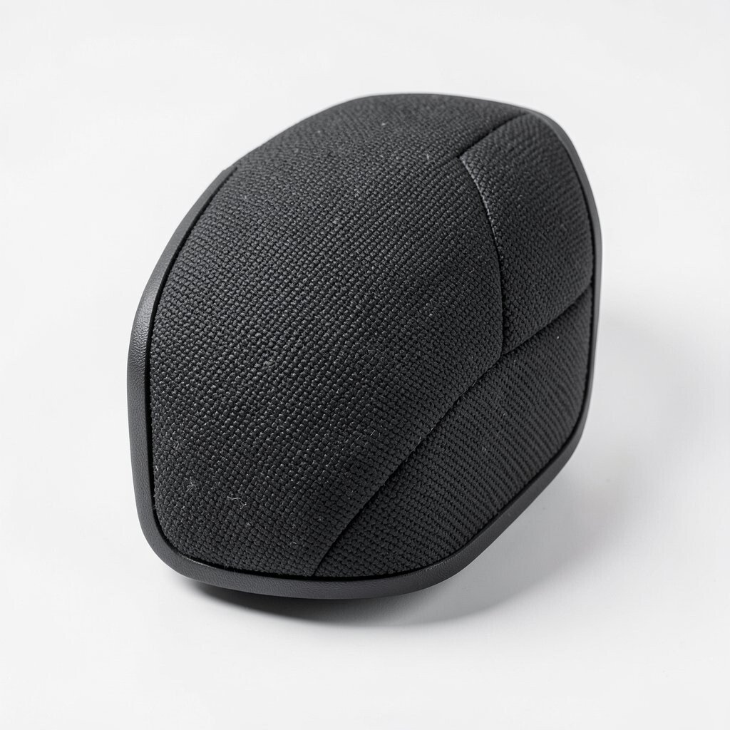
Imagine a rigid shell paired with a rip-stop fabric-like texture on key surfaces. The contrast gives a rugged feel, like gear made for real life.
This design is unique because it blends softness in appearance with hard structural edges. Benefits include better hand comfort and better scratch resistance on the texture zones.
Practical tip is to choose a texture finish that won’t peel at corners, since edges get the most wear. For cost considerations, focus texture only where it matters most and keep the rest simple and durable.
20. Prism-Bevel Reflective Corners
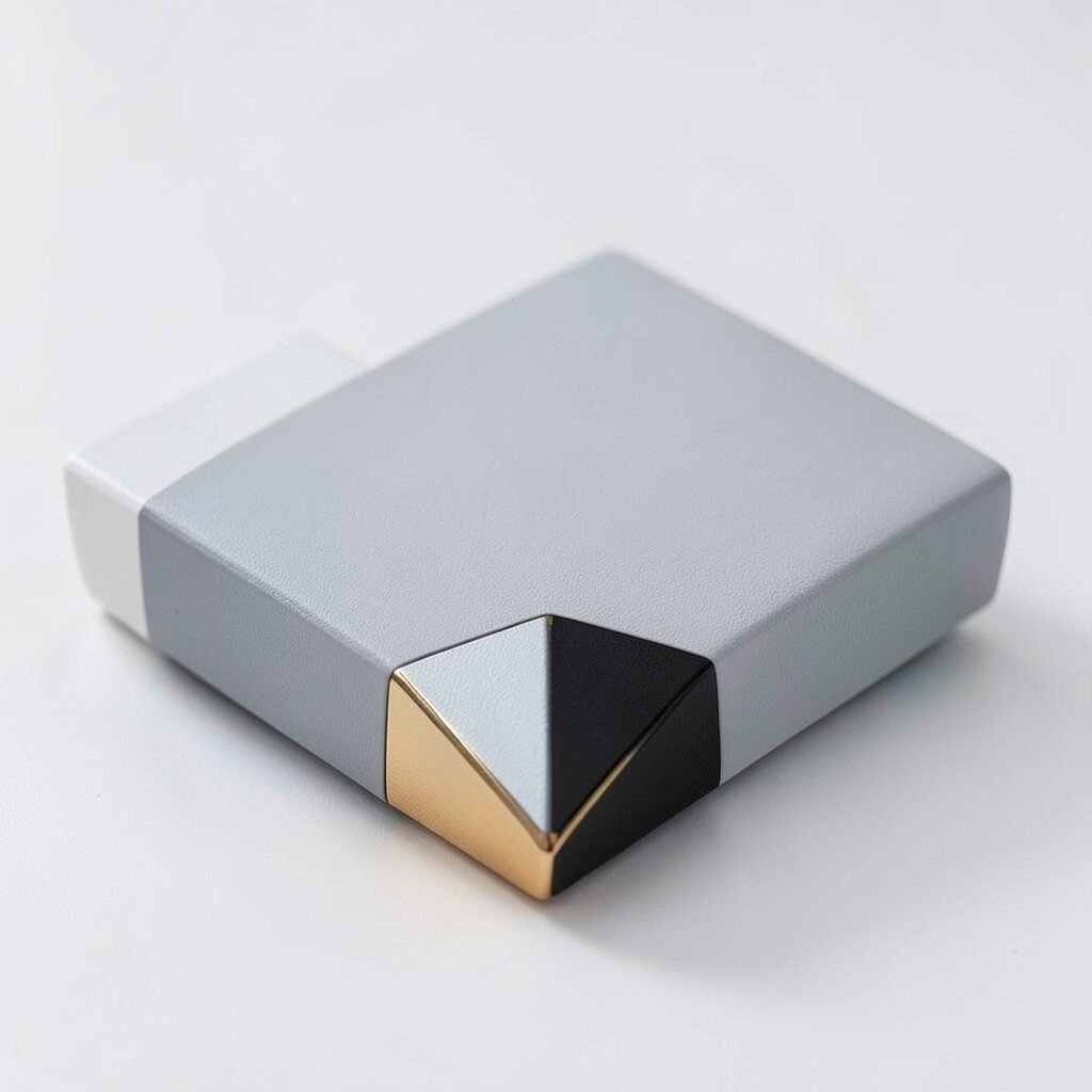
Picture corners cut with small prism bevels that throw tiny flashes of light. The product looks lively without turning into a disco ball.
These bevels can also reduce the harshness of hard edges, making the object feel more friendly. The uniqueness comes from how light plays differently as the object moves.
Keep bevel sizes consistent and avoid overly sharp geometry so it stays safe and comfortable. For practical tips, test reflectivity under bright indoor lights and outdoors, because some finishes look great in a photo but too harsh in sunlight.
Personalize by choosing a color tone for the bevel region, like cool gray, warm brass, or subtle black.
21. Minimal Labeling with Glow-Read Tool Icons
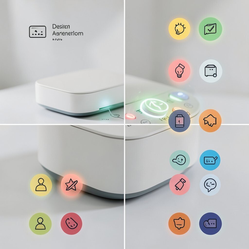
Imagine icons that appear only when you need them, like a faint glow readout near the controls. The front stays calm until the object is active.
This style fits current trends toward cleaner faces with smarter feedback. Benefits include less clutter, faster recognition of settings, and a premium look that feels intentional.
For practical tips, design the glow area so it doesn’t distract when the device is idle. Keep costs reasonable by using one light source and sharing the same illumination across multiple icons through simple masking.
Personalize by offering different icon packs with color and shape variations that match user preferences.
22. Curved Rail System for Accessory Sliding
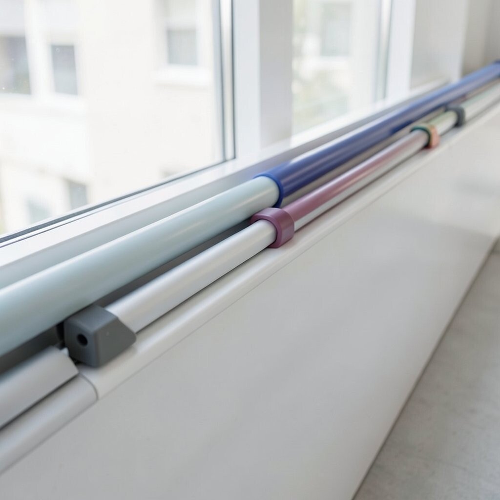
Picture a product with smooth curved rails running along the side, where accessories slide in like they belong there. The motion looks smooth and satisfying, like a camera lens track.
This gives uniqueness because the accessory system becomes part of the silhouette, not a clunky add-on. Benefits include flexible customization, easy carrying, and a way to keep accessories organized without extra bags.
Practical tip is to design for tolerance, since rails can feel stuck if they’re too tight. Consider cost by using the same rail profile across multiple accessory types and varying only the end clips or inserts.
Personalize by letting users swap rail colors or choose different accessory modules for travel, work, or hobbies.