A neutral palette can feel like a warm handshake every day. It brings calm to your space while still looking sharp and intentional.
1. Soft Ivory And Creamy Off-White
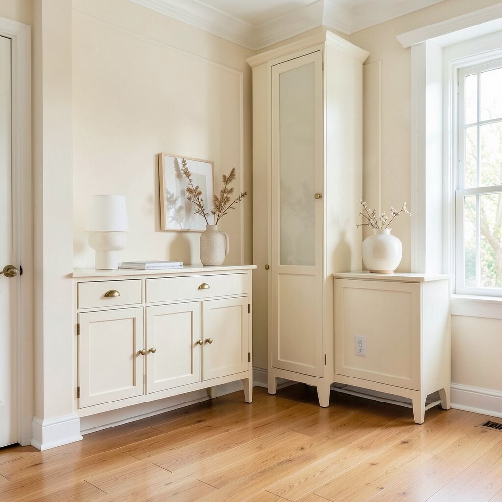
Soft ivory and creamy off-white set a classic tone without feeling plain. You get a light, airy look that makes rooms feel tidy and inviting.
Try pairing these shades with warm wood floors and brushed brass hardware for an easy, timeless combo. To personalize, shift the undertone slightly warmer if your lighting is cool, or slightly cooler if your room feels too yellow.
2. Greige Walls That Balance Warmth And Cool
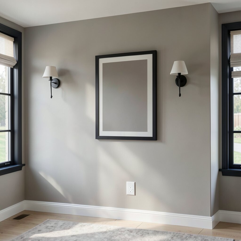
Greige sits right in the middle, so it flatters modern and classic styles at the same time. It looks smooth and steady, like a neutral suit that always fits.
For best results, test several samples on different walls because morning light and evening light can change the mood. Add contrast with darker accents like charcoal frames or blackened iron fixtures.
For cost control, paint walls with a reliable mid-sheen finish and save higher-end paint for trim if your budget is tight. Right now, many designers favor greige because it works with most furniture tones and camera-friendly lighting in photos.
3. Sand Beige For A Relaxed, Natural Classic
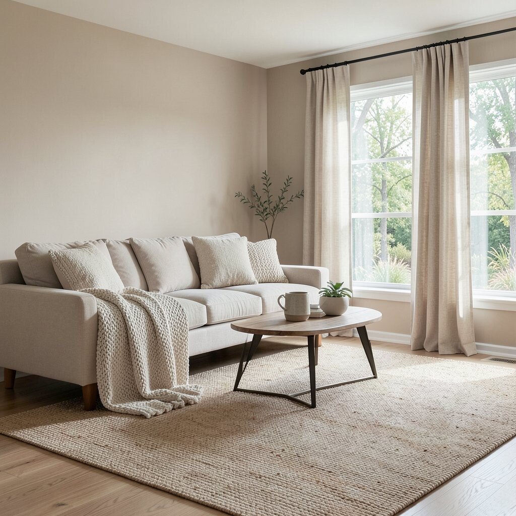
Sand beige brings the comfort of sunlit stone and linen. It gives your home a grounded look that feels lived-in but still polished.
Use sand beige on larger surfaces like living room walls, then keep textiles slightly varied so everything doesn’t blend into one big block. A chunky knit throw, a woven rug, or simple curtains can add texture without fighting the color.
To personalize, match the shade to the outside view, especially if you have trees, brick, or sand-colored landscaping nearby. If you want a classic look on a budget, choose one statement piece such as a larger area rug and let beige walls keep the focus calm.
4. Taupe That Looks Elegant In Every Light
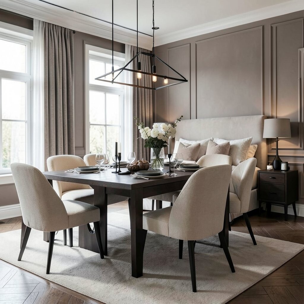
Taupe feels sophisticated because it holds both gray and brown notes. It makes furniture look richer and helps your decor feel curated.
Consider taupe for dining rooms and bedrooms where you want a quiet, steady vibe. Pair it with ivory accents and matte black details for a timeless contrast that stays trendy without trying too hard.
5. Warm Greys For Modern Classic Rooms
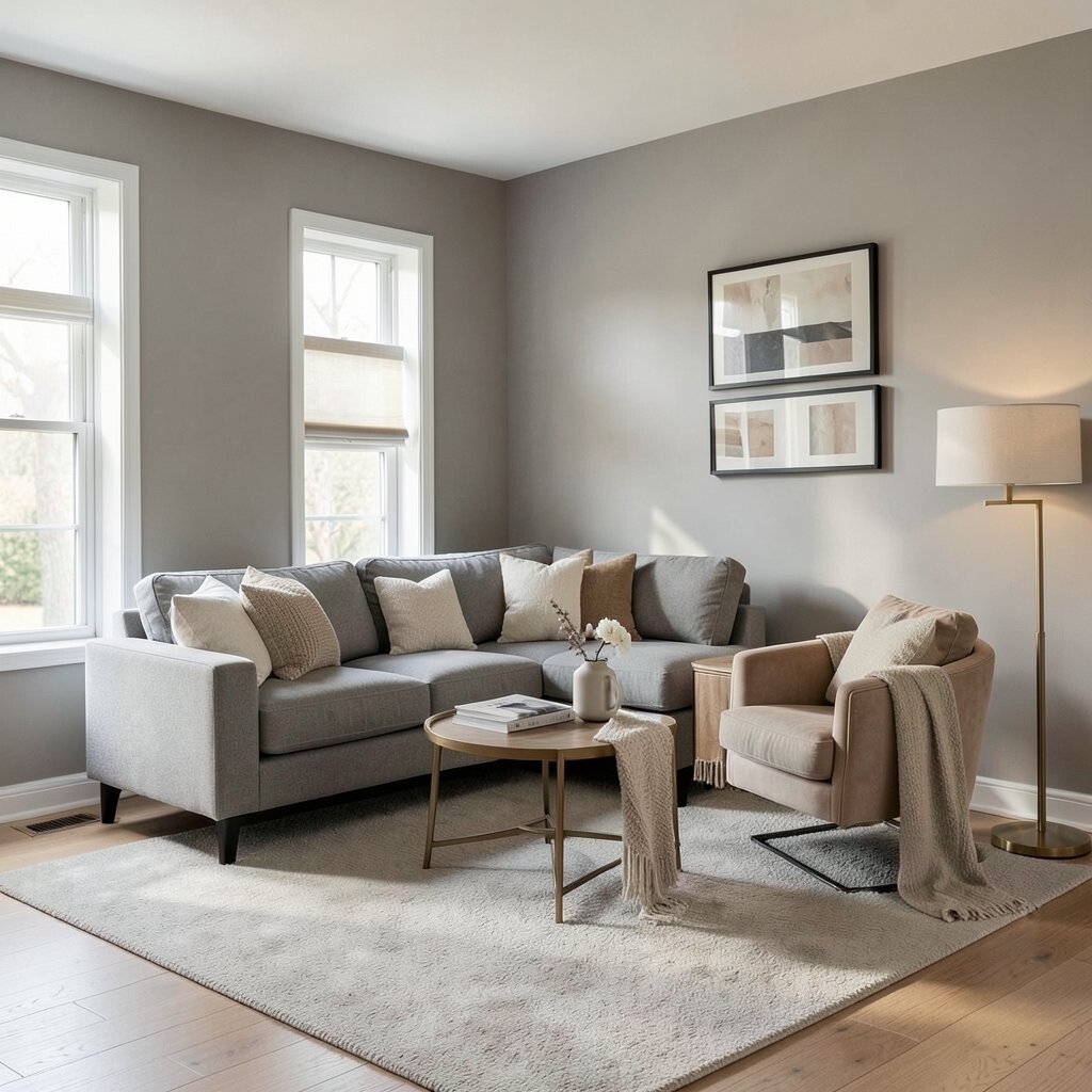
Warm greys add structure while still feeling cozy. They work beautifully when you want a classic foundation with the option to switch styles later.
Choose a warm grey with a hint of beige if your home has a lot of wood. Add depth with layered neutrals like oatmeal, cream, and camel so the space feels soft rather than flat.
For practical styling, keep wall paint one step lighter than your main rug so the room feels open. This is also a current favorite because warm greys photograph well and pair smoothly with mixed metals.
6. Cool Slate For A Fresh, Classic Edge
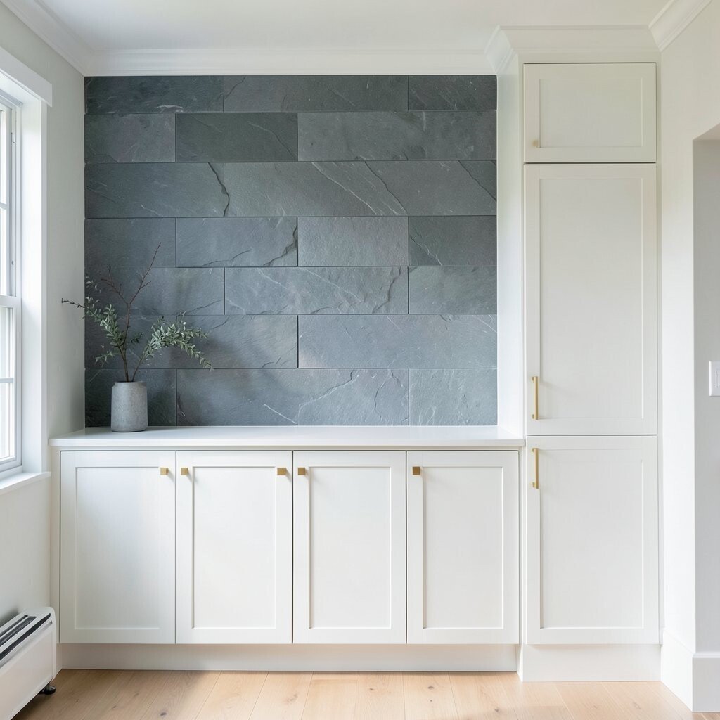
Cool slate adds a crisp, refined feeling without turning into a bold color. It can make your home feel calmer and more grounded at the same time.
Use slate as an accent for a feature wall, built-ins, or cabinetry, then keep surrounding colors light to balance it out. If you like contrast, pair slate with clean white trim and simple brass pulls.
7. Charcoal Accents For Depth And Definition
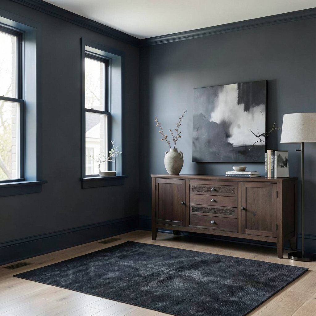
Charcoal is the secret weapon for making neutrals look intentional. It adds definition to rooms, especially where you want lines to stand out.
Try charcoal in smaller doses like window frames, picture ledges, console tables, or a dark rug runner. The benefit is that it helps every other neutral pop while still keeping the overall look classic and calm.
To personalize, choose a charcoal that leans slightly blue if you love a modern classic mood, or slightly brown if your home is heavy on warm wood. For cost considerations, repainting trim or switching hardware is often less expensive than major furniture upgrades.
8. Cocoa Brown For A Classic, Cozy Grounding
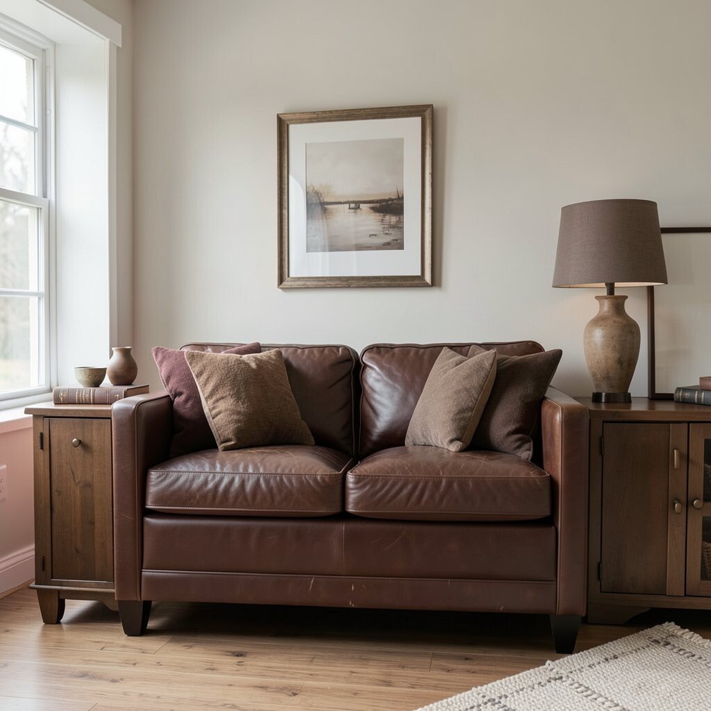
Cocoa brown feels warm and steady, like leather and well-worn books. It brings comfort while still reading as classic and mature.
Use cocoa in wood tones, leather seating, or lower cabinetry, and keep the walls lighter so the room doesn’t get heavy. A practical trick is to repeat the brown shade in small ways, like in throw pillows, a lamp base, or a picture frame.
9. Mushroom Beige For Subtle Sophistication
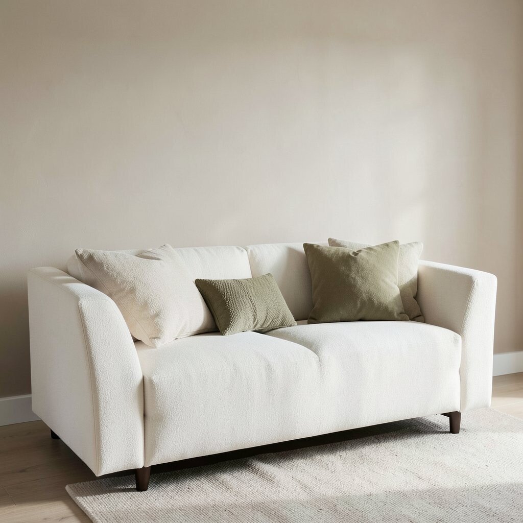
Mushroom beige gives a gentle, earthy softness that feels refined. It’s a neutral that doesn’t demand attention but still makes everything look put together.
Consider mushroom for walls or large upholstered pieces when you want a calm backdrop. Pair it with creamy whites and muted olive accents to keep the classic theme natural.
10. Oyster White For Crisp, Classic Cleanliness
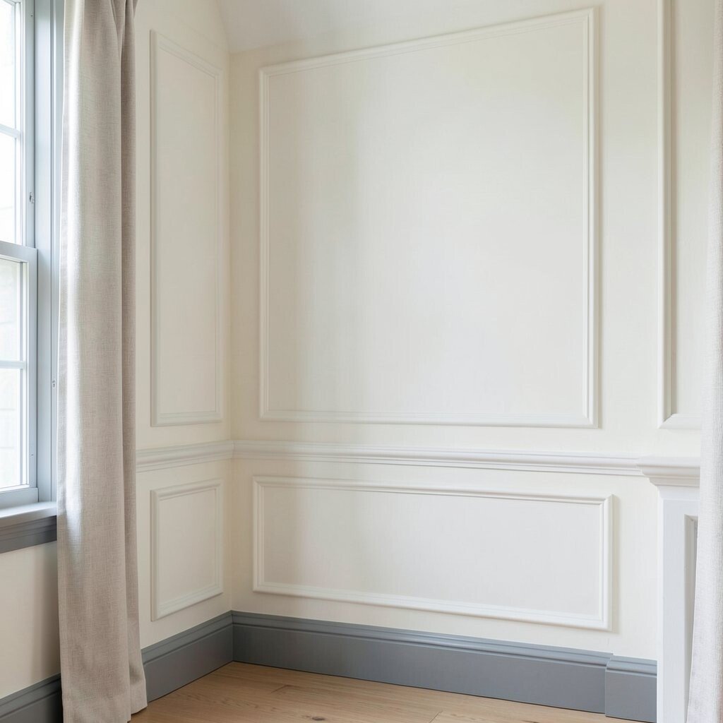
Oyster white sits between true white and warm cream, which makes it feel elegant. It gives your space a clean look without the harshness some pure whites bring.
Try oyster white on walls if you want brightness but prefer a softer feel. Add classic contrast with gentle gray trim, simple molding, or a textured linen curtain.
If you have cool daylight bulbs, oyster white can reduce the icy effect and keep colors looking natural. For personalization, pick one accent color like muted navy or soft olive and keep it small so the palette stays timeless.
11. Linen Gray For Casual Elegance
Linen gray creates an easygoing classic feel that still looks neat. It works well in spaces where you want comfort and light together.
Use linen gray on walls or bedding, and then layer it with off-white, taupe, and sandy tones. The benefit is that it hides small imperfections better than many bright shades, which is handy for everyday living.
For trend relevance, soft fabric-like neutrals are popular because they look warm and lived-in rather than sterile. To keep costs down, focus spending on textiles like curtains and duvet covers, which make the biggest visual change.
12. Olive Nude For A Timeless Natural Twist
Olive nude brings nature-inspired warmth to a neutral palette. It feels classic because it echoes plant tones that never really go out of style.
Pair olive nude with ivory, tan, and light oak for a look that feels both calm and interesting. Add a practical touch by choosing stain-resistant fabrics for upholstery if you live with pets or kids.
13. Putty Color For Calm Walls With Character
Putty color gives walls a gentle, velvety presence. It adds character without becoming dramatic or hard to match.
Choose putty as a main wall color, then add darker neutral accents like charcoal and warm bronze. You’ll notice the room feels cohesive because putty naturally links lighter and darker shades together.
For personalization, try textured finishes like matte paint or subtle plaster-style effects so the color looks rich. If you want classic styling on a budget, use putty walls to make inexpensive furniture look more intentional through contrast and texture.
14. Warm Ivory Trim For A Classic Frame Around Everything
Warm ivory trim makes the whole room look more finished. It’s like putting a neat border around your design, even when the rest stays neutral.
Paint trim, baseboards, and shelving in warm ivory to soften sharp edges and keep the style timeless. Pair it with medium or darker neutrals so the trim feels bright but not stark.
15. Beige Stone Tones For Architectural Calm
Beige stone tones mimic the look of natural surfaces and give a timeless calm. They pair well with classic architecture, including paneling and crown molding.
Use beige stone in entryways, bathrooms, or kitchens where you want a clean and steady mood. A practical tip is to choose grout, caulk, and hardware finishes that match the warmth of the stone tone to keep everything aligned.
To personalize, repeat stone tones across multiple materials, such as a stone-look countertop with beige wall paint. For cost considerations, a stone-look surface can be more affordable than real stone while still delivering that classic mineral feel.
16. Light Umber For Soft Depth Without Full Darkness
Light umber adds gentle depth, like the color of old paper and warm wood. It feels inviting and classic, especially in rooms that need a little more comfort.
Try light umber in rugs, accent chairs, or cabinetry, and keep walls a shade lighter to maintain an open feel. You can also add small pops of cream and brass so the room feels bright and polished.
17. Creamy Oatmeal For Relaxed Comfort
Creamy oatmeal makes spaces feel comfortable and softly refined. It’s the kind of neutral that looks good with everyday life, not just perfect styling.
Use oatmeal on large fabric pieces like sofas, drapes, or armchairs to create a welcoming base. For personalization, add a slightly darker neutral, such as taupe or cocoa, to prevent the palette from looking too uniform.
As a current trend, oat and oatmeal tones are popular because they feel cozy and warm in photos. For cost control, choosing a durable oatmeal textile can reduce how often you need replacements, especially in high-traffic areas.
18. Putty And Smoke Layering For A Designer Look
Layering putty and smoke creates a designer-like depth without using bold colors. It’s a classic trick because it builds dimension through shade rather than hue.
Start with a putty base on walls or bigger furniture, then add smoke tones through art frames, lampshades, and smaller decor. The benefit is that the room stays cohesive even when you mix textures like metal, glass, and fabric.
19. Classic Neutral With Warm Metallics For Shine That Endures
Pair neutral paint colors with warm metallics like antique brass, brushed gold, or copper to bring a classic glow. The room feels elevated because the shine adds movement and detail.
Keep metallics consistent in key places, such as cabinet pulls, light fixtures, and faucets, so it looks intentional. For practical personalization, choose matte finishes if you prefer a softer look, or satin finishes if you want a brighter, more traditional sparkle.
To manage cost, update just one or two high-visibility hardware areas first, then expand later if you love the look. Warm metallic accents continue to stay in style because they blend with neutrals easily and make classic palettes feel fresh.