The right wall print can make your office feel brand new without major changes. Small visual updates can boost focus, mood, and daily pride in your space.
When you choose art that matches how you work, the room starts supporting you. Below are practical, friendly ideas you can use right away.
1. Color-Field Abstracts
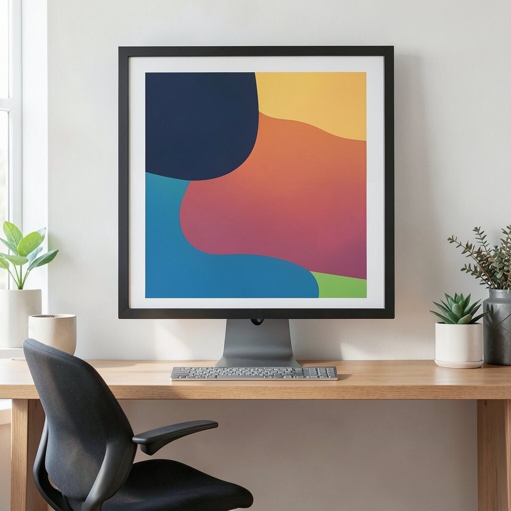
Pick a bold abstract print with thick shapes and gentle gradients. Let the colors echo items you already use, like your chair, desk mat, or notebook covers.
Place it where you spend the most time, such as behind your monitor. You will get an instant feeling of depth and calm, which can soften glare and reduce visual stress. For a budget-friendly approach, choose giclée posters or high-quality prints from local shops and frame them with a simple matte frame.
2. Framed Botanical Presses
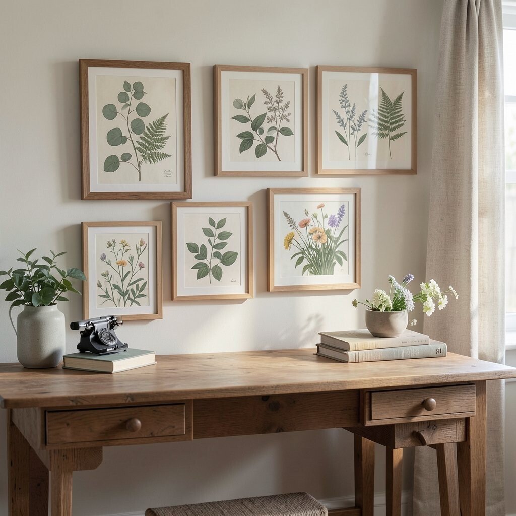
Hang botanical prints that look like old-fashioned plant studies. The delicate lines add a natural touch and make corners feel more alive.
Choose one consistent theme, like eucalyptus, ferns, or wildflowers, so the room feels pulled together. This style is unique because it blends calm details with a tidy, organized vibe. To keep it practical, select prints with muted greens and cream tones if your desk already has many colors.
You can also personalize by matching the leaves to colors found in your workspace, such as your curtain fabric or rug. If you want to save money, look for smaller frames and group them in a neat grid on the wall. Current trends favor layered nature themes, especially when they pair well with warm wood and soft lighting.
3. City Maps With Typographic Charm
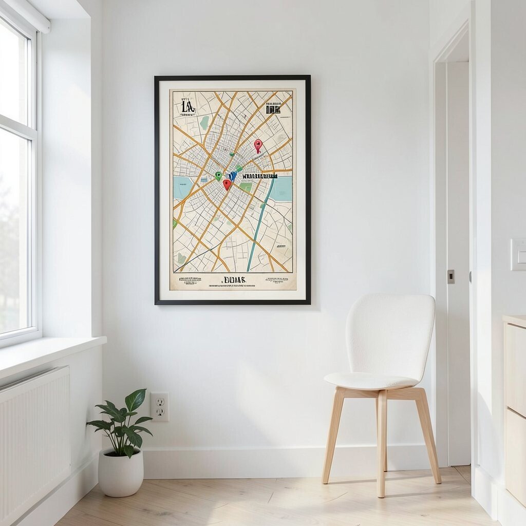
Find a print of a map with clean typography and a slightly vintage vibe. Even if you do not travel often, a familiar street layout can make your office feel more personal.
Pick a neighborhood you love, your hometown, or the place where you made an important life choice. This creates uniqueness because the art carries meaning, not just style. It also helps benefits like focus because the visual pattern gives your eyes something pleasant to rest on while you work.
Use practical placement by hanging it at eye level near a reading spot or in the hallway by your desk. For personalization, select a map print that includes your favorite landmark highlighted in color. If cost matters, buy an affordable map poster and frame it yourself with basic glass, which still looks polished.
Many people now choose minimalist map prints paired with lots of white space, which keeps the room feeling fresh and modern.
4. Monochrome Photo Strips
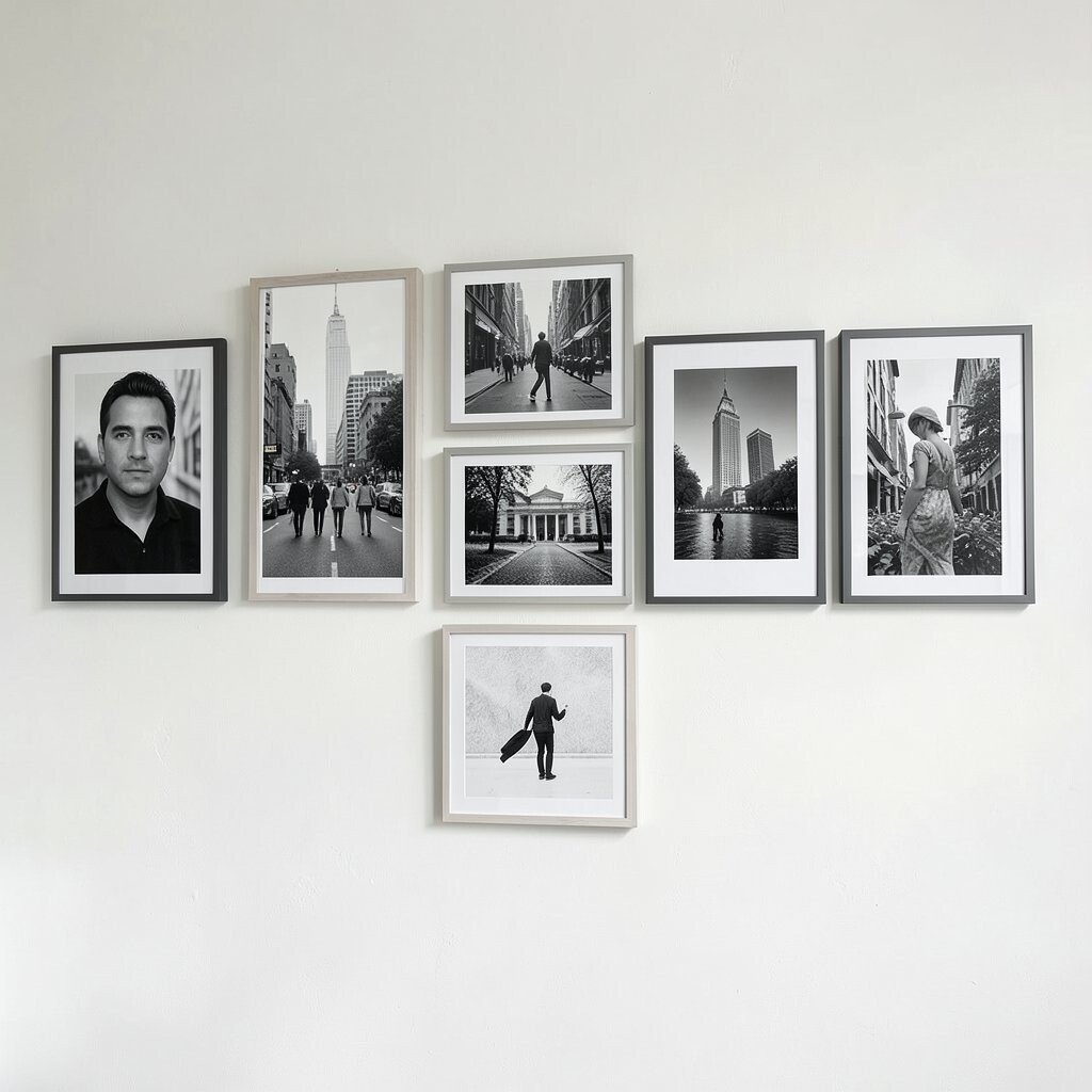
Create a gallery feel without clutter by using monochrome photo strips. Think black-and-white portraits, street scenes, or simple landscapes with strong contrast.
Arrange them horizontally so the wall feels wide and open. This can benefit your space by balancing busy desks, because the photos look neat and consistent. Choose prints that match your theme, like all city, all nature, or all architecture, so it feels intentional and not random.
If you want a quick personalization idea, print a few photos from your own life and keep the rest themed. Frames can be simple and matching, which usually keeps cost lower while still looking high-end. A current trend is using uniform frames with slight spacing, which gives a modern rhythm to the wall.
5. Motivational Quote Posters With Soft Fonts
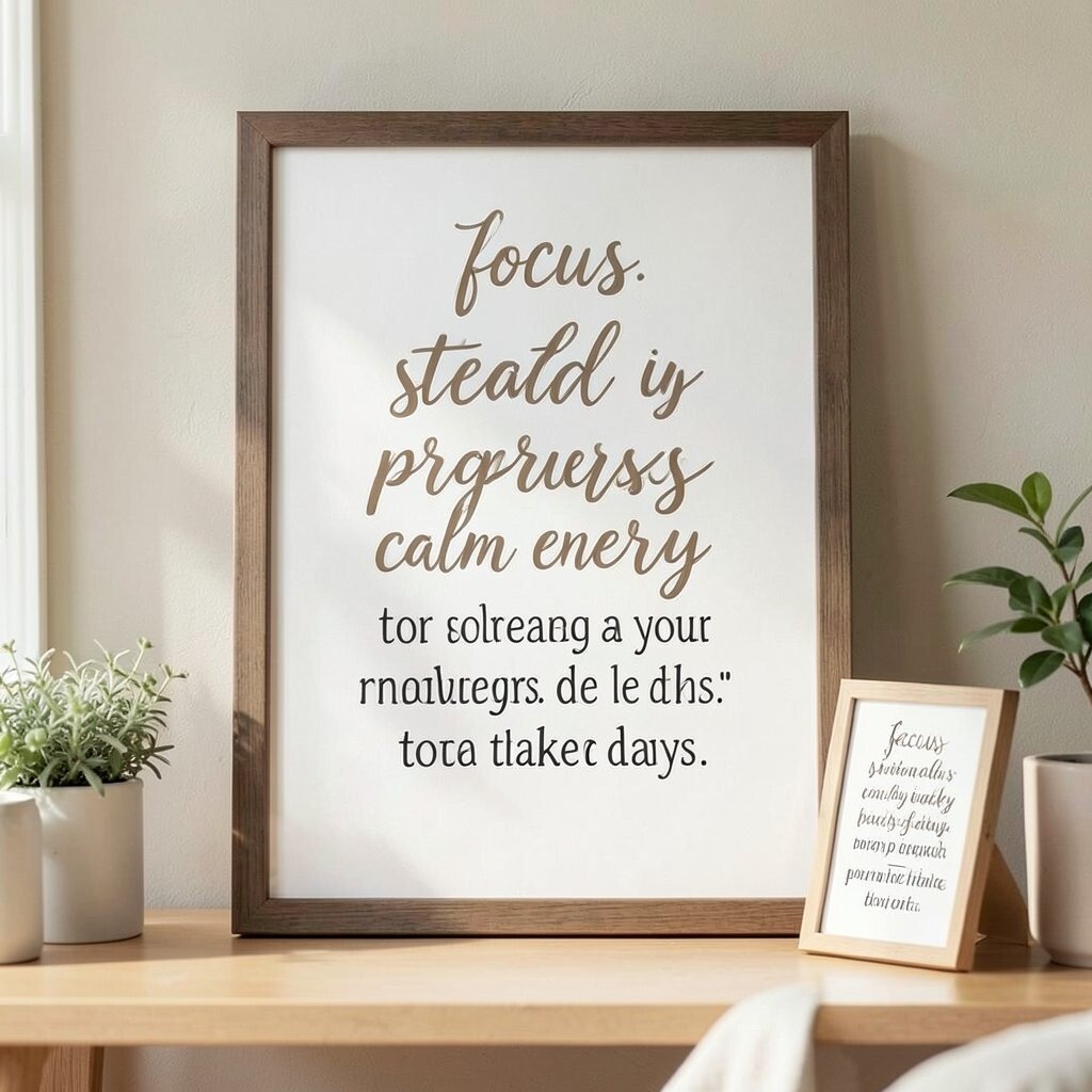
Pick quote prints with gentle lettering and lots of breathing room. The message should feel supportive, not pushy, so it stays inspiring on busy days.
Choose words that match your work habits, like “focus,” “steady progress,” or “calm energy.” This brings benefits because a positive reminder can make hard tasks feel more doable. Make it practical by sizing the text to read easily from your chair, then placing it where you naturally look when you take breaks.
Personalize by selecting a quote that reflects your team values or your personal routine, like a daily mantra. For cost considerations, start with one framed print and add inexpensive matching prints later if you enjoy the look. Current trends lean toward softer typography, muted inks, and warm backgrounds rather than harsh neon colors.
6. Patterned Geometric Prints
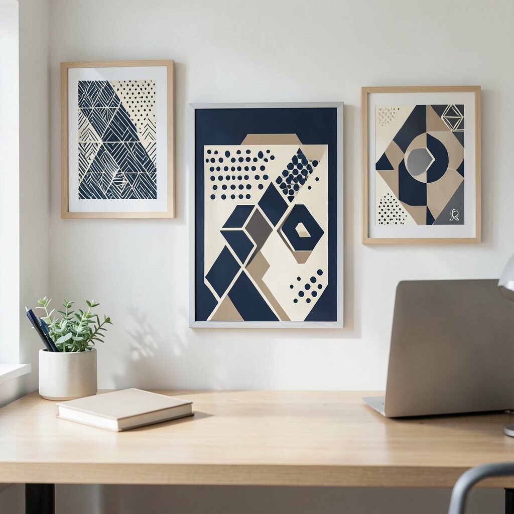
Choose geometric prints that feel crisp and tidy, like triangles, lines, or repeating dots. These visuals can bring energy to your desk without making the room feel chaotic.
Use colors that work with your existing palette, such as navy and cream or charcoal and tan. The uniqueness comes from how geometry creates a subtle sense of movement, which can help you stay alert. For practical tips, pick a print that is not too busy, so it supports your work instead of competing with your documents.
If you want a personalization idea, match shapes to icons you already like, like hexagons for a tech theme or circles for wellness. To manage cost, choose removable frames or simple poster frames you can reuse for other prints later. Many offices now favor geometric patterns because they look modern and pair easily with clean desks and neutral furniture.
7. Vintage Travel Posters For Calm Daydreaming
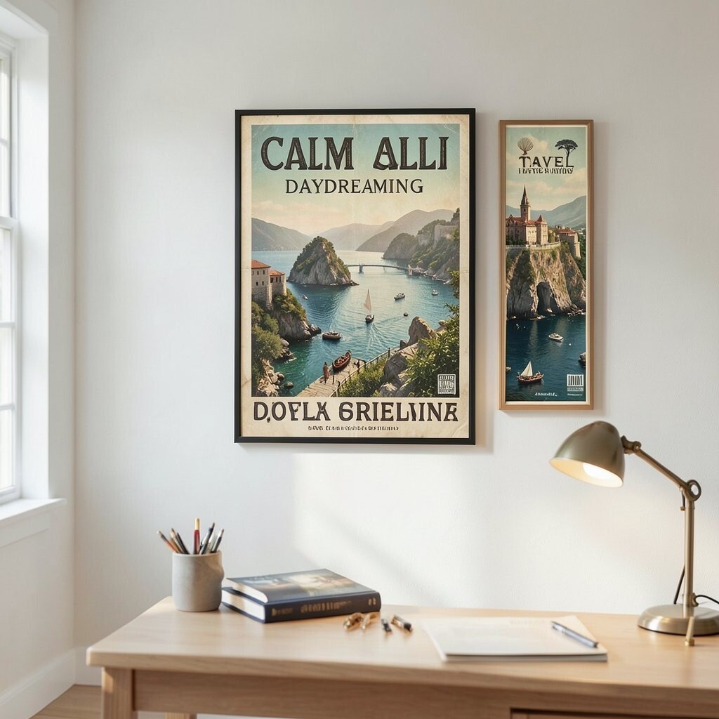
Hang a vintage-style travel print that feels like a soft memory rather than a loud advertisement. Look for muted colors and classic typography that gives your room personality.
This option is unique because it blends nostalgia with motivation, which can brighten long work sessions. It also brings a benefit by giving your eyes a relaxing scene to glance at during breaks. Place it where natural light touches it gently, so the colors look warm instead of washed out.
Personalize by selecting a destination you want to visit or a route you once took. For cost considerations, posters are usually cheaper than framed art, so you can buy the print first and upgrade the frame later. Current trends show more people using travel prints as a way to create “story” walls in home offices.
Keep it practical by choosing a single hero print and letting the rest of the wall stay simple for balance.
8. Watercolor Waves And Soft Gradients
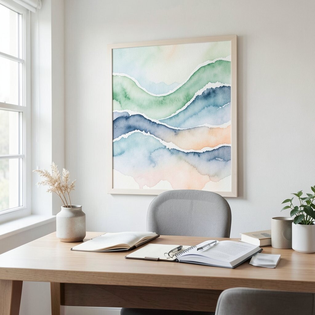
Bring in watercolor wave prints with smooth, airy color changes. They can make your office feel lighter and more soothing.
Choose tones that fit your mood, like sea glass greens, dusty blues, or pale peach. The benefits include reduced visual harshness, which can help you feel more relaxed while reading and writing. For practical tips, hang the print near your desk but avoid placing it directly under a bright lamp that creates glare.
9. Oversized Line Art Of Everyday Objects
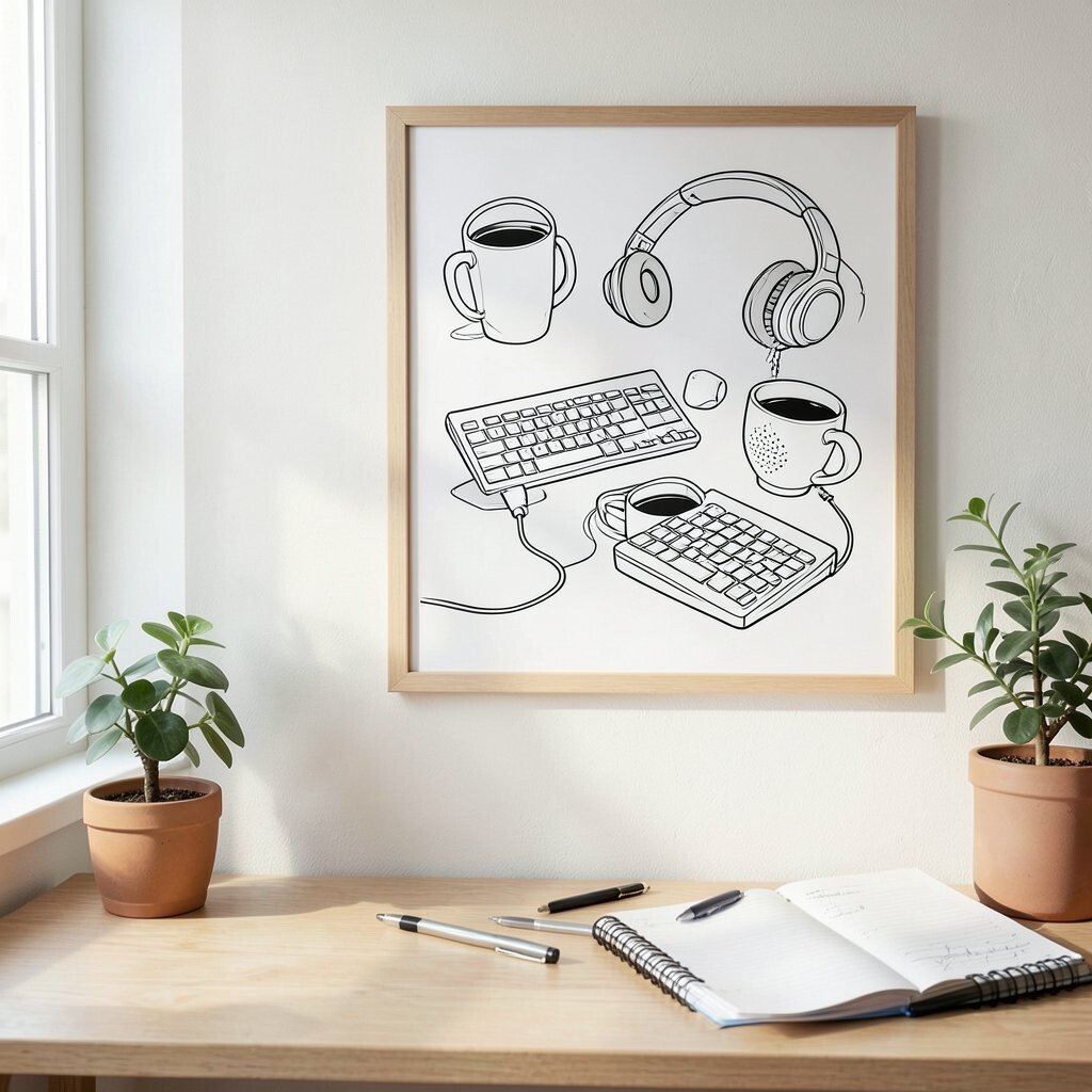
Look for prints that use clean line art of coffee cups, pens, keyboards, or plants. This kind of art feels friendly because it shows objects you genuinely use.
Its uniqueness comes from being both decorative and relatable, which makes your office feel like yours. As a benefit, the simple lines keep your mind calm while you focus on tasks. For personalization, choose objects tied to your job, like if you work with music, include notes, headphones, or a studio mic illustration.
To manage cost, print-friendly line art often comes as affordable posters, and you can frame it with basic materials. A current trend is “functional cute” décor, where art supports daily life rather than staying purely aesthetic. Place it where you can see it when you start your day, like above a coffee station or beside your planner.
10. Monogram And Initial Wall Art
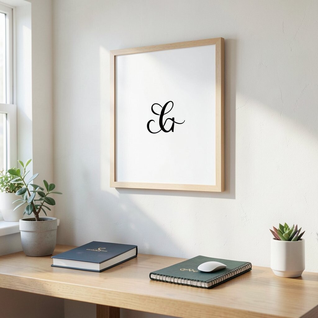
Add a print that features your initials or a small monogram design. It is a simple way to make a shared space feel more personal and grounded.
Pick a style that matches your vibe, like elegant serif letters, modern sans fonts, or playful hand-drawn forms. The benefit is emotional comfort, because your workspace feels like it belongs to you. For practical tips, keep the monogram big enough to be noticed, but not so large that it overwhelms the wall.
Personalize further by choosing colors that match your accessories, like a notebook cover or mouse pad. Consider cost by looking for DIY monogram prints, which can be cheaper while still looking intentional. Current trends include minimal letter art combined with lots of white space, which keeps the office feeling fresh.
11. Handwritten “Workspace Rules” Prints
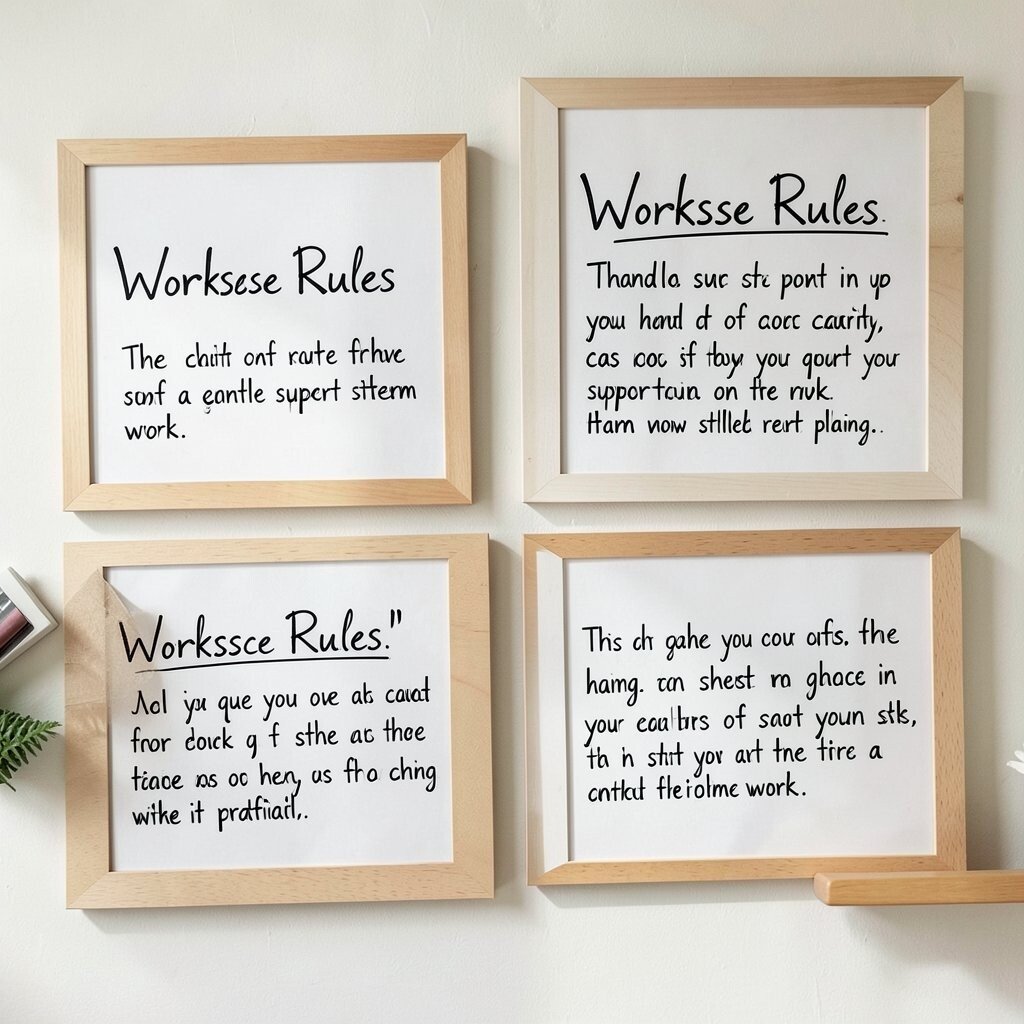
Use a print that shows your own kind of rules in a calm style. Instead of generic slogans, choose statements that fit how you really work.
This is unique because it turns your office into a gentle support system. The benefits show up as clarity, since quick reminders can help you start tasks without friction. Make it practical by keeping the wording short and placing it near where you handle planning, like by your calendar or filing area.
12. Minimalist Typography Posters
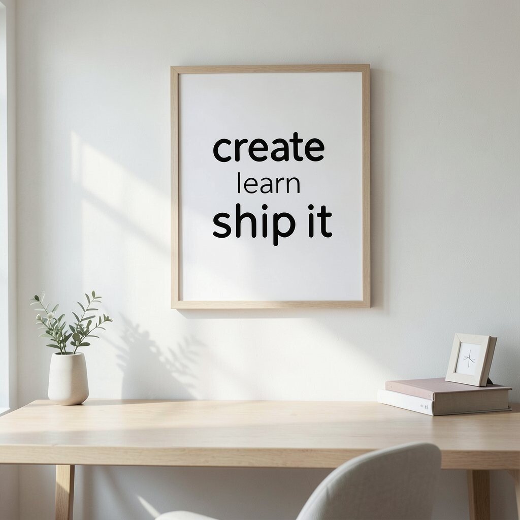
Choose typography art with short phrases, single words, or abstract letter forms. Even when the message is small, it creates a modern, clean look.
Pick phrases that feel helpful in your day, like “create,” “learn,” or “ship it” if your work is action-focused. The uniqueness comes from the way typography acts like design, not clutter. For practical tips, pair the print with neutral frames and let the text become the focal point so your wall stays tidy.
Personalize by using a font that matches your branding style, or by selecting words that reflect team values. To keep costs down, typography prints are often available in many affordable sizes online, so you can find the perfect fit. Current trends lean toward bold letter shapes and calm color palettes that look great with modern desks and shelving.
Keep the print at a height you can see easily from your seated position, so it feels present without being distracting.
13. Color-Coded Mandala Ornaments
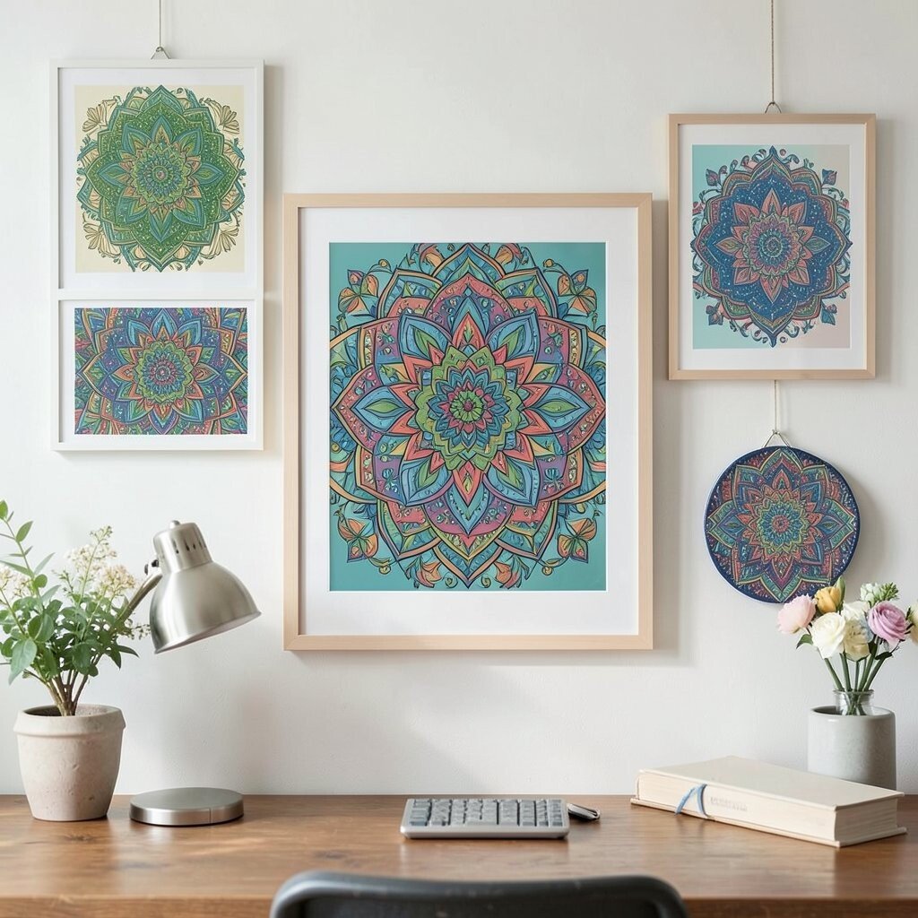
Hang mandala prints with a tidy layout and color-coded sections. They bring a sense of order while still looking artistic.
This option is unique because it blends structure and imagination, like a decorative system. The benefits can include a calming visual center, which can help you slow down during stressful moments. For practical tips, choose one main color story so the print matches your desk accessories and does not clash.
Personalize by picking colors connected to your goals, like greens for growth or blues for focus. If cost is a concern, search for poster prints instead of originals and frame them with simple mats to look crisp. Current trends show a rise in “mindful décor,” where patterns feel soothing and not too loud.
14. Abstract Terracotta And Clay Tones
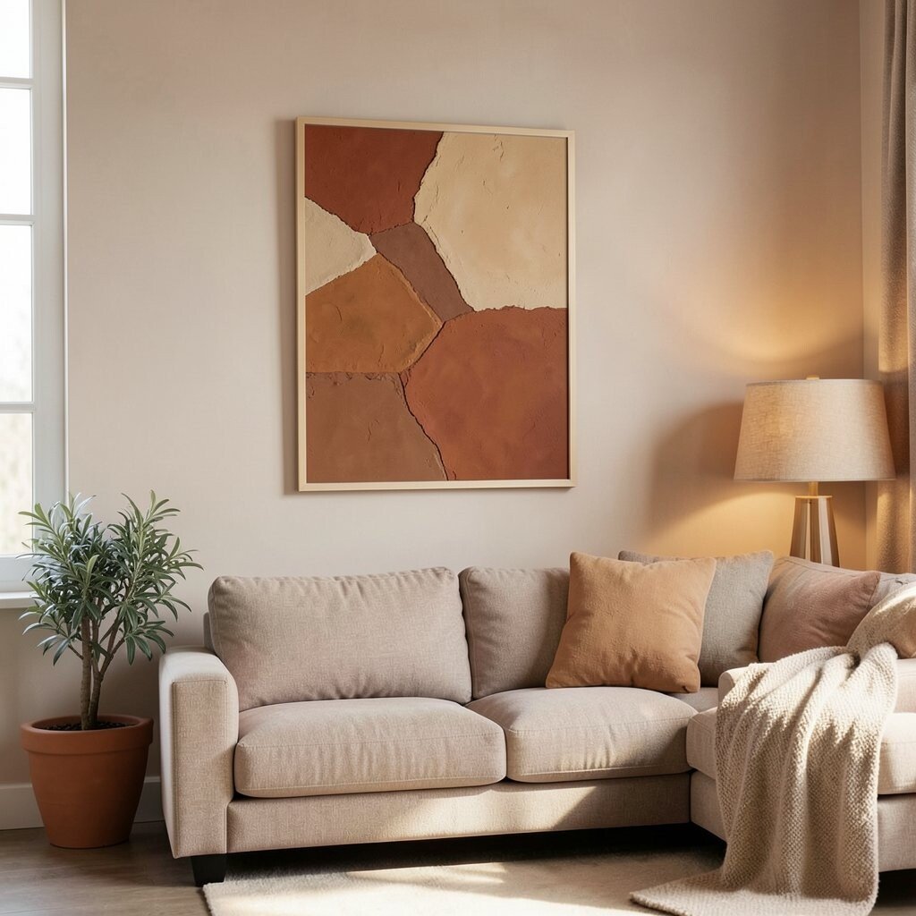
Select prints that use warm clay tones like terracotta, rust, and soft sand. These colors make offices feel cozy and grounded.
The uniqueness is in the earthy palette, which can soften the feel of metal desks and cool lighting. A benefit is that warm art often makes a space feel more welcoming, which can boost comfort during long hours. For practical placement, hang it across from your main seating area so you get a pleasant color glance when you look away from your screen.
Personalize by pairing the print with a terracotta plant pot, a warm-toned lamp, or desk accessories in similar hues. For cost considerations, look for matte prints because terracotta tones can look rich even without expensive glossy finishes. Current trends favor warm neutrals combined with a single bold color accent, and this fits perfectly.
If you want a safe start, choose a medium-size print and avoid overcrowding the wall with other bright colors.
15. Skyline Silhouette And Night Lights
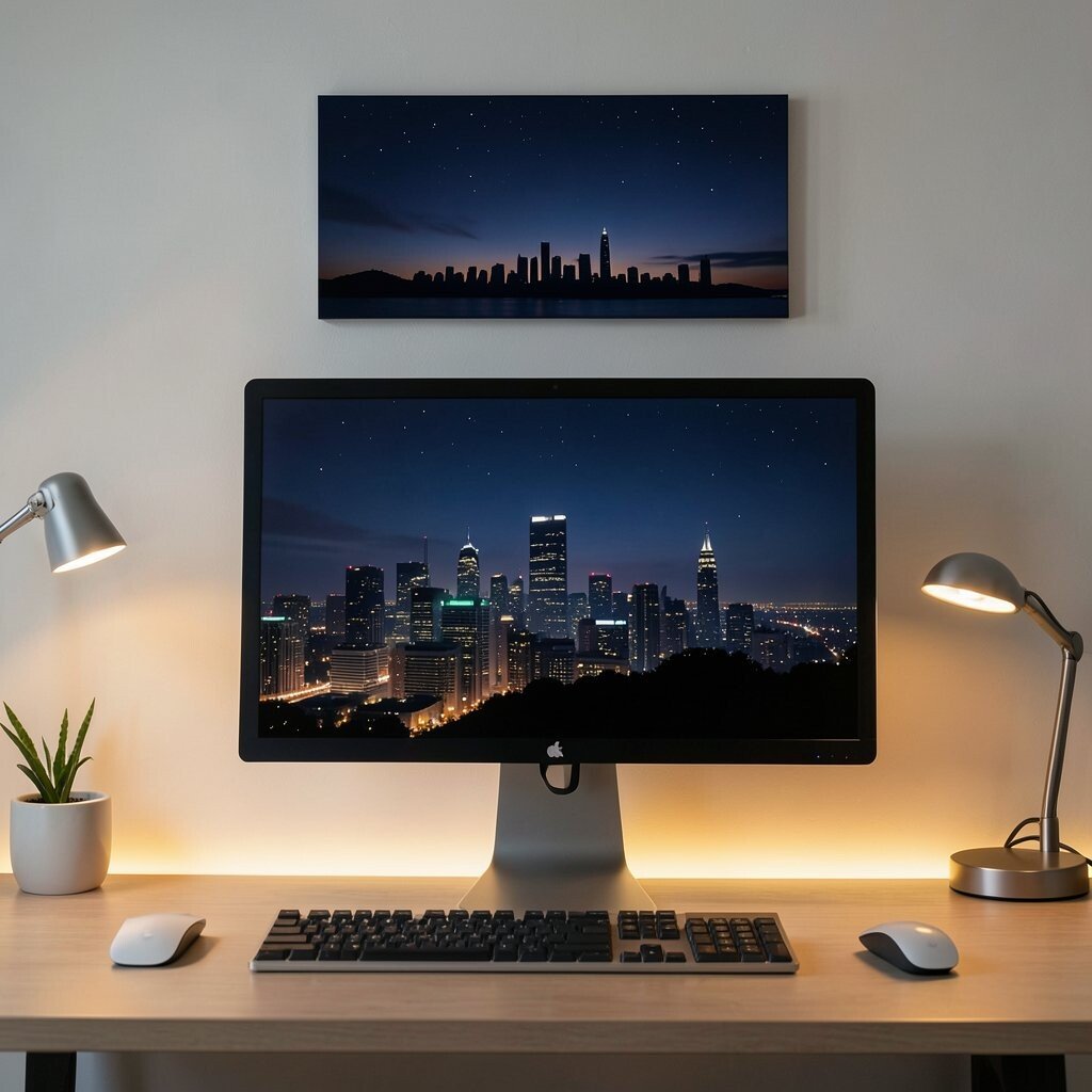
Use skyline silhouette prints with a nighttime palette and soft glow effects. They add a modern city mood without needing a busy theme.
This style is unique because it creates drama through contrast rather than clutter. The benefits include a clear focal point that can look great behind your monitor area. For practical tips, pick a silhouette that matches your room width and place it so the skyline aligns with the top of your desk or shelves.
Personalize by choosing the city that matters most to you, like your current home or a place you dream about. Keep costs in mind by choosing downloadable prints and framing them with a standard size, which often saves money. Current trends include darker art paired with warm lights, like LED strips or soft lamps, for a cozy vibe.
Make sure the print colors are not too bright if you work long hours, since gentle night shades feel calmer.
16. Oversized Botanical Letters
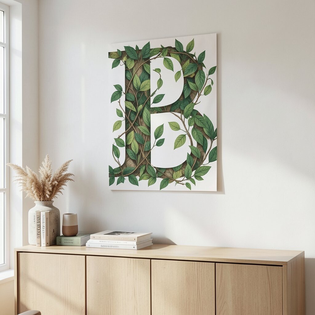
Try prints that combine letters with leaf patterns, like a big “B” with vines inside. It feels artsy and organized at the same time.
The uniqueness comes from mixing personal monogram energy with nature texture. Benefits include a clear visual anchor, which can make the whole office feel more intentional. For practical tips, place it on the wall near your books or above a cabinet where it can act like a banner.
Personalize by using a first initial that matches your surname or your brand, plus choose leaf colors that mirror the tones in your décor. For cost considerations, letter-and-botanical prints are often available as affordable poster sets, so you can start with one and add more later. Current trends include layered botanical motifs and large-scale typographic art that feels modern and calm.
If your office is small, keep the background light so the letter does not feel heavy.
17. Minimal Landscapes With Lots Of Sky
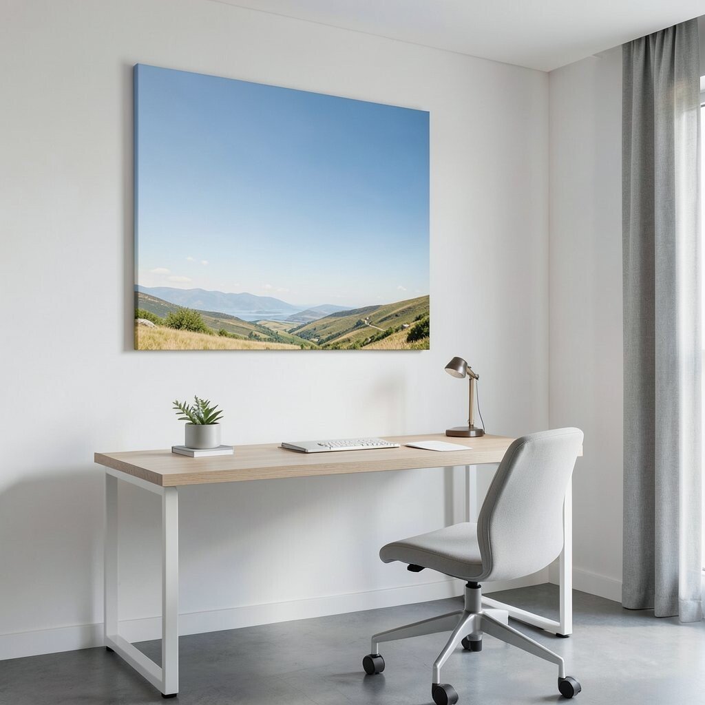
Choose landscape prints that emphasize wide skies, gentle hills, or simple horizons. This gives your office a feeling of space, even if the room is not large.
The benefit is mental breathing room, because your eyes get a calm view with fewer sharp details. This kind of art is unique because it makes your desk area feel open and peaceful. For practical tips, pick a landscape color palette that matches your floor or curtains to make everything feel connected.
Personalize by selecting a place you love, like a favorite hiking route or coast walk. To keep costs down, consider canvas-look prints that are lighter than traditional framed canvases. Current trends favor serene, nature-based visuals paired with clean furniture lines, making this a strong option for modern offices.
Hang it where you can see it during breaks, so it supports relaxation rather than only looking pretty.
18. Creative Diagram Prints For Brainy Energy
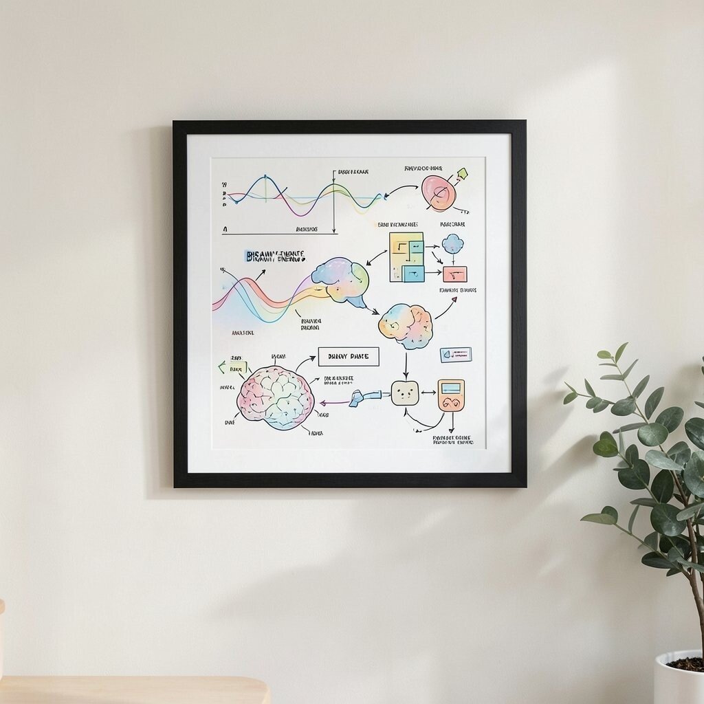
Use prints that look like diagrams, charts, or clever scientific sketches. They can add a playful “smart” vibe without turning your office into a classroom.
This style is unique because it feels like your mind is at work even when you are just sitting. The benefits include a lively visual texture that can help you feel motivated, especially for planning and problem-solving tasks. For practical tips, choose a diagram style with gentle colors so it does not become visually tiring.
Personalize by picking diagrams that relate to your field, like music waves for audio work or flowcharts for process design. For cost considerations, digital print formats are often easy to find in multiple sizes, so you can match your wall without overspending. Current trends include maker-style décor and nerdy art that celebrates creative thinking.
Keep the print framed neatly, because clean edges make even abstract diagrams look polished.
19. Gallery Wall Mix With A Single Theme
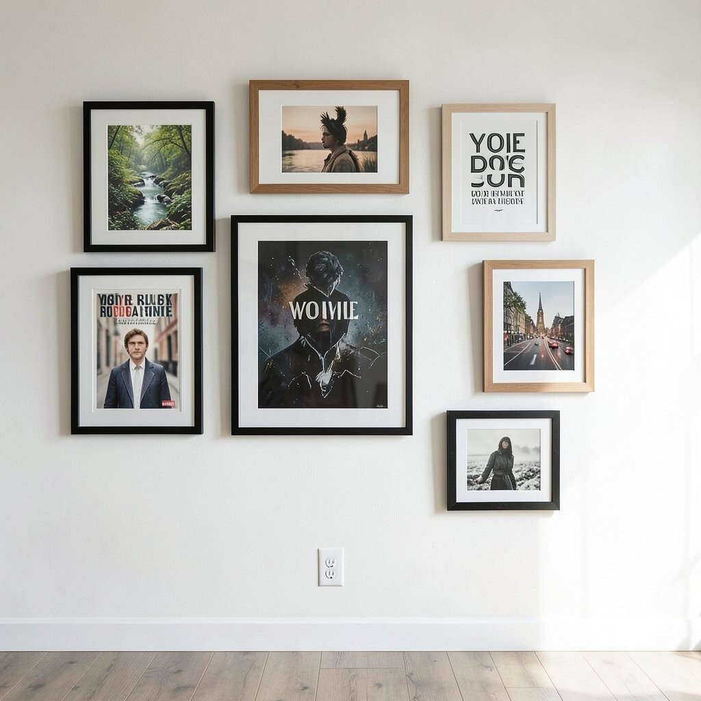
Create a curated gallery wall using prints that share one theme, like nature, cities, or typography. When everything fits together, the wall looks intentional instead of random.
Choose frames in matching colors or finishes, such as black, oak, or white, so the set feels cohesive. This approach is unique because the mix lets you show personality while still keeping structure. The benefits show up as visual comfort, since your eyes enjoy variety without the chaos of mismatched art.
For practical tips, plan the layout on the floor first, then measure so spacing stays even. Personalize by including one print that is yours, such as a poster from a favorite exhibit, a photo print you love, or a custom quote that matches your goals. Cost considerations are easier here because you can buy a few affordable posters and upgrade one or two frames later for a high-end look.
Current trends favor gallery walls that start with one bold anchor print and then add smaller supporting pieces around it.