Walls can look ordinary until you give them a gentle pattern and depth. Texture knockdown finishes are a favorite because they hide flaws while adding character.
From subtle plaster vibes to bold modern swirls, you can build a look that feels custom without needing advanced skills. The key is choosing a technique, then shaping it to match your room, your light, and your everyday life.
1. Classic Smooth-Plus Knockdown
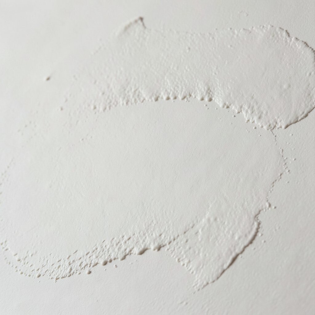
Start with a clean base coat that feels nearly silky when you run a hand over it. Then spread a knockdown-ready texture at a steady thickness, keeping your trowel pressure light.
When you knock it down, the surface should catch light softly, with small flat peaks instead of deep ridges. This finish is great for hallways and living rooms because it looks neat and still forgives minor wall dents.
To make it look more tailored, align your passes in one direction, like gentle lanes. Use a consistent timing window so the knockdown happens when the material is set enough to hold its shape but still easy to flatten.
2. Limewash-Inspired Knockdown
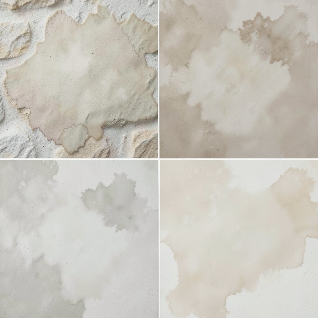
Apply a knockdown layer, then work in thin color so the wall shows muted, cloudy variations. It should look like sun-warmed stone, with soft depth instead of sharp contrast.
For added realism, use a cloudy topcoat that allows darker areas to linger in the low spots. You get a naturally imperfect look that feels timeless and warm.
Choose lighter tones for small rooms and pair them with matte trim so the texture stays the star. If you want a more dramatic vibe, vary your color wash in two passes and slightly overlap the wet areas.
3. Stipple and Crush Microtexture
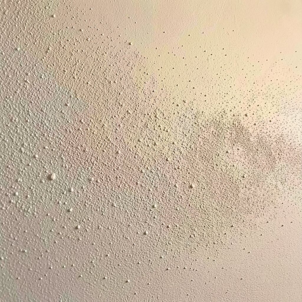
Before you knock it down, create a fine stipple pattern with a brush or textured roller. The texture should look like tiny pebbles clustered closely, not chunky blobs.
After knocking down, those micro highs become gentle speckles that shift when you walk past the wall. This is a practical way to hide paint roller marks and small patches that never want to look perfect.
Use a test board first so you can dial in how crisp the speckle stays. If you like a calmer look, knock down more aggressively; if you want more sparkle, flatten less.
Try a satin interior paint for subtle movement while still keeping the wall easy to clean. Pair it with warm lighting to make the microtexture feel cozy, not gritty.
4. Feathered Roller Knockdown
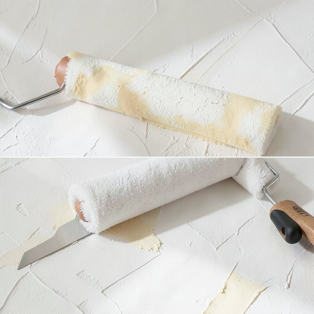
Roll on your texture with a feathering technique, then lightly knock it down with a wide blade. The visual goal is a soft, airy pattern that resembles brush strokes flattened into plaster.
This approach looks elegant in offices and reading nooks because it adds motion without feeling loud. It also works well on walls with minor unevenness, since the feathered valleys catch shadows.
Keep your roller loaded but not dripping so you avoid thick puddles that refuse to flatten. If you’re personalizing, try two subtle paint tones, one on the high areas and one that lets the lows hold more pigment.
5. Vertical Raked Knockdown Stripes
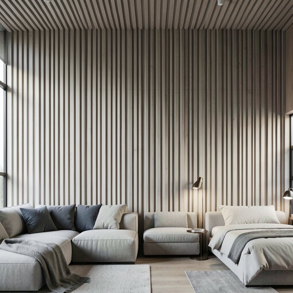
Shape the wet texture with vertical passes, then knock it down so the grooves turn into thin shadow lines. The result is a tall, modern look that helps make ceilings feel a bit higher.
You’ll love how stripes can guide the eye, especially behind sofas or beds. This texture pattern also disguises wall seams and uneven joint work better than a flat finish.
For accuracy, measure your starting point and keep your tool strokes straight. Want extra character? Lightly vary pressure at the top third so the stripe shadows soften as they rise.
6. Horizontal Drift Knockdown
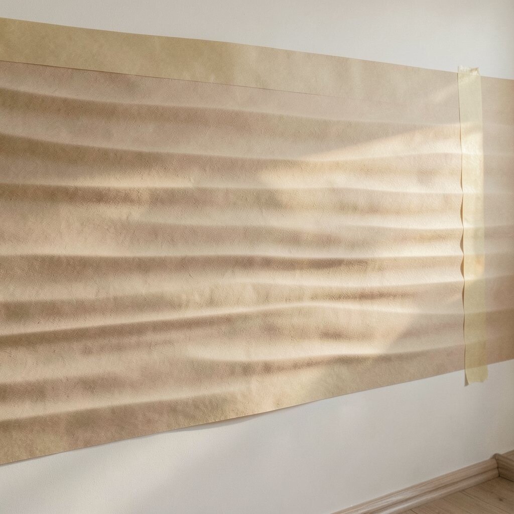
Use broad horizontal sweeps as you apply texture, then knock it down to preserve long, calm bands. Think of wind moving across sand, with a surface that looks layered rather than flat.
Horizontal patterns are great for creating a relaxed feel in kitchens and dining areas. They add warmth while still looking clean from across the room.
Use painter’s tape to mark your first line so each pass stays parallel. If you want a more modern edge, keep the bands consistent and finish with a crisp edge where the wall meets trim.
Choose a color that looks slightly different under morning light versus evening light. That shift makes the drift pattern feel alive as your day moves on.
7. Corner-Forward Basket Weave Knockdown
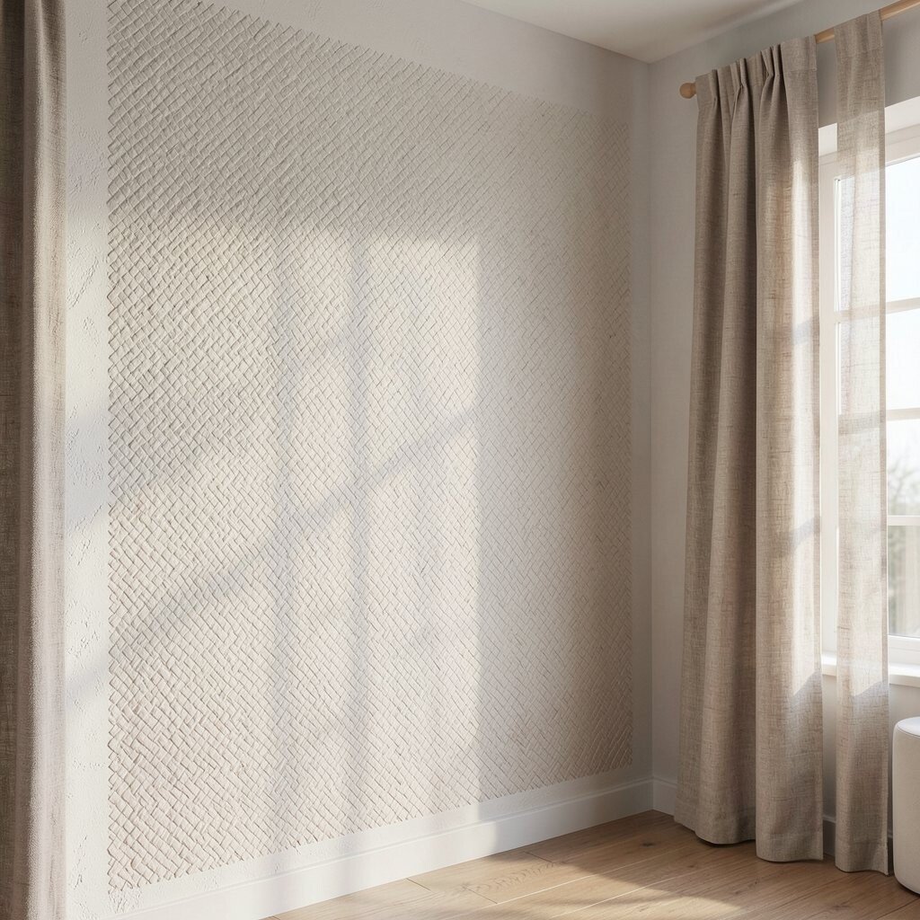
Create a basket-like impression by lightly tooling the texture into a grid, then knock it down just enough to blur the peaks. When done right, it should feel woven and dimensional, like a calm fabric pressed into plaster.
This style is unique because it combines structure with softness, giving your wall a crafted feel. It’s also helpful for covering small imperfections because the crossing shadows break up the visual surface.
Work slowly and keep your pattern spacing even, even if it’s imperfect in a charming way. For personalization, choose a slightly warmer white or a muted clay tone to make the weave look like it belongs to a handmade home.
Cost-wise, you’ll spend a bit more time than materials, since careful tooling matters. Plan extra prep time and protect floors well, because woven textures tend to create more debris.
Pair it with natural wood, linen curtains, and matte fixtures to keep the look cohesive.
8. Geode-Style Knockdown Veins
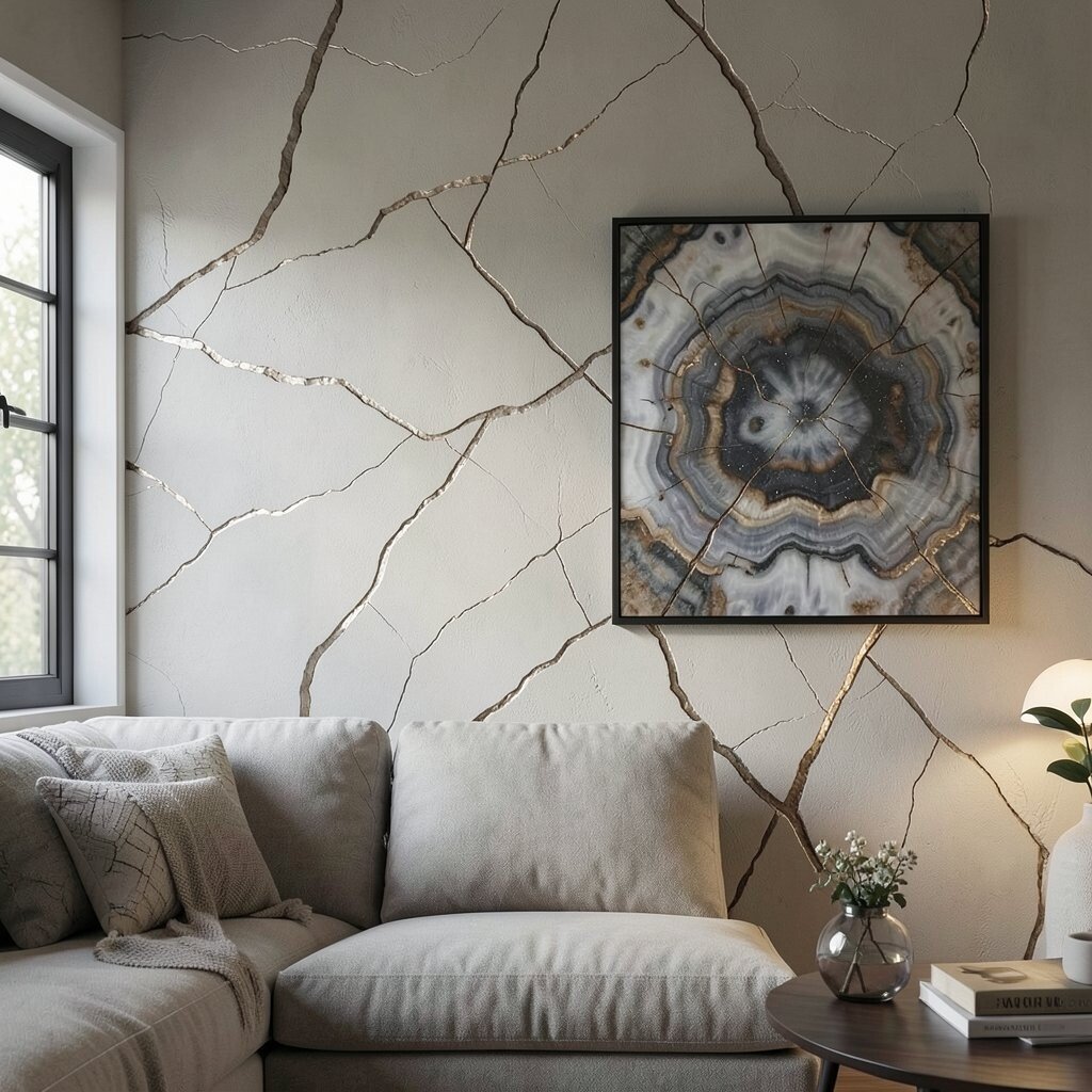
Apply texture in irregular patches, then knock it down while leaving some edges slightly sharper. To get a geode vibe, create vein-like ridges that wander across the wall without forming a strict grid.
This sample looks striking even with simple lighting, because the ridges catch highlights like stone. It can also feel surprisingly wearable in a living room when you keep the colors subtle.
Use two tones in your paint system so the “veins” read deeper but not neon. A gentle hint of metallic in the low areas makes it feel elegant, especially at night.
Keep a rag nearby to blend transitions so the wall doesn’t look randomly splotchy. For personalization, place the strongest pattern behind artwork so the wall acts like a frame.
9. Spanish Plaster Knockdown Marble Mood
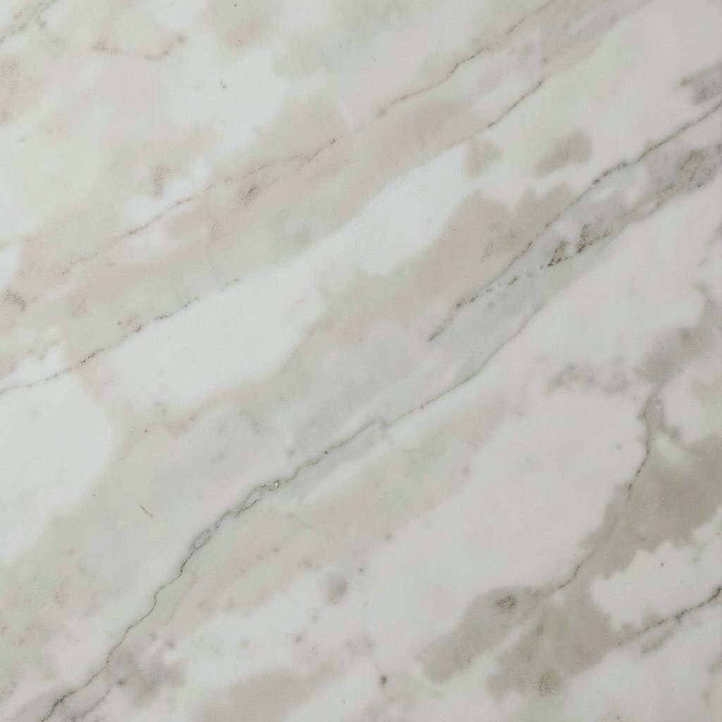
Spread texture in smooth swaths, then pull a flexible blade through it to create faint marbling. After knockdown, the wall should show cloudy movement, with lighter swirls and darker pockets.
This finish brings an old-world mood without the cost and mess of full stone installation. It’s also great at hiding minor patchwork, since the marbling makes uniform perfection unnecessary.
Choose colors with similar undertones so the veining feels natural, like earth and lime meeting. If you want a cleaner look, keep the marbling minimal and let the texture do most of the work.
Seal the surface if you plan to clean it often, especially in entryways where hands and bags land. Use protective drop cloths because the blade work can fling tiny bits.
10. Smoothed Sand Knockdown With Edge Shadows
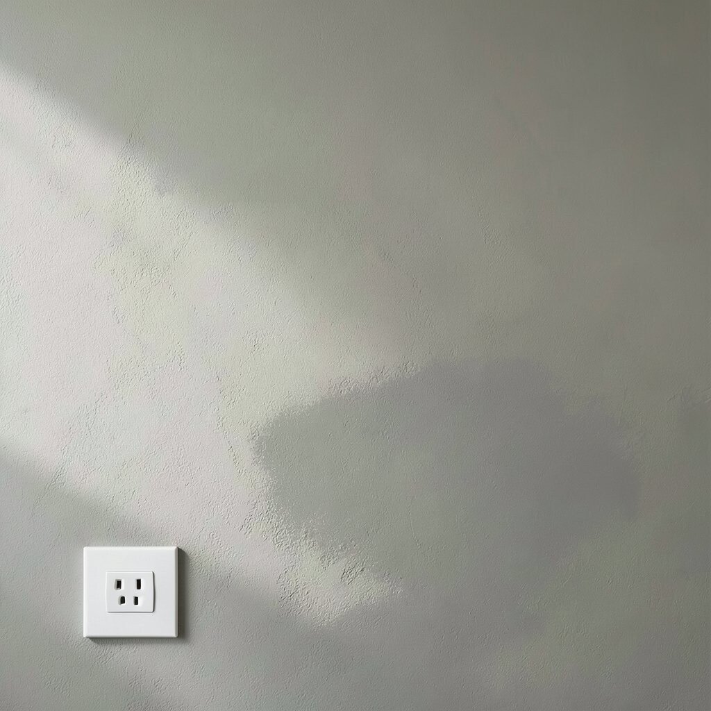
Go for a smoother knockdown by pressing down more firmly after application. The wall should look like fine sand under light, with tiny highs that flatten into gentle highlights.
You get a refined texture that still adds depth, which is why this works well in modern spaces. Edge shadows around outlets and frames become more noticeable in a good way, giving your room built-in character.
To personalize, use a slightly darker base coat and then apply a lighter topcoat so the deepest areas remain visible. That soft tonal variation helps the texture look richer even when you pick a simple color.
Spend time sanding and feathering before you start, because this finish shows subtle unevenness once the wall is smooth. If you’re keeping a budget in mind, prioritize prep because it’s the part that saves money on redo work.
11. Bold Scrape-Back Knockdown With Contrast
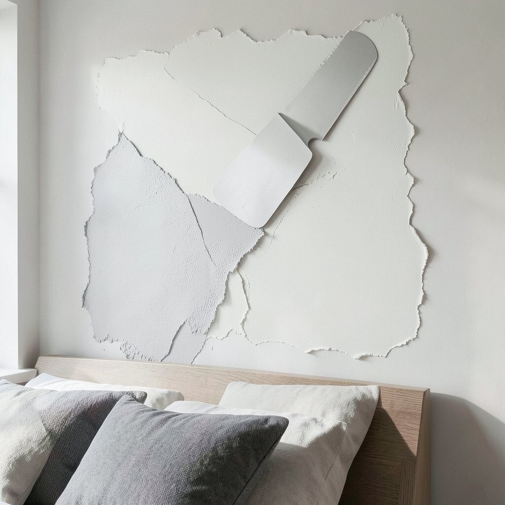
Apply knockdown texture, then scrape back select areas before full flattening. The wall should show contrast between smoother zones and slightly raised sections, like a layered artwork.
This sample feels creative and daring, making it perfect for an accent wall behind a headboard or in a studio corner. It also offers practical benefits since the varied surface hides spots that tend to show through flat paint.
Use a flexible scraper for more natural arcs and a wider blade for cleaner sections. If you want to keep it friendly, keep the contrast moderate so it doesn’t look like a construction site.
Plan your color strategy early, because high and low areas will hold different amounts of paint. A topcoat in eggshell can keep it durable while still showing the texture’s personality.
12. Patterned Fan Knockdown Over Primer Pop
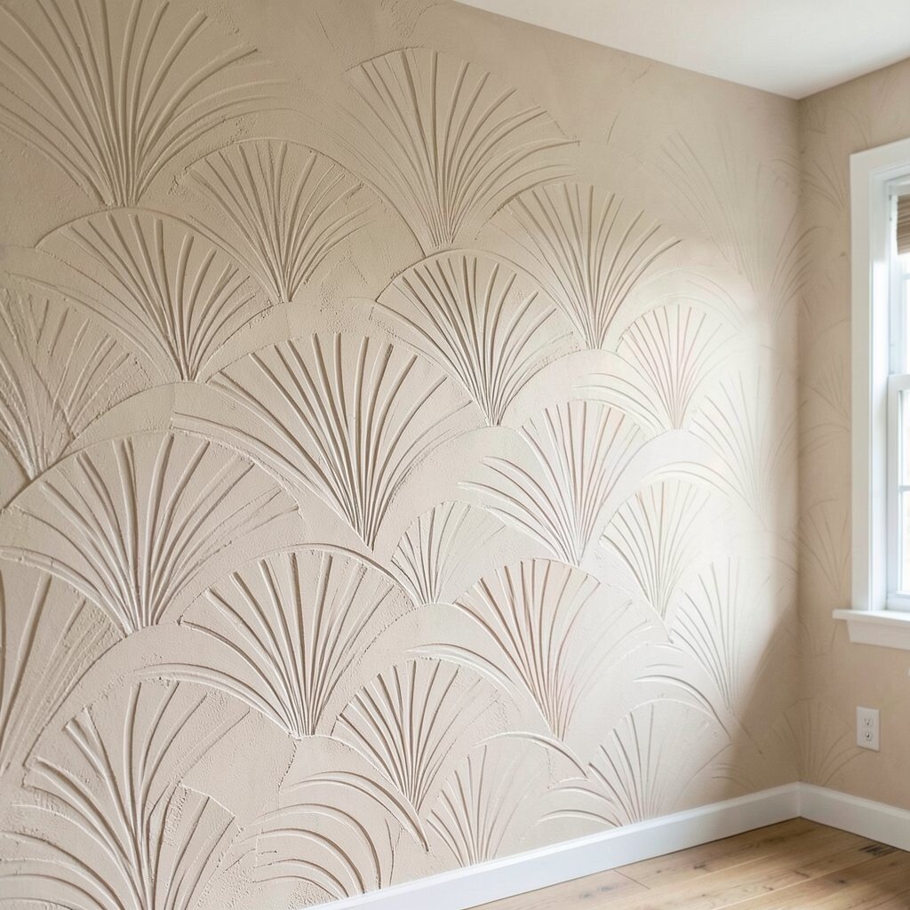
Build the texture with fan-shaped strokes, then knock it down while following those curves. The surface should show repeating arcs that feel rhythmic, like gentle waves or a sunburst softened by plaster.
This option is unique because it blends a decorative pattern with the forgiving nature of knockdown. It’s especially effective when you use lighting with a slant, since the arcs create movement without needing bold colors.
Let the primer tone peek through under your topcoat by using thin paint layers. That technique adds depth and makes the wall feel more layered, like it has history.
Keep the fan pattern consistent in size, then vary the spacing slightly for a more organic finish. If you’re personalizing for a specific space, match the arc direction to the room’s layout, such as angling fans toward a fireplace or window.
For cost considerations, consider buying a quality knockdown tool once, since a worn edge makes uneven arcs. Test a small section first, because patterned knockdown is easier to refine than to fix after everything cures.