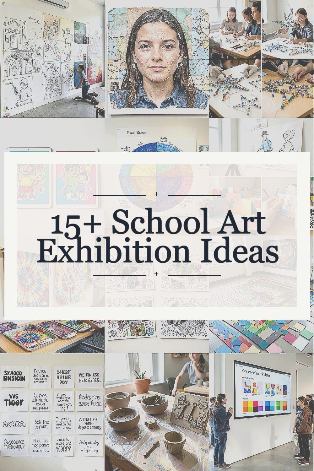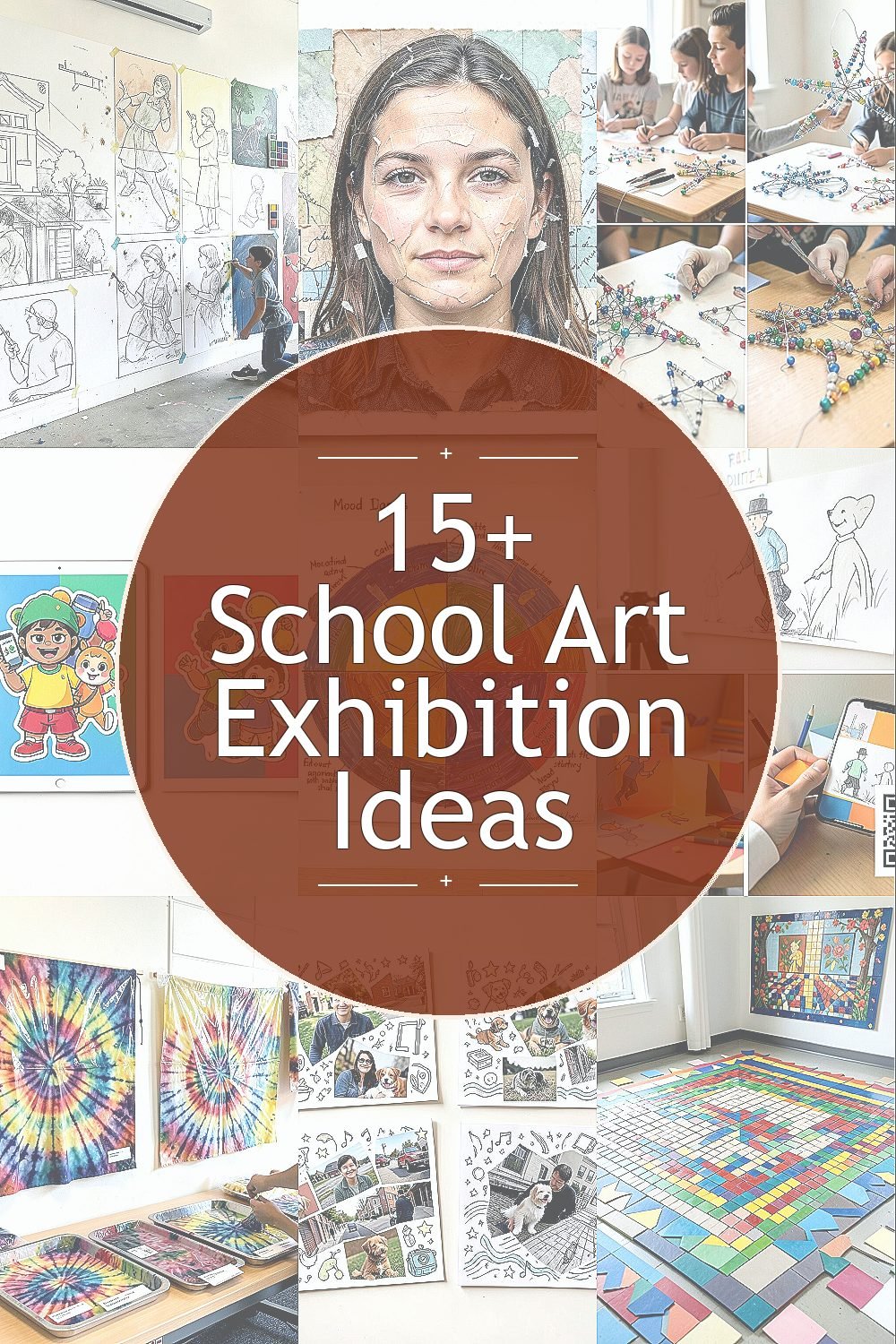
The hallway feels different when art fills it with stories. Old techniques and new screens can both make students shine.
Here are practical, creative ideas for a school art exhibition that balances traditional charm with digital energy.
1. Chalk-to-Canvas Mural Wall

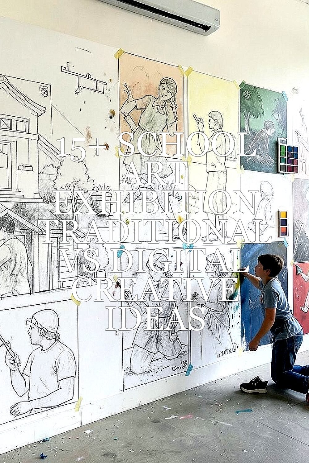
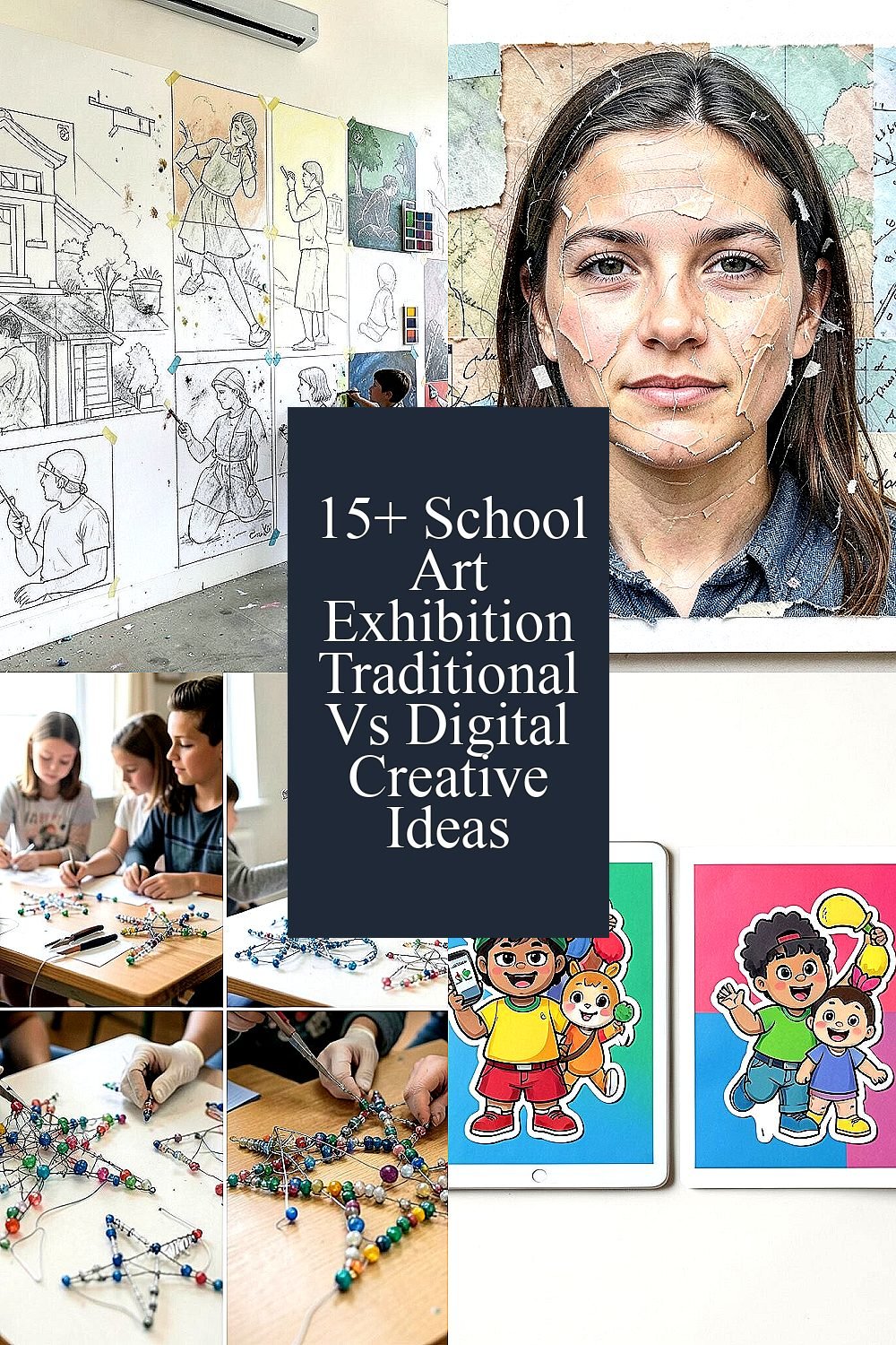
Students sketch directly on layout chalk outlines, then paint over the final shapes using acrylic or tempera. The wall can look like a living sketchbook, with visible plans, smudges, and color tests.
It feels special because the process shows effort, not just the finished image. To keep it organized, tape off small zones for each student and provide a simple color palette so the mural looks unified from far away. Add personalization by letting each artist include a tiny symbol or name tag hidden in the corner like a secret signature.
2. Collage Portraits With Found-Texture Backdrops

Students build portraits using magazine clippings, scraps of fabric, and torn paper layers for a rich visual texture. Close up, you can see edges, fibers, and glue lines that make each face feel real.
This kind of work teaches patience and careful cutting, and it also supports mixed-skill learners because many steps can be small and doable. For a smooth exhibition, ask students to mount each portrait on sturdy paper or foam board so edges stay crisp and photos look clean.
Keep costs low by setting up a donation jar for old catalogs and encouraging students to bring clean scrap bags. For a modern twist, add a printed background strip like a weather map or a simple word collage, then let the handwriting blend into the textures.
3. Wire-and-Bead Sculpture Starforms

On the display tables, students create gentle star shapes using twist wire, then fill them with beads and small bottle-cap accents. From a distance, the sculptures glow with tiny reflections, like they are made of little moments of light.
Working in three dimensions boosts fine motor skills and helps students understand balance and structure. Provide pliers and pre-cut wire lengths to reduce frustration, and remind students to wear gloves if they need them.
This format is unique because the same design idea can look totally different depending on bead size, wire thickness, and color choices. For personalization, encourage each student to pick a theme, like ocean currents or favorite planets, and design their bead colors around that theme.
To manage cost, collect beads from craft drawers and use inexpensive wire spools. For a current trend, you can pair the sculptures with short student captions about how they built symmetry, because audiences enjoy hearing the thinking behind the look.
4. Digital Sticker-Style Character Posters

Students design characters on a tablet or computer using simple shape tools and sticker packs. The posters look playful, with bold outlines and bright color blocks that pop against a clean background.
Digital sticker style helps students who love graphic design and makes it easy to revise mistakes without starting over. For practical setup, print the designs on sturdy cardstock or lightweight poster paper so they stand up to crowds.
5. Color Wheel Paintings With “Mood Names”

Students paint a full color wheel, then add handwritten labels that match their choices, like calm blue, sunny gold, or stormy purple. In the gallery lighting, the wheel can look like a small portal of color.
This traditional exercise supports learning because it shows relationships between colors and how mixing affects the final shade. Give clear mixing guides and let students test small swatches before painting the full wheel.
For uniqueness, invite them to name each section with a mood story, then add a tiny drawing that matches the story. Cost stays manageable since paint and paper are easy to find, and you can reuse palettes across classes to reduce waste.
6. Stop-Motion Sketch Animation Loop

Students create a short animation using paper drawings and simple filming with a phone or tablet. The resulting loop can play on a screen, showing a character stepping forward like it’s alive.
It’s a fun way to connect art with storytelling and improves patience because each frame must be slightly adjusted. Use a basic tripod or a stable stand so the animation stays steady, and store each project in a folder with the student name and class period.
To personalize, let students build a tiny set using colored construction paper and reuse the same background while changing only the character. For current trends, pair the animation with a QR code so families can watch at their own pace on mobile devices.
7. Fabric Dye Tie-Patterns on Museum-Tray Displays

Students try tie-dye or dip-dye using washable dyes, then hang finished pieces for drying near the exhibition. The fabric catches light in waves, and patterns look dramatic even when viewed from a short distance.
This art choice stands out because it feels wearable and real, not just flat on paper. Set up trays with labels and careful spacing so pieces do not smear, and consider using plastic sleeves or clear bags for travel from classroom to display.
8. Photo Collage Cards With Hand-Drawn Overlays

Students take photos using a school camera or tablet, then layer hand-drawn lines, doodles, and symbols on top. The final cards look like little magazine covers where real life meets imagination.
Digital plus hand work helps students express identity since they can use their own photos of objects, pets, places, or neighborhood streets. For practical tips, ask them to keep the background simple and save in high resolution so small details do not blur.
To keep cost down, use free photo editing apps available on school devices. Personalization can be built in by letting students choose a color theme and adding a recurring motif, like stars, waves, or musical notes.
9. Mosaic Tile Lines With Color-Blocked Borders

Students create mosaic patterns using paper squares, small foam shapes, or inexpensive tile-like craft pieces. From across the room, the lines look bold, and up close, you can see the rhythm of each repeated square.
It’s beneficial because mosaic work trains students to plan and place carefully, which also improves attention to spacing. Provide pre-cut grids or templates so first-time artists can focus on color and layout.
Uniqueness comes naturally since no two students arrange the same colors in the same order. For personalization, add a border style choice such as zigzags or gentle curves, and let each student pick a favorite palette based on a seasonal theme.
Cost considerations are friendly when you use recycled paper squares or craft-store foam alternatives. A modern touch is to include a short student statement about how they used contrast to make certain sections “pop.”
10. Typography Posters Using Student Poetry

Students write short poems or phrases, then design typographic posters where letters become the artwork. Some choose thick bubble fonts, others prefer thin elegant lines, and together the wall looks alive.
Typography supports literacy and creativity at the same time, and it gives students a clear way to connect their words to visuals. For practical display tips, print posters on uniform sizes and use consistent spacing so the gallery looks neat and welcoming.
11. Clay Coils With Imprint Texture Stories

Students roll clay coils to build simple bowls, planters, or mini wall plaques, then press items like leaves, keys, or textured fabric into the surface. The imprint marks create tiny landscapes that cast small shadows.
This traditional process is great for building understanding of form and texture, and it can be surprisingly relaxing. Plan ahead for drying and firing, and protect the workspace with plastic covers for easy cleanup.
Personalization shines because students can choose textures that match their own lives, like “garden week” impressions or “music practice” marks. Keep costs reasonable by using classroom clay kits and reusing tools like ribbon scraps and stamps.
12. Interactive “Choose Your Palette” Digital Wall

Students create several color palette options for the same artwork, then display them on a screen where visitors can switch versions. The experience feels like stepping into a gallery that responds to curiosity.
This digital approach is beneficial because it shows how color choices affect mood, contrast, and readability. For practical setup, keep the interface simple and ensure each variation is labeled clearly for visitors who are not familiar with the software.
Uniqueness comes from letting each student build multiple versions, not just one final image. Cost considerations are mostly about printing or screen time, so if devices are limited, you can rotate the projects during the exhibition hours.
13. Traditional Printmaking With Bubble Wrap Relief

Students make simple relief prints by pressing paint onto textured materials like bubble wrap, string, or cardboard cutouts. When they stamp onto paper, the result looks like patterns from a top-secret science lab.
Printmaking is a strong benefit for classrooms because each student can create several copies and experiment without fear of wasting a single “perfect” piece. Keep it practical by using disposable trays and setting up a drying rack with clear airflow.
Personalization is easy since students can combine textures in their own order and add a handwritten title after the prints dry. For cost savings, gather textures from packaging and household items, then remind families to avoid anything too sharp for student hands.
For current trends, you can arrange prints in a grid pattern like modern design posters, which makes the traditional process feel current and clean.
14. Digital Sketchbook Pages as a “Timeline of Growth”

Students upload or present selected digital sketchbook pages that show drafts, revisions, and final tweaks. On the wall, visitors can see small steps, like adjusting eyes, changing backgrounds, or refining shadows.
This format benefits students because it highlights learning rather than only results, and it teaches that improvement is part of art. Keep it practical by using consistent page templates so the gallery looks organized, and display only a few pages per student to avoid clutter.
15. Paper Lantern Installations With Cut-Shadow Patterns
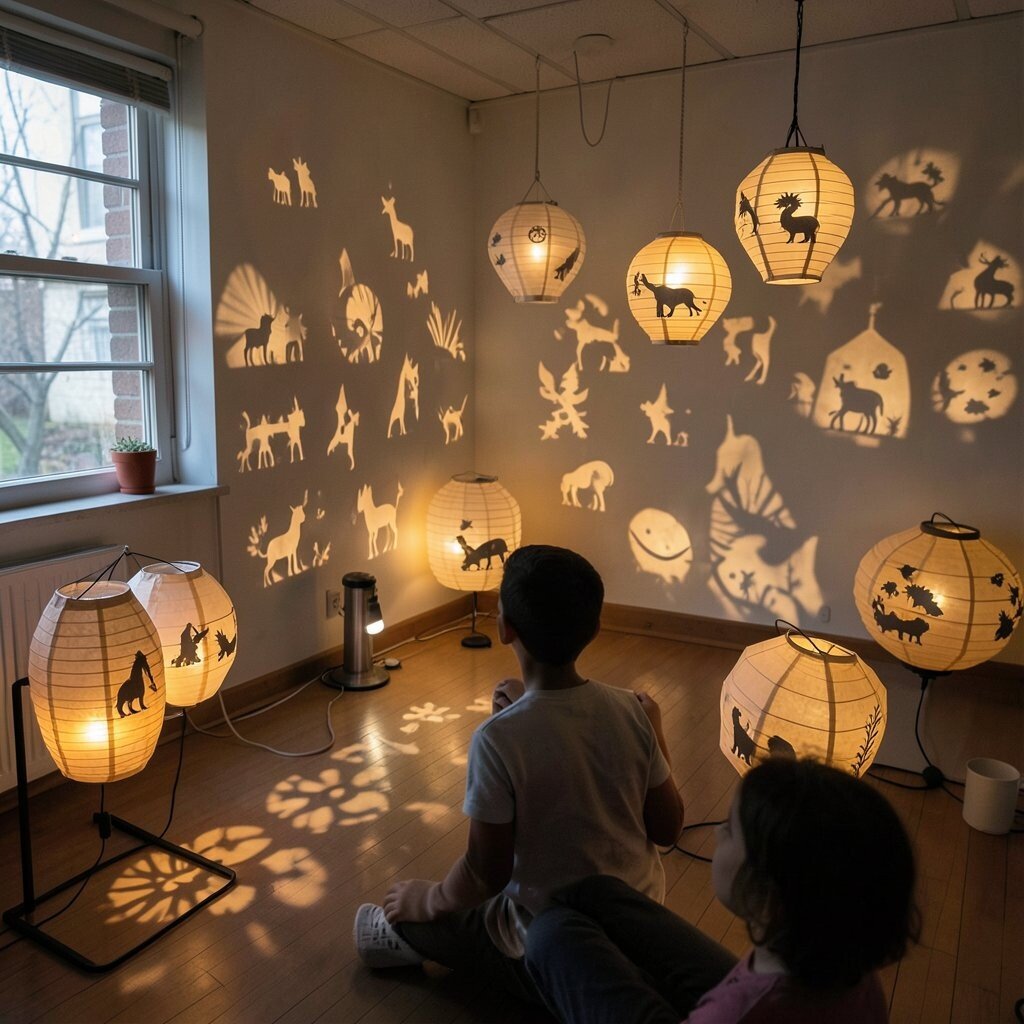
Students fold and decorate paper lanterns, then cut shapes that create shadow patterns when lit. In a dimmer corner, the room can glow with warm silhouettes like tiny stories floating in the air.
It’s unique because the artwork changes throughout the exhibition as light shifts and visitors move. For practical tips, use LED lights instead of open flames and secure lantern tops so they stay stable.
Personalization ideas are endless since students can build themes like animals, space, or favorite myths using simple cut shapes. To manage cost, buy paper in bulk and choose reusable metal or plastic lantern frames where possible.
16. Mixed Media “Museum Label” Cards With QR Links

Students create traditional information cards using handwritten details, drawings, and small sketches of their process. Each card can include a QR code that links to a digital photo gallery of steps, making the display feel modern without losing charm.
This approach is beneficial because it supports communication, giving families context and helping students practice explaining their choices. Keep it practical by printing QR links in high contrast and testing them on school devices before the exhibition opens.
Uniqueness comes from combining neat label writing with student-made visuals, like tiny thumbnails of drafts or color tests. Cost stays reasonable since you only need cardstock, simple printing, and a few digital photos, plus it matches current trends where visitors want quick behind-the-scenes access.