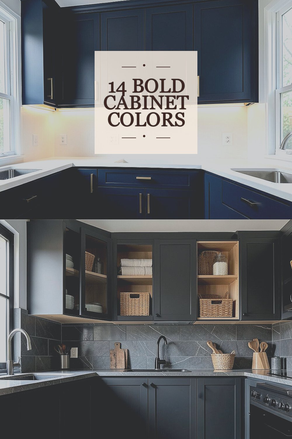
Your kitchen cabinets can change the whole mood of your home. Pick a bold color and watch everyday cooking feel more exciting.
1. Classic Navy With Crisp White Accents
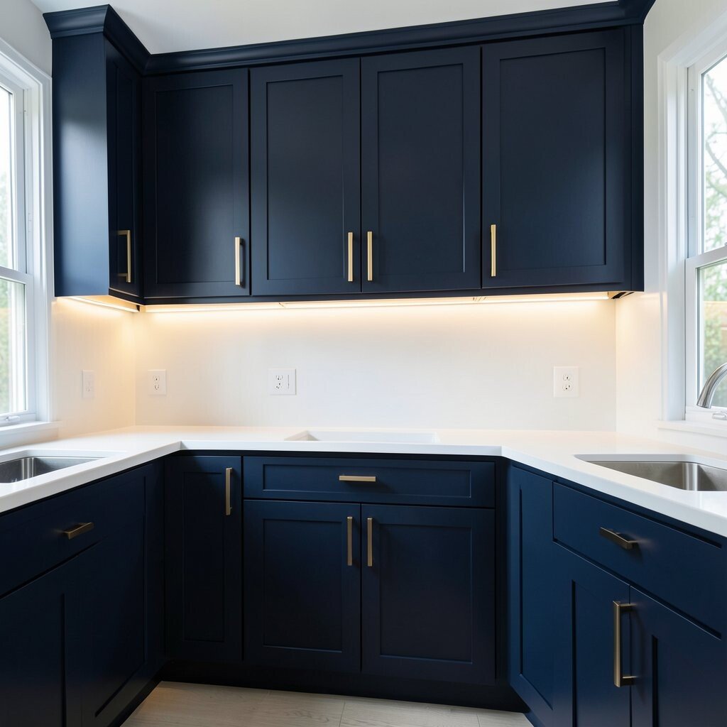
Navy cabinets look calm and confident at the same time. They make the room feel deeper, especially when paired with bright white countertops and trim.
Choose matte navy if you want a soft, modern look, or choose satin for a smoother, slightly richer shine. This color hides small spots and everyday smudges better than very light tones, so it stays looking tidy with normal use. To keep it from feeling too dark, add warm under-cabinet lighting and select hardware in brushed brass or polished chrome for a clean contrast.
2. Smoked Charcoal For A City-Style Kitchen
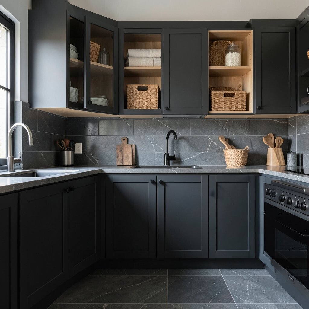
Smoked charcoal brings an urban feel without looking harsh. You will notice a sleek, grounded look that pairs well with gray veining in stone and darker floors.
It is a practical choice because it masks dust, scuffs, and slight discoloration more easily than pastel cabinets. For a balanced look, combine charcoal with light wood shelves or open cabinet fronts so the kitchen stays airy. If you love a polished vibe, use darker grout lines on backsplashes and pick a glossy faucet finish to add shine where the eye lands.
To personalize it, consider two-tone styling with charcoal lowers and lighter uppers, or add a thin trim line in a warmer gray. In terms of cost, charcoal paint usually falls in the same range as other solid colors, and hardware upgrades can deliver a big impact even on a modest budget. A trendy approach right now is mixing charcoal with natural textures like rattan, linen, and reclaimed wood for a layered, lived-in look.
3. Emerald Green That Feels Like a Handmade Jewel
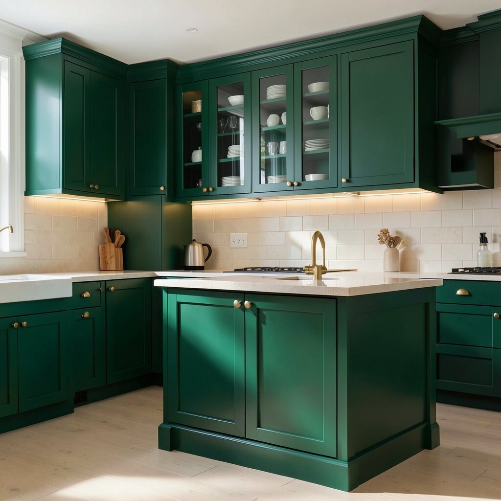
Emerald green cabinets look luxurious and full of life. When the light hits, the shade can feel like a deep gemstone instead of a flat paint color.
Green works beautifully with brass hardware, cream tile, and warm white walls. It is also a fun way to add personality because it stands out while still feeling timeless. For everyday practicality, aim for a durable cabinet finish like a high-quality paint system or a cabinet-grade enamel that can handle repeated cleaning.
You can personalize the look by matching green uppers with a neutral island, or by using glass doors so you can display dishes like a curated shelf. If your kitchen gets a lot of sun, emerald can look vivid and bright, so consider a slightly darker tint if you prefer a calmer mood. As a current style move, many kitchens are choosing rich greens to create contrast against light flooring and soft, minimal countertops.
4. Sunny Butter Yellow For a Cheerful Morning Feel
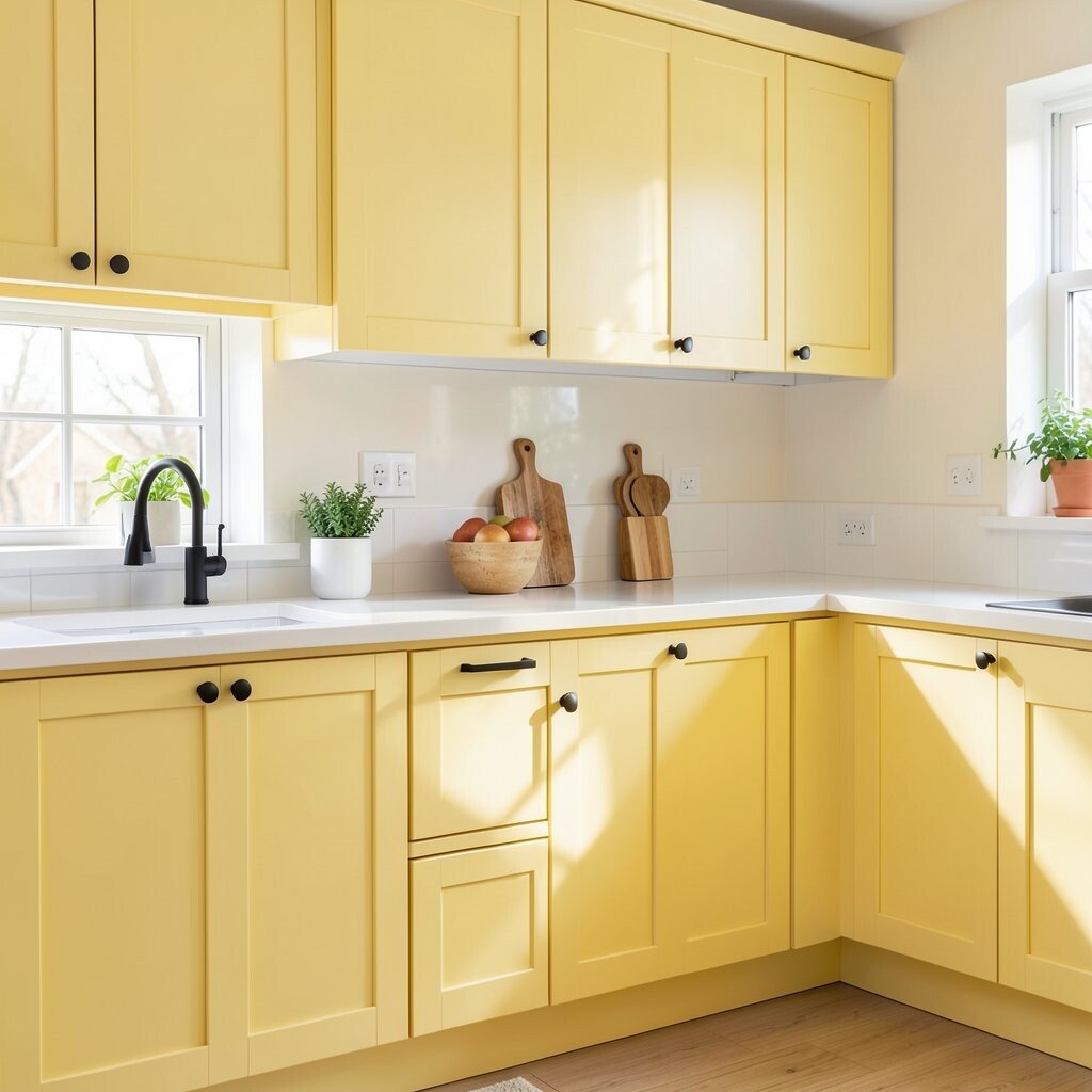
Butter yellow cabinets bring instant warmth and a friendly glow. They make the space feel like sunlight even on cloudy days.
Yellow can also be easier than you think to live with when you choose a buttery, slightly muted tone instead of a neon shade. Pair it with white countertops and simple black hardware for a crisp look that stays readable and neat. For practicality, keep cleaning easy by sealing the finish well and using gentle, non-abrasive cleaners.
5. Terracotta Orange With a Cozy, Earthy Twist
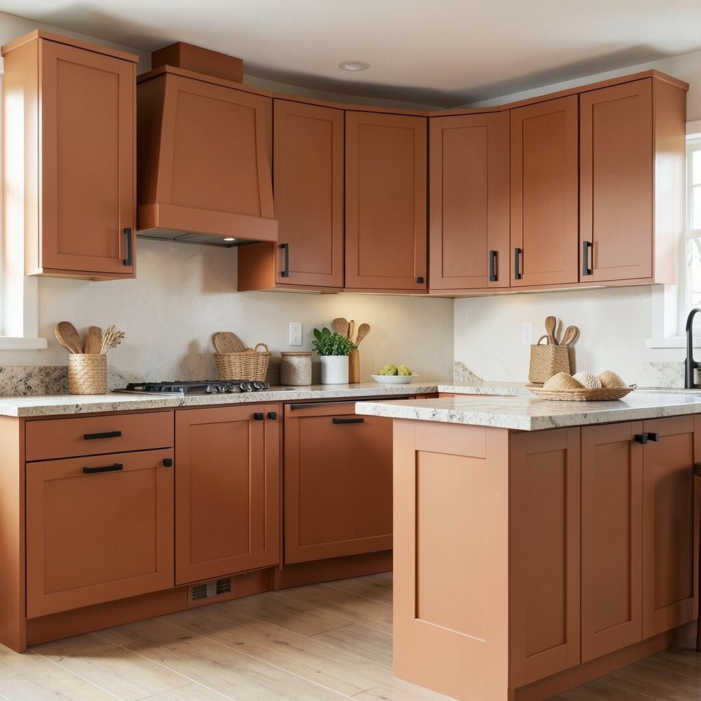
Terracotta orange cabinets add a cozy, lived-in warmth to your kitchen. They look amazing with stone-look counters, warm wood, and woven textures.
Because terracotta is tied to natural colors, it often hides small marks better than pale colors. You will also get a strong visual style without needing complicated design tricks. For personalization, try terracotta on the lower cabinets with lighter uppers, or use it on an island for a bold focal point.
If you want a modern touch, add matte black hardware and a backsplash in soft white or cream. In terms of cost, terracotta paint can be budget-friendly if you keep the hardware upgrades simple. A popular current trend is using earthy tones to balance sleek appliances and keep the room from feeling too cold.
6. Dusty Rose For a Soft, Romantic Statement
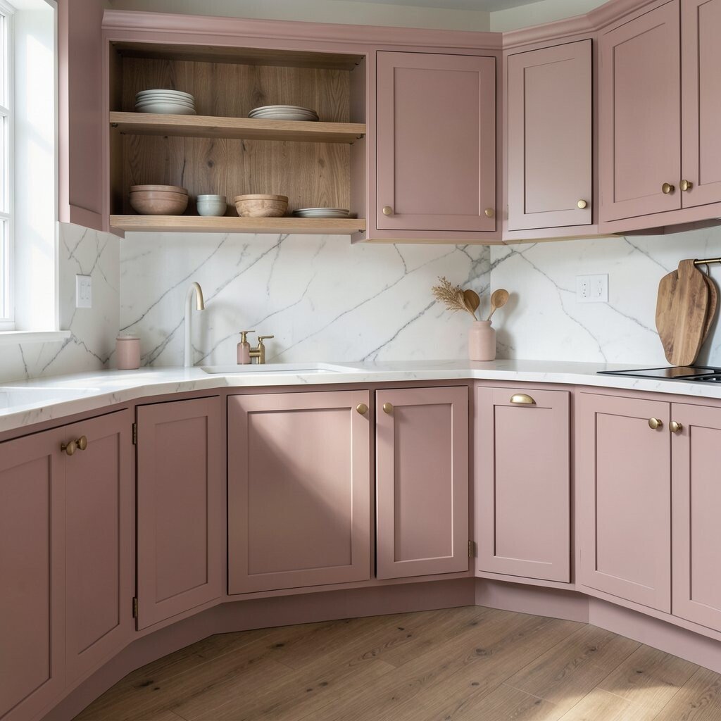
Dusty rose cabinets feel gentle and stylish, like a color you would see in a beautiful vintage shop. The tone adds warmth without overpowering your counters and flooring.
This color can be surprisingly practical when you choose a muted rose that does not show contrast stains as easily as brighter pinks. It pairs nicely with white quartz, light marble, and warm brass hardware for a classic-meets-modern look. To make the space feel more grounded, add a wood tone floor or natural wood open shelving.
If you want to personalize without a full renovation, consider painting only cabinet doors while keeping frames neutral. With cost in mind, partial cabinet painting usually costs less than replacing cabinetry, and it can still feel dramatic. A current trend is using muted blush and rose tones to bring personality into kitchens that otherwise stay simple and bright.
7. Bright White With a Bold Black Edge
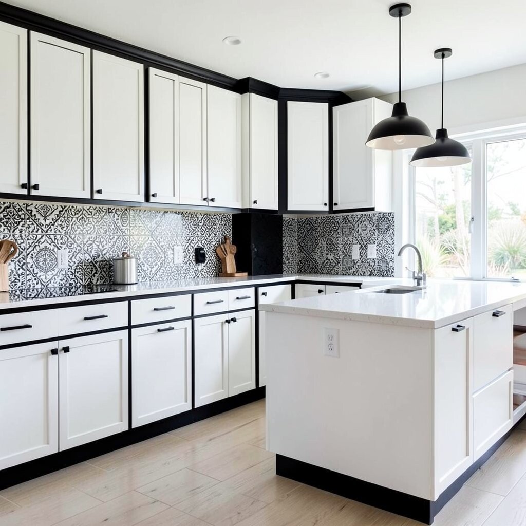
Bold white cabinets can still feel exciting when you add a strong accent. Think crisp white doors with a black glaze outline, or white cabinets paired with thick black hardware and trim.
This setup keeps your kitchen light and clean while giving you the structure of a dramatic design. It also helps small spaces feel bigger because bright color reflects light well. A practical step is to use a durable white finish that resists yellowing and can handle frequent wiping.
For personalization, add a black-and-white backsplash pattern or a black pendant light over the island. Cost can stay reasonable because a white base can be paired with affordable hardware and lighting changes. This look matches a current style favorite that leans into high-contrast design and graphic details.
8. Deep Teal For a Calm Yet Dramatic Contrast
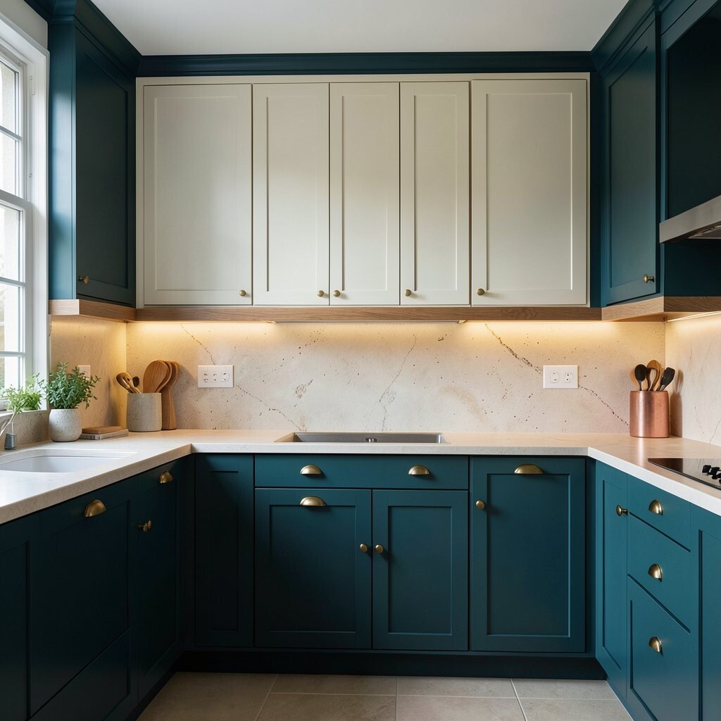
Deep teal cabinets look rich and calming, like a dark ocean at dusk. The color adds drama while still feeling cooler and balanced than many warmer shades.
Teal stands out beautifully next to light stone countertops, cream walls, and brass or copper accents. It is also practical because the depth of the shade hides minor scuffs better than lighter colors. To keep it from feeling heavy, add warm lighting and choose a backsplash that has movement, such as subtle specks or soft veining.
If you want to personalize, use teal on base cabinets and consider leaving uppers in a soft off-white. You can also add a wood shelf detail for a natural break in the color. In many kitchens right now, teal is being used as a middle ground between blue and green, giving a unique twist without losing the classic appeal of navy.
9. Forest Green With Warm Wood Pairing
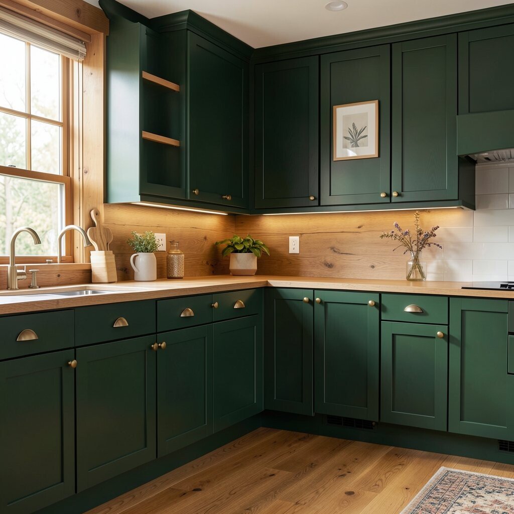
Forest green cabinets can feel bold and grounded, especially when you balance them with warm wood. The combo makes the kitchen look cozy, like a cabin-style space that still feels modern.
Choose a forest green that leans slightly warm so it harmonizes with oak, walnut, and honey-toned floors. This color can be forgiving because it does not show tiny dust specks as easily as very light finishes. For practical styling, use brass knobs and hang simple framed art so the room feels welcoming rather than formal.
10. Ripe Plum For a Creative, Artistic Kitchen
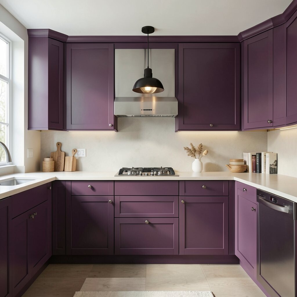
Ripe plum cabinets give your kitchen an expressive, artistic vibe. The shade adds depth and makes even simple countertops look more refined.
Plum pairs well with sleek metals like brushed steel and with warmer tones like camel leather or honey wood. It can also hide everyday wear if you choose a consistent cabinet enamel with a smooth, sealed surface. A smart personalization idea is to pair plum with an all-neutral backsplash so the color stays the star without visual clutter.
For cost considerations, plum paint is often comparable to other bold colors, and you can increase impact with a single backsplash and a statement light. A current trend is using jewel-toned cabinetry to add color without needing colorful walls, which helps keep the rest of your home feeling cohesive. If you want a gentle look, choose a softer plum and add lighter countertops to maintain an open, airy feel.
11. Sand Beige For Boldness That Still Feels Neutral
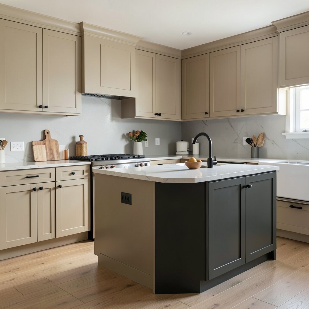
Sand beige cabinets are a bold choice for people who love calm color. They add warmth and texture while staying close to neutral, so the kitchen never feels too intense.
This is a practical option because beige tones tend to mask minor chips and marks better than crisp white. Pair it with black hardware and a light gray backsplash for a modern look that still feels soft. To personalize, try two-tone styling with beige on the perimeter cabinets and a darker accent color on the island.
Cost can stay steady because beige cabinets can be done in a standard paint approach, and they also reduce the need for heavy color coordination. As a current trend, many kitchens are using warm sand and greige tones to bridge modern minimalism with inviting warmth. If your home has plenty of wood furniture, beige cabinetry can make everything feel like it belongs together.
12. Mocha Brown For a Warm, Classic Feel
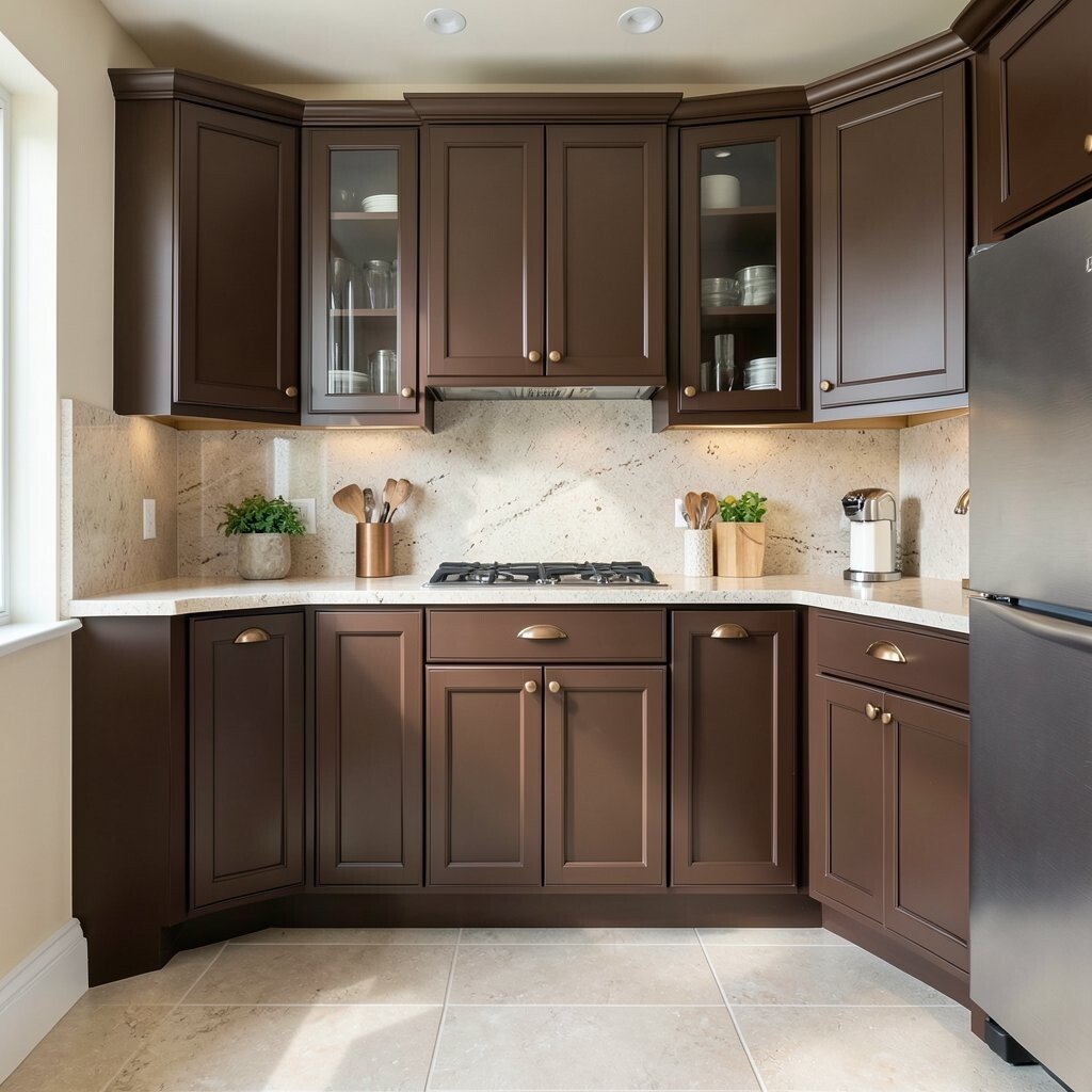
Mocha brown cabinets look rich and timeless, like your kitchen has always had that cozy charm. The color brings depth and pairs effortlessly with creamy walls and warm stainless steel.
Brown can hide daily life well, especially if you choose a slightly satin finish that is easy to wipe down. You also get natural harmony with tile floors, wood accents, and countertop colors like quartz in oatmeal or light taupe. For personalization, add a contrasting light backsplash and choose hardware in bronze or gold to make the brown feel intentional.
13. Metallic Silver Gray For a Modern, High-Energy Look
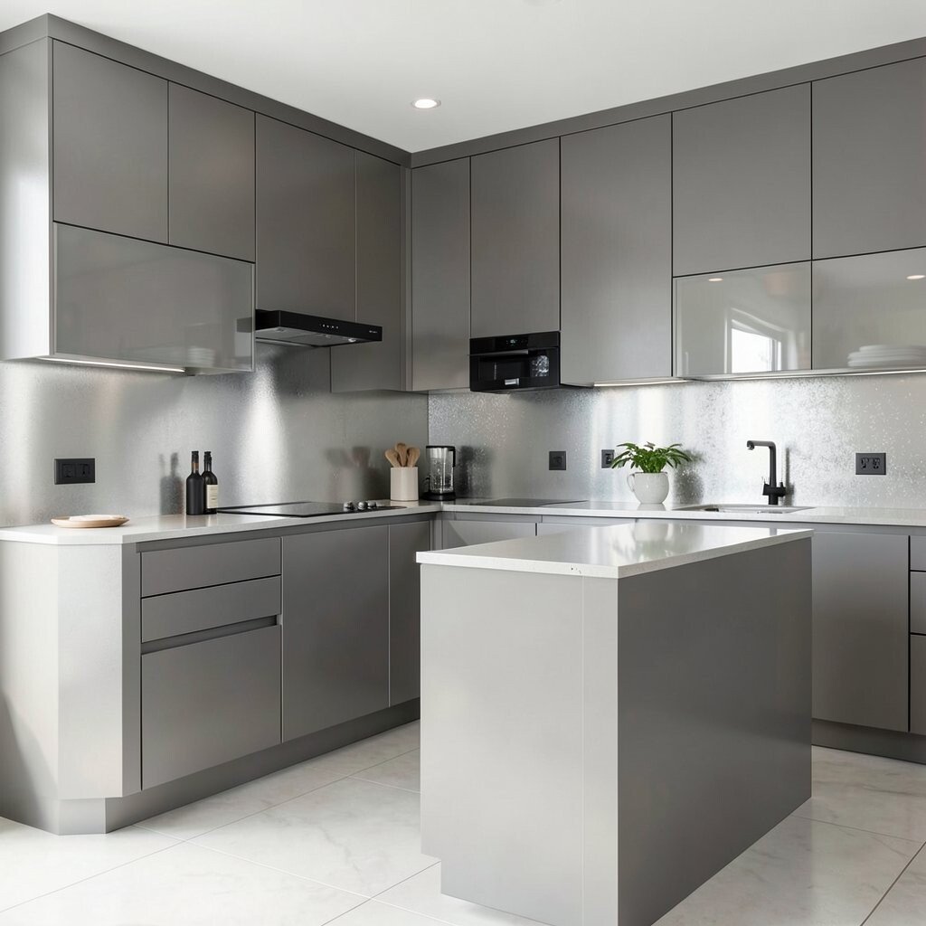
Metallic silver gray cabinets make a kitchen feel modern and energized. The color reflects light in a way that can make the room feel bigger and brighter.
It is especially striking when paired with matte black fixtures, clear glass cabinet doors, or a backsplash with subtle shimmer. For practical tips, use proper prep and a cabinet-safe topcoat so the finish stays smooth and clean. Metallics can show fingerprints more than flat paints, so consider a finish that is designed for cabinets and plan for quick wipe-down habits.
To personalize, you can limit metallic gray to an island or upper cabinets while keeping the rest in a matte neutral. Cost considerations matter here because special finishes may cost more than basic paint, but the dramatic effect can be worth it. Current trends are leaning into sleek, reflective accents, especially in kitchens with clean lines and minimal decor.
14. Bold Red For a Confident Centerpiece Kitchen
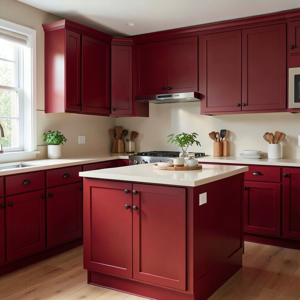
Bold red cabinets turn the kitchen into a confident centerpiece. The color feels lively and makes simple meals feel more special.
Red can be practical when you choose a deep, rich shade like cherry or brick rather than a super bright pink-red. Those tones tend to look luxurious and hide minor scuffs better than very light colors. For balancing, pair red with white or cream countertops and keep the backsplash simple so the red stays readable and not overwhelming.
If you want to personalize, try red on the lower cabinets with lighter uppers or use red only on the island for a strong focal point. In terms of cost, painting cabinets is often far less expensive than replacing them, and hardware changes like black or brass knobs can add a high-end feel without huge spending. A current trend is using red as a statement against neutral walls, especially in kitchens that want personality but still want to feel timeless.