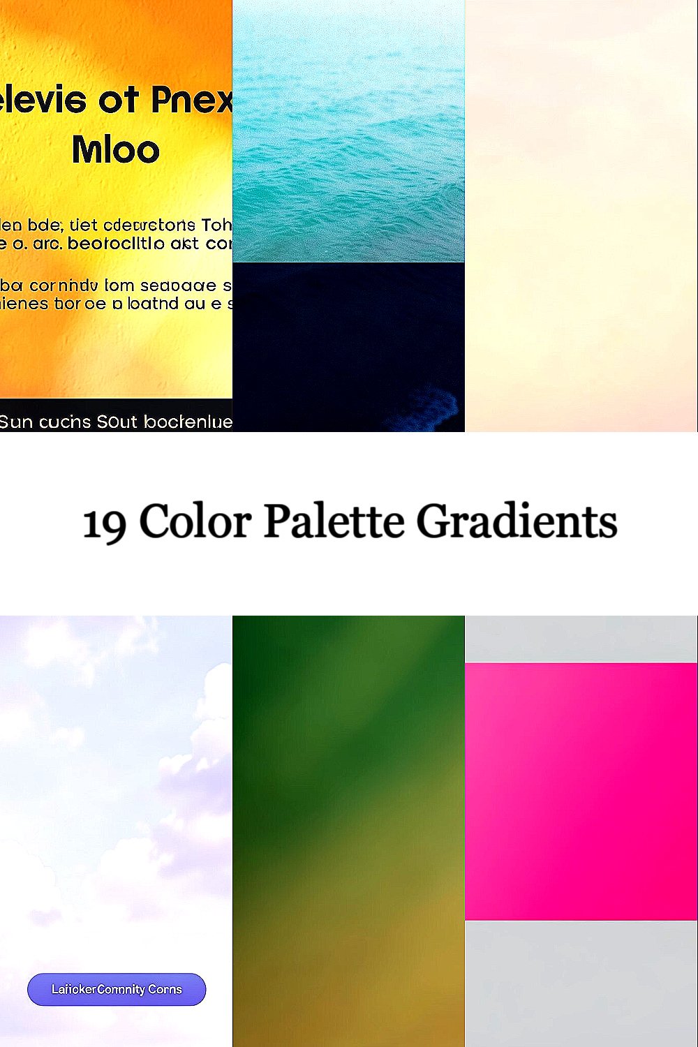
Color gradients can make simple layouts feel alive. The right palette helps your design look modern, friendly, and focused.
1. Sunlit Citrus Glow

Imagine warm oranges melting into soft yellows like afternoon light on a wall. This gradient feels happy, bright, and instantly inviting for landing pages and hero sections.
To keep it readable, pair the glow with a clean dark text color and strong contrast. Use it behind buttons or as a soft background wash so it supports content instead of fighting it.
2. Ocean Teal to Deep Navy

Picture calm turquoise water fading into deep navy like a twilight shoreline. It gives your design a cool, trustworthy mood that still feels fresh and modern.
This palette works beautifully for dashboards, apps, and portfolio headers. Try adding a slight blur or lower opacity for the gradient layer when you want a softer, less intense look.
If you want it to feel more premium, add a subtle grain texture on top. For practical testing, view it on both a phone and a bright laptop screen to ensure the tones don’t lose their difference.
3. Rose Blush and Soft Peach

Think of delicate rose tones blending into gentle peach like a sunrise over a garden. It’s romantic without being heavy, and it suits wellness, beauty, and lifestyle branding.
Use this gradient for cards, section headers, and social banners where you want a warm glow. When you choose fonts, go for clean rounded styles or simple sans serifs to match the softness.
For personalization, tweak the balance so peach dominates for a friendlier vibe or rose dominates for a more elegant feel. If you’re working with a limited budget, reuse the same gradient across many pages and adjust only the size and blending mode.
4. Lavender Mist With Sky Accents

Visualize lavender floating into pale sky tones, airy and light like morning clouds. The effect brings a calm tone that feels friendly for education, creative tools, and community sites.
To make it action-friendly, place it behind calls to action and keep button text strong and clear. You can also repeat it subtly in icons or small UI chips for a consistent style across the interface.
5. Forest Green Fade to Pine Gold

Imagine deep forest greens sliding into warm pine gold, like sunlight through leaves. This gradient feels grounded and energetic, which is great for outdoor brands and product pages.
Use darker shades for navigation bars and lighter shades for highlight zones. If you’re designing for accessibility, check that the contrast between text and background stays high even when the gradient shifts.
To personalize, adjust the gold intensity so it feels subtle for professional sites or bold for playful promotions. A smart cost choice is to build one gradient and reuse it across backgrounds, hero banners, and email headers.
6. Cherry Pink to Magenta Pop

Picture bright cherry pink turning into vivid magenta, like a burst of color at a festival. This palette grabs attention fast, making it ideal for product launches and event pages.
Keep the design balanced by using this gradient mainly in small areas like badges, hover states, and highlight borders. Pair it with neutral grays so your layout feels sharp instead of overwhelming.
If your brand voice is playful, add small motion effects like a slow gradient shift. For practical tips, test the gradient with real images so skin tones and photos still look natural next to the pop color.
7. Sunset Ember From Coral to Amber

Think of coral warming into amber, like an ember at the edge of sunset. This gradient adds warmth and a sense of momentum, which can help your page feel welcoming and alive.
It’s especially good for e-commerce sections where you want products to feel desirable. Use it behind product carousels or as a border glow around key items.
8. Cool Gray Indigo Blend

Imagine cool gray drifting into indigo, smooth and modern like a clean studio wall. This palette helps designs feel organized and calm while still looking stylish.
It works well for SaaS landing pages, admin tools, and tech blogs. If you want a current trend feel, combine the gradient with thin lines, soft shadows, and lots of spacing.
For personalization, shift the indigo toward blue for a cooler look or toward purple for extra creativity. To manage costs, keep your font choices simple and let the gradient do most of the visual work.
9. Gold Champagne to Warm Cream

Picture champagne gold flowing into creamy tones like soft light on polished metal. This gradient feels luxurious and gentle, perfect for premium services and elegant brands.
Use it sparingly so it stays special, like on pricing cards or feature highlights. If your layout has lots of text, place the gradient behind large padding areas so the content remains calm and readable.
For uniqueness, try a slightly angled blend that follows your page layout. A practical idea is to create a reusable CSS style variable so you can update the entire brand look quickly later.
10. Electric Blue to Cyan Wave

Visualize electric blue turning into bright cyan like a lightning strike meeting a clear sky. This gradient feels futuristic and energetic, great for creative apps and tech brands.
To keep it usable, choose darker text colors only when the cyan is not too light, or use white text with darker stops. You can also add a subtle overlay on top of images to keep the gradient consistent across different photos.
11. Autumn Rust to Deep Brown

Imagine rust orange fading into deep brown, like fallen leaves pressed into paper. This gradient brings a cozy, grounded mood that feels great for content sites and craft brands.
Pair it with warm off-white text and earthy accents like terracotta icons. If you want it to feel more modern, avoid too many extra colors and let the gradient be the main character.
For personalization, adjust the ratio so rust feels like the glow while brown stays like the foundation. On the cost side, you can use it as a single background layer and reuse it across multiple templates without rework.
12. Lemon Lime to Soft Mint

Think of bright lemon lime blending into soft mint, like fresh fruit juice and cool air together. This gradient feels crisp and playful, ideal for healthy snacks, fitness, and friendly interfaces.
Use it for section separators, app splash screens, and feature highlights. If you have forms, place subtle gradients behind form containers so the page feels lively while still easy to use.
13. Royal Purple to Rose Quartz

Picture royal purple flowing into rose quartz, rich and romantic at the same time. It gives your design depth and personality, making it great for creative studios and beauty brands.
This palette shines in hero banners and bold typography areas. For practical tips, keep the saturation in check by using darker purple for backgrounds and lighter rose tones for highlights.
To personalize, try mixing in a small amount of near-black at the purple end so the gradient looks more dramatic. If you’re working with a tight budget, a single gradient can carry an entire color system when paired with neutrals.
14. Aqua Seafoam to Pale Lagoon

Imagine seafoam fading into pale lagoon, light and airy like a gentle breeze near water. The result feels relaxing, which is perfect for travel pages, meditation apps, and friendly blogs.
Use this gradient behind cards and expandable panels, because it makes surfaces feel soft and inviting. When you add images, keep the photos bright and clear so the gradient doesn’t make everything look washed out.
15. Coral Reef Red to Salmon Pink

Picture coral reef colors blending from red to salmon pink, lively and full of movement. This gradient works well when you want something energetic yet approachable.
Place it in hero areas, newsletter signups, and discount banners. A good practical move is to choose one supporting neutral like warm gray so the coral tones stay readable and balanced.
To make it unique, use it in a slightly radial form for highlights around icons. For cost considerations, keep the same gradient but change its direction across different sections so each area feels distinct without extra assets.
16. Deep Teal to Emerald Bloom

Think of deep teal flowing into emerald green, like water turning into thriving plant life. This gradient feels vibrant and confident, great for sustainability brands and modern portfolios.
It’s also a strong choice for product sections where you want a clear visual anchor. Try pairing it with crisp white text and simple button styles so your calls to action stand out.
17. Black Cherry to Soft Plum

Imagine black cherry fading into soft plum, dramatic yet smooth like velvet curtains. This palette adds elegance and can make your layout feel cinematic.
Use it for dark mode themes, night-time event pages, and premium UI cards. For practical tips, watch out for contrast and make sure text stays readable when the plum end gets lighter.
To personalize, add a faint glow effect around important elements like pricing and links. If you’re trying to keep costs low, use the gradient as a background and rely on typography hierarchy for the rest of the design.
18. Sky Rose to Gentle Lilac

Picture sky rose blending into gentle lilac, like sweet aromas in a cool morning air. It gives a light, creative vibe that fits startups, music pages, and brand experiments.
This gradient is excellent for subtle overlays because it feels soothing instead of loud. You can also use it to tint illustrations and create a consistent color story across multiple graphics.
For uniqueness, limit the gradient to a corner or edge so the main content stays clean. On cost considerations, using the same gradient across icons and banners can reduce design time while keeping everything cohesive.
19. Warm Terracotta to Sunset Rose

Imagine terracotta warming into sunset rose, earthy and glowing like clay warmed by sunlight. This gradient feels welcoming and human, which is why it works so well for community-driven brands.
Try it on onboarding screens, profile cards, and blog headers where you want a gentle emotional tone. If you want personalization, adjust the terracotta depth to match your brand mood, from calm to bold.
For practical tips, keep a consistent gradient direction across your site so your users feel orientation and polish. For cost considerations, build it once and reuse it across templates, then fine-tune only the spacing and typography for each page.