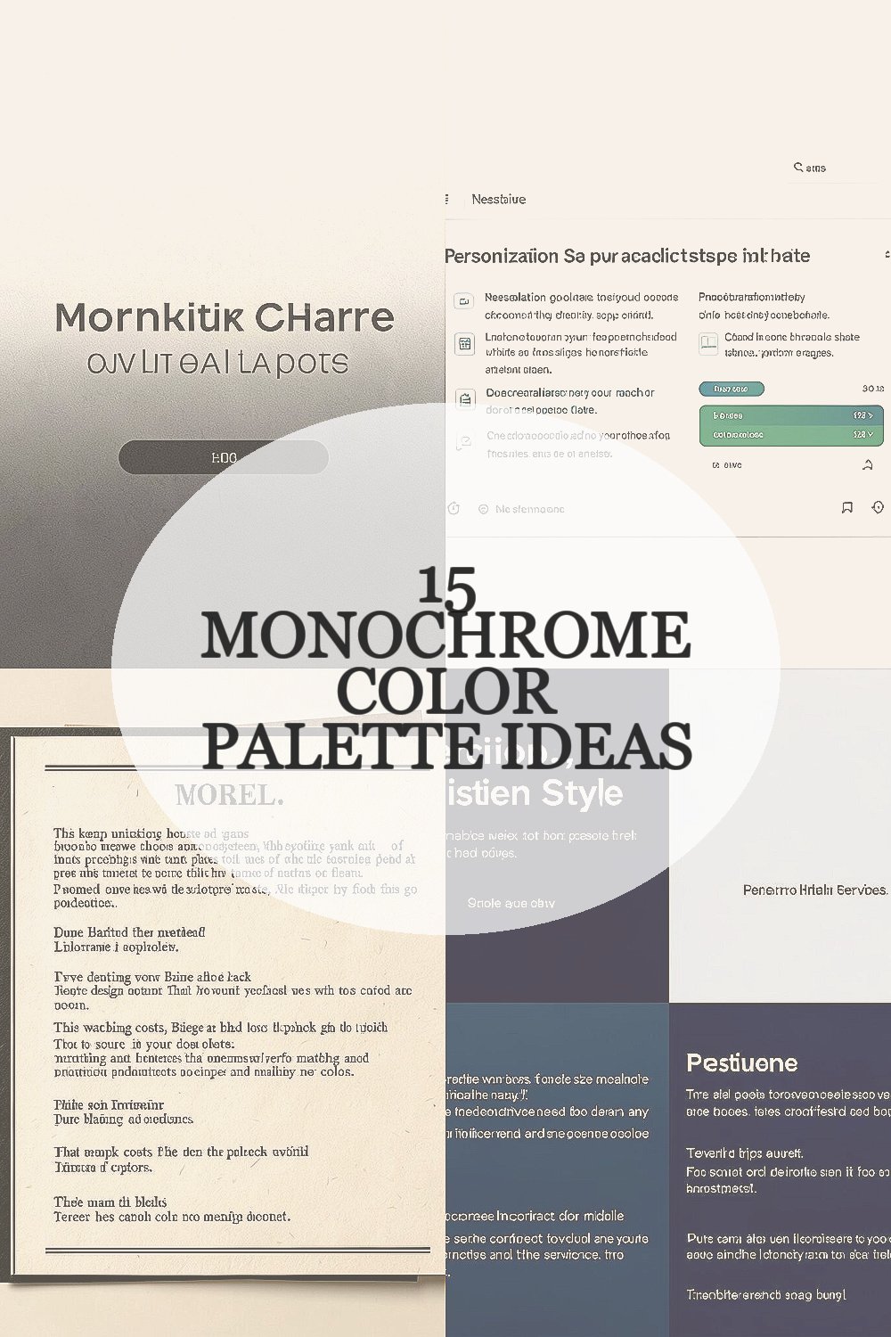
The right monochrome palette can make simple design choices feel surprisingly rich. It’s a quiet style with loud results.
Monochrome means you use one color family, but you keep life in the project by varying shades, tones, and textures. When you do it well, the whole piece looks planned, calm, and modern.
1. Soft Charcoal on Warm Off-White

Picture a page that starts in warm off-white and slowly deepens into soft charcoal. The contrast feels gentle, like morning light on paper.
Use it for websites, posters, or branding when you want clear readability without harsh edges. Try pairing charcoal text with off-white backgrounds, then add one near-black accent for icons or buttons so key parts stand out.
To keep it unique, fold in subtle grain using matte textures or light noise overlays. This makes the monochrome palette feel intentional, not flat, and it works especially well with photography.
2. Cool Slate With Crisp White Space

Think of cool slate as your main mood, sitting quietly on clean white space. It looks modern, airy, and a little techy.
This palette is great for dashboards, app screens, and product pages where users need to scan information fast. Keep large areas in white, use slate for body text, and reserve a darker slant of slate for headings.
For personalization, match the slates to your brand personality by choosing either blue-leaning or green-leaning slate. You can also vary opacity on icons so the interface feels friendly instead of strict.
3. Classic Black and Paper-Like Beige

Imagine classic black ink printed on paper-like beige, with a warm, human feel. The look is timeless and pairs well with stories, portfolios, and menus.
This combination helps content feel premium because the beige softens the contrast. If you’re designing something for print or packaging, it can also reduce the “sterile” vibe that pure black can bring.
Make it actionable by limiting black to text, borders, and key shapes while letting beige carry the background. To keep uniqueness, add one slightly darker beige layer behind images, so your layout gains depth without adding new colors.
If you’re watching costs, beige and black are easy to source in most design systems and printing options. That means fewer revisions for color matching and simpler production.
4. Monochrome Navy for Serious, Polished Style

Visualize a navy-heavy design where every shade feels steady and focused. From deep midnight tones to softer periwinkle grays, it reads as confident and calm.
Navy monochrome works beautifully for legal pages, school projects, and professional services because it feels trustworthy. Use lighter navy for backgrounds, mid navy for headings, and very dark navy for strong emphasis like links.
For practical tips, test contrast with real text sizes so your content stays readable on mobile. You can also use navy gradients sparingly to highlight hero sections without making the page busy.
5. Charcoal Mist With Silver Accents

Picture a charcoal mist background with subtle silver highlights that look almost like metal. The palette feels sleek, modern, and slightly futuristic.
This approach is great for tech brands, product mockups, and sleek event graphics. Keep primary text in charcoal, then use silver accents for small UI elements like dividers, badges, and hover states.
To personalize, choose whether your silver leans warmer or cooler so it matches your photos. If you’re using real product images, sample highlights from the metal parts to keep everything cohesive.
6. Monochrome Forest Green for Grounded Energy

Imagine forest green across everything, from fresh leaf tones to deeper evergreen shadows. It gives a grounded, natural energy that feels comforting.
Use this palette for wellness brands, landscaping portfolios, recipe sites, and eco-friendly packaging. A lighter green background with darker green text creates a friendly contrast that still feels bold.
For uniqueness, add texture that mimics paper fibers or leaf-like patterns in the background. Practical tip: keep your main text in a mid-to-dark green and avoid using very light green for small font sizes.
If cost matters, green is a common pigment in printing and a popular choice in design tools. That usually means easier color matching and fewer surprises during production.
7. Muted Teal With Foggy Blue-Gray

Think of muted teal as the core color, softened by foggy blue-gray around it. The effect is smooth and calming, like cloudy water.
This palette shines in creative studios, travel blogs, and calm app interfaces. Pair teal for buttons and key headings with blue-gray for backgrounds and supporting text so everything feels balanced.
Try personalization by selecting a teal that matches your brand photos. If your imagery has ocean tones, lean more blue; if it has lush greens, lean more green while staying in the same family.
8. Monochrome Purple for Dreamy Depth

Picture a purple monochrome design that ranges from gentle lavender to deep violet. It feels dreamy, artistic, and a bit mysterious without being chaotic.
Purple palettes are perfect for music pages, events, beauty brands, and storytelling portfolios. Use lavender for big surfaces, medium violet for readable text, and near-black violet for strong emphasis like dividers and CTA bars.
For practical tips, keep your spacing generous so the palette breathes. Add uniqueness through subtle background patterns, like faint shapes that repeat at low opacity.
Cost considerations are easy here because purple shades are widely supported in print and digital. You can also create many variations with opacity and overlays, reducing the need for extra materials.
9. Monochrome Red With Soft Blush Highlights

Imagine rich red shaped into a calm system by mixing it with soft blush tones. The result feels warm and expressive instead of aggressive.
This palette is great for food brands, maker projects, and bold landing pages. Use darker red sparingly for buttons and headings, while blush tones can serve as airy backgrounds for sections and cards.
To keep it unique, add a slightly desaturated red-gray for borders or small captions. That little shift makes the monochrome theme feel designed rather than just “red everywhere.”
10. Monochrome Orange for Cozy Focus

Visualize monochrome orange that starts as warm peach and deepens into burnt amber. It creates a friendly, cozy mood that grabs attention gently.
Use it for cafés, learning communities, product packaging mockups, and event posters. Keep your brightest peach for backgrounds, medium amber for text, and deeper burnt tones for accents that need to pop.
For personalization, match the orange to your season theme by choosing more coral for spring and more terracotta for fall. Practical tip: avoid tiny orange text on light backgrounds since some orange shades can reduce readability.
11. Monochrome Pink With Rose-Tinted Contrast

Picture a rose-pink world with layers of blush, dusty rose, and deeper magenta shadows. It feels romantic, modern, and fun to play with.
This palette works well for lifestyle brands, wedding stationery, creative apps, and playful personal projects. Use a light blush for the main background, rose for body text, and magenta for calls to action.
To make it actionable, keep your shapes crisp so the palette looks intentional. Add uniqueness by using a matte finish for large backgrounds and a slightly glossy highlight for important elements like icons.
Trends right now lean into soft gradients and tactile surfaces, and pink monochrome is perfect for that look. You can keep the design current by using gentle transitions rather than harsh blocks of color.
12. Monochrome Brown With Creamy Highlights

Imagine rich brown used with creamy highlights that look like warm sunlight. It creates an earthy, vintage feeling with real depth.
This palette is ideal for coffee brands, craft projects, heritage-style websites, and book covers. Use lighter cream backgrounds for readability, then build structure using cocoa and dark umber for headings and borders.
For practical tips, add simple visual hierarchy with size and spacing since you’re keeping the color family consistent. Personalization is easy too, because you can pull lighter or darker browns from your own photos or fabric swatches.
If you’re thinking about cost, brown tones are common in both digital design sets and many printing workflows. That makes it easier to keep the project consistent across formats like flyers, stickers, and packaging.
13. Monochrome Gray With Almost-White Layering

Picture an almost-white base with layers of gray that shift from clean to smoky. This palette feels balanced, modern, and easy to adjust.
It’s a top choice for corporate documents, UI designs, and portfolios that need a polished look. Use near-white for large backgrounds, mid-gray for body text, and dark gray for headers and important UI elements.
To keep uniqueness, include different surface textures like frosted glass effects, paper grain, or soft blur overlays. Those subtle differences help the eye find structure without adding new colors.
14. Monochrome Gold on Dark Charcoal Grounds

Imagine gold-like tones floating over dark charcoal, like warm light in a dim room. The palette feels luxurious, celebratory, and eye-catching.
This works well for awards, premium product pages, event branding, and special edition packaging. Use dark charcoal as the main background, then apply gold for headings, highlights, and icons.
For practical tips, keep gold accents small so the design doesn’t lose readability. You can also personalize by choosing gold that leans more champagne or more antique, depending on the mood of your images.
On the trends side, metallic-inspired monochrome is still popular because it looks high-end even in simple layouts. Just be careful with contrast and test on multiple screens for accessibility.
15. Monochrome Monochrome-Blue for Clean Ocean Branding

Imagine ocean-blue monochrome where every shade feels like a calm sea. From pale sky-blue to deep storm-blue, the story stays steady.
Use it for water-themed projects, fitness plans, sustainability messaging, and product lines with a fresh vibe. Keep pale blues for backgrounds, medium blues for text, and deeper blues for borders and interactive elements.
To make it unique, add one or two “sky” gradients that follow the same blue family but don’t jump too far in tone. A practical tip is to vary line thickness and spacing so charts, diagrams, or sections still feel clear.
If cost considerations matter, blue tones are usually easy to reproduce in both digital and print since they’re widely supported. That helps you spend more time on layout and less time on color corrections.