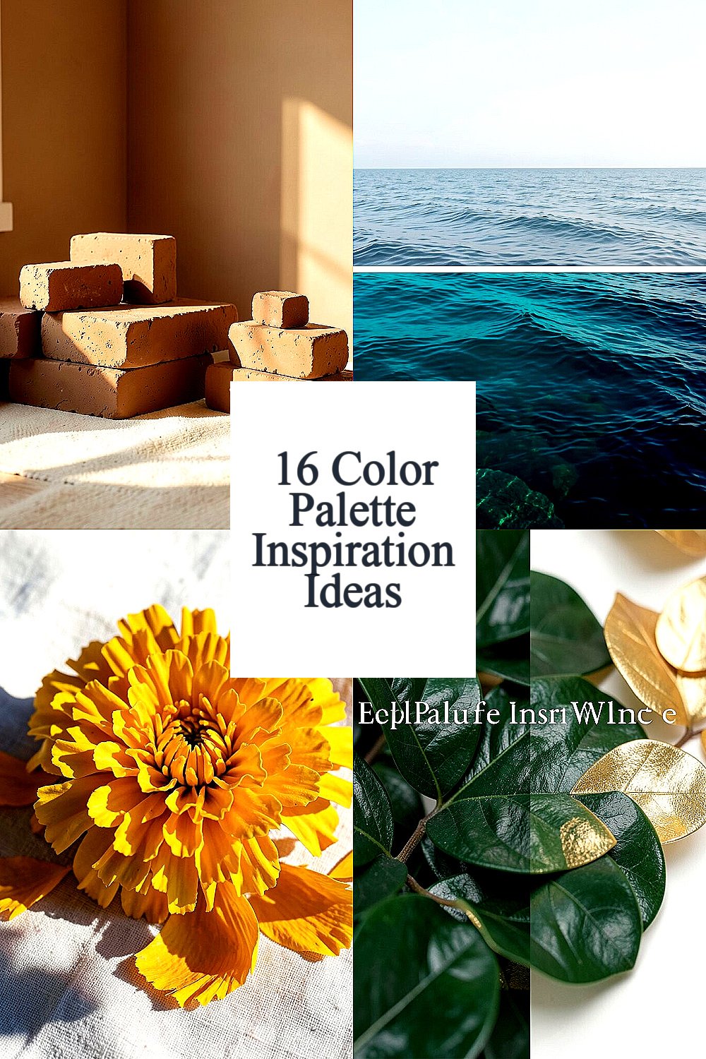
The right colors can make your work feel alive before anyone reads a single word. When the palette fits your mood, every decision gets easier.
Pick a palette that matches your audience, your space, and the story you want people to feel. Then let the colors guide your layout, typography, and details in a way that feels natural and confident.
1. Warm Clay and Soft Cream
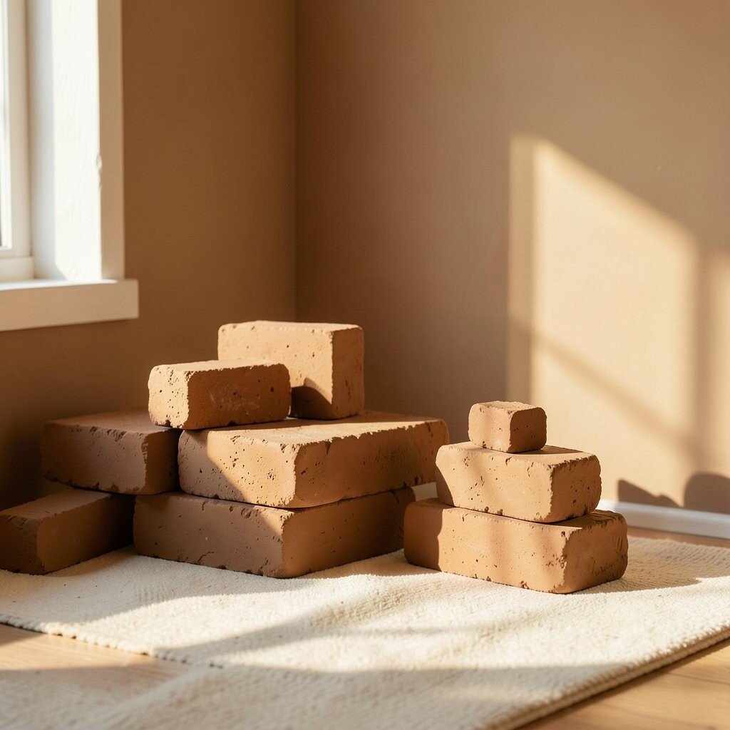
Picture a cozy room lit by late afternoon sun. Warm clay tones sit like gentle bricks while soft cream keeps the whole scene airy.
Use this palette for brand visuals that should feel welcoming and steady. It works especially well for packaging, local service sites, and small product launches where trust matters. Try a clay base for backgrounds, then cream for text and key UI elements so everything remains readable and calm.
2. Ocean Teal, Deep Navy, and Mist Gray
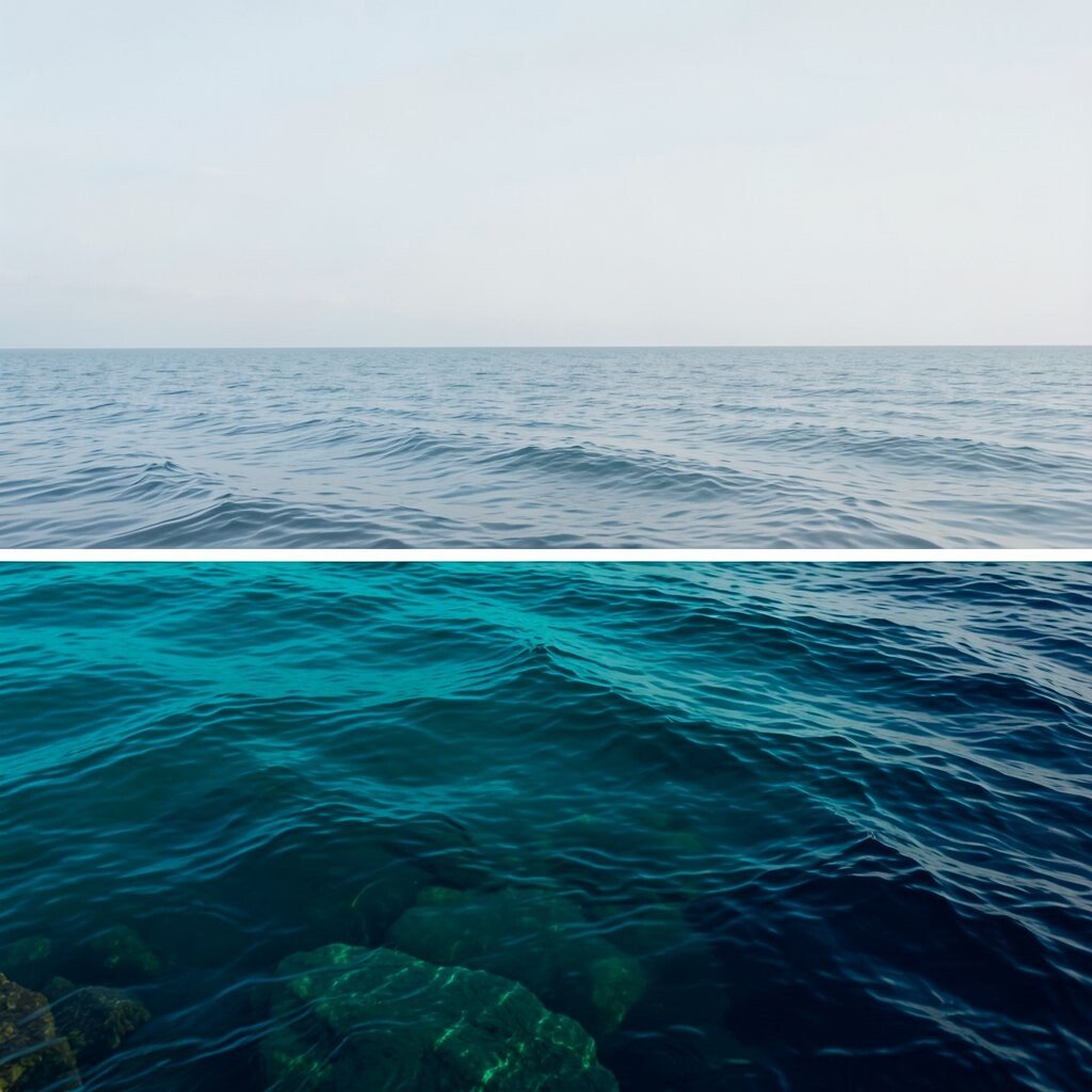
Imagine looking out at a calm sea, then noticing the deeper water hiding underneath. Ocean teal brings energy, deep navy adds focus, and mist gray smooths the edges.
This palette is great when you want a modern, dependable look with a little personality. Pair navy for strong headlines and buttons, then use teal for icons, links, and small accents. To keep it feeling fresh, use mist gray for panels, cards, and secondary text so the design never looks heavy.
For practical cost control, choose one bold brand color and treat the other shades as support. You can create variety with opacity and spacing instead of buying new colors for every section. A current trend is using deep navy with bright teal highlights to create a sleek, tech-style vibe without going too loud.
3. Sunlit Marigold, Charcoal, and Pale Linen

Think of marigold petals warming under light, with charcoal shadows making everything crisp. Pale linen keeps the composition from feeling crowded.
Marigold works beautifully for hero sections, promo banners, and call-to-action areas because it naturally grabs attention. Use charcoal for paragraphs and navigation so your content stays easy to scan. Then let pale linen act as your background so the bright color has room to breathe.
For personalization, adjust the marigold temperature to match your brand voice. A slightly softer yellow works for friendly lifestyle brands, while a richer amber suits bold creators and energetic products. If you are designing for print, test your charcoal and marigold together because high contrast can look different on coated and uncoated paper.
4. Emerald Green, Warm Gold, and Off-White
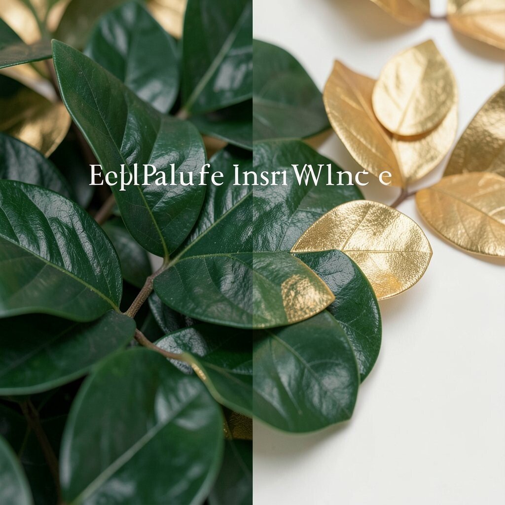
Close your eyes and picture lush leaves beside a small flash of warm metal. Emerald green feels grounded, warm gold adds celebration, and off-white keeps the look elegant.
Use this palette for anything that needs a premium feel without being cold. Emerald can anchor your layout, gold can highlight pricing, badges, or special features, and off-white can carry the text. Keep gold touches small so it feels like a reward rather than a constant spotlight.
5. Berry Purple, Soft Rose, and Clean White
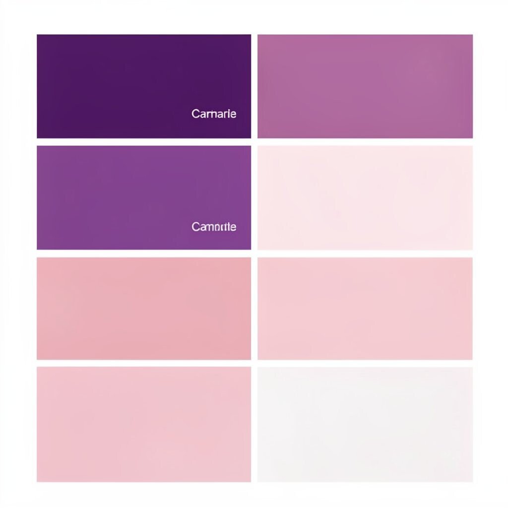
Berry purple makes a statement, while soft rose adds warmth and approachability. Clean white keeps the palette airy and friendly.
This combination is perfect for beauty brands, creative studios, and community projects that should feel expressive. Use berry purple for headings and major buttons, then reserve soft rose for backgrounds, dividers, and subtle gradients. If you want extra usability, keep contrast high by using white text on darker berry shapes.
For current trends, you will often see purple paired with gentle pink tones to create a “soft bold” mood. To stay practical, build your palette around just two main colors plus neutrals, then derive the rest with tints and shades. That way you avoid endless color switching while still getting visual variety.
6. Forest Green, Cocoa Brown, and Sand Beige

Imagine a walk through pine trees after rain, with the scent of earth lingering in the air. Forest green leads the scene, cocoa brown adds depth, and sand beige gives it a natural finish.
This palette feels grounded and reliable, which is great for outdoor gear, wellness products, and heritage-style brands. Use forest green for backgrounds or large sections, cocoa brown for typography, and sand beige for layout space and form fields. A small trick is to use sand beige for your “resting” areas so users always have visual calm between actions.
If you are working with multiple pages, keep your color rules consistent so the site feels like one place. Forest green can be the primary action color, while cocoa brown can act as your secondary text color. You can also personalize by shifting the sand beige warmer for a rustic style or cooler for a modern natural look.
When thinking about cost, earthy palettes are helpful because they often print well and hide minor color variation. Still, test your sand beige and cocoa brown on your actual materials to make sure the contrast stays strong.
7. Coral Pink, Aqua Blue, and Pale Gray

Coral pink feels like a cheerful splash, and aqua blue adds a refreshing, playful balance. Pale gray ties it all together like a calm sidewalk under bright umbrellas.
This palette is ideal for kid-friendly products, summer campaigns, and social platforms that need an upbeat vibe. Use coral for attention-grabbing accents and aqua for interactive elements like hover states. Keep pale gray for backgrounds and longer text areas so reading stays comfortable.
A practical tip is to set a single “loud” color and a single “support” color. Coral can be the loud one, and aqua the support, while gray handles structure. Personalize by choosing a more muted coral for a sophisticated tone or a brighter coral for bold marketing pages.
For current trends, you will see more lively corals paired with clean blues because they feel optimistic and modern. If you worry about looking too busy, limit coral to buttons and key icons, then use aqua in small sections and outlines.
8. Black Teal, Soft Cyan, and Warm White

Picture a night sky over a quiet harbor, where teal holds the darkness and cyan carries the glow. Warm white makes the whole palette feel inviting instead of harsh.
This is a strong choice for apps, dashboards, and brands that need a sleek, digital feel. Use black teal for navigation, headers, and thick dividers, then use soft cyan for links and emphasis. Warm white should be your text and background anchor so your design stays readable.
If your project uses lots of UI elements, this palette can help you create clear hierarchy fast. The darker teal provides structure, cyan gives you cues, and warm white prevents eye strain. To personalize, swap soft cyan for a slightly greener or more blue cyan based on your brand personality.
9. Lavender, Dusty Mauve, and Light Sand
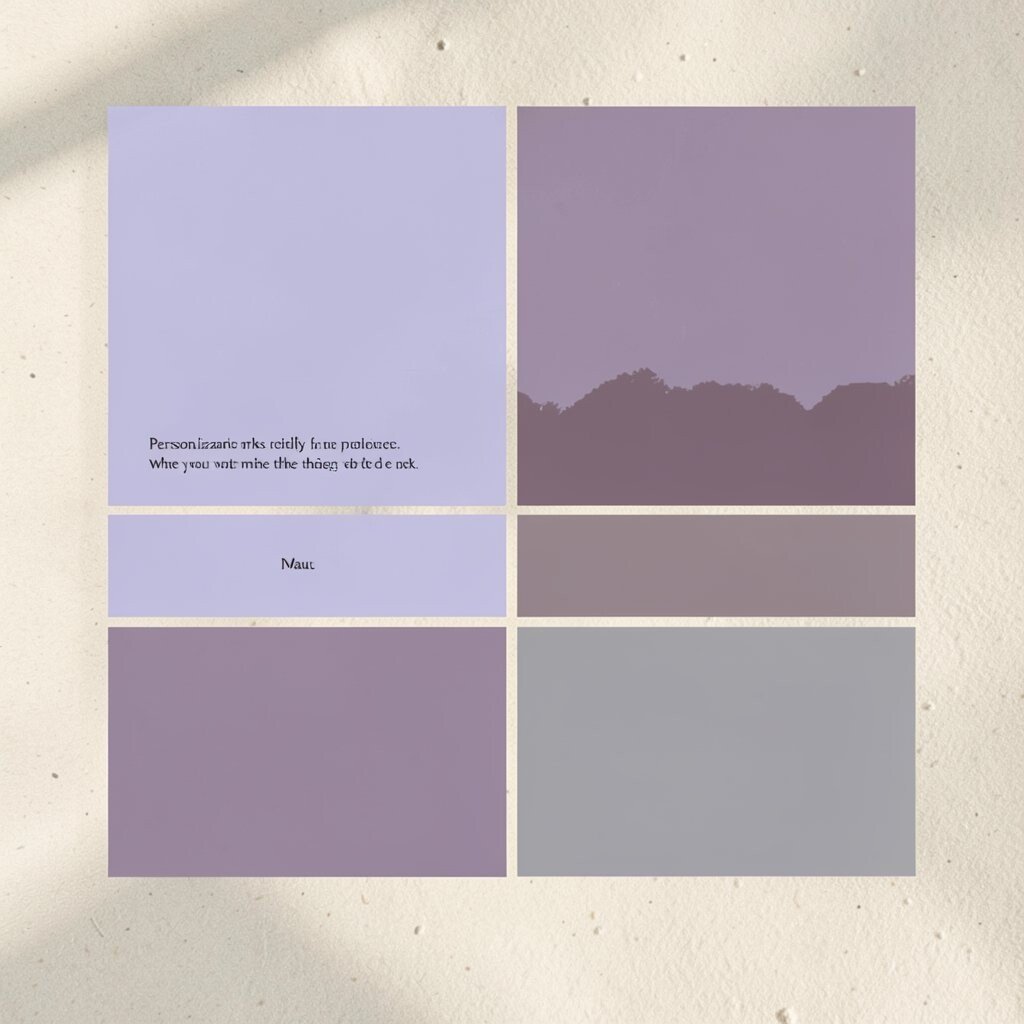
Lavender gives a gentle dreamy feeling, while dusty mauve adds a deeper, more grown-up mood. Light sand keeps everything soft and grounded.
This palette works beautifully for stationery, lifestyle brands, and creative portfolios that want a calm, artsy presence. Use lavender for headings and decorative blocks, dusty mauve for buttons and links, and light sand for backgrounds. The sand tone also helps reduce harsh contrast for long reading sessions.
When you want practical balance, use mauve sparingly for the most important actions. That way the palette stays light, and users never miss the one thing they need to do next. Personalization is easy by leaning lavender toward purple for a more whimsical style or toward gray for a modern, understated look.
10. Royal Blue, Steel Gray, and Pure White
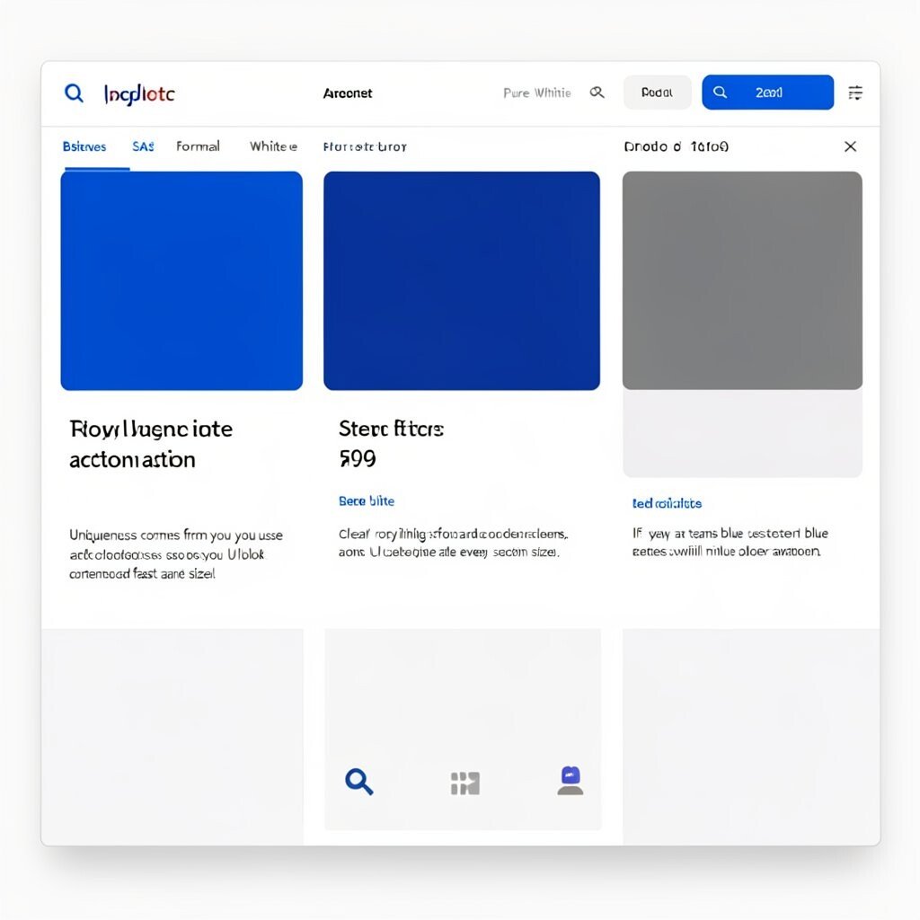
Royal blue feels confident, and steel gray adds a crisp, professional edge. Pure white keeps your layout clean and sharp.
This classic palette is excellent for business websites, SaaS products, and formal portfolios. Royal blue can be your primary action color, steel gray can guide spacing and secondary text, and pure white can keep the background consistent. For practical tips, create a clear system for borders and card backgrounds so your UI looks organized at every screen size.
Uniqueness comes from how you use the blue tone. Try pairing royal blue with thin outlines and generous whitespace for a modern feel, or use thicker blue shapes for a bold, editorial style. If you are thinking about current trends, many teams now use stronger blue accents with minimal color variation to keep interfaces fast and clear.
11. Red Brick, Creamy Beige, and Charcoal
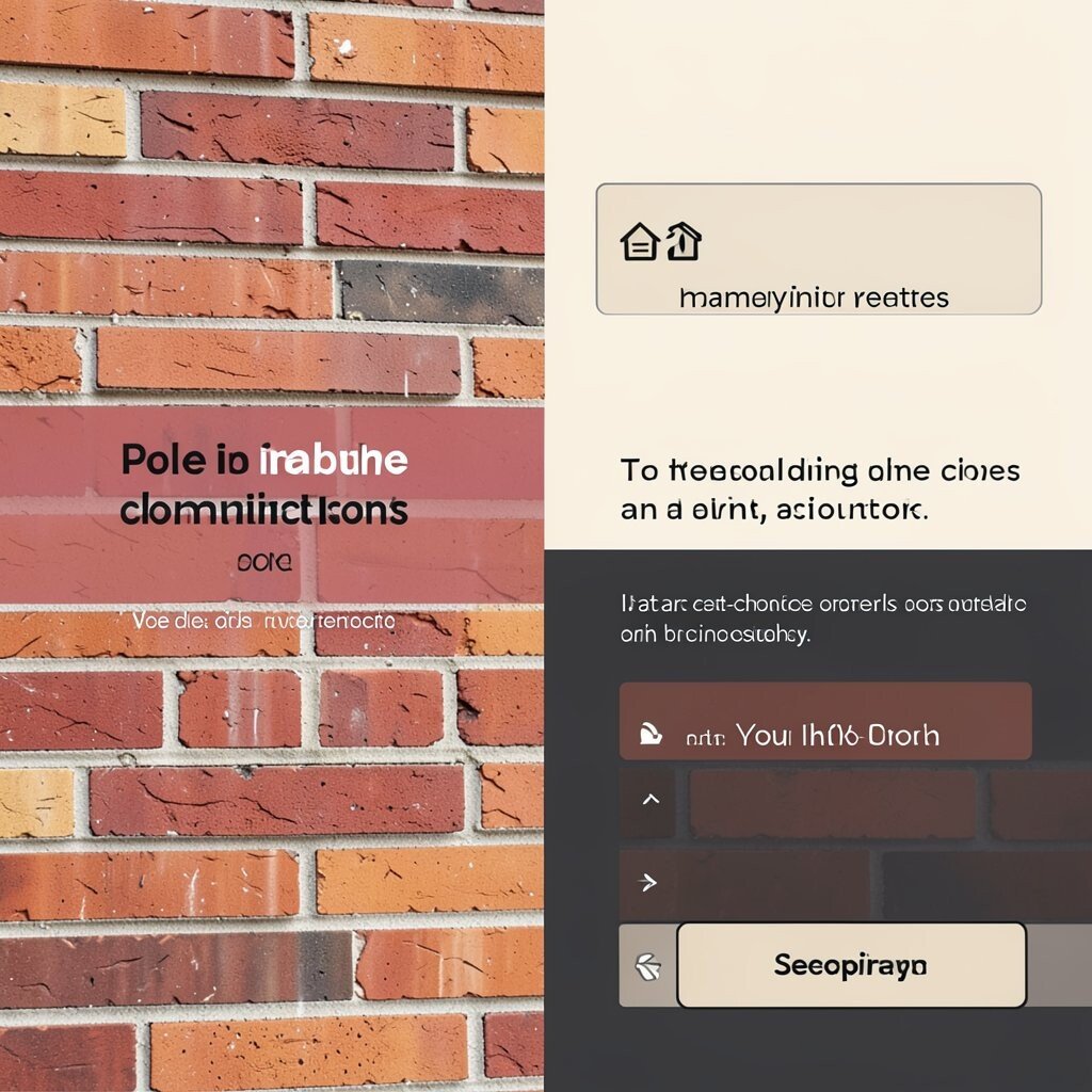
Red brick brings warmth and human energy, like a well-loved storefront. Creamy beige softens the intensity, while charcoal adds solid structure.
This palette is a great match for restaurants, community events, and handmade products. Use red brick for attention points like banners, pricing, and key icons, then rely on charcoal for readable text and navigation. Creamy beige should act as the background so the design stays welcoming and not too aggressive.
For personalization, try adjusting the brick tone to be more orange or more maroon. That one choice can shift the whole mood from playful to sophisticated. If you are cost-conscious, brick and charcoal often work well across print processes because dark neutrals hide small inconsistencies.
To make the design actionable, set your primary button in brick and your secondary button in beige with a charcoal outline. That creates a clear visual path without needing too many extra colors.
12. Lime Green, Deep Teal, and Snow White
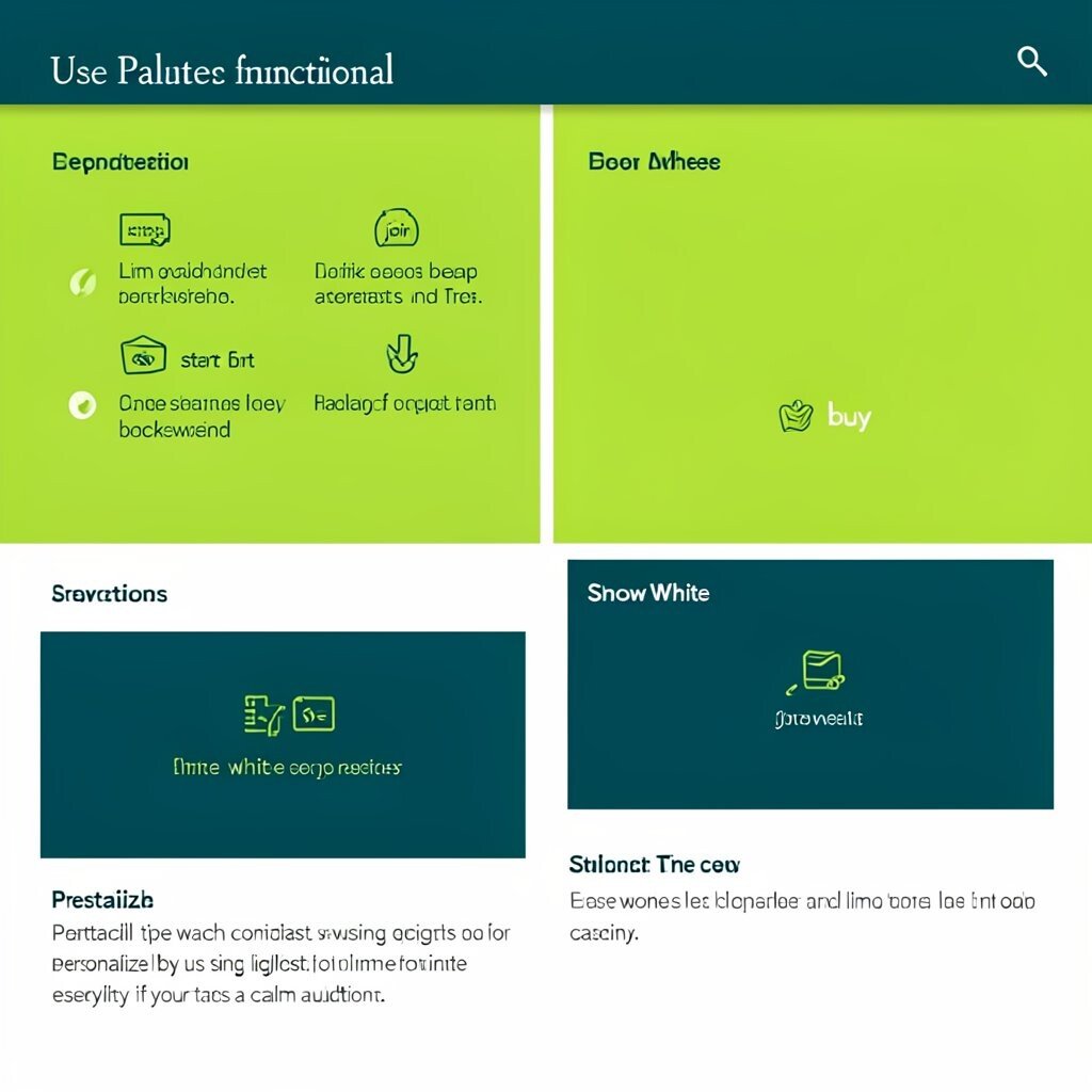
Lime green is lively and optimistic, while deep teal brings steadiness and clarity. Snow white creates a clean stage so the accents can pop.
This palette is perfect when you want a “fresh and functional” feel. Use deep teal for headers and major layout blocks, then let lime green mark key actions like “start,” “join,” or “buy.” Snow white should handle backgrounds and body text for easy reading and quick scanning.
A practical tip is to watch contrast when using lime green, especially for small text. Lime works best for icons, highlights, and buttons rather than paragraphs. Personalize by using a slightly softer lime for less intensity, especially if your brand targets a calm audience.
13. Teak Orange, Olive Green, and Light Gray

Teak orange feels like warm wood and friendly light, while olive green adds a natural, outdoorsy calm. Light gray acts like a neutral canvas for everything to sit neatly.
Use this palette for eco-themed brands, design studios, and home improvement products. Teak orange can highlight calls to action and important product details, and olive green can support sections that need trust. Light gray helps keep pages balanced and avoids that heavy “all earth” look.
Uniqueness comes from pairing an orange that feels earthy instead of bright candy. To personalize, choose an orange that matches the texture you want to evoke, such as a lighter teak for airy feel or darker burnt orange for bold warmth. A current trend is mixing warm neutrals with one nature color to create a modern organic style that still looks polished.
14. Ice Blue, Midnight Purple, and Soft Cream
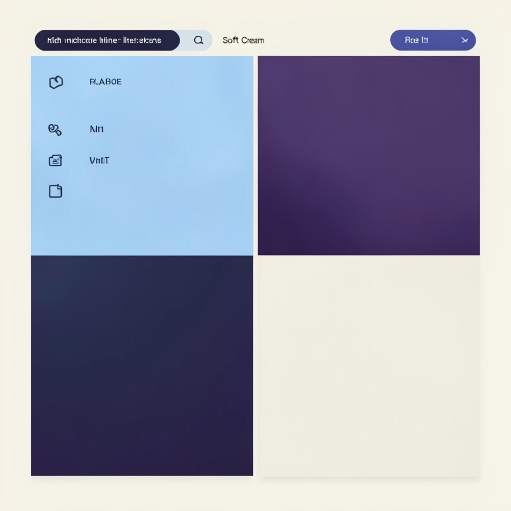
Ice blue feels like clear glass, and midnight purple adds mystery without losing elegance. Soft cream rounds everything out so the palette stays friendly.
This combination is great for creative tech, event branding, and portfolios that need both clarity and character. Use midnight purple for headings and navigation, ice blue for links, highlights, and interactive states, and soft cream for backgrounds. It also looks beautiful in gradient areas where you want color to glide instead of jump.
For practical tips, limit the purple to structural parts so it doesn’t overtake the design. Then use ice blue for small moments like icons and underlines to guide attention. Personalize by selecting a more vibrant purple for energetic projects or a deeper, muted purple for a more luxe vibe.
15. Metallic Gold, Charcoal Black, and Ivory

Metallic gold can feel luxurious, especially when it is paired with deep charcoal and creamy ivory. The gold glints like a finishing touch, not the whole outfit.
This palette is excellent for events, premium product pages, and brand identities that want a celebratory feel. Use charcoal black for typography and strong layout structure, ivory for backgrounds and long text, and gold for badges, dividers, and key highlights. Keep gold limited so it stays special and easy on the eyes.
To personalize, decide if your gold should lean warm or slightly cooler. Warm gold feels classic and rich, while cooler gold reads more modern and sleek. When cost matters, consider how metallic colors will reproduce on your actual materials, since gold can look different on screens, paper, and fabric.
If you want current-trend alignment, many recent designs use “quiet luxury” palettes, where black and ivory lead and gold appears as a small accent that feels intentional.
16. Monochrome Sand, Soft Caramel, and Deep Umber

This palette is all about gentle warmth, like paper, leather, and sunbaked clay. Monochrome sand creates calm space, soft caramel adds a friendly glow, and deep umber gives you strong grounding.
It is a smart choice for editorial layouts, wellness brands, and any project that benefits from low visual noise. Use sand for backgrounds, caramel for buttons and highlights, and umber for headlines and body text. The best part is that monochrome palettes make it easier to keep your hierarchy consistent across pages.
For practical personalization, shift one color slightly darker for emphasis and keep the rest close to the same temperature. That keeps the design cohesive while still offering enough contrast to guide users. If you are working with a small team, monochrome palettes can also reduce decision fatigue because your color system feels naturally unified.
Cost considerations are often easier too since you can rely on a limited set of tones that work across digital and print. Just test on your final outputs to ensure the umber remains readable and the caramel buttons look great under real lighting conditions.