
The right colors can make your space feel like it has its own energy. Small choices can lead to big mood changes.
1. Citrus Splash With Warm Sun
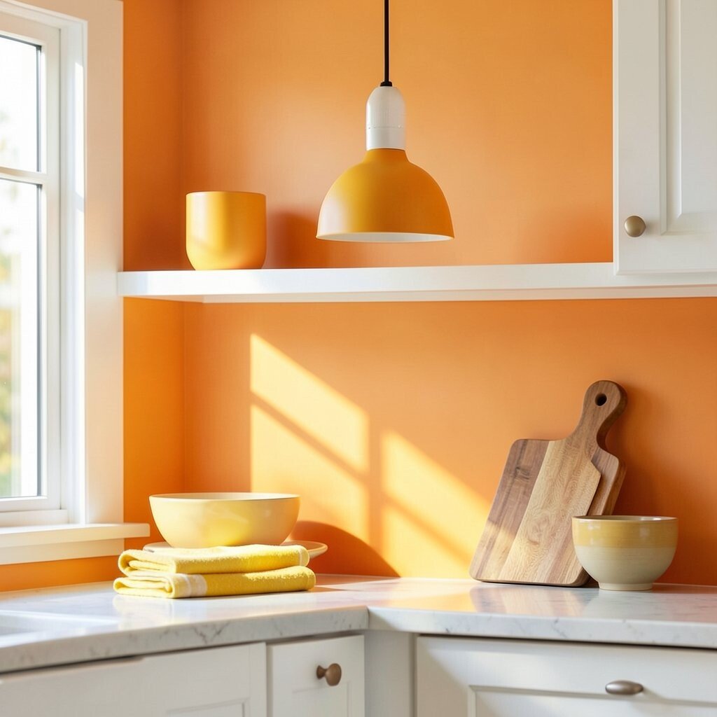
Picture a bright kitchen wall washed in sunny orange, paired with gentle yellow light. Then add a clean white trim so everything feels crisp and easy to read.
This palette brings cheer fast, and it works well when you want a friendly first impression. To keep it from feeling too loud, use orange as an accent and let white do most of the work. A simple way to personalize it is to choose a citrus shade that matches your favorite fruit tone, like mango for sweetness or tangerine for sparkle.
For a practical setup, start with paint or contact paper on one area like a backsplash stripe, shelf front, or cabinet door. Pair it with everyday items such as lemon-toned dish towels and a warm wood cutting board to ground the brightness. If you’re budgeting, consider using decals or removable wall paint for the orange portion, then invest in a single statement item like a pendant light.
2. Ocean Calm With Deep Teal Confidence

Imagine soft sky blues drifting into a richer teal, like sea glass under daylight. Add brushed nickel or light gray so the whole look feels cool and steady.
This scheme is great for rooms where you want a calmer rhythm, like a home office or reading corner. You’ll notice it can also make smaller spaces feel bigger because the lighter blue pulls the eye upward.
To make it practical, choose one main blue for walls and use teal in smaller zones like a chair, rug, or framed art. Trend-wise, watery colors are popular right now because they pair well with both modern and coastal styles. Personalize it by selecting teal with a slight green lean for a fresher vibe or a navy-lean for drama.
If you’re cost-conscious, paint a single wall feature or use teal textiles instead of repainting everything. You can also find affordable ways to get the look with curtains, bedding, and budget-friendly shelves. Keep the finish matte or eggshell for a softer feel that won’t glare under sunlight.
3. Raspberry Pop With Soft Blush Ease
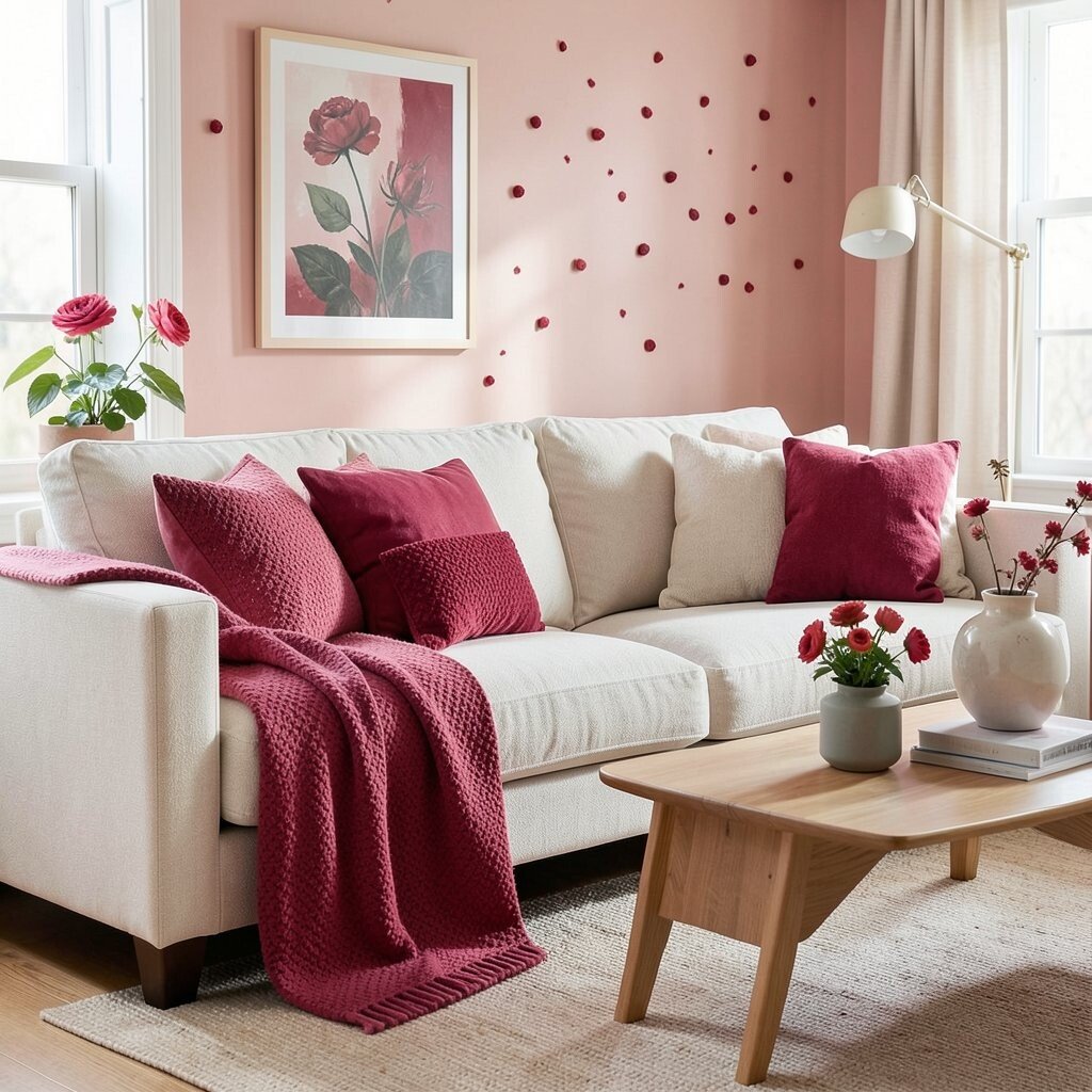
Think of a rosy blush base with raspberry accents that show up like bold confetti. You can picture it in a playful living room where everything looks inviting and warm.
This palette is unique because it blends sweet and modern without feeling childish. It benefits your mood by creating a “welcoming handshake” feeling, especially in spaces you use daily.
For practical tips, use blush for larger surfaces like walls or large furniture, then add raspberry through pillows, art prints, and small decor. To personalize, try varying the raspberry intensity by choosing either a bright magenta for energy or a muted berry for calm. Pair the look with warm neutrals like cream or light tan so the pink tones stay balanced.
If you’re worried about spending, pick one or two raspberry items first, such as a throw blanket and one statement vase. Later you can expand with more pieces once you see how often you love them. Currently, many people are choosing “soft contrast” palettes like this, where one bold shade shows up gently rather than dominating the whole room.
4. Forest & Clay For Cozy Earth Energy
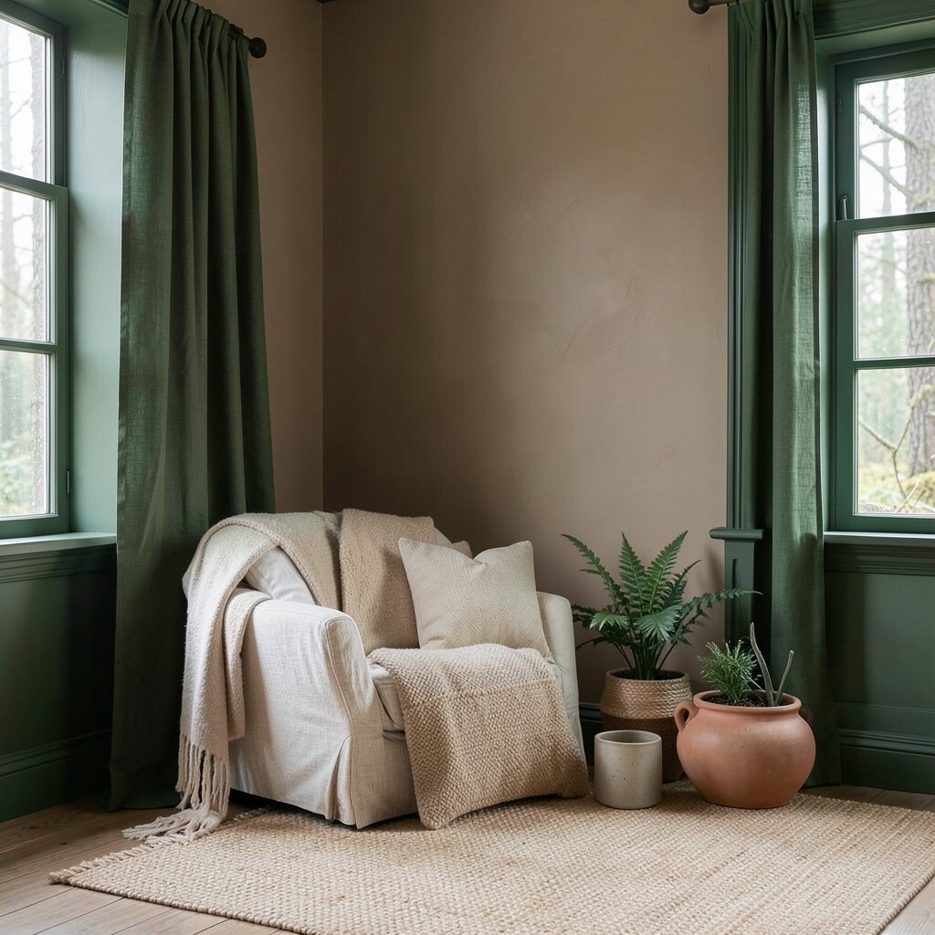
Imagine deep forest green next to earthy clay tones, like moss and terracotta after a warm rain. Add beige or off-white to keep the palette from feeling heavy.
This color combination feels grounded and comforting, which is helpful in bedrooms and family rooms. It brings uniqueness because the greens are natural, not overly bright, and the clay adds a handmade warmth.
To make it practical, paint or wallpaper the largest surface in a clay neutral, then use forest green in trim, curtains, or an accent wall. You can also bring the palette to life through natural textures like linen, jute, and matte ceramics. Personalize by choosing a green that feels more olive for gentle warmth or more pine for a richer look.
If you’re keeping costs down, start with accessories like throw pillows, a rug, or a set of planters. These items usually cost less than changing large surfaces, and they let you test your favorite shade combos. A current trend is pairing earthy greens with warm earthy beiges, because it looks stylish while still feeling cozy.
5. Modern Mono With Bright Lime Spark
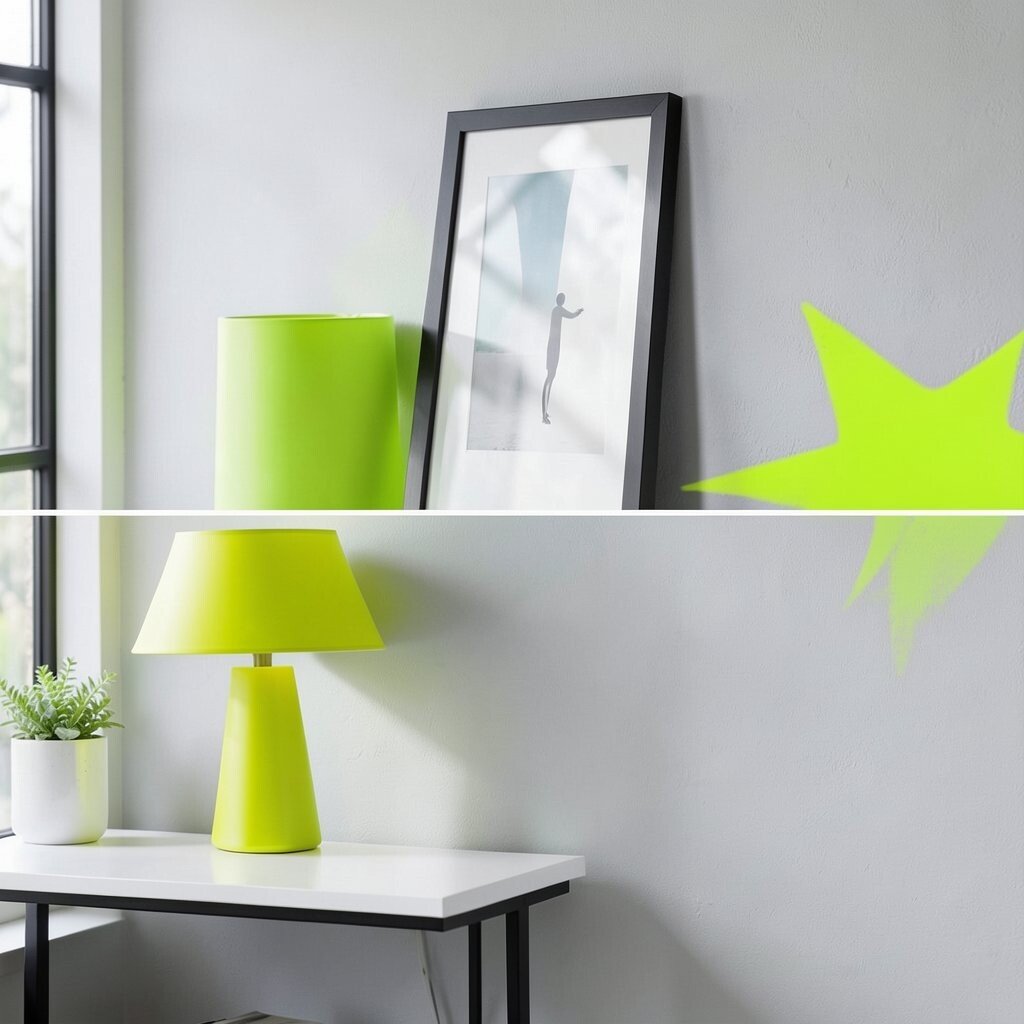
Picture a black, white, and gray foundation with a single lime burst, like a neon bookmark on a calm page. The contrast makes the lime feel extra fresh and alive.
This scheme helps you keep things organized visually, since the neutrals set a clean stage. It also benefits creativity because the lime accent can feel energizing without needing many colors.
To keep it practical, limit lime to small items such as a lamp shade, framed prints, or desk accessories. Personalize by choosing lime that leans more yellow for a playful vibe or more chartreuse for a bolder edge. If you want a softer look, try a muted “key lime” rather than a highlighter shade.
Cost considerations are friendly here because you can buy lime in affordable ways like stationery, rugs in small sizes, and removable wall art. The current trend of minimal bases with one vivid accent is popular because it looks modern and doesn’t require constant repainting. Try pairing with sleek materials like glass, steel, or smooth ceramic for a sharp finish.
6. Lavender Fields With Creamy Softness
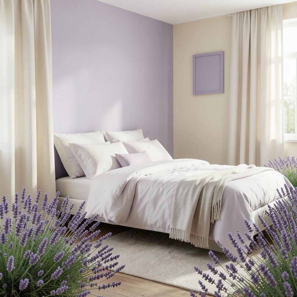
Imagine lavender that isn’t too purple, resting on warm creamy walls. Add subtle gray accents for a gentle, polished feel that still looks dreamy.
This palette is unique because it can look elegant and cozy at the same time. It benefits relaxation, so it works especially well in bedrooms, bathrooms, and calm reading spots.
For practical tips, use lavender as a wall color in a low-traffic room, or keep it lighter with lavender-toned paint samples for balance. Then bring in cream through curtains, bedding, or a rug to prevent the purple from feeling cold. Personalize by selecting lavender with a pink undertone for romance or a blue undertone for a more spa-like mood.
If you’re planning a budget-friendly refresh, look for lavender in fabric before committing to paint. Affordable sources include sheets, throw blankets, and simple wall frames. A relevant trend is “quiet color,” where muted pastels are popular because they feel calming and look good in natural light.
7. Roasted Cocoa With Honey Gold Glow
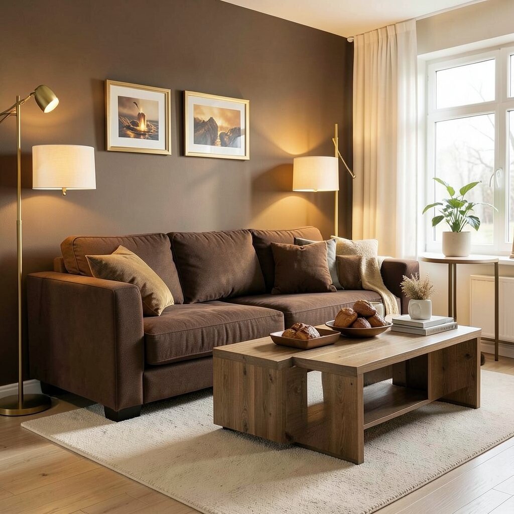
Picture cocoa brown furniture with a honey gold highlight, like warm light over baked goods. Add cream or light sand for breathing room and a softer transition.
This palette brings comfort and richness, and it can make a room feel instantly more welcoming. The uniqueness comes from the pairing of deep browns with golden warmth instead of harsh contrast.
To make it practical, choose cocoa for larger items like a sofa, accent wall, or cabinets, then add honey gold through lighting, hardware, or decorative trays. Personalize it by shifting honey gold toward amber for a cozy glow or toward pale gold for a lighter touch. Warm whites keep everything looking clean and avoid any muddy effects.
If you want to stay within budget, use bulbs with warmer color temperatures and choose inexpensive gold-toned accessories. You can also repaint small pieces like picture frames, lamps, or side tables rather than buying new furniture. Current trends favor “warm neutrals” that feel lived-in, and this combination fits that style perfectly.
8. Bright Cherry With Clean Arctic White
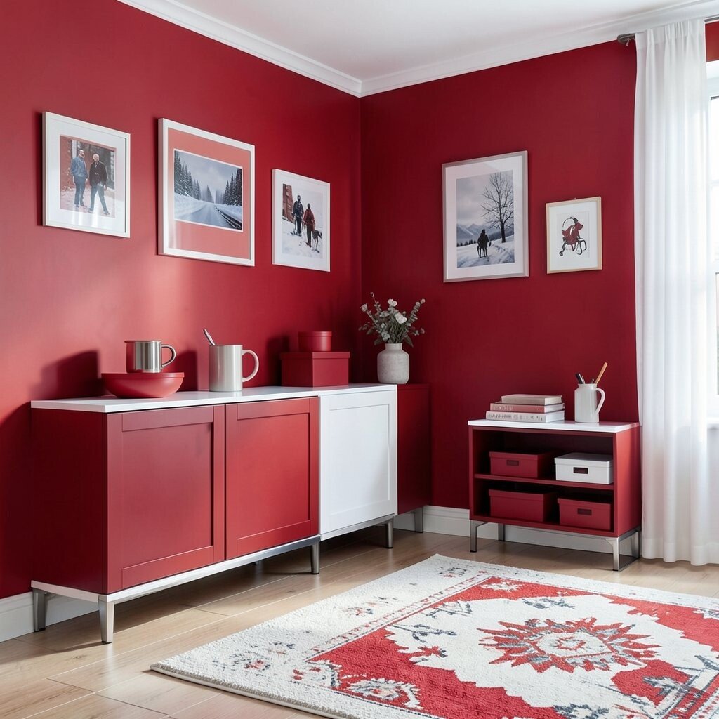
Think of a lively cherry red popping against arctic white, like a crisp winter mug with a red handle. Keep the rest of the space simple so the red stays fun, not chaotic.
This palette is bold and playful, which is great for entryways, game rooms, or creative studios. It benefits your space by making focal points obvious and giving the room a lively rhythm.
For practical tips, use cherry red on one wall, one cabinet set, or a strong piece of furniture. Then use arctic white for the rest, including trim, larger textiles, and shelving. Personalize by using a darker cherry for drama or a lighter cherry for a sweeter feel, and match it with simple metal finishes like chrome or brushed steel.
Cost considerations can be managed by painting just one feature wall or using removable wallpaper panels. Red accents are often easy to find in affordable decor like storage boxes, rugs, and wall art. The current trend of high-contrast color pops keeps showing up, especially in modern and Scandinavian-inspired spaces.
9. Citrus Leaf Green With Soft Sky Neutrals
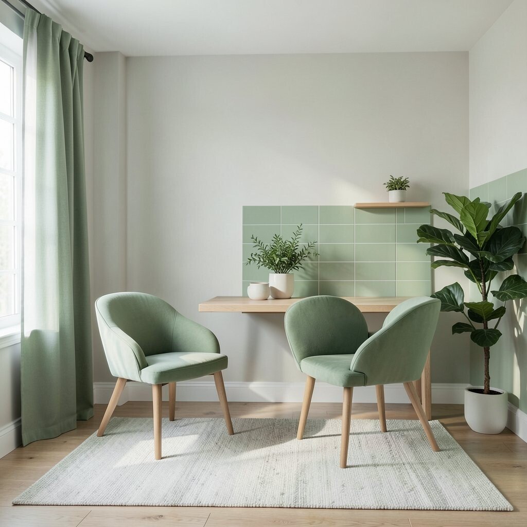
Imagine leaf green paired with a soft sky neutral that feels light and airy. It’s like walking through a garden while the sun stays gentle overhead.
This scheme feels fresh and natural, so it’s a great pick for kitchens and home offices. It benefits focus because the lighter neutrals keep the room calm while the green adds energy.
For practical tips, choose a sky-neutral wall color and add leaf green with chairs, curtains, or an accent rug. Personalize by selecting a green that matches your style, such as more sage for subtlety or more vibrant leaf for a lively burst. Add natural wood to make the colors feel grounded and not too “painted on.”
If you’re cost-conscious, use green through paint-free methods like slipcovers, plant pots, and peel-and-stick backsplash tiles. You can also swap a rug or curtains before taking on larger projects. A current trend is bringing nature colors indoors, and this palette fits right into that look.
10. Sunset Peach With Deep Midnight Ink
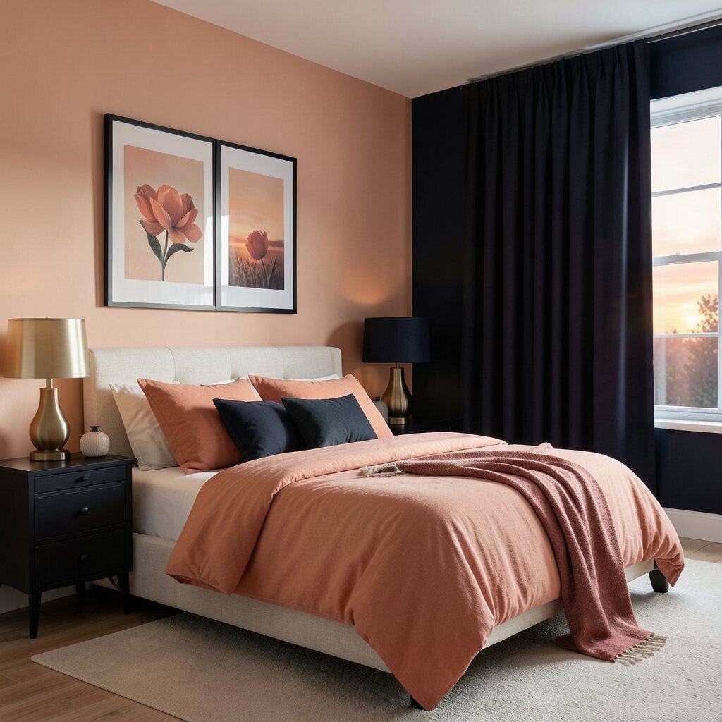
Picture sunset peach blending into deep midnight ink, like dusk colors spreading across the sky. Use pale sand or warm cream to help the transition look smooth.
This palette feels romantic and stylish, and it’s very memorable. It benefits the mood by balancing a warm, friendly color with a cool, grounded dark shade.
To make it practical, use peach on walls or large textiles, then add midnight ink through frames, bedding details, and accent furniture. Personalize by adjusting peach to coral for a brighter feel or apricot for a calmer tone. Try including brushed brass or warm metal accents so the sunset side stays cozy.
For cost considerations, start with bedding, artwork, and small decor, because they’re easier to switch later. Midnight ink is also easy to find in affordable paint or in dark curtains, which can change the whole room fast. Right now, sunset-inspired palettes are trending in a lot of modern interiors, especially for creating “warm evening” vibes.
11. Sapphire Blue With Muted Terracotta Warmth
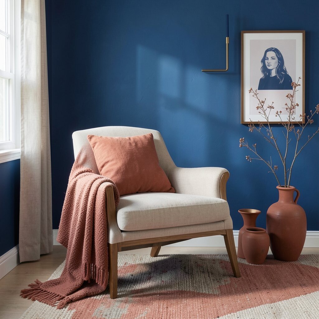
Imagine sapphire blue paired with muted terracotta, creating a rich, artsy contrast. Add warm beige or light taupe so the colors feel balanced and wearable in everyday life.
This palette is unique because it mixes bold blue with soft clay warmth instead of pairing blue with gray. It benefits your space by making it feel creative while still staying grounded.
For practical tips, choose sapphire for a feature wall or a statement piece like a chair, then use terracotta in smaller decor items such as bowls, vases, or throw pillows. Personalize by selecting terracotta that’s more dusty for a vintage look or more red for a modern punch. Keep metals mixed gently, and consider warm bronze or copper for extra harmony.
If you’re trying to control costs, focus on terracotta textiles and small ceramic items before repainting. Sapphire can be brought in through washable paint samples, accent rugs, or even larger framed prints. This combination aligns with a current trend of “global warmth,” where earthy tones meet deep, jewel-like colors.
12. Soft Mint With Natural Sand Balance
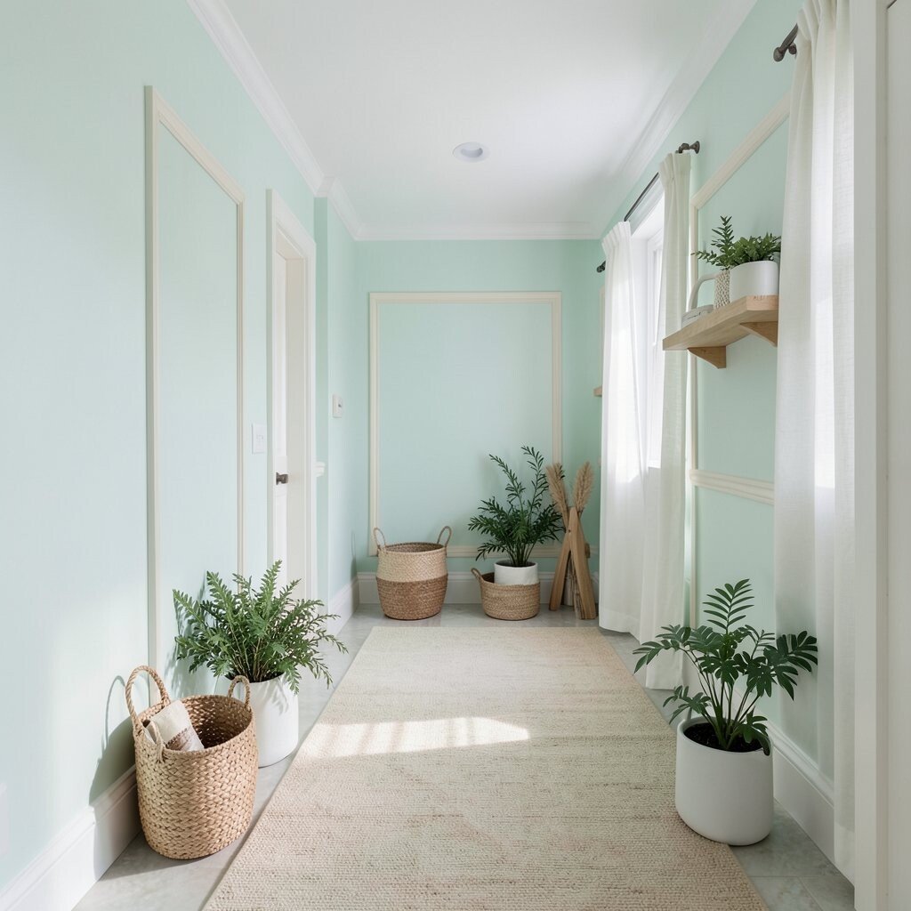
Picture soft mint walls with natural sand accents, like a beach path lined with fresh greenery. Add white or light cream trim to keep everything looking bright and clean.
This palette is soothing and optimistic, which makes it ideal for bathrooms, nurseries, and sunny hallways. It benefits your daily life because it feels easy to live with and pairs well with many decor styles.
For practical tips, use mint as a wall or large furniture color, then add sand through rugs, baskets, and wooden accessories. Personalize by choosing mint that’s more pastel for calm or slightly deeper for a more “styled” look. If you love variety, mix in subtle patterns like thin stripes or tiny botanical prints.
Cost considerations are manageable because you can get this look through paint, but also through inexpensive updates like woven baskets, light curtains, and simple wall shelves. The current trend of light, breathable colors keeps mint and sand popular since they look great in daylight. To make it feel intentional, stick to one or two shades of each color family rather than adding many random variations.
13. Sunset Coral With Neutral Stone Modernity
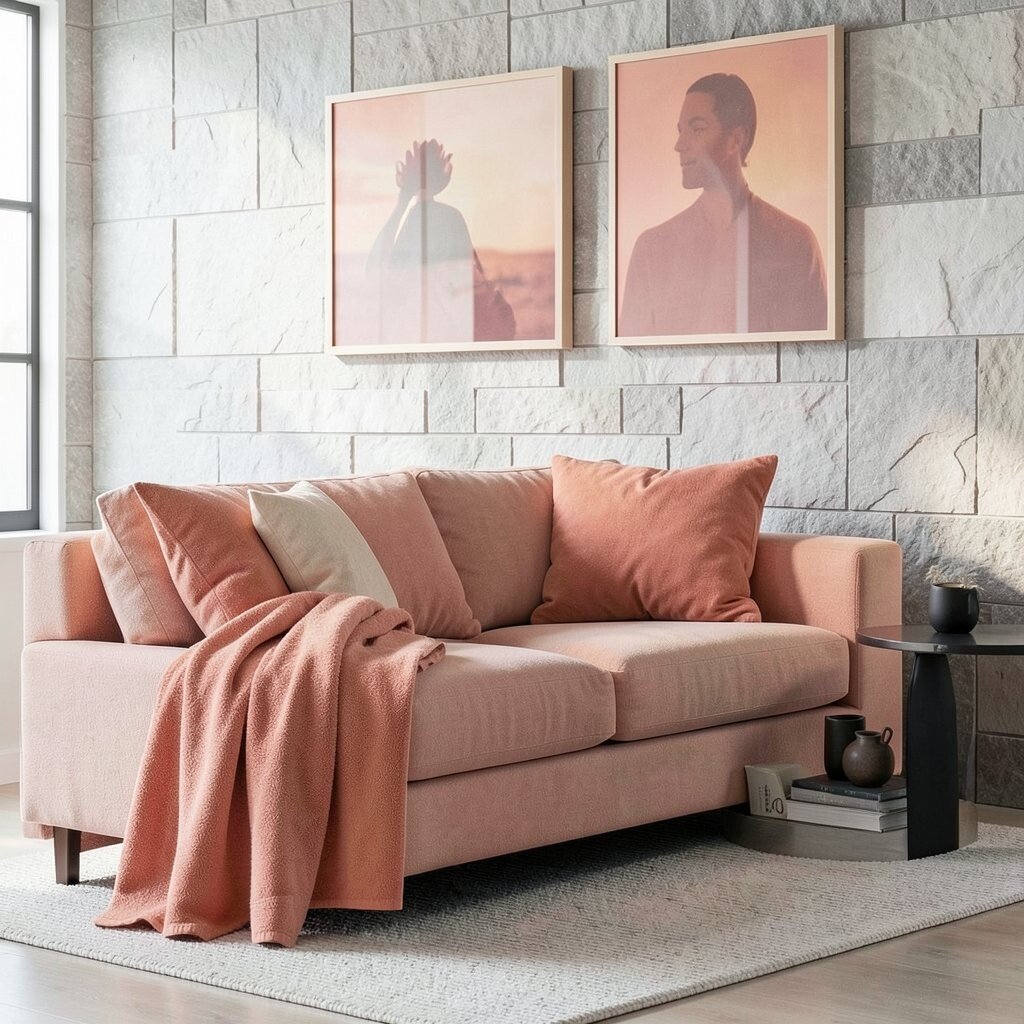
Imagine coral that feels like a warm sunset, set against neutral stone grays and soft whites. The result looks modern, friendly, and full of gentle energy.
This palette feels both unique and practical because it avoids the harshness of very bright reds. It benefits your space by adding warmth without overwhelming the room.
For practical tips, use neutral stone as your base, then add coral through cushions, art, and a few decorative objects. Personalize it by choosing coral that leans peach for a calmer vibe or leans more pink for a bolder mood. Include black or dark gray details sparingly to help the coral stand out clearly.
If you’re watching the budget, coral is often easy to find in affordable decor like towels, wall prints, and small accent furniture. You can also test coral with removable wallpaper or peel-and-stick tiles so you can see how it looks in your lighting. A current trend is “warm modern” color palettes, and coral with stone neutrals is a perfect match for that style.