Warm color choices can make a room feel softer and more inviting in an instant. The right palette also helps light bounce around so everything looks fresher.
Below are practical ideas that use warmth without turning your space into a furnace. Each option is easy to personalize, budget-friendly when needed, and styled to match what you love.
1. Honeyed Beige With Cream Accents
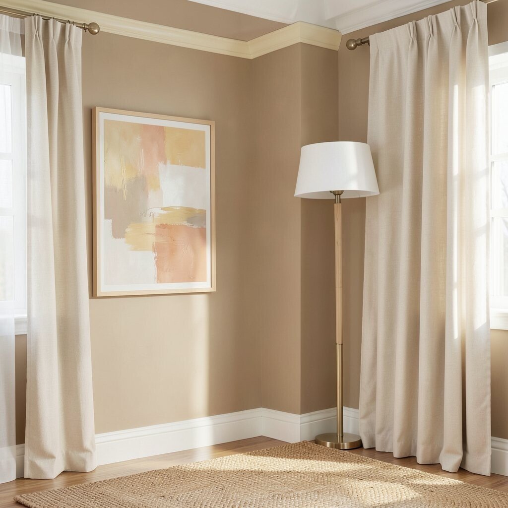
Imagine a sunlit wall in honeyed beige, with cream trims that look clean and calm. This palette gives you cozy warmth while still feeling airy.
Pair beige walls with cream curtains, white-backed lampshades, and light-toned wood. The benefit is a room that feels welcoming even on cloudy days, because warm neutrals reflect light gently instead of absorbing it.
Add texture so it doesn’t feel flat, like a woven jute rug or a soft boucle throw. If you want a current look, mix matte finishes with just one or two lightly glossy touches for a “lived-in but polished” vibe.
For a personal twist, choose artwork with muted gold, pale terracotta, or soft saffron hints. If you’re watching costs, paint is usually the biggest impact, while swap-friendly items like pillow covers and curtains are easy to update later.
2. Terracotta Walls With Dusty Rose Details
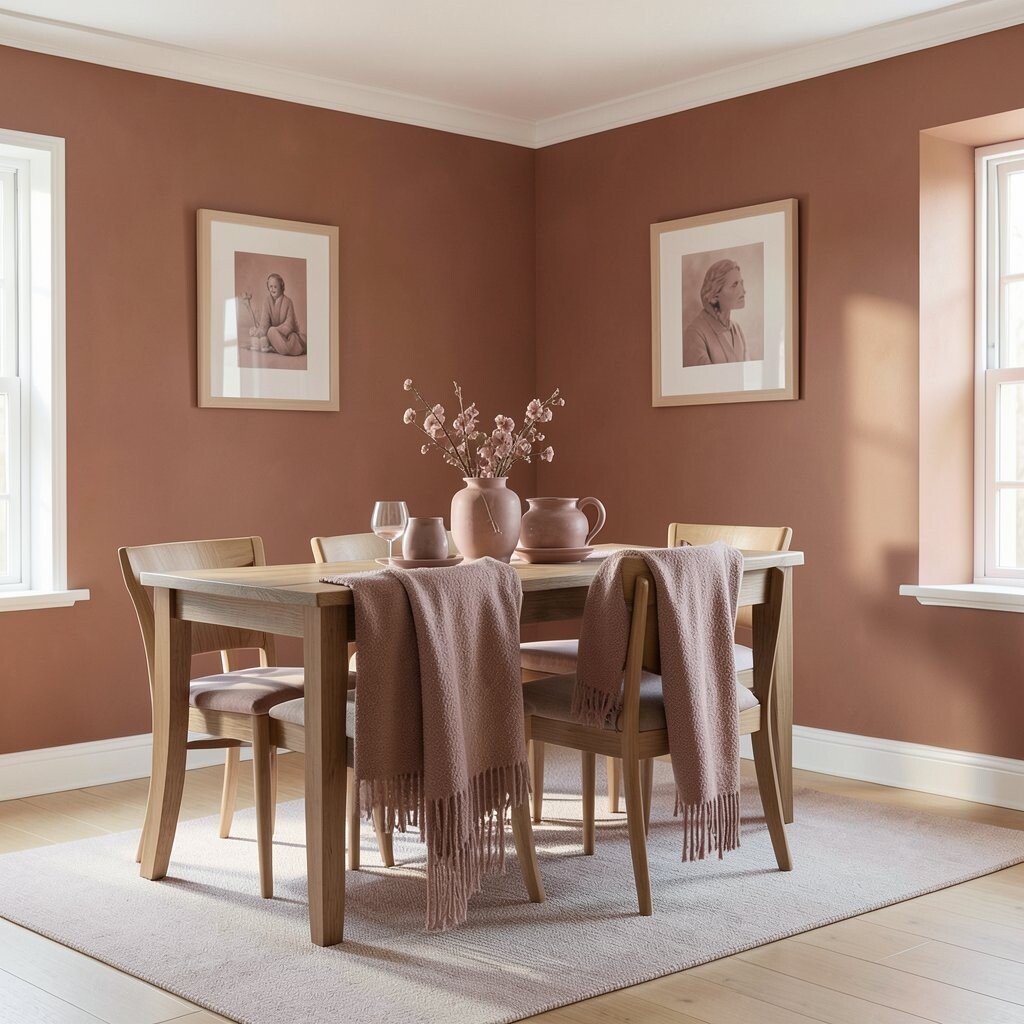
Terracotta brings the feel of warm clay and late-afternoon light. Dusty rose accents add a gentle romance without overpowering the room.
Use terracotta on one main wall or as the base color in a dining area for a confident focal point. Then bring in dusty rose through ceramics, throw blankets, and framed prints so the palette stays balanced.
To keep things bright, choose warm white trim and light flooring, or add a pale runner if your floors are darker. This combo helps warmth look designed, because rose tones keep terracotta from feeling too heavy.
For uniqueness, try a slightly muted terracotta rather than a bright orange-red, especially if your home gets cool light. If budget is tight, start with terracotta-inspired decor and finish with paint only in the areas you spend the most time in.
3. Apricot and Sand for a Soft, Sunny Mood
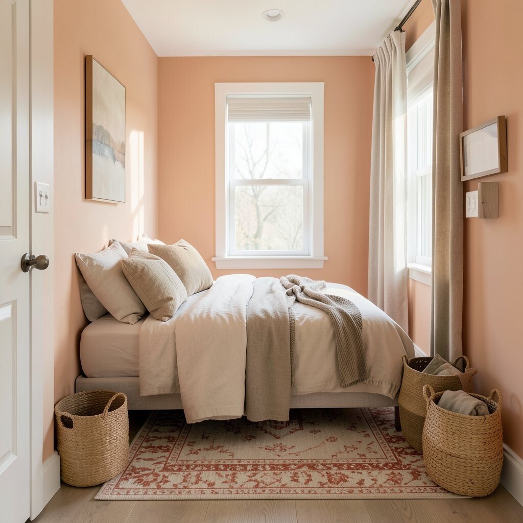
Apricot color feels like a gentle morning glow, not a loud burst. Sand tones keep the room grounded and make the whole space feel calmer.
Paint a bedroom or hallway in a light apricot wash, then layer sand cushions, beige linens, and tan baskets. You’ll notice the benefit right away since this pairing makes spaces look tidy and warm even when the room is simple.
For practical styling, choose one pattern with apricot and repeat it in small ways, like in a rug border or a few pillow shapes. Trends right now favor warm, creamy layers, and this palette fits that look smoothly.
If you want to personalize, add a few pieces in muted olive or soft espresso wood to add depth. Cost-wise, you can often get the look with paint plus affordable textiles like curtains and pillow inserts.
4. Spiced Olive With Warm White Trim
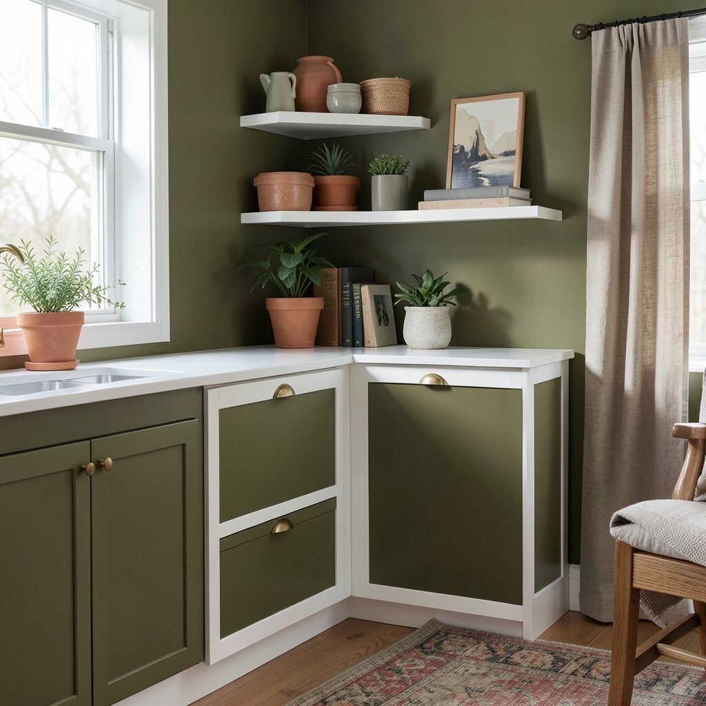
Spiced olive creates a cozy, grounded mood that still feels modern. Warm white trim makes the color look crisp and keeps the room from shrinking visually.
This palette works beautifully in kitchens, reading nooks, and entryways because olive warmth pairs well with natural materials. Use olive paint on lower cabinets, a built-in shelf, or an accent wall, then brighten edges with warm white for a clean frame effect.
Add personality by mixing in brass hardware, terracotta planters, or oak furniture. If you want a current look, lean into matte finishes and earthy textiles like linen or cotton canvas.
When costs matter, you can update cabinets or furniture fronts with paint and swap hardware for a big payoff. Even if you don’t paint, you can mimic the idea with olive curtains, a spiced-toned rug, and simple wall art.
5. Golden Mustard With Charcoal Contrast
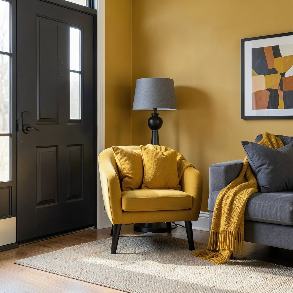
Mustard can look bold in the best way, like a warm scarf against cool air. Pairing it with charcoal adds structure and keeps the brightness from feeling chaotic.
Try golden mustard on an accent wall, a statement chair, or a front door. Then balance it with charcoal elements like a lamp base, picture frames, or a sofa throw so the room feels intentional.
This color combo is unique because it mixes sunshine energy with a strong anchor. It also helps with light management since charcoal adds contrast that makes warm tones look even more vibrant.
To personalize, choose mustard shades that lean slightly toward honey or spice instead of neon. If budget is limited, start with removable updates such as a rug, pillows, or a single piece of art, then build from there as your comfort grows.
6. Caramel Brown With Soft Toasted Linen
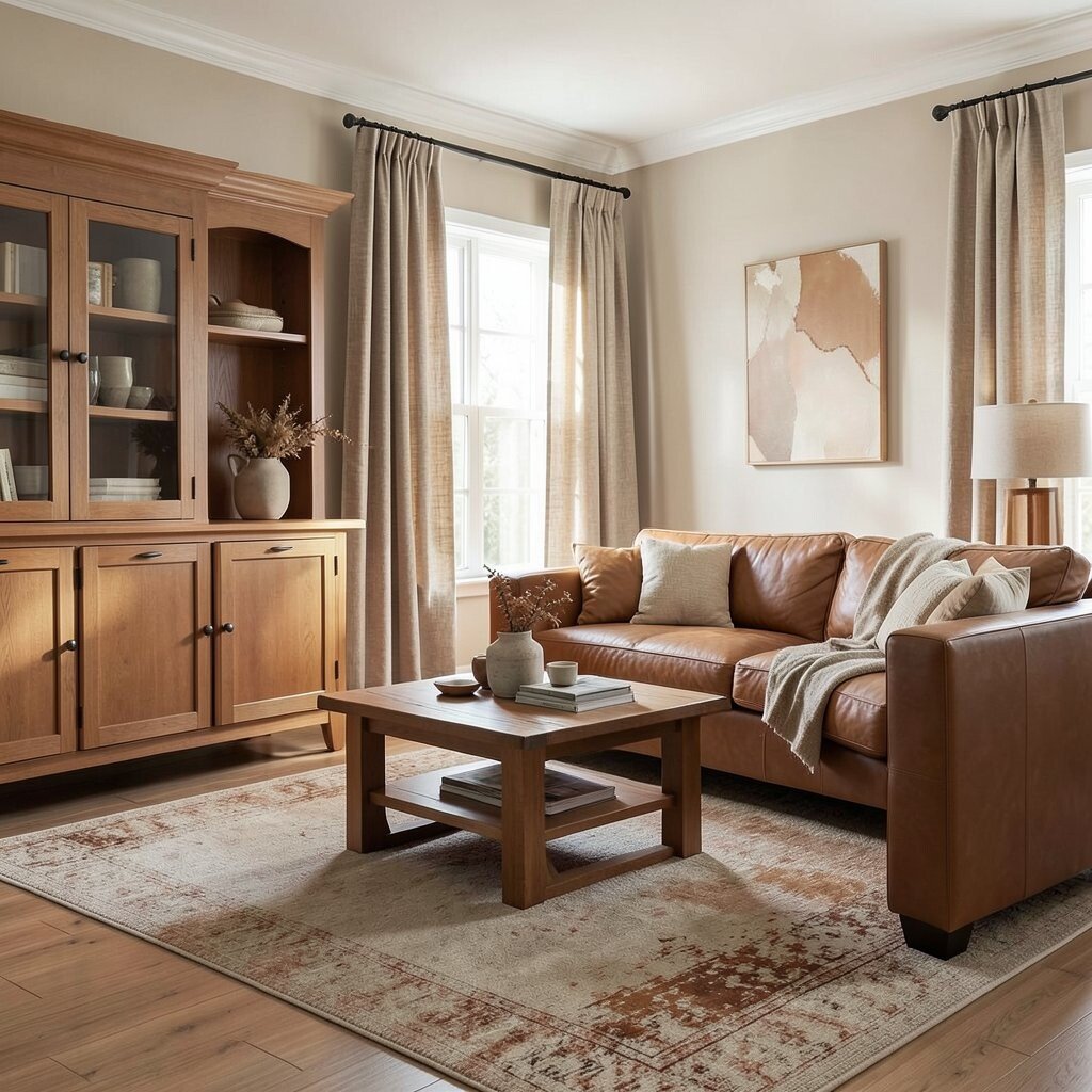
Caramel brown feels comforting and friendly, like warm bread and cozy coffee. When you pair it with toasted linen, everything looks soft instead of heavy.
Use caramel on woodwork, accent cabinetry, or a leather-style sofa, then layer in linen-toned curtains and slipcovers. The benefit is that your space feels layered and lived-in without turning dark.
For a practical approach, keep walls in a lighter warm neutral and bring caramel in through furniture, rugs, or large decor. This lets you enjoy warmth while protecting the room from feeling too dim.
Add uniqueness by choosing caramel shades with slight undertones like cinnamon or honey rather than flat brown. If costs are a concern, focus on one main large item, like a rug, and let smaller accessories do the rest.
7. Coral Accent Palette With Creamy Base Colors
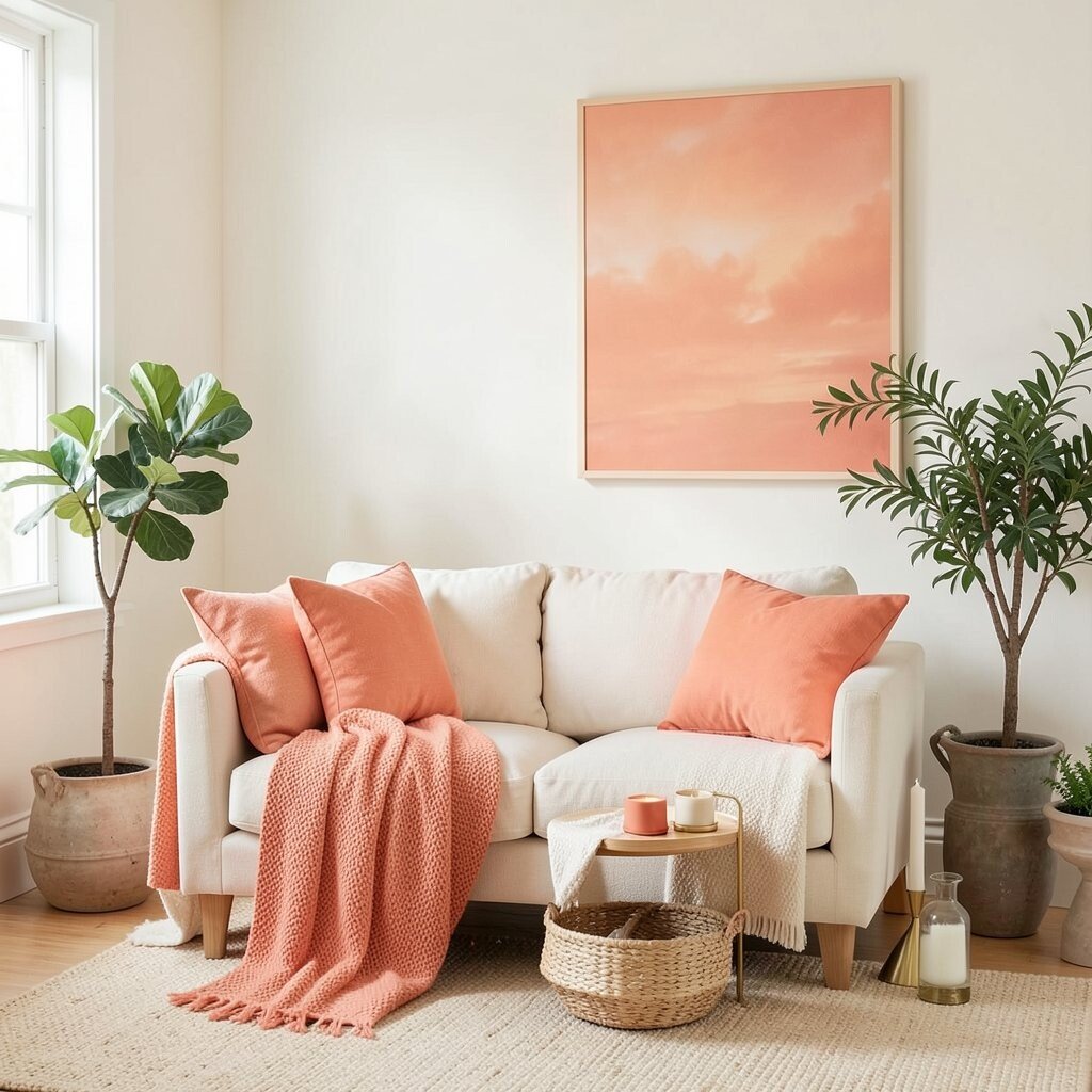
Coral adds a friendly pop of warmth, like a peachy sunset that doesn’t shout. A creamy base keeps it bright and makes coral look fresh.
Start with a neutral room in cream or warm white, then introduce coral in pillows, a throw, or one large wall print. The benefit is that you get energy and warmth without committing to painting every surface.
To keep it wearable, match coral with light woods, soft green plants, or subtle gold accessories. Coral pairs especially well with today’s trend for mixed materials, because it looks great next to woven textures and ceramics.
Personalize by choosing coral tones that lean more peach if you want gentler warmth. If you’re budgeting, shop for coral in small, swap-friendly pieces like candle holders, vases, and seat cushions.
8. Warm Burgundy With Blush Pink Undertones
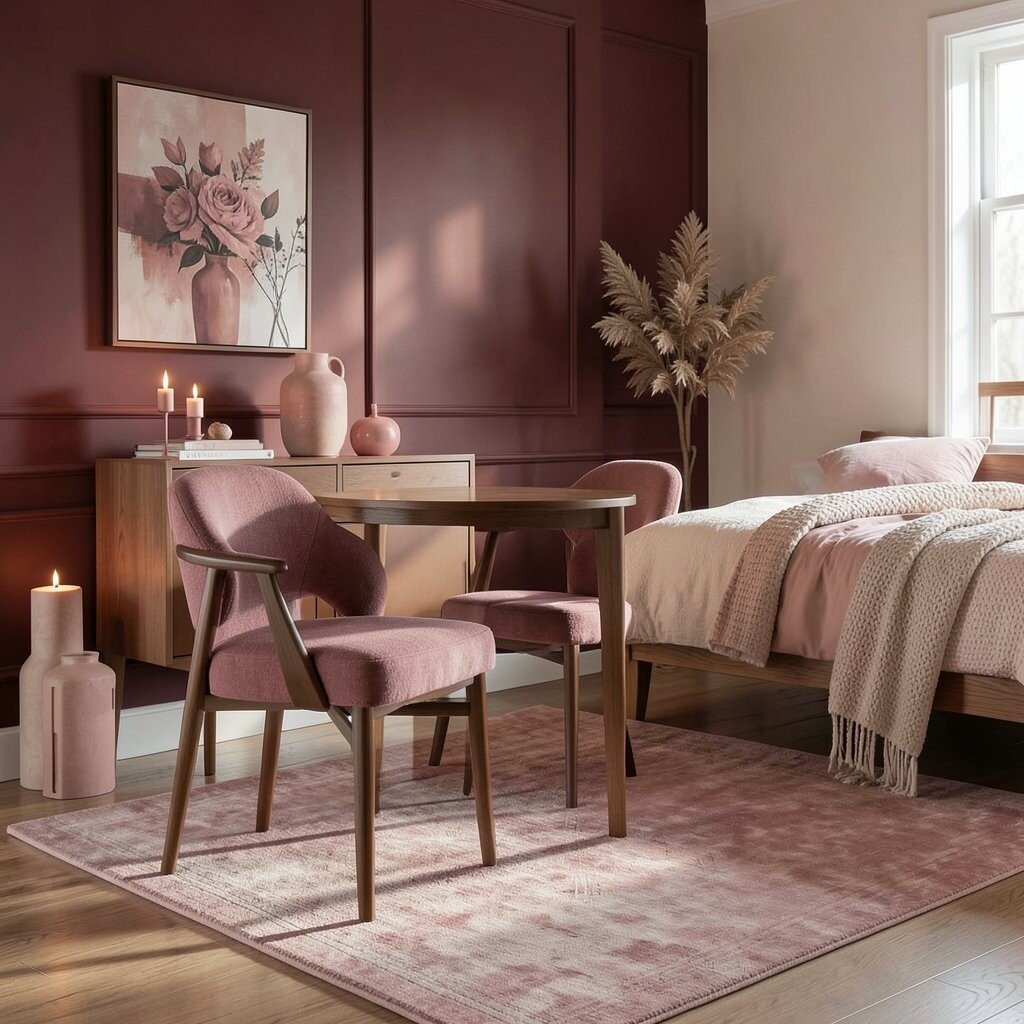
Burgundy can feel luxurious, and warm undertones make it feel welcoming instead of gloomy. Blush pink helps the palette glow, like warm candlelight on a calm evening.
Try warm burgundy on a feature wall, a dining chair fabric, or a statement rug. Use blush pink in small decor items such as artwork, ceramic vases, or textured bedding to soften the look.
This palette is unique because it blends depth with softness, creating a room that feels dramatic but still comfortable. It also benefits lighting, since blush highlights keep the space from looking too dark.
For practical results, balance the palette with warm whites, cream, and natural wood. If costs are a concern, pick one anchor item like a rug and choose budget-friendly blush decor to fill the visual space.
9. Rosewood and Soft Terracotta Layers
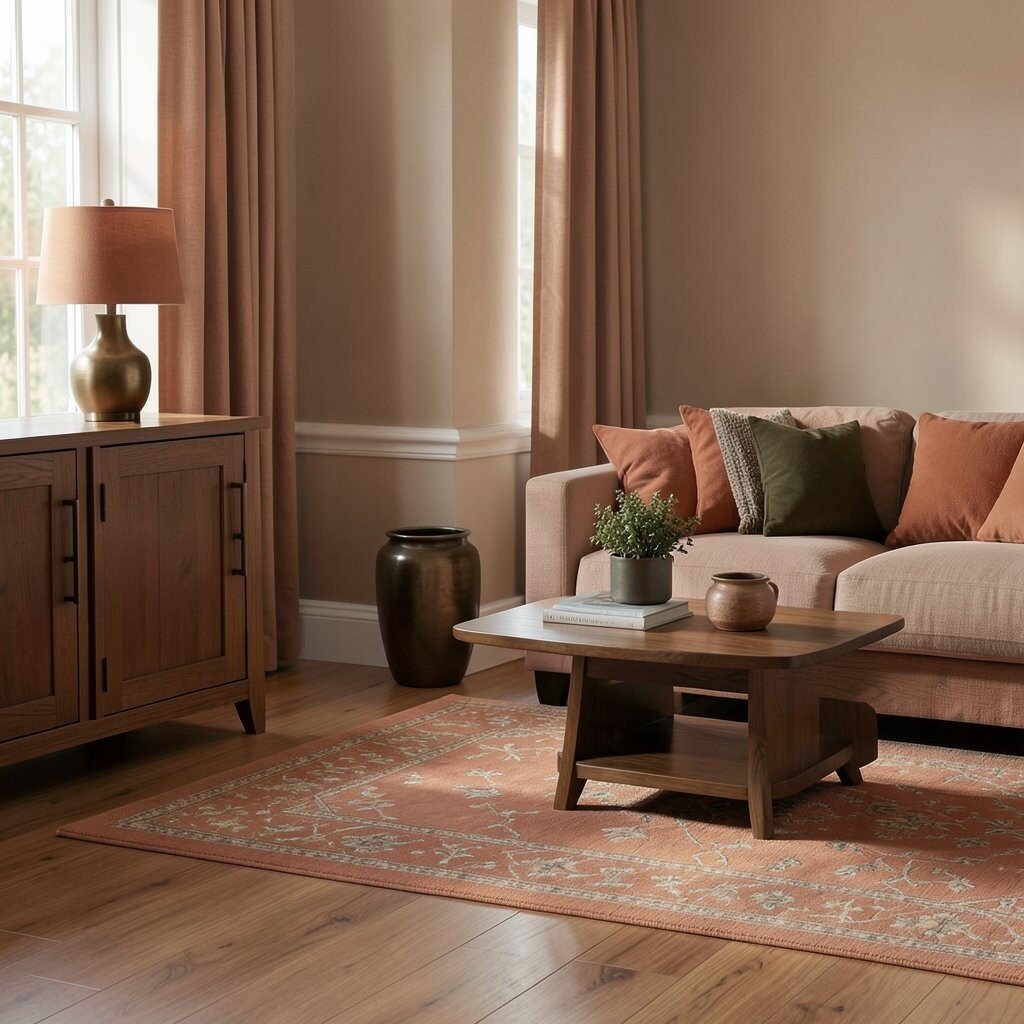
Rosewood tones feel warm and elegant, like polished furniture under gentle light. Soft terracotta layers add a cozy, casual warmth that feels inviting.
Use rosewood as the main color through flooring, cabinetry, or larger furniture pieces, then bring in terracotta through textiles and decor. The benefit is that your room looks cohesive because both colors share similar warm undertones.
For a practical tip, repeat the terracotta in three places, like a lamp base, a rug pattern, and a small planter. This creates unity without requiring a full repaint.
Personalize with deeper accents such as dark olive or aged brass to add character. If you’re working with a budget, keep paint neutral and spend a little more on one statement fabric, like a curtain or sofa cover.
10. Sunset Orange With Neutral Gray for Balance
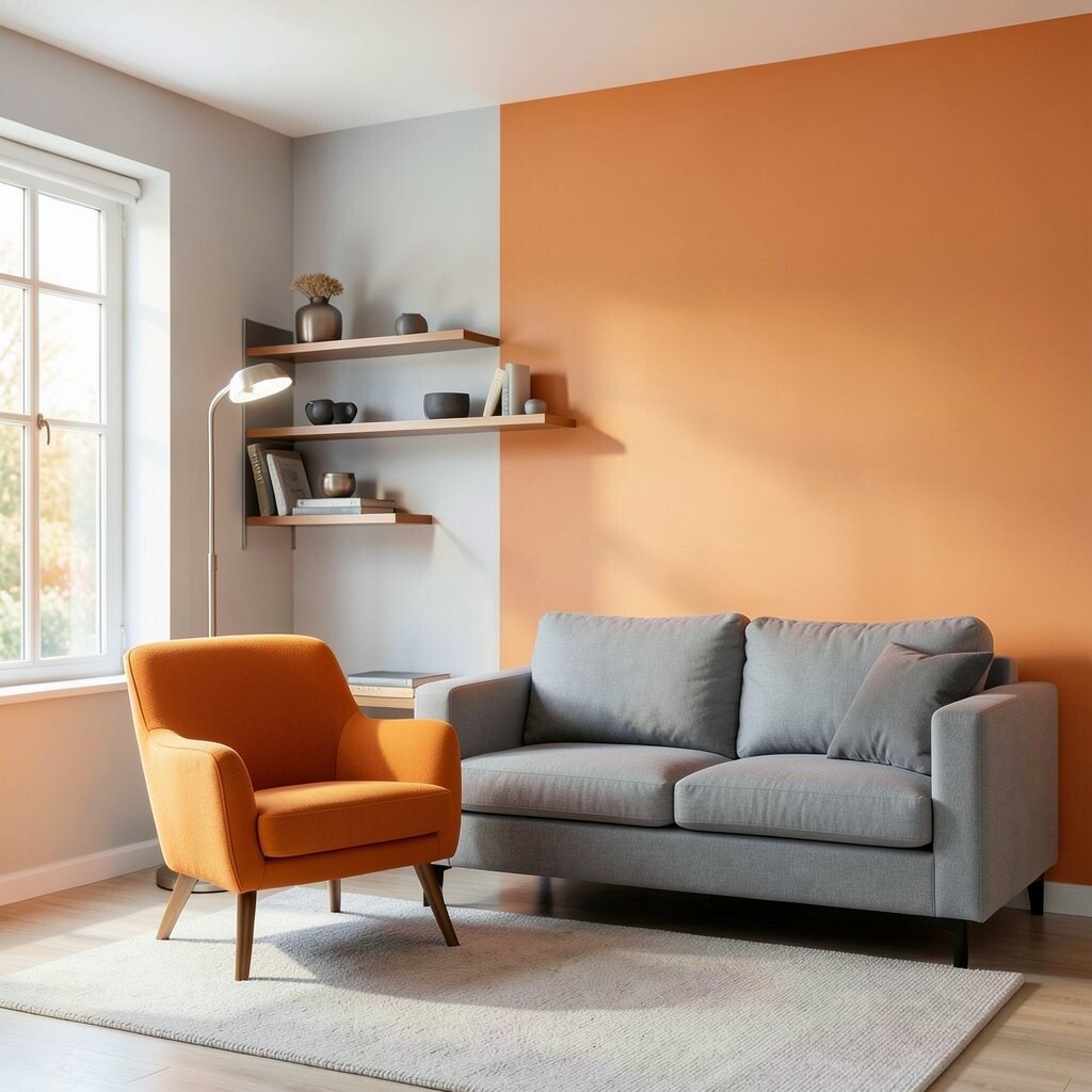
Sunset orange brings lively warmth, and it feels especially cheerful in spaces that need energy. Neutral gray helps keep the palette from feeling too intense.
Consider orange in a chair, a set of shelves, or one accent wall, while keeping walls and large surfaces in light gray or warm white. This benefit gives you brightness and focus without overwhelming the eye.
To make it feel modern, pair orange with brushed metal, charcoal accents, and simple shapes. Current trends favor warm brights used sparingly, so your orange will feel fresh rather than dated.
Personalize by choosing a softer “peachy orange” if you want cozy warmth rather than bold color. For cost control, start with paint only where it’s easy to change, like an accent wall behind a couch.
11. Creamy Peach With Warm Olive Decor
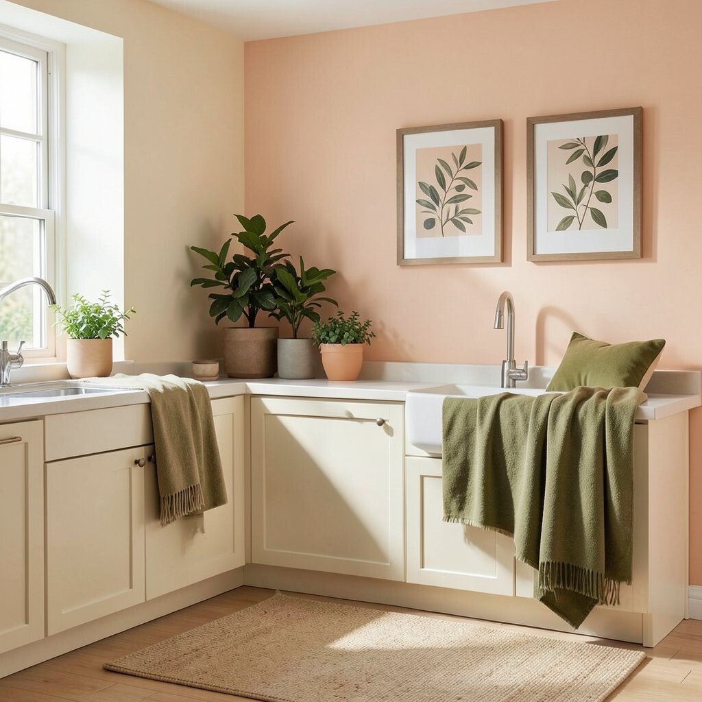
Creamy peach feels friendly and light, like fruit sweetness in a bright kitchen. Warm olive decor adds a grounding twist that makes the peach look even more vivid.
Paint walls in a creamy peach or choose peach-tinted wallpaper in small areas like a nook. Then style with olive throws, plant pots, and framed art that includes olive or sage tones.
This palette is unique because it blends a soft, airy color with earthy greens, creating a room that feels both cheerful and balanced. It also benefits daily life by making your space look organized, since greens and neutrals hide small messes better visually.
For practical personalization, pick a peach shade that matches your skin tones in artwork and textiles so everything feels harmonious. If budget is tight, use olive accents through pillows, rugs, and greenery, while keeping walls in a warm neutral.
12. Soft Gold and Warm White for a Light-Loving Look
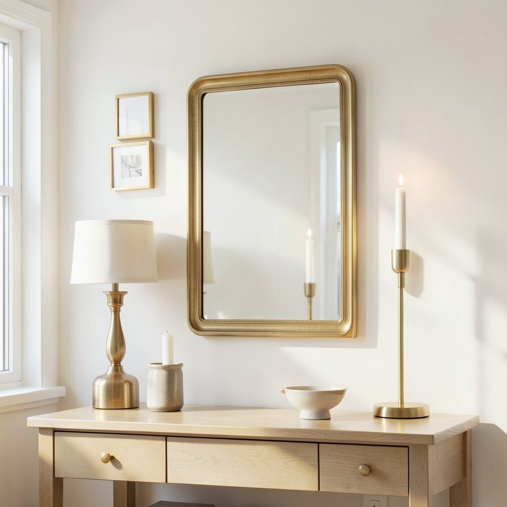
Soft gold can be surprisingly calming when it stays gentle and spread out. Combined with warm white, it makes your space feel brighter and more elegant.
Choose warm white walls and use gold in small moments like picture frames, lamp bases, mirror edges, and hardware. The benefit is that light bounces around, giving your room a glow without needing bold color everywhere.
For uniqueness, try a brushed gold finish or antique-style tones rather than shiny, mirror-bright gold. This matches current trends for warm metallics used with matte surfaces and natural textures.
To personalize, decide if you want gold to feel modern or vintage, then pick the shapes accordingly. Cost-wise, you can often achieve the look with thrifted frames, affordable candles holders, and one updated mirror, then keep the rest simple.