
A bright idea deserves a bright mood. Color can quietly steer the whole project from “maybe” to “yes.”
When you choose a palette with a little whimsy, the room feels friendlier and the work feels lighter. Even small touches can make your space, brand, or plan feel more alive.
1. Sunbeam Citrus Pop

Picture a kitchen wall washed in warm mango and soft lemon. Now imagine a notebook with a citrus strip along the edge, like sunshine keeping watch.
This palette brings energy without feeling harsh, especially when you balance it with creamy off-whites. For a practical start, use lemon as an accent on labels, dividers, or small icons while keeping your main surfaces neutral. If you’re making a brand kit, try citrus highlights on buttons and headlines so important actions feel inviting. A simple way to personalize is to swap mango for tangerine or add a tiny splash of lime in patterns.
2. Cornflower Sky Calm

Think of a soft cornflower blue paired with cloudy grays. It’s the color combo you’d pick for a cozy corner that still feels airy.
This style helps your eyes rest, so it’s great for study spaces, calm marketing designs, and everyday organization. Use cornflower for headers and key labels, then anchor everything with a cool gray background so text stays crisp. If you want practical motion, try subtle gradient backgrounds on slides or site hero sections using light blues that fade gently. For cost considerations, start with paint samples or inexpensive digital templates, then commit only to the colors you love most.
To personalize, add a tiny hint of lavender in artwork or a repeating pattern in your stationery so it feels uniquely yours. This palette is also popular in modern “clean and soothing” visuals, especially for wellness brands and minimalist interiors.
3. Rose Tea Blush Romance

Imagine dusty rose, tea-stained peach, and a whisper of rosewood. It feels like gentle warmth wrapping around your plans.
Blush colors soften hard edges, which makes them perfect for friendly logos, welcome signs, and creative workbooks. You can keep it practical by using blush as a background tint and darker rose for buttons, headings, or headings in your typography. For personalization, mix in small florals or abstract dots on one accent page, rather than coating everything. If you’re updating a room, choose blush fabric or removable wallpaper first since it’s easier to change than paint.
This palette is unique because it can look sweet or sophisticated depending on your paired neutrals. Current trends lean toward “soft contrast,” where blush meets charcoal or deep plum for a confident look. Add one unexpected element, like a metallic rose-gold pen holder, to make the vibe feel a little playful.
Cost-wise, blush is forgiving since many shades are available in low-cost craft paints and budget-friendly paper packs. Even a few coordinated desk items can create the whole look fast.
4. Mint Circuit Freshness

Picture mint green lines like tiny circuits on a white base. It gives a modern zing while still feeling light and friendly.
This palette helps ideas feel organized, which is great for planners, maker spaces, and presentations. Use mint as the highlight color for checkmarks, section headers, and quick diagrams, then keep the majority of your layout clean and white. A practical tip is to repeat a simple line pattern across dividers so your system looks cohesive without extra work. If you want personalization, choose a slightly more teal mint for a cooler mood or a softer mint for a calmer feel.
To manage cost, try a small set of patterned sticky notes or printable icons before buying larger materials. This “tech-meets-nature” look is trending in product demos and creative tech branding, so your designs can feel current without being flashy.
5. Berry Jam Velvet Depth

Think of blackberry, warm berry red, and deep plum like a spoonful of jam. It feels bold, cozy, and a little dramatic in the best way.
This palette adds depth, making it ideal for evening events, book covers, and statement accents in a room. Keep it practical by using berry tones sparingly, like in frames, sidebars, or a single painted feature wall, while balancing with cream or light gray. For typography, choose a lighter or white font on darker berry backgrounds so readability stays strong. Personalize by adding a small pattern of tiny berries or swirling shapes on one page or panel.
Uniqueness comes from how berry colors can feel both vintage and fresh depending on your lighter neutrals. If you’re designing a website, try berry for the “primary” button and plum for secondary links so your interface feels structured. Cost considerations are easier when you treat it as an accent palette, since you won’t need to cover large areas to get impact.
6. Sea Glass Turquoise Wonder

Imagine turquoise that looks gently weathered, like sea glass found in sand. Pair it with pale sand tones and a soft gray for a naturally relaxed feel.
This palette brings a refreshing calm that works well for dashboards, beachy brands, and creative studios. Use sea glass for icons, borders, or small card headers, then let warm neutrals do the heavy lifting for backgrounds. A practical tip is to test your contrast by printing a page in grayscale, since some turquoise shades can look similar to gray when printed. To personalize, add a subtle wave pattern in your stationery or use tiny starfish motifs in a minimal way.
7. Sunset Terracotta Energy

Picture terracotta sunsets with a hint of peachy coral. It feels earthy, welcoming, and full of motion.
Terracotta tones can make everyday projects feel grounded and inspiring. For practical use, combine terracotta with warm cream or light tan so the colors feel balanced rather than busy. Use terracotta for labels, headings, and warm accent blocks, especially when you want your content to feel friendly. Personalize by choosing a terracotta shade that leans more red or more orange, then match it with a small second accent like muted teal.
Cost-wise, terracotta is great because it pairs with lots of affordable materials like clay-colored paper, budget frames, and easily found hardware tones. Current design trends love earthy palettes mixed with crisp whites, which means you can keep the look modern without expensive upgrades.
Uniqueness shows up when you add texture, such as a matte terracotta finish or a lightly speckled pattern. That little touch makes the palette feel handcrafted, even if everything is store-bought.
8. Dandelion Gold Cheer

Think of bright yellow like dandelions in bright light. Add a soft cream and a muted olive to keep it from getting too loud.
This palette instantly lifts mood, which is helpful for brainstorming spaces, children’s study corners, and cheerful brand graphics. Use gold as a highlight color for icons, dividers, or key phrases, and keep backgrounds light so the yellow stays pleasant. A practical tip is to pair yellow with dark text for readability, since light-on-light can blur quickly. For personalization, try a tiny repeating pattern of half-circles or leaf shapes in the olive tone so it feels playful and not generic.
9. Deep Forest Emerald Focus
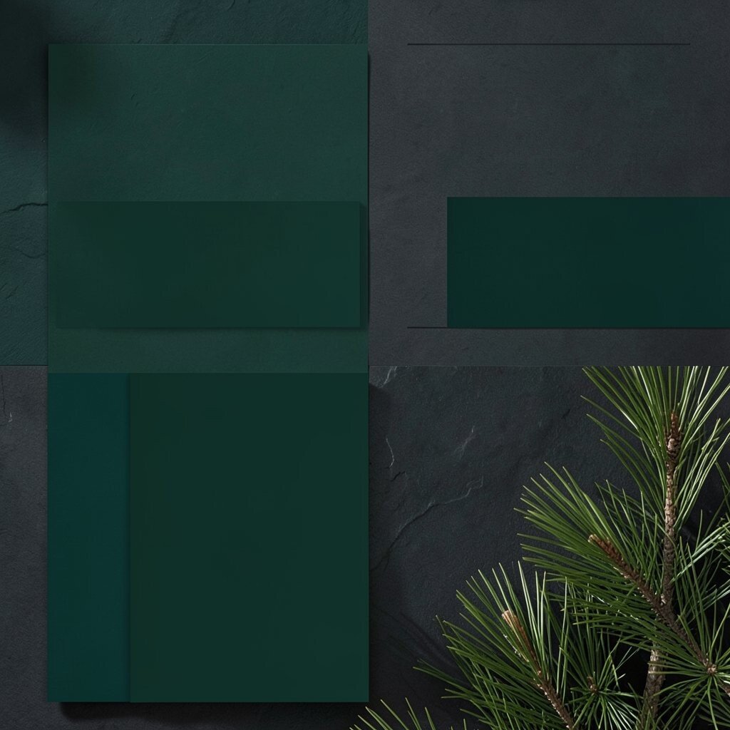
Picture emerald green beside deep charcoal and a touch of pine. It feels like stepping into shade after a long sunny day.
Dark green palettes create focus and calm, making them great for planners, reading lists, and project trackers. Use emerald for sidebars, section tags, or app accents, while letting charcoal handle most large areas. If you want a practical layout, keep your typography high-contrast and avoid using pure black everywhere, since it can feel too heavy. Personalize by adding a small warm accent like amber or caramel to keep the vibe from feeling cold.
This palette is unique because it can shift from “cozy cabin” to “sleek modern” depending on your lighting and texture. It also fits current trends in nature-inspired design that uses deep tones with clean shapes. Cost considerations are easier since dark accents can be achieved with inexpensive printables, colored folders, and simple marker sets.
10. Lilac Whisper Lightness

Imagine lilac floating across a soft white background like morning fog. It’s gentle, dreamy, and surprisingly usable.
Lilac works well when you want your project to feel calm but still creative. Use lilac for gentle backgrounds, subtle banners, and rounded shapes, and pair it with cool gray or warm beige for balance. A practical tip is to limit lilac to about one primary area in a design so it stays airy rather than pastel overload. Personalize by swapping lilac intensity, choosing a brighter purple for more punch or a softer lavender for extra sweetness.
If you’re creating content, consider using lilac for link underlines or small callout cards, since it can guide attention without shouting. This palette also fits current trends that favor soft gradients and rounded UI elements.
11. Licorice Ink Contrast
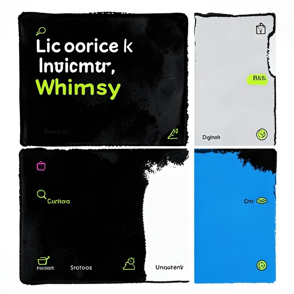
Think of near-black ink, crisp white, and a playful accent color like electric lime. It’s sleek, high-contrast, and full of confidence.
This palette helps content stand out, so it’s great for posters, presentations, and any design where clarity matters. Use licorice ink for text and strong shapes, then bring in the lime as tiny highlights on icons and links. A practical tip is to keep lines thick enough for easy reading, especially for printed materials or small screens. Personalize by choosing a different accent, like hot pink or bright blue, depending on the vibe you want.
Uniqueness comes from how this palette balances edgy style with a friendly wink. Cost considerations can be low because many projects can be done digitally first, then printed only after you’re sure. Current trends also favor bold, minimalist palettes in web and product design, so this look feels modern without being complicated.
12. Peachy Glow Daydream
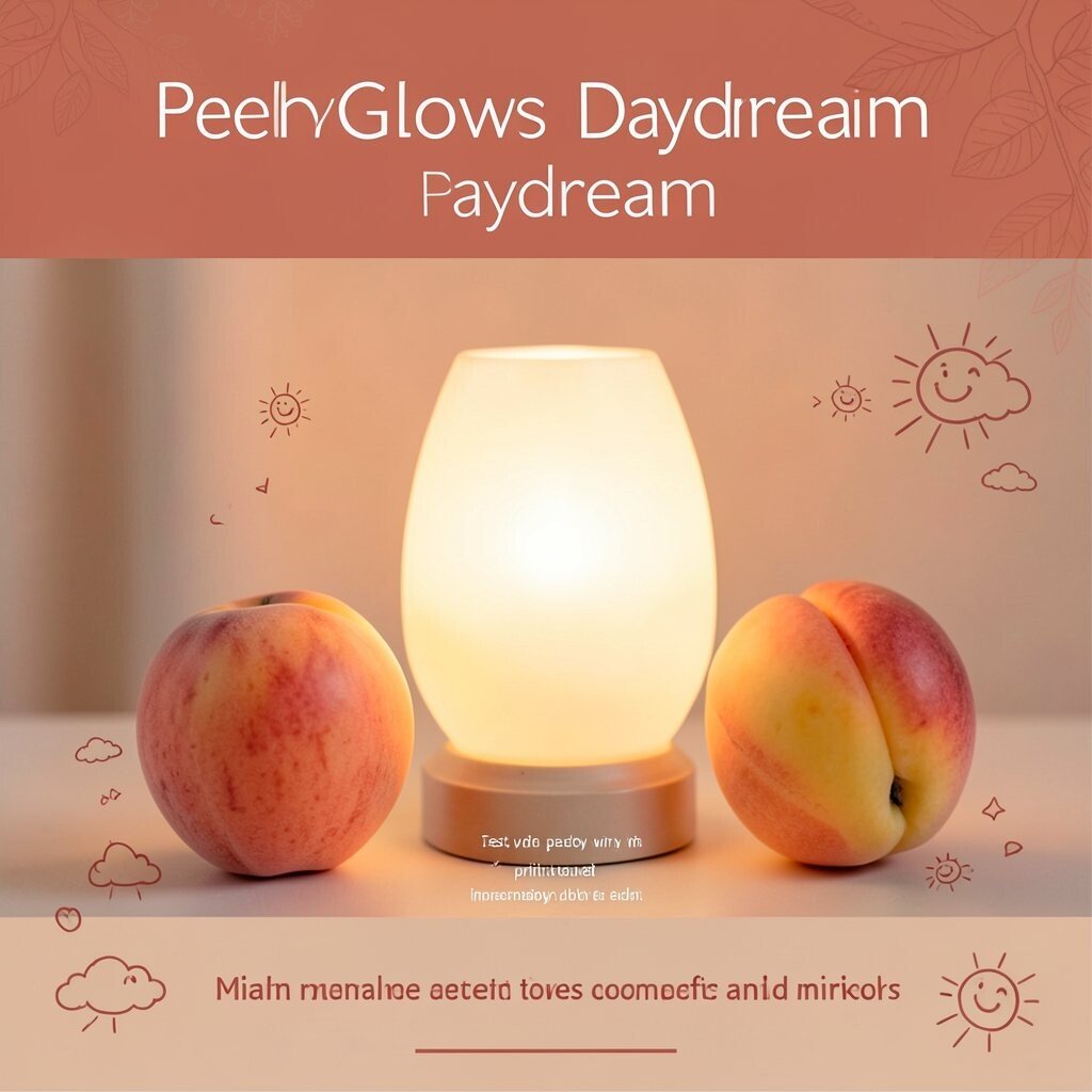
Picture peach, apricot, and warm cream glowing like a soft lamp at dusk. It makes everything feel more welcoming and less stressful.
Peach palettes are great for event flyers, community boards, and lifestyle branding because they feel approachable. Use peach as a background tint, then bring in deeper coral or terracotta for headers so your layout stays structured. For practical tips, test your colors in natural daylight since peach can shift and sometimes look different in warm vs cool light. Personalize by adding tiny doodles, like clouds or smiling suns, in a darker coral ink.
Cost-wise, peach is an easy win for paper crafts and printables, and it pairs well with inexpensive colored markers. It’s also trending in “warm minimalism,” where softer tones replace harsh brights for a kinder feel.
That gentle warmth is what makes the palette feel unique and easy to live with.
13. Ocean Indigo Night Rhythm

Imagine indigo like a twilight sky, paired with deep navy and a small spark of aqua. It feels calm yet dramatic, like music starting softly.
This palette supports focus, so it’s useful for goal boards, creative prompts, and nighttime study routines. Use indigo for main headers and navy for backgrounds, then add aqua accents for emphasis. A practical tip is to keep the aqua limited to small details, because too much aqua can steal attention from your message. Personalize by adding a subtle star pattern or wave lines to one corner of your design.
Uniqueness is in the contrast between deep blues and bright water tones, which can make your work feel more cinematic. Cost considerations are manageable since you can achieve this look with a few coordinated pens, stickers, or printed pages. This style also matches current trends in “night mode” aesthetics for apps and digital dashboards.
14. Lemon Meringue Sweet Simplicity
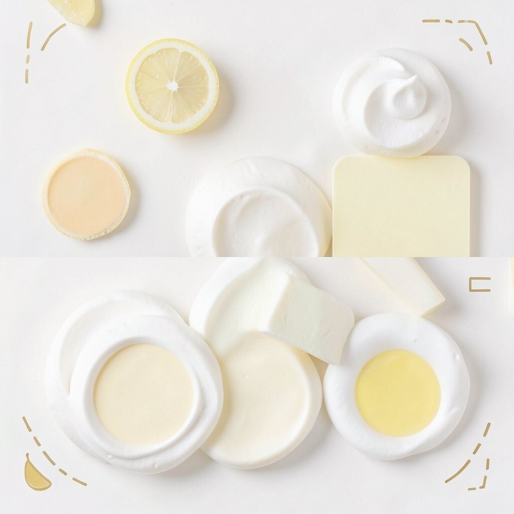
Picture pale lemon, soft vanilla, and a tiny hint of butter-gold. It feels light, clean, and quietly happy.
This palette is ideal when you want simplicity with charm. Use meringue tones for backgrounds and spacing blocks, then add lemon only for highlights like dates, icons, and key headings. For practical use, keep your design lots of white space so the palette stays fresh instead of crowded. Personalize by adding small dashed lines or simple geometric shapes in a gentle gold for a custom touch.
Cost considerations are friendly because these colors print well and work with common craft paper shades. This palette is also popular in modern clean layouts where soft yellows replace bold primaries for a kinder look.
15. Coral Pop Friendly Heat

Imagine coral that leans bright yet warm, paired with cool mint and crisp white. It feels friendly, energetic, and ready to welcome someone in.
Coral is a great choice when you want your project to feel social and upbeat. Use coral as a button color, accent label, or a single color block that signals where to start. A practical tip is to choose mint as your secondary tone so your palette feels balanced and not too hot. Personalize by pairing coral with patterns like tiny polka dots or simple stripes that match your theme.
Uniqueness comes from coral’s ability to feel both playful and professional when paired right. Cost-wise, you can keep spending low by using coral only on small elements first, then adding more only if it feels perfect. This palette aligns with current trends in bold-friendly UI and colorful event marketing.
When coral is handled carefully, it can make even plain content feel exciting.
16. Steel Silver Modern Neutrals
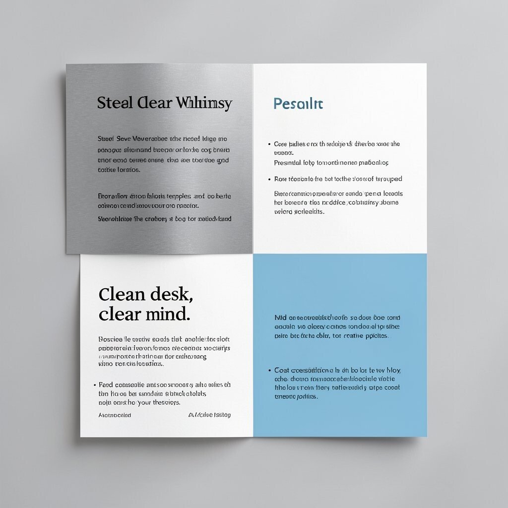
Think of cool silver, soft black, and clean white with a tiny accent like sky blue. It feels modern, organized, and a little futuristic.
This palette helps you create a “clean desk, clear mind” vibe. Use silver tones for backgrounds or card surfaces, then choose black or dark gray for text and outlines so everything stays readable. A practical tip is to add one bright accent spot, like sky blue, to guide attention without overwhelming the page. Personalize by changing the accent to match your purpose, such as using teal for calm topics or cobalt for creative topics.
Cost considerations can be low since this palette can be done with printed templates and simple gray paper. It also fits current trends where minimal layouts and tech-inspired visuals feel at home in websites and presentations.
17. Watermelon Fizz Playful Contrast

Picture watermelon pink, crisp green, and juicy red accents on a white base. It feels fun, lively, and perfect for projects that need a smile.
This palette is great for kids’ materials, summer events, and casual brand visuals. Keep it practical by using pink as the main highlight, green for supporting accents, and white for most of the background. A practical tip is to avoid using only saturated red and green together everywhere, since it can feel too busy; instead, sprinkle them like seasoning. Personalize by adding a subtle rind-like texture pattern in a lighter green so the palette feels like it belongs together.
Uniqueness is easy here because watermelon themes stand out without needing complicated artwork. Cost-wise, you can create a full look using themed stickers, affordable scrapbook paper, and basic color printing.
This playful contrast also matches current trends for colorful, snackable visuals in social media posts.
18. Antique Brass Warm Charm
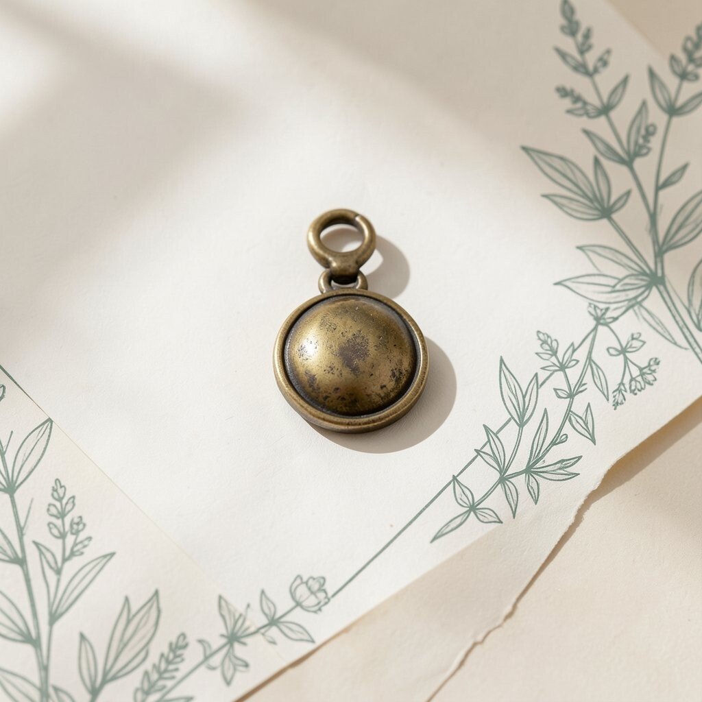
Imagine aged brass, honey beige, and muted sage in soft harmony. It feels like warm light hitting a vintage frame.
This palette is unique because metallic warmth can make ordinary spaces feel special. Use brass as an accent in small details, like picture frames, hardware finishes, or thin graphic lines, while keeping backgrounds in gentle beige or off-white. For practical tips, choose one “metal” tone and stick with it so your design looks intentional. Personalize by adding sage green patterns or botanical illustrations to one corner for a natural touch.
Cost considerations depend on how you implement it, but you can keep it friendly by using gold-ink pens, temporary metallic stickers, or digital metallic effects. This palette is trending in modern vintage looks where warm neutrals meet soft plant tones.
19. Raspberry Bloom Creative Punch

Think raspberry pink, dusty plum, and a soft butter background. It’s bold enough to spark creativity but balanced enough to stay usable.
This palette works well for art prompts, creative workshops, and brand concepts that want personality. Use raspberry for important highlights, like titles and creative prompts, then ground the layout with plum and butter tones for calmer contrast. A practical tip is to keep your text color dark enough to read quickly, especially if raspberry is your background tint. Personalize by adding a repeating blossom pattern in plum ink so your visuals feel handcrafted.
Uniqueness shines when you pair fruit tones with soft, creamy neutrals instead of stark whites. Cost-wise, you can start with printed pattern sheets and craft supplies, then upgrade later if you want to paint or apply wallpaper. Current trends often favor playful gradients and warm florals, and this palette fits right in.
20. Smoke Peach Balanced Comfort

Picture smoky peach, muted taupe, and soft cream like a cozy sweater. It feels calm, comfortable, and quietly confident.
This palette is great for everyday rooms, home offices, and brands that want a relaxed tone without looking plain. Use peachy taupe as a background, keep accents in slightly brighter peach for warmth, and add dark text in charcoal for readability. A practical tip is to mix matte and slightly textured surfaces, since smoke tones look richer with depth. Personalize by choosing a repeating pattern like soft dots or gentle stripes, then limiting it to dividers or covers.
Cost considerations are friendly because muted colors hide small wear and don’t demand perfect matching. This palette also aligns with current trends in “soft earth” interiors that favor comfort over sharpness.
21. Peacock Feather Grand Whimsy
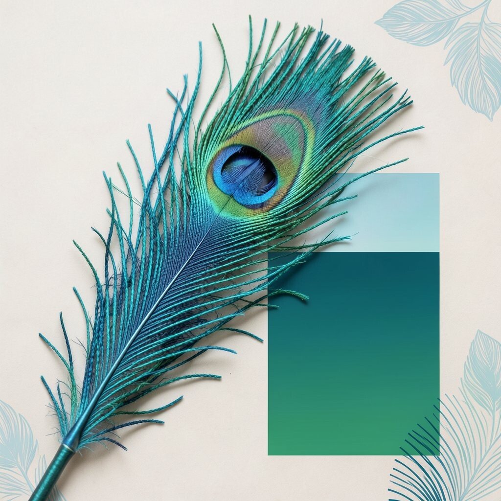
Imagine peacock blues and greens with flashes of turquoise and deep teal. It feels like a feather that wants to make an entrance.
This palette is all about statement energy, which is perfect for event banners, special projects, and creative portfolios. Use peacock tones as accents on key sections and let a neutral base keep everything from feeling too busy. A practical tip is to limit the palette to a few main colors and use them consistently, like one blue for headers and one green for backgrounds, to stay organized. Personalize by adding a subtle feather pattern in one corner of your designs or using layered gradient effects in digital work.
Uniqueness comes from the peacock vibe, which can be glamorous or playful depending on your finish and paired neutrals. Cost considerations can stay manageable because you can use the bold colors in prints, stickers, or templates before committing to larger physical changes. This look also echoes current trends in expressive color storytelling, where one vivid palette sets the tone for an entire campaign.
When you handle peacock colors with restraint, the result feels bright, memorable, and totally yours.