Great design starts long before colors and shapes. A few common mistakes can quietly drain your best ideas.
Use this checklist to spot the traps that slow you down and weaken the message. You will learn simple ways to make your work clearer, kinder, and more useful.
1. Designing Without a Clear Audience

When your design is for everyone, it often feels like it is for nobody. You may picture a friendly scene, like a welcome mat in the wrong house, and it still does not fit.
Pick one real person you want to help, then shape every choice around their needs. Clear focus makes the message sharper, the layout calmer, and decisions faster. Write down what they care about most and keep that list near your workspace.
2. Skipping Research and Trusting Your First Guess
You might begin with a quick sketch and assume it will land well. The result can look polished but still miss what people actually want.
Small research steps can reveal surprising patterns, like users comparing two buttons because one feels safer. When you test early, you reduce costly rework later and your design gains real credibility. Collect a few comments, scan reviews, and note repeated words people use.
If time is tight, ask one person to walk through your idea while you watch. Their confusion will show you where the design needs clearer cues and simpler language.
3. Overloading the Page With Too Many Ideas
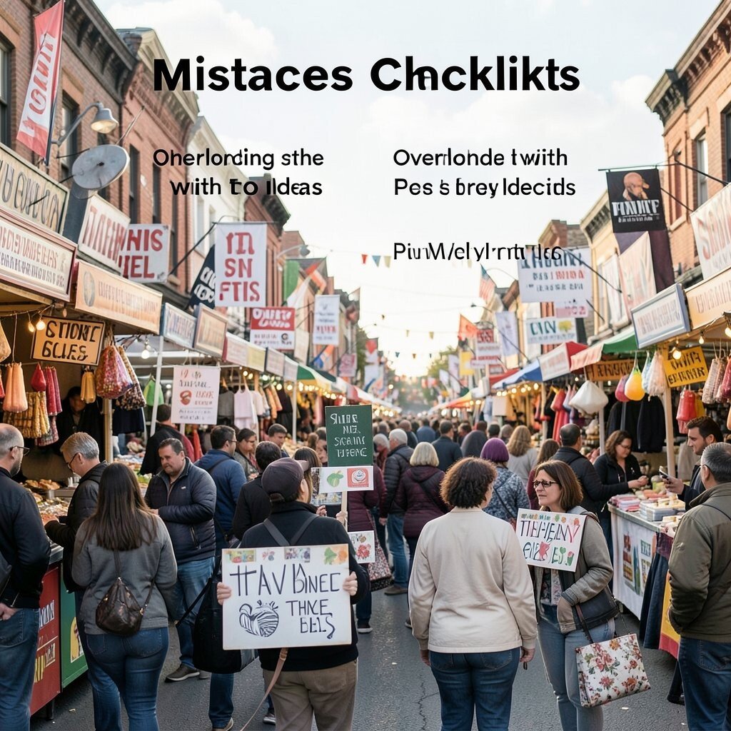
Your screen can start to look like a busy street fair with signs everywhere. Even if each element is good, the whole place can feel noisy.
Choose one main goal per page, then support it with fewer, stronger parts. A cleaner structure helps people follow the story and find what they need. Try grouping related items and giving important sections more breathing room.
Use visual hierarchy so the eye knows where to go first, second, and third. When the design feels organized, the experience becomes more confident, more unique, and more enjoyable to use.
4. Using Generic Layouts That Look Like Everything Else
A common mistake is relying on the same template structure you have seen a hundred times. The design may feel familiar, but it also feels forgettable.
Try adding a signature element that reflects the topic and tone, like a custom icon set or a distinct grid. Unique details create emotional memory and help your work stand out in a crowded feed. Keep the structure simple, then add one creative twist in typography, spacing, or imagery.
5. Choosing Low-Contrast Colors That Quietly Hurt Readability
Soft text on a light background can look elegant, but it may strain eyes. If a reader squints, the message is already losing.
Good contrast improves accessibility and makes the design more usable in bright rooms. Consider testing in grayscale to check whether the layout still holds up. You can use a color contrast tool or just compare your design to printed paper.
Pick one dark text color and one bold accent color, then let the rest support them. When readability is strong, your design feels trustworthy and modern.
6. Ignoring Mobile First Constraints
Many designs look great on a wide monitor but collapse on a phone. Suddenly buttons are tiny, text wraps awkwardly, and the whole layout feels cramped.
Design for thumbs and short attention spans so interactions feel smooth. Mobile-friendly spacing reduces frustration and increases completion rates. Preview your work on different screen sizes early, not at the end.
Use responsive type sizes and flexible layouts that adapt gracefully. A mobile-first mindset also helps you decide what is truly important because you must fit it clearly.
7. Making Buttons That Are Hard to Notice
If users cannot spot the main action, they may think the page is done with no next step. A button that blends into the background is like a door painted the same color as the wall.
Make primary actions stand out through size, color, and placement. Clear calls to action guide attention and reduce bounce. Keep secondary actions quieter so the focus stays on the goal.
Use strong wording that matches the user’s intent and keeps the label short. Consider adding hover and focus states so the button feels alive and responsive.
8. Using Jargon or Overly Clever Copy

Big words and inside jokes can make a design sound smart while confusing people. The page may look sleek, yet the meaning slips away.
Write like you are helping a friend understand quickly. Clear language improves comprehension and keeps trust high. Replace vague phrases with simple descriptions of what happens next.
9. Relying on a Single Font and Calling It Style
Sometimes a design looks “finished” because it has one font and a few sizes. But the hierarchy can still feel flat, like a melody without a chorus.
Use typography to create structure, not just decoration. Pair a readable body font with a distinct heading style to guide the eye. Vary weight and spacing to signal importance without adding extra clutter.
Keep line lengths comfortable so the text feels easy to scan. When typography works well, the design feels calm, professional, and uniquely yours.
10. Forgetting Spacing and Alignment Basics
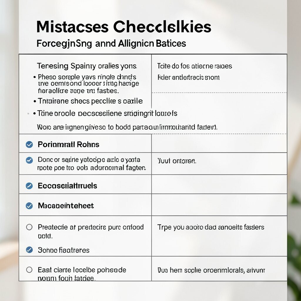
Poor alignment makes a layout feel restless even when everything else is correct. You might notice it as a subtle “almost right” feeling.
Use consistent spacing rules so elements relate clearly. Good alignment makes your design feel intentional and helps people process information faster. Try a grid or spacing scale so you avoid random gaps that look accidental.
11. Not Accounting for Different States and Edge Cases
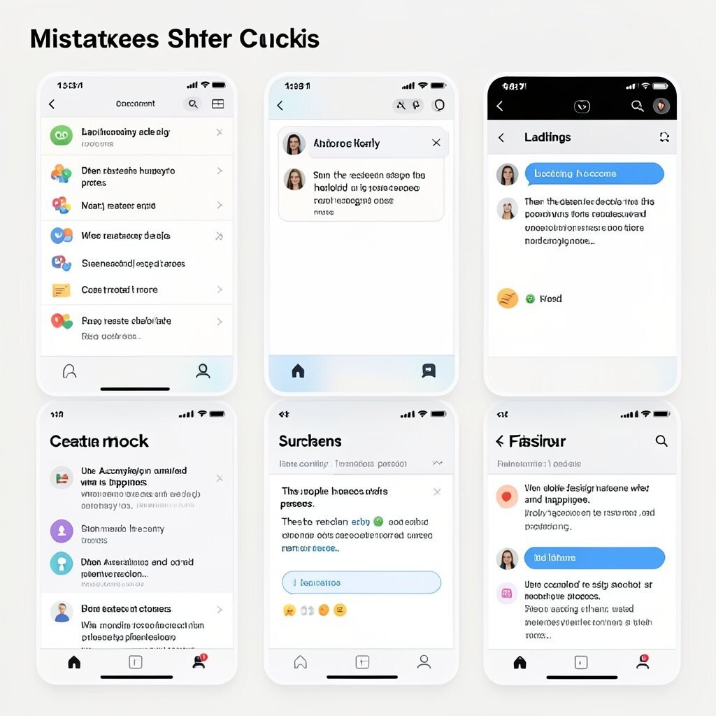
A design often looks perfect in the default view but breaks in real life. Error messages, empty content, and loading screens can turn a smooth experience into a confusing one.
Plan states early so the interface stays helpful under pressure. When the design handles edge cases, users trust it more. Create mockups for loading, success, and failure states, and make sure the language is kind and clear.
Use consistent icons and colors so people recognize what is happening. This also reduces design churn when real data replaces placeholders.
12. Overusing Animations and Effects
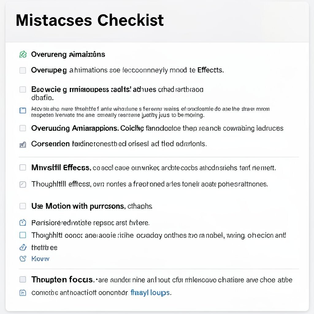
Animations can add delight, but too many can steal attention from the main message. A page can start to feel like it is constantly moving just to be moving.
Use motion with purpose, such as showing change, confirming actions, or guiding focus. Thoughtful effects can make the interface feel more modern and responsive. Keep transitions short and avoid constant bouncing or flashy loops.
13. Building a Visual Hierarchy That Fights the Reading Flow
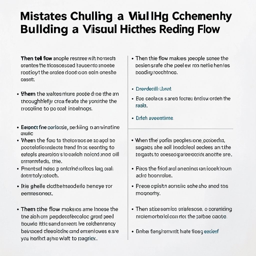
If headlines, images, and paragraphs compete for attention, readers may bounce around without finishing. The page can look busy even when it is not packed with content.
Match the hierarchy to how people naturally scan. Place the most important information near the top and align sections so the eye follows a predictable path. Use size, spacing, and contrast to signal order rather than relying on random emphasis.
When the flow makes sense, people feel guided and the design feels thoughtfully crafted. You will also find that editing becomes easier because you know what to prioritize.
14. Choosing Imagery Without Meaning or Consistency
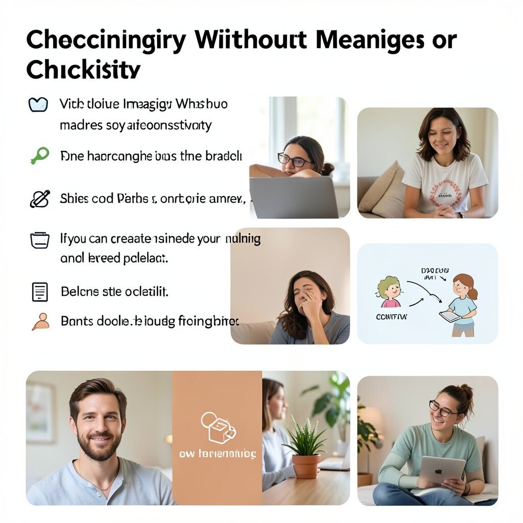
Stock photos that do not match your brand can make the whole design feel uneasy. The picture might look shiny, but it does not fit the story you are telling.
Pick images with a consistent style, lighting, and mood so the page feels unified. Visual consistency makes your brand feel real and helps users relax. Consider using photos, illustrations, or icons that share the same color palette and level of detail.
If you can, create simple custom visuals, like small diagrams or branded icons. That touch can make your design feel unique while still staying practical and budget-friendly.
15. Ignoring Accessibility From the Start
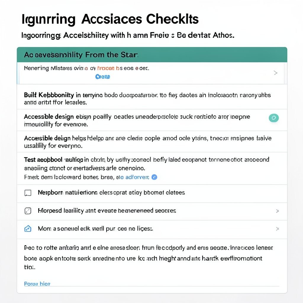
When accessibility is added later, it can be hard to fix layout and design decisions already made. You may end up shrinking text, changing colors, or rewriting labels under pressure.
Build accessibility in early by using readable type, clear focus states, and meaningful labels. Accessible design helps more people and often improves usability for everyone. Test keyboard navigation and ensure contrast supports both light and dark environments.
16. Treating Feedback as an Afterthought
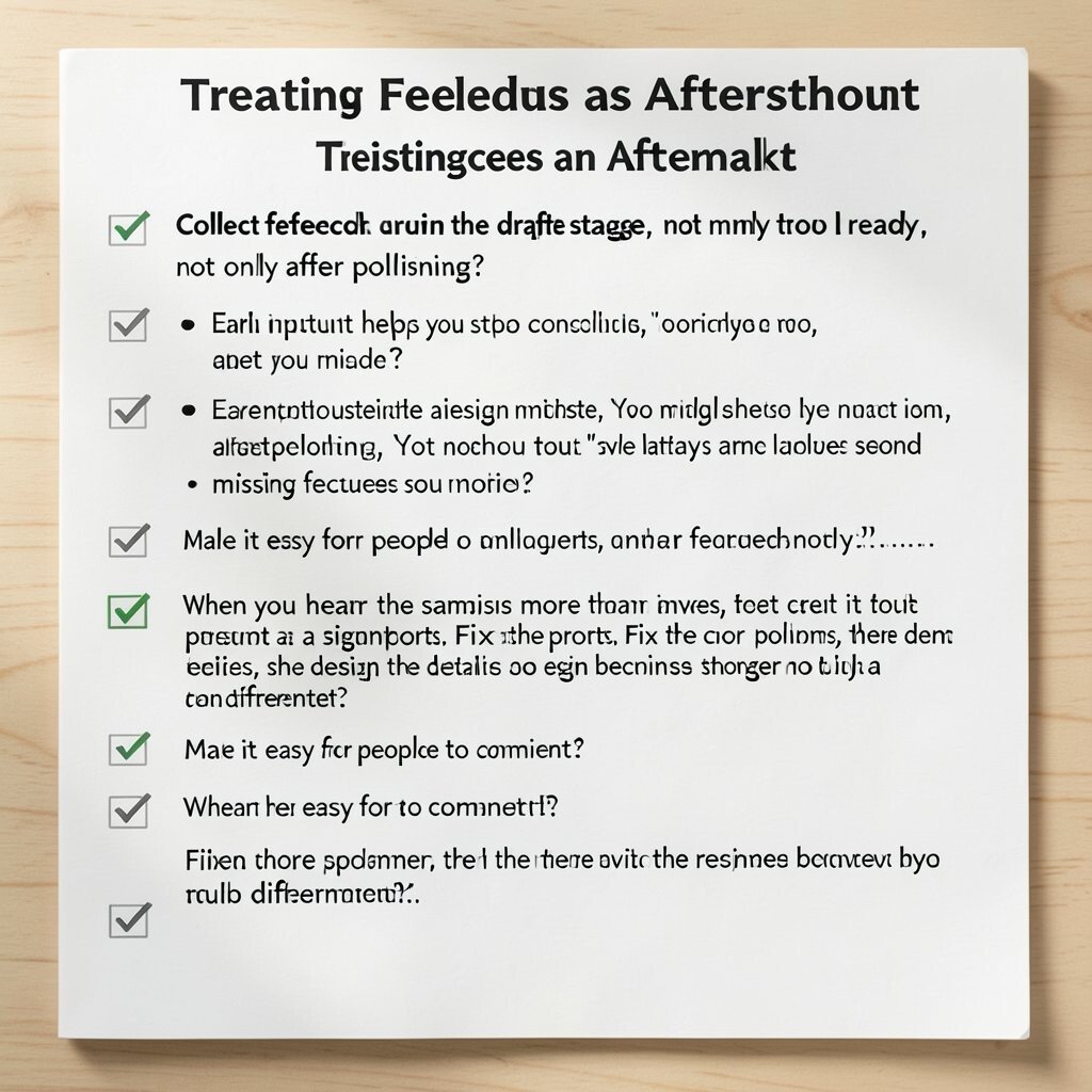
One of the sneakiest design mistakes is waiting too long to get reactions. You might think it is “almost ready,” but users will always notice what you missed.
Collect feedback during the draft stage, not only after polishing. Early input helps you spot confusing wording, unclear layouts, and missing features sooner. Make it easy for people to comment by using short checklists and direct questions.
When you hear the same issue more than once, treat it as a signpost. Fix the core problem, then revisit the details so the design becomes stronger, not just different.
17. Making Everything “On Brand” and Nothing Human
Brand rules are helpful, but strictness can remove warmth. Your design may look correct, yet it might feel cold, like a showroom without people.
Balance consistency with personality by using friendly microcopy and approachable visuals. Human tone builds trust and makes the experience feel safer. Consider adding small touches like playful icons, gentle spacing, and a recognizable voice in your text.
Let your design reflect real situations, such as calm error messages or supportive success messages. When people feel cared for, they engage longer and share more.
18. Not Planning Cost and Effort for the Final Build
Some designs look amazing in a mockup but become expensive during production. Fancy effects, complex layouts, and heavy assets can add time and cost fast.
Think about build effort while you design by keeping components reusable and predictable. Practical constraints often lead to better ideas because you choose what matters most. Use lightweight images, avoid overly complex interactions, and prefer common UI patterns when appropriate.
If you need custom visuals, estimate what is realistic for your timeline. A clear scope helps you stay unique without turning the project into a never-ending workload.
19. Overlooking the Context Where People Will Use Your Design

A design that works in a studio can fail in real life. Users might be on a noisy train, using poor lighting, or rushing through a task.
Imagine the environment and design for it through size, contrast, and clear feedback. Context-aware choices improve clarity and reduce mistakes. Consider whether people will use your design one-handed, with gloves, or while multitasking.
Include guidance through simple instructions and helpful confirmations. When the design fits the moment, it feels more like a tool than a poster.
20. Ignoring Current Trends While Copying Them Too Closely
Trends can be useful because they show what people expect from modern interfaces. But copying a trend without adapting it can make your design look like a costume.
Watch what is popular, such as calmer gradients, bolder typography, and more realistic micro-animations. Then blend those patterns with your own meaning and structure. Your uniqueness should come from content choices, visual rhythm, and the way the design supports the task.
Use trends lightly and test them for readability and speed. When your design stays grounded while still feeling current, it earns attention for the right reasons.
21. Treating Your First Version as the Final Answer
Drafts are where the good ideas become great ones. If you lock too early, you might keep flaws just because they feel familiar.
Rework your layout by changing one major thing at a time, like hierarchy, spacing, or copy clarity. Iteration leads to better decisions and fewer surprises. Keep what works, cut what distracts, and refine until the experience feels effortless.
Celebrate small wins, such as a clearer headline or a smoother path to the main action. When you keep improving, your design becomes not only better-looking but genuinely more helpful.