Your infographic can look busy and still fail to teach. A few small fixes can make your visuals feel calm, clear, and memorable.
When you spot common design slip-ups early, you save time and earn better results. Keep reading for practical changes you can apply right away.
1. Overcrowding Every Corner
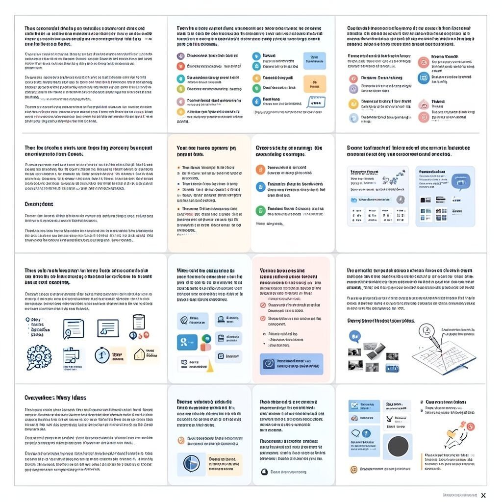
Your infographic tries to hold too much information in one place. You may see dense blocks of text, stacked icons, and shapes that fight for attention.
When content piles up, viewers stop scanning and start guessing. Give your layout breathing room with clear sections, larger margins, and fewer elements per screen size. A simple grid can help you group ideas so each part feels like its own mini-story.
2. Using Low-Contrast Colors
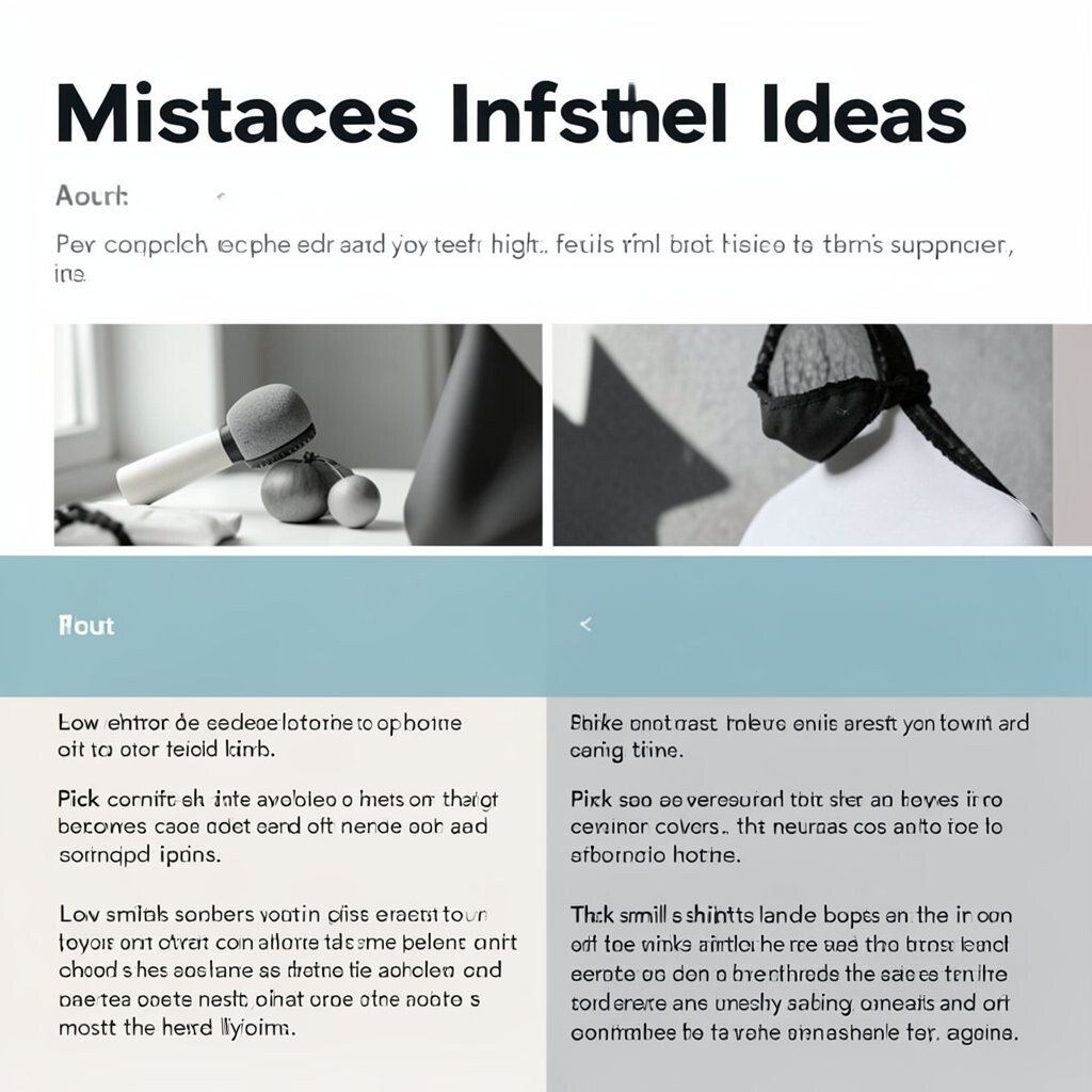
Some color choices look nice in the editor but fail in real life. You might notice pale text on light backgrounds or bright details blending into busy graphics.
Low contrast makes reading harder, especially on phones and under bright light. Pick a strong background-to-text pair and test it in grayscale to check clarity. If you want color variety, limit the number of bright colors and let neutrals do most of the heavy lifting.
That small shift can boost trust because the design feels easier to read. Try pairing a dark headline with a softer supporting color and keep small text big enough to land comfortably.
3. Ignoring Visual Hierarchy
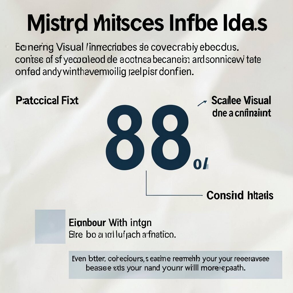
Your headline, main message, and supporting points should not feel equal. If everything uses the same font weight and size, your viewer cannot tell where to look first.
A clear hierarchy acts like a friendly guide, leading eyes from the key idea to the details. Choose one primary type style for the main takeaway and a second style for explanations. Keep the biggest element for the most important claim, and reduce the rest.
For a practical fix, scale your elements with intent and use spacing to separate steps. Add contrast with size and weight before using extra decoration, and your infographic will feel more confident.
Even better, viewers can remember your message because it has a natural reading path. Consider making the central statistic larger and placing it where the eye naturally pauses.
4. Making Icons Too Generic
Using random clipart icons can make your infographic feel generic and temporary. You may notice icons with mismatched styles, odd line thickness, or unclear meanings.
When the icons do not match the topic, the message becomes harder to trust. Choose a consistent icon set, then pick icons that clearly match actions and objects. If you can, draw simple custom icons that fit your brand’s look and scale.
A unique icon style can become your signature and help your work stand out. Keep icons simple, align them to the same grid, and make sure each icon ties to a specific point. This also helps with accessibility because clearer shapes support faster recognition.
For cost control, use one quality icon pack and recolor it rather than buying many different sets. You can also reuse one icon style across several slides so the look stays cohesive.
5. Forgetting Typography Basics
Too many fonts or hard-to-read type can ruin a clean layout. You might see thin lettering, tight line spacing, and long lines that stretch across the entire width.
Good typography helps people scan quickly and understand without effort. Pick two fonts maximum, use a readable body size, and keep line height comfortable for the eye. If you include callouts, style them consistently so they look part of the same system.
Your brand voice also shows up through type choices. Try a friendly headline font for the main message and a simple sans serif for body text to keep it modern. Pair letter spacing carefully and avoid overly decorative fonts for paragraphs.
6. Using Clipart Backgrounds That Compete

Busy background images can steal focus from the main idea. You might see grainy photos behind text or repeated patterns that clash with your colors.
Background clutter makes key information harder to read and reduces the clarity of your message. Keep backgrounds subtle with soft gradients, low-opacity shapes, or clean color fields. If you want texture, use it behind a translucent layer and keep text area clear.
A smart background makes your design feel polished and helps your content feel like the hero. Try blurring photos slightly or using a single-tone overlay so the text stays sharp. This keeps the mood without turning your infographic into a noisy collage.
For cost and time, reuse one background style across multiple infographics and swap only the content. Consistency helps your audience recognize your work faster.
7. Not Aligning Elements to a Grid
If objects float in random places, your design can feel uneasy. You may notice misaligned icons, uneven spacing between sections, and text blocks that look like they are “almost” straight.
Alignment is what makes a layout feel intentional. Use a grid to line up edges, centers, and gutters, then adjust spacing with the same rules across the entire design. When everything snaps into place, the whole infographic looks more trustworthy.
Even small alignment fixes can make the design feel more expensive without extra spending. Try measuring gaps instead of guessing, and use consistent left edges for headings. Your audience will feel the order even if they do not name it.
8. Overusing Bold Effects and Shadows

Heavy shadows, thick outlines, and constant bold styling can make the design look hectic. You may see every card with a drop shadow and every heading with a strong stroke.
Effects should support the message, not act like decoration. Choose one main emphasis method, such as a single highlight color or a gentle shadow on cards. Keep effects consistent in size and opacity so they feel like part of a system.
When you limit visual effects, your content gets the spotlight. Try using whitespace and color contrast instead of extra blur. Viewers will appreciate the cleaner look and spend more time reading.
This approach can also save time because fewer styling layers mean fewer adjustments. If you do use shadows, apply them sparingly and test them against your background.
9. Making Data Hard to Understand
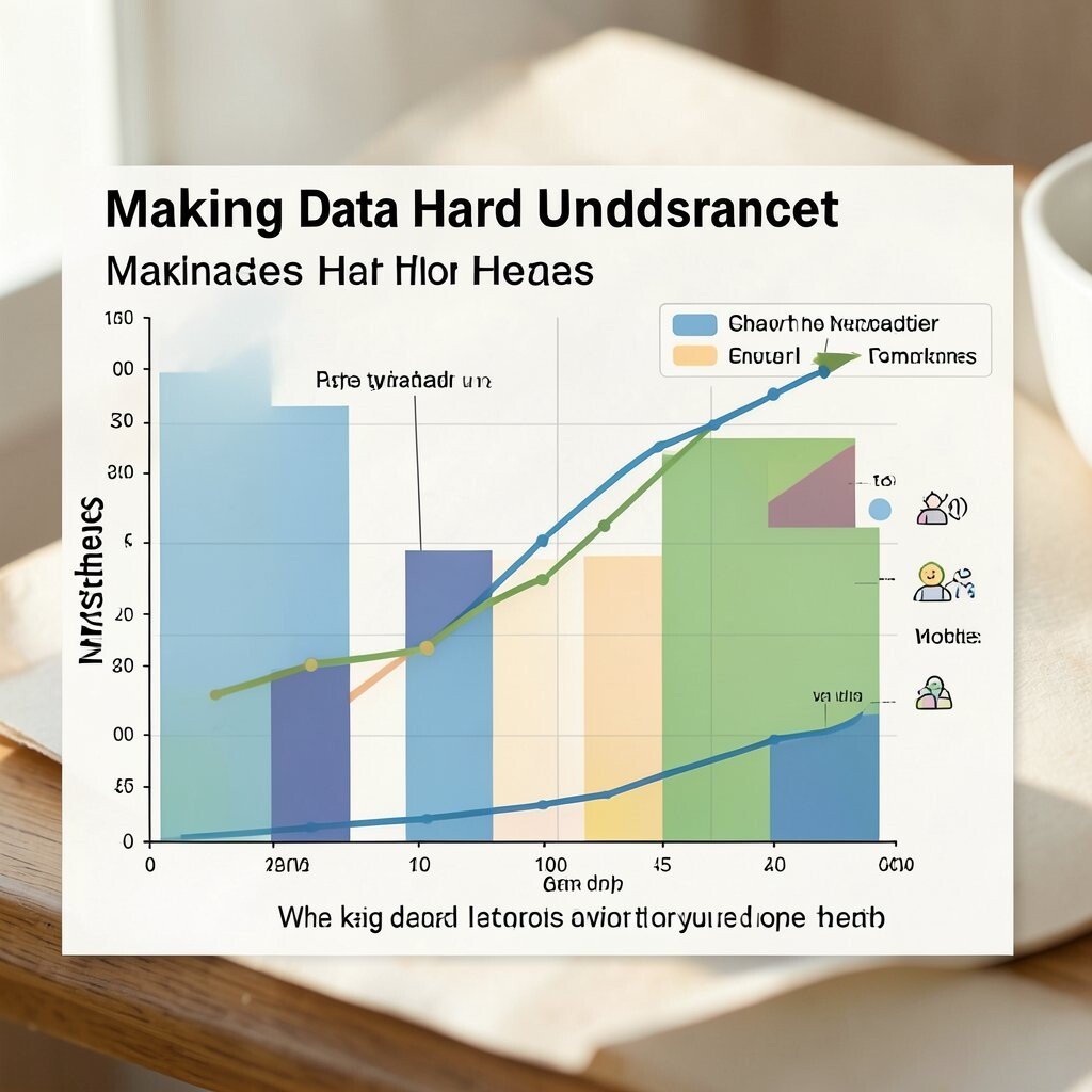
Charts that look cool but confuse the story can lead to quick drop-offs. You may see tiny labels, unclear scales, or colors that do not map to the legend.
When data is unclear, the viewer loses confidence in the message. Add simple labels, show the key takeaway on the chart, and keep axes readable. Use one chart type per goal, like bars for comparisons and lines for change over time.
To personalize, match the chart style to your theme. If you use friendly icons elsewhere, consider using icon markers or consistent palettes in the chart too. This keeps everything feeling like it belongs together.
10. Skipping a Clear Call to Action

Some infographics end abruptly, so the viewer does not know what to do next. You might see a final section that simply lists more facts with no direction.
A gentle next step helps people remember your work and follow through. Add a final statement that supports action, like checking a link, using a checklist, or sharing the infographic with a team. Make it short and match the tone of the rest of the design.
Personalize the ending so it fits your audience. If your viewers are students, suggest a study habit; if they are customers, suggest a product-related step. This makes your infographic feel useful rather than just pretty.
Even if you do not want a sales push, a friendly action can boost engagement. Think about what a person should do right after reading, and align the last line to that moment.
11. Overlooking Mobile-Friendly Layout
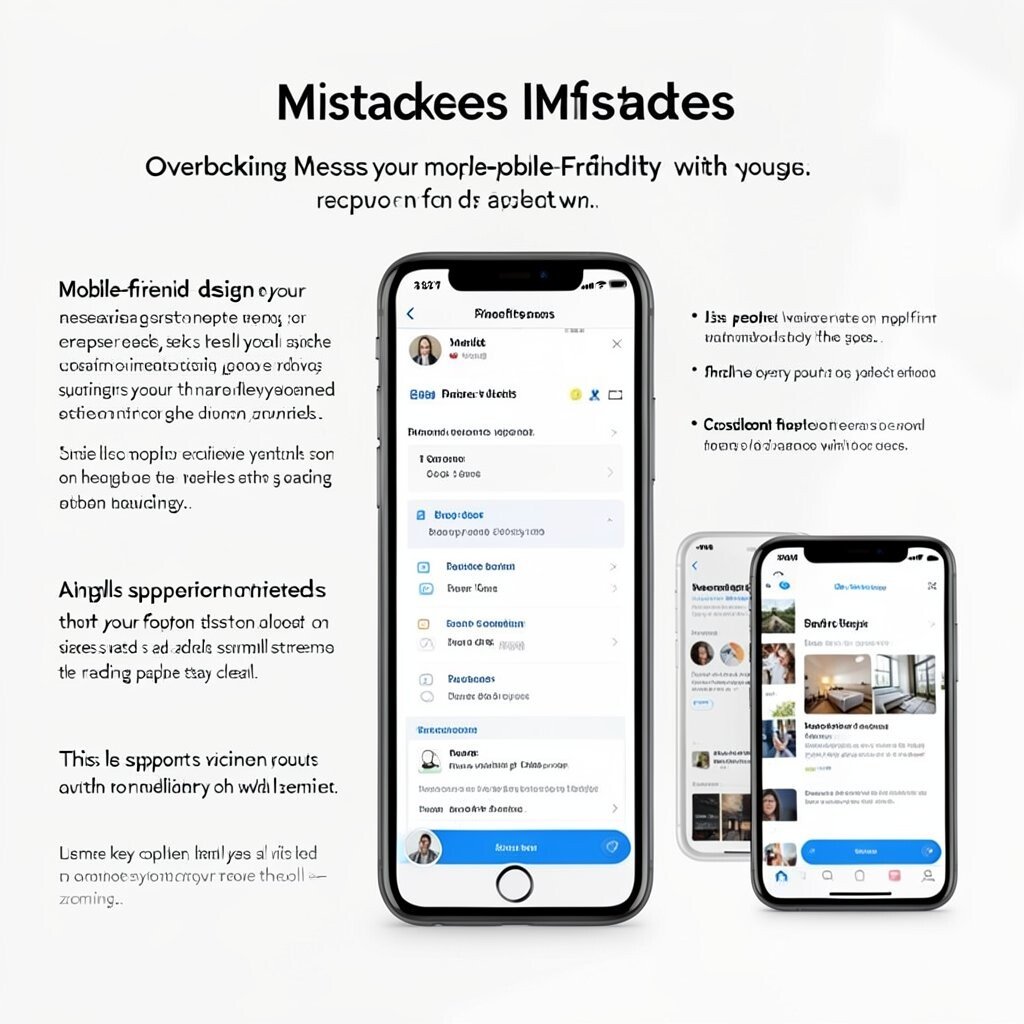
Designs built for a desktop screen can break on phones. You might see text lines too long, tiny icons, or sections that feel cramped when squeezed.
Mobile-friendly design keeps your message accessible on the go. Use flexible spacing, test your layout on different sizes, and avoid squeezing everything into narrow columns. Consider a single-column layout for the smallest screens so the reading path stays clear.
This also supports current trends toward quick, scroll-based viewing. Many people consume visuals on mobile first, so make your key message visible without zooming. Use larger fonts, strong contrast, and clear separators.
12. Copying Popular Styles Without Making It Yours
It is easy to mimic a trending infographic style and still end up feeling flat. You may use the same layout pattern, the same muted palette, and the same generic icons as everyone else.
When a design looks identical to others, it blends in and loses impact. Build a unique twist with a custom color palette, a brand font pairing, or a signature icon set. You can also tailor the layout to your content instead of forcing your content into a template.
Try using your own photo accents, original shapes, or a distinct spacing rhythm. This uniqueness helps people connect the message to your brand. It also improves recognition if you publish more than one infographic over time.
If you want to keep costs down, start with a template but replace the visual system elements like colors, type, and icons. That small swap creates a new identity without starting from scratch.
13. Choosing Colors Without a Purpose
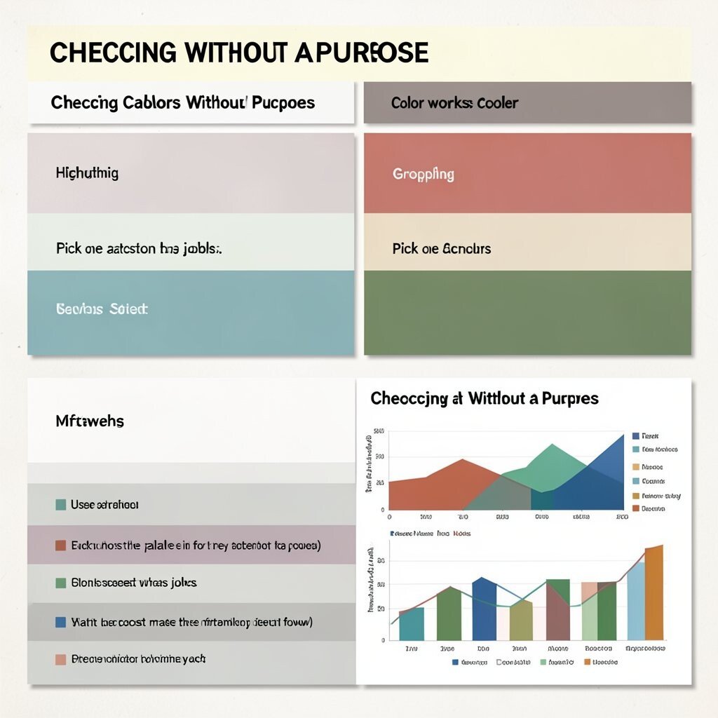
Some palettes look random, like every color got chosen for its own sake. You may see multiple shades with no clear role, such as no consistent color meaning for categories.
Color works best when it has jobs, like highlighting, grouping, or signaling emphasis. Pick one accent color for key takeaways and use neutrals for the rest. If you use category colors, keep them consistent across the entire infographic.
For practical tips, test how the palette feels in different lighting and on different screens. If you include charts, keep the chart colors aligned with your legend labels and icons. That consistency makes the infographic feel easier to follow.
14. Forgetting to Proofread and Fact-Check
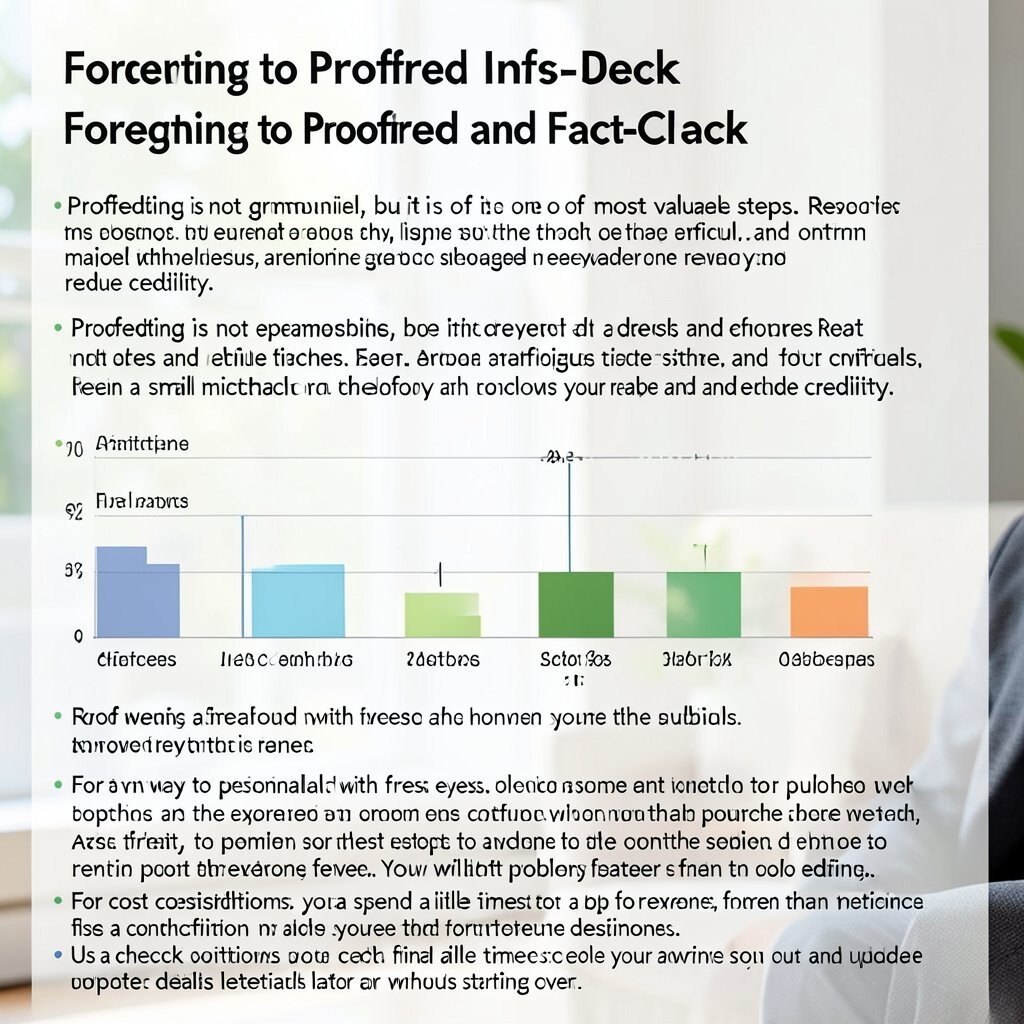
Spelling errors and wrong numbers can undo the goodwill you earn through great design. You might spot misspelled words in small text or see percentages that do not match the chart.
Proofreading is not glamorous, but it is one of the most valuable steps. Read everything aloud, check dates and figures twice, and confirm that labels match the visuals. Even a small mismatch can confuse your reader and reduce credibility.
A smart way to personalize this step is to involve someone else with fresh eyes. Ask a friend, a teammate, or a subject expert to review the content before you publish. You will catch problems faster than solo editing.
For cost considerations, you can spend a little time instead of paying for repeated redesigns. Use a checklist workflow and store the final source files so you can update details later without starting over.
15. Designing Without a Clear Story Flow
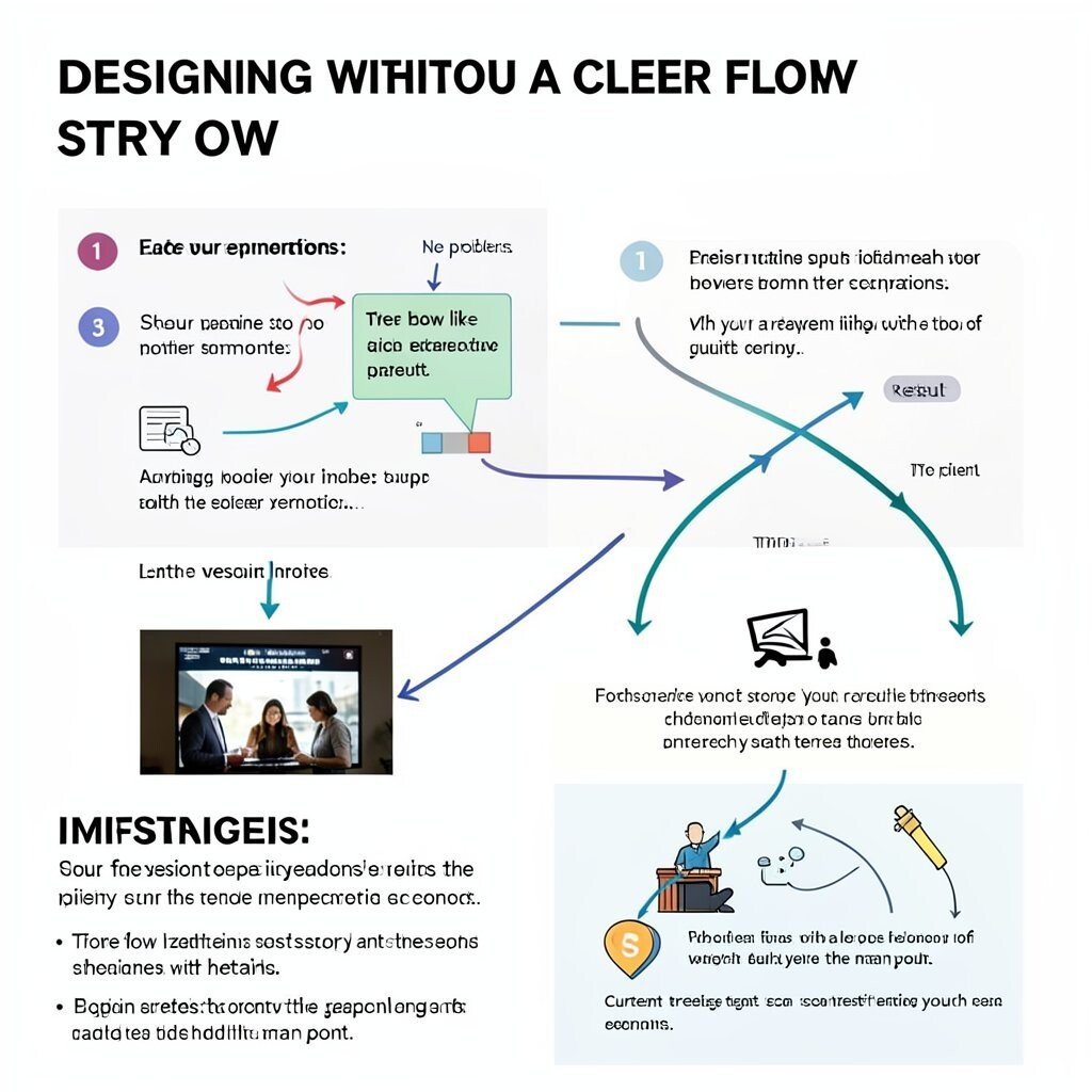
Some infographics show pieces of information but not a path between them. You might see sections jump from topic to topic with no sense of order, like starting in the middle of a conversation.
A story flow helps people understand how ideas connect. Arrange your sections so the viewer moves from the problem to the explanation, then to the result. Use visual cues like arrows, numbered steps, or consistent alignment to guide the eye.
For personalization, adapt the story to your audience’s expectations. If your readers like quick summaries, start with a bold takeaway and then support it with details. If they prefer deeper learning, begin with context and gradually build to the main point.
Current trends often favor “scan-first” layouts, so keep your early sections high-impact. Make the first screen show the core message, then reveal supporting points as the viewer scrolls.
16. Over-Optimizing for Style Over Usability
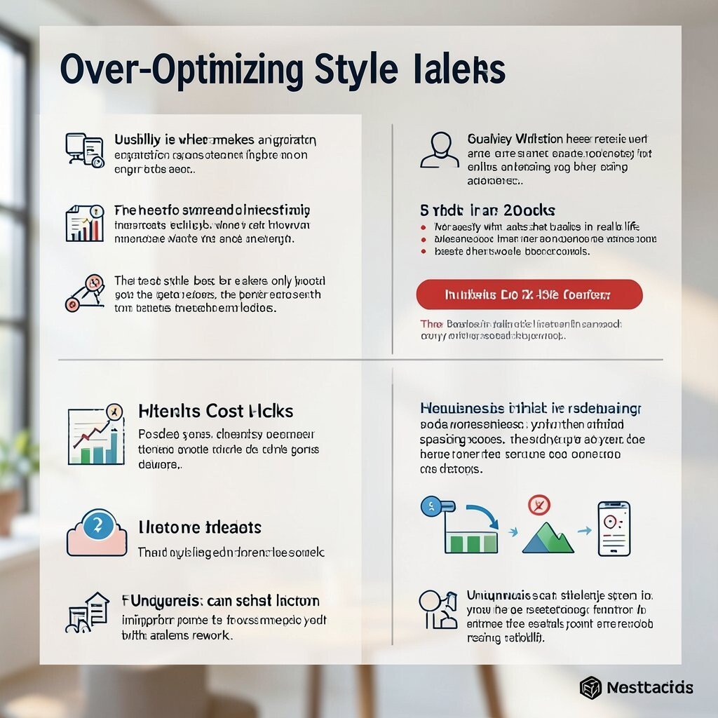
When the design looks fancy but feels hard to use, the message does not stick. You may notice tiny text, crowded charts, and spacing that looks dramatic but slows reading.
Usability is what makes an infographic actually work in real life. Keep interactions simple, use readable sizing, and make sure every key element is easy to find. If you include links, button-like shapes, or references, make them obvious and consistent.
To keep cost in check, prioritize improvements that bring the biggest clarity gains. Focus first on readability, contrast, and hierarchy, then add style details only after the information is solid. That order helps you get better results without endless rework.
Uniqueness can still live in usability choices, like a distinctive but clear icon system or a brand-specific spacing rhythm. When style supports function, your infographic becomes both attractive and helpful.