Your craft space can quietly fight back in the small ways you don’t notice. A few poor choices in supplies and setup can make even simple projects feel harder than they should.
In the sections below, you’ll see common design mistakes that come from the wrong materials, the wrong measurements, and the wrong habits.
1. Choosing Supplies That Don’t Match Your Project Mood
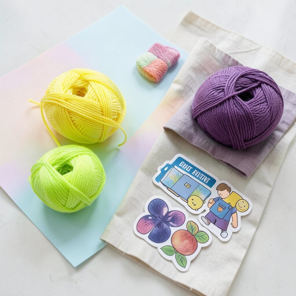
When your supplies have the wrong “vibe,” everything looks off before you even finish the first step. Picture a bright neon yarn next to soft pastel paper, or thick, shiny stickers mixed with matte fabric.
Try to imagine the final scene in your head, then pick textures and colors that belong in that same world. Matching material weights, shine levels, and color temperatures helps the piece feel intentional. It also makes the work more fun because you’re not constantly correcting how one material clashes with another.
2. Ignoring Color Consistency Across Your Whole Kit
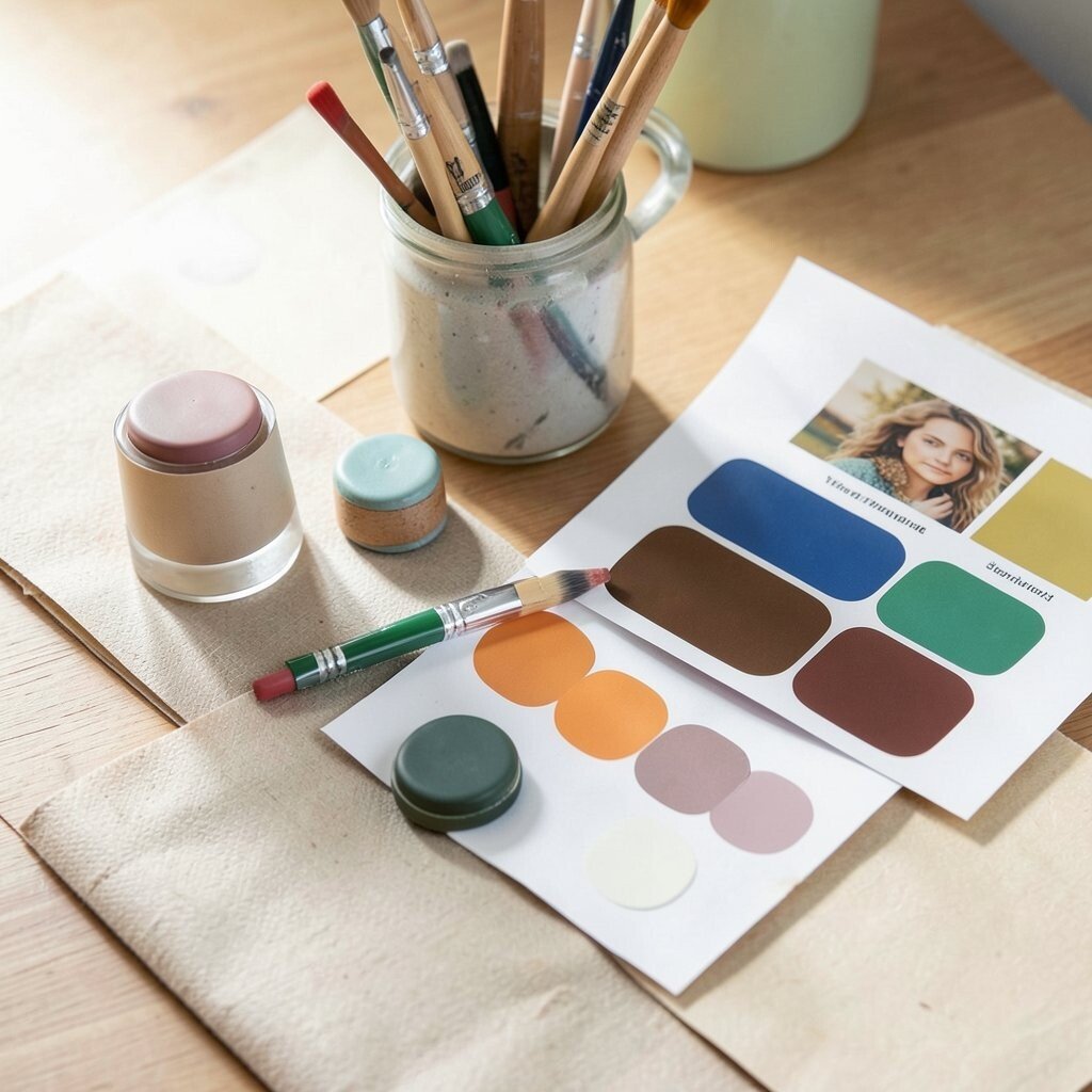
It’s easy to grab “close enough” colors when a project feels urgent. Later, you notice the seams, borders, or accents look like they came from different seasons.
Use a small reference system by keeping your main palette visible, such as a printed swatch sheet or a photo of finished inspiration. Stick with a limited range for backgrounds, midtones, and highlights so the eye knows where to rest. This simple approach improves clarity and makes your work look more polished, even when you’re still learning.
For personalization, you can swap one accent color for a meaningful shade, like a favorite color of a gift recipient. If budget is tight, buy fewer colors but in better quality so they blend smoothly. Seasonal trends often push bold accents, but consistent base tones keep trendiness from turning into visual noise.
3. Buying Tools Without Learning the Basics of Use
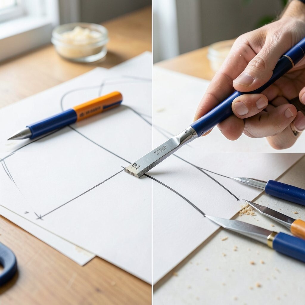
A new craft tool can feel exciting, but misuse turns it into a frustration machine. If you’ve ever fought with uneven cuts or messy lines, it usually starts with using the tool before you understand its feel.
Practice on scrap first so you can learn pressure, angles, and speed without ruining your real piece. You’ll get cleaner edges and smoother layers, and you’ll stop wasting supplies. That saves money and also reduces the chance of a project taking over your whole evening.
To keep things unique, test different settings on a small corner and save the best result for later. Current trends favor crisp layering and clean die cuts, so learning the tool’s limits helps you chase that look without accidental damage. Even a basic approach like marking a guide line can make your results look designer-level.
When you buy, look for tools that suit your hand comfort, not just the biggest brand name. A tool that feels right will help you stay consistent, and consistency is where good design starts.
4. Using Cheap Adhesives That Show Through
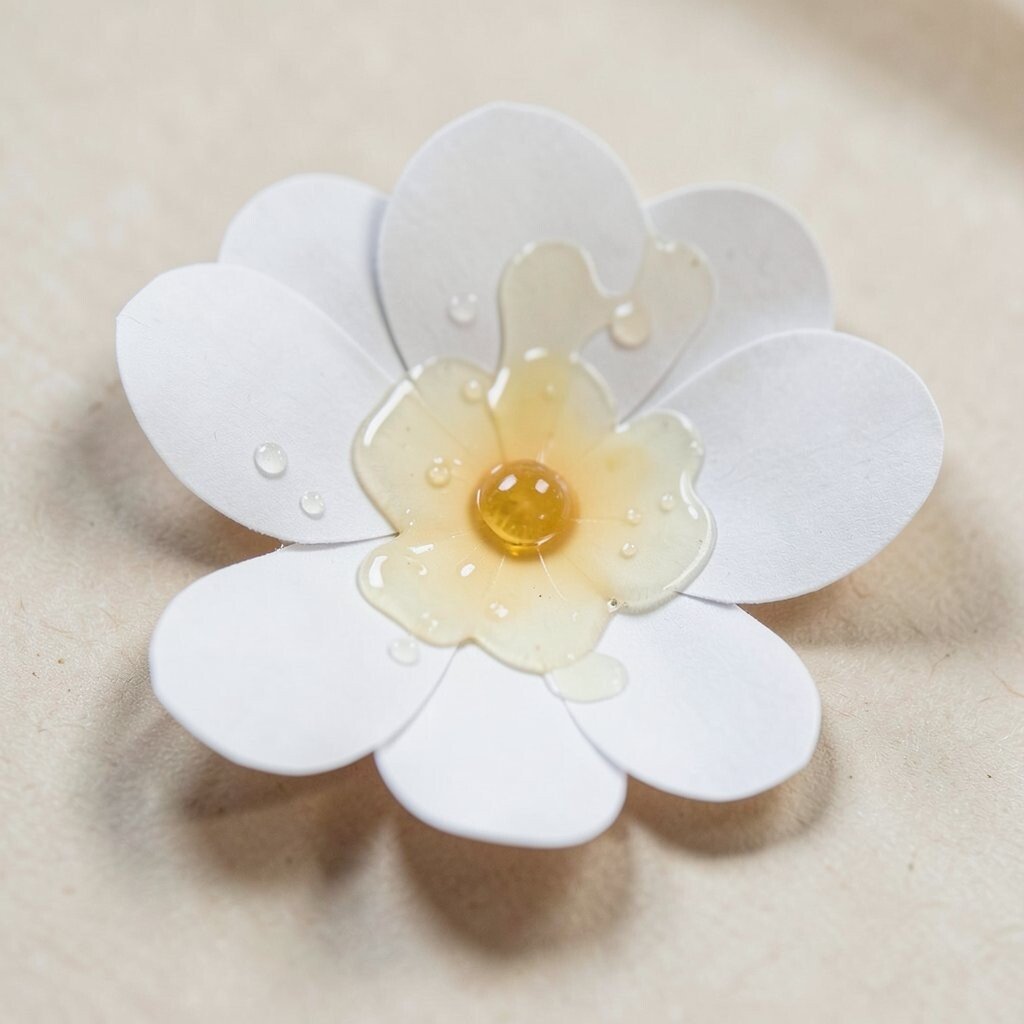
Some glues dry clear, but others turn slightly cloudy or shiny, and it shows up under light. Think about a delicate paper flower where the adhesive spots look like tiny wet patches. Even worse, some tapes leave edges that catch on camera flash.
Pick adhesives that match the surface you’re joining, especially if the project will be seen up close. Matching glue to paper, fabric, or cardstock keeps edges tidy and reduces warping. This also makes your work last longer because you’re using a bond that fits the material.
5. Overstuffing Projects With Too Many Decorative Elements
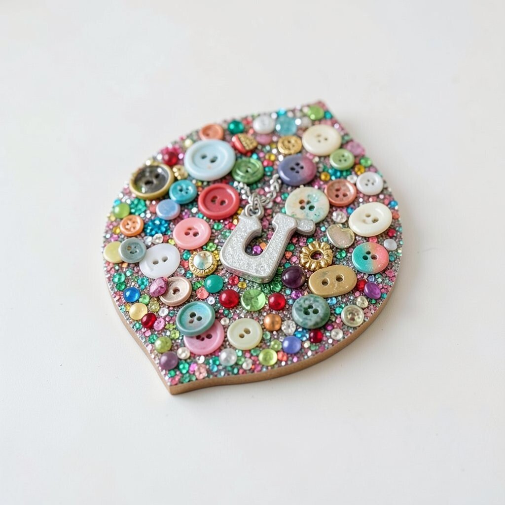
When everything is covered in glitter, buttons, and tiny charms, the piece stops having a focal point. Your eye keeps bouncing instead of resting, so nothing feels “designed,” even if every part is cute.
Choose one main feature and support it with simpler details around it. Add small accents where they guide attention, like repeating a shape near a corner or echoing a color in one border line. This helps your design feel balanced and makes the final look look thoughtful, not accidental.
For personalization, swap extra ornaments for a single meaningful item, like a letter charm or a birthstone bead. Trends often move toward maximal styling, but you can still keep it wearable by leaving breathing space. If you’re trying to save money, buying fewer specialty trims usually costs less than constantly replacing items you end up not using.
6. Skipping Test Layouts and Jumping Straight to Cutting
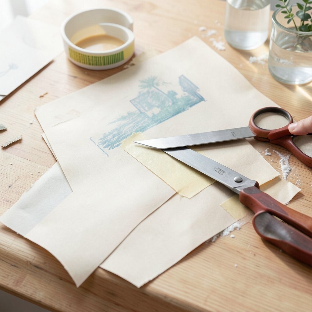
It’s tempting to start trimming right away, especially when inspiration hits fast. But without a quick layout check, pieces may end up too tight, too loose, or slightly crooked.
Do a dry placement first using paper scraps or painter’s tape so you can see the proportions. You’ll catch spacing problems before they become permanent, and your final edges will look calmer. This habit also improves your confidence because you can adjust without stress.
7. Choosing Fabric and Paper With Opposite “Stretch” Behavior

Some materials warp when you add adhesive or heat, while others stay stable and flat. If you mix those behaviors in one piece, the layers can ripple or pull away from each other.
Look at how your chosen fabric reacts to light pressure and how your paper behaves with glue. Stabilizers, backing paper, and careful drying time can keep everything aligned. The payoff is a crisp finish that holds its shape, which makes the work feel more expensive.
For personalization, you can deliberately pair different behaviors for texture contrast, like a soft fabric panel framed by a firm border. Just be strategic about where you allow movement and where you demand stability. In current crafting trends, mixed media is popular, but clean boundaries are what make it look intentional rather than messy.
8. Using the Same Color for Every Layer and Border
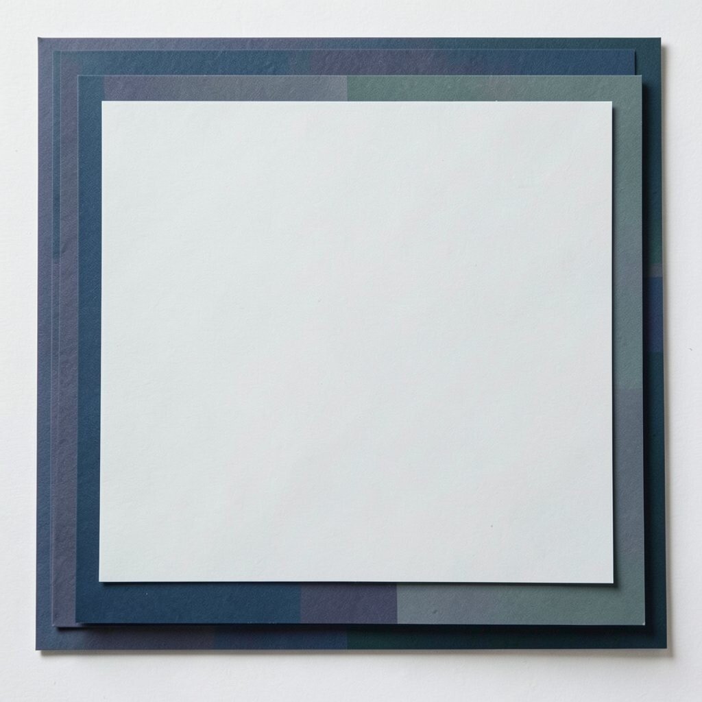
When everything uses the same shade, your piece can look flat even if you used great supplies. Light and shadow need different colors to create depth on the page or surface.
Add subtle variation by using a darker or lighter version of the main color for edges and highlights. This makes layers pop and gives your eye clear structure. It also makes your design feel intentional, especially in crafts like cards, scrapbook pages, and labels.
9. Forgetting About Scale, Especially With Small Embellishments
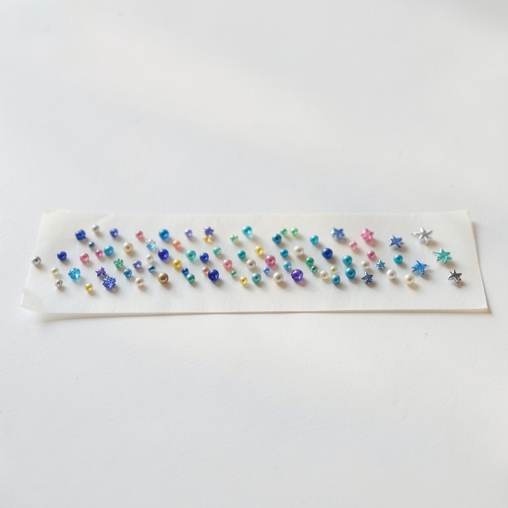
Small details are supposed to look charming, but wrong scale can make them look crowded. A row of tiny beads might overwhelm a simple background if the rest of the design stays too plain.
Before gluing, place embellishments in a row with temporary tape and step back to check the overall balance. Scaling elements up slightly can create a stronger focal point, while scaling them down too far can make them disappear. You’ll get better readability and cleaner visual hierarchy.
To personalize, choose a symbol set that fits your story, like tiny stars for a night-themed theme, but keep their size consistent with your layout. If you notice trends in social feeds, you’ll see that large shapes often lead and small ones support, which helps everything stay legible. Budget also plays a role, because buying one larger pack of coordinated pieces can cost less than chasing tiny, random add-ons.
10. Relying on One Technique for Every Project
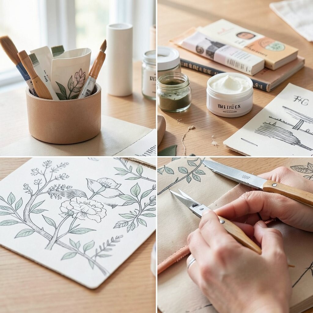
Reusing the same method can accidentally make your style look repetitive. Even if you love a technique, every project needs its own best match.
Try mixing approaches, like pairing stamping with hand-drawn details or combining cutting with stitching. This keeps the work fresh and gives you more ways to show uniqueness. It also helps you discover what materials behave best, so you waste less on “not working” supplies.
11. Choosing Inconsistent Paper Weights and Folding Wrong

Paper that’s too thin bends at the wrong places and can look flimsy on borders. Paper that’s too thick can crack when folded, leaving jagged creases that ruin the clean look.
Pick a paper weight that fits your use, especially for cards, boxes, and folded covers. If you’re working with heavier sheets, score lines gently before folding. Better folding means neater edges, and neat edges make the whole design feel more deliberate.
For personalization, consider mixing weights only in ways you can control, like using thicker cardstock as the base and lighter paper as a top layer. Current trends love layered cards, and proper folding keeps those layers flat. If you’re watching costs, buying one reliable cardstock pack is often cheaper than repeatedly replacing papers that don’t fold well.
12. Overlooking Lighting and How It Changes Color
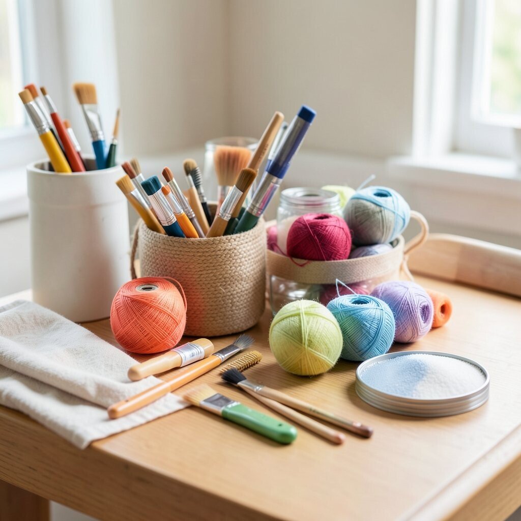
Color looks different under warm lamps, cool LED lights, or daylight from a window. You might think your palette is perfect, then take a photo and realize it looks dull or too bright.
Check your colors in the light you’ll use most, and adjust with small test swatches. This helps you keep the intended mood, whether you’re aiming for cozy warmth or crisp modern tones. The benefit is more accurate results and fewer back-and-forth corrections.
13. Using Patterned Backgrounds Without a Clear Layout Plan
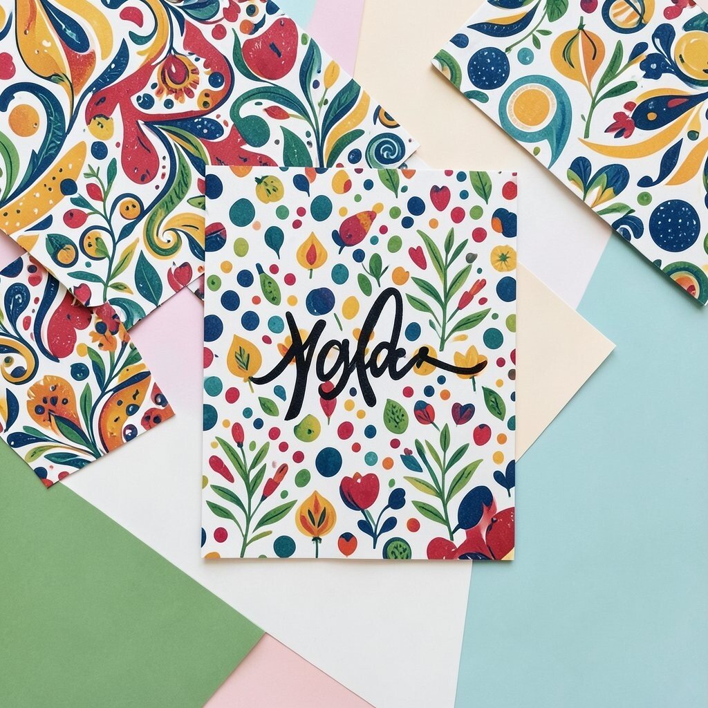
Pattern is powerful, but too many patterns can fight each other. A busy background with busy focal shapes can make your main element disappear.
Choose one pattern to lead and let the other parts stay calmer, using solid colors or larger shapes for balance. Keeping patterned areas in one zone makes your eye feel guided. This also helps your design look clean even when you add small personalization touches.
For uniqueness, you can combine a strong pattern with a single custom detail, like a hand-lettered name or a signature symbol. Trends often lean toward bold prints, but designers still build clear spacing around them to avoid visual chaos. If you’re budget-conscious, buy smaller scrap sheets and test how they pair before committing.
14. Forgetting Storage That Keeps Supplies From Warping
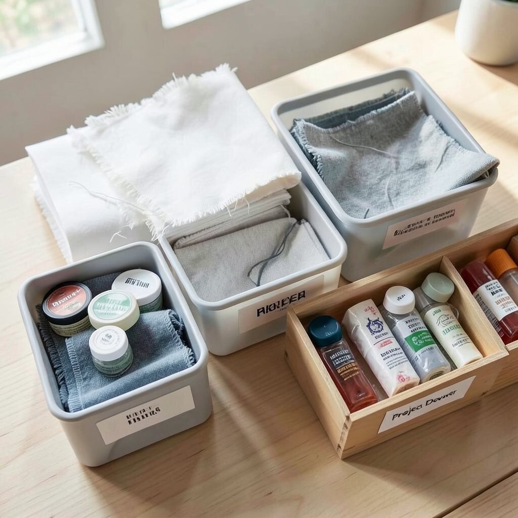
Paper can curl, fabric edges can fray, and adhesives can dry out when supplies sit in the wrong conditions. The design suffers because materials start off already uneven.
Store paper flat, fabric folded with protective layers, and adhesives capped tightly to prevent thickening. Use labeled bins so you can find what matches your palette quickly. Better organization saves time, which is a real benefit when you’re juggling busy schedules.
For personalization, set up a small “project drawer” for your current theme so your creative momentum stays strong. Current trends encourage intentional, slow crafting, and good storage supports that calm pace. You’ll also save money because fewer supplies get ruined before you even use them.
15. Cutting Too Tight and Ending Up With Frayed Edges
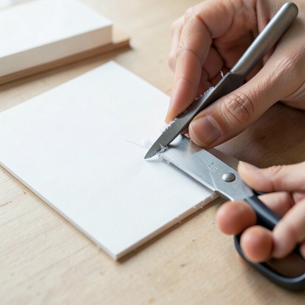
Cutting is where precision meets patience, and rushing can cause tiny mistakes to grow. When cuts are too tight, materials may fray, crack, or lift when you bend or adhere them.
Leave a small margin for trimming and test the fit before you commit to the final cut. Sharp blades and slow, steady pressure create smoother edges and cleaner lines. This improves your final finish and reduces the need to re-cut expensive cardstock or specialty foam.
16. Skipping Edge Finishing on Visible Borders
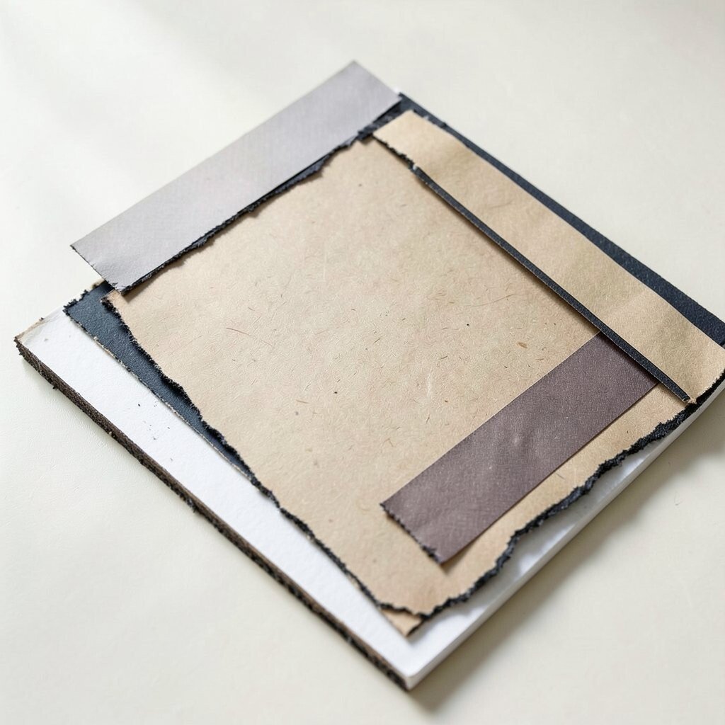
Even a good layout can look unfinished when edges are raw. Imagine a layered collage where the border shows unsealed paper fibers or uneven foam edges.
Finish edges with matching markers, ink pads, washi tape, or sanding blocks depending on the material. Edge finishing adds a subtle detail that makes designs look polished and intentional. It also helps prevent fraying over time, which is a quiet benefit for long-lasting projects.
For personalization, choose an edge tone that echoes your theme, like using dark ink for a vintage look or bright marker for a modern feel. Trends often highlight clean, crisp borders, so taking edge finishing seriously can instantly upgrade your style. If cost is a concern, smaller ink pads and a single multi-purpose tool can cover many projects.
17. Choosing Embellishments Without Considering Weight and Balance
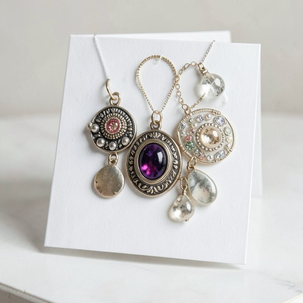
Heavy charms and thick embellishments can pull a page down or make a card sag. That weight can also stretch adhesives and cause corners to lift later.
Balance heavier items with stable backing, proper adhesive types, and thoughtful placement. Lighter accents around a heavier focal point often look more harmonious than stacking weight in one spot. You’ll enjoy a steadier result that holds up and looks better when opened or moved.
18. Using Fonts or Lettering Styles That Don’t Match Your Design Intent
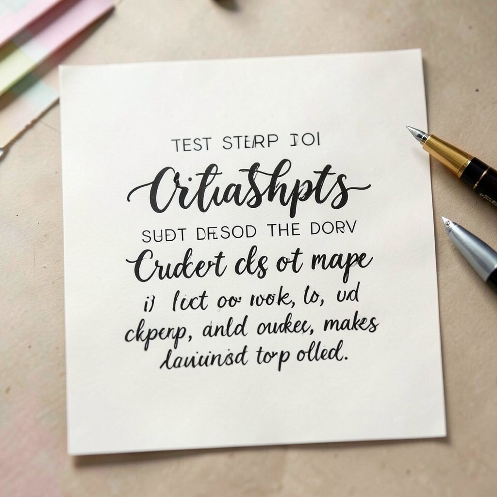
Typography can make or break a craft project, even when everything else is beautiful. A playful script may feel wrong on a calm, minimal layout, and an ultra formal font can clash with cozy handmade textures.
Pick a lettering style that supports the mood, then keep sizes consistent so the message reads easily. Test on scrap first, because letter spacing can look different depending on paper. Clean readable text gives your work confidence, and it also makes personalization feel polished.
For uniqueness, combine two styles intentionally, like bold block letters for headings and soft handwriting for names. Current trends like mixed typography can look great, but they still follow good spacing rules. If you’re budgeting, printable letter templates and basic pens can replace buying multiple expensive font sets.
19. Ignoring the Background-to-Foreground Contrast
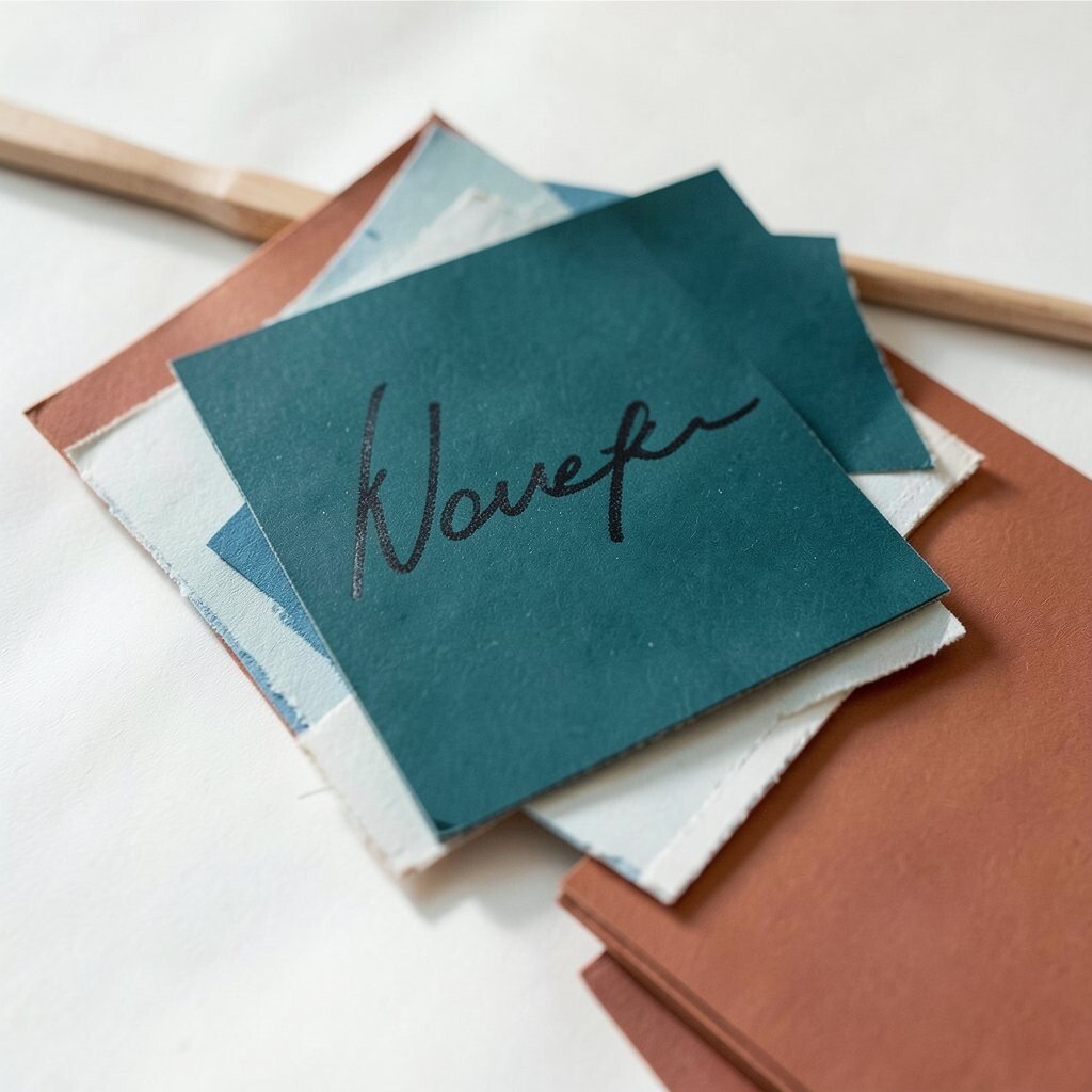
When the foreground blends into the background, your focal point gets lost. It might look fine in person, but photos reveal the problem fast, like light gray text on pale paper.
Create contrast with value differences, not just color. A darker outline, a brighter highlight, or a slightly different texture helps your main element stand out. This improves readability and makes your design feel sharper and more professional.
For personalization, you can use a signature color as your contrast anchor, like a deep teal or warm terracotta. Trends often use soft gradients, but contrast still matters for clarity. If you want to avoid extra spending, you can strengthen contrast with simple tools like ink, chalk, or layered cardstock scraps.
20. Forgetting About Surface Compatibility for Paint, Ink, and Sealers
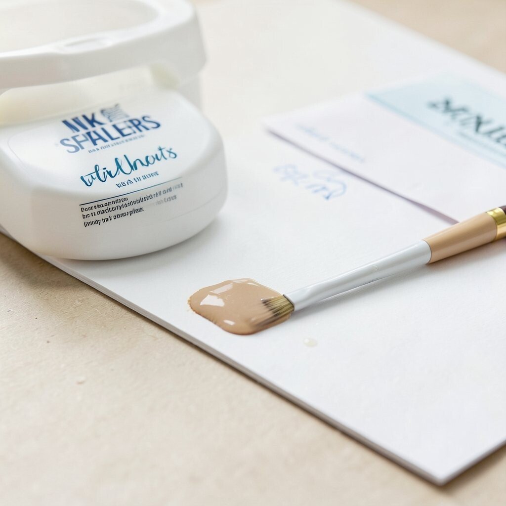
Some inks bead on glossy paper, and some paints peel off smooth cardstock. If you seal too early or seal with the wrong product, you might ruin fine details.
Test a tiny corner on the exact surface you plan to use. Let it dry fully before adding more layers so you can judge how it behaves. That simple step protects your work and helps you pick supplies that work together.
For personalization, pick sealers that match your desired finish, like matte for a soft look or gloss for a punchy highlight. Current trends favor durable, photo-friendly finishes, especially for scrapbook pages and keepsake boxes. Cost-wise, using one reliable sealer carefully often beats buying multiple quick fixes.
21. Over-Planning Too Late in the Process
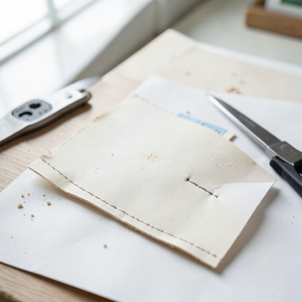
Design planning is helpful, but waiting until the last minute can lead to rushed choices. You might add embellishments that don’t match because you’re trying to “save” a spot that feels empty.
Keep a loose plan from the start by deciding your focal point and your balance areas. Even a simple thumbnail sketch or a quick grid layout can guide your placement. This keeps you from buying extra supplies at the end, and it helps you use what you already own.
For uniqueness, leave one intentionally imperfect handmade detail, like a tiny misaligned stitch that becomes your signature. Trends often celebrate handmade character, but the rest still needs structure. When you plan early, you spend less time correcting and more time enjoying the creative flow.
22. Treating Quality as a Luxury Instead of a Foundation
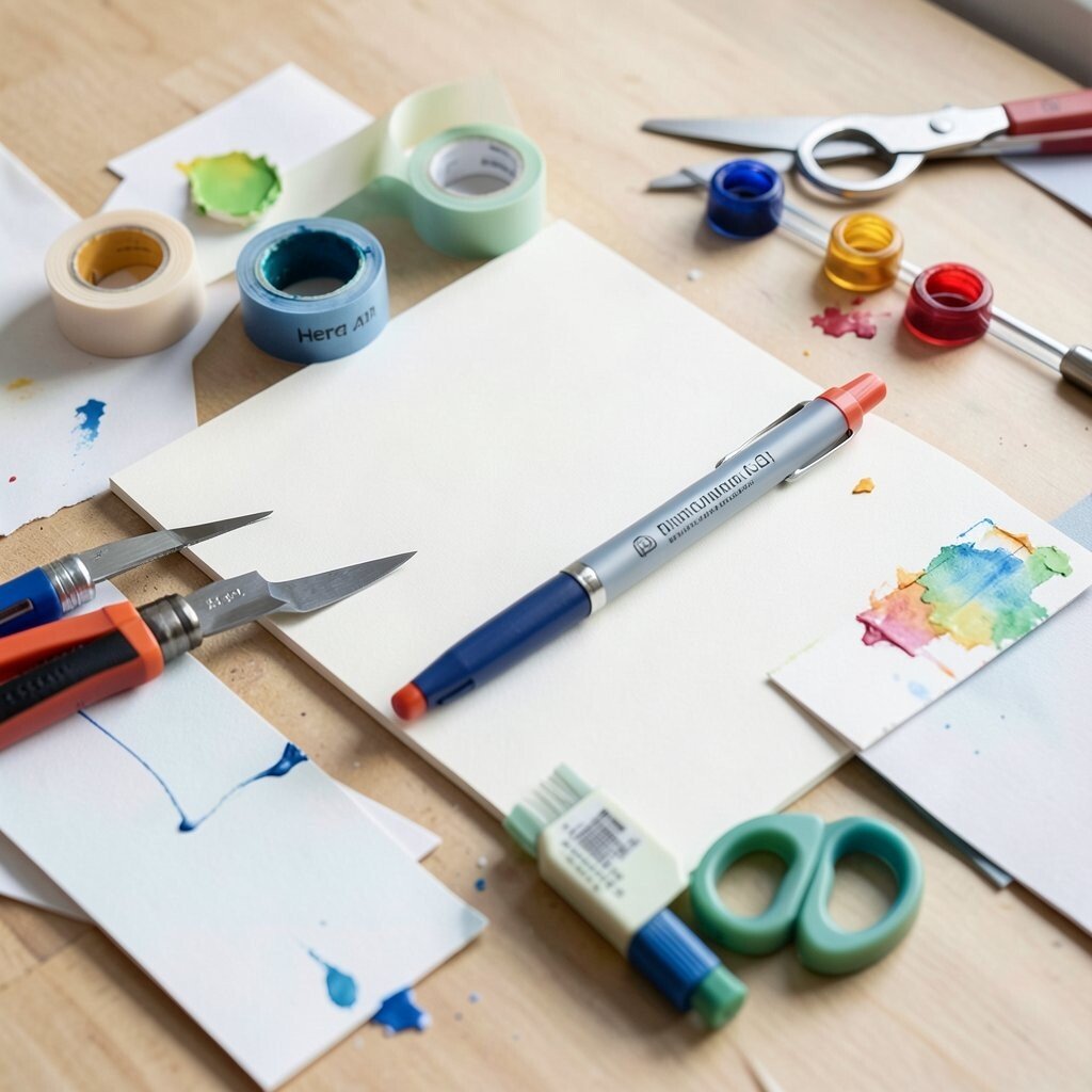
Cheap supplies can be tempting, but they often lead to hidden costs through waste and repeated attempts. A bad blade dulls faster, a flimsy tape lifts sooner, and inconsistent dye can shift your colors.
Think of quality as a foundation that makes your design easier, not as an expensive bonus. If you invest in a few essentials that you use often, you’ll see better results across many projects. That’s how you build a craft style that feels confident and unique without constantly rebuying materials.
For personalization, choose a “hero” supply that matches your creative identity, like your favorite pen type or your go-to cardstock finish. Trends keep changing, but strong basics stay useful, from adhesives to cutting tools. When budgeting, allocate money to the parts that touch most of your work, and use lower-cost options for experiments or background scrap layers.
Your craft space becomes smoother, your designs look more intentional, and you spend less time fixing problems caused by the wrong materials.