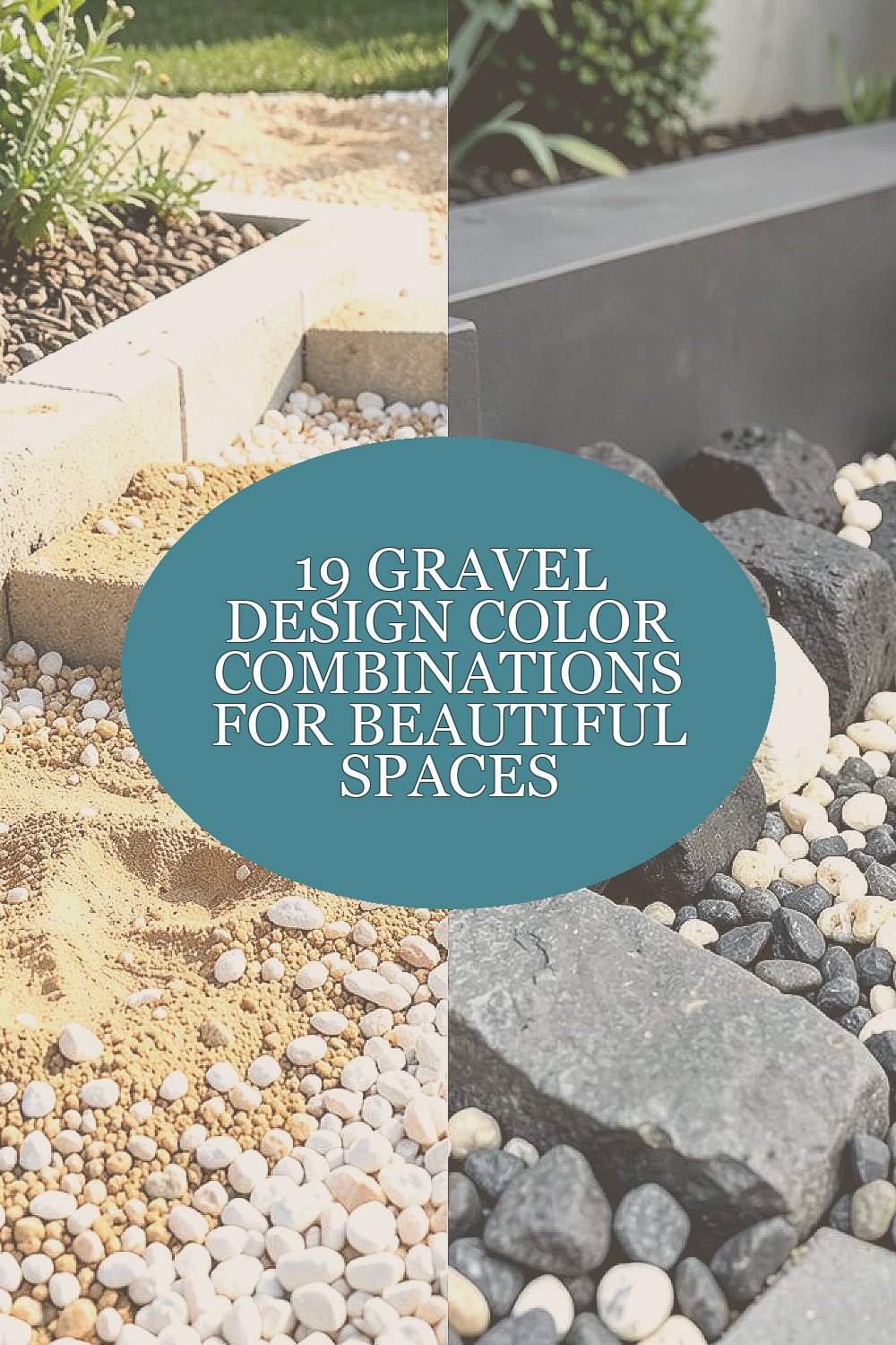
Gravel can look calm, bold, or totally custom. With the right color mix, even a simple path starts to feel like a design choice.
Today you’ll see color pairings that work in yards, courtyards, driveways, and garden beds. Each option includes practical ways to plan it, so the result feels good to live with.
1. Warm Sand and Soft White
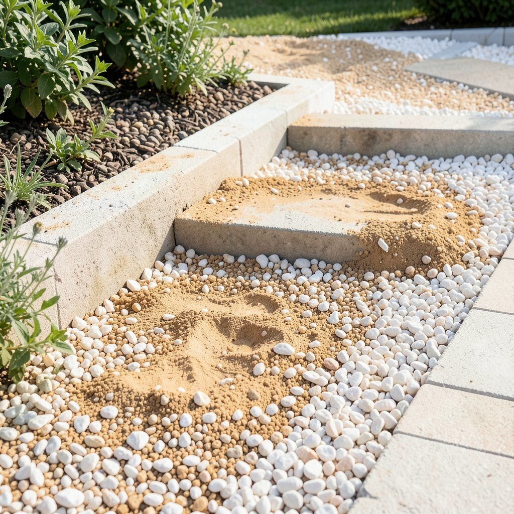
Warm sand gravel with soft white stones creates a light, breezy look that feels clean and friendly. You’ll notice how the pale tones bounce daylight across steps, edging, and borders.
This combo is great for small areas because it visually opens the space. It also hides minor dust and light footprints better than darker blends. For an easy win, use soft white as an accent strip around plants or along a walkway edge.
2. Charcoal Base With Cream Accents
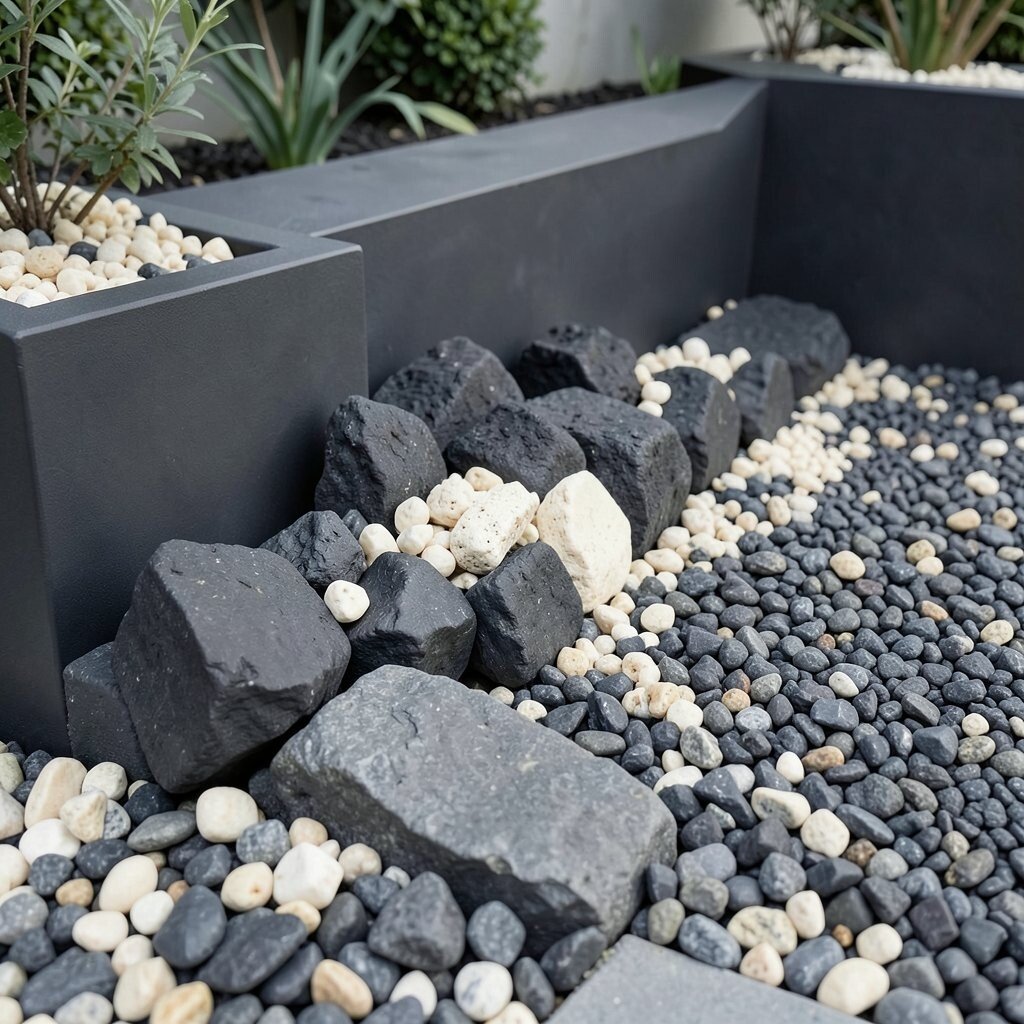
A charcoal base gives a modern, grounded vibe, while cream accents add gentle contrast. When the stones sit together, the surface looks smooth from a distance but still full of texture up close.
This pairing is especially nice for contemporary landscaping, like modern planters and clean-lined benches. It also shows fewer stains compared with bright all-white choices. Keep the cream pieces larger than the charcoal so the accents read clearly at a quick glance.
If you want extra pop without extra cost, sprinkle cream in a simple curve rather than covering everything. Budget-friendly mixes often use a dominant color with a smaller portion of a second shade. Ask your supplier for a sample tray so you can see how the tones look after a light watering.
3. Terracotta and Oat Beige
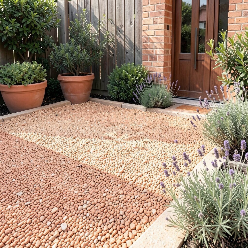
Terracotta gravel and oat beige stones feel inviting and earthy, like sun-warmed patio walls. The colors blend naturally with terracotta pots, wooden fences, and green shrubs.
This combination helps outdoor spaces feel cozy, not harsh. It also pairs well with Mediterranean-style planting, including lavender and rosemary. To keep it neat, plan a border line using the beige and leave the terracotta as the main field.
If you love personalization, match the tone to your house brick or front door color. Consider using a slightly deeper terracotta in areas that get less sun so the warmth stays balanced year-round. For cost control, use the terracotta as the dominant layer and save beige for the framing details.
4. Sea Glass Teal and Pearl Gray
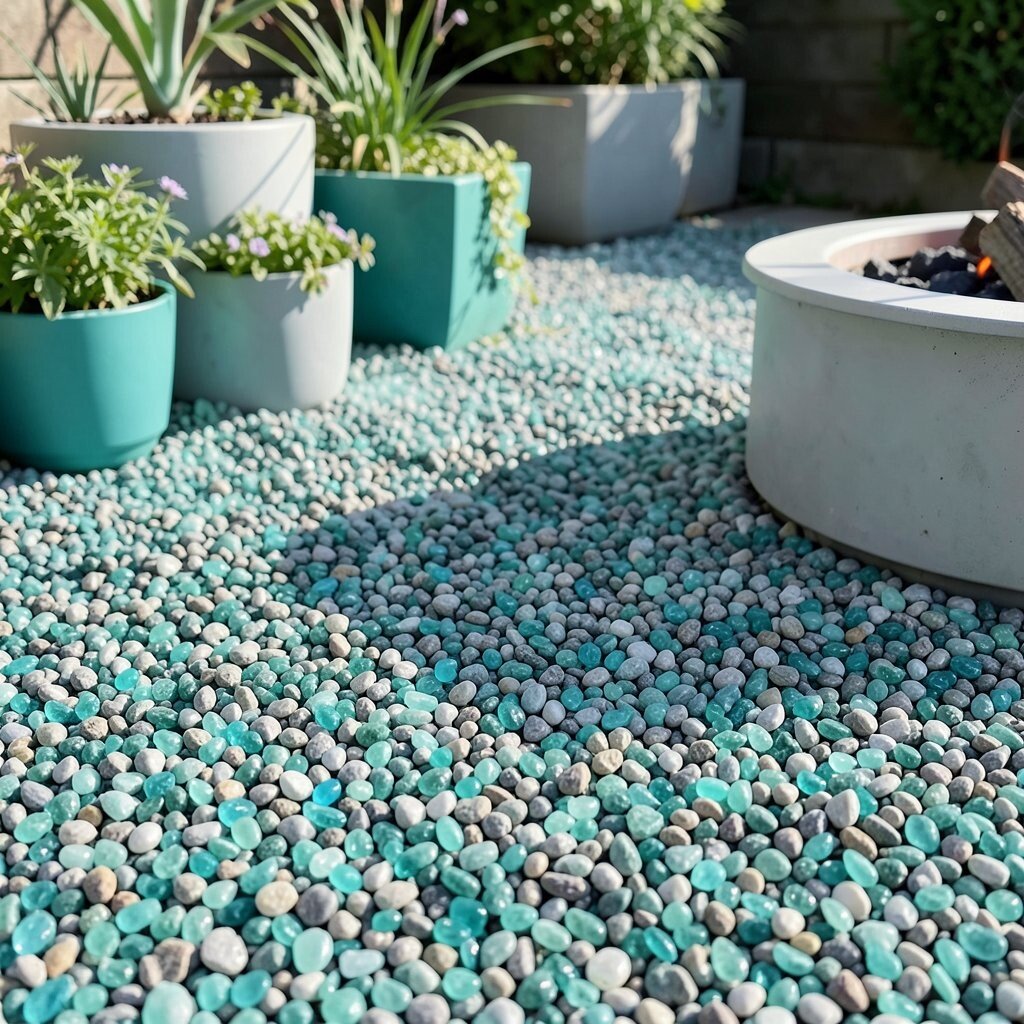
Sea glass teal gravel with pearl gray creates a refreshing, coastal feel. The teal flashes like tiny bits of sky under sunlight, while the gray keeps the look steady.
This pairing is unique because it doesn’t rely on the same plain grays you see everywhere. It can make a seating nook feel brighter and cooler, even in late-afternoon light. Try using teal near planters or around a fire pit so the color becomes a focal point.
5. Forest Green and Limestone White
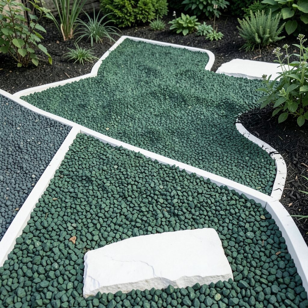
Forest green gravel paired with limestone white looks bold and natural at the same time. The dark green anchors the design, and the white gives crisp separation for edges and stepping stones.
This combo can make plants look richer because the background color deepens the greens. It’s also great for pathways that need clearer direction, since white stands out against darker stones. Use a thin white line to outline beds, and let the green fill the main surface area.
If you want it more subtle, choose a softer green instead of near-black tones. For personalization, match the green gravel to other materials like wrought iron or dark wood. From a cost angle, limestone white accents can be cheaper than fully high-contrast coverage, so you get drama without overspending.
6. Tuscan Gold and Burnt Umber
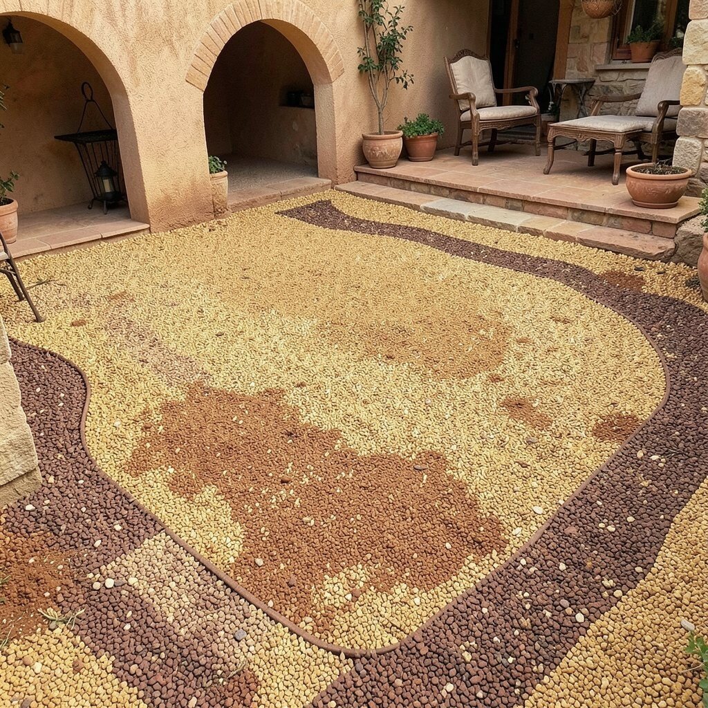
Tuscan gold gravel with burnt umber creates a warm, old-world atmosphere. The mix looks especially good around arches, curved steps, and rustic outdoor furniture.
This combination feels rich without needing bright colors. It also hides dirt well because the brown tones blend with common outdoor dust. For a practical layout, keep the gold as the main color and weave in umber in small pockets for a natural, sun-faded pattern.
7. Silver Blue and Cool White
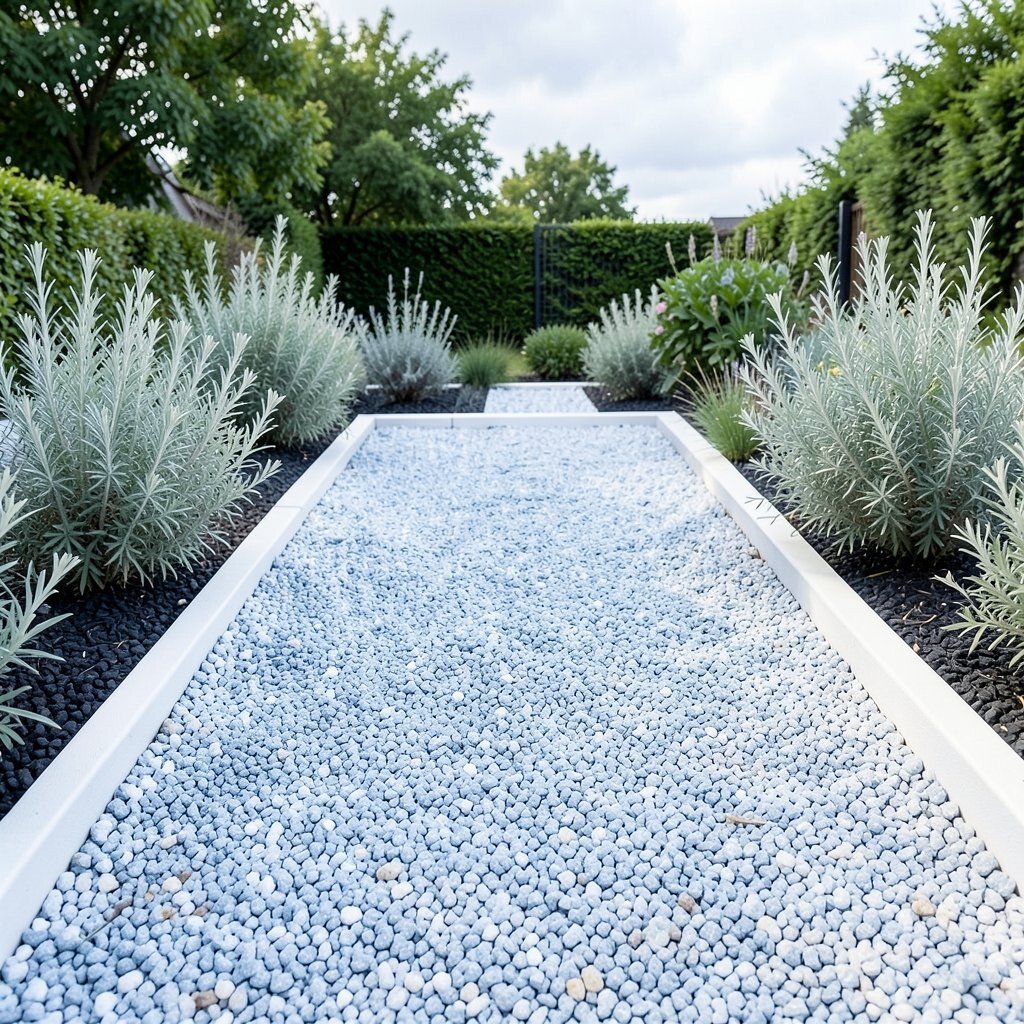
Silver blue and cool white gravel can make a yard feel crisp and modern. The tones look like a cloudy sky reflected on stone, with the cool white acting like gentle highlights.
This palette is ideal if you like a calm, airy look that doesn’t feel overly busy. Cool colors also help borders look sharper, especially around silver foliage like dusty miller. Use cool white near the walkway edges, then let silver blue fill the center for a clear visual flow.
To personalize, add a single darker accent color using a small amount of charcoal stones. This helps you echo things like slate planters or metal railings. If you’re watching cost, buy your main bulk from one color and use the second shade only for the most visible zones.
8. Brick Red and Light Sand
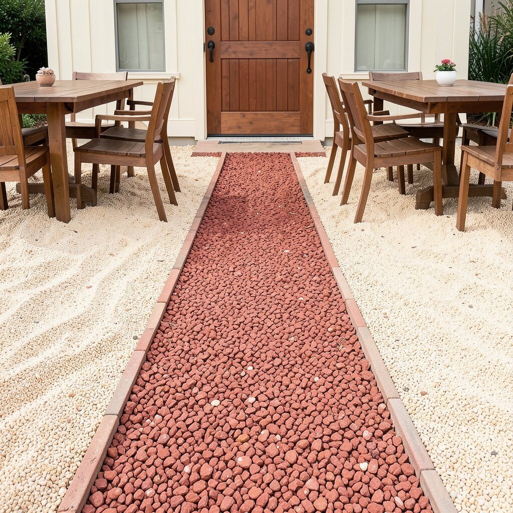
Brick red gravel with light sand stones gives a classic, welcoming look. The red adds energy, while the sand softens it so the space feels balanced.
This combo works beautifully around outdoor dining areas and entry paths. It also looks great with warm-toned wood and cream-colored exterior finishes. A practical approach is to create a red “lane” in the middle of a walkway, with sand on both sides for contrast.
9. Midnight Black and Pale Gray
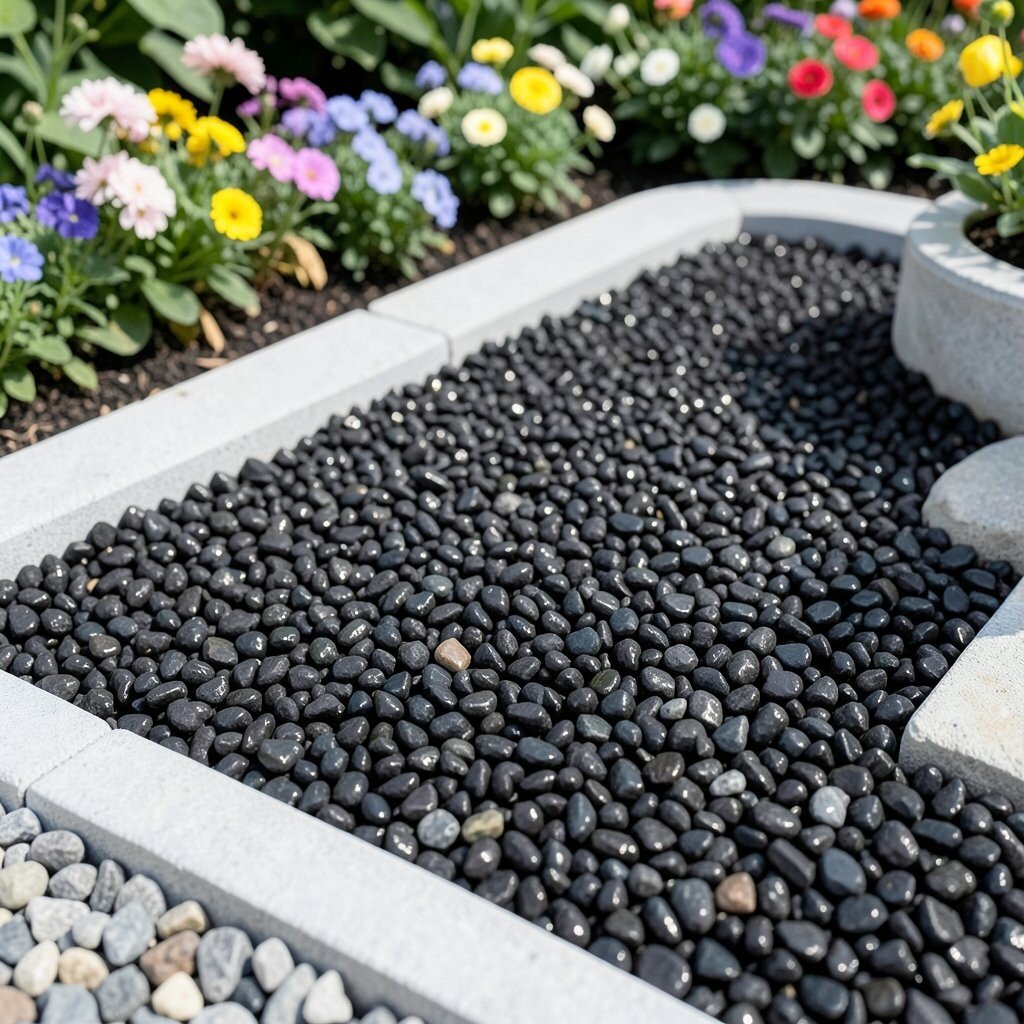
Midnight black gravel with pale gray can look striking and sleek. Up close, the stones sparkle subtly, and from afar the surface reads like a solid, elegant color field.
This pairing feels unique because it’s high contrast without being loud. It also creates a sharp backdrop for bright flowers, which makes colors pop. For best results, use pale gray for stepping-stone borders or to outline garden beds so the layout stays easy to follow.
If you worry about heat, choose a lighter gravel for the parts that get full sun all day. Some regions also see black gravel hold more warmth, so plan the darkest tones where people linger less. For personalization, repeat the pale gray in other materials like edging stones or pot trim.
10. Rose Pink and Soft Taupe
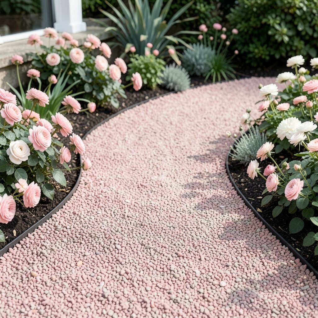
Rose pink gravel with soft taupe creates a gentle, romantic atmosphere. The taupe acts like a warm neutral, keeping the pink from feeling too sweet.
This combination is great for cottage gardens, front porches, and shaded corners where pink can still feel charming. It also pairs well with blush flowers and creamy whites. Use rose pink in curved shapes around plants, and let taupe carry most of the coverage for a natural transition.
11. Olive Green and Natural Beige
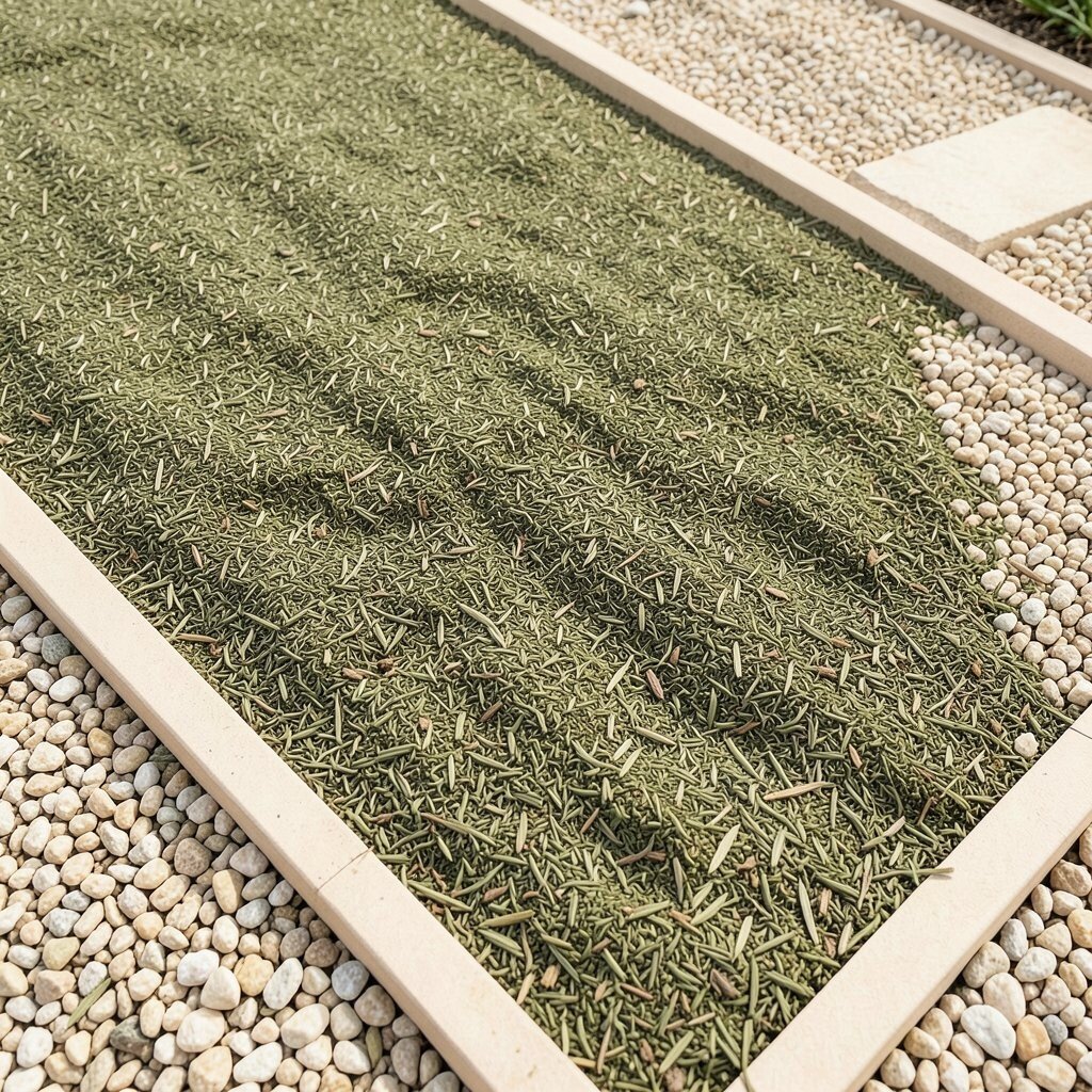
Olive green gravel with natural beige feels grounded and calm. The colors remind people of dried herbs and sunlit pathways.
This palette is practical because it blends with almost every green plant color. Beige also helps make edges look tidy and intentional, especially around borders. For an actionable layout, use beige for edging lines and olive for the main gravel area.
If you want it to feel more custom, add a small amount of lighter cream stones near where you place stepping stones. That small highlight can make the path feel easier to navigate. Cost-wise, using beige for thin borders usually uses less material than covering the entire area with a second color.
12. Charcoal and Sandstone Tan
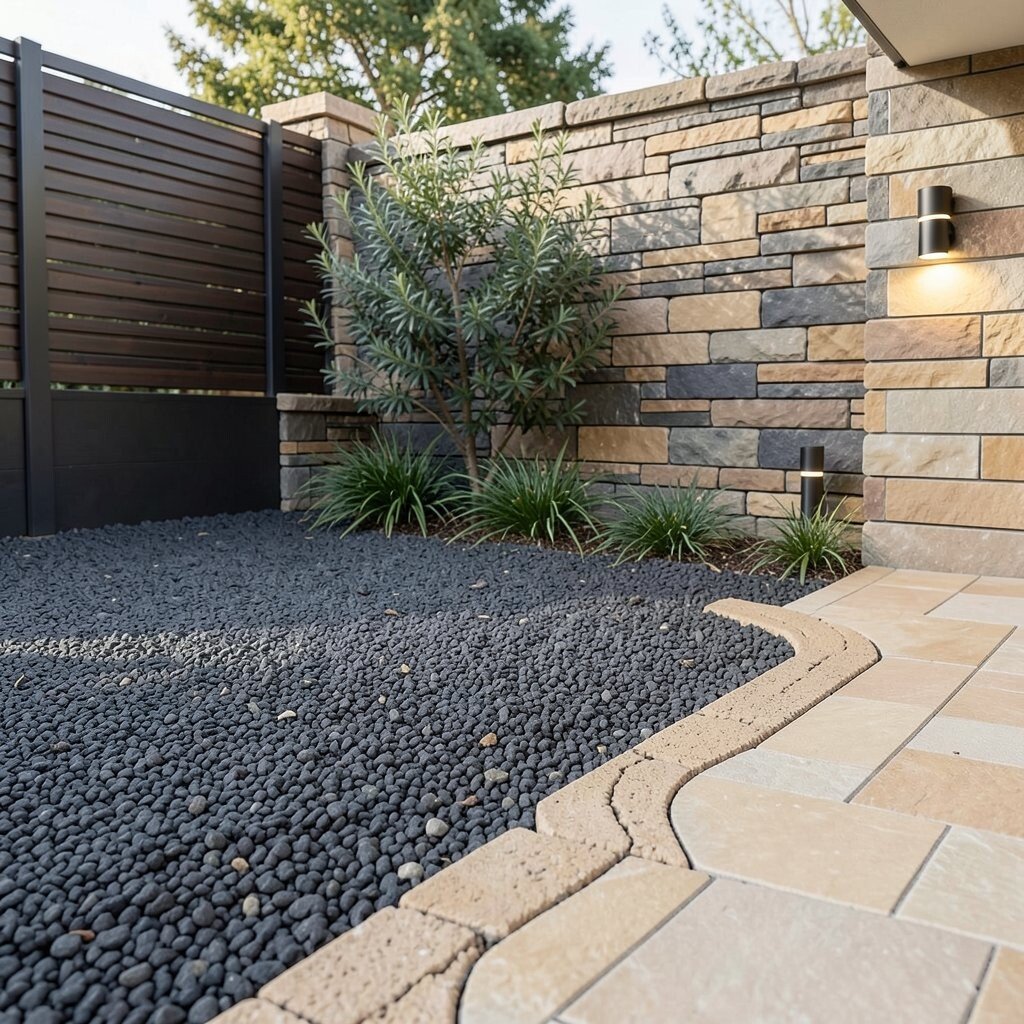
Charcoal gravel combined with sandstone tan looks modern and quietly warm. The tan brings in a soft earthy tone that keeps the charcoal from feeling too heavy.
This pairing works well with stone walls, modern fencing, and sleek outdoor lighting. It also helps plants look more defined because the tan outlines the greenery. For a clean look, keep the charcoal as the bulk and use tan as a deliberate pattern along the edges or around a focal planting.
To personalize, match the tan to nearby masonry, like a patio paver or retaining wall. If you want a more designer feel, create a “wave” pattern using tan rather than straight borders. When budgeting, ask for blended color options because some suppliers sell mixes that reduce labor and extra material orders.
13. Cocoa Brown and Creamy Off-White
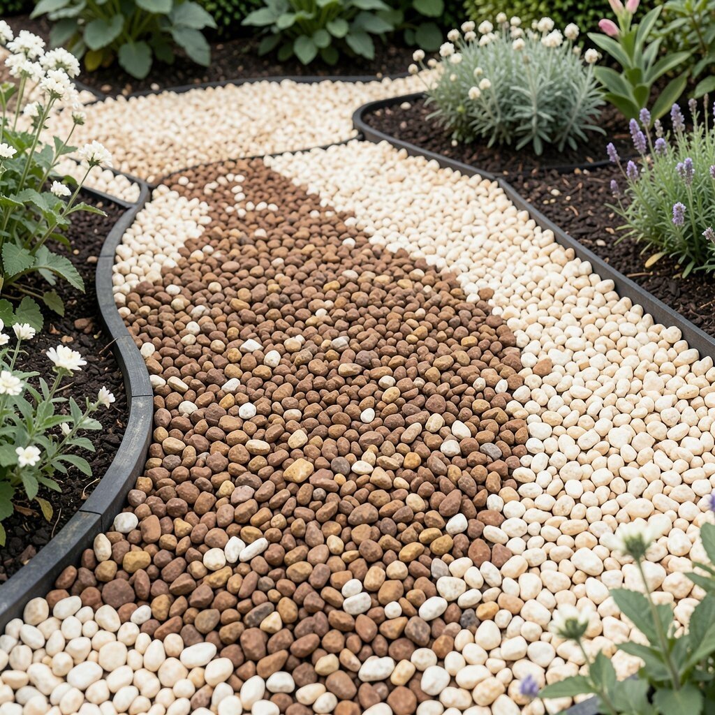
Cocoa brown gravel with creamy off-white stones gives a classic, timeless style. The cream tone feels warm, like aged plaster, while the cocoa adds depth.
This combo is great for traditional homes and garden beds where you want a polished look. It also hides wear because both tones are naturally forgiving. A helpful tip is to use the off-white around plants or along curves so the bed lines read clearly.
14. Sapphire Blue and White Limestone

Sapphire blue gravel with white limestone can feel bold, like a splash of ocean next to greenery. The white keeps the design fresh and prevents the blue from taking over.
This combination looks especially good with blue planters, modern pergolas, or clean stone steps. It also adds high visual contrast, which helps paths feel easier to see. Keep your layout simple by using blue in the center and white for border lines and around key fixtures.
If you want personalization, add one repeating blue accent near a bench or garden sculpture. That repetition makes the space feel styled, not random. For cost considerations, use the blue as the dominant color only where it’s most visible from the house or street, and use limestone more in hidden areas.
15. Golden Yellow and Soft Gray
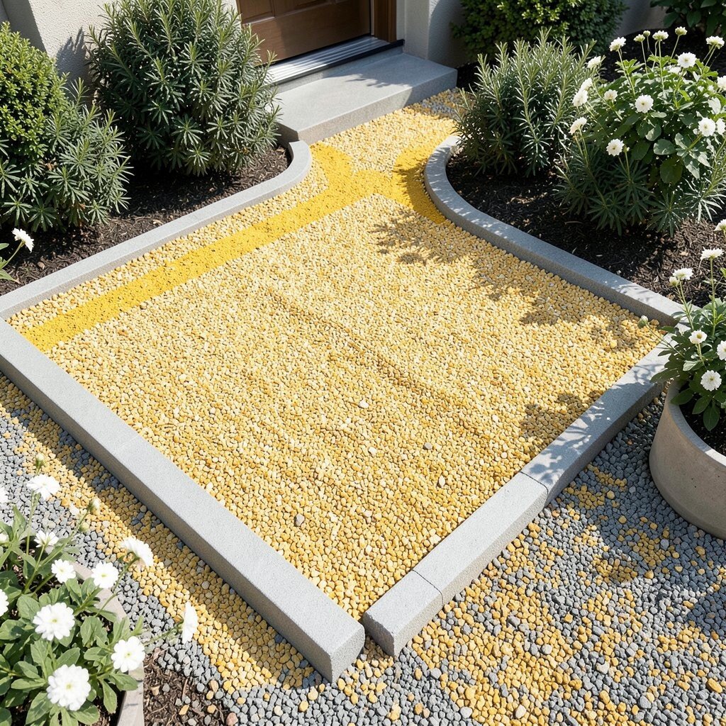
Golden yellow gravel with soft gray creates a cheerful yet modern contrast. The yellow feels sunny, while the gray keeps it grounded and practical.
This pairing can make entryways and walkways feel welcoming right away. It also looks great with dark green shrubs and simple white flowers. Try using yellow in a stripe or small arc so the gray does the job of calm background coverage.
If you’re worried about the yellow looking too bright, choose a muted gold rather than a neon tone. You can also balance it by repeating the gray in edging materials and outdoor furniture. For budgeting, plan the smallest “highlight” zones for yellow since that’s usually the more expensive-looking color.
16. Chocolate Brown and Light Pebble Gray
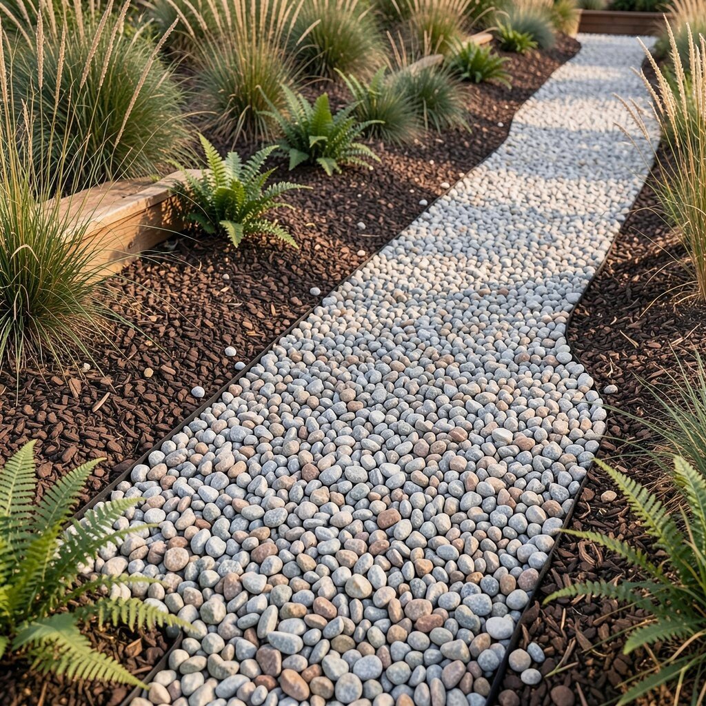
Chocolate brown paired with light pebble gray looks natural and quietly luxurious. The mix resembles earthy riverbanks, with a soft shimmer from the lighter gray stones.
This combination works well when you want comfort instead of sharp contrast. It also pairs nicely with landscaping that includes grasses, ferns, and warm wood textures. Use chocolate brown as the base and scatter light pebble gray more heavily near pathways so the route feels defined.
17. Midnight Blue and Warm White
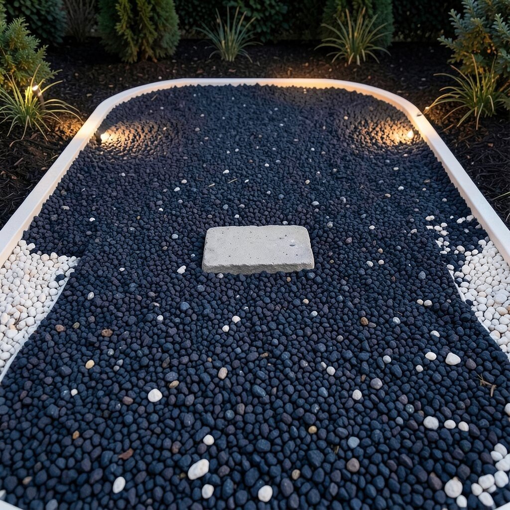
Midnight blue gravel with warm white stones makes a dramatic, elegant surface. The warm white adds a cozy touch, so the blue feels deep rather than cold.
This palette feels unique in outdoor spaces because it’s not the usual black and white. It also makes greenery stand out strongly, especially against darker mulch. For practical styling, outline bed edges with warm white and keep midnight blue as the main field.
If you want personalization, coordinate the warm white to outdoor lights so the tones feel consistent at night. You can also add a small cluster of stepping stones centered in blue for a clear visual anchor. On cost, consider limiting the warm white to thin borders since it provides most of the contrast effect.
18. Light Sage Green and Beige
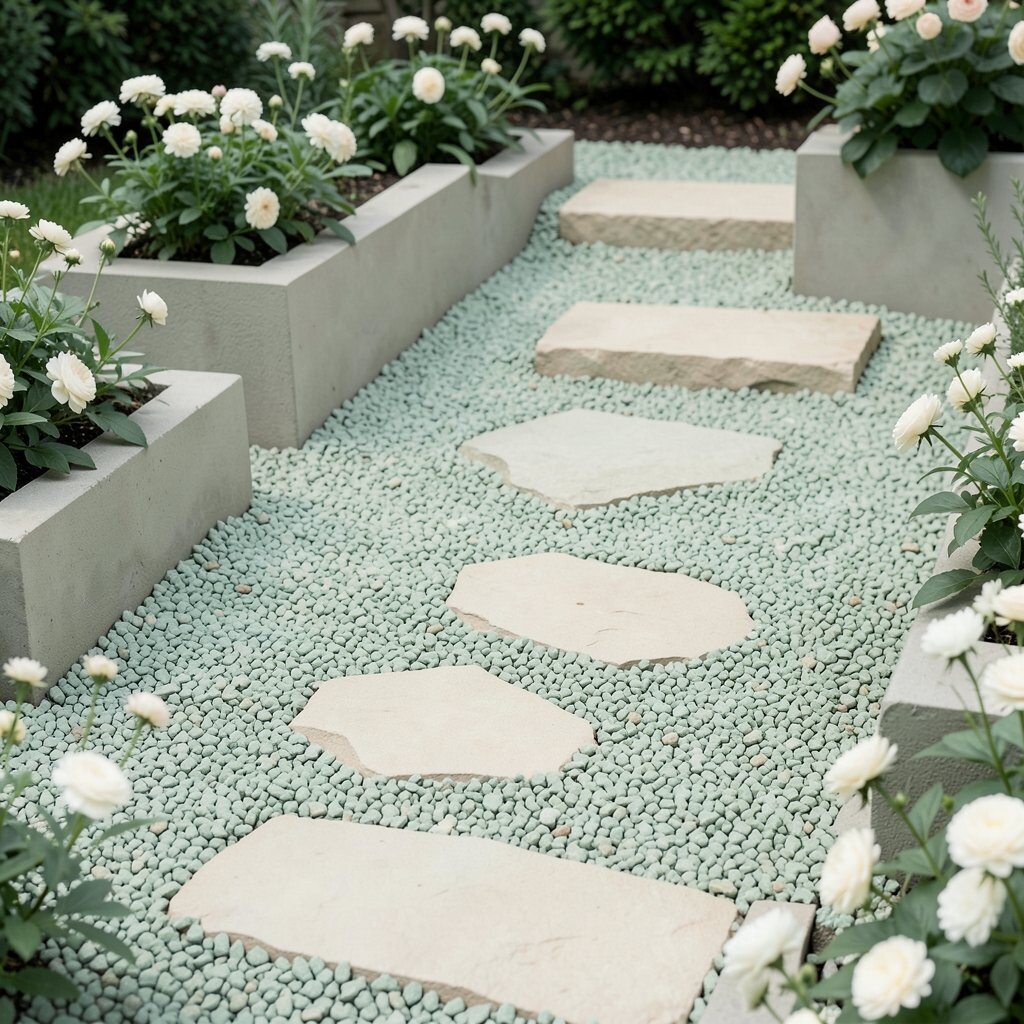
Light sage green gravel with beige creates a soft, relaxed garden look. It feels like a calm breath outdoors, especially when paired with pale flowers and natural textures.
This combination is great for low-key landscaping where you want color but not loud statements. Sage also pairs well with many greens because it’s muted rather than intense. Use sage as the main color and add beige around stepping stones and planter bases for tidy definition.
19. Plum Purple and Silver Gray
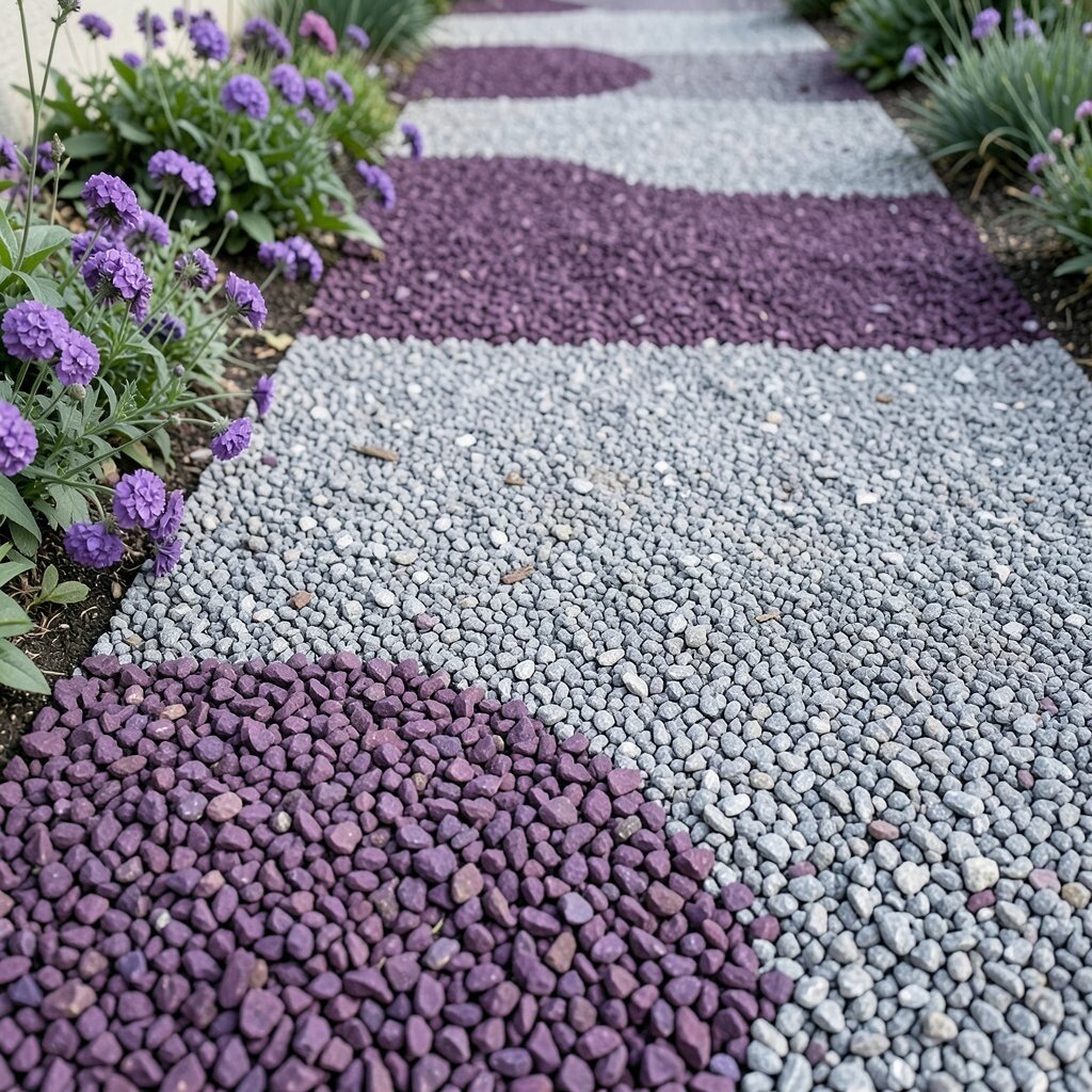
Plum purple gravel with silver gray creates a modern, creative contrast. The purple adds a jewel-like feeling, while the silver gray keeps the scene refined and balanced.
This combination is ideal if you like personal style and want the gravel itself to feel like part of the decor. It also helps purple flowers look richer when they repeat the same family of tones. For practical tips, use silver gray for the largest coverage area and sprinkle plum in patterned sections so it looks intentional.
If you want to keep it wearable, choose plum gravel that reads more like deep mauve than bright magenta. That subtle shift often looks more natural alongside wood and stone. For cost planning, focus the plum on the most visible zones, like the front path, and let silver gray handle the rest for a smarter material spend.