The calm of a clean surface can change how you feel. Sometimes the simplest board layout makes the biggest difference.
1. One-Color Starter Layout
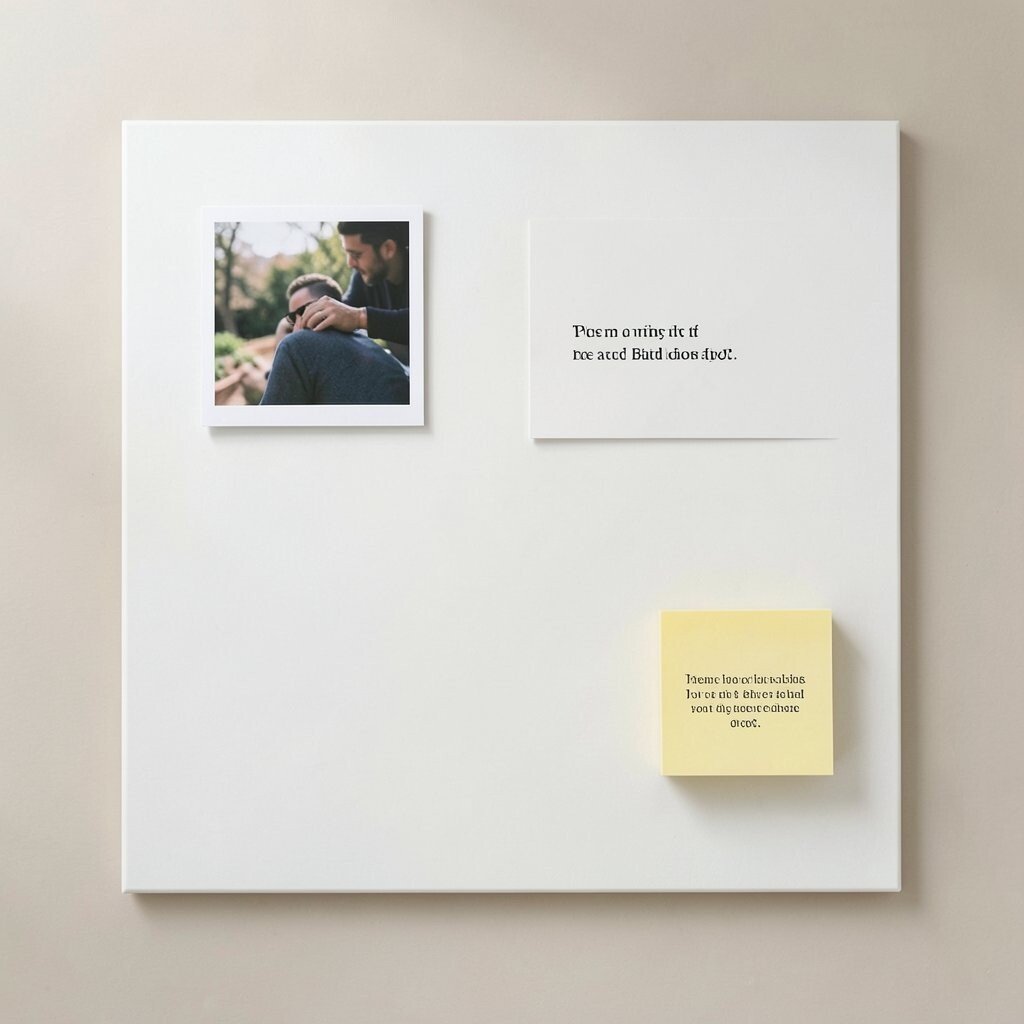
Start with a blank board that uses one color for everything. Keep items spaced so your eyes never get lost.
Choose a soft neutral base like warm white, light gray, or sand. Add only a few elements: a small focal photo, one quote card, and a single sticky note block. Use the same font style and the same size of card so the design stays steady.
2. Centered Photo With Breathing Room
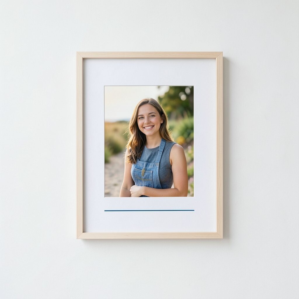
Place one photo in the exact middle of your board and let it do the talking. Keep the rest of the space open so your brain can rest.
Use a simple frame or a clean border cut from paper so the photo feels intentional. Add a short line underneath in a matching color, then stop. This layout feels modern and it is easy to keep updated because you only swap the photo when your mood changes.
For personalization, try switching the photo style by season, like black and white for a quiet vibe or bright colors for energy. A practical tip is to keep the board size consistent, since changing sizes can make the look feel busy. If you want a budget-friendly approach, print photos at home and use inexpensive paper frames.
3. Three-Zone Habit Board
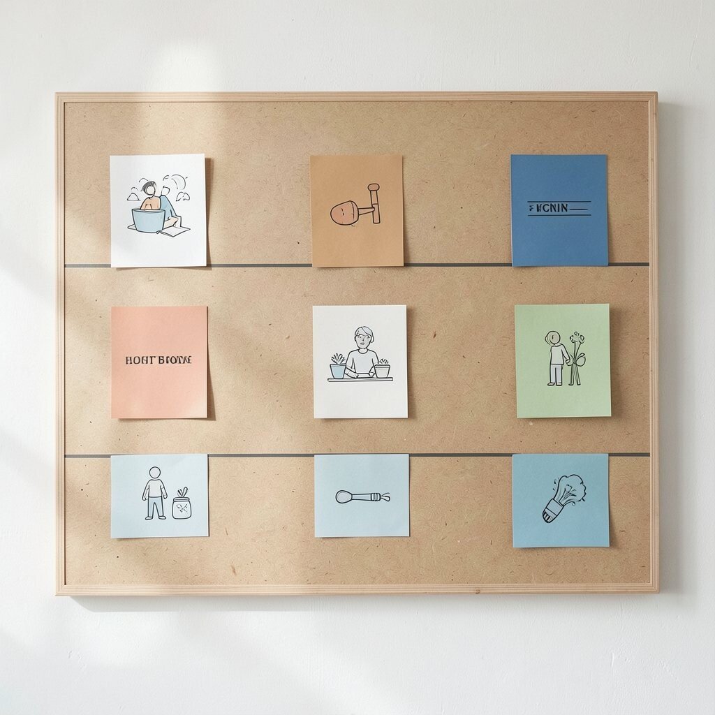
Divide the board into three wide zones using thin tape lines. Think of them as morning, focus, and evening, with clear boundaries.
In each zone, place only a few cards that match the time of day. Use icons or small drawings instead of long text blocks so the board stays calm. This arrangement helps you act faster because your next step is always in the same place.
If you like variety, personalize each zone with a different color of card, but keep the overall palette minimal. A practical tip is to limit each zone to two to four items so you do not overload it. For cost considerations, reuse old cards and cut icons from magazine pages or print free templates.
4. Monochrome Mood Tracker Grid
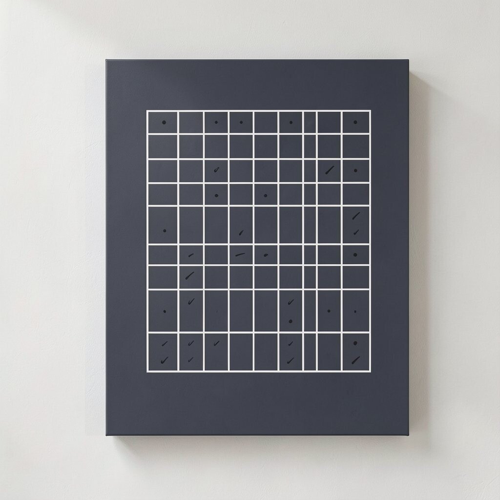
Make a small grid with tiny squares for tracking your mood. Use one monochrome shade, like charcoal or deep navy, to keep it neat.
Fill each square with a simple mark such as a dot or short stroke. The board looks graphic and clean, and it gives you quick feedback without heavy notes. When you see patterns, you can adjust your week without spending time writing essays.
5. Tape-Only Timeline
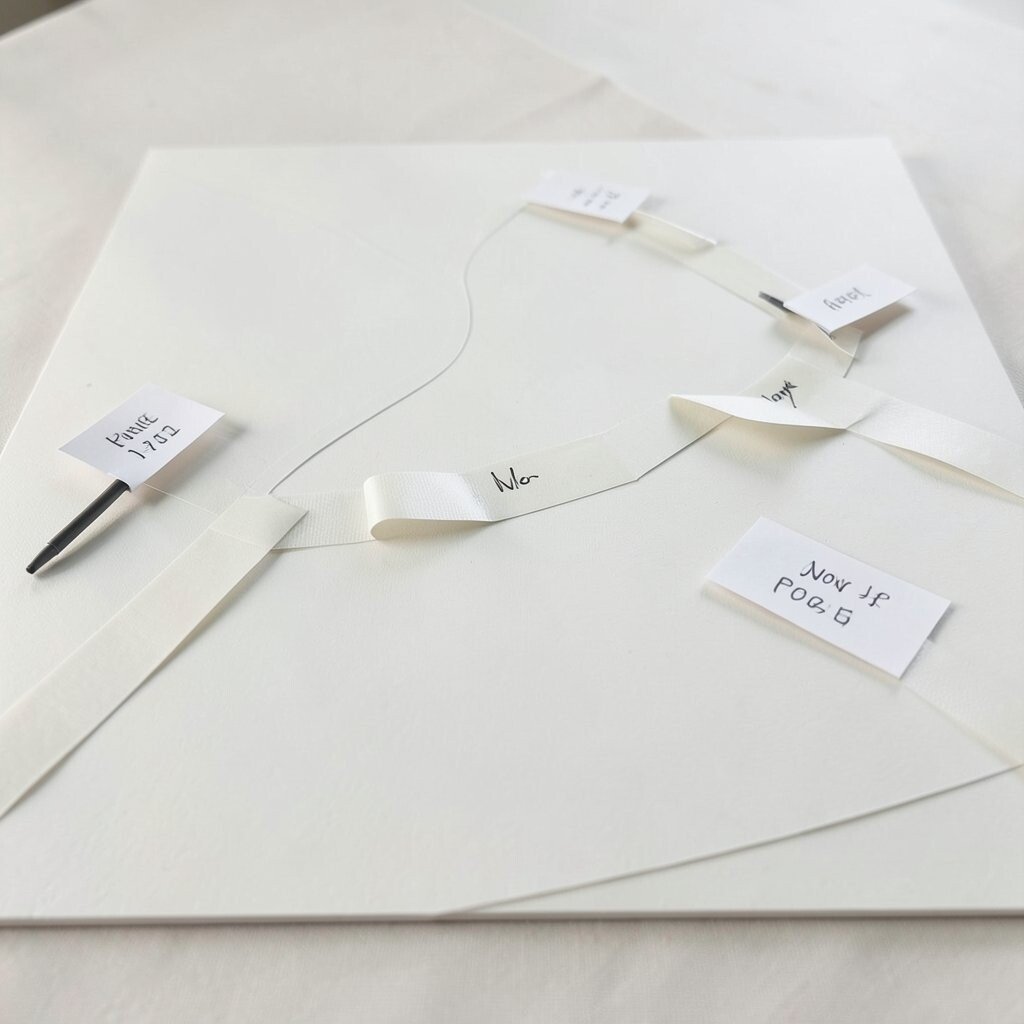
Create a timeline using tape strips rather than bulky markers. Place them across the board like gentle paths.
Add small paper flags at key points, and write short dates or events on each flag. Keep the handwriting consistent and light, so the overall feel stays simple. This works great for planning because the structure stays visible even when you change the details.
For personalization, try angled tape lines that match a theme, like calm curves for wellness or straight lines for work. A practical tip is to use removable tape so your board stays flexible. If you are keeping costs low, cut flags from scrap paper and use a cheap fine-tip pen.
6. Texture-Forward Collage With Rules
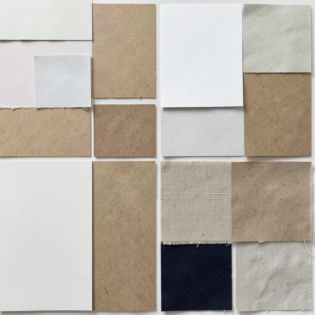
Build a collage that focuses on texture instead of busy pictures. Use paper types like matte, glossy, kraft, and fabric scraps for contrast.
Pick a limited palette of two or three tones so the textures feel connected. Arrange pieces with generous gaps and a gentle rhythm, like a pattern that repeats softly. This approach is unique because the board feels rich even when it is uncluttered.
7. Minimal Task Card Stack
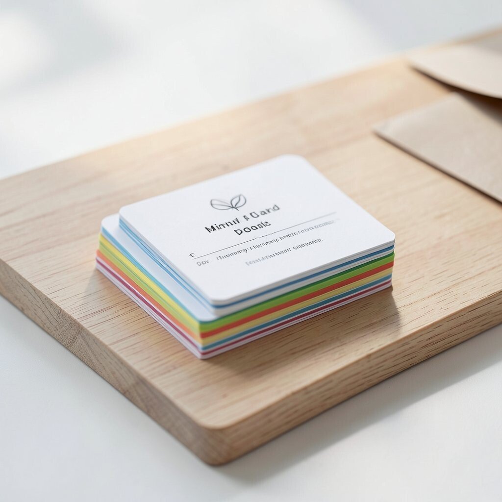
Use a small area of the board for task cards that stack like a neat pile. The goal is fewer cards, not smaller writing.
Choose cards that share the same size and style, then place them in a slight offset so they look tidy. When you finish a task, flip the card over or move it to a done spot. The benefit is that you get instant clarity at a glance.
For personalization, color-code tasks by theme, like home, health, or creative. A practical tip is to keep the stack to a manageable number so you do not feel overwhelmed. Cost considerations are easy here because index cards, craft paper, and old envelopes can work as your base.
8. Corner Focus With One Anchor
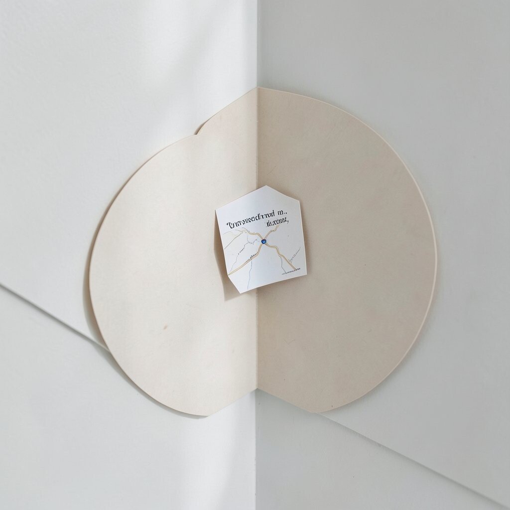
Pick a corner of your board and place one anchor element there, such as a single quote, a tiny map, or a favorite card. Keep the rest of the board mostly empty.
Choose a small accent shape, like a circle cut from paper, to frame the anchor lightly. This style is calming because your attention has one destination instead of many competing spots. It also helps you avoid clutter creep because you can clearly see when the corner is “done.”
9. Color-Coded Learning Menu
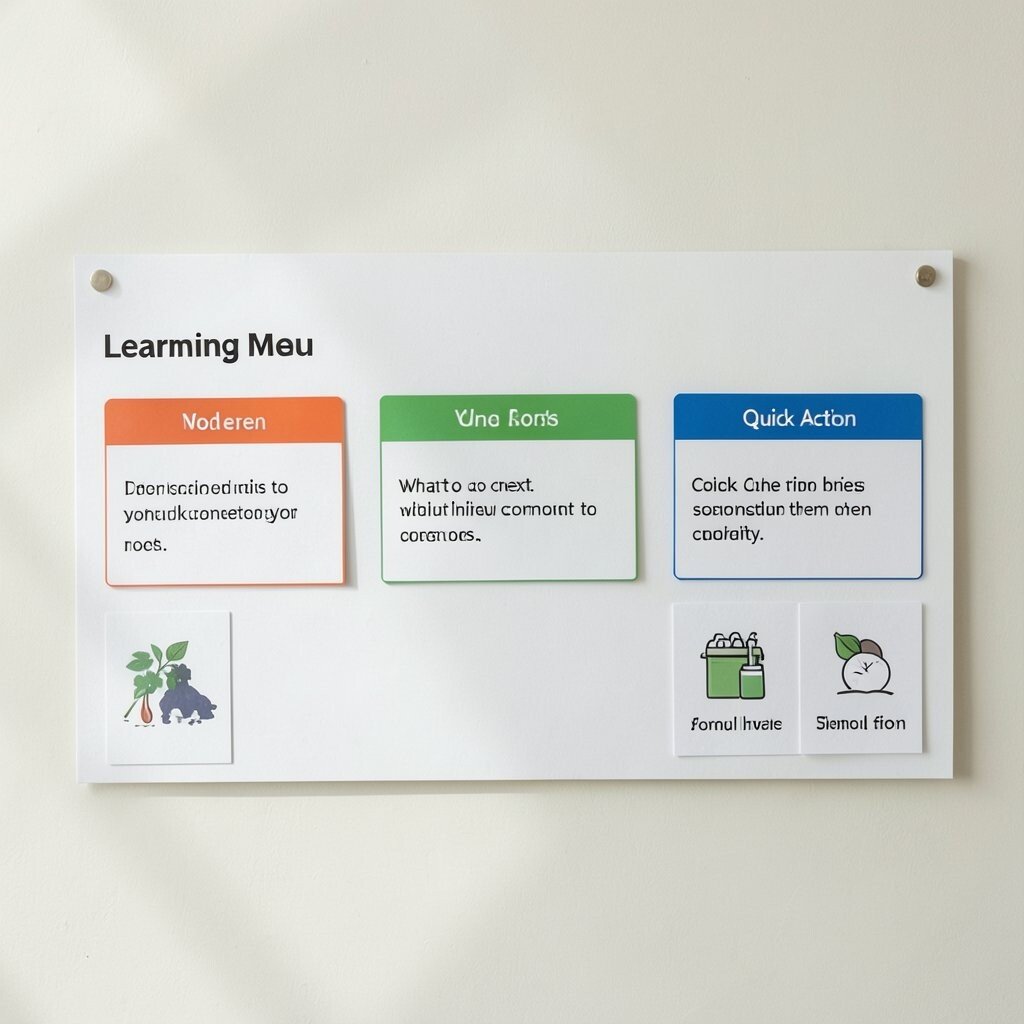
Set up a learning menu with a simple row of three to five topics. Use color labels, but keep the wording short.
For each topic, add one resource link card and one quick action prompt card. The board stays practical because you can see what to do next without searching through notes. It is unique in a minimalist way because the categories feel like a menu, not a wall of information.
Personalization can be as simple as changing the color theme to match your favorite school supplies. A practical tip is to use the same icon for each category so your brain connects them quickly. For cost, you can print icons from free resources and glue them onto cardstock scraps.
10. Circular Goal Orbit
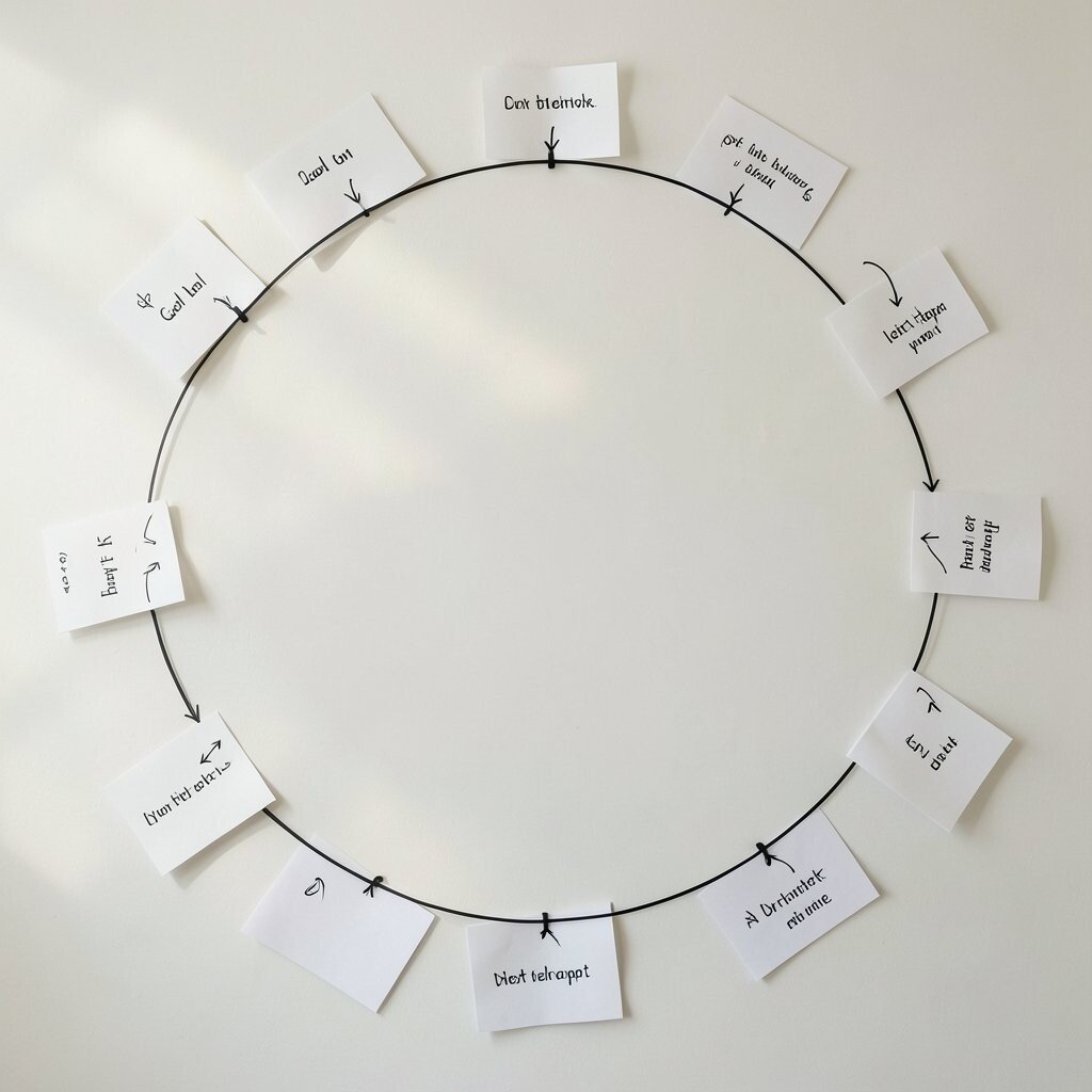
Draw a circle or an arc with a thin marker, then place goals around the edge like an orbit. Keep the center mostly blank so the goals feel held.
Add small cards for each goal and use tiny arrows to show priority. This layout is visually satisfying and it makes long-term aims feel reachable. The main benefit is that you can see your big picture while still keeping your next step close.
11. Seasonal Swap Board
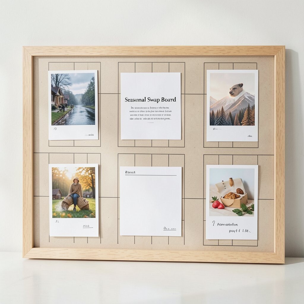
Make your board designed for easy seasonal swaps. Use a consistent layout grid so you can replace visuals without rebuilding everything.
In each season area, add a small set of items like a weather photo, one plan card, and one reminder note. The uniqueness comes from the gentle rotation, since the same structure holds new inspiration each time. You stay organized because the layout stays familiar.
For personalization, match the theme to your life, like cozy tones for a calm season or bright accents when you want energy. A practical tip is to store spare cards in a folder so you can swap quickly. Cost considerations are friendly because you can reuse card frames and update only the prints and notes.
12. Minimal Vision Strip
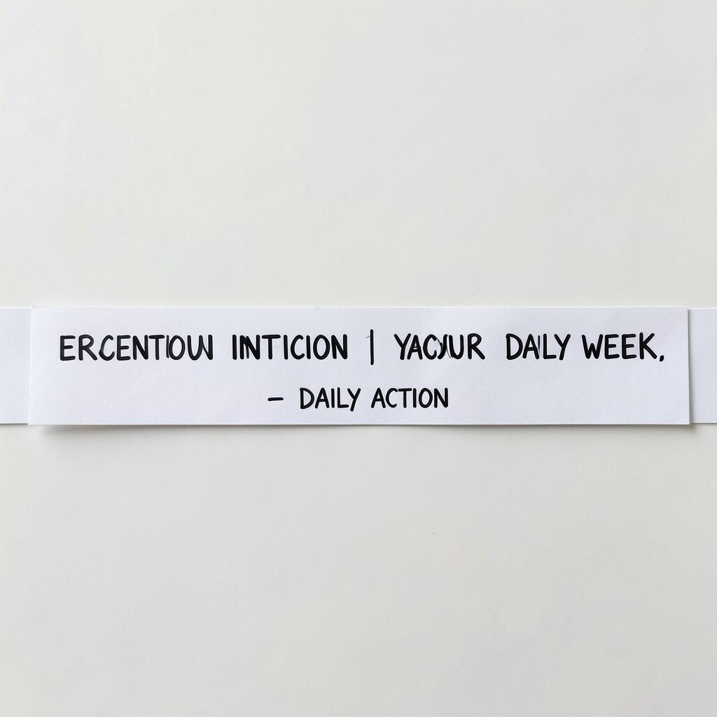
Create a long strip across the board, like a ribbon, and place your vision words along it. Keep the words short so they feel like steady signals.
Use one line for the big intention and another line for a daily action. The benefit is that you get both meaning and practicality without clutter. It also looks elegant because the strip guides the eye in one direction.
Personalization idea is to change the action line based on your week, while keeping the intention line the same. A practical tip is to use different font weights, such as one word in bold and the rest in regular, for visual balance. If you are mindful about cost, you can write the words by hand and cut small strip shapes from scrap paper.
13. Dry-Erase Focus Panel
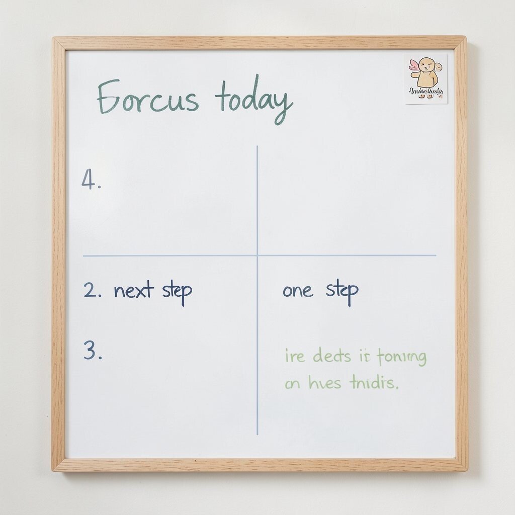
Try a small dry-erase panel style board for quick updates. Even if you keep it minimalist, the clean wipe-clean function makes it feel alive.
Use a grid with only two sections, like focus today and one next step. Write in one color for the main line and a lighter color for supporting notes. The benefit is speed since you can refresh your plan in seconds and never deal with paper clutter.
For personalization, add a tiny sticker in a corner that matches your style, but keep the rest plain. A practical tip is to lightly number your two sections so you do not have to think about where things go. Cost considerations are reasonable because you can start small and buy refills or wipeable accessories without making a big investment.