
Texture knockdown can make walls feel modern without starting from scratch. When you plan it well, you get a clean look that still feels inviting.
It’s a great middle path between smooth drywall and bold plaster vibes. With a few smart choices, your walls can look crisp, cozy, and completely you.
1. Crisp White Knockdown With Soft Edge Lighting

Go for a crisp white knockdown finish and let the texture do the talking. The surface catches light in gentle ways, making corners look cleaner.
Choose warm white for the paint so the wall feels friendly, not icy. Add soft edge lighting with slim wall sconces or LED tape near the ceiling line to highlight the knockdown pattern.
2. Warm Greige Walls That Hide Everyday Life

Warm greige knockdown walls look calm and grounded, even in busy homes. The slight depth from texture helps hide tiny scuffs and minor marks.
Pair the greige with natural wood trim and matte black hardware for a current, balanced vibe. For better coverage, use a paint roller made for textured surfaces and apply in steady, overlapping passes.
Pick a sheen that won’t glare, like eggshell, so the texture stays flattering. If you have kids or pets, this choice can reduce how often you feel pressured to repaint.
3. Two-Tone Knockdown With a Simple Accent Rail

Two-tone walls can look high-end when the knockdown texture stays consistent. Use one color for the main wall and a second shade for a neat accent band.
Keep the line straight by using painter’s tape and a light hand when cutting in. A simple accent rail or chair-rail height stripe makes the look feel tailored without getting fussy.
Try a deeper color for the lower section to add warmth and help furniture look grounded. This style works well in dining rooms, hallways, and entry spaces where you want a little drama.
For personalization, choose shades that match your art frames or rug colors. Plan lighting before you paint, since contrast looks different in daylight versus evening.
4. Knockdown Overboard Repairs for Uneven Drywall

If your walls have patchy spots, knockdown can help blend them into one smooth-looking surface. It’s especially helpful when repairs left faint ridges or shallow waves.
Start by sanding the repaired areas until they’re truly flat to the touch. Use joint compound evenly and feather out edges so the knockdown pattern forms naturally across the whole wall.
Prime well before finishing so the texture and paint hold steady. This approach can save money compared to full wall replacements.
5. Matte Paint and Subtle Texture for a Gallery Feel

Matte paint with knockdown texture creates a gallery-like calm that still feels rich. The walls absorb light, so artwork and shelves look crisp and never washed out.
Choose a paint that lists good stain resistance if you hang frames near frequently used doors. When you roll, keep pressure light so the knockdown stays delicate and not overly chunky.
For practical results, use a small foam roller for tight areas and a brush for edges. This combo helps you avoid heavy overlap marks that can show later.
6. Soft Color Wash on the Knockdown Surface

A color wash adds a gentle, artistic mood while keeping the knockdown base intact. The texture creates natural variation that looks handmade rather than flat.
Mix glaze or a tinted wash in a thin, watery consistency and apply with a wide brush or rag technique. Work in sections and step back often so the tone stays even and balanced.
Greens, warm sand tones, and light terracotta work beautifully because they echo natural materials. Personalize by matching the wash to your cushions or throw blankets so the room feels cohesive.
7. Powder Blue Knockdown for a Fresh, Airy Look

Powder blue knockdown walls can make a room feel bright and breezy. The texture adds depth, so the color doesn’t look flat or one-note.
Pair it with white trim and light gray flooring for a clean, modern feel. To keep it looking fresh, choose a paint that resists yellowing and holds its tone over time.
Use ceiling light bulbs with a neutral color temperature so blue stays true. If you worry about going too bold, start with one room like a bathroom or reading nook.
8. Textured Knockdown With Vertical Rhythm on Ceilings
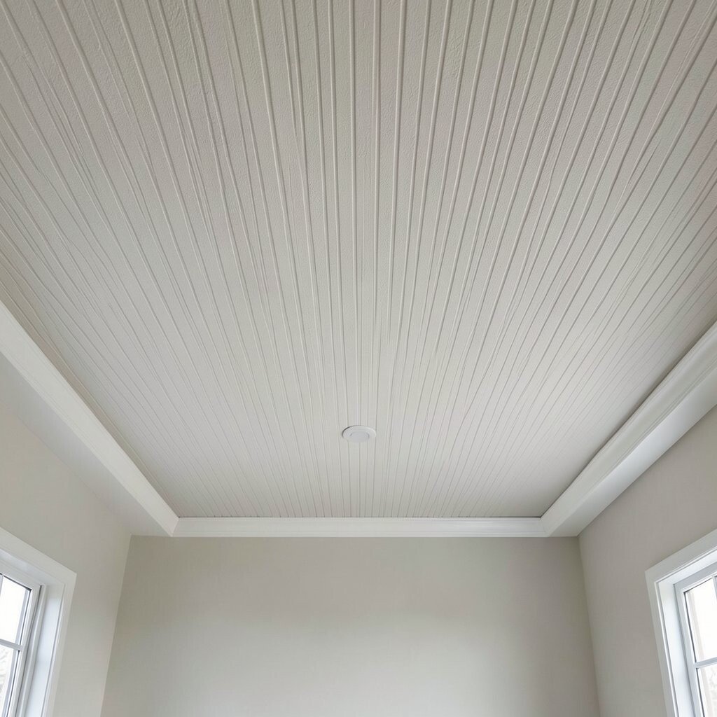
Knockdown isn’t only for walls; it can look amazing on ceilings too. When done with vertical rhythm, it adds height and makes a room feel taller.
Ask your contractor or yourself to aim the knockdown direction so the pattern lines up consistently from one end to the other. This is a small detail, but it changes how the whole space reads visually.
Keep the ceiling color slightly lighter than the walls to avoid a heavy look. For personalization, match trim profiles or beams so the ceiling texture feels intentional, not accidental.
Plan for practical cleaning by using a paint finish that can handle light dusting. This can be a budget-friendly upgrade compared with replacing trim or ceiling panels.
9. Charcoal Knockdown for a Bold Modern Contrast

Charcoal knockdown brings drama and modern edge without needing dramatic wallpaper. The texture makes the dark color feel dimensional, not dull.
Use high-quality paint and consider an eggshell or satin finish for easier wipe-down. Dark walls show less dirt in some lighting, but they do show scuffs, so quality matters.
Balance charcoal with bright elements like white shelving, warm metal frames, or light wood furniture. A few black-and-brass accents can make the look feel designed, not random.
10. Knocking Down Texture for a Clean Spa Bathroom Mood

In bathrooms, textured knockdown can support a spa vibe when paired with the right colors. Think soft whites, pale stone grays, or light sand tones that feel calm against tiles.
Choose a moisture-friendly primer and paint so the wall holds up near steam and splashes. Keep ventilation running, because even durable paint performs best when the room dries fast.
For practical upgrades, seal areas around towel bars and fixtures with careful caulk lines. Personalize with a matching paint tone in your vanity or built-in storage to make the whole space feel cohesive.
11. Knockdown Behind Open Shelving for a Warm Backdrop

Open shelving looks more styled when the wall behind it has texture. Knockdown gives your shelves a background that feels cozy and a little architectural.
Pick a color that complements the wood and metal of your shelves, like warm white or soft taupe. Use consistent paint sheen so the wall doesn’t compete with items you display.
To keep it actionable, measure shelf placement before you paint so you can plan for any gaps. If you’re changing what you show, you can update decor later without repainting the wall.
12. Textured Knockdown With a Limewash-Inspired Finish

Limewash-inspired paint can make walls look naturally aged, and knockdown helps sell that effect. The surface feels organic, like you could touch history.
Apply thin coats with a mottled technique using a brush or sponge so the texture shows through. This method works well with earthy neutrals like oatmeal, clay, and soft white.
For personalization, tint the limewash with a hint of your favorite color, like sage or warm ochre. Even on a budget, this look can feel custom because each wall section turns out a little different.
Just remember to protect the finish from heavy scrubbing and plan a gentle cleaning routine. If you do it right, the walls can stay beautiful for years.
13. Wallpaper-Like Color Blocking With Paint Only

You can mimic the look of wallpaper using knockdown texture and simple paint shapes. Color blocking adds playful structure without the cost of installing real wallpaper.
Use painter’s tape to create clean edges and keep the pattern simple so the texture still feels elegant. Try rounded corners or gentle geometric shapes that match your room’s style.
For a trending look, choose earthy tones and let white trim frame the blocks like a gallery wall. This approach is easy to personalize because you can swap colors to match art, rugs, or seasonal decor.
14. Subtle Ombre Knockdown for a Relaxed Visual Gradient

An ombre effect on knockdown walls creates a soft gradient that feels modern and soothing. The texture helps smooth the transition so it doesn’t look harsh.
Blend colors gradually from light to a slightly deeper shade, using a large brush and light pressure. Work slowly and feather edges so the gradient looks natural rather than striped.
Choose colors within the same family, like off-white to warm cream, to keep it calm. This is a great option if you love color but want it gentle and not overwhelming.
Cost-wise, you usually just need an extra paint color and your normal supplies. The real work is patience, so plan a couple of extra evenings for blending and drying time.
15. Knockdown With Natural Stone Colors for Entryways

Entryways need strong first impressions, and natural stone colors do that beautifully. Knockdown texture adds a quiet realism that feels tied to materials like limestone and travertine.
Pick a palette of warm grays, creamy beige, and muted taupe so the space feels welcoming. Pair with a durable doormat and consider a stain-resistant paint finish for heavy traffic zones.
To personalize, add a small wall niche or a floating shelf and paint the niche a slightly deeper tone. That small change makes the entry feel intentional and helps you use the space better.
16. High-End Venetian-Style Look Using Knockdown and Finishing Techniques

For a luxe look, you can build a Venetian-style effect on top of knockdown. The secret is controlling sheen and layering paint so light glides across the surface.
Use a base coat, let it cure, and then apply a thin finishing layer with a method that varies the strokes. The knockdown texture will catch those layers and create movement that looks like plaster.
Stay realistic about cost by using small sample amounts first so you nail the tone and sheen before doing full walls. If you’re hiring help, this finish is worth it because skilled technique affects the final look dramatically.
Personalize with metal accents like bronze frames or warm brass lighting to make the wall look even more special. When everything matches, the texture becomes a feature that feels designed rather than simply painted.