Calm rooms start with choices that feel soft to the eye. Neutral color palettes can make daily life feel slower and kinder.
When your space looks balanced, your mind has room to breathe. With a few smart moves, neutral can still feel warm, personal, and full of life.
1. Warm Greige Walls With Soft Sheen
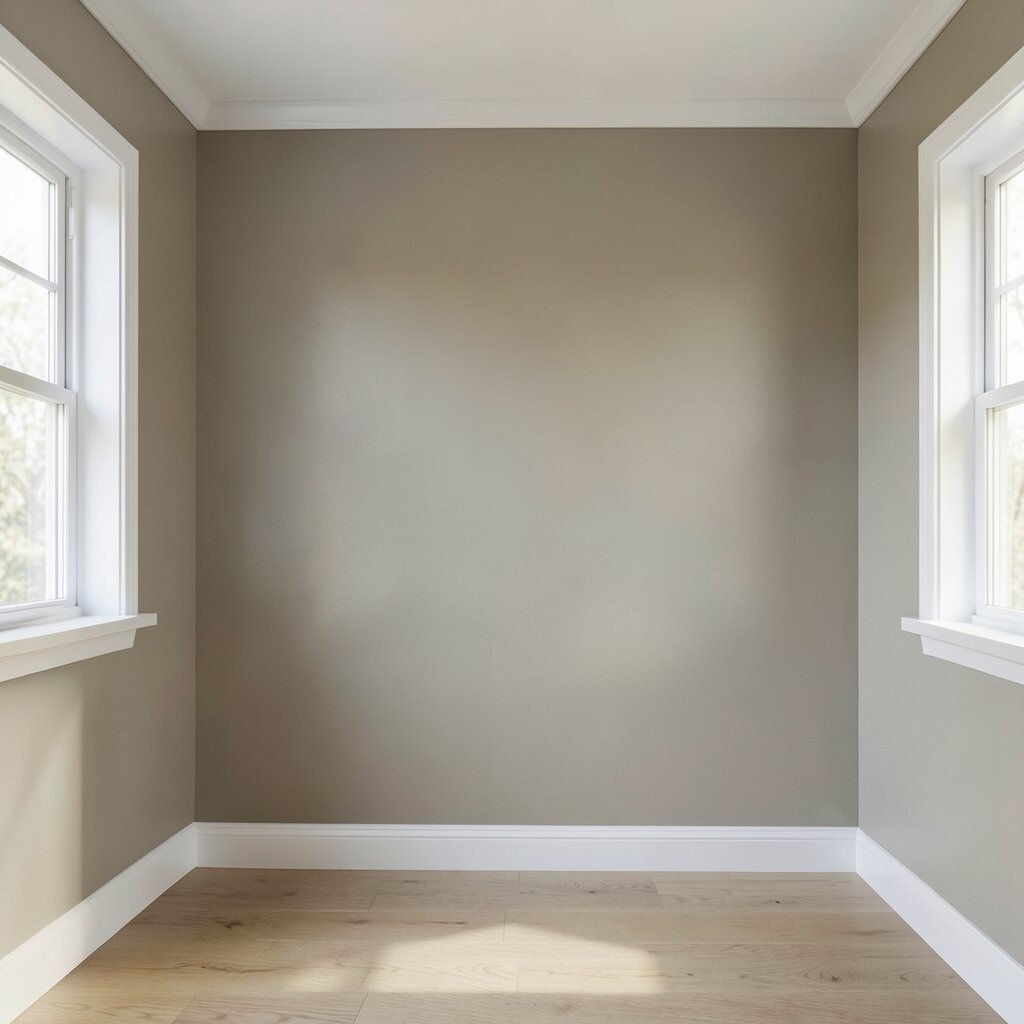
Imagine walking into a room where the walls sit between beige and gray, like sand warmed by sunlight. A soft sheen catches light gently, so everything feels inviting instead of flat.
Choose a warm greige to keep the room steady across the day, from morning glow to evening lamplight. Pair it with crisp white trim for calm contrast that still feels clean. If you paint yourself, spend extra time on prep and sample patches so the undertone matches your floors.
Use a matte or eggshell finish depending on how much natural light you get, because glare can steal the cozy feeling. Add a textured roller or subtle sponging only if you want a lightly lived-in look. This option tends to be cost-friendly since paint is one of the biggest visual upgrades you can do.
2. Off-White Walls Paired With Walnut Accents
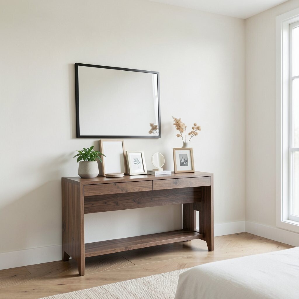
Off-white walls create a gentle backdrop that makes the room feel bigger and calmer. Walnut accents bring in a natural depth that keeps neutrals from looking too cool.
Try matching a walnut console, bed frame, or picture ledge to smaller items like coasters and frames. You will get a balanced look that feels modern yet grounded. For a practical approach, bring home two off-white paint samples and compare them next to your walnut samples.
3. Taupe Upholstery for a Cozy Living Room
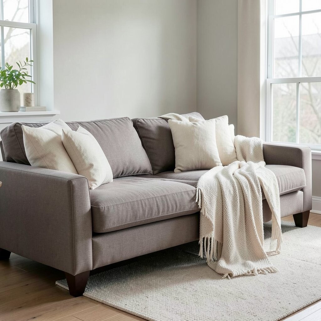
Taupe upholstery looks like a quiet hug. It blends well with many neutrals and makes the room feel lived-in from the first glance.
Choose a medium taupe for pieces like a sofa, accent chair, or window bench so it hides small everyday marks. Add cream throw pillows and a simple throw blanket to keep the color story soft. To personalize it, select fabric with a subtle weave, like linen blends or boucle, for a tactile calm.
If you shop for secondhand, inspect seams and cushions closely since comfort matters more than the shade. New upholstery can cost a lot, but slipcovers or reupholstery only one piece can help you stay on budget. This look also lines up with current trends toward warm minimalism and texture-first decorating.
4. Layered Cream Textiles for Instant Softness
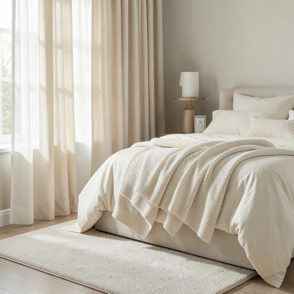
Cream textiles can turn an empty room into something comfortable. Think of curtains, rugs, and bedding that look creamy and feel gentle against your skin.
Go for layered thickness by mixing a sheer curtain with heavier drapes, or mixing a soft rug with a smaller textured runner. When you vary the textures, the space feels rich without using bold colors. Start with one big fabric change first, like new curtains, since it has a big impact.
5. Light Gray Flooring With Body-Warming Rugs
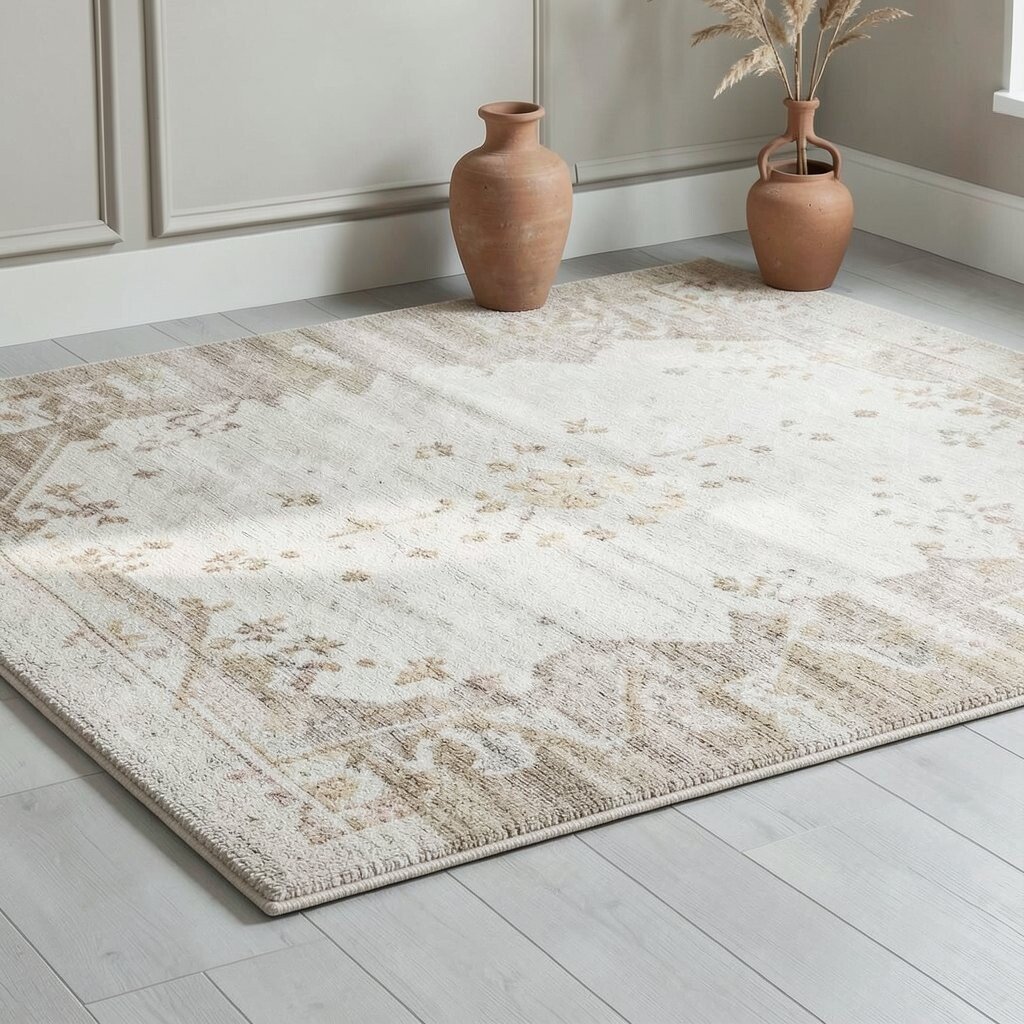
Light gray floors can feel clean and calm, like fresh paper. The trick is to add warmth above it so the room doesn’t feel chilly.
Choose a rug in ivory, oatmeal, or beige with a low-contrast pattern that still shows texture. A slight pattern helps hide footprints and gives the room visual comfort. If you rent, you can use a large area rug or even interlocking floor tiles in a similar tone for a temporary refresh.
Consider current interior trends that favor grounded neutrals and gentle patterning rather than loud prints. For practical budgeting, aim for the biggest rug you can afford since it will unify everything you place on it. Add a few warm accessories, like a clay-colored vase, to keep the gray from taking over.
6. Charcoal Details for Quiet Contrast
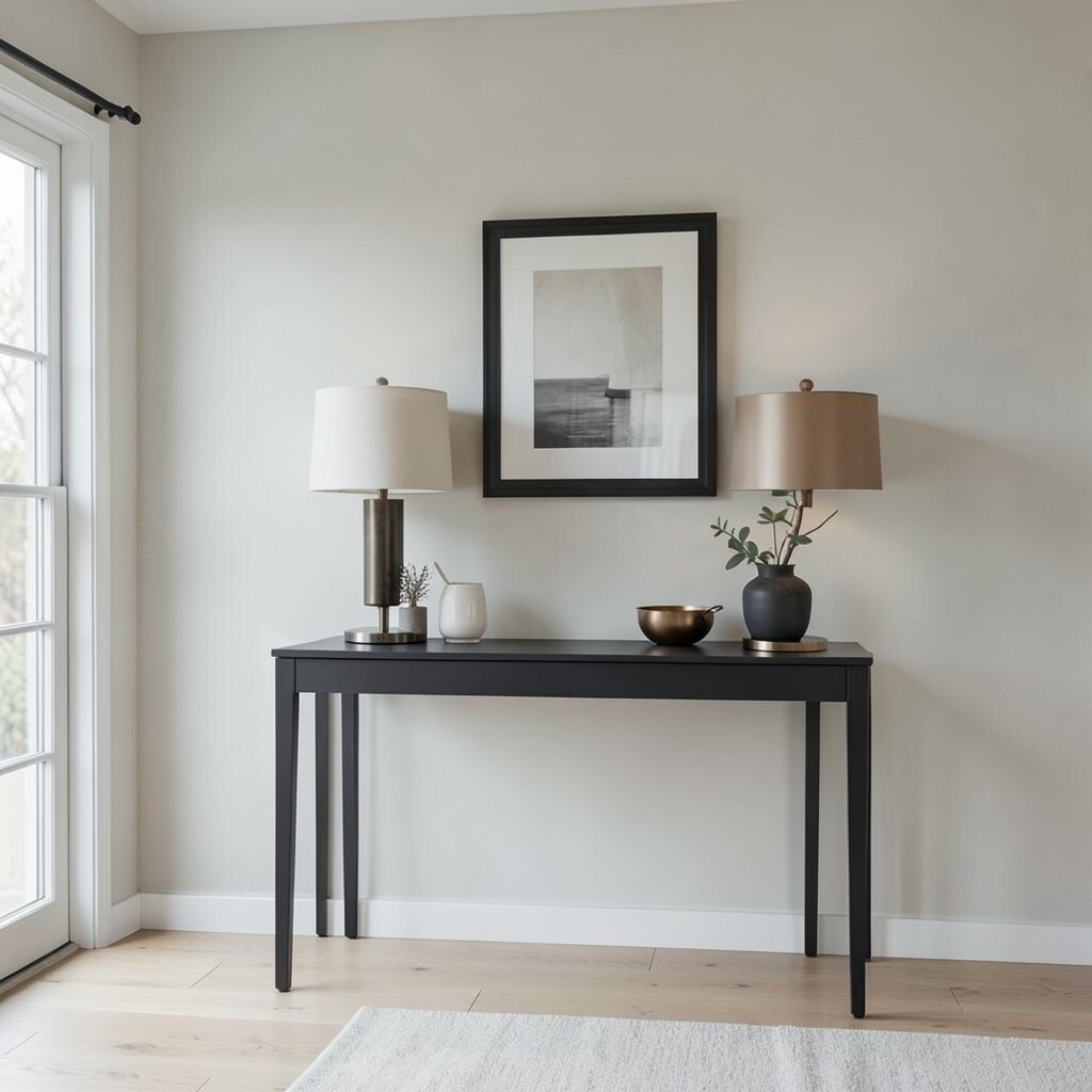
Charcoal details add structure without shouting. Used carefully, they make neutrals look intentional and help your room feel designed.
Try a charcoal picture frame wall, a slim console table, or matte hardware on cabinets. Keep the main surfaces light, then let charcoal show up in small doses for a calm contrast. This works especially well in open-plan spaces where you want clear visual boundaries.
If you want to personalize, mix charcoal with warm metals like brushed brass or antique bronze. Those combinations feel trend-forward while still staying neutral. For cost, focus on cheaper swaps like frames, lamp bases, or curtain rods before investing in larger items.
7. Linen Beige Curtains That Float With Light
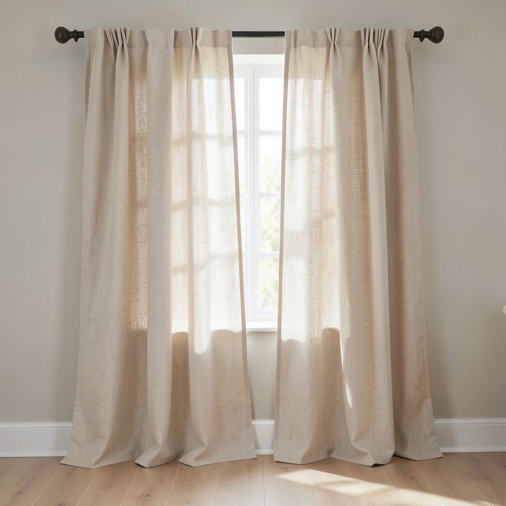
Let linen beige curtains take center stage when you want the room to feel relaxed. Their airy look softens shadows and makes windows feel like calm focal points.
Choose a curtain panel that reaches close to the floor, or slightly puddles if your style is cozy. Line them only if you need extra privacy or light control, because unlined linen can feel extra breezy in daytime. A quick personalization move is to use tiebacks in the same neutral family to keep the look neat.
8. Sand Tones in a Minimal Kitchen
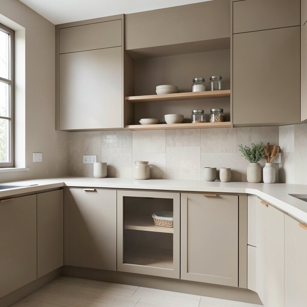
Sand tones in a kitchen can feel soothing and practical. When cabinets and walls share a similar neutral range, the space looks tidy even when life is busy.
Pair sand-colored cabinets with a light countertop and warm hardware for a balanced everyday look. Add simple open shelving with neutral bowls and glass jars so the counters feel light. If you want a small-budget approach, swap cabinet pulls and add a fresh backsplash in a subtle tile pattern.
This style fits current trends toward clean lines and warm neutrals that feel lived-in. For personalization, use a muted stoneware set in oatmeal, sage, or clay to bring in gentle contrast. You will also find it easier to keep the look cohesive since most items match.
9. White Brick or Limewash Look Walls
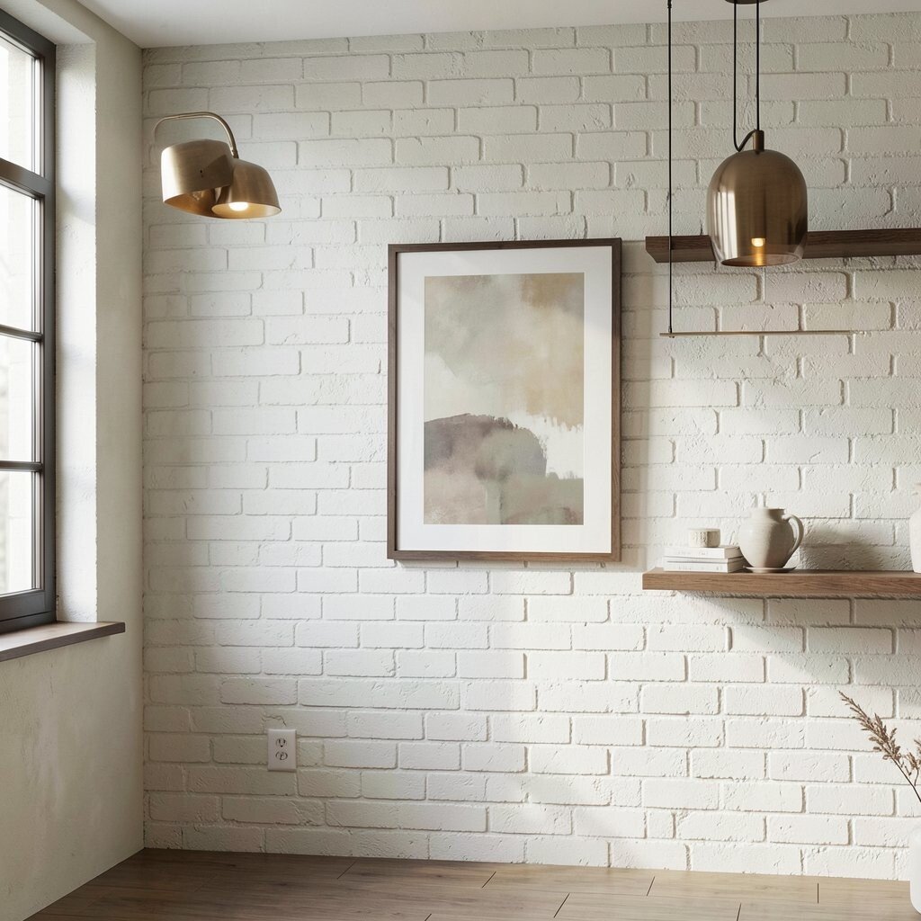
A limewash look can make walls feel soft and timeless. It adds a little uneven texture, like a gentle weathered surface.
If you have exposed brick, a whitewash or limewash effect can be a calm upgrade without making the wall feel too slick. Texture matters here, because it bounces light while still looking cozy. Pair the wall with darker wood accents or warm metal lighting so the room feels grounded.
For cost considerations, limewash style finishes can be less expensive than full renovations, and you can often do them in phases. Test samples on a small section first since brick absorbs color differently. This trend keeps showing up because it makes neutrals feel artistic rather than plain.
To personalize, use a single bold framed print with muted tones so the wall texture stays the star. Keep decor simple on shelves, then let negative space help the room breathe.
10. Muted Olive in Neutral Rooms
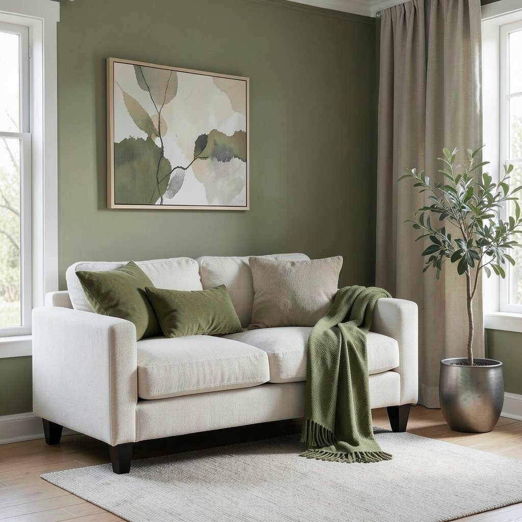
Muted olive works like a neutral with a secret warmth. It brings the calm feel of nature without turning the room into a strong color statement.
Use olive in small places like pillows, a throw blanket, or a plant pot that matches your metal finishes. When you keep olive paired with creams and taupes, the room stays soft and soothing. This is a great option if you want uniqueness while still following a calm neutral palette.
Choose fabrics with a matte finish so the olive looks relaxed rather than shiny. For cost, start with textiles and wall art before buying bigger furniture. Current trends lean toward natural-inspired colors like sage and olive, so this choice feels modern but gentle.
11. Greige Built-Ins for a Clean, Calm Flow
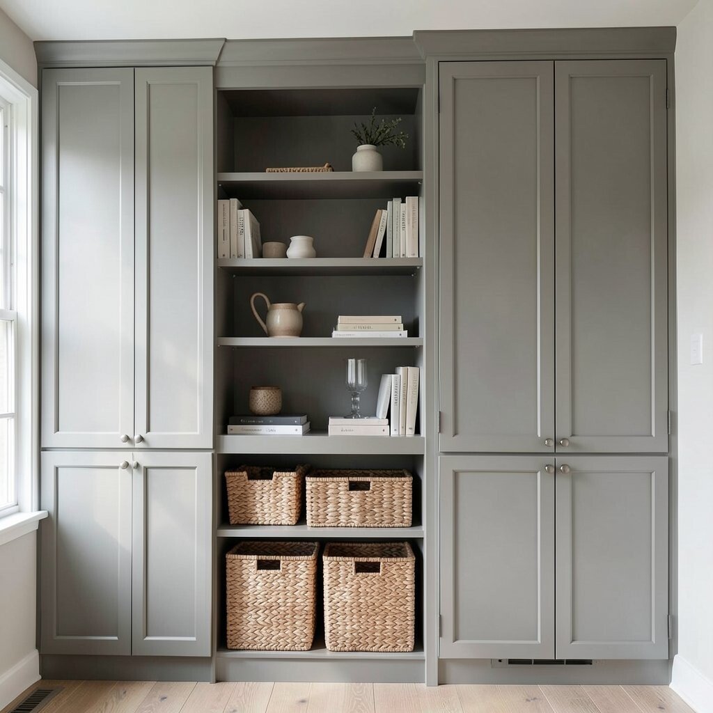
Built-ins can make a room feel calm because they create clear order. A greige finish on shelves and cabinets helps the storage blend into the background.
Arrange items by height, then place a few neutral books stacked vertically so the shelves look intentional. Add baskets in woven natural fibers for a practical way to hide clutter. This also makes personalization easier since you can swap baskets or add new decor with each season.
If your built-ins are already wood, you can update them with a greige stain or paint that matches your wall color. Consider your lighting too, since built-ins can look darker in corners. A careful coat count and proper sanding will help the finish look smooth and calm.
12. Monochrome Layering With Multiple Light Neutrals
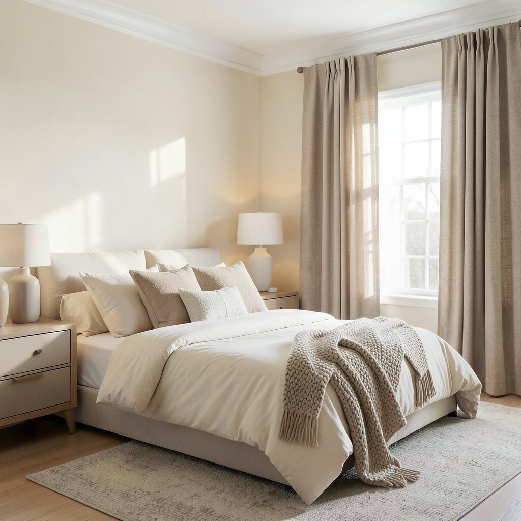
Monochrome layering means using only one color family, but in many light shades. The room feels calm because your eyes don’t need to jump between unrelated colors.
Try a setup with cream walls, ivory bedding, oat curtains, and a warm white lamp. Keep the undertones consistent so the neutrals harmonize instead of clashing. For personalization, add one piece in a slightly different texture, like a chunky knit blanket or a smooth ceramic vase.
This approach is popular right now because it feels airy, stylish, and easy to maintain. Budget-wise, you can start small with throw pillows and a rug, then build up over time. The biggest practical win is that you won’t struggle to match decor as you add new items.
13. Soft Black Accents on Every Level
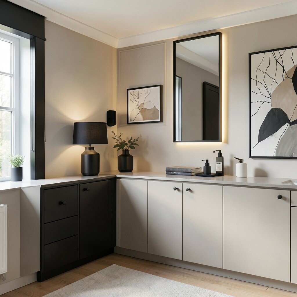
Soft black accents can look elegant while still keeping things calm. The key is choosing matte or satin finishes that feel gentle rather than harsh.
Add soft black in lighting, cabinet knobs, or thin-framed mirrors so the room has a grounded frame. Keep most surfaces warm and light so black doesn’t overpower the space. If you want to personalize, choose artwork with black line details and muted backgrounds.
From a cost perspective, hardware swaps and new lamp shades can make a big difference without major projects. This look also fits current trends for crisp, subtle contrast that still feels comfortable. Take a moment to check how black interacts with your lighting temperature, since warmer bulbs can make it feel softer.
14. Natural Fiber Rugs in Oat and Jute
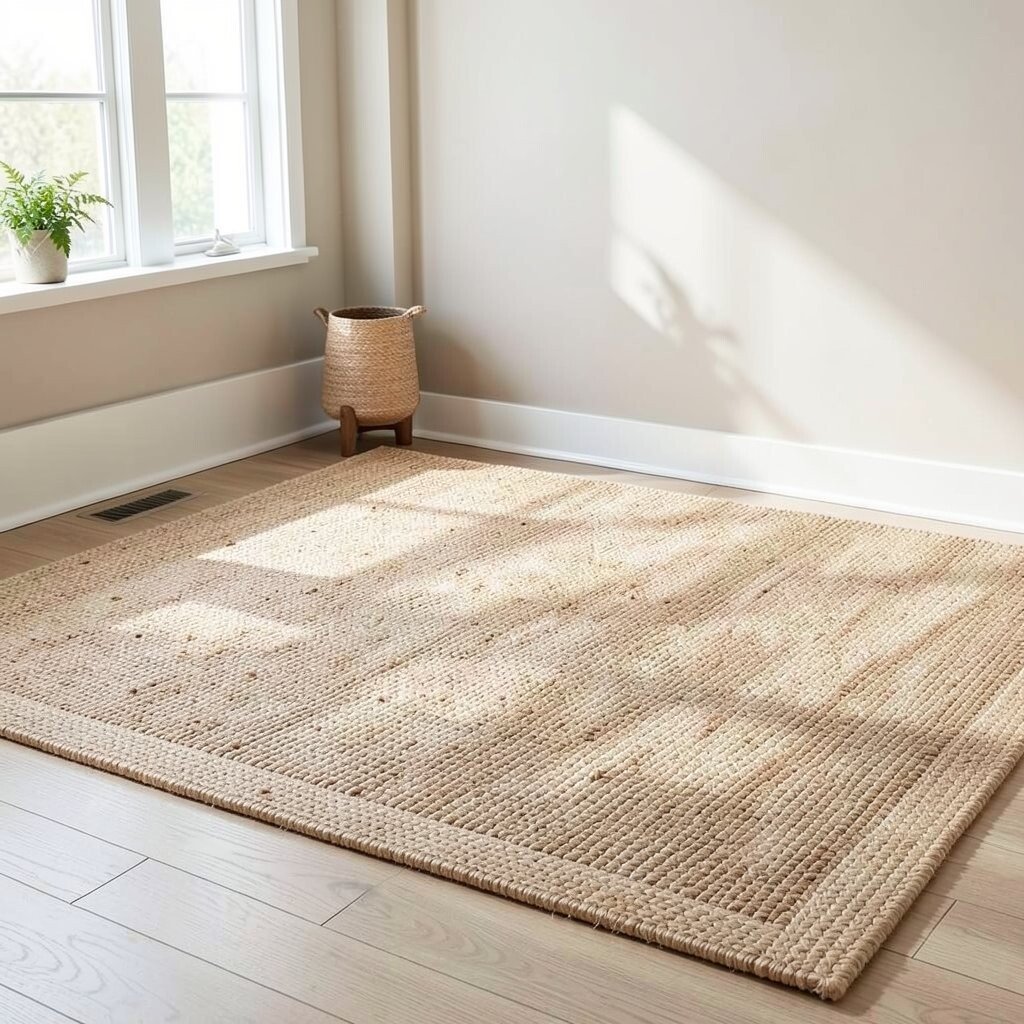
A rug made from natural fibers feels calm the moment you step on it. Jute, sisal, and woven blends create a grounded texture that works with almost any neutral palette.
Choose an oat or sand color tone so the rug reads warm underfoot and pairs nicely with beige, cream, and taupe. If you have pets or heavy foot traffic, consider a rug with a blend that resists wear. Add a thin non-slip pad underneath so it feels secure and practical.
15. Cream and Beige Bedding With a Textured Blanket
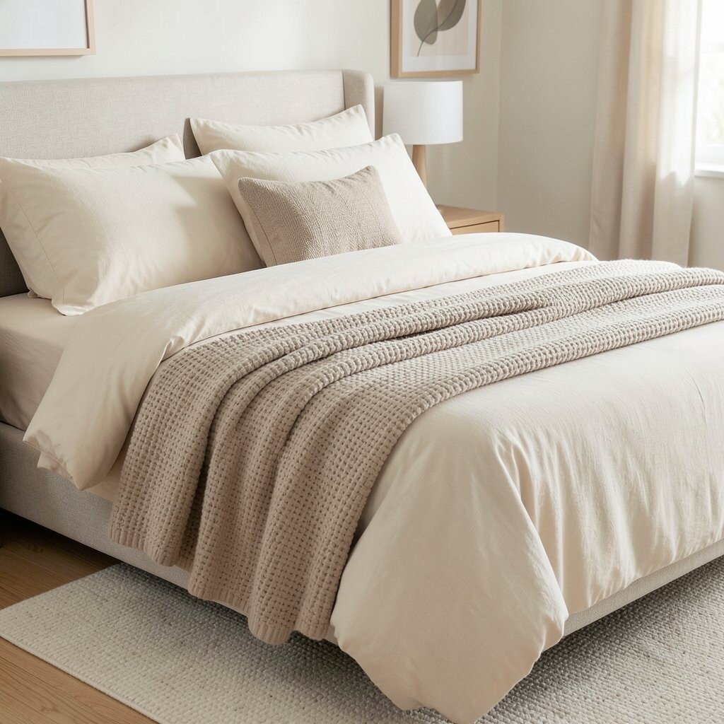
Your bed is where calm should start, and bedding is the easiest place to shape that feeling. Cream and beige sheets make the room look restful even before you add pillows.
Layer in one textured blanket like waffle knit, chunky linen, or a soft herringbone throw. The texture adds uniqueness without adding loud colors. For practical personalization, mix pillow sizes and add one small accent pillow that matches a rug tone or art frame.
Consider cost by prioritizing items you use daily, like quality sheets and a comfortable blanket. Decorative pillow covers are an affordable way to refresh the look for different seasons. Current bedroom trends favor simple, breathable palettes, and this combination fits that vibe perfectly.
16. Neutral Wall Art With Large, Soft Shapes
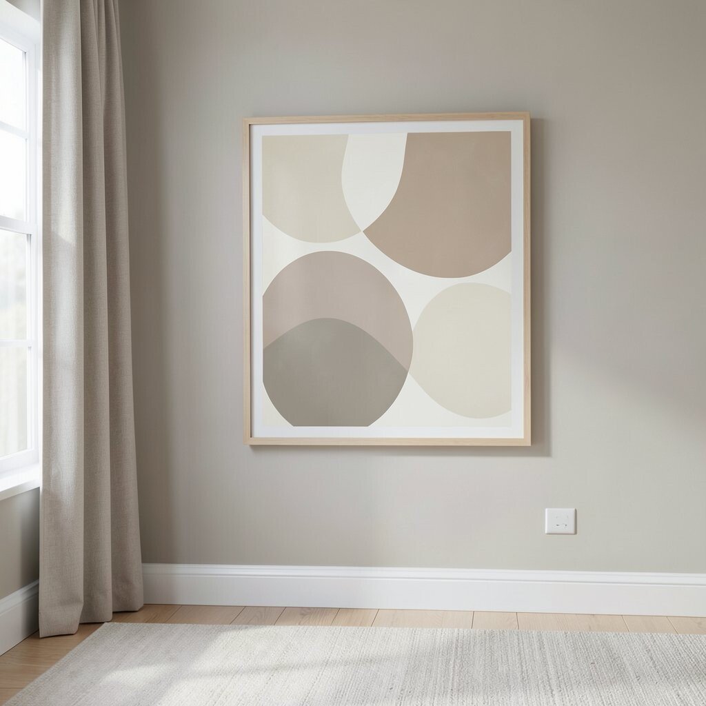
Neutral wall art can create calm by guiding your eyes gently around the room. Large soft shapes feel soothing and also make small rooms look less crowded.
Look for prints with tonal gradients, minimal lines, or abstract forms in cream, sand, and muted taupe. This keeps the art from becoming the only bold element while still giving the space personality. Use a simple frame in warm white or light wood to keep everything consistent.
For personalization, match the art tones to your rug and curtains so the room feels cohesive. Budget-wise, consider buying one larger piece instead of several smaller ones, since it tends to look more intentional. If you love DIY, you can create a tonal abstract using watered-down paint and sponges.
17. Beige Stone or Porcelain Countertops for Quiet Luxury
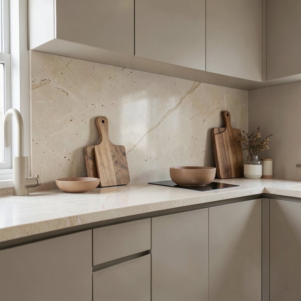
Stone-like countertops can give a calm, upscale feel without using bright colors. Beige veining or subtle speckling adds visual interest while staying neutral.
If you’re remodeling, choose a finish that feels soft under light, like honed or matte surfaces. If you can’t replace counters, you can still get the look with a neutral backsplash and matching accessories. Add wooden cutting boards and warm-toned dishware to make the space feel welcoming and practical.
Uniqueness comes from the veining pattern, which varies naturally, so your kitchen or bath will feel one of a kind. For cost considerations, focus spending on the surfaces you touch most, then keep decor simple. Current trends favor calm, natural textures that mimic stone, and this choice aligns with that direction.
18. Soft Sage Details for a Fresh Neutral Mood
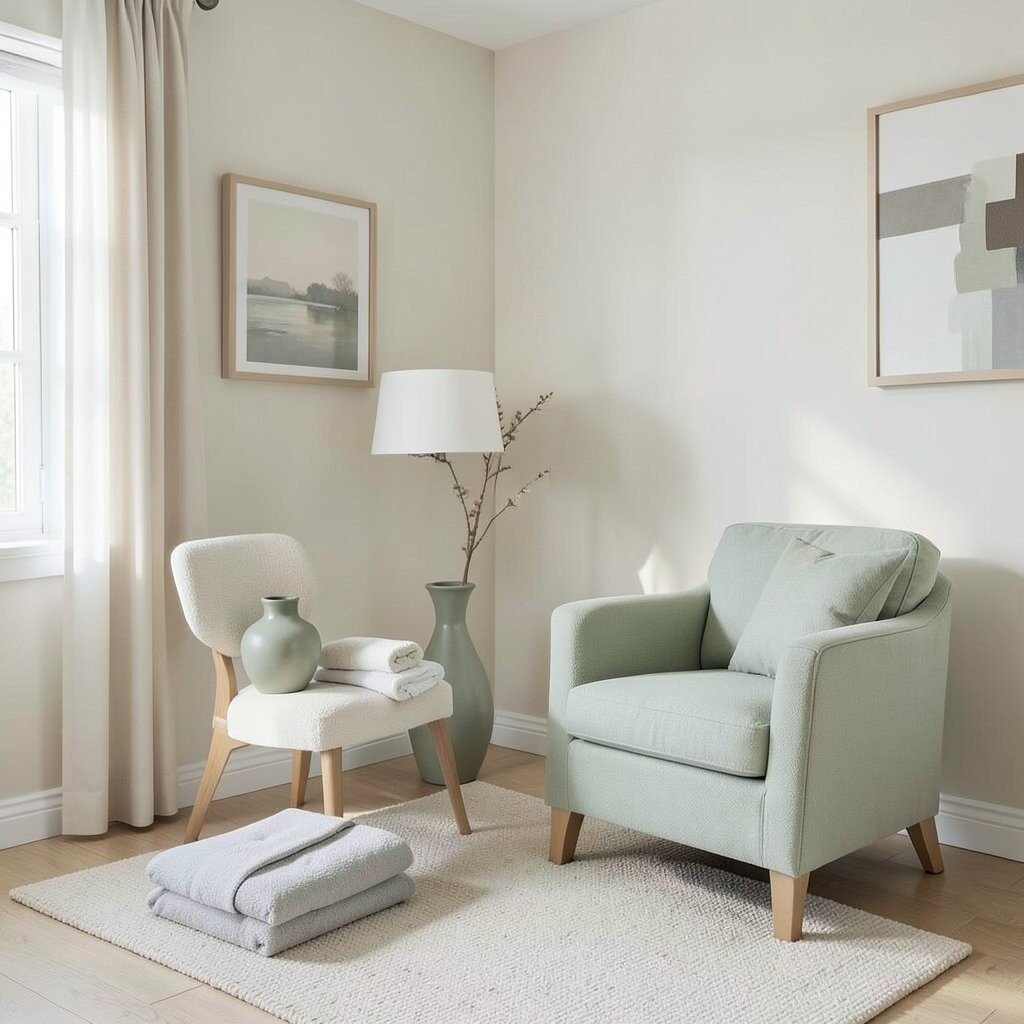
Sage details can make neutral rooms feel fresh and calm. The color sits comfortably between green and gray, so it stays soothing rather than loud.
Use sage in ceramics, towels, a vase, or a small accent chair cover. Keep the rest of the room in creams, warm whites, and taupes so the sage reads like a gentle accent. To personalize, pick one sage tone and repeat it in two or three places for a cohesive story.
19. Neutral Entryway Styling With Low-Contrast Storage
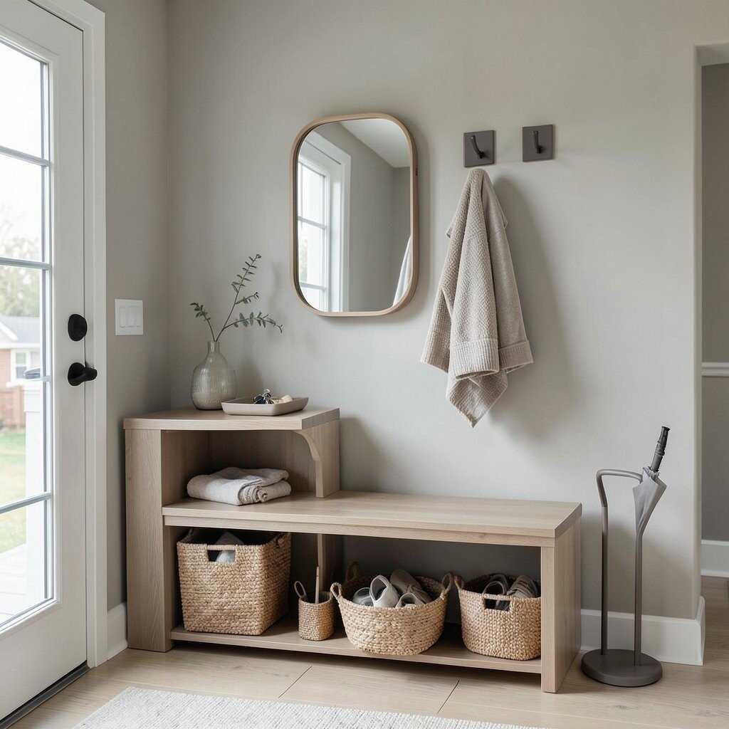
An entryway sets the tone for the whole home, so calm styling matters. Neutral storage pieces help your space feel orderly even when you’re coming and going.
Choose a console or bench in a light wood tone, then add baskets in natural fibers for shoes and small items. Use hooks in a dark neutral finish so coats hang neatly without looking messy. A small mirror with a soft frame can brighten the space and make it feel welcoming.
For practical personalization, keep a neutral tray for keys and a simple neutral umbrella stand if you need one. This can be done cheaply with a few swaps rather than a full renovation. Current trends favor functional beauty, and a calm entryway is one of the most useful upgrades you can make.
20. Blend Textures With Matte Paint and Polished Ceramics
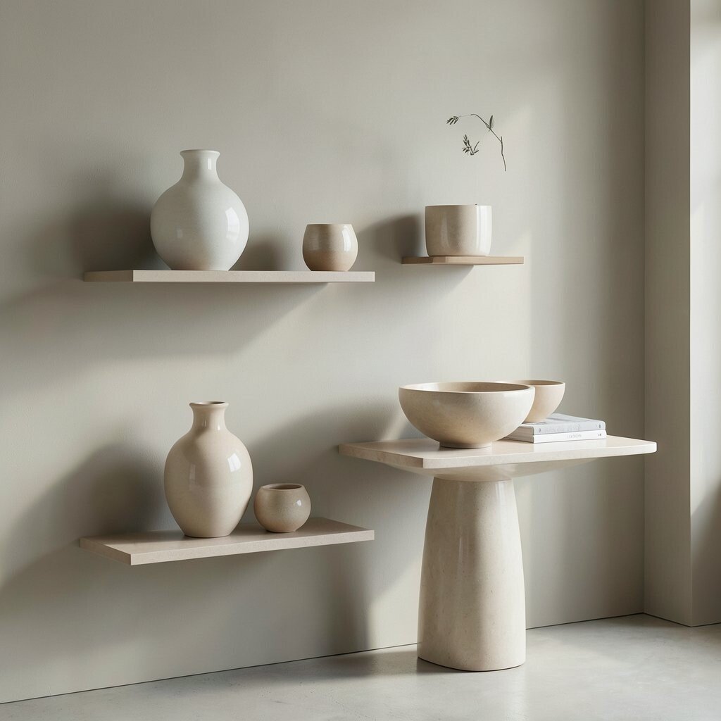
Calm interiors often come from contrast in texture, not color. Pair matte walls in warm neutrals with polished ceramics that catch light softly.
Try a matte paint finish in greige or cream, then add a few ceramic pieces in off-white, sand, or warm beige. The light reflection on ceramics makes the room feel alive while the matte surfaces keep it grounded. Personalize by mixing shapes, like a round vase with a sculptural bowl, so each piece feels intentional.
For budget considerations, you can create this look by updating paint or buying a few statement ceramics rather than replacing furniture. If you do paint, use proper primers and test samples so undertones match your existing floors. This texture-forward approach is staying popular because it looks high-end without needing a complicated color scheme.
Finally, keep styling minimal by giving each object breathing space on shelves and tables. When you let textures and light do the work, the room stays calm and your style feels effortless.