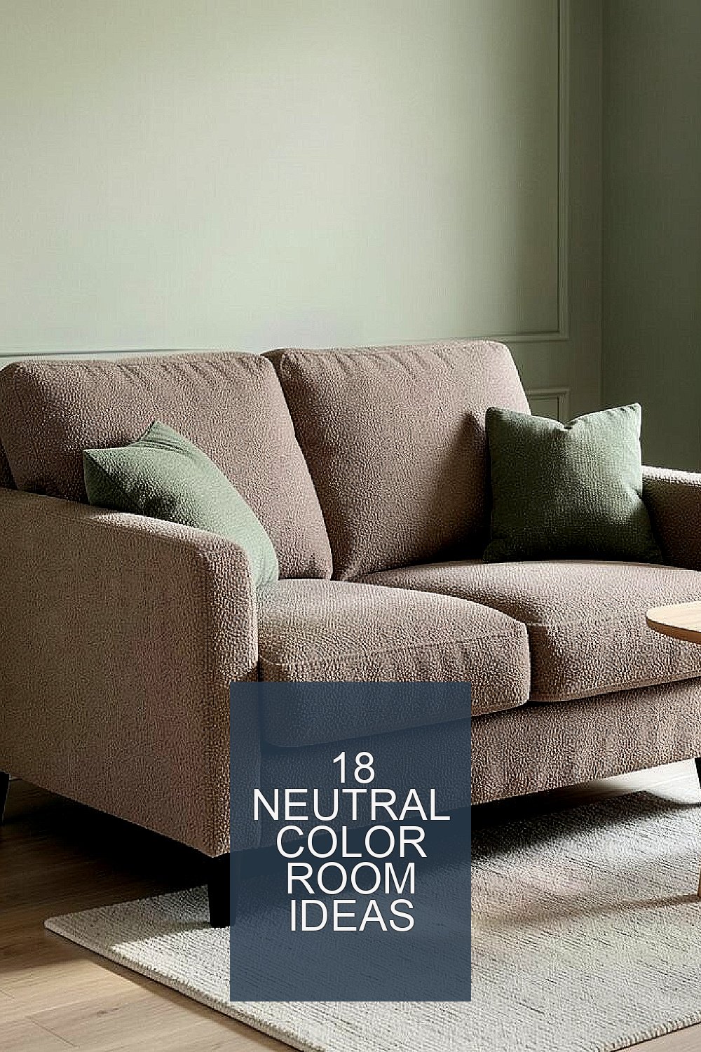
The right neutral palette can make a home feel quieter without feeling plain. A few smart choices in paint, texture, and light can change the mood fast.
1. Soft Linen Walls for a Gentle Backdrop

Imagine walking into a room where the walls look like sun-warmed linen. The color feels muted, like a quiet morning sky.
Choose a warm off-white or light greige with a slightly soft undertone. Pair it with natural fabrics like linen curtains and a cotton throw so everything looks calm together. This approach helps the room feel airy while still giving you a cozy base for daily life.
2. Warm Taupe Furniture That Feels Grounding
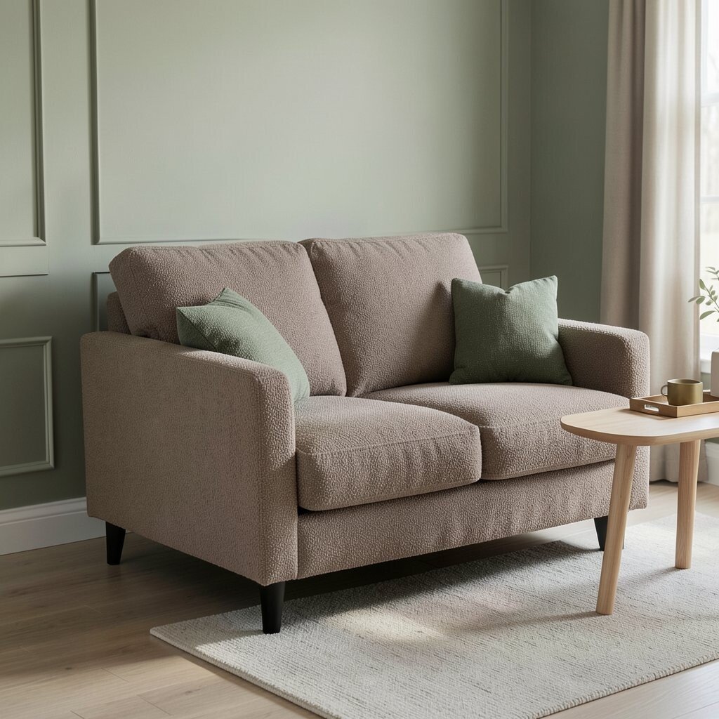
A warm taupe sofa or accent chair adds a steady, cozy presence. It looks inviting, even on the simplest day.
Go for a fabric with a subtle texture, like boucle, woven cotton, or performance linen. Keep the rest of the room in gentle tones so the taupe becomes the anchor, not the loudest element. For practical comfort, choose stain-resistant finishes and test fabric swatches in your actual light.
If you want a current look, mix taupe with muted greens and soft brass details. Add a small tray or side table in light wood to keep the style fresh. Budget-wise, consider upgrading one key piece first, then add accents over time.
3. Greige Shelving to Highlight Everyday Beauty

Greige shelving makes a wall feel organized and calm at the same time. Books, baskets, and small plants look extra neat when the background is balanced.
Use simple shelves in a smooth matte finish so reflections stay soft. Styling works best when you group items in small clusters and leave some empty space, so your eyes get a break. This reduces visual clutter and makes the room feel easier to live in.
Add a few personal objects like a ceramic mug collection or a framed photo in a neutral frame. If your home is trending toward minimal styling, choose fewer items but make each one feel special. For cost control, paint existing shelving or refinish it instead of buying new.
Keep weights in mind, and mount shelves securely to studs if possible. A tidy shelf line also makes it easier to spot what you need quickly during busy days.
4. Oatmeal Curtains for Soft Light Control

Oatmeal curtains feel like a gentle filter over the room. They turn bright sun into a warmer glow that feels easy on the eyes.
Pick a medium weight fabric so it drapes nicely while still giving some privacy. Hang the rod near the ceiling for a taller look, and consider a liner if you need better light control. When you soften the light, your whole space feels calmer, especially in the evening.
5. Light Walnut Floors for Natural Warmth

Light walnut floors can make a neutral room feel lived-in and warm. The subtle grain pattern adds movement without shouting for attention.
Choose area rugs in creamy, sand, or light greige to keep the palette cohesive. If you’re furnishing a rental, start with rugs and removable pads instead of changing flooring right away. Flooring changes can be costly, so layering is a smart first move that still looks intentional.
To personalize, add a low-profile rug with a simple pattern like woven stripes or a barely-there geometric. This keeps the floor’s natural look in focus while adding comfort underfoot. Many homes now mix warm wood with soft neutrals for a timeless, current feel.
6. Creamy White Trim for Crisp Calm
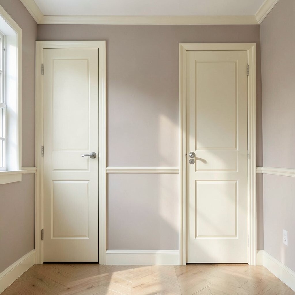
Crisp cream trim makes neutral rooms look polished. It creates clean lines that help the space feel calmer and more organized.
Try a satin or semi-gloss finish on trim because it’s easier to wipe and stays bright. Pair it with warm wall colors so the trim feels friendly, not icy. This is a practical upgrade that can make older rooms look updated without major renovations.
For personalization, paint doors and built-ins in the same trim color for a smooth, cohesive flow. If you love a trend toward soft contrast, choose slightly deeper neutral walls to let the trim pop gently. Budget-wise, it’s usually a paint-and-time project, not a big purchase.
7. Stone-Colored Accent Wall for Quiet Depth

A stone-colored accent wall adds depth without turning dramatic. It looks like smooth rock warmed by daylight.
Pick a color that matches the undertone of your other neutrals so everything stays harmonious. Pair the wall with light wood, matte metals, and cozy textiles to keep the mood soft. If you’re renting, use peel-and-stick wallpaper in a subtle stone pattern for an easy change.
For uniqueness, choose a flat finish so the wall absorbs light and feels restful. Add art with neutral tones and simple frames to highlight the texture. The result is a room that feels grounded and calm, even when it’s busy with everyday life.
Measure your space before you buy and test samples on multiple walls to see how the color shifts.
8. Minimalistic Bed Styling in Tan and Sand
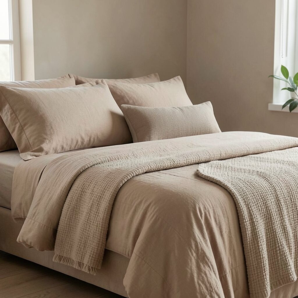
Tan and sand bedding can make bedtime feel calmer right away. The colors are soft, and they blend with almost every neutral décor style.
Start with a fitted sheet in a warm neutral, then layer a duvet cover and quilt in slightly different tones. Add a throw pillow with a simple texture like ribbed linen or a subtle weave so it feels inviting. This gives you a spa-like look without needing fancy patterns.
Personalization can be as simple as choosing pillowcases in your favorite neutral shade, like greige or oat. Keep accent colors to just one small family, such as soft olive or muted clay, so the room stays balanced. For cost considerations, swap pillows and throws first since small textiles often refresh the whole look.
9. Soft Gray Reading Corner for Evening Wind-Down
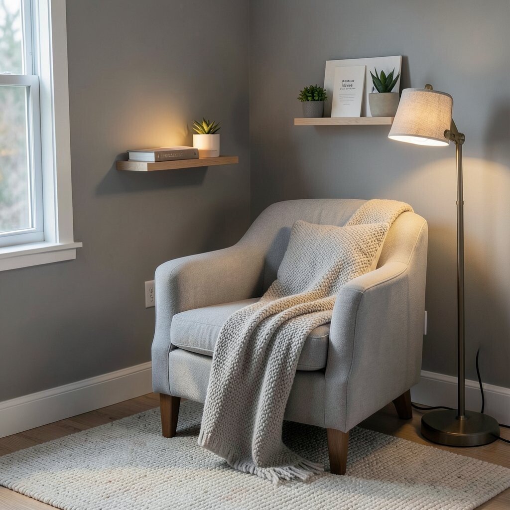
A soft gray reading corner feels like a cozy pause button. It invites you to slow down with a book and a warm drink.
Pick a gentle gray with warmth, then add a comfy chair and a textured rug. A thick throw blanket and a floor lamp with a warm bulb will make the area feel soothing at night. This creates a clear zone for rest, which can help your brain feel less scattered.
If you want a unique twist, add a small gallery ledge in a neutral wood tone for reading notes or small plants. Current trends often lean toward functional corners that look beautiful but also do a job. Keep the styling simple so the calm stays strong.
10. Beige and Black Photography Frames for Modern Contrast

Beige and black frames add just enough contrast to keep neutrals interesting. The room feels modern while still staying calm and steady.
Choose frames with slim lines and matte finishes to avoid harsh shine. Use a consistent size set for a tidy look, or mix sizes slightly for a relaxed gallery vibe. This can make walls feel styled without loud colors.
Personalize by selecting photos with warm lighting, landscapes, or minimalist scenes. If you like the current trend of gallery walls, keep the mat colors in cream so everything looks cohesive. Budget-wise, printing photos yourself and using thrifted frames can create a high-impact look.
Arrange on the floor first to see spacing, then hang carefully so the wall feels balanced.
11. Neutral Rug Layers for Cozy Texture Without Color Chaos

Layering neutral rugs creates instant comfort and softens hard flooring. Even in a simple palette, textures can make the room feel rich.
Try a larger flatweave rug in cream, then add a smaller patterned rug in sand or light gray. This keeps the floor area visually interesting while still calm. For practical tips, use a rug pad to stop slipping and protect flooring.
If you want personalization, match the rug tones to your curtains or bedding so everything ties together. Many current interiors use layered neutrals to make rooms feel styled without bold paint choices. Cost can be managed by buying one foundational rug and layering with a smaller, more affordable accent rug.
12. Sand-Colored Walls With Muted Olive Accents

Sand-colored walls feel sunny but not bright. They give you a warm foundation that holds up well over time.
Add muted olive accents through pillows, a throw, or a plant stand to bring life into the calm. The olive tone adds a natural feel that blends with wood and stone materials. This combination is popular right now because it looks organic and relaxing.
Personalization is easy by choosing olive shades that match your skin tones and the lighting in your room. If you want less contrast, choose more beige in your olive, or keep olive to accessories only. Budget-wise, changing textiles and décor is often cheaper than repainting.
13. Natural Fiber Baskets for Clutter-Free Living

Neutral baskets in seagrass, jute, or woven fibers make storage look beautiful. They also help you keep everyday items close but not messy.
Use them for blankets, extra pillows, or kids’ toys so the room stays calm even when life gets busy. Matching basket tones to your floors and walls creates a smooth, quiet look. This is a practical fix that reduces visual noise fast.
For personalization, label baskets with simple tags or choose one basket color family that ties into your décor. Current trends lean into natural textures, so woven storage feels fresh. If you want to save money, repurpose storage bins and cover them with neutral liners instead of buying many new pieces.
Make sure sizes fit your shelves and leave a little room so items aren’t crammed together.
14. Matte Black Hardware for Modern, Calm Lines

Matte black hardware can look sleek without making the room feel harsh. Used in small doses, it gives neutral spaces a modern edge.
Try black cabinet pulls, curtain rods, or a bathroom mirror frame to create clean, intentional lines. Choose matte finishes because they hide fingerprints and look softer than shiny metal. This kind of detail is an easy win that doesn’t require repainting everything.
If you love personalization, coordinate black accents with one other element, like a black floor lamp or a black picture rail. It’s a trend in many modern homes to use simple black details against warm neutrals for contrast. Budget-wise, hardware upgrades are usually one of the most affordable “looks new” changes.
15. Neutral Wall Art With Soft Shapes and Textures

Wall art in neutral tones can make a room feel thoughtful and calm. Soft shapes and gentle textures help your eyes rest.
Pick pieces with muted colors like cream, sand, clay, or soft gray. A textured canvas, a woven wall piece, or a framed print with grainy detail can look warm without using bright hues. This keeps the style unique while still blending smoothly.
Personalize by choosing art that matches your everyday comfort, like nature scenes, abstract shapes that feel quiet, or minimal line drawings. A current favorite is neutral art with subtle movement, like brush-like strokes or layered paper textures. For cost considerations, shop prints first, then upgrade frames later as your budget allows.
Hang art at eye level and keep spacing consistent so the layout feels balanced.
16. Beige Bathroom Spa Setup With Towels and Stone Soap Dishes

A neutral bathroom setup can feel like a small spa at home. Beige towels and warm stone accessories make the space look tidy and soothing.
Choose a towel set in oatmeal, cream, or light sand, and add a matching bath mat for a pulled-together look. Use stone or ceramic soap dishes and a simple organizer so counter space stays uncluttered. This helps the whole room feel calmer when you walk in after a long day.
For practical tips, buy a few extra face cloths and keep a discreet basket for laundry so mess stays hidden. Personalization can come from scent choices, like a warm vanilla or fresh linen-inspired soap, while still keeping the visual palette neutral. Budget-wise, refreshing textiles and accessories is usually cheaper than changing fixtures.
If your lighting is cool, choose warmer neutrals so the bathroom feels inviting instead of gray.
17. Taupe and Cream Dining Seating for Easy Hosting

Taupe and cream dining seating can make hosting feel effortless. The neutral fabric looks welcoming and works with almost any centerpiece.
Choose chair upholstery or chair covers in taupe with a durable weave if kids or frequent guests are part of your life. Pair it with a light table finish, or use a simple table runner in cream to soften the space. When the dining area feels calm, conversations tend to feel smoother too.
Personalization can be as simple as swapping placemats by season, such as warm sand for autumn and lighter cream for spring. Current trends often mix neutrals with organic details, so a wooden serving board or linen napkins fit right in. Cost considerations are friendly here because you can upgrade covers and linens without replacing full chairs.
Use warm lighting above the table to make neutrals look richer and more flattering.
18. Neutral Lighting Plan With Warm Bulbs and Layered Lamps
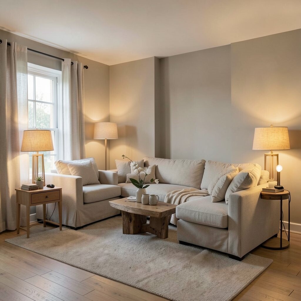
Neutral rooms feel best when the lighting is soft and warm. A good lighting plan brings out textures in fabric, wood, and stone.
Use warm bulbs, then layer lamps so you’re not relying on only one bright ceiling light. Add a floor lamp near a seating area and a small table lamp near a reading spot to create cozy zones. This is a practical way to make the room feel calm at different times of day.
For uniqueness, choose lamp shades in linen, oatmeal, or textured paper so they blend into the palette. Many current interiors focus on layered lighting because it reduces harsh shadows and makes spaces feel more relaxing. If you’re mindful of cost, start with one lamp and one new bulb, then build the plan slowly as you find pieces you love.
Keep dimmers in mind for bedrooms and living rooms so you can adjust the mood with a gentle touch.