The calm home feeling is mostly about the colors you live with every day. When the palette is neutral, your space can breathe and settle you down.
Neutral doesn’t have to mean boring, either. Current design choices show that soft tones, warm undertones, and smart contrasts can make rooms feel inviting and balanced.
1. Warm Greige With Soft Depth
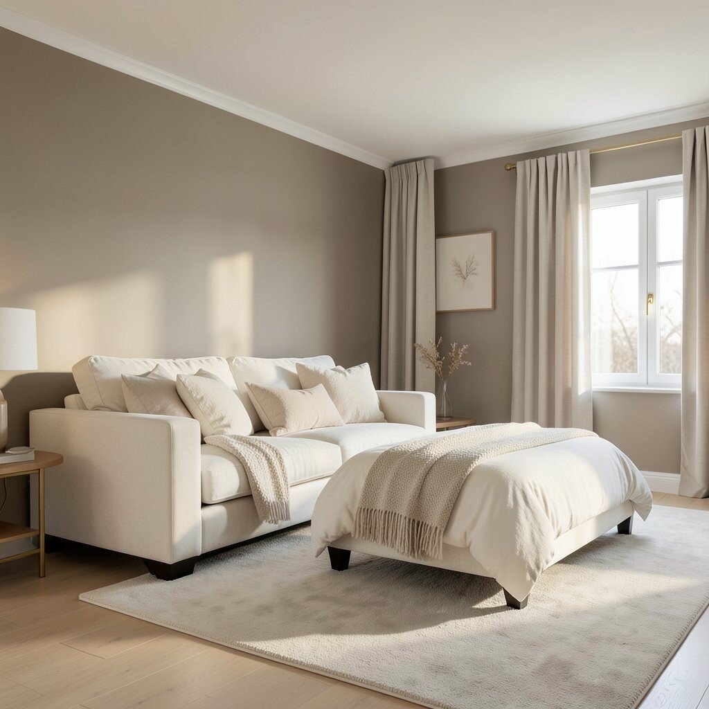
Greige has been popular, but the trend is shifting toward warmer greige that looks cozy instead of gray. You’ll notice it in living rooms with light wood floors, matte walls, and gentle lighting that makes the room feel like late afternoon.
Use warm greige on walls and keep trim slightly brighter so details stay crisp. For a practical start, pair it with creamy white textiles and warm brass or brushed nickel hardware. If you want it to feel unique, add one slightly deeper greige accent wall behind a sofa or bed, then repeat that tone once more in a rug or curtain.
Neutral color choices also help your home feel calm because there are fewer visual interruptions. This palette is friendly for frequent updates, since decor changes can steer the mood without repainting. It’s also cost-considerate, because you can buy larger quantities of paint in one go and reuse the same base color for touch-ups later.
2. Clay Beige That Feels Like Sun-Baked Earth

Clay beige is a warm neutral with a hint of terracotta that feels grounded. In photos, it often looks like soft sand in real life, especially when the room gets natural daylight.
This color trend works beautifully in kitchens and dining spaces where you want comfort and steadiness. Try it on lower cabinets, a backsplash wall, or open shelving back panels so the warmth shows up without taking over the whole room.
If you want personalization, match it with pale oak, woven baskets, and textured linens. Add one small color pop through ceramics or artwork, but keep everything else muted so the calm stays intact. When budgeting, you can choose paint for only the most visible wall areas and keep the rest bright white for a balanced cost.
3. Milky Off-White With a Lived-In Glow

Milky off-white brings a clean look while still feeling soft. It’s the kind of shade that holds light, so hallways, bedrooms, and small rooms feel larger without looking cold.
Choose it when you want walls to act like a gentle background for furniture and art. Pair it with light gray or taupe fabrics for subtle contrast, and you’ll get a calm look that still feels layered.
For uniqueness, consider painting the ceiling the same milky off-white and using a slightly different sheen on walls for depth. Add a few creamy accessories with natural texture, like boucle throws, linen drapes, or stoneware. This approach can be cost-effective because off-white paint is widely available, and a consistent color reduces the need for multiple shades.
It also supports a common current trend toward softer, less stark lighting, where warm bulbs make whites feel creamy rather than icy. You can refresh the look later with new curtains or frames instead of repeating a full paint job.
4. Soft Mushroom Taupe for Cozy Texture

Mushroom taupe is a neutral that sits between beige and gray, often with a gentle brown warmth. It looks best in rooms with natural materials, like rattan, reclaimed wood, or leather accents.
Paint the main walls mushroom taupe when you want comfort that still feels modern. Then keep the trim and ceiling light so the room doesn’t feel heavy, and your furniture stays the focus.
5. Greige-Like Stone Colors in Matte Finishes

Stone-toned neutrals are becoming a favorite because they look calm and also slightly architectural. With matte finishes, you get a velvety effect that hides minor wall imperfections and keeps glare down.
Try this trend in bathrooms or bedrooms, where a quiet color can make mornings feel slower. Use stone colors on walls and add glossy elements only in small doses, like a mirror frame or a faucet, so the look stays soothing.
For personalization, mix in subtle pattern through bedding or a textured area rug, then repeat the stone tone in a small decor item. If you’re keeping costs in check, matte paint can cover well with fewer coats, and that saves both time and money. It’s also a great base for seasonal changes, since neutral backgrounds handle new color accents easily.
6. Olive-Undertone Neutrals for a Gentle Nature Mood

Olive-leaning neutrals are a quiet trend that adds calm energy without turning a room into a themed space. You’ll see it in earthy bedrooms and reading corners where the color feels like greenery seen through a window.
Pick an olive-leaning neutral for a feature wall, then balance it with warm whites and pale wood. Add plants with matte ceramic pots so the tones feel natural together.
To keep things actionable, start with removable items like cushions before committing to paint. Once you’re sure you like the direction, choose a satin or eggshell finish on walls for durability while still looking soft. Budget-wise, you can test a few shades with sample pots, and those small trials prevent costly repainting later.
7. Cool Light Gray With Warm Lighting

Cool light gray can feel calm and clean when it’s paired with warm lighting. The key is choosing a gray that doesn’t tip too blue, because that’s when it can start to feel sharp.
Use this shade for open living spaces where you want a fresh backdrop for sofas and shelves. Add warmer materials like walnut, cream knit throws, and soft gold accents to keep the overall mood friendly.
8. Sandy Beige With Woven-Like Texture Styling

Sandy beige is a neutral that reminds people of beach houses and slow weekends. It looks especially good when your decor includes woven textures that catch light gently.
Paint walls sandy beige, then layer in jute, rattan, and cotton for a look that feels tactile. For a practical touch, choose a neutral curtain fabric with visible weave so it adds character without adding loud color.
To personalize, use a rug that includes a slightly darker sand stripe or a subtle pattern, then repeat the lighter sand tone in throw pillows. This approach can fit many budgets because you can update only textiles and wall paint if you want a full refresh. It also follows a current trend of mixing neutrals with texture-first styling rather than relying on bold colors.
If you love change, this palette makes it easy to swap seasonal decor while the room stays consistently calm.
9. Soft Charcoal for Anchoring Without Harshness

Charcoal might sound intense, but soft charcoal can act like a calm anchor. Think of it as a neutral that adds structure, especially in rooms with lots of light.
Use it on built-ins, lower cabinets, picture frames, or an accent wall where you want contrast. Pair it with warm whites and creamy textiles so the charcoal stays grounded, not gloomy.
10. Warm White Trim With Slightly Creamy Walls

This trend focuses on subtle contrast between trim and walls, which can make a home feel thoughtfully finished. Instead of using one flat white everywhere, you keep trim slightly warmer and walls a bit creamier.
Try creamy walls in living rooms, then use warm white trim for windows, doors, and baseboards. The result is a gentle highlight around architectural lines, which helps a space look tidy and calm.
For uniqueness, match the trim tone with a few recurring elements, like the color of your lamp shades or the finish of cabinet pulls. If you’re watching costs, repainting trim can be more forgiving than repainting entire walls, and you can often refresh with fewer materials. This style is also current because it creates a refined look without needing complicated color matching.
11. Pale Putty With Modern Minimal Styling

Pale putty sits in a sweet spot between gray and beige, often with a soft, dusty feel. It looks modern and calm, especially in minimalist homes with clean lines.
Use pale putty in rooms where you want a calm backdrop for artwork and furniture. Keep surfaces uncluttered, then add warmth through natural wood, soft rugs, and simple ceramics.
If you want personalization, choose a rug with a barely-there pattern so the room gains interest when you look closer. When budgeting, focus spending on a quality rug and lighting since neutrals make those items stand out. This is a practical way to get a high-end vibe without expensive cabinetry changes.
12. Light Stone Neutrals With Layered Materials

Light stone neutrals are popular because they feel serene, airy, and slightly grounded. They often resemble limestone or light travertine, especially when paired with warm light and natural fibers.
Choose this color for open-plan spaces where you want everything to flow together. Combine it with layered materials like textured curtains, a soft wool rug, and matte ceramics for visual calm without visual emptiness.
For uniqueness, use one darker neutral accent like soft espresso wood or a deep olive plant pot, then repeat it in a small decor item. Keep costs reasonable by painting key walls first and letting textiles do the rest of the styling work. This trend is also aligned with today’s focus on comfortable, lived-in interiors where neutrals feel collected rather than perfectly staged.
Once you get the base right, you can personalize forever through pillows, art, and seasonal swaps, and your calm home will stay steady through every change.