Soft walls have a way of making a room feel quieter, even when life is busy. The right neutral can hold everything together without stealing attention.
Pick a tone that matches your everyday mood, and your space will start working for you.
1. Warm Greige With a Cozy Glow
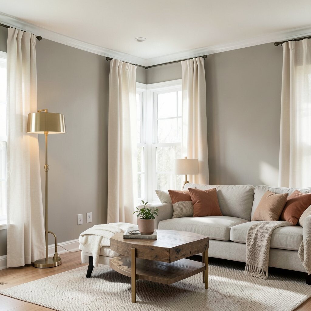
Warm greige sits between beige and gray, so it reads calm but never cold. In daylight, it looks like clean sand mixed with a whisper of stone, which feels welcoming from the moment you walk in.
It helps soften sharp furniture lines and makes wood tones look richer. You can pair it with cream curtains, brushed brass, or muted terracotta accents for a gentle, lived-in feel. If you want a low-effort upgrade, repainting a neutral greige like this is often one of the easiest ways to calm the whole home.
Use it in a living room where you want conversations to feel easy and unhurried. For a practical approach, test samples on two different walls since morning and evening light can shift the color. When you choose finishes, a satin or eggshell sheen keeps the surface wipeable without making the walls too shiny.
2. Soft Dove Gray for Effortless Balance
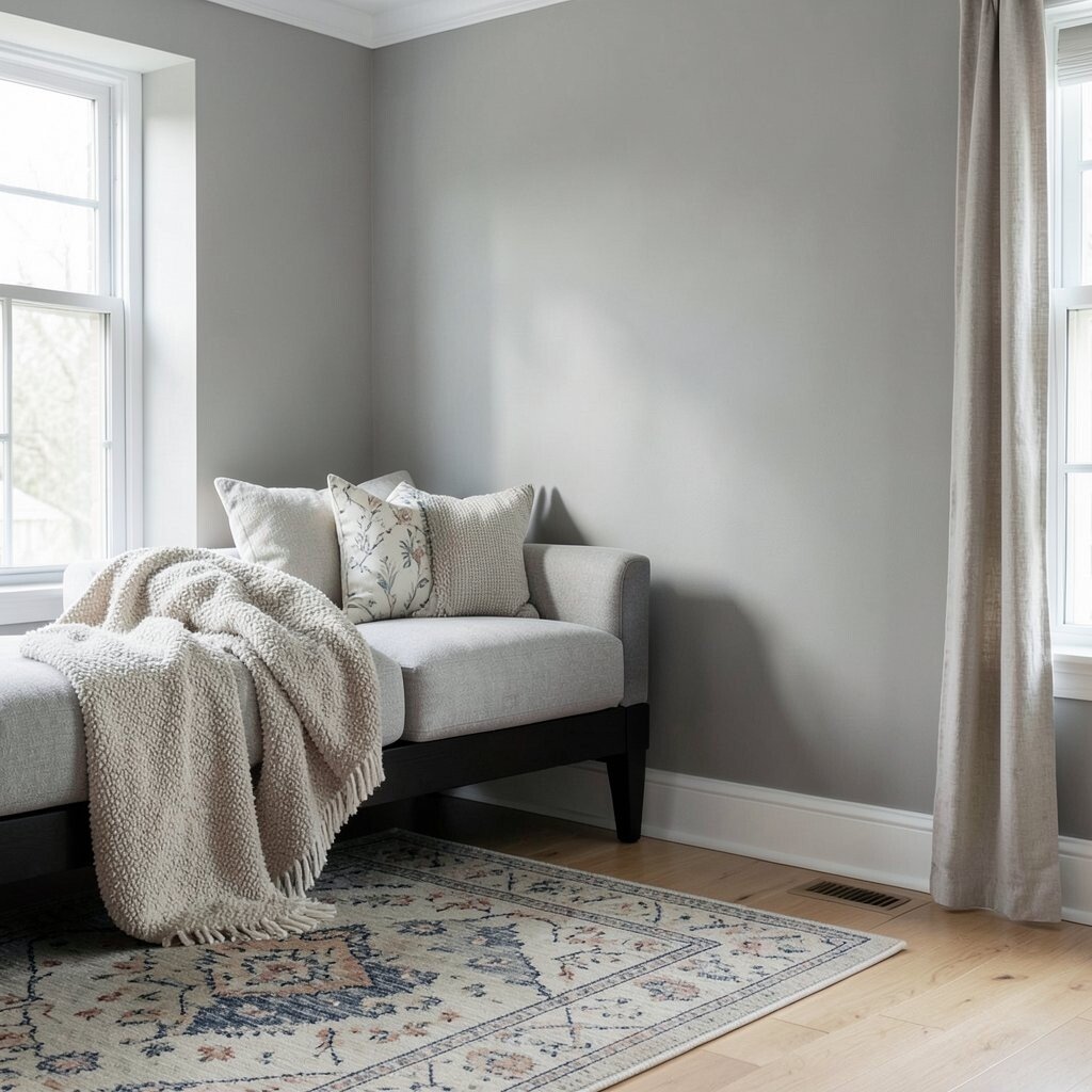
Dove gray is the kind of neutral that makes everything look tidy without feeling strict. It has a gentle, smoky mood that still feels light enough for everyday living.
This color balances bold pillows, patterned rugs, and dark furniture so the room doesn’t feel heavy. You’ll notice it visually “settles” busy areas, especially in spaces where you have lots of decor. A dove gray wall can also make a small room feel more organized, because it absorbs glare rather than reflecting it back.
Try pairing it with crisp white trim and light oak floors for a clean, balanced look. To personalize, add one or two soft texture elements like boucle throws or linen curtains. If you’re cost-conscious, greys often cover well over older paint tones, which may reduce the number of coats you need.
3. Creamy Oyster for a Light, Airy Mood
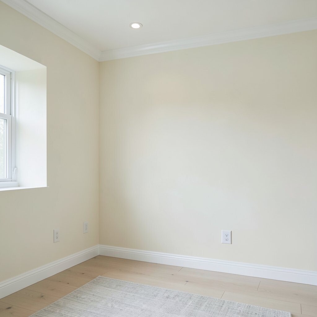
Oyster is a creamy neutral with a hint of warm undertone that keeps walls feeling bright. It reminds me of seafoam tones and smooth shells, so the room looks calm without turning yellow.
It’s ideal when you want softness but still crave a crisp, fresh atmosphere. Because oyster stays close to whites, it works beautifully with modern lighting, pale woods, and subtle gray accents. This shade also makes art look extra clear, since the background doesn’t compete.
Use it in hallways and bedrooms where you want a steady, soothing flow from wall to wall. For practical results, choose a paint that resists scuffs if the area gets heavy foot traffic. If you want a slight upgrade, add a warm white baseboard and ceiling line to make the walls feel taller.
In current trends, people are leaning toward warm “near-white” walls instead of stark white. Oyster fits right in because it gives that airy glow while still hiding minor wall imperfections. If you’re working with a tight budget, near-whites can be forgiving and may require less patching compared to dramatic colors.
4. Classic Taupe for Cozy, Grounded Style
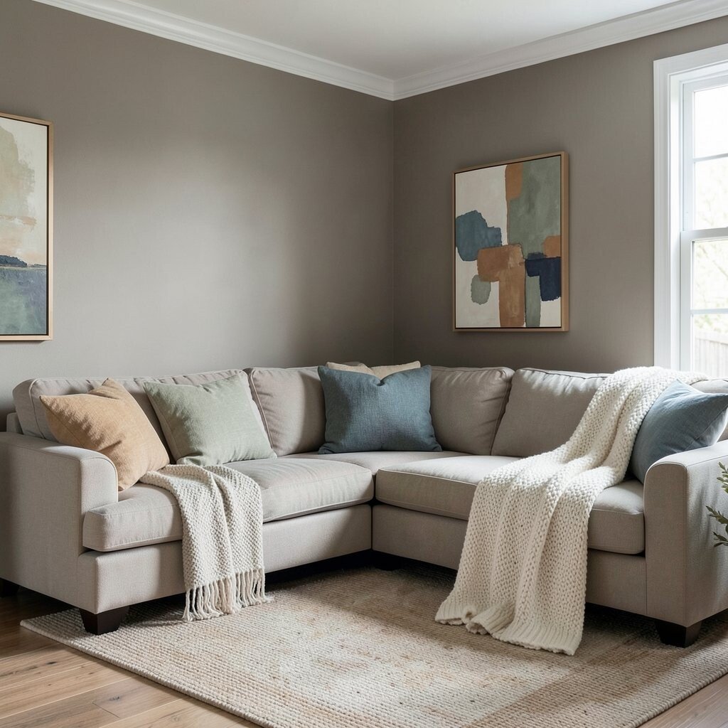
Taupe feels like a warm hug for a room, because it blends brown and gray into something balanced. When the light hits it, you’ll see a gentle depth that keeps blank walls from looking flat.
It’s great for living spaces and dining rooms where you want a grounded, steady vibe. Taupe pairs easily with leather, natural fibers, and earthy art, so you don’t need to shop for special matches. It can also make dark wood furniture feel intentional rather than heavy.
Keep it current by mixing taupe walls with lighter textiles, like oat-colored rugs and cream knit blankets. If you want a personal touch, try accenting with sage green, dusty blue, or caramel touches in decor. For cost considerations, taupe is often a smart choice because it can cover uneven walls with fewer layers when applied well.
5. Cool Sand for a Soft, Modern Neutral
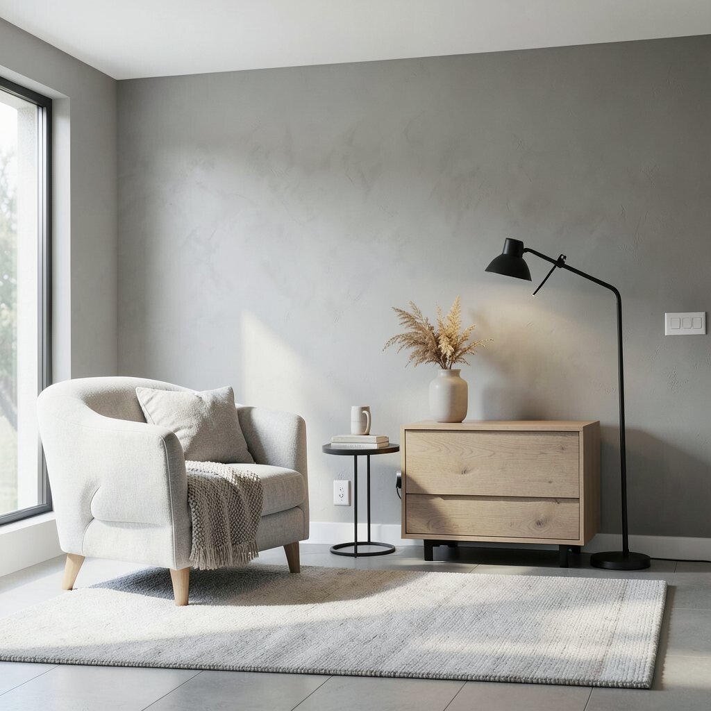
Cool sand is a neutral that sits between beige and gray, but it leans slightly more modern. It looks like sunlit plaster, so the room feels airy while still feeling anchored.
You’ll enjoy how it creates a quiet backdrop for both contemporary and classic furnishings. Cool sand reduces visual contrast, which helps your eyes rest when the space is busy. It’s also a strong option when you want a neutral that won’t feel too warm at night.
For personalization, pair it with charcoal accents or simple black metal lighting to sharpen the look. Try using textured paint or matte finish to hide small imperfections and keep it feeling soft. If you’re worried about cost, neutral sand tones are widely available, so you can often find sales or matching sample kits without extra hassle.
6. Pale Linen for a Gentle, Natural Look
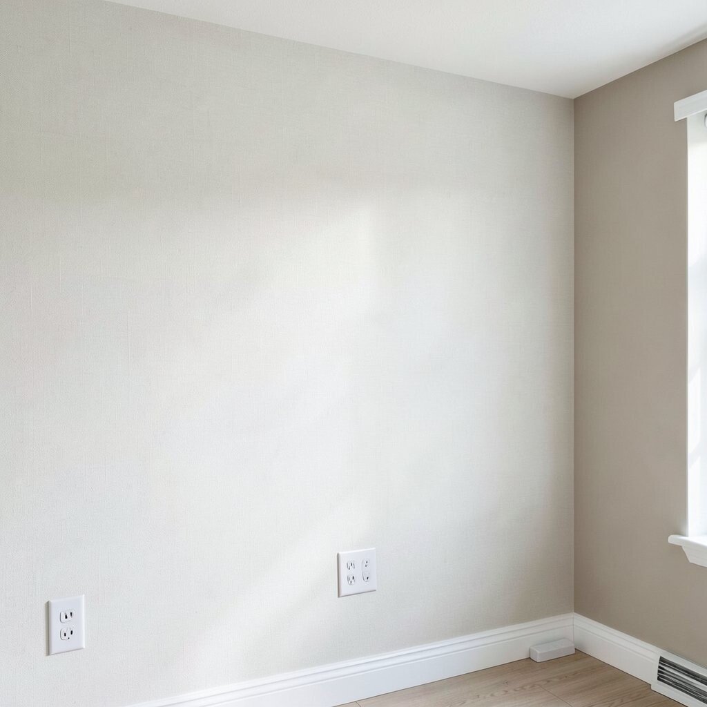
Pale linen is a quiet neutral that feels like fresh fabric drying in a calm room. It carries a faint warmth and a subtle softness that makes spaces feel comfortable right away.
This color is especially good in bedrooms, nurseries, and reading corners where you want a soothing mood. It pairs beautifully with soft whites, light tan, and natural wood tones, creating a gentle harmony. You’ll also find that pale linen makes textiles look rich, since the wall doesn’t steal attention from patterns or textures.
Choose it if you love a natural style but want something more refined than plain beige. For practical tips, consider a washable paint if your walls are near outlets, switch plates, or high-traffic spots. To personalize, add one accent wall with the same tone slightly deeper, using a different sheen to create depth without loud color.
In many homes today, people want “soft natural” spaces that feel calm and lived-in. Pale linen stays on trend because it reads warm and clean while still feeling understated. Budget-wise, lighter colors can reduce the need for heavy primer on many surfaces, especially when the existing paint isn’t dark.
7. Light Greige With a Clean Finish
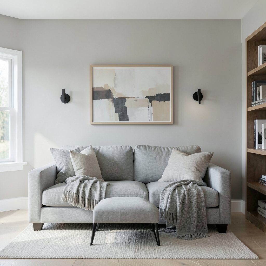
Light greige is the neutral sweet spot when you want calm with a little more sophistication. It’s smooth, bright, and easy to style because it lives close to both beige and gray.
This shade makes rooms feel open and helps keep the focus on furniture and art. It also works well in kitchens and entryways where you need a welcoming, clear backdrop. If your home gets a lot of natural light, light greige can look crisp without becoming icy.
For a practical approach, use a durable, wipeable finish in areas that get touched often. Personalize by adding matte black hardware, soft gray textiles, or warm wood shelving to make the neutral feel intentional. If you’re planning around cost, light greige can be economical since many brands offer it as a standard color and you may find it in ready-to-sample bundles.
8. Soft Charcoal for Quiet Drama
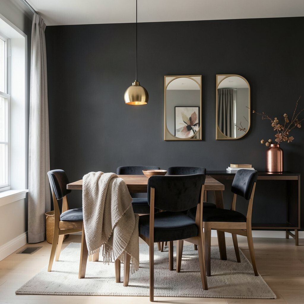
Soft charcoal brings calm drama without the sharpness of deep black. It looks velvety and composed, especially when paired with warm lighting and light floors.
When used on a feature wall or smaller room, it can make the space feel like a cozy retreat. Charcoal helps hide everyday scuffs better than very light paint, which can be a relief in active homes. It also makes artwork and mirrors stand out with a clean contrast.
Try charcoal in a dining room, home office, or powder room where you want a moodier feel. Personalize with warm metals, such as brushed gold or copper, and add layered textiles to keep the look soft. From a cost standpoint, dark colors may require extra coats, so it’s smart to plan your budget for full coverage and proper primer.
9. Milky White With Warm Undertones
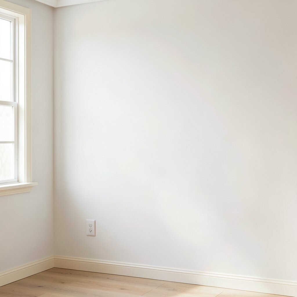
Milky white is not the stark kind that feels cold and clinical. It has a gentle warmth that makes walls feel cozy, even when the room is minimal.
This color is great for creating a calm canvas that lets everything else shine. You can pair it with almost any neutral palette, from light grays to soft taupes, and it still looks consistent. Milky white also brightens spaces where you don’t get much sun, which helps the room feel more open.
Use it throughout your home if you want a consistent, soothing look from room to room. For practical tips, choose a finish that fits the space, like eggshell for living areas and satin for kitchens or halls. To personalize, play with trim color, since warm white walls often look best with creamy trim rather than bright icy whites.
Current trends often favor soft whites with warmth, because people want light without glare. If you’re mindful of cost, milky white usually covers well, but it’s still worth priming patched areas so the wall stays evenly toned. A clean, even wall can reduce repainting later, which saves money over time.
10. Muted Sage for Calm With a Hint of Life
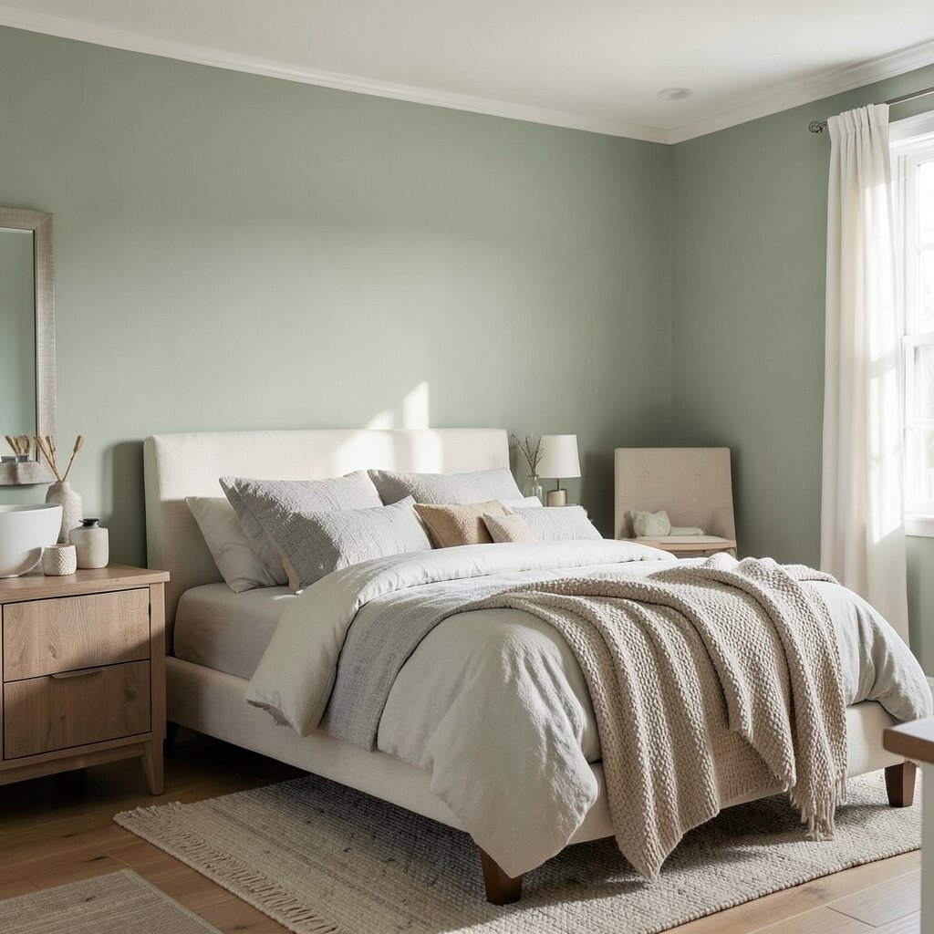
Muted sage is a neutral-leaning green that feels restful instead of energizing. It adds life to a room while staying gentle enough for everyday calm.
This shade works wonderfully in bedrooms and bathrooms, because it brings a spa-like softness. It also pairs nicely with off-whites, warm woods, and natural stone, creating a cohesive, grounded look. You’ll notice that sage walls help the room feel balanced, especially when you use soft lighting and textured fabrics.
For practical personalization, match your decor to the undertone by adding either warm beige accents or cool gray accents. If you want to keep it neutral, choose sage in a lighter tone and rely on furniture colors for the contrast. Cost-wise, green shades can vary in coverage, so testing a sample first can prevent surprises.
11. Soft Putty for a Vintage-Inspired Calm
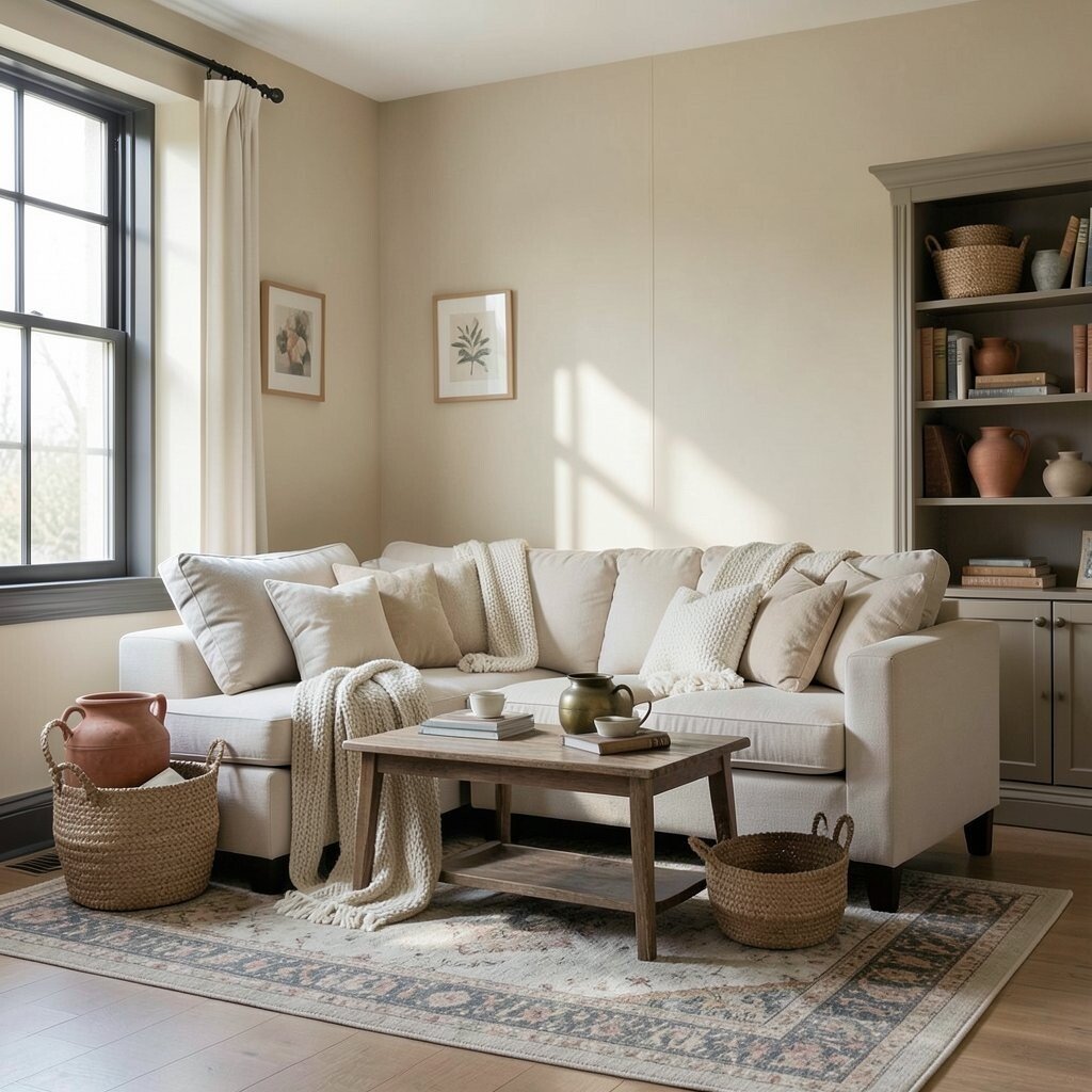
Putty is one of those colors that looks like it has history, even when the walls are brand new. It’s warm, slightly dusty, and it gives a room a relaxed, vintage-inspired calm.
This palette feels welcoming because it’s not too gray and not too beige. Putty pairs beautifully with aged brass, terracotta pottery, and patterned rugs that have muted tones. It also makes layered textures feel intentional, like knit blankets, woven baskets, and soft rugs with low contrast.
Use soft putty in living rooms and libraries where you want warmth and comfort without going too bold. For personalization, consider adding subtle contrast with darker window frames or a slightly deeper neutral in built-ins. If you’re budgeting, putty can be efficient since it hides tiny wall imperfections and may require fewer touch-ups compared to lighter glossy finishes.
In today’s design mood, many people lean toward earthy neutrals that still feel refined. Putty fits that trend because it looks natural and calm while remaining unique. It’s also a great way to bring warmth to homes with cooler flooring or lighting, balancing the overall feel.
12. Silvered Pearl for a Subtle, Serene Glow
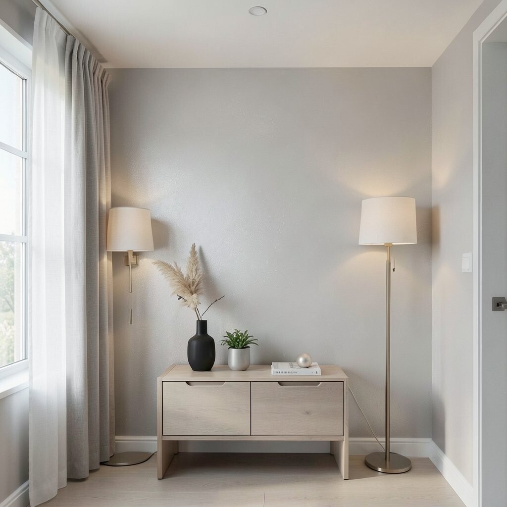
Silvered pearl is a neutral with a delicate sheen and a hint of coolness that feels smooth and serene. It can look like soft moonlight on walls, especially when paired with warm lamps.
This color gives a gentle sense of elegance without turning dramatic. It’s perfect for spaces where you want a quiet glow, like a hallway, bedroom, or entry nook. Pearl tones also work well with sleek furniture and light curtains because the walls stay soft while still offering depth.
For practical tips, choose a finish carefully, since slight shimmer can highlight texture. Personalize by adding calm contrast using charcoal accents, pale wood, or brushed nickel details. From a cost perspective, pearl and specialty tones can cost a bit more, so consider getting samples and confirming how it looks in your exact lighting before committing.
If your home follows current trends toward soft glam and calm sophistication, silvered pearl is a strong fit. It stays neutral, but the effect feels special and intentional. A well-chosen pearl wall can also make your decor feel more cohesive, because the background adds a consistent, serene tone across the room.