Your brand can feel like a warm handshake or a confusing shrug. Small design choices add up fast, and people notice.
Good branding makes your business look confident, memorable, and easy to trust.
1. Pick a Signature Color That Feels Like Your Voice
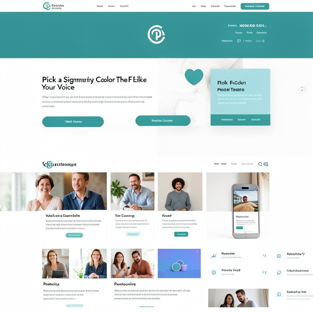
Choose a color that matches your mood and message. When customers see it, they should instantly think of you.
Use that color in your logo accents, website buttons, packaging, and even social icons. Keep the rest of your palette simple so the main color stays powerful. For practical testing, apply the color to your homepage header and your most popular product page, then ask a few people if it feels right.
2. Build a Logo System Instead of a Single Logo
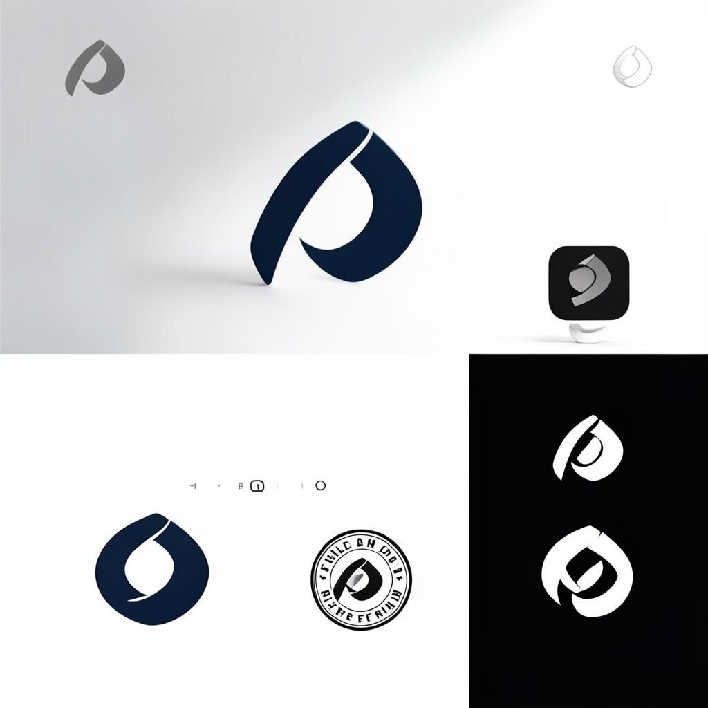
A logo should work in many sizes and places, not just on a letterhead. A flexible system helps you stay sharp on every platform.
Create a primary version for your website and a smaller icon for avatars and favicons. Add a monochrome version for stamps, invoices, and embroidery. This saves money over time because you won’t need separate redesigns whenever a new format shows up.
To personalize it, keep the same core shape but adjust the proportions for light and dark backgrounds. A current trend is using clean geometry and bold negative space, which stays readable even at small sizes.
3. Choose Fonts That Look Good in Real Life

Your typography sets the tone before anyone reads a word. Friendly fonts feel inviting, while strong fonts feel reliable.
Pick a primary font for headings and a simpler one for body text. Make sure it stays clear on mobile screens, especially on your pricing and service pages. Then test it on a real photo background, because the web can surprise you.
For uniqueness, pair a classic font with one modern accent style, like slightly rounded terminals or tighter spacing. You can often find great options through free-to-use font libraries and trial licenses, keeping cost under control.
4. Use a Consistent Layout Grid Across Your Brand
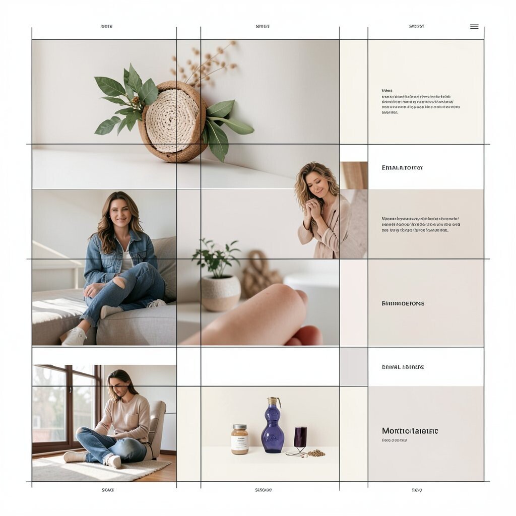
A layout grid helps your design feel organized and calm. Even when you change colors or images, the structure keeps things steady.
Start with a simple system for margins, spacing, and alignment. Use it for your blog posts, product cards, email banners, and presentation slides. This is a practical way to make your brand look polished without hiring a full design team for every new asset.
5. Create a Photo Style People Can Recognize

Decide how your photos should look, not just what they should show. A consistent style makes your feed feel like one story.
Choose a color grade, lighting style, and composition pattern that matches your vibe. For example, bright and airy works well for wellness brands, while moody contrast can fit premium fashion or nightlife. Then set rules for how close shots should be and where people should look in the frame.
Personalize it by adding a recurring element, like a signature background texture or a specific prop. This can be done with simple shot lists and quick edits, so it stays budget-friendly. Many businesses now pair photo consistency with short video clips that match the same tone.
6. Design Branded Packaging That Shows Value at First Touch
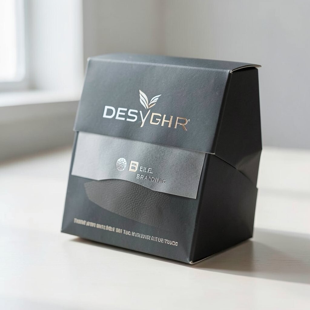
Packaging is often the last thing someone sees before they share you with others. Make it feel thoughtful and sturdy.
Use your signature color and a clear typographic hierarchy so the product name and key info are easy to spot. Add a tactile detail like a matte finish, a textured label, or a spot gloss logo. These upgrades can be cost-effective when you start small with one best-selling item and scale later based on feedback.
7. Give Your Website a “One-Feeling” Visual Theme
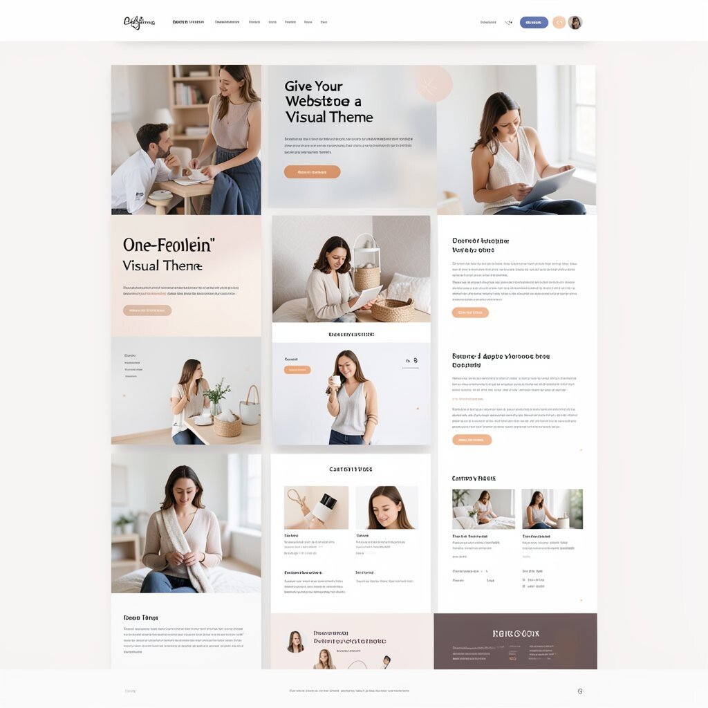
Your website should feel like a single mood, from headline to button. When the visuals match, people trust you faster.
Pick a theme for spacing, card shapes, and button styles, then keep those choices consistent across pages. Use one background pattern style and limit the number of image treatments. If you sell products, make your category pages feel the same as your product pages, which reduces confusion.
For practical tips, create a small style guide for your team and link it to your templates. A trend right now is using soft gradients and subtle shadows, but always keep contrast strong for readability.
8. Turn Your Brand Colors Into a Real System of Shades
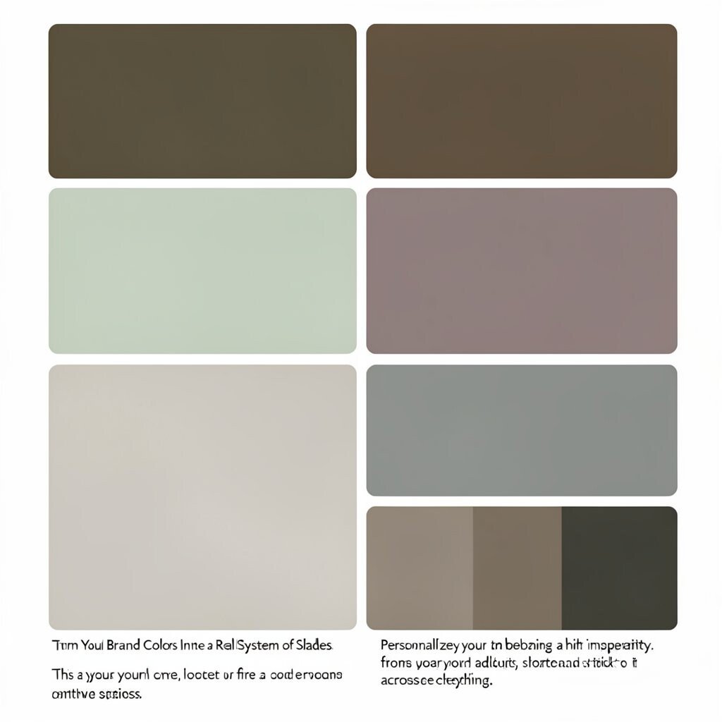
One color is nice, but a set of shades makes your design smarter. It helps you create depth without chaos.
Select a main color, then build lighter and darker versions for backgrounds, borders, and hover states. Use neutral tones for text and surfaces so your design stays clean. This approach helps with accessibility, because you can adjust contrast for better readability on all screens.
Personalize your system by borrowing a hint of inspiration from your ingredients, materials, or city. If your budget is tight, create a small palette using a free color tool and stick to it across everything.
9. Create an Illustration Style That Feels Like Your World
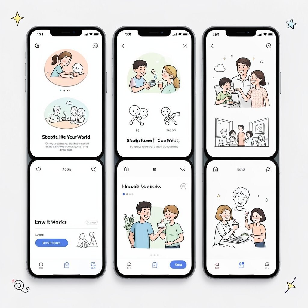
Illustrations can make your brand feel playful and memorable. They also work well when photography is limited.
Choose a style, such as flat icons, line art, or simple character scenes. Keep your line thickness and color usage consistent so every illustration looks like it belongs together. Then use them in your onboarding screens, empty states, and how-it-works sections.
For uniqueness, add recurring mini details like a tiny star, a swirl, or a shape that appears in corners. Many teams now use lightweight vector illustrations because they scale cleanly and stay affordable.
10. Make Icons and UI Elements Match Your Brand
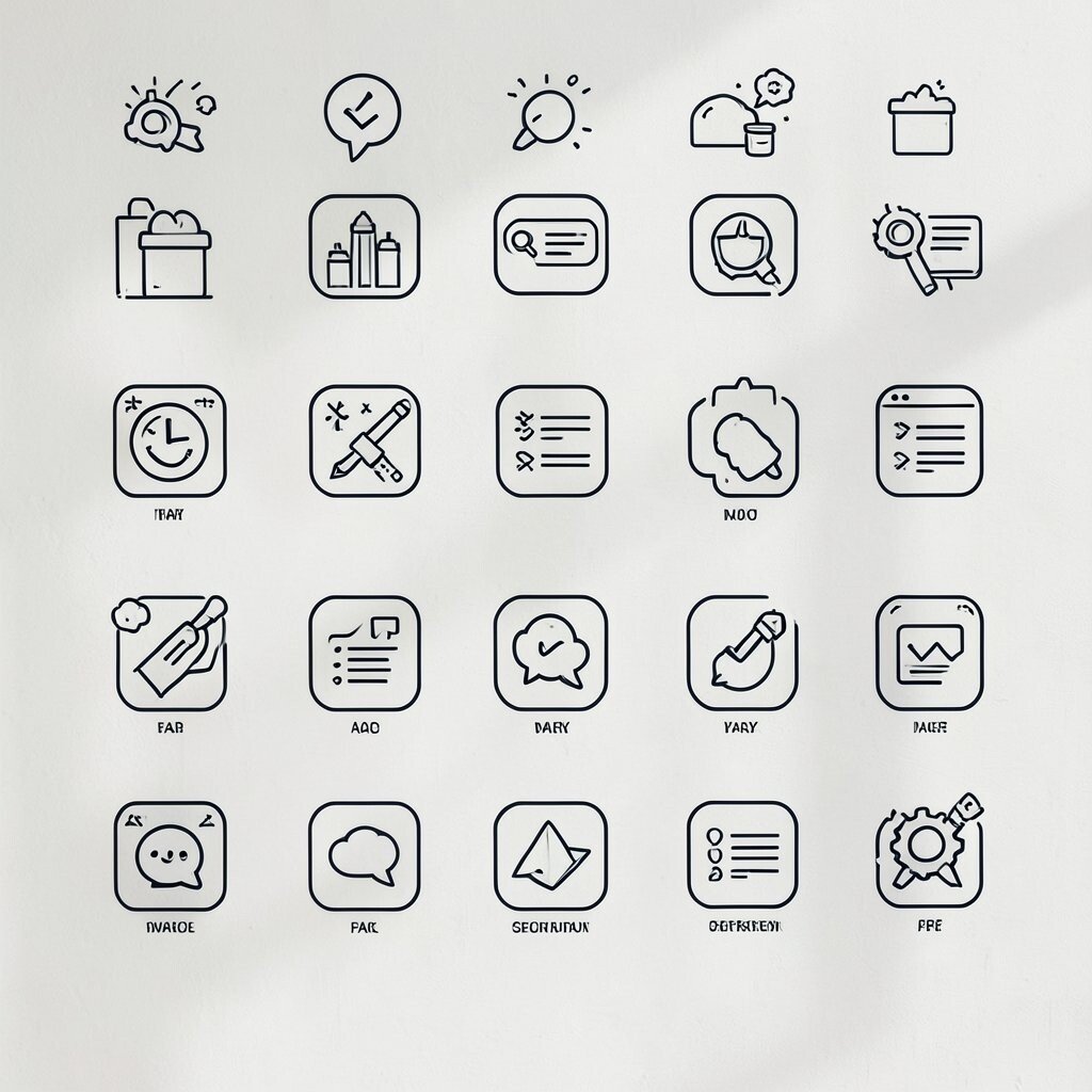
Icons are small, but they shape how your brand feels in the user’s hands. Matching them to your style makes everything feel intentional.
Create a set of icons with the same stroke style, rounded corners, or line weights. Use them for features, FAQs, and navigation. This reduces design time because you won’t scramble to find random icons each launch.
11. Use Brand Shapes for Headers, Dividers, and Badges
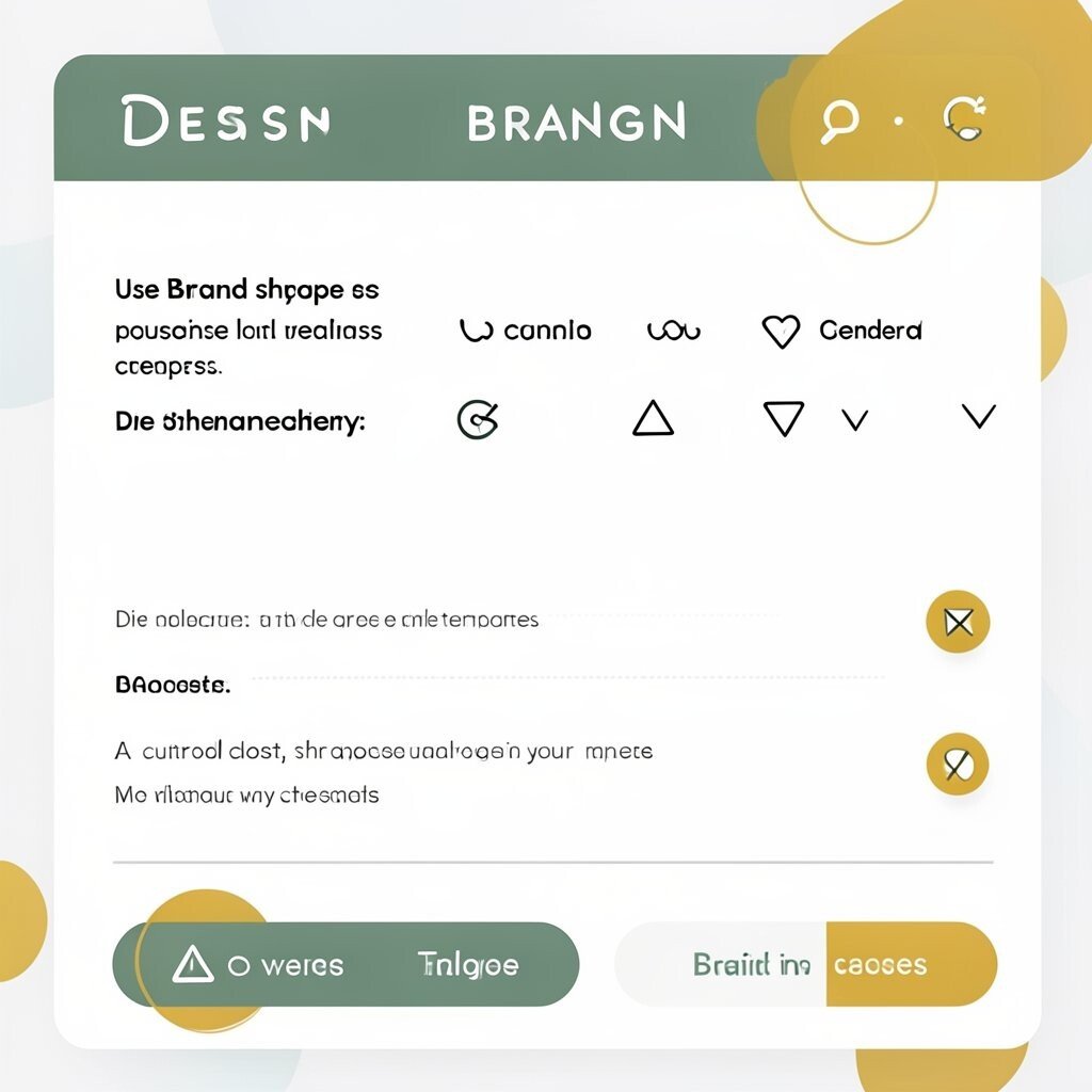
Shapes add personality without changing your whole design. A consistent shape system can make even simple pages look branded.
Try triangles, circles, squiggles, or rounded rectangles as accents. Place them as dividers, background blobs, or badges on offers. This is a practical way to create uniqueness while keeping your layout clean and easy to read.
To control cost, start with three shapes and reuse them in your templates. A current trend is using bold, simple shapes with generous spacing, which looks modern and friendly.
12. Write a Tone-Forward Brand Experience With Microcopy
Microcopy is the short text that guides people, like button labels and form hints. When it sounds like you, it feels stylish and human.
Use consistent wording for actions, confirmations, and error messages. Keep it short, clear, and aligned with your personality. This helps practical conversion because people understand what to do next without guessing.
Personalize it by making your brand voice show up in tiny places, like how you greet customers in emails. Many brands now pair strong visuals with warm, simple language for a smoother experience.
13. Design a Brand Pattern for Backgrounds and Highlights

A pattern can make your brand feel richer even when your content is simple. It also gives you a consistent look for social posts and landing pages.
Create a pattern using your shapes, letters, or tiny icons, then keep it repeatable. Use it lightly as a background behind text or as a header accent. If you worry about cost, you can often create patterns using basic vector tools and reuse them across multiple designs.
14. Style Your Social Media Templates Like a Mini Magazine
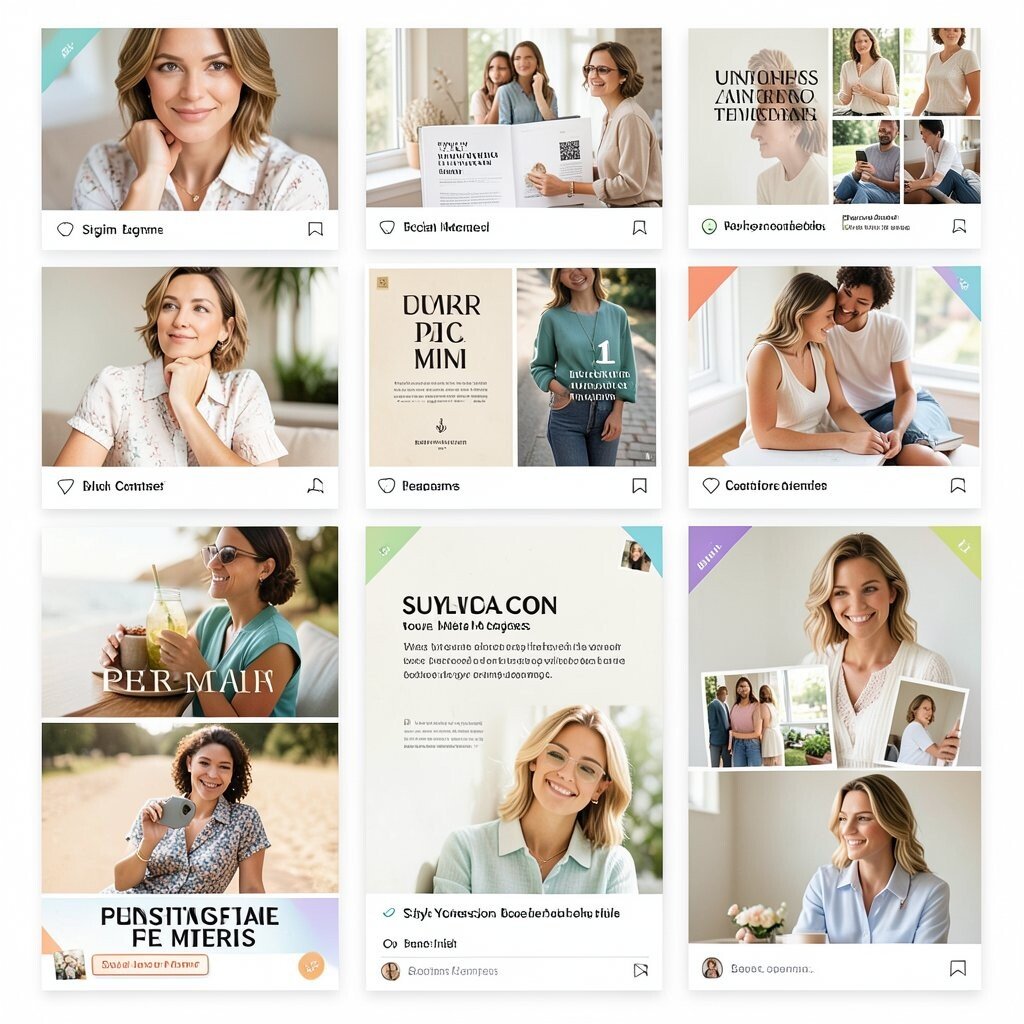
Your social posts work like covers and spreads. A template system helps you post faster and look more professional.
Pick a consistent grid, font pairing, and image crop rules for posts and stories. Add your brand color as a small underline, sticker, or corner accent. When you plan content in batches, you save time and money while keeping quality high.
Uniqueness can come from a “signature frame” that appears in every graphic. A current trend is using carousel layouts with consistent icon bullets and clean spacing for better scanning.
15. Create a Captivating Brand Tagline and Use It Everywhere

A tagline acts like a shortcut to what you stand for. When it’s used consistently, people remember you more easily.
Choose words that match your tone and avoid jargon. Place it on your website banner, social bio, pitch deck cover, and packaging. This keeps your message unified even when your visuals change.
16. Standardize Your Brand Imagery With Crop and Framing Rules

Even great photos can look off if they’re cropped differently. Framing rules create a neat, stylish look across your library.
Decide how wide images should be, whether you favor close-ups, and what kind of horizon placement you like. Apply those rules to your website hero images, product shots, and thumbnails. This is practical because your team can follow the same steps, and you reduce back-and-forth.
To personalize, borrow framing inspiration from your industry, like classic studio portraits or candid street shots. Many brands now use consistent lens effects, such as slight grain or soft vignettes, to tie images together.
17. Use Motion Like a Brand Signature in Small Places
Motion can make your brand feel alive, even in tiny doses. Simple animations can guide attention without being distracting.
Add subtle effects, like a button hover shift, a logo fade, or a smooth reveal on scroll. Keep motion fast and clean so it doesn’t slow the page or annoy users. This trend is popular because it adds polish, but it can still be budget-friendly when you use existing animation settings in your website platform.
18. Upgrade Your Email Branding With a Strong Visual Header
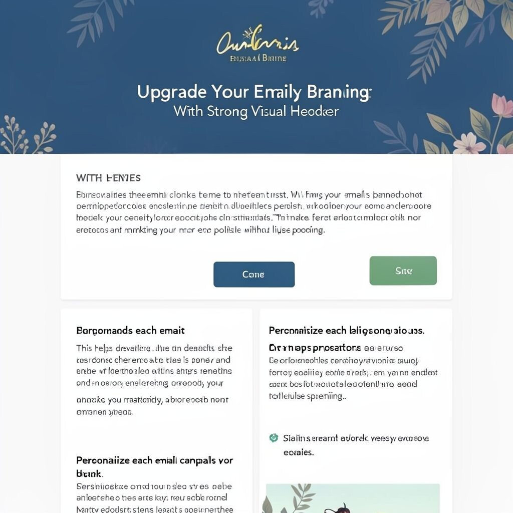
Email is where design can quietly build trust. When your emails look consistent, people feel confident opening and clicking.
Use a branded header with your logo, signature color, and a simple headline style. Keep your body text typography consistent and your buttons the same shape every time. This helps deliverability and readability, and it makes your marketing look more polished without huge spending.
Personalize each email campaign with small variations, like a themed background pattern or an icon set for seasonal promotions. Many businesses now use short, clear blocks and plenty of whitespace, which looks stylish and keeps the message easy to scan.
19. Align Every Brand Asset With a Simple Style Guide
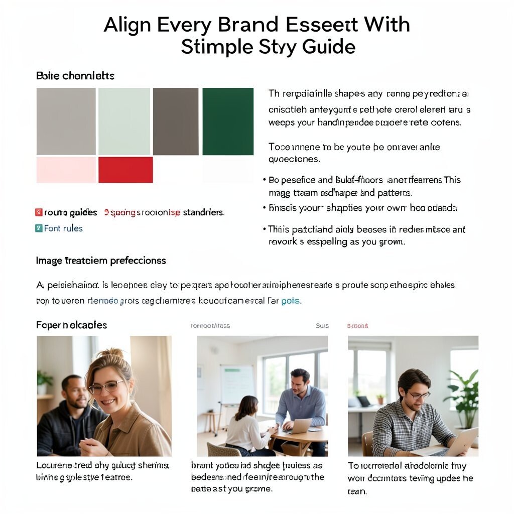
A style guide is what turns good ideas into repeatable results. It keeps your branding consistent even when multiple people create content.
Write down your color palette, font rules, spacing standards, and image treatment preferences. Include guidance on logo placement and how to use your shapes and patterns. This is practical and budget-friendly because it reduces mistakes and rework, especially as you grow.
To personalize, add examples from your own photos and past posts, so your team has real references. A current trend is sharing lightweight style guides as living documents that teams update as they learn.
20. Invest in One High-Impact Design Asset First
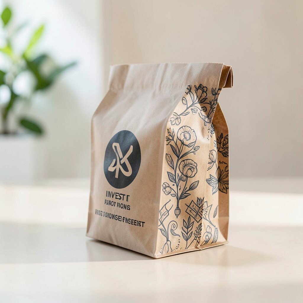
When budgets are tight, start with the asset that people see most often. One strong upgrade can raise the feel of your whole business.
Many brands begin with a website refresh, a logo system, or a signature packaging look for a top product line. Pick the item that appears in your ads, your social posts, and your customer conversations. Then make it match your style across everything else.
For uniqueness, choose something that fits your business story, like a custom illustration series or a distinctive pattern for your checkout pages. This approach keeps costs under control while still giving you noticeable momentum, and it helps you build confidence before scaling.