
Good design feels effortless, but the path there is full of small traps. When you spot the traps early, you save time, money, and stress.
1. Overstuffing Every Space

When a layout tries to fit everything at once, it starts to look noisy. You might see text blocks crowding each other, buttons floating without breathing room, and images fighting for attention.
Less clutter makes it easier for people to scan and understand fast. Start by choosing one main job for the page, then give that job the clearest space. Try grouping related things together and removing extra elements you never really use.
2. Ignoring the Reader’s Eye Path
Many designs force eyes to wander with no clear direction. You might notice the hero image, headline, and product features all compete equally, so nothing feels like it comes first.
Use a simple reading flow by placing the most important content where eyes naturally land. Put the headline near the top, support it with one short explanation, and then arrange details in a logical order. This helps people move from curiosity to understanding without getting stuck.
For personalization, swap the order of content based on audience needs, like putting pricing higher for shoppers and benefits higher for beginners. If you work with current trends, consider calmer layouts that emphasize whitespace and clear hierarchy over dense dashboards. Cost stays reasonable because you usually fix structure with content moves rather than new tools.
3. Choosing Style Before Solving the Problem

Some teams pick a bold look first and only later ask what the design should actually do. You might see a flashy color scheme that feels exciting, yet the page still confuses people about next steps.
Work from the real goal, like signing up, learning a feature, or booking an appointment. Once the goal is clear, style becomes easier because you know what to highlight. Create a quick sketch showing where the key message and action should live, then build outward from that plan.
To keep it unique, borrow style cues from the brand’s story or real-world materials you already have, like the texture of packaging or the color of a product photo. When you do this, the design feels personal instead of random. A practical way to manage cost is to reuse existing brand assets and focus on layout, not brand-new visuals.
4. Making Everything the Same Size

If every element looks identical, the design loses its “main character.” You may notice that headings, labels, and body text all share similar weight, so readers don’t know where to pause.
Use size and weight to signal importance and help scanning. Make your headline larger than supporting text, and use consistent spacing so groups feel tied together. This gives people confidence because the interface feels organized, not accidental.
5. Using Low-Contrast Colors

Low contrast can make text feel hard to read, even when the design looks stylish. You might see light gray letters on a white background, or bright colors stacked on top of darker ones without enough separation.
Higher contrast improves clarity and makes the design feel sharper. Choose a color pair with strong difference, then test it on real screens in daylight. You can keep a modern feel by using muted backgrounds while making the key text and buttons clearly bold.
If you want personalization, swap color themes based on brand personality, like a calm palette for wellness and a vibrant one for entertainment. Current trends often include accessible typography that looks clean and professional. Cost is usually minimal since contrast fixes can be done by adjusting styles and checking accessibility tools.
6. Designing for Yourself Instead of Users

When you design based on your own habits, the interface may surprise everyone else. You might prefer shortcuts and extra features, but a new visitor needs simple guidance.
Picture a first-time user walking through the page like it’s a new room. Ask what they would look for first, what might confuse them, and what they would expect to happen when they click. This mindset improves usability and keeps your design focused on real human needs.
For uniqueness, you can still bring your personality by choosing tone and visuals that match your brand, but keep the path simple. Personalize by offering different entry points, like different feature summaries for different audiences. Testing with a small group is often cheap and delivers high value quickly.
7. Overcomplicating the Navigation
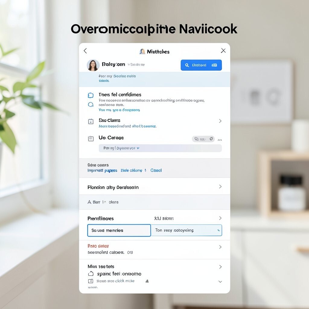
Complex menus can make even a good product feel hard to reach. You may see deep dropdowns, too many categories, and labels that sound clever but unclear.
Keep navigation short and predictable so people can find things without guessing. Use clear names, limit the number of primary links, and make sure important pages stay reachable. When users feel confident, they spend more time and click more often.
8. Making Buttons That Don’t Look Clickable
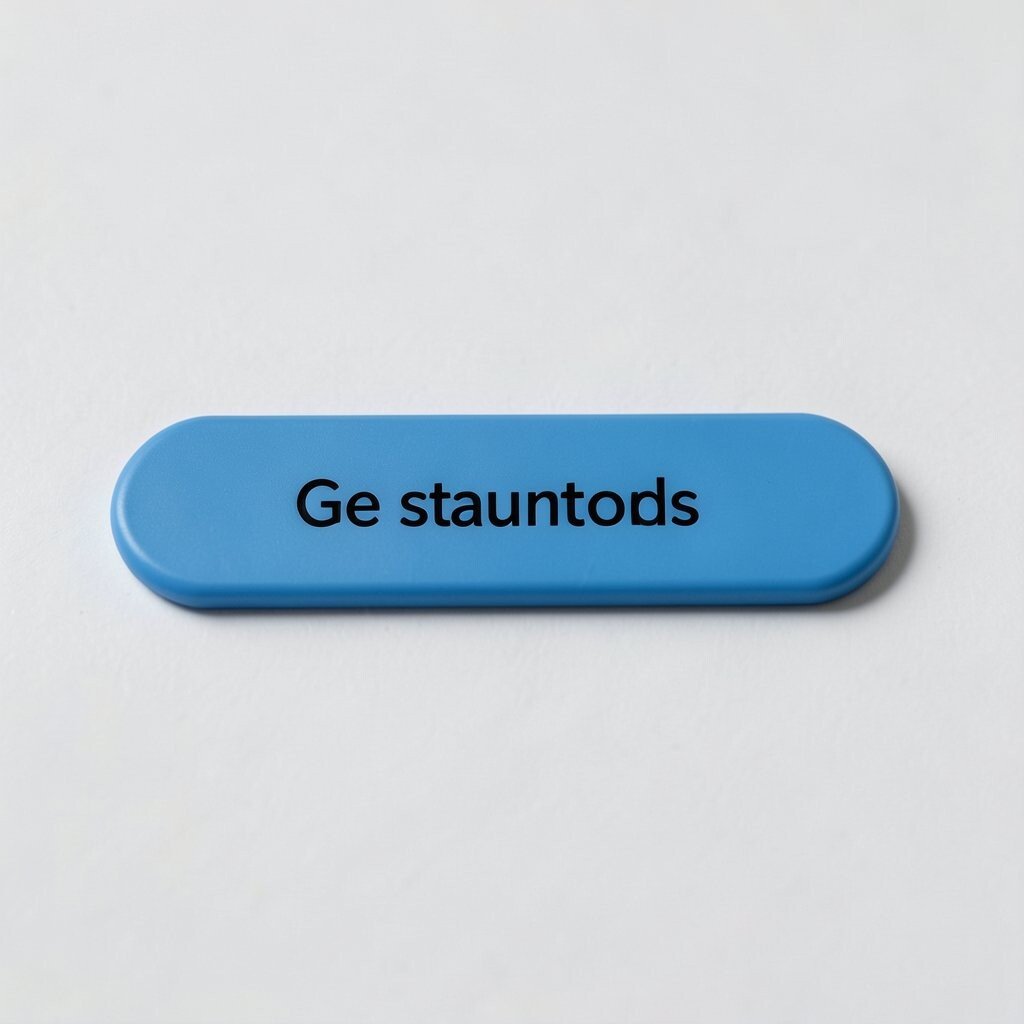
A button should feel like a button, not like plain text. You might notice a call-to-action that looks like a paragraph link, or one with no color change on hover, so users hesitate.
Clear button styling improves action rates and reduces frustration. Use strong contrast, consistent shape, and a readable label that matches the action people expect. Try a simple pattern like a solid filled button for primary actions and an outlined one for secondary options.
To personalize, tailor the button language to your audience, such as “Get started” for beginners and “View plans” for shoppers who compare. Current trends often use friendly microcopy and subtle hover effects that confirm interaction. Cost remains low since these fixes are mostly design tweaks, not major redesign work.
9. Forgetting Mobile and Small Screens

Many layouts look perfect on a desktop monitor, then fall apart on phones. You might see tiny text, cramped buttons, images that crop awkwardly, and sections that stack in confusing ways.
Design for mobile first to keep content readable and actions easy. Use flexible spacing, larger tap targets, and layouts that stack in a sensible order. When your design works on small screens, it usually improves on large ones too.
For personalization, consider different content density by audience, like compact cards for busy users and more detailed blocks for learners. Trends today favor card-based interfaces and smooth scrolling experiences. Mobile fixes can be cost-effective because you can often adjust CSS and templates instead of rebuilding assets.
10. Using Too Many Fonts or Styles

When you mix too many typefaces, the page can look like multiple brands tried to share one stage. You might spot headlines in one font, body text in another, and random weights that feel inconsistent.
Choose a small font set and stick to it for a clean, confident look. Use type size, weight, and spacing to create hierarchy instead of switching fonts constantly. This boosts readability and makes the design feel more unified.
11. Relying on Visuals Without Context

Images alone can’t guide people, especially when the photo doesn’t match the message. You might notice a gallery of pictures with no clear explanation, so visitors don’t know what they should feel or do next.
Pair visuals with short captions or supporting text that explains what matters. This helps users connect the picture to a benefit, like comfort, reliability, or speed. Clear context also makes your design feel more trustworthy and less like decoration.
To keep it unique, use custom images when possible, such as photos taken in your real space or mockups that match your product. Personalize by choosing images that reflect the people your audience wants to see, like diverse models or relevant settings. Cost considerations vary, but you can often start with existing assets and improve over time through focused shoots.
12. Hiding Important Information

Important details get missed when they are tucked away too far. You might see pricing, shipping, or key requirements buried under multiple clicks or placed in hard-to-find areas.
Make critical info visible so people can make decisions with confidence. Put essential details near the call-to-action and keep them easy to scan. This reduces support questions and builds trust.
13. Ignoring Consistency in Spacing and Layout
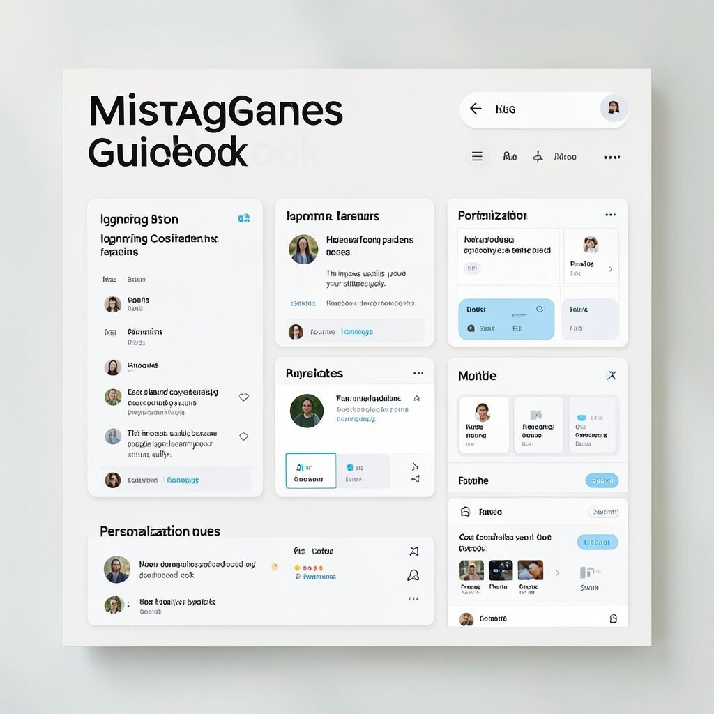
Inconsistent spacing makes an interface feel unfinished, even if the colors look great. You might notice uneven gaps between sections, elements that don’t align, and sections that jump in rhythm.
Use a spacing system so your design feels calm and repeatable. Keep alignment consistent, repeat common margins, and use the same layout patterns across similar sections. This improves usability because people learn your structure quickly.
For personalization, you can vary layout patterns by purpose while keeping the same spacing rules, like using a different card style for a featured item. Current trends often use grid-based design and modular components for that polished look. Cost considerations are practical here since a spacing system speeds up future updates and reduces design rework.
14. Skipping Feedback and Testing

Design mistakes multiply when you ship without checking how people react. You might hear vague complaints later, like “it feels confusing,” but the cause stays unclear.
Get feedback early by testing with real users, even with a small group. Watch what they do, not just what they say, and fix the moments where people hesitate. This creates better ideas while keeping the risk lower.
For personalization, tailor the test to your audience segments so you learn differences between first-timers and returning users. Trends in product teams highlight rapid iteration and short feedback loops, which help teams stay on track. Cost considerations are manageable because many tests use quick prototypes and simple usability checks before full build work.