
Your walls can look calm and stylish without feeling plain. Texture knockdown brings depth that feels inviting from every angle.
Once you see the pattern in real light, it becomes hard to ignore. It adds character, hides flaws, and gives you plenty of ways to make a room feel like yours.
1. Classic Knockdown Plaster for Warm, Everyday Rooms

Imagine stepping into a room where the wall looks like soft stucco under gentle daylight. The surface holds tiny peaks and flattened swirls that catch light without shouting.
This kind of texture is loved because it is forgiving and visual. It helps hide hairline imperfections and minor wall patches so you get a more even look.
To get a clean classic feel, keep your mix consistent and work in steady sections. Use a wide trowel to spread the compound smoothly, then tap or drag lightly for the signature knockdown.
2. Modern Knockdown with a Low-Profile, Silky Finish
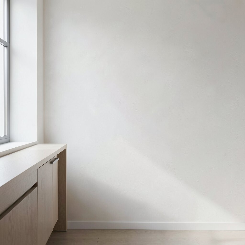
You can make knockdown look modern by keeping the pattern shallow and neat. When the peaks are subtle, the wall reads as smooth at a glance and textured up close.
This approach feels fresh in kitchens, hallways, and offices. It also pairs well with minimal trim and simple furniture because the texture stays quiet.
Try aiming for a lighter “touch” when you knock down, using only gentle pressure. If you want extra polish, sand lightly after it dries and prime before paint.
3. Knockdown in Bold Colors That Still Feel Cozy

Color makes texture feel like art. A rich paint shade turns the knockdown ridges into small highlights that move as you walk by.
Deep greens, warm greiges, and dusty blues look especially good because they play nicely with the irregular surface. The result is dramatic but not harsh, since the wall has natural softness.
Pick a finish that supports your mood, such as satin for durability and easy cleaning. Test your color on a small section first, because textured walls can look slightly deeper after the paint fully cures.
Personalize it by choosing one accent wall in your favorite shade while keeping the rest lighter. This gives you a stylish focal point without making the whole space feel intense.
4. Elegant Knockdown for Living Rooms with Statement Lighting
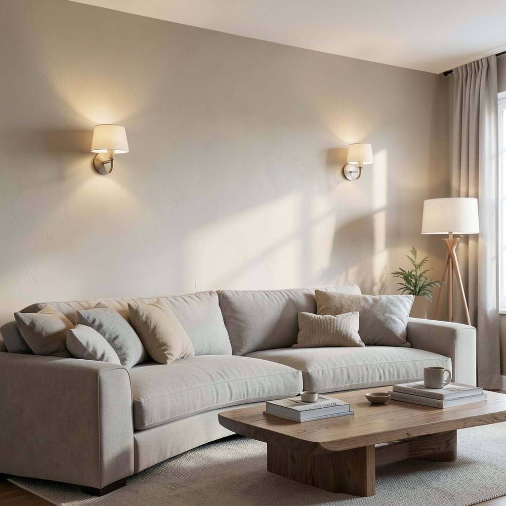
When living rooms have strong lighting, knockdown texture becomes even more beautiful. Your wall turns into a soft canvas that reflects warm highlights instead of flat shadows.
This look is unique because it works with many design styles, from traditional to modern. It can also hide small dings and uneven patches that show up under bright lamps.
Position wall sconces or floor lamps so the light grazes the surface. That angled light will bring out the pattern and make the room feel more layered.
Consider using a light base coat under your final paint color for consistent depth. If you love a high-end look, ask your painter about a primer tinted close to your topcoat.
5. Small Space Magic: Knockdown Texture for Entryways

Entryways often get lots of attention, yet they have limited space to fix flaws. Knockdown texture is a practical way to make walls look finished even if they’re not perfect.
The pattern adds depth that makes narrow hall areas feel longer. It also brings visual warmth right when you step inside.
For practical control, use painter’s tape to mark edges and keep outlets clean. Work with thinner compound layers if your entryway has tight corners, and smooth carefully before knocking down.
Personalize with a paint color that matches your front door or seasonal decor. A subtle warm neutral can make the whole space feel welcoming year-round.
6. Linen-Like Knockdown Texture for Bedrooms and Calm Spaces

Think of fabric textures, not rough walls. A fine knockdown can create a linen-like surface that feels soothing and cozy in a bedroom.
This style is beneficial for relaxing rooms because it softens the look of large flat walls. It also reduces the way shadows define imperfections.
To keep it gentle, use a fine sand finish on the dry compound and avoid heavy ridges. Apply paint with steady strokes so the color settles evenly across the texture.
Try pairing the look with warm lighting and soft fabrics like curtains and throws. The texture will support that calm vibe instead of competing with your decor.
If you want easy maintenance, choose a paint rated for scrubbing, especially if the wall is near a headboard.
7. Knockdown over New Drywall for a Smooth, Starter-Friendly Upgrade
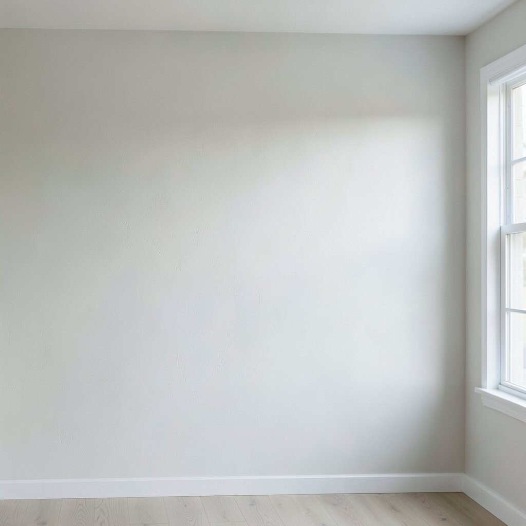
If you’re starting from fresh drywall, knockdown can help you get a stylish wall without endless skim coats. The texture naturally disguises tiny uneven spots that show up during painting.
This method is unique because it turns preparation work into a more forgiving finish. It also helps you achieve a consistent look across different drywall sheets.
Use a bonding primer first, then apply the compound evenly. Let it cure fully before you knock down, and follow the timing your product suggests.
For personalization, decide how visible you want the pattern to be and match it to your room size. In a smaller room, a gentler knockdown often looks more polished.
8. Heritage-Inspired Knockdown for a Classic, Architectural Feel
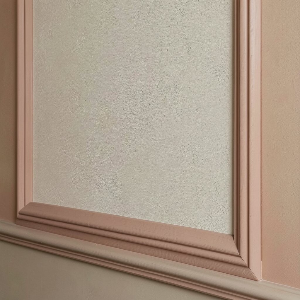
Heritage style homes often lean into walls that look like they belong in an old building. Knockdown texture can mimic that heritage depth while still feeling clean and updated.
This texture benefits you when you want character without complicated molding. It also creates a sense of craftsmanship, especially when paired with traditional colors.
Choose warmer paints like oatmeal, sand, or muted terracotta for a grounded look. Use a slightly larger knockdown pattern so the wall has visual rhythm.
To make it feel architectural, keep trim crisp and consistent, then highlight the edges with careful paint lines. The contrast between smooth trim and textured wall looks elegant every time.
9. Tropical Knockdown Texture That Feels Light and Breezy

Tropical rooms benefit from texture that looks sun-kissed rather than heavy. A knockdown wall can feel airy when you pair it with bright whites, sandy beiges, and soft pastel accents.
This design is unique because the irregular surface acts like a wave of light. As the sun moves, the wall’s highlights shift gently.
Try a color palette of warm white plus one lively accent like coral or leafy green on trim or an accent wall. Keep the texture on the finer side so it feels light instead of chunky.
Practical tip for a breezy finish is to use a breathable primer if you live in a humid climate. Also keep ventilation strong while paint cures to prevent uneven sheen.
10. Knockdown Accent Wall Ideas for Big Impact on a Budget
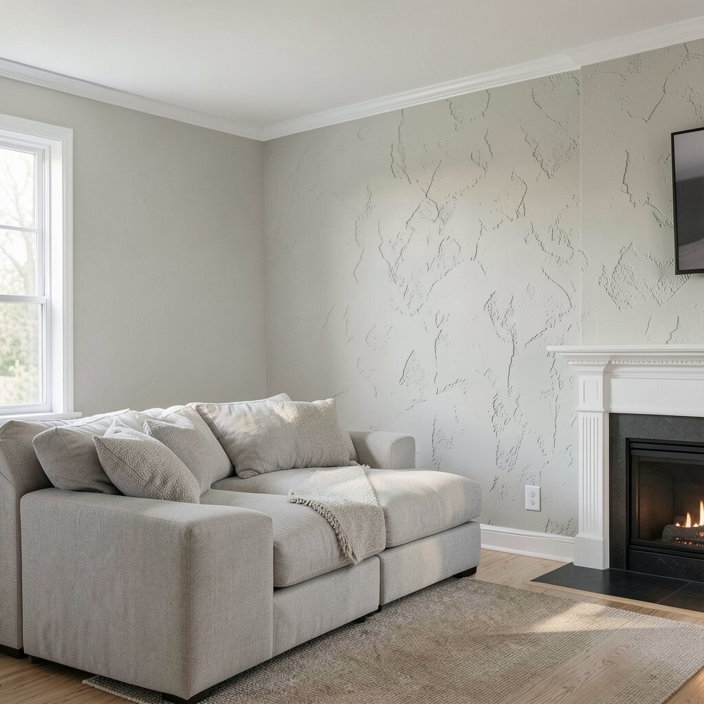
You can get a high-end look without redoing every wall. One textured accent wall can become the hero, giving the room depth where it matters most.
This approach is beneficial because you spend less time and material. It’s also unique since the rest of the room can stay smooth, letting the texture steal the spotlight.
Pick a focal point like behind a sofa, the headboard wall, or the wall near a fireplace. Before starting, measure and plan so the edges line up with your layout and furniture.
Cost considerations matter here, so choose durable paint finishes and avoid expensive specialty primers unless required. You can often save money by concentrating your texture work on the single best wall.
11. Industrial Knockdown for Loft-Style Spaces

Industrial design loves strong mood, and knockdown can deliver it without looking harsh. When you paint it in cool grays or charcoal tones, the texture turns into a gritty, stylish backdrop.
The benefit is that it adds depth even when your decor is simple. It also hides wall wear and subtle surface flaws that can show up in older spaces.
To keep it controlled, use a tighter pattern and avoid large, dramatic ridges. Matte or eggshell paint helps keep the wall from looking too shiny in dim loft lighting.
Personalize this style with metal lighting, black frames, or wood shelves that contrast with the textured surface. The texture will make everything look more intentional.
12. Soft Geometric Knockdown with Controlled Tooling
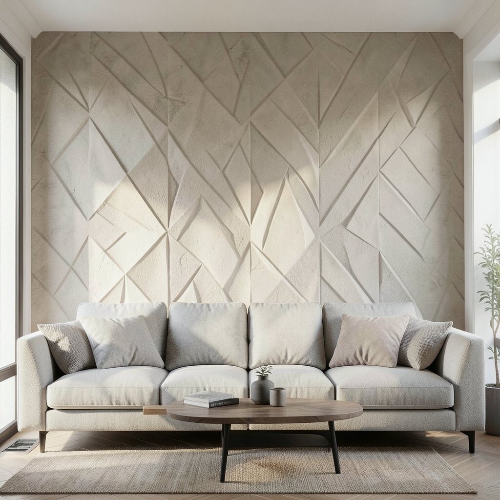
Texture doesn’t have to be random. With careful tooling, you can shape the pattern into gentle directionality that feels almost geometric.
This is beneficial because it gives your wall a planned look while still staying warm and imperfect. It also keeps the texture from feeling chaotic when paired with modern furniture.
Work in long passes in one direction, then knock down with consistent light pressure. Step back often to check the pattern and keep it balanced across the wall.
For personalization, match the direction of the pattern to your room layout. Vertical drift can make a wall feel taller, while horizontal drift can make a space feel calmer.
13. Color-Blocked Knockdown Effects for Fun, Creative Rooms
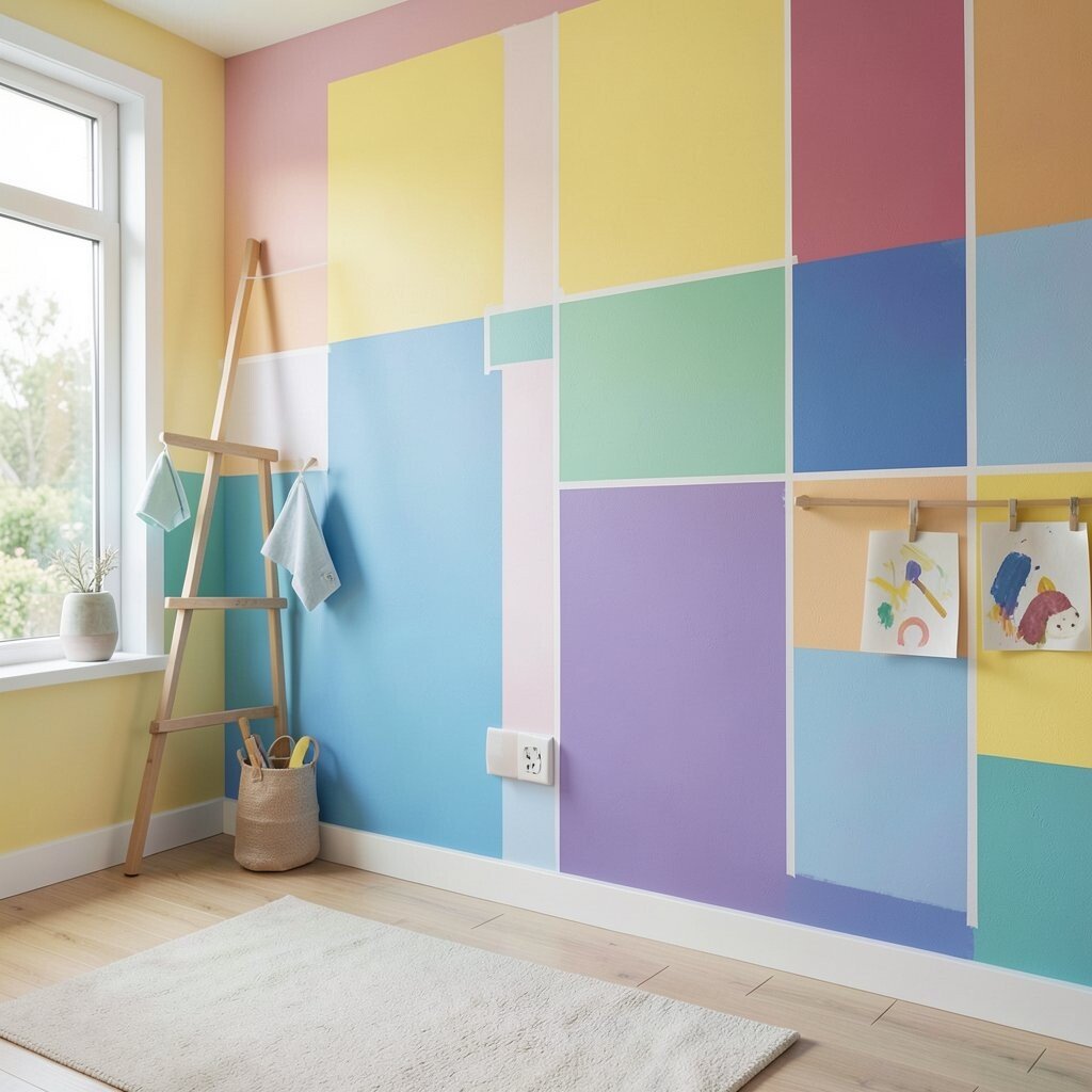
If you love playful design, knockdown can fit right into a color-blocked plan. Even with bold blocks, the texture adds softness so the look feels artistic instead of strict.
This is unique because texture can blend the edges visually while still keeping strong color separation. It also gives children’s rooms, studios, and creative spaces a lively feel.
Use painter’s tape to create clean boundaries and remove it at the right time for crisp lines. Plan your color layout before you start so the blocks match your wall proportions.
Cost considerations are simple here since you’re buying less paint when you limit the number of colors. You can also use leftover paint for smaller accent areas if you test first.
14. Knockdown Texture Near Bathrooms for Spa-Like Style

Bathrooms look more spa-like when walls feel calm and visually interesting. Knockdown texture can add that relaxed depth, especially when paired with light, soothing colors.
This style benefits you because it softens the look of large wet-room surfaces. It also helps mask minor imperfections around areas that see daily use.
Practical tip is to choose moisture-resistant primer and paint made for damp spaces. Ensure proper ventilation during curing, and treat the area around fixtures with extra care.
For personalization, pick soft whites with warm undertones or gentle stone colors. Those shades make the texture feel like it belongs in a luxury retreat.
15. Knockdown Texture with Earthy Plasters for Natural Homes

Earthy plaster tones make walls feel grounded and welcoming. Knockdown texture strengthens that natural look by adding depth similar to minerals and clay.
This approach is beneficial because it stays timeless while still feeling warm. It also pairs well with wood, linen, and natural stone decor.
Choose colors like clay, olive, driftwood, or warm charcoal depending on your room mood. Keep the topcoat consistent so the undertones don’t shift across the surface.
To personalize, add subtle contrast by using a slightly different shade for an accent ledge or corner detail. The texture will make those small design choices look richer.
16. Modern Farmhouse Knockdown with White Walls and Soft Contrast

Modern farmhouse style is all about comfort with a clean edge. Knockdown texture looks perfect with soft whites because it adds depth without changing the room’s brightness too much.
The benefit is that white knockdown hides light-catching flaws better than you might think. It also helps walls look freshly finished even when the room lives hard.
For best results, prime well so the final color stays even across the ridges. Use a semi-flat or eggshell paint to keep the wall looking gentle and not overly glossy.
Personalize with warm wood beams, black hardware, and cozy textiles. The textured wall becomes a neutral backdrop that makes your decor feel richer.
17. Knockdown Texture for Dining Rooms with Rich, Reflective Warmth

Dining rooms need walls that feel elegant when the lights turn on. Knockdown texture does that by creating a subtle glow effect as light hits the surface from different angles.
This is beneficial because it makes the space feel more intimate. It also adds a sense of depth behind buffet tables, art, and statement mirrors.
Choose a warm paint tone and a finish that holds up to everyday use. Satin can be a great choice if the room sees frequent cleaning and splatters during meals.
To personalize, coordinate the wall color with your table wood tone. When the undertones match, the texture looks intentional instead of random.
18. Layered Knockdown with Slight Variation for a Higher-End Look

A little variation can make knockdown look more designer. Instead of forcing everything to match perfectly, allow small changes in the pattern so the wall feels alive.
This is unique because the wall looks richer as you move around it. It also feels less like a uniform coating and more like a carefully crafted surface.
Practical tip is to maintain control while still giving yourself freedom. Use consistent timing and pressure, but don’t overwork the compound once the knockdown starts forming.
Cost considerations can come down to planning your sections well. When you work efficiently and avoid redoing patches, you reduce wasted materials and extra labor.
19. Knockdown Texture Around Stairs and Hallways for Flow

Hallways and staircases can feel plain because they’re narrow and bright. Knockdown texture adds interest and makes the whole path feel cohesive as you move through the home.
This benefits you by turning long wall runs into something visually engaging. It also hides scuffs and minor imperfections that often happen in high-traffic areas.
Choose a medium pattern size so it reads clearly at a distance. Apply paint in a durable finish, and consider a color that ties into nearby rooms for a smooth flow.
To personalize, align the knockdown direction with the motion of the hallway. That subtle decision can make the space feel longer and more intentional.
20. Current Trend Look: Soft Knockdown with Airy, Neutral Palettes

One of the current trends is a light, airy neutral look with subtle texture. It keeps rooms feeling open while still adding the depth you want from a wall finish.
This is beneficial because neutrals work with nearly everything, from colorful art to changing seasonal decor. The knockdown helps the neutral palette feel warm instead of flat.
Try colors like warm greige, pale taupe, and creamy off-white. Keep the pattern delicate so it feels modern and not too rustic.
For personalization, add a slightly warmer paint on trim or door frames so the texture has a gentle contrast. If you’re cost-conscious, focus on great primer and careful edges, since that’s where quality shows most.
To keep the finish looking fresh, clean with gentle methods and avoid harsh scrubbing. When your wall is well coated and properly cured, the texture stays beautiful for everyday life.