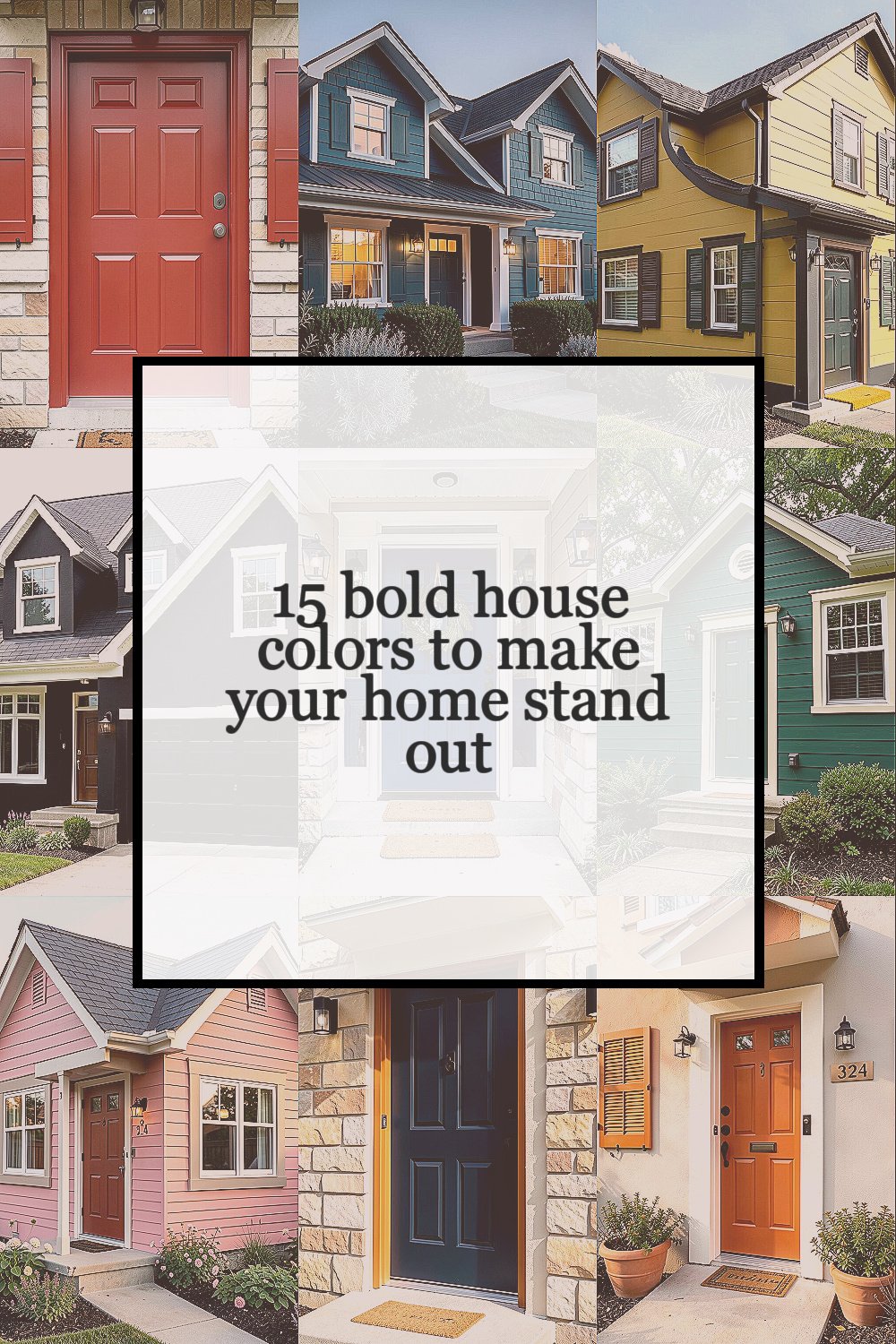
A bold exterior color can change the whole mood of your street. It also helps your home feel more like you.
Because the right shade shows up in small everyday moments, from morning coffee to evening walks. With a little planning, you can get a look that feels fresh, confident, and totally livable.
1. Cherry Red
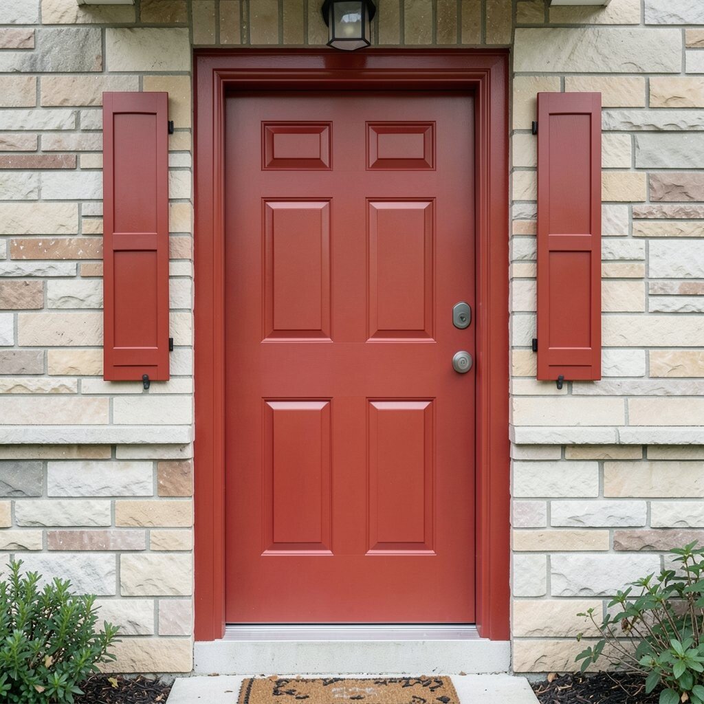
Picture a warm cherry red door and trim against soft daylight, like a tiny firefly welcoming you home. The deep red hue can make your facade feel lively even on cloudy days.
You’ll get instant curb appeal because red draws the eye and creates a strong focal point. It also pairs nicely with classic materials like brick, light stone, or simple siding, helping everything look more intentional.
Choose a satin or semi-gloss finish for trim so it stays crisp and wipeable. If you worry about the shade feeling too strong, use cherry red mainly on the front door, shutters, or accent panels, and keep the main body color a calmer neutral.
2. Deep Teal
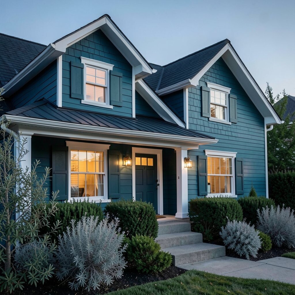
Deep teal feels like a calm ocean at dusk, rich and steady without being boring. It looks great with warm whites, brass fixtures, and dark rooflines.
This color can make your home look more custom because teal reads as confident and a little unexpected. It also hides dirt better than lighter shades, which is a real day-to-day perk.
Pair teal with landscaping that has silver leaves or evergreen texture to make the whole front feel cohesive. For a practical start, test a few swatches on a full sun and shade side of your house before you commit.
3. Mustard Yellow
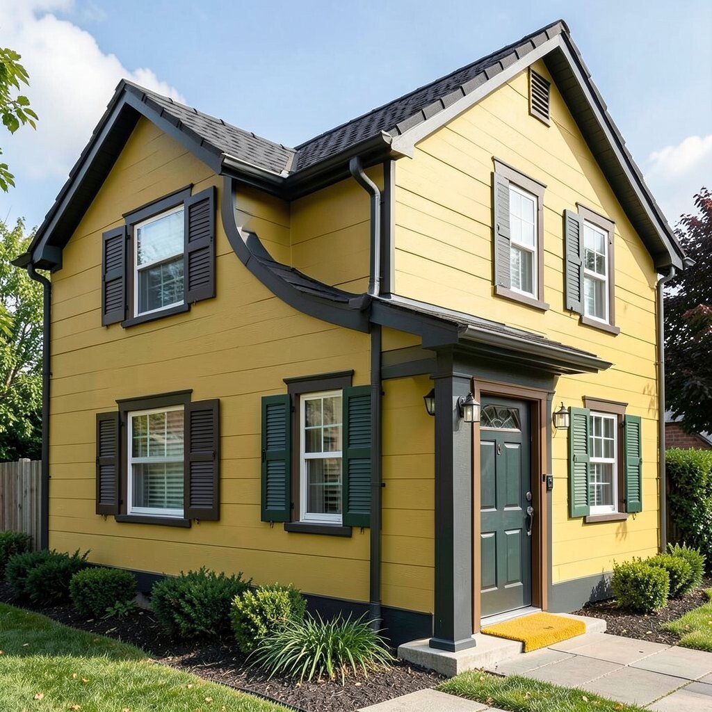
Mustard yellow can bring a sunny glow that still feels grown-up. Think of the color of a vintage market sign, bright but grounded.
When you use it on exterior walls, it can lift curb appeal fast and make your home look cheerful. It’s also a fantastic choice if you want something bold but not as intense as pure red.
Balance it with darker trim like charcoal, espresso brown, or deep green so the yellow doesn’t feel flat. If your roof is dark, mustard tends to look especially sharp, and you can add personality with patterned shutters or a yellow-toned entry mat.
Consider a durable exterior paint made for sun exposure since yellow can fade faster than some darker colors. To keep costs down, plan one solid color for the majority of the home and reserve brighter accents for areas that are easy to paint.
4. Charcoal Black
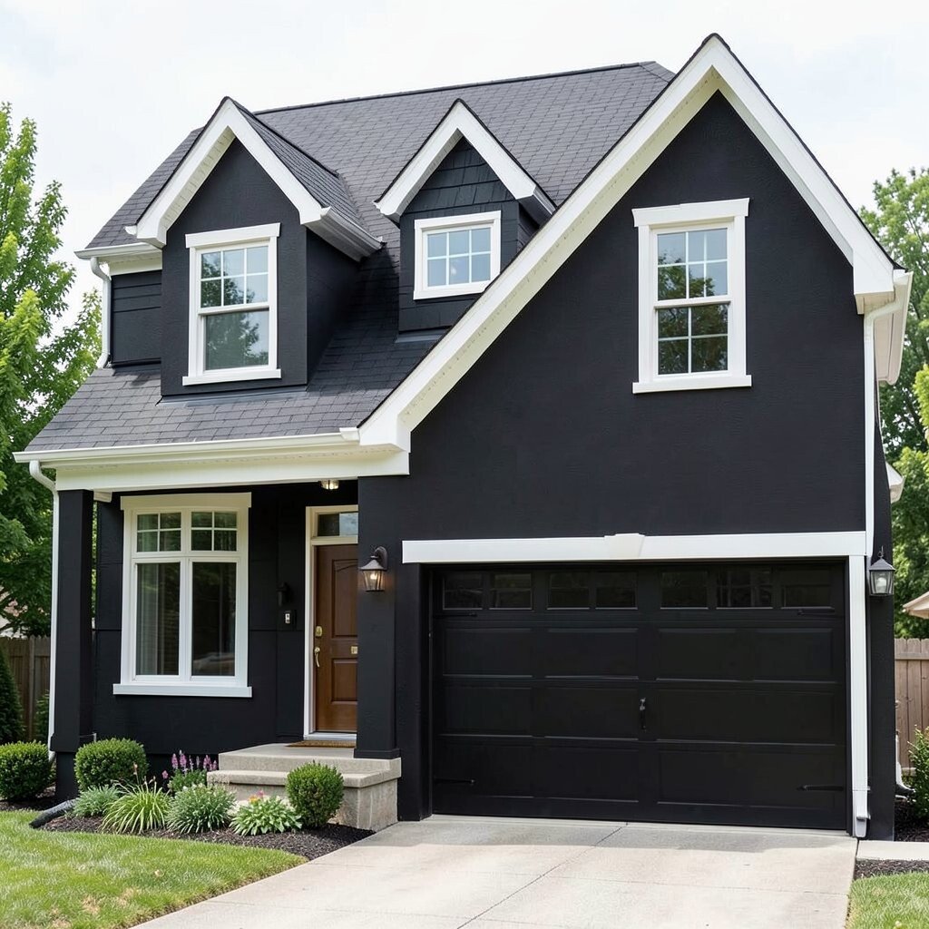
Charcoal black gives a modern, strong look that feels sleek and neat. It can make windows and architectural lines stand out in a clean way.
This shade often makes a home feel more expensive because it creates strong contrast with lighter trim and natural wood. It also works well on dormers, garages, and full facades when you want a bold statement.
Use black with crisp white trim and warm-toned metals like bronze or gold for a friendly effect. Because black can absorb heat, choose a high-quality exterior paint system and consider lighter roof surfaces if you live in a very hot climate.
To personalize, try a matte finish on large wall areas and a satin finish on doors to add subtle depth. If full black feels too dramatic, do black only on the garage door and window frames for a big impact with less repainting.
5. Royal Blue
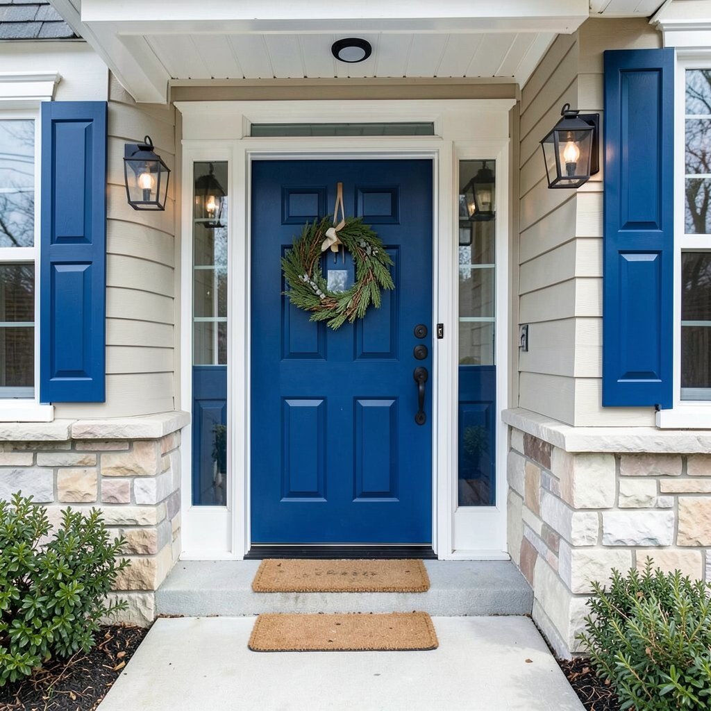
Royal blue feels classic and fearless at the same time. Imagine a front porch that looks like it belongs in a storybook, with rich color around every entry.
This bold blue can make your home look welcoming because it reads as strong and cheerful. It also contrasts beautifully with white trim, light stone, and even copper accents.
You can keep it practical by using a quality exterior paint that resists fading and mildew. For a more balanced design, paint shutters and the front door in royal blue while keeping the main facade in a light neutral.
For personalization, hang a wreath that pulls from your trim color and add outdoor lanterns to make the entry feel inviting. If you want a modern twist, pair royal blue with black hardware and a simple front walkway lighting plan.
6. Forest Green
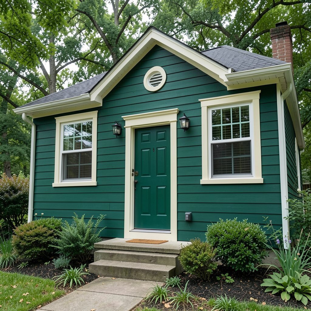
Forest green brings the calm confidence of a shaded tree line. It’s a bold color that still feels natural and easy to live with.
People often notice forest green because it makes trim look sharp and highlights textures like wood grain or stone edges. It also blends well with many landscapes, from traditional shrubs to native plants.
To keep it from feeling heavy, add warm white trim or light cream around windows and doors. If your home has brick, forest green can tie everything together by adding a deeper, richer tone.
When you plan the project, ask for paint options rated for exterior durability so the color stays true through rain and sun. Budget-wise, you can save money by doing one main color on the body and reserving extra coats for the door and high-traffic trim.
7. Rosewood Pink
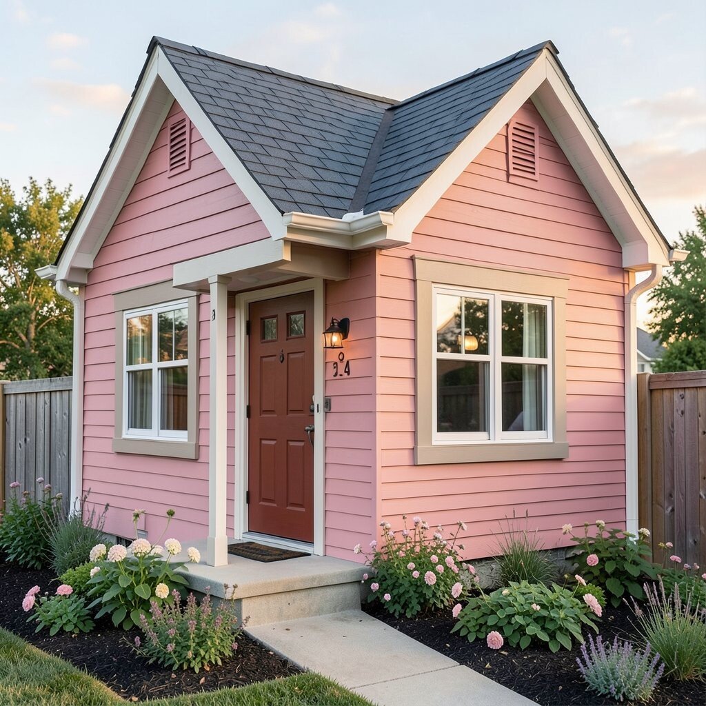
Rosewood pink is bold without screaming, like a soft sunset pinned to your home’s exterior. It adds warmth and can make the whole facade feel welcoming.
This shade gives a unique look that stands out, especially in neighborhoods dominated by plain whites and grays. It can also make your entry feel friendlier, which is a real benefit if you love hosting or relaxing outside.
Pair rosewood pink with neutral trim like off-white, taupe, or light beige to keep it classy. For a practical touch, use a finish that wipes clean since pink can show scuffs on busy areas.
Try personalization with matching house numbers in a darker metal and add flower beds with muted pinks and greens. If you’re worried about cost, test a small section first because you’ll avoid repainting larger areas if the shade isn’t right.
Rosewood can look especially gorgeous with dark roof shingles and natural wood fences. It’s a great choice for people who want something different but still soft and comforting.
8. Warm Sandstone Beige
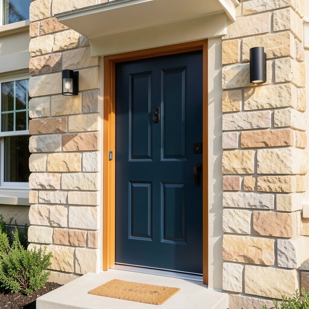
Warm sandstone beige might sound tame, but it can still feel bold when the tone is rich and saturated. It looks like sunlit stone and gives a relaxed, upscale feel.
This color helps your home look clean and bright while hiding everyday marks better than very pale shades. It also offers a strong base for colorful accents like a vivid door or standout trim.
To make it stand out, add a deeper accent color on the front door such as deep teal, burnt orange, or rich navy. If you want a modern look, keep the trim crisp and go for simple, clean lines in your hardware and lighting.
For practical planning, choose a paint that matches your siding material and weather conditions. Costs can be easier to manage with beige because it often needs fewer touch-ups for minor scuffs compared to lighter whites.
9. Burnt Orange
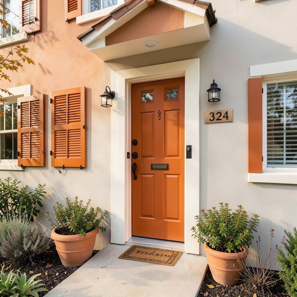
Burnt orange brings energy and charm, like autumn leaves that never fade. It’s a bold choice that can make your entrance feel lively and memorable.
When used wisely, burnt orange creates a strong curb appeal boost while still feeling cozy. It also pairs well with earthy landscaping, terracotta pots, and warm browns.
Try it on shutters, the front door, or a small section of the facade if you want a statement without a full commitment. For a balanced look, keep the body color a neutral such as cream or warm gray.
To personalize, select house numbers in matte black or brushed bronze so the colors feel coordinated. If you live where seasons are intense, pick a paint that’s designed for temperature swings and strong UV exposure.
10. Slate Purple
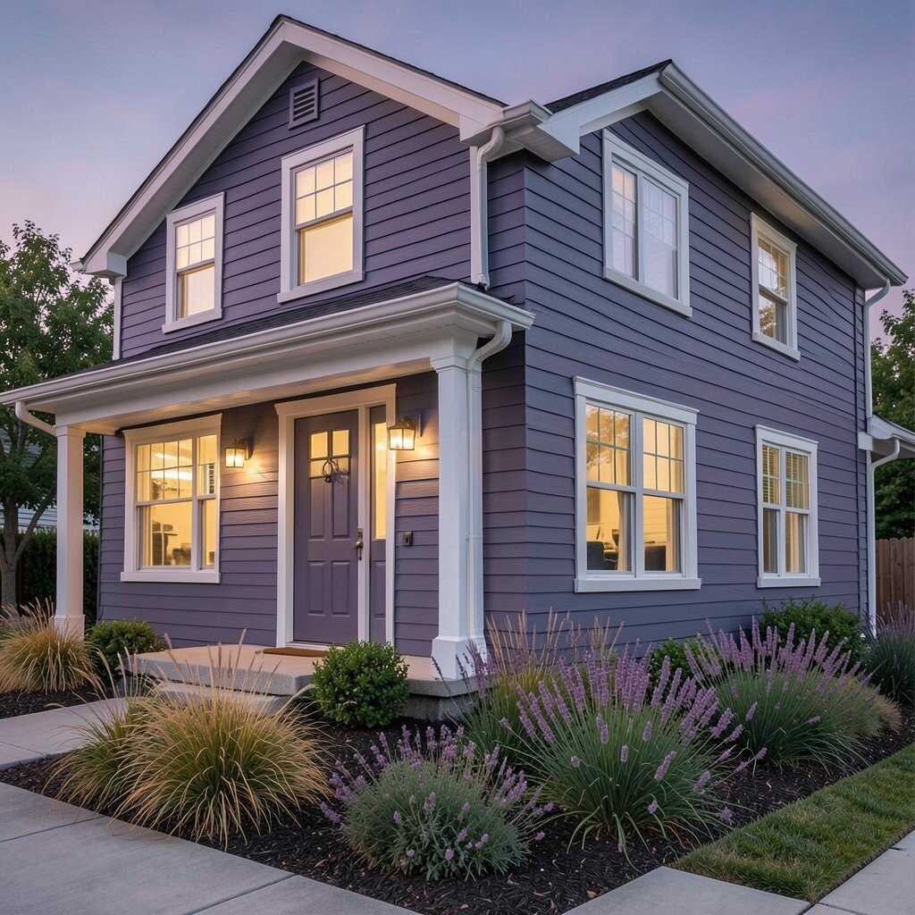
Slate purple sounds unusual, yet it can look surprisingly elegant. Picture a dusty plum tone that feels like evening sky with a hint of charcoal.
This color helps your home stand out because it’s rare enough to feel unique, but not so bright it becomes exhausting. It also looks beautiful with silver, pewter, or dark bronze hardware.
Use slate purple with light trim so the windows pop and the facade stays readable from the sidewalk. If you want a friendly look, add warm-colored landscaping like golden grasses or soft lavender blooms.
Since purple pigments can shift, choose an exterior paint brand with strong color retention and ask about sample testing. It can be cost-effective to commit to one bold wall area and keep the rest neutral until you see how it looks over a full season.
For practical tips, use a primer rated for your siding type, especially if you’re going over a darker old color. Good prep keeps the new shade even and reduces the chance of peeling.
11. Bright White With Bold Black Trim
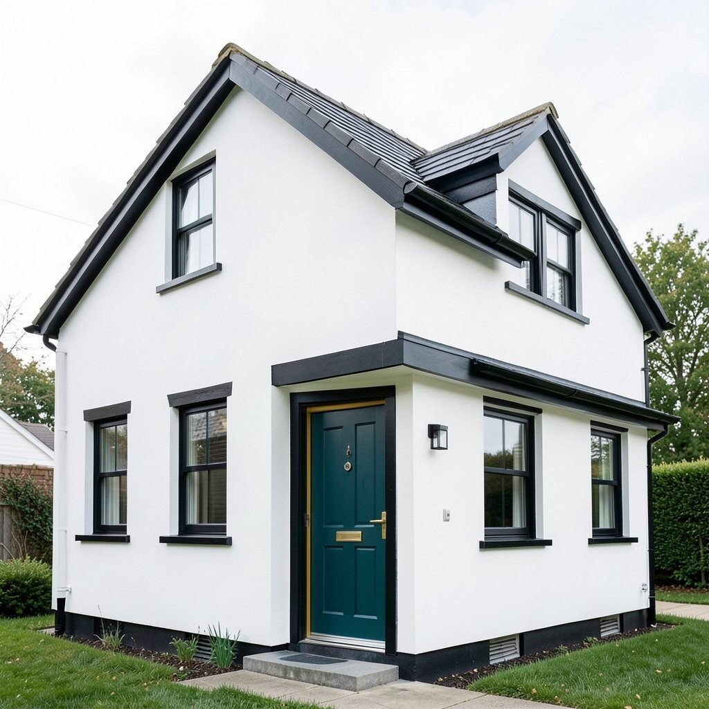
Bright white by itself can be simple, but it becomes bold when you pair it with strong black trim. The look feels crisp like a newly made sketch, sharp and clean.
This combo offers clarity for your architecture, making rooflines, windows, and corners feel defined. It’s also practical because white walls can be easier to maintain when dust settles, as long as you choose a cleanable finish.
You can customize the personality through the front door color, such as deep teal or mustard, while keeping the base palette steady. This approach often reduces decision stress, since you’re working with a reliable neutral foundation.
For cost considerations, think about using the boldest colors only where you’ll notice them most, like the entry and trim. Plan for proper caulking and painting edges so the black lines stay smooth and neat over time.
12. Smoky Blue Gray
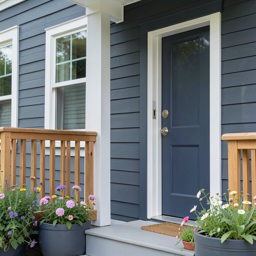
Smoky blue gray is a smart bold shade because it shifts with light. In the morning it looks cooler, and later it can feel slightly warmer and softer.
This color can make your home look modern without feeling cold. It also hides flaws better than bright colors because it sits in the middle range visually.
To get a desirable look, match it with white or pale gray trim and add warm wood accents like a cedar railing. If you want extra impact, choose a door in muted charcoal or a deep navy.
Trends are leaning toward comforting, lived-in neutrals, and smoky blue gray fits that current style. It also helps your outdoor decor look balanced since many flowers and planters pop against cool tones.
13. Coastal Aqua
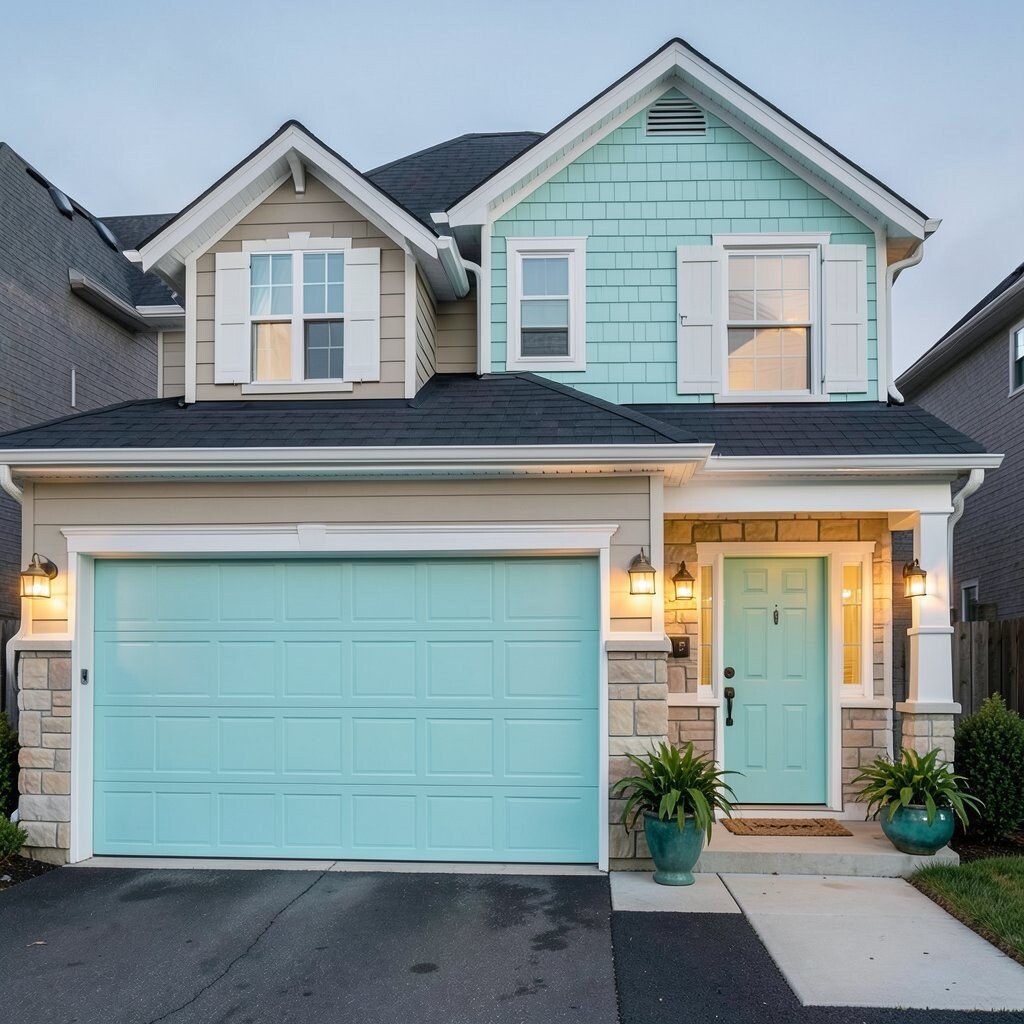
Coastal aqua brings a refreshing feel that reminds you of beach days. It’s vivid enough to be bold, yet it can still feel light and airy.
This shade works well when you want your home to feel upbeat and inviting. It also stands out nicely against darker roofs and can pair beautifully with white shutters and sandy-toned stone.
Use aqua thoughtfully so it doesn’t overwhelm the whole facade. A practical move is to paint the main body a calmer neutral and reserve aqua for the garage doors, shutters, or a single feature wall.
For personalization, add sea-glass colored planters, warm brass lights, and textured doormats that tie in the coastal vibe. If you’re budget mindful, keep the high-color areas limited to surfaces that need fewer coats because of good siding condition.
Aqua can also make an entry feel like a vacation spot, especially when paired with soft outdoor lighting at night. Just be sure to choose an exterior paint that resists salt air if you live near the coast.
14. Rust Red
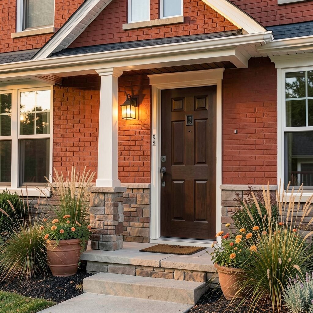
Rust red carries warmth and character, like terracotta warmed by the sun. It can make your home feel grounded and stylish.
This bold color creates a unique identity, especially when your home has brick patterns, stone edges, or a textured facade. It also complements natural wood and earthy landscaping that includes browns, greens, and gold accents.
For practical tips, match rust red with off-white or creamy trim so the look stays balanced. If you want extra curb appeal, paint the door in a darker shade such as deep walnut brown or another rust tone for depth.
Cost can vary based on prep work, so budget for cleaning, scraping, and priming if your current color is peeling or chalky. Choosing a high-quality paint system can reduce the number of repaints, which often saves money in the long run.
To personalize, add a porch light with a warm glow and consider planters with grasses or flowering plants in muted oranges. Rust red tends to look best in landscaping that feels natural rather than overly neon.
15. Modern Olive
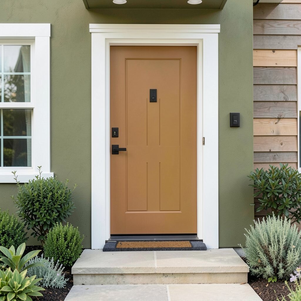
Modern olive feels bold in a calm way, like a green that has been softened by time. It’s earthy, stylish, and surprisingly flattering with many architectural styles.
This color stands out because it’s not the typical forest green, and that subtle difference makes it feel more custom. It also offers benefits like blending well with outdoor plants, which helps your landscaping look intentional instead of random.
Try olive with crisp white trim and black or bronze hardware for a clean, contemporary feel. If you want a warmer look, pair it with natural wood accents and stone steps in beige or gray tones.
For personalization, paint the front door a contrasting color like mustard or terracotta to create a strong focal point. In terms of practical planning, pick a paint finish that resists fading and mildew because olive tones can still show uneven wear in high-splash areas.
Olive is also a current trend choice since many people want color that feels connected to nature. When you test swatches, observe them through different times of day so you can choose the tone that feels right in your light.