Color can act like a secret language for your senses. When you match the right swatch to the right mood, your work starts to feel finished.
Think of these shades as handy cards you can pull out whenever you need a new idea. You’ll find practical ways to use them, plus little cost-smart notes so your creativity stays easy to sustain.
1. Cloud Cream
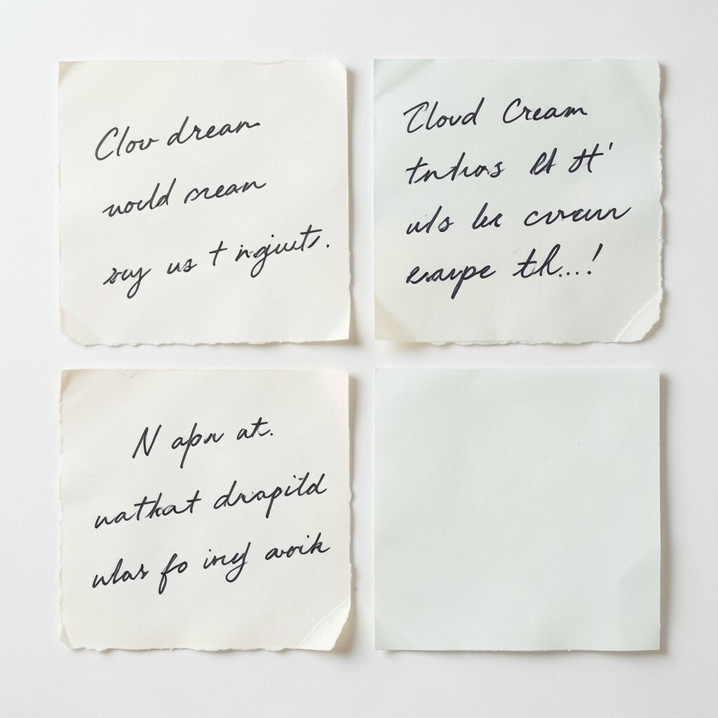
Cloud Cream feels soft and calm, like light falling on fresh paper. It pairs well with handwritten notes, minimalist posters, and cozy branding.
Use it as a background so other colors stand out without shouting. Keep contrast in mind by adding a deeper shade for text and outlines. If you’re working digitally, try a slightly warm tint to make screens look less harsh.
2. Ocean Teal

Ocean Teal looks fresh and steady, like a glass bottle of sea breeze. It adds energy to websites, product mockups, and creative portfolios.
Try it in headers, buttons, or the main accent on a layout. Pair it with Cloud Cream or soft coral to keep it friendly. For personalization, swap the teal undertone toward green for a more natural vibe or toward blue for a cooler, sleeker feel.
3. Sunset Coral
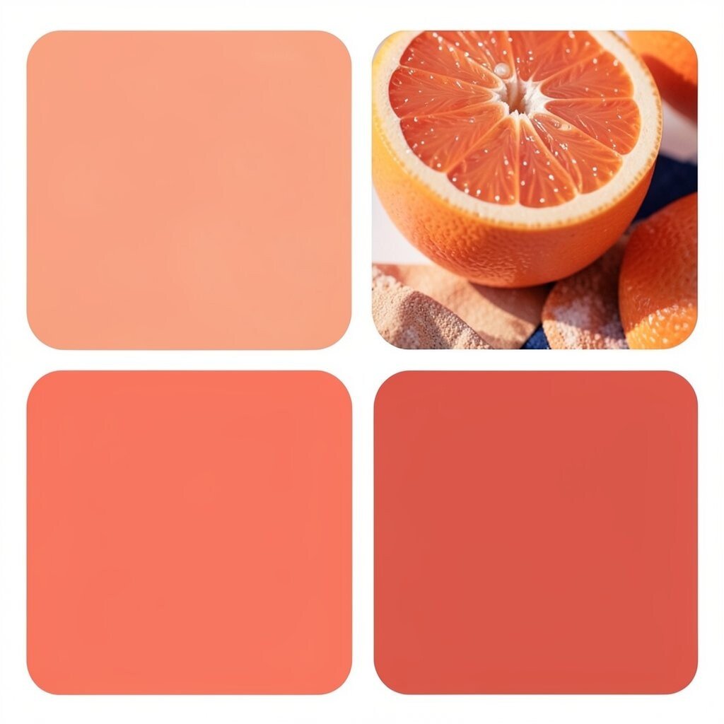
Sunset Coral glows like warm fruit and late afternoon light. It makes people feel noticed, so it’s great for invitations, packaging, and social graphics.
Work it into small areas first, like a border or a single headline line. Combine it with deep navy accents so it doesn’t fade. If you’re printing on a budget, this color also holds up nicely when used sparingly.
For a trend-friendly look, pair coral with airy backgrounds and rounded shapes. You can also use it for highlight strokes in digital illustrations. Personalize it by mixing your own tint if you’re painting, starting with a peach base and adding a little warm red.
4. Deep Forest
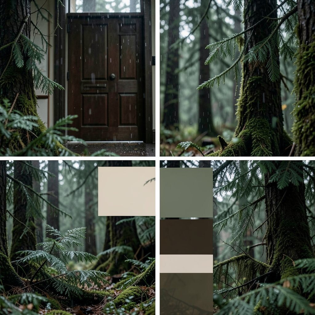
Deep Forest feels grounded and rich, like evergreen needles after rain. It’s a strong choice for book covers, logos, and calm-but-serious designs.
Use it for headings, icons, and the darker side of a palette. Pair it with warm neutrals to keep the vibe approachable. If you’re creating a mood board for a home space, this shade works well on doors, frames, or accent walls where natural light can bounce off it.
5. Golden Honey

Golden Honey reads like sunshine in paint, bold but still warm. It instantly adds optimism to crafts, slides, and handmade labels.
Try it as a highlight color over Cloud Cream or light gray. Keep it balanced by using one darker shade, like Deep Forest or Charcoal Smoke, for structure.
If you want a current look, use honey as a small “glow” effect behind photos or typography. You can also test it on paper scraps before committing to a full print run. For cost considerations, honey works best when you limit large solid fills and focus on accents.
6. Charcoal Smoke
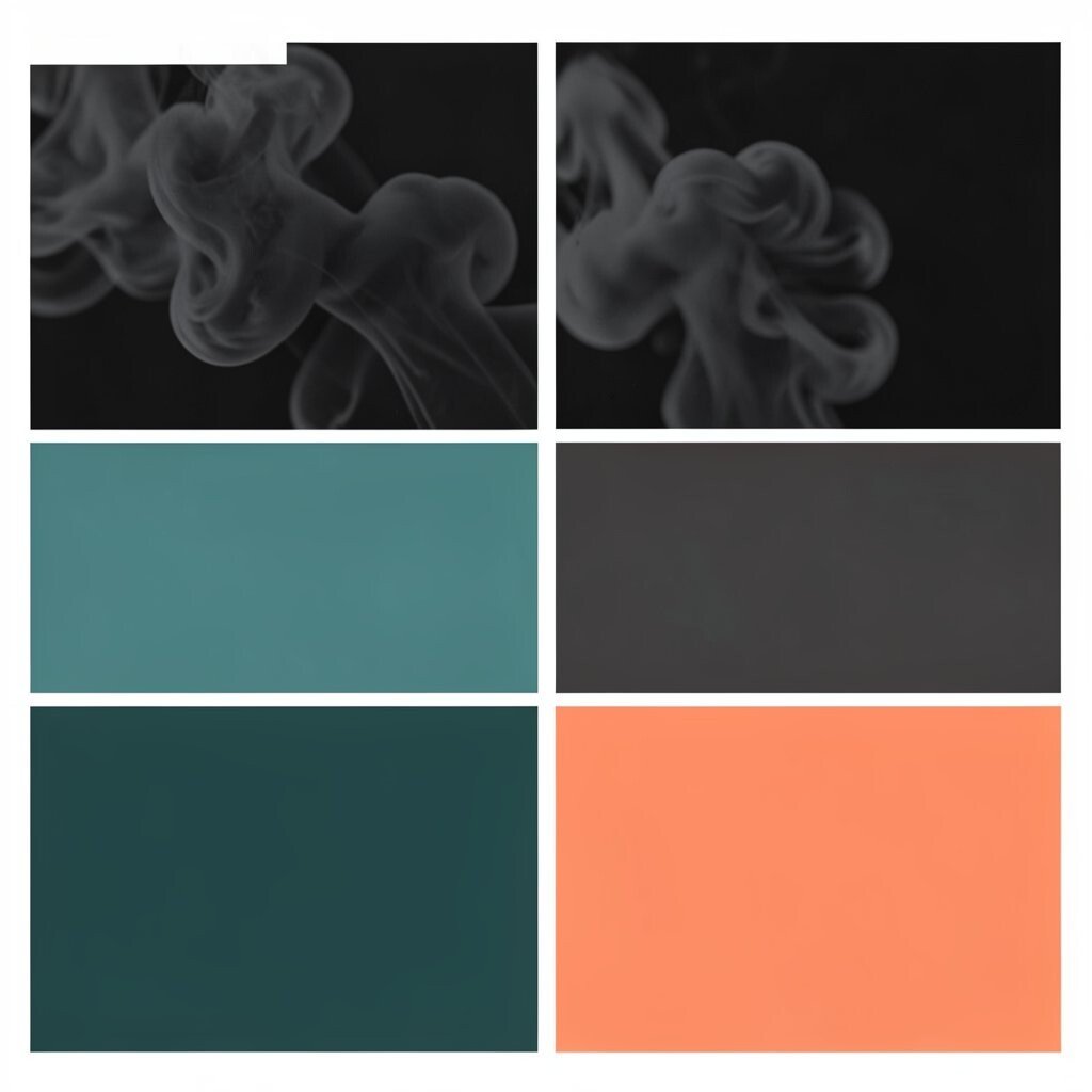
Charcoal Smoke is modern, steady, and easy to read. It helps layouts feel clean and gives other colors a place to rest.
Use it for body text, headings, and thin lines. Pair it with Ocean Teal or Sunset Coral so the whole palette feels lively, not heavy. If you’re aiming for accessibility, charcoal is a safer choice than pure black on many screens.
7. Rose Blush
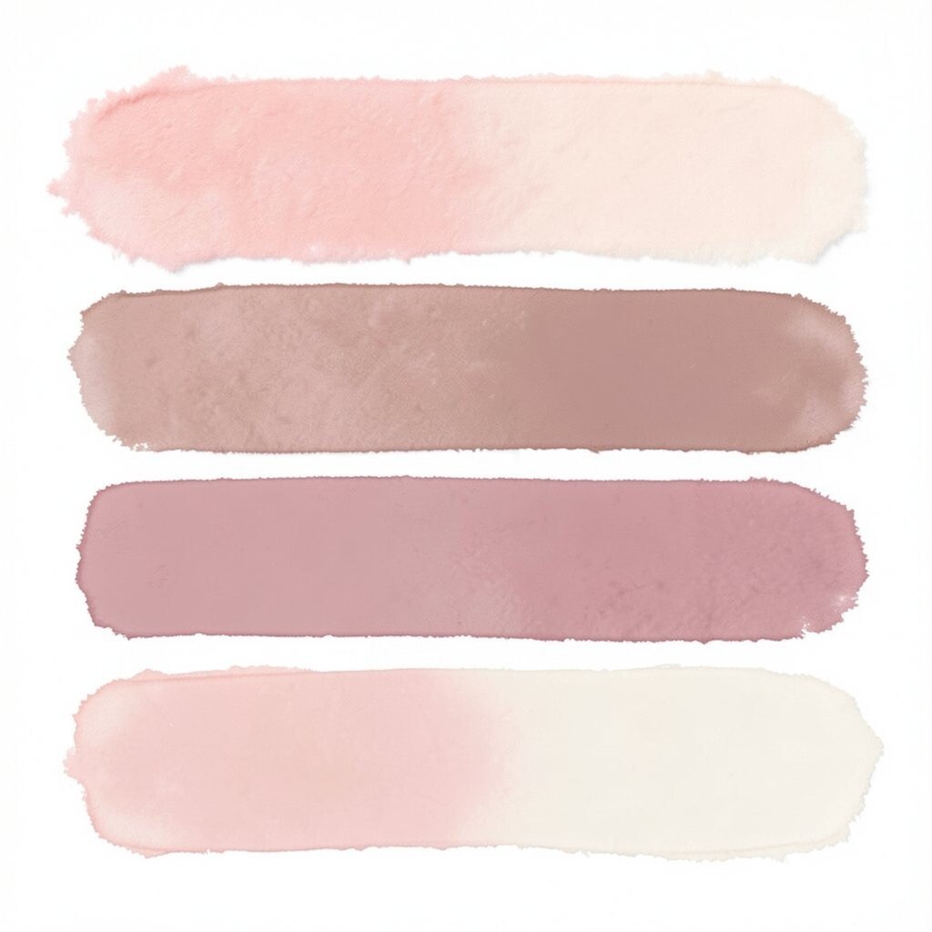
Rose Blush looks gentle and romantic, like cotton candy at the edge of a carnival. It brings a soft mood to stationery, portrait edits, and playful brand themes.
Use it in gradients or small blocks behind text. Pair it with Cloud Cream for sweetness or with Deep Forest for a more grown-up twist. For personalization, try a more muted dusty rose if you want a calm, vintage feel.
On a practical level, blush tones look great in photo overlays, especially for warm skin tones. They also help you build a cohesive look when you mix hand-drawn elements with digital layouts. If you’re printing at home, use blush in outlines rather than huge fills to stretch ink longer.
8. Sky Silver
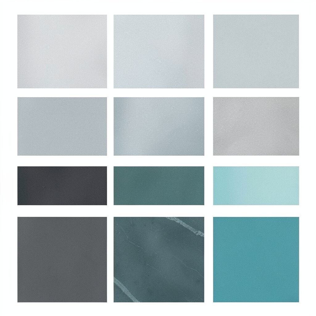
Sky Silver feels airy and techy, like a quiet morning before the day starts. It’s ideal for modern websites, slide decks, and product branding.
Use it as a background layer or as a highlight on buttons. Pair it with Charcoal Smoke for clear readability and with Ocean Teal for a fresh accent. If you like trends, try it with subtle grain textures so it feels less flat and more crafted.
9. Purple Workshop
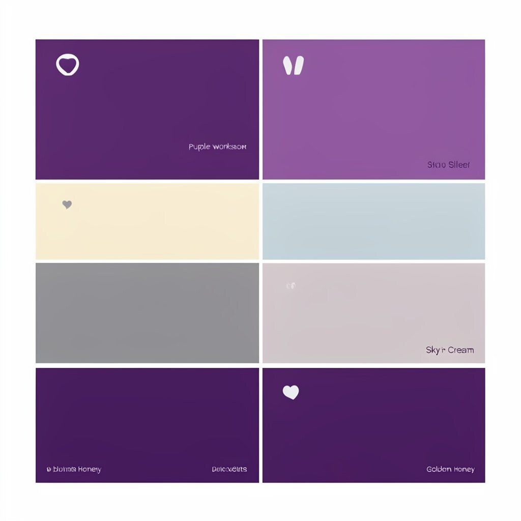
Purple Workshop gives a creative spark without needing neon energy. It’s great for art classes, workshop flyers, and personal websites with character.
Try it for callouts, dividers, or a single bold headline. Combine it with Golden Honey to create a fun, inspiring contrast. If you want it to feel less intense, soften the purple by mixing it with Sky Silver or Cream.
In practical terms, this shade stands out well in small typography. It also works nicely on illustrated icons and playful patterns. Personalize it by choosing a plum version if you want a richer, evening feel.
10. Berry Ink
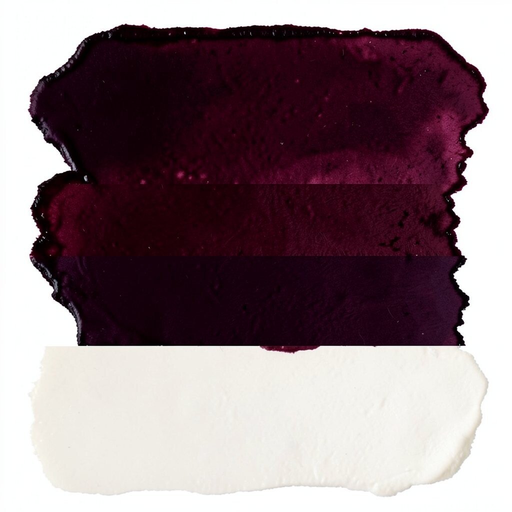
Berry Ink looks like a rich stain, deep and slightly mysterious. It’s perfect for bold posters, dark-mode themes, and dramatic photo filters.
Use it for overlays and large blocks only when you want emphasis. Pair it with Cloud Cream so the design stays readable and bright. If you’re working on a budget, this color can cover well with fewer layers when used as a top tint.
11. Lemon Chiffon
Lemon Chiffon feels cheerful and light, like a fresh breeze through a kitchen window. It’s great for learning materials, kids’ crafts, and energizing social posts.
Put it behind short text to make messages pop. Pair it with Charcoal Smoke or Deep Forest for balance, since bright yellow needs a darker anchor. For personalization, choose a softer buttery yellow if you want a more vintage charm.
Current design trends often use bright accents with lots of white space, and lemon does that job well. Try it as a “spot color” in a mostly neutral palette to keep everything looking crisp. If you’re printing, use it in patterns rather than full-page solids to save ink.
12. Jade Meadow
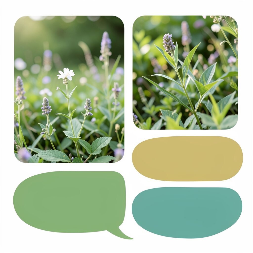
Jade Meadow brings a calm, nature-inspired vibe that feels refreshing. It’s a great swatch for wellness brands, garden-themed artwork, and soothing illustrations.
Use it in icons, charts, or background shapes that need a gentle pop. Pair it with Cloud Cream and Ocean Teal for a smooth, cohesive feel. If you want uniqueness, add a tiny amount of Golden Honey to shift the jade toward a warmer leaf tone.
13. Rust Brick
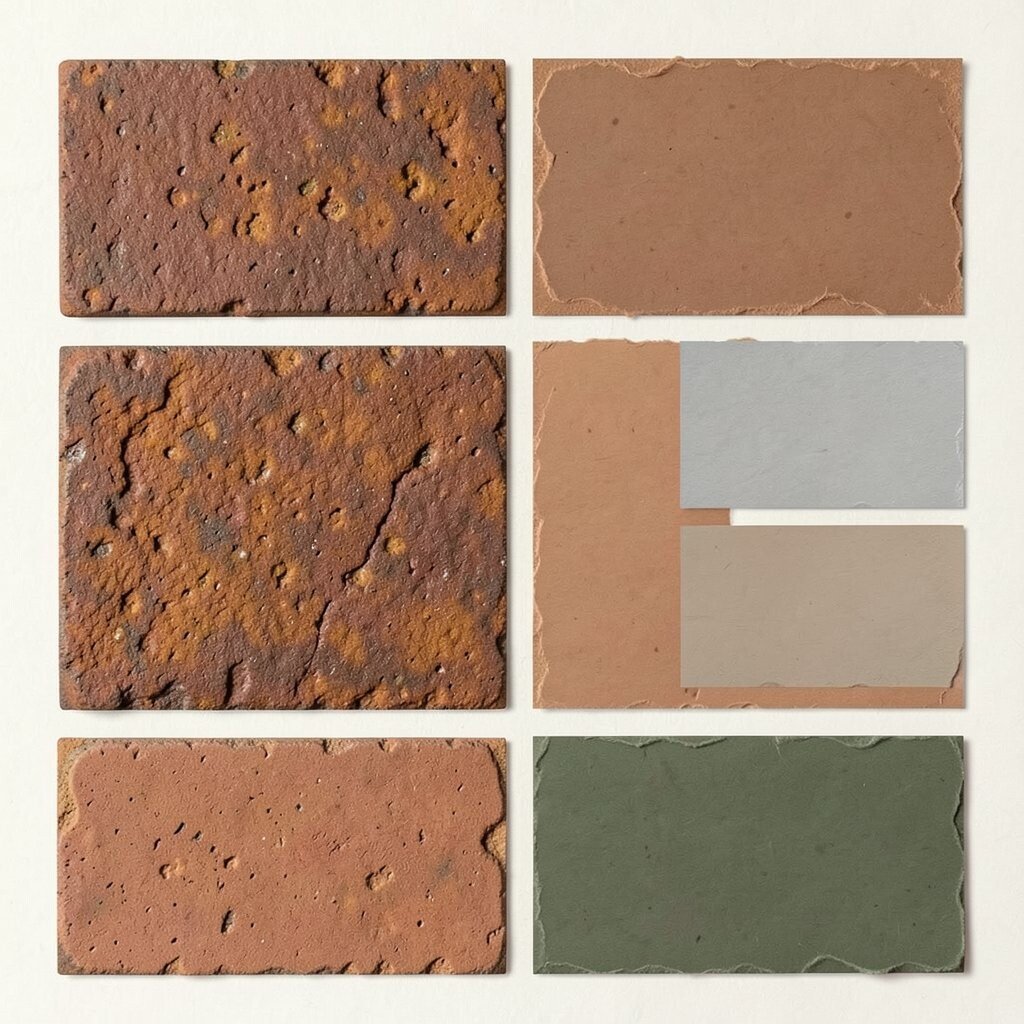
Rust Brick looks warm, textured, and full of personality. It’s excellent for packaging, handmade goods, and design work that wants a cozy edge.
Try it in borders, stamps, or photo frames so it feels crafted rather than flat. Pair it with Sky Silver or Charcoal Smoke for a balanced look. For practical tips, use rust as a thin layer over lighter backgrounds so it stays legible and not muddy.
To match current trends, combine rust with earthy greens and natural paper textures. You can also personalize it by choosing a lighter terracotta shade for a friendlier tone. When cost matters, rust looks great as a solid accent in small areas, which helps stretch materials.
14. Ink Blue
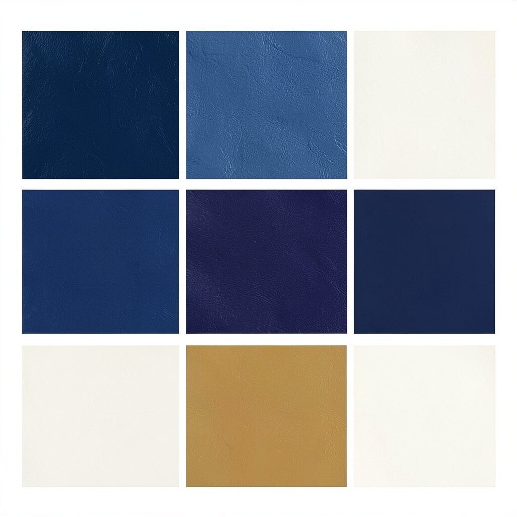
Ink Blue feels confident and trustworthy, like a firm signature. It works well for professional branding, app screens, and clean typography layouts.
Use it for links, strong headlines, and interactive elements in digital designs. Pair it with Cloud Cream for clarity and with Golden Honey for a small celebratory accent. If you want to personalize, try a darker indigo version for a more dramatic, editorial feel.
15. Blush Sand
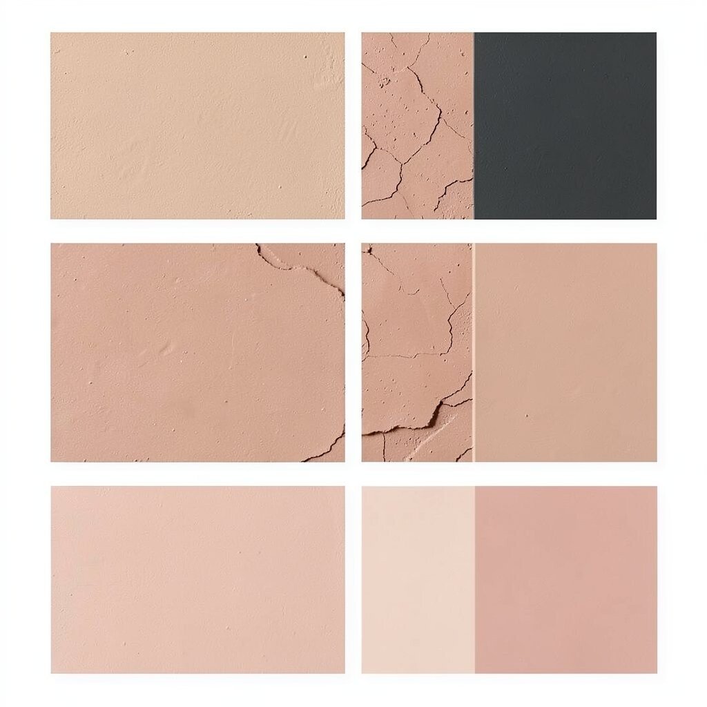
Blush Sand looks soft and warm, like sunlit clay after it’s dried. It’s a great neutral when you want warmth but still crave calm.
Use it as a background for websites, worksheets, or presentation slides. Pair it with Deep Forest and Charcoal Smoke to keep it grounded. If you’re working with photos, blush sand helps portraits look more natural by avoiding harsh contrast.
For uniqueness, try it alongside Rose Blush for a tonal palette that feels cohesive and gentle. It’s also a smart choice for cost considerations because neutrals are easy to reproduce with simple dyes, paints, or low-cost printing settings.
16. Mint Circuit
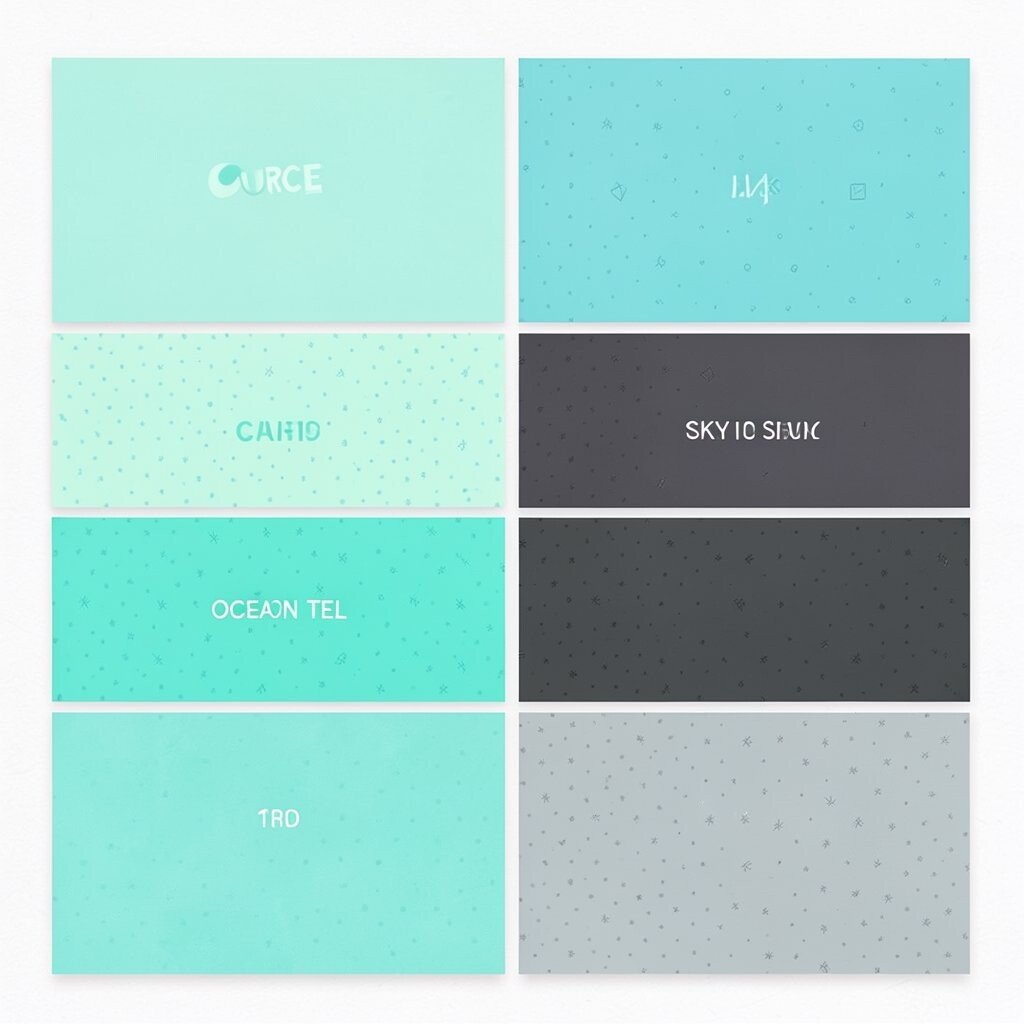
Mint Circuit has a playful, modern energy that feels like fresh tech. It’s perfect for maker projects, student portfolios, and bright digital interfaces.
Use it as a secondary accent next to Ocean Teal or Charcoal Smoke. Pair it with Sky Silver so the palette looks clean and current. If you want it to feel more unique, add a light pattern or small dot texture to keep it from looking too flat.
17. Saffron Thread
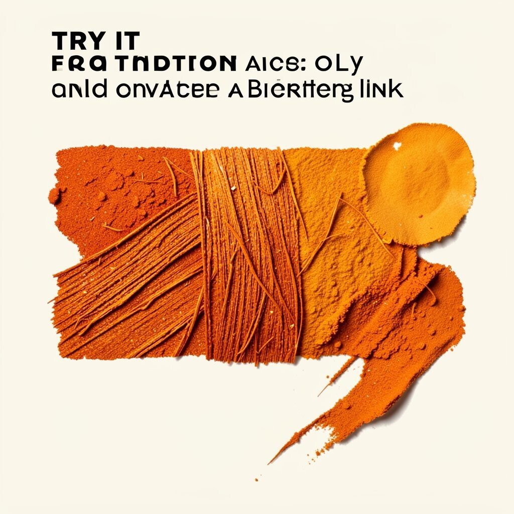
Saffron Thread feels vivid and creative, like spices stirred into warm air. It’s great for art branding, bold illustrations, and eye-catching event designs.
Try it as a headline color and use a calm background like Cloud Cream. Pair it with Berry Ink for a rich contrast that feels dramatic and stylish. For practical tips, keep the saffron mostly in key areas so it doesn’t overwhelm the rest of your layout.
To match current trends, think in terms of “accent only” palettes with strong typographic layouts. You can personalize it by choosing a slightly orange-leaning saffron for a warmer mood. If cost matters, use thinner lines and highlight shapes rather than large solid fills.
18. Cocoa Velvet
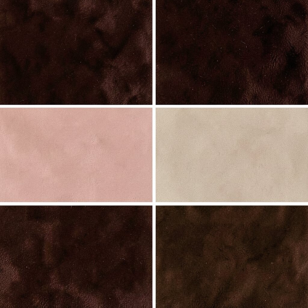
Cocoa Velvet is deep, warm, and comforting, like a cup of dark chocolate. It adds a premium feel to menus, brand assets, and crafts.
Use it for backgrounds, thick text, or shadow effects. Pair it with Rose Blush for a sweet contrast or with Sky Silver for a more modern look. For uniqueness, create layered depth by using Cocoa Velvet plus a lighter tan as a highlight.
19. Pale Glacier

Pale Glacier feels cool and calm, like ice on a window at dawn. It works well for minimal layouts, skincare brands, and clean illustration styles.
Use it as a large background tone to make other colors feel crisp. Pair it with Ink Blue or Purple Workshop so the palette stays lively but not chaotic. If you want an actionable approach, test it under your real lighting conditions if you’re doing physical materials.
For current trend vibes, pair Pale Glacier with slightly darker accents and plenty of negative space. Personalize it by adjusting toward blue-gray for a cooler feel or toward off-white for a softer look. As a cost consideration, pale shades often hide minor print inconsistencies better than ultra-bright colors.
20. Neon Peony
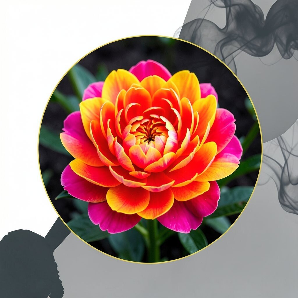
Neon Peony feels bold and attention-grabbing, but you can still use it thoughtfully. It’s perfect for posters, music flyers, and energetic brand campaigns.
Use it as a single focal accent, like a circle behind a title or a bright stroke on an illustration. Pair it with Charcoal Smoke to control the intensity and keep it readable. If you’re worried about oversaturation, try a slightly muted version for a more wearable feel.
21. Evergreen Smoke

Evergreen Smoke blends nature and calm mystery, like fog over a pine forest. It’s a versatile shade that can feel both modern and cozy.
Use it for sections, cards, or mid-tone backgrounds that need depth. Pair it with Cloud Cream for a gentle contrast and with Golden Honey for a warm accent. For personalization, mix it toward teal for a fresher feel or toward brown for a more vintage, earthy character.
To keep it practical, reserve Evergreen Smoke for medium-sized areas rather than tiny details where it may lose clarity. It also fits current design trends that favor layered tones and soft contrast. If you’re creating physical prints, apply it with light pressure first so you can build color gradually and manage material use.