
Color can turn any board into a daily mood boost. These examples show how to use vivid ideas in real spaces.
Pick what fits your life, then tweak it until it feels like you.
1. Sunrise Sticky-Note Desk Board

Think of a board that looks like an early morning sky. Bright sticky notes in warm yellows, soft oranges, and gentle pinks sit in friendly rows like little flags for tasks.
This setup helps you see your day at a glance without digging through lists. Keep the top rows for what must happen first and use the lower colors for later items. If you want it to feel even more personal, choose a color for each family role or subject and repeat that choice every week.
2. Rainbow Timeline With Washi Accents
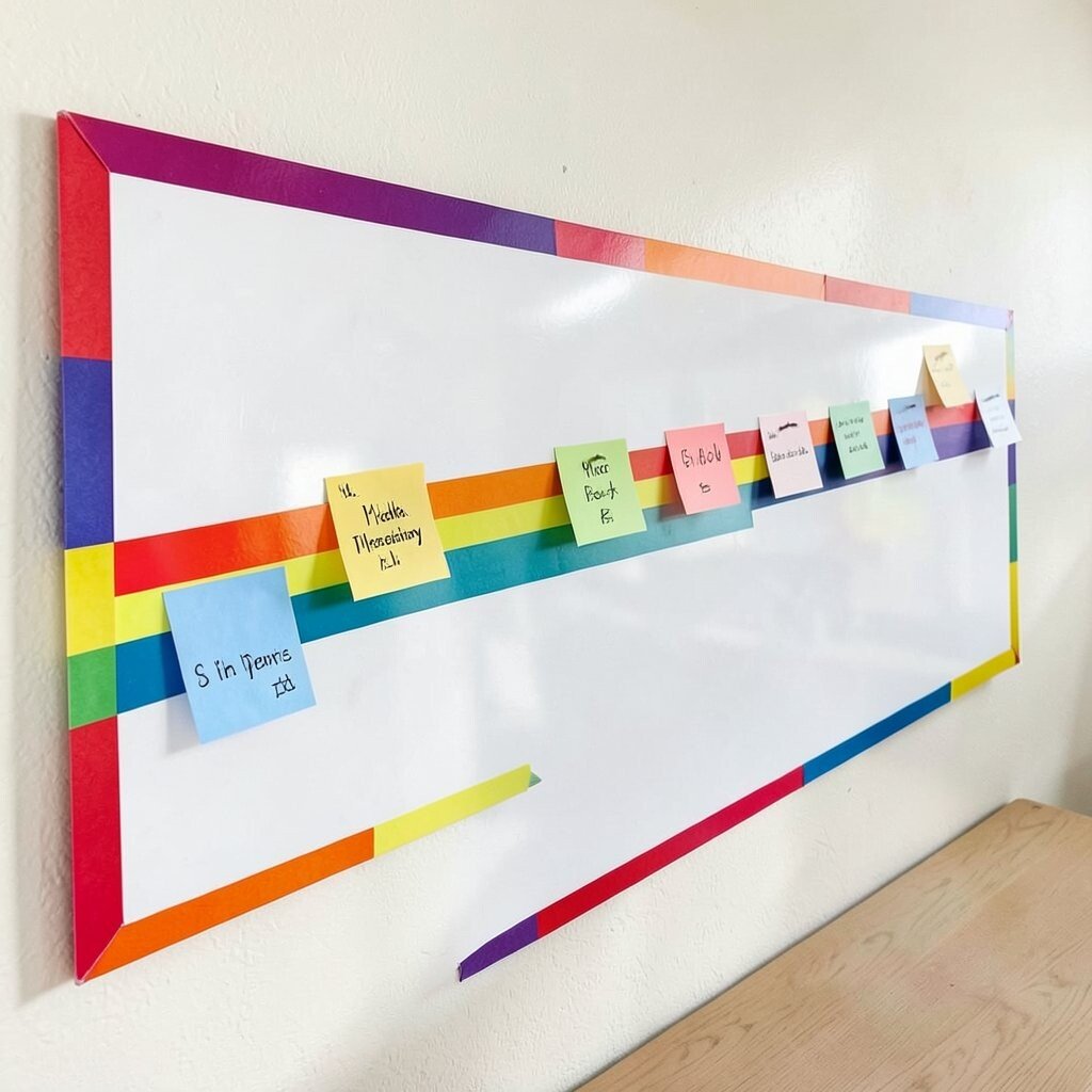
A long board with a rainbow timeline can look both neat and playful. Use bold markers for the path and add washi tape borders in different widths to frame milestones.
Moving from one color to the next makes progress feel smoother and more motivating. Keep each step short so you can update it fast. For a practical system, pin dated cards along the timeline and swap them out as dates pass so the board never feels cluttered.
To keep cost low, use leftover tape from craft bins and write on simple index cards instead of buying fancy inserts. A current trend is using “micro milestones,” so break big plans into tiny steps that fit on one bright card.
3. Ocean-Themed Vision Board With Layered Texture
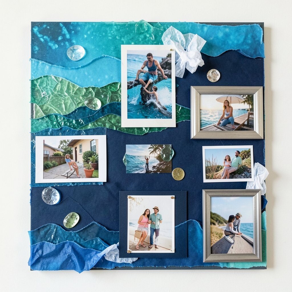
Picture a board filled with blues that range from sea-glass green to deep ocean navy. You can add texture using cut paper waves, crumpled tissue accents, and a few shiny stickers that catch the light.
Layering adds depth, which makes your goals feel more real and less flat. Choose a few clear themes, like health, home, or learning, and give each theme its own color group. When you personalize, use photo scraps that matter to you, not generic images, so the board feels like your story.
For practical upkeep, refresh the edges of each layer once a month so it stays tidy. If you’re watching cost, print pictures at home and use thrifted frames or foam board as the base.
Many people are leaning into tactile boards right now, since textured collage art feels calming and creative at the same time.
4. Neon Task Board With Grid-Friendly Design
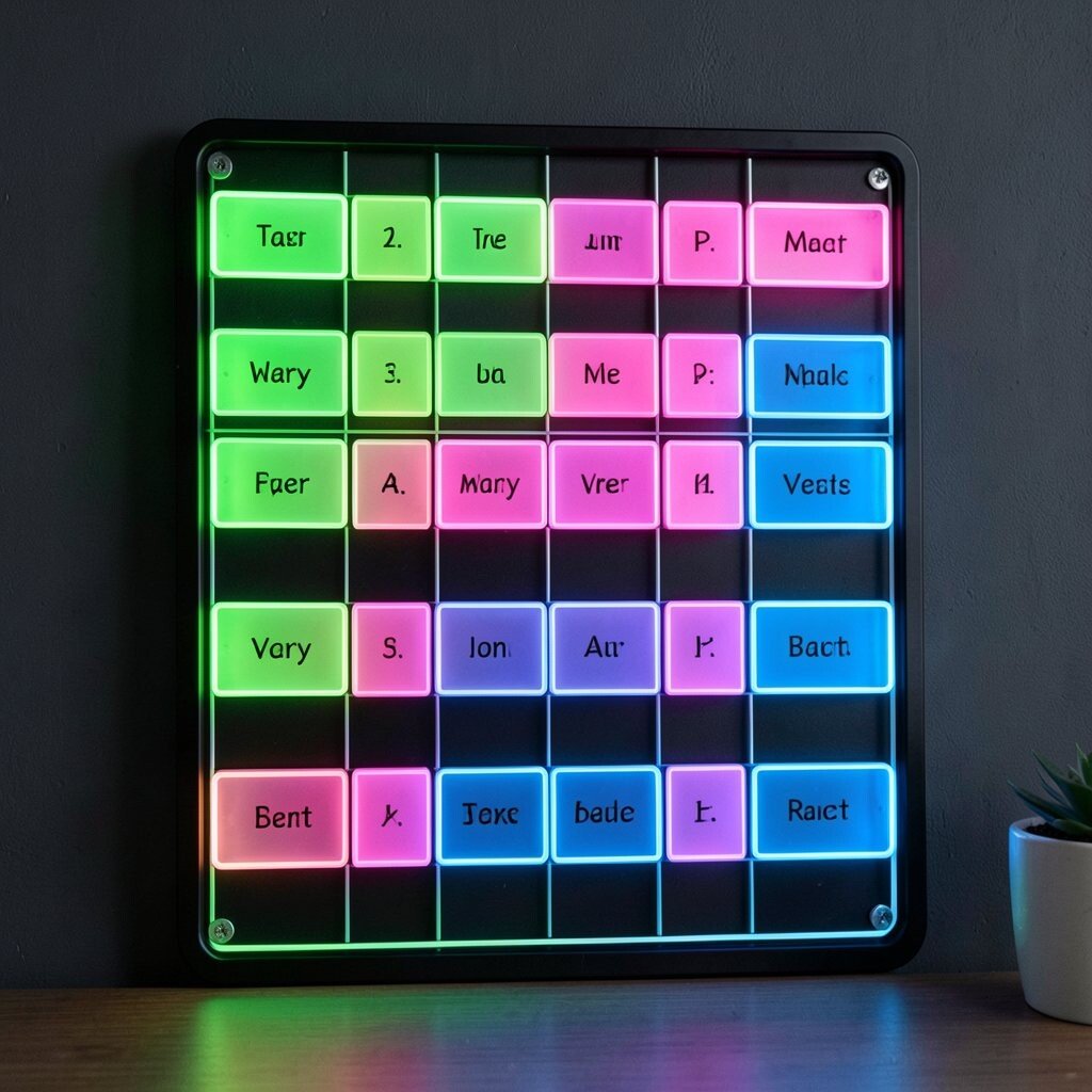
A neon task board can feel electric, even in a small space. Imagine a dark backing with bright grid lines and task cards in neon green, hot pink, and electric blue.
The grid makes planning easy, because every item has a clear spot. Keep tasks short and write one main verb on each card so you can scan quickly. If you want it to look extra clean, align cards to the same width and use one font style for consistency.
5. Pastel Recipe Board With Color-Coded Cards

Envision a soft pastel board where cooking notes look gentle and inviting. Use pale mint, blush, and butter-yellow sections for categories like breakfasts, dinners, and snacks.
When recipes are color-coded, cooking decisions get faster, and you waste less time searching. Add a small photo on each card to spark appetite and make the board more fun to use. Personalize by writing family twists, like “spicy version” or “quick weekday.”
To manage cost, print recipe cards from your own notes and slide them into clear sleeves you already own. A trendy move right now is adding “ingredient reality,” meaning you list common pantry items so you’re more likely to cook what you already have.
6. Sunset Budget Board With Check-Off Bands

A sunset budget board can look like a warm evening with bands of orange, peach, and gold. Place money goals into wide horizontal sections so every category feels like part of a larger view.
Seeing your plan in bands helps you notice balance faster than a long spreadsheet. For practical tips, pick a simple system where you check off small progress weekly. Personalize the board by using colors that match your spending style, like calming blue for savings or bold purple for fun.
Cost can stay reasonable by using regular index cards, a marker, and a board you already have. Many people now use budgeting visuals that focus on momentum, so keep the board encouraging instead of strict.
7. Gallery-Style Mood Board With Photo Triangles
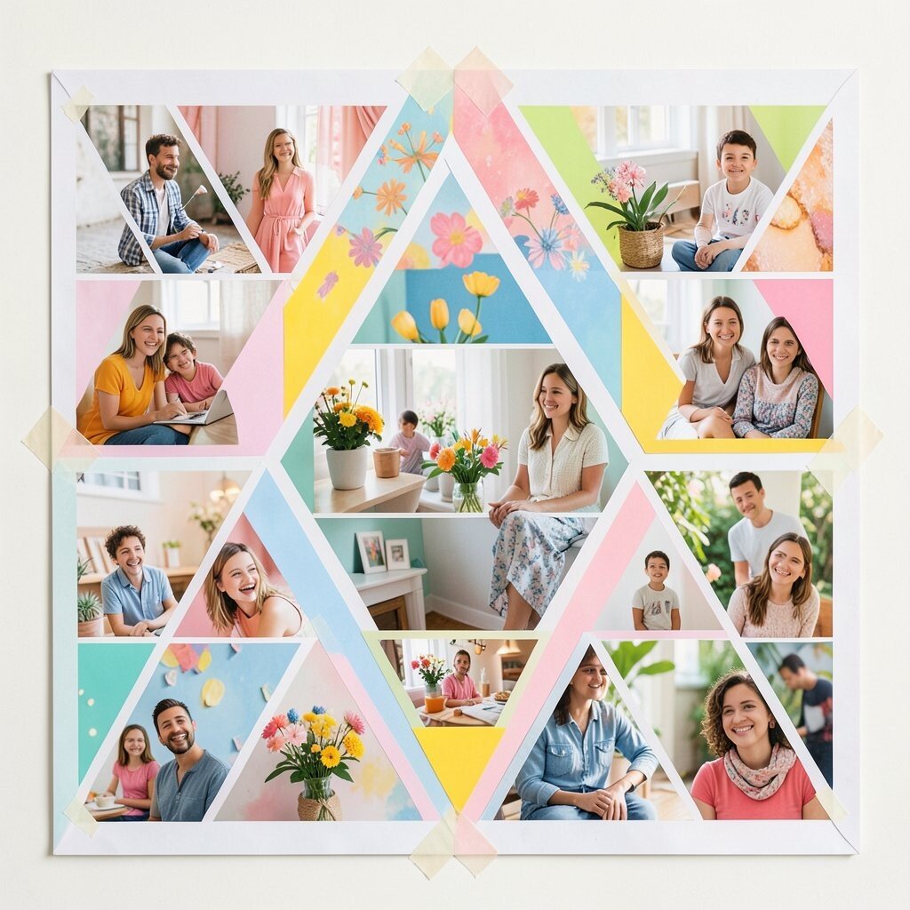
Think of a mood board that looks like a tiny art gallery. Photos are cut into triangle shapes and layered so they create an energetic collage in cheerful tones.
This style makes your choices feel creative, because you can mix textures and colors without rules that feel too strict. Keep the center area for your main theme and let side sections hold supporting ideas. If you want personalization, include images you took yourself, even if they are simple snapshots, since they carry meaning.
For a practical approach, use clear tape to secure edges and keep your board flexible for changes. If cost is a worry, cut shapes from magazines and use a glue stick instead of expensive printouts.
8. Tropical Habit Board With Leafy Magnetic Pieces
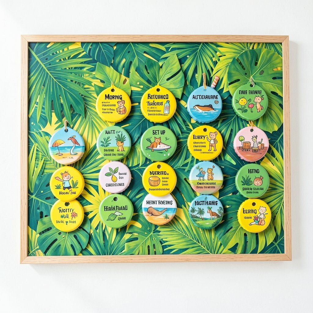
A tropical habit board can feel like a mini vacation in your home. Bright greens and bold yellows pop, and leafy magnet pieces hold habit trackers in place.
Magnets make updates easy, which matters when motivation changes day to day. Set up a simple row for morning, afternoon, and evening so you can check quickly. Personalize by choosing habit themes that match the colors, like yellow for energy and green for calm routines.
When you think about cost, magnets can be made from old bottle caps with adhesive backing or purchased in small packs for less. A current trend is mixing wellness and style, so pairing habits with fun visuals is a great way to keep it light.
To keep things practical, avoid adding too many habits at once and focus on a small set that you can actually maintain.
9. Bold Whiteboard With Color-Block Focus Zones
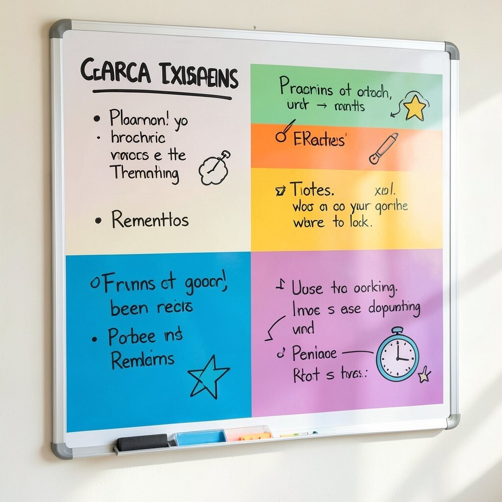
Imagine a whiteboard split into thick color blocks like a modern design poster. Each color zone holds a kind of thinking, such as planning, notes, and reminders, all in clean marker strokes.
This setup helps you stay organized because your eyes know where to look. Use thick markers for the headline tasks and lighter colors for small notes so the board stays readable. For personalization, draw simple icons that match each color zone, like a star for goals or a clock for deadlines.
10. Berry-Themed Study Board With Index Card Rings

A berry-themed study board can use rich red, purple, and soft lavender like a snack color palette. You can pin index cards in a gentle spiral, then group topics with small circle rings.
That visual grouping makes reviewing easier because related material stays together. Keep key formulas or summaries on one color card set so you can spot them fast before a test. Personalize by writing “example problems” on a different color so practice feels different from reading.
Cost stays friendly when you use paper you already have and print only what’s necessary. A trend in study planning is using quick “active recall” prompts, so add tiny questions on the cards instead of only writing notes.
11. Citrus Inspiration Board With Bright Pinwheel Layout
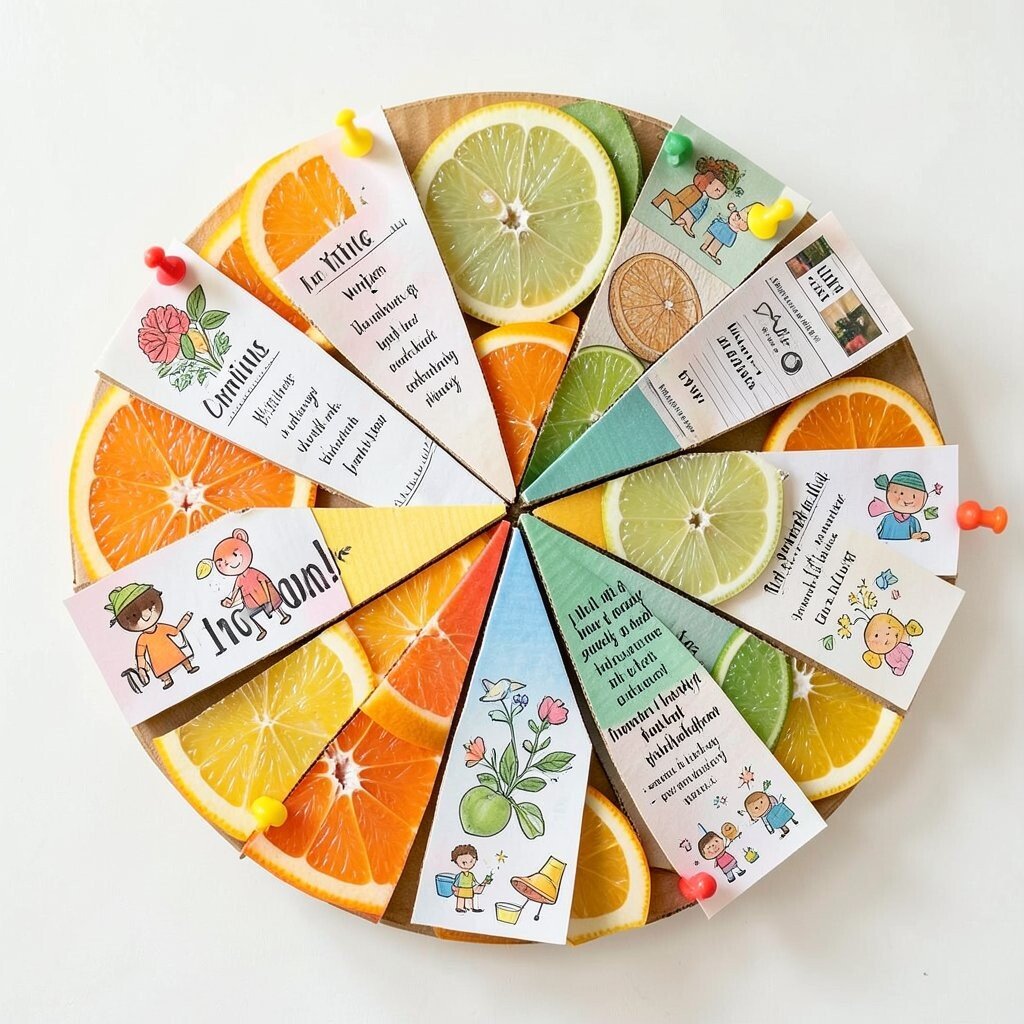
Picture a citrus board with sunny slices, like orange and lime accents, arranged in a pinwheel layout. Bright push pins hold small cards at the ends, giving the whole board a lively spin-like feeling.
This design boosts creativity because it invites you to move your attention from one idea to the next. Keep each spoke for a different creative category, like writing, design, and goals. For personalization, swap in mini doodles that you enjoy, since small personal art makes the board feel yours.
To keep costs in check, make the pinwheel from cardboard and use printables or magazine cutouts. People are also leaning toward “prompt boards” right now, where every section gives you a tiny writing or making task.
When you update, rotate one spoke each week so the board stays fresh without constant rebuilding.
12. Cozy Neutral Board With Colorful Side Accents
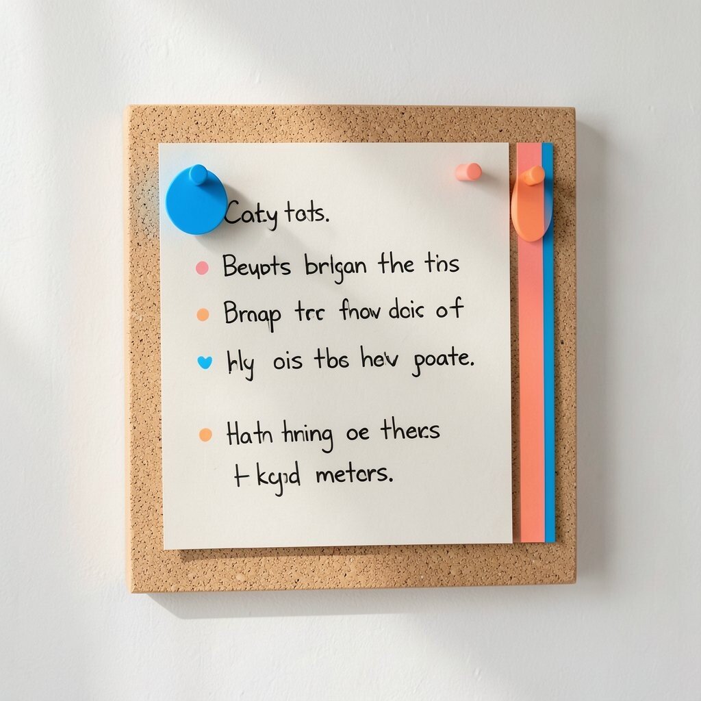
Some boards look best when most of the space stays calm, then color shows up in small bursts. Think beige cork or wood tones with bright blue and coral magnets holding only the most important notes.
This approach helps your brain relax while still giving you strong cues for action. Keep the colorful accents for deadlines, priority habits, or key meetings so you don’t overwhelm your space. Personalize by matching accent colors to your favorite mug, blanket, or planner so it feels coordinated.
13. Night Sky Branding Board With Starry Dot Clusters
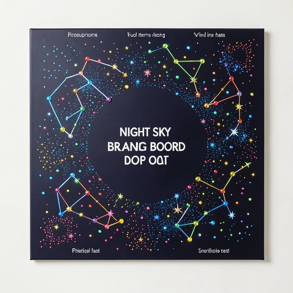
A night sky board can use deep navy and black backgrounds with clusters of starry dots in bright colors. Use glow-style stickers or metallic marker dots to form constellations around your topics.
This layout feels unique because it turns planning into a creative scene. Put your main goal in the center and let support ideas orbit it, which makes priorities feel clear. For practical tips, label the edges lightly with short keywords so you can find items fast even when it looks artsy.
If cost is a concern, draw stars with a simple dot pattern and use inexpensive craft gems sparingly. A current trend is “visual storytelling,” so arrange elements like chapters that show how your project grows over time.
To keep it sustainable, reuse old stickers by moving them to new constellations instead of buying new supplies.
14. Country Market Board With Colorful Price Tag System

Imagine a board that looks like a charming market stall, filled with small cards that resemble price tags. Use bright reds, teals, and yellows so each card stands out, then connect them to goals with thin string or clear clips.
This playful system makes planning feel light, and it can also help you track spending or effort. Use one color for “money,” another for “time,” and a third for “energy” so you can personalize the meaning. A practical trick is to keep the numbers small by using categories and ranges, which prevents the board from feeling too intense.
Cost considerations are easy here because you can create tags from cardstock scraps and use basic markers. A trend that fits this style is using “values-based shopping,” so the board can help you decide what to buy based on what you care about.
When you personalize, write a short phrase on the back of a tag so you remember the reason behind each choice.