A room can feel magical, yet small design missteps can spoil the mood fast. The fix is usually simpler than you think, and your art deserves that extra care.
1. Bad Lighting That Flattens Color

Bright bulbs that glare straight into the eyes can make paintings look dull and lifeless. Warm lamps can be comforting, but harsh hotspots can erase subtle brushstrokes.
Use lighting that feels balanced, so skin tones stay natural and shadows look intentional. Position fixtures so the beam grazes the artwork rather than blasting the surface. If you can, use dimmers and step back to check how the piece reads from different angles.
2. Choosing Frames That Fight the Artwork
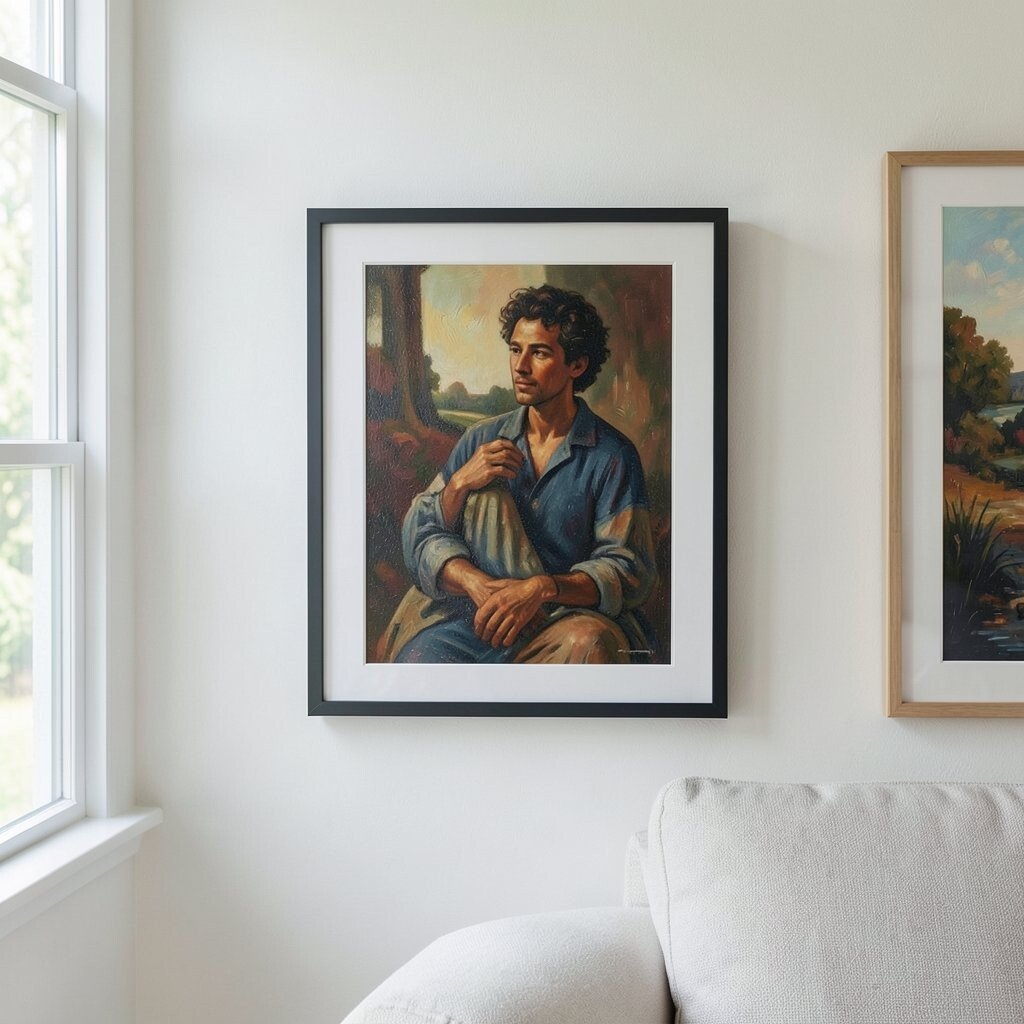
A frame should frame the art, not compete with it. When the border is too shiny, too thick, or too busy, it pulls attention away from the main story.
Match the frame to the artwork’s mood by using materials and colors that support the message. For a modern print, a thin matte frame often feels clean and current. For a warm oil painting, a richer finish can add depth and comfort without stealing the spotlight.
To personalize, try mixing finishes across the room while keeping a consistent width, so everything feels curated. If cost matters, you can reuse older frames by repainting them and adding simple liners for a fresher look. Many current interiors favor quieter borders and soft textures, which helps artwork remain the star.
3. Hanging at the Wrong Height
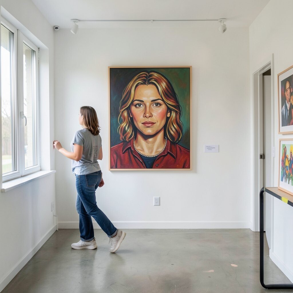
Art that sits too high can feel tense, like it’s staring down. Art that sits too low can look slumped and accidental.
Center the piece so the main subject lands around eye level for typical viewing. A portrait should feel like you can comfortably meet it, not stretch your neck to see it. After hanging, walk around the room and check how it looks when you’re standing, not just when you’re measuring.
Try marking a few spots on painter’s tape before committing, especially in busy spaces like hallways. You can also adjust for personalization by considering who uses the room most, such as kids’ art stations or guest seating areas. This kind of small planning saves money because you won’t have to remount and patch walls.
4. Overcrowding Without Breathing Room

When every wall is packed, your eyes bounce around and nothing gets to be memorable. A crowded display can feel like visual noise, even if each piece is beautiful on its own.
Give your favorite work space to land by leaving clear margins around each piece and around the full arrangement. Instead of filling every square inch, choose a focal area and build around it. This creates calmer flow, which helps people actually stop and look.
5. Ignoring Wall Color and Contrast

A pale wall can make dark artwork look heavy, while a deep wall color can swallow light pieces. The result is art that feels muted or oddly washed out.
Test contrast by holding the piece up near the wall or imagining how it will look once hung. Off-white walls often provide a flexible backdrop, while earthy tones can create warmth. Current styling trends also lean into textured paint and matte finishes, which can make color feel richer without extra glare.
Personalize by pulling one color from the artwork into small accents, like a pillow or vase, so the room feels connected. If you’re working on a budget, you can change wall impact with simple adhesive samples or temporary swatches. This helps you avoid costly repainting while still getting the tone just right.
6. Skipping Proper Spacing in Groupings

Gallery walls look great when spacing is intentional, but random gaps can make the layout feel messy. Even slight misalignment can show up once people move through the room.
Use consistent spacing so the group reads as one collection, not a pile of frames. Keeping equal margins between frames helps the eye move smoothly from piece to piece. A gentle grid can work for modern sets, while varied heights can feel playful when the gaps remain thoughtful.
For practical setup, measure the center-to-center distance, then mark your wall lightly before hanging anything. You can also personalize by letting one frame stand out with slightly wider spacing, which quietly signals importance. If you’re buying multiple frames, plan a repeatable sizing system early so cost stays predictable.
7. Using Nails and Hardware That Damage Art or Walls
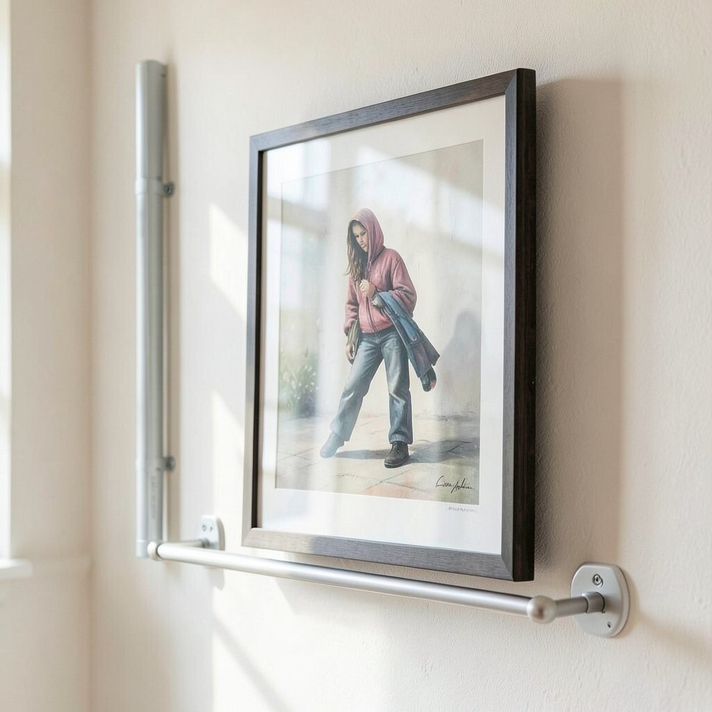
Cheap hangers can loosen over time, causing frames to tilt or slide. Worse, heavy pieces need hardware that truly supports their weight.
Choose hardware based on both frame weight and wall type so the art stays safe and level. Studs are sturdy for heavier works, while alternatives may work for lighter pieces. If you rent or care about wall longevity, consider picture hanging systems that reduce unnecessary patching.
To personalize, hang art so it can be swapped easily, using rails or track systems when possible. This makes seasonal changes simple and keeps your collection feeling fresh. Spending a little more on reliable hooks is usually cheaper than repairing dents, cracks, or ruined drywall.
8. Failing to Consider Reflection and Window Light
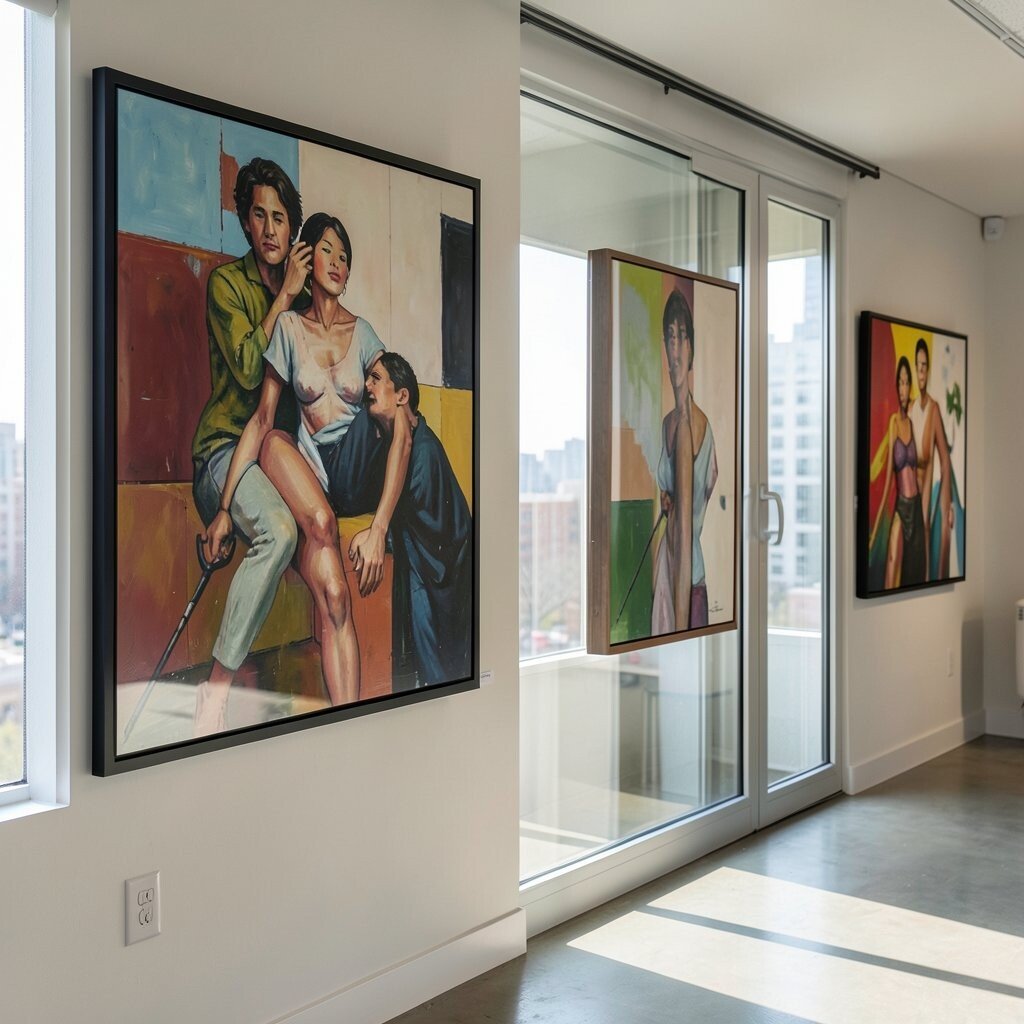
Direct sunlight can fade pigments, and it can also create reflections that cover the art. A beautiful window view can accidentally turn your artwork into a glare party.
Place pieces away from harsh sun paths and consider curtains or UV-filtering film when windows are close. If your art must sit near glass, aim for indirect light and avoid midday exposure. This protects color and keeps details visible, which is the whole point of display.
9. Not Planning for Viewing Angles
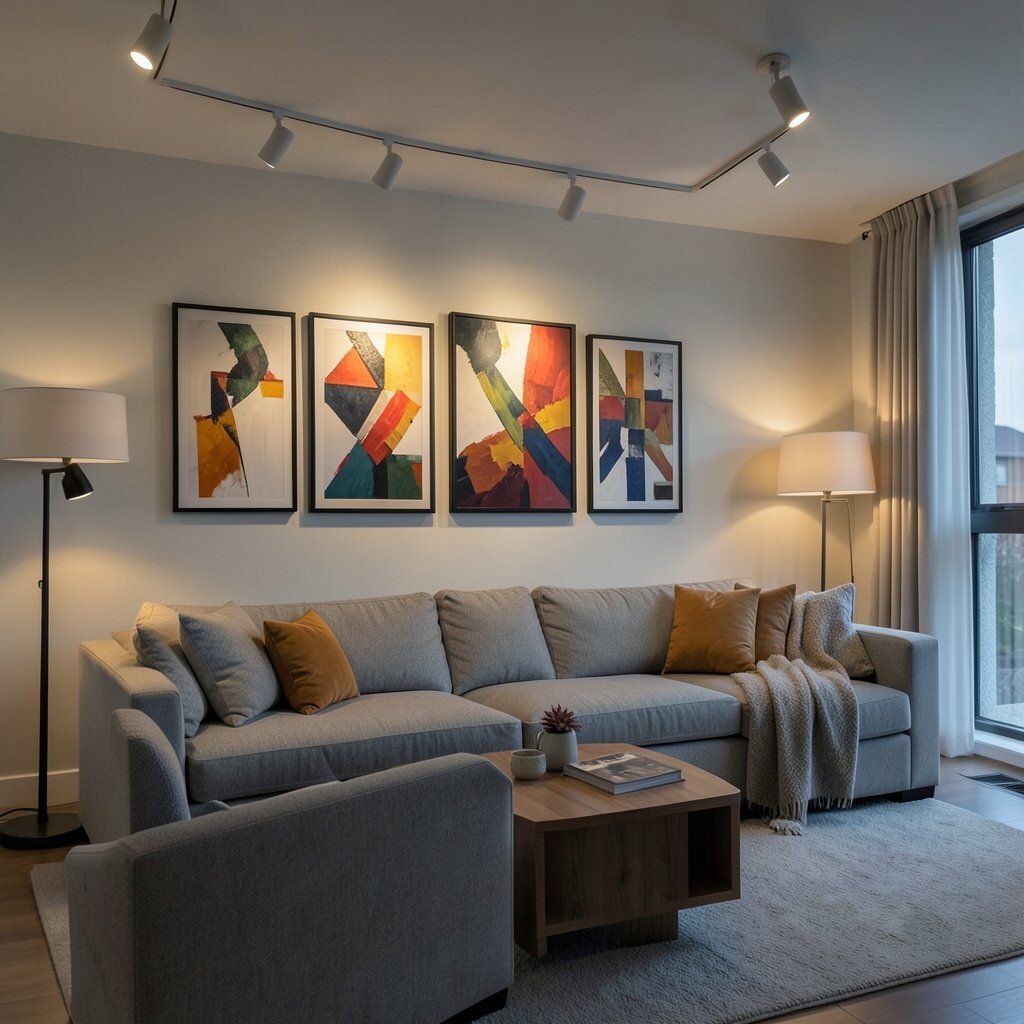
Some prints look perfect straight on, but turn flat or weird when you view them from the couch. If the arrangement doesn’t match how people actually stand and sit, the art won’t get its best moment.
Step back and look from the main seating spot before you call the job done. Adjust tilt and position so the artwork stays readable from common angles. This helps the whole room feel intentional, not just framed.
Personalize by placing a small spotlight so the piece glows during evening, matching the way you use the room. Many modern homes use layered light, like floor lamps plus track lights, which improves viewing comfort. It can also save money because you won’t need to replace art that was chosen without considering how it will appear day and night.
10. Treating Oversized Art Like It’s Small

A big artwork changes the space, so it shouldn’t be handled like a smaller poster. If the mounting location is too cramped, the piece can feel cut off or awkward.
Give large art room to breathe and keep it visually grounded on the wall. Leave extra margin around the edges so the viewer sees the full composition. For practical sizing, use painter’s tape to outline the boundaries on the wall before buying hardware or making permanent marks.
11. Using the Same Light Temperature Everywhere

One room might feel cozy with warm bulbs, while another needs cooler light to keep colors crisp. Mixing temperatures without thinking can make the art look inconsistent across the home.
Try matching light color across the display area so reds, blues, and neutrals stay true. Many fixtures now offer adjustable settings, which is helpful for modern living rooms and hallways. Warm lighting often flatters wood and skin tones, while slightly cooler lighting can sharpen details in contemporary prints.
Personalize your setup by changing lighting mood for different times of day, such as using a warmer scene in the evening. If you want to stay mindful about cost, start with adjustable bulbs in a few key fixtures rather than replacing everything at once. This keeps your collection looking cohesive without huge spending.
12. Ignoring the Backdrop Texture

A smooth wall is predictable, but textured surfaces change how shadows fall around frames. Sometimes a tiny frame shadow looks messy because the wall bumps are too busy.
Consider how the wall texture will interact with the frame, especially for matte art or minimalist lines. Matte backdrops can hide glare, while glossy surfaces can create extra shine. If you’re dealing with strong texture, using slightly wider frames or mounts can help the art read clearly.
Personalize by coordinating texture and material, like pairing wood frames with natural plaster walls. Current trends often mix materials, such as combining stone-look paint with simple metallic frames, which can feel elevated. If budget is tight, you can adjust the look with frame depth and positioning before buying new wall treatments.
13. Choosing Art Sizes Without Considering Furniture Scale

Art that’s too small over a sofa can feel like it’s lost in the room. Art that’s too large over a narrow console can crowd the space and block natural flow.
Match the artwork to the furniture width so the balance feels calm. A common win is keeping the art roughly proportional to the main piece of furniture, so the pair looks planned rather than accidental. After hanging, sit in your usual spot and see if the piece feels like part of the scene.
14. Hanging Everything at One Distance From the Wall

When every frame hugs the wall, the display can look flat and one-note. Depth differences matter, especially for pieces with shadows, embossing, or dimensional frames.
Use different mounting depth when it helps the art cast a subtle shadow that feels dimensional. Spacers and shadow-gap mounts can create a gallery-like separation, making prints and textiles look more premium. If your budget is limited, you can still gain depth by adjusting frame thickness and choosing mats with clean edges.
Personalize by giving the most important piece a slight separation from the wall so it becomes the natural anchor. This is a smart trick in modern interiors where layering and negative space are valued. It can also reduce the need for extra décor because the artwork feels more dimensional on its own.
15. Neglecting Condition and Cleaning Before Display

Dust, fingerprints, and fingerprints caught under glass can make even a perfect piece look tired. Over time, grime dulls contrast and hides details.
Clean frames and glass gently before hanging so the art stays crisp and clear. Use soft, dry methods first, and avoid harsh chemicals that could harm finishes. If the artwork is behind glass, check that the seal is intact to prevent buildup and avoid moisture problems.
Personalize your care routine by setting a simple monthly check-in, especially in kitchens, bathrooms, or homes with pets. This prevents slow wear and can save money because you won’t need replacement glass or damaged framing. Current collectors often treat display preparation as part of the art experience, not a last-minute chore.
16. Forgetting Seasonal Updates and Personal Life Changes
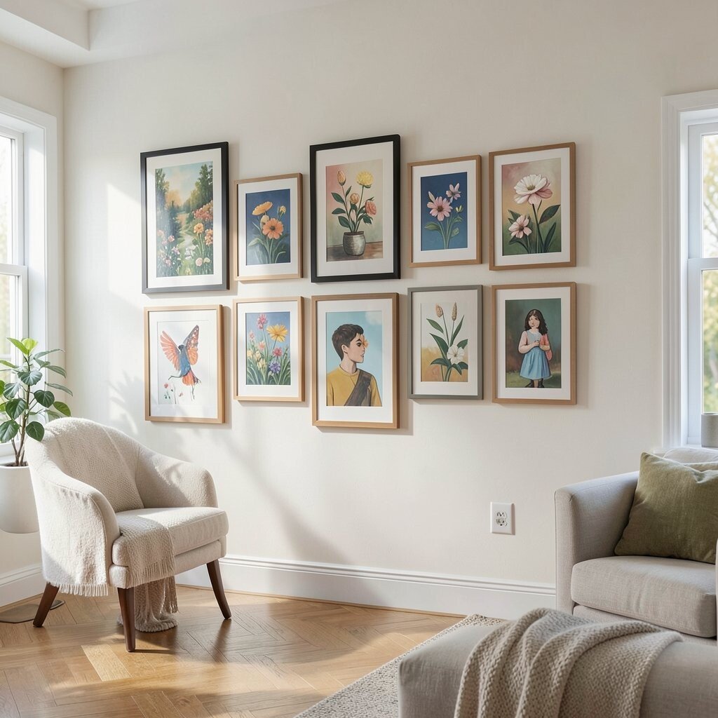
Rooms change with the seasons, and so does how you want to feel when you walk in. If your display never shifts, the space can slowly stop reflecting your current life.
Rotate small pieces, swap seasonal colors, or rework the spacing in a group to refresh the vibe. Rotations can also help protect light-sensitive art by changing exposure patterns. This makes your collection feel alive and personal, not like it’s stuck on a single moment.
Try personalization by keeping a core set of frames and swapping only the art inside. That approach keeps costs lower and lets you try new styles without buying an entire new wall system. Many modern homes love this flexibility because it supports hobbies, gifts, and changing tastes.
17. Treating Your Display Like a Fixed Rulebook

People often hang art once and then follow strict “shoulds” forever, even when the room later changes. New furniture, rugs, and lighting can make the original layout feel off.
Be willing to adjust, because design works best when it fits real routines. If you move the couch or change the lamp placement, recheck how the artwork looks in that new setup. This keeps your display grounded in the way you actually live, which is where good style begins.
Personalize the process by taking a quick photo from your favorite viewing spot, then comparing before and after. Over time, you’ll learn what feels right for your tastes and your home’s natural light. Staying flexible can be the most budget-friendly choice, since you avoid replacement and make smarter tweaks instead.