Your design can look fine at first glance and still cause real friction. Small choices quietly steer how people feel, click, and trust.
Here are common mistakes, each described with a visual picture and practical fixes you can apply right away.
1. Cluttered Pages That Feel Busy

A crowded layout is like a room full of furniture shoved too close together. In a quick visual scan, your eye bounces between headlines, buttons, icons, and text blocks that compete instead of guide. People often leave because they feel they have to work to find the point. A calmer page helps visitors stay longer because the next step becomes obvious.
Try giving your content “breathing space” so the page reads in clear chunks. You can do this by using fewer elements per screen, increasing spacing, and aligning items to an invisible grid. Look at your page like a camera view and remove anything that does not support the main action. If you sell products, keep the hero area focused on one highlight, one offer, and one clear route.
2. Weak Visual Hierarchy That Hides the Main Message
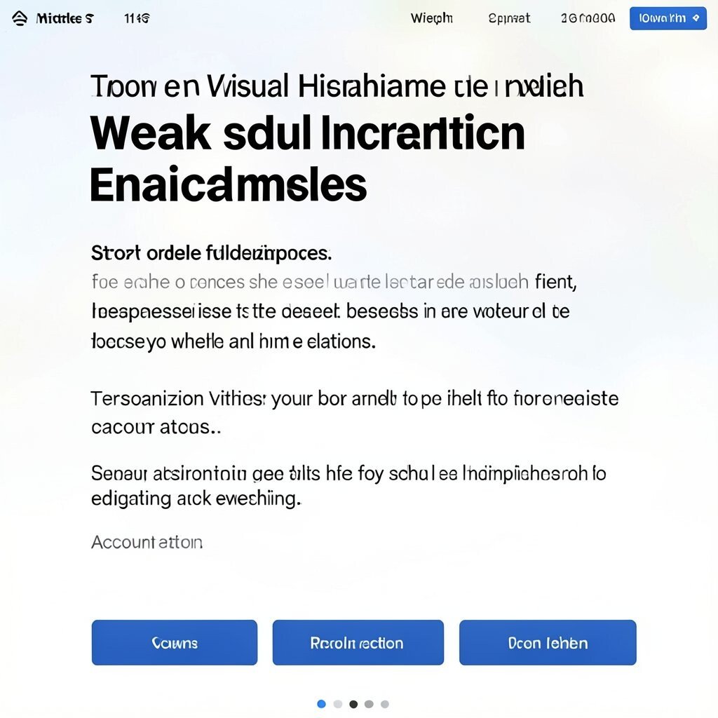
When hierarchy is unclear, everything looks equally important. Imagine a screenshot where the headline, subheading, and three buttons all share similar font size and weight, so your eyes do not know what to do first. People may scroll longer than they should or bounce because the “story order” feels wrong. A strong hierarchy makes the page feel friendly because it tells the viewer what to notice first.
Use size, weight, and placement to create a path through the content. Make the main message large and distinct, then support it with smaller text that explains details. Buttons should stand out through contrast and spacing, not through subtle changes that blend in. For personalization, adjust hierarchy based on intent, like giving returning visitors a more prominent account action.
Cost can be low here because you mainly need updated typography and layout spacing. Current trends favor bold headings with simple type choices, plus generous whitespace around key sections. Test by squinting at the page for a second; if you cannot quickly spot the main point, the hierarchy needs a reset. Even a small scale change can improve conversions without redesigning everything.
3. Low Contrast Text That Makes Reading Hard
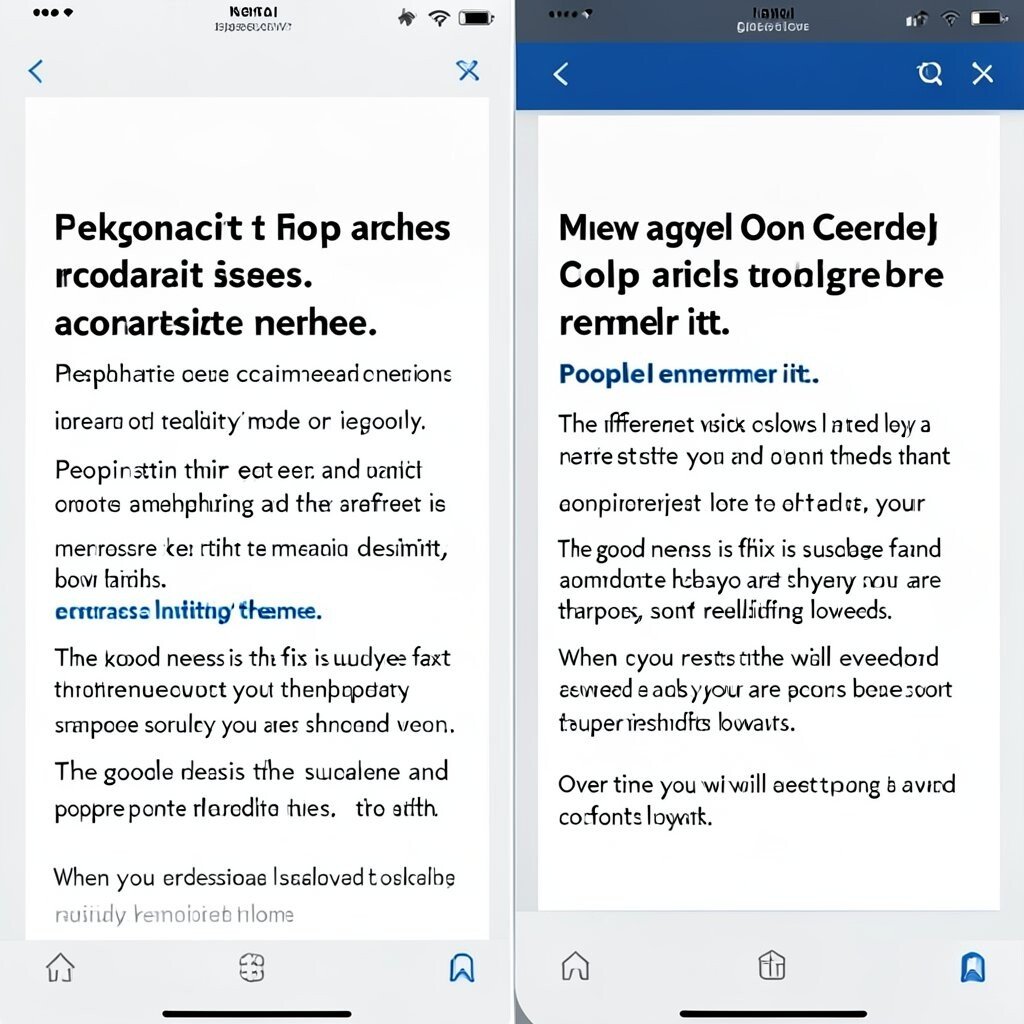
Low contrast is the silent killer of usability, especially on mobile screens. In a visual mock, body text can appear washed out against a light gray background, and you might only notice the problem when someone else reads it. People strain their eyes and may assume your content is low quality. High contrast improves accessibility, readability, and overall trust.
Pick color pairs that remain clear in daylight and at night. Use a contrast checker during design and then verify again in real conditions like your phone screen. Consider adding a slightly darker background or a deeper text color to keep the look modern. If your brand uses light palettes, you can still keep readability by using thicker font weight for key text lines.
To personalize, you can offer a “high readability” mode on larger sites or let users switch themes. That kind of feature feels thoughtful and supports people with different needs. The good news is the fix is usually fast and inexpensive because you are swapping colors, not rebuilding layouts. Many current designs also embrace layered backgrounds, but they keep text contrast crisp.
When you present visual examples to teams, include one version with contrast issues and one corrected version side by side. The difference looks obvious, and people remember it. Over time, you will develop a strong eye for what “too faint” looks like.
4. Too Many Fonts or Styles That Look Uncontrolled
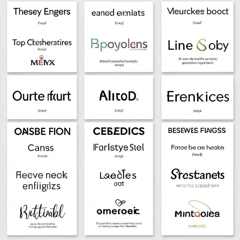
Mixing multiple fonts and weights without rules can make a design feel messy. Picture a card grid where each item uses a different type style, and the page starts to feel like a collage rather than a system. It may still be “readable,” but the brand voice feels inconsistent. A tighter type system makes everything look intentional and easier to scan.
Choose one primary font, one secondary font if needed, and keep styles limited. Use consistent sizes and weights for headings, body, and captions so the page behaves predictably. You can create a small typographic scale where each step has a clear purpose. For practical personalization, vary styles only by content type, like using a special style for testimonials across all pages.
If you do need a trend-friendly look, try using one modern display font for the hero and a clean sans for everything else. Many teams now prefer simple font pairings and fewer weights, which also speeds up performance. Cost is often low because this is mostly a design decision, though you may need updated licensing if you switch font families. The real win is that future pages become easier since the rules are already set.
5. Buttons That Don’t Look Clickable
A button should shout “press me,” even before you read the text. In a visual screenshot, a call-to-action might look like plain text with a small border, so it blends into the background. People hesitate because they are not sure if something is interactive. Clear button styling reduces confusion and increases clicks.
Use a solid background, high contrast text, and enough padding so the button feels touch-friendly. Keep the button style consistent across the site so users learn your interface. Add hover and focus states that visually confirm the action, like a subtle color shift or shadow. If you offer multiple actions, create a visual hierarchy by making the primary button stronger than secondary ones.
For personalization, change the button label based on context, such as “Resume” for returning visitors. You can also adjust color choices for audiences while still staying inside accessibility rules. Current trends often favor bold, rounded shapes with clear spacing, especially on landing pages. The cost is usually minimal because the fix is styling, not a new feature build.
6. Overusing Decorative Graphics That Distract
Decorations can be fun, but too many can pull attention away from meaning. Imagine a marketing hero with floating shapes, busy patterns, and multiple icons, all competing for your eye at once. You might still like the vibe, yet users struggle to spot the headline and main offer. When visuals support the message instead of fighting it, people feel calmer and more confident.
Keep graphics purposeful and reduce anything that does not guide attention. For example, use one hero illustration and let the rest of the page stay simple. If you want personality, pick a single style like soft gradients or consistent icon lines. You can personalize by tailoring illustrations to audience segments, such as a different scene for different use cases.
Cost considerations matter too because heavy illustration work can raise production time. A practical approach is reusing simple vector icons and adjusting colors to match your brand. Many modern designs also lean toward subtle, minimal ornamentation rather than fully busy backgrounds. When in doubt, ask whether the visual improves comprehension or just looks “cool.”
Try running a quick test by hiding images and checking if the page still communicates the main point. If the message survives, the graphics are likely supportive. If it falls apart, you have clarity to fix.
7. Copy That’s Too Generic or Too Clever
If your text could fit on almost any website, it will feel forgettable. In a visual example, headings like “Welcome to the Future” with vague paragraphs create a pleasant look but weak meaning. Visitors may admire the design and still not understand what you do. Specific, friendly copy helps people connect the visuals to real outcomes.
Write lines that name the reader’s situation and the result they want. Replace broad claims with concrete details, like what users get and how fast they can start. Keep the tone conversational and short, so skimmers can catch the point quickly. Personalization can help here too by tailoring examples to industry, skill level, or goal.
Consider cost by starting with small revisions to existing copy rather than hiring a full rebrand. Current trends favor plain language and honest phrasing, especially on product and service pages. You can also use microcopy near buttons to reduce uncertainty, like clarifying what happens after clicking. The best designs feel human, not like a slogan pasted on top of a layout.
8. Bad Spacing That Breaks Layout Rhythm
Spacing is the hidden conductor of the page, and poor rhythm makes designs feel awkward. Picture a list where items are too close together, then suddenly one section has huge gaps, creating an uneven scroll. Your eyes keep tripping over edges because the structure feels inconsistent. Good spacing improves readability and makes the page feel polished.
Use consistent margins and padding, then stick to a spacing scale. Align elements to a grid so lines and blocks feel anchored. When you adjust one section, check neighboring sections so the whole page keeps a steady beat. For personalization, you can adjust spacing density based on content length, like using tighter spacing for dense data cards.
Cost is often low because spacing tweaks mostly involve design settings. Still, it can save development time later since fewer layout issues reach production. Many current designs favor “measured” whitespace with rounded corners and soft shadows, but the real secret is consistency. If you want a quick win, focus on line height and paragraph spacing before anything else. Your page will instantly feel more confident.
9. Ignoring Mobile View and Touch Behavior
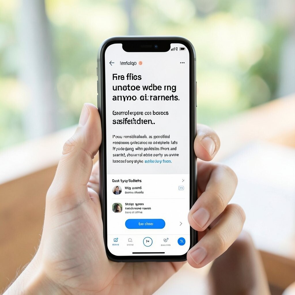
What looks good on a desktop monitor can fail on a phone in seconds. In a visual example, tiny buttons sit side by side and a hero headline wraps awkwardly into several lines. People miss taps and get annoyed, even if the design looks sleek. Mobile-first attention improves usability, reduces mistakes, and boosts satisfaction.
Check touch targets so buttons and links are easy to hit with a thumb. Ensure text size stays readable and line lengths do not become tiny slivers. Reduce multi-column layouts that collapse poorly, and allow sections to stack naturally. If you personalize, adjust content density for different device categories, like fewer cards per row on smaller screens.
Cost considerations are practical here because mobile fixes can be cheaper early and expensive late. If you design with responsive rules from the start, you avoid last-minute rework. Current trends include sticky action bars and simplified navigation patterns that make key actions reachable. Use design system components so you do not invent a new mobile style every time.
Try a real phone test and watch how fast a new person can complete the main action. The moment they hesitate is often where spacing or touch behavior needs attention.
10. Overcomplicated Navigation That Makes Finding Things Hard
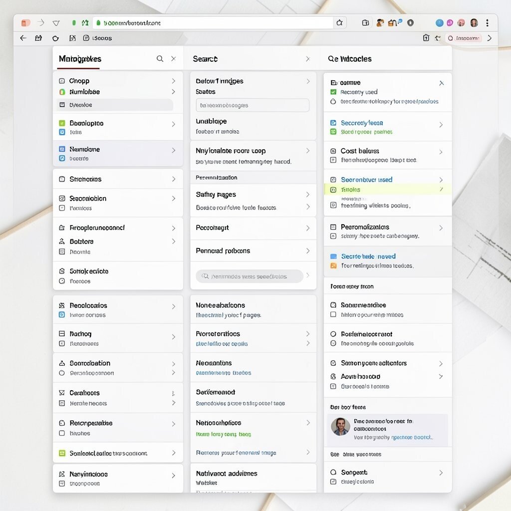
Navigation should feel like a map, not a puzzle. Imagine a screenshot where the menu includes many categories, each with submenus, and the top bar changes size on hover. Users spend time deciding where to go instead of using your content. Clear navigation helps people trust the interface and act with confidence.
Limit top-level items and group similar pages under one umbrella. Use labels that match how people talk, not how your internal team describes features. Include search if you have lots of pages, and make sure the search results page feels helpful. For personalization, you can surface “recently used” links for returning visitors to speed up tasks.
Cost can be managed by starting with labeling changes and information architecture before building new features. Many teams now use simplified mega-menus only when necessary, because they can become heavy. Trends also favor persistent, predictable navigation patterns that do not jump around. If your site has multiple audiences, consider separate navigation paths for each intent group.
To make your fix actionable, create a short path test where you ask someone to reach one destination. If they take too many steps, navigation clarity needs improvement.
11. Too-Loud Motion or Animation That Hurts Focus

Motion can add delight, but excessive animation can steal attention and slow down reading. In a visual example, a landing page has elements bouncing, fading, and sliding every time you scroll. Visitors might love it briefly and then feel tired or distracted. Calm motion supports understanding instead of competing with it.
Use animation sparingly and tie it to user actions, like confirming a click or revealing a panel they requested. Prefer quick transitions with gentle easing so the page feels responsive. Always include a reduced-motion option for people who prefer less stimulation. Personalization can be as simple as enabling motion settings based on user preferences.
Cost considerations include performance and development effort if you add complex animations. Lightweight CSS animations are often cheaper than heavy video-like effects. Current trends lean toward subtle micro-interactions, such as button press effects and smooth modal transitions. If you want to keep a playful style, pick one motion style and apply it consistently across the site.
12. Poor Use of Color That Breaks Brand Trust
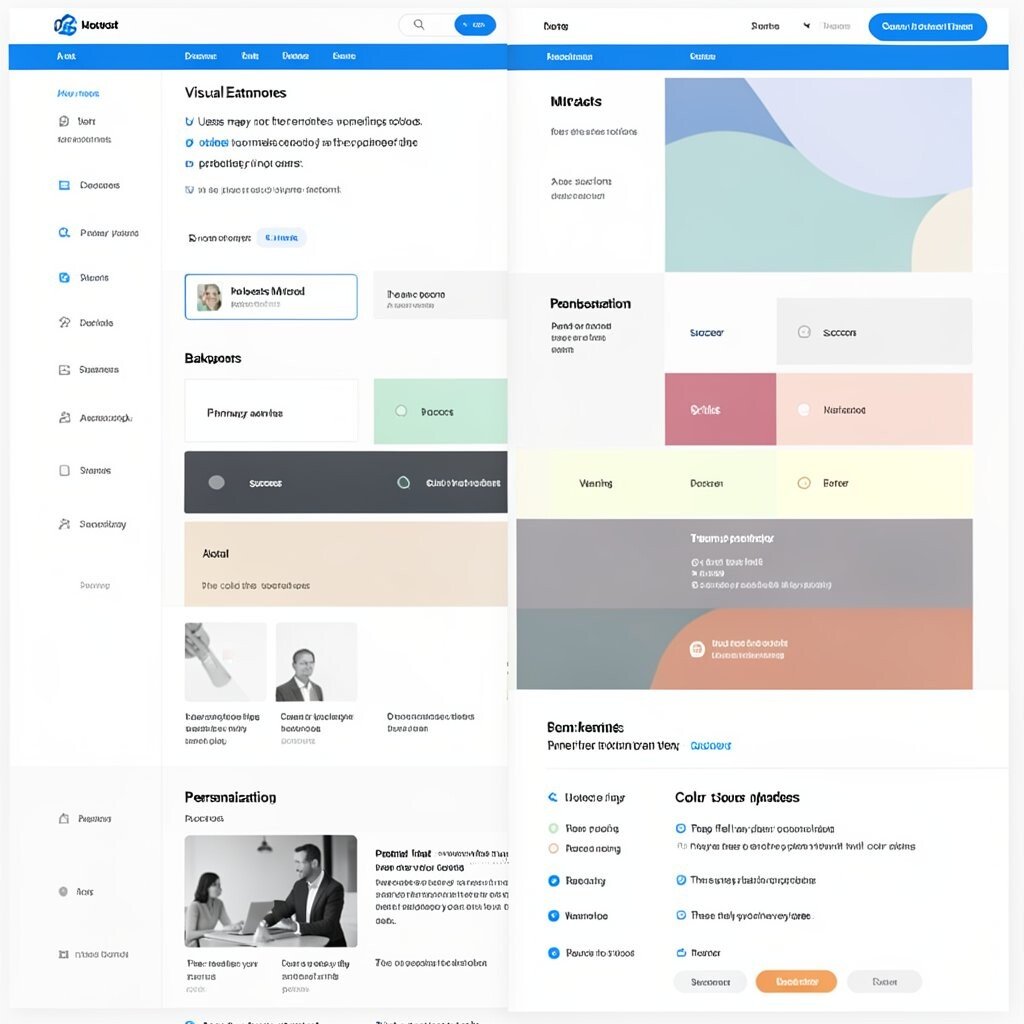
Color choices shape emotion fast, and confusing palettes can make users uneasy. Picture a website where links are a different blue in one section and another blue elsewhere, while warnings look like playful accents. Users may not trust the meaning of colors because they seem inconsistent. A clear color system makes the interface feel predictable and reliable.
Build a small palette with roles like primary actions, links, backgrounds, and status states. Keep color meaning consistent so people learn the system quickly. Use test screenshots with grayscale to check whether hierarchy survives without color. For personalization, you can support theme switching while keeping accessibility contrast and status colors consistent.
Cost is usually moderate since you may need to update design tokens, but it saves time long term. Current trends often use rich accents with muted backgrounds, but the best results come from disciplined usage. Consider updating your color logic first, then adjusting visuals like icons and borders. People feel safer when they can predict what will happen based on color alone.
A practical tip is to list your status colors like success, warning, and error and confirm they stay the same across every page. That simple habit reduces a lot of design confusion.
13. Using Visuals Without Context or Explanation
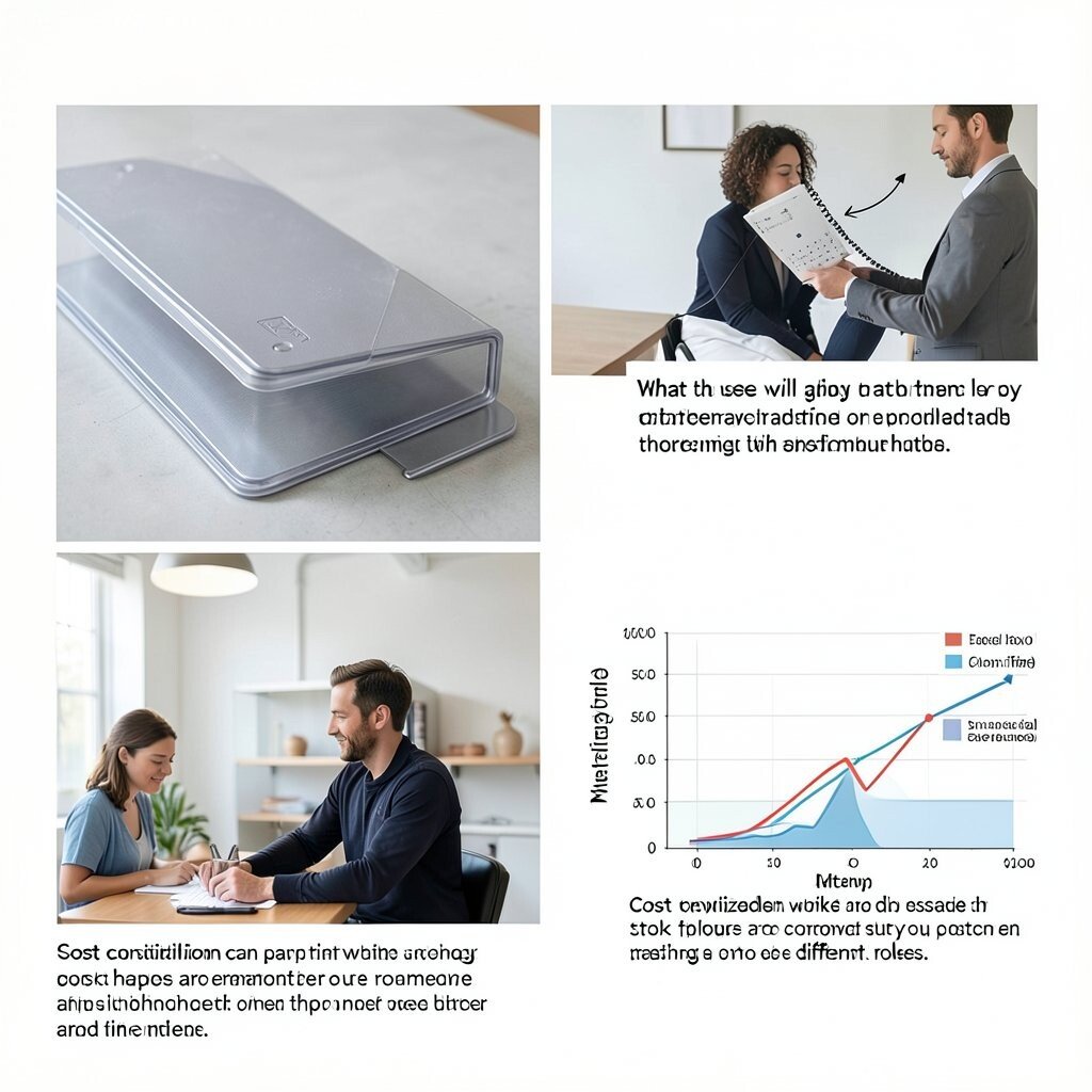
An image can look professional yet still fail if it does not connect to the user’s goal. In a visual example, you might see a product photo with no caption, no mention of what it shows, and no hint about who it’s for. People may wonder if the image is relevant or outdated. Clear context helps visuals do their job and increases trust.
Add short descriptions near images that explain what matters, like features, outcomes, or scenarios. Use captions that answer basic questions quickly, such as what the user will gain from what they are seeing. If you use charts, label axes and keep legends readable so people can interpret the story. For personalization, swap images based on user segment, like showing work scenarios relevant to different roles.
Cost considerations can be kept low by improving captions and alt text first. Stock photos are common, but you can still make them feel purposeful by matching the visuals to the exact promise you make in text. Current trends favor authentic imagery and subtle lifestyle cues, yet even simple photos work if the explanation is clear. Aim to show one key idea per image rather than cramming multiple meanings into a single frame.
14. Overusing Borders and Shadows That Look Heavy
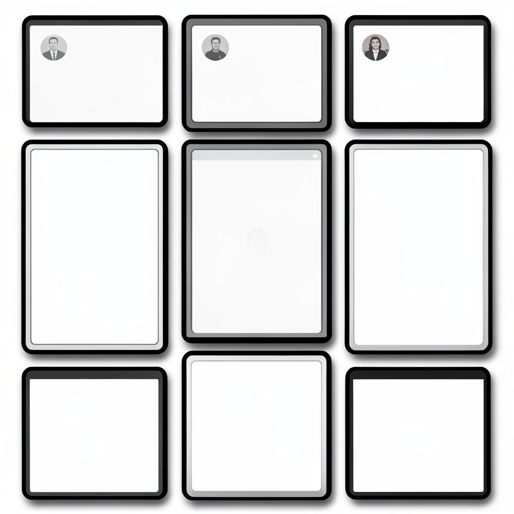
Too many borders and shadows can make a design feel like it is wearing armor. Imagine a card grid where every card has thick outlines and strong drop shadows, creating a cluttered look. It might feel “premium” at first, but the page loses clarity because edges fight each other. Softer, purposeful depth helps users understand groups without overwhelming the eye.
Use shadows to suggest hierarchy and layering, not to decorate everything. Choose one shadow style and apply it consistently to similar components. Increase spacing and alignment first, then use subtle elevation as the finishing touch. For personalization, you can increase contrast for accessibility modes or reduce shadow intensity for a calmer theme.
Cost is usually low because this is mostly a style adjustment. Many current designs use minimal shadow with blurred gradients or simple outlines, aiming for clean modern cards. If you redesign, pick fewer elevation levels so the interface stays predictable. A practical test is to compare your design in bright light and dim light; heavy shadows often look harsh in both.
When you reduce shadow strength, the layout often looks instantly more “expensive” because the content gets more attention.
15. Not Designing for Trust Signals Like Reviews and Guarantees
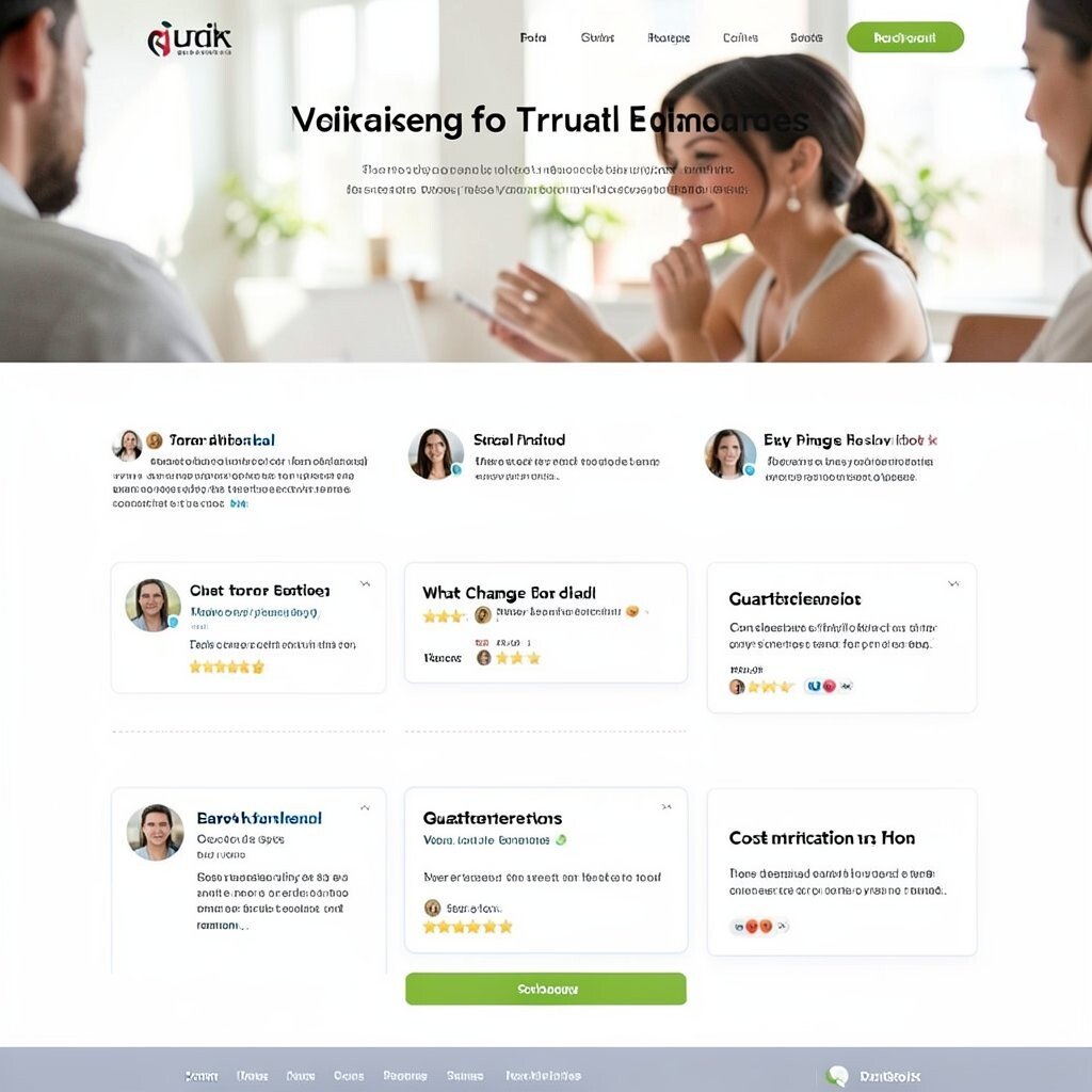
Users want proof, and missing trust signals can make a page feel risky. In a visual example, a landing page has strong visuals but no social proof, no clear pricing explanation, and no reassurance near the call-to-action. People hesitate because they fear hidden surprises. Trust-building elements help the design feel safer and increase action.
Add clear review sections, customer quotes, and easy-to-skim evidence near where people decide. Show results with context, like what changed and how long it took. Include guarantees and policies in a way that reduces uncertainty, such as simple wording near checkout or signup. For personalization, surface reviews relevant to the user’s use case so proof feels specific, not random.
Cost considerations vary, but you can start small with existing testimonials and clear FAQ content. Many teams also follow current trends by using short testimonial cards and rating summaries, but the key is authenticity. Ensure the text and visuals stay consistent and not overly generic. Even a few well-chosen trust signals can boost conversions more than adding another banner.
Visually, place trust elements close to the main action, so the reassurance arrives right when the user needs it.
16. Inconsistent Component Styles Across the Same Page

When components do not match, the interface feels unreliable even if the design is attractive. Picture a single screen where headings look different across sections, buttons vary in size, and form fields use mismatched borders. Users feel like they cannot predict the rules of the interface. Consistency improves speed because people can scan and act without re-learning patterns.
Use a design system for typography, buttons, inputs, spacing, and icon styles so every page shares the same language. Align form field styling with button styling so users see a coherent interaction pattern. If you must vary styles for emphasis, limit the variation and document what changes mean. For personalization, adjust content while keeping the component structure stable, like changing labels but not changing layout logic.
Cost is worth thinking about because building a system takes time, but it prevents repeating work and reduces bugs. Current trends favor cohesive UI libraries and token-based styling, which makes updates easier. A practical tip is to audit your page by comparing three similar components, like two call-to-action buttons, across sections. If they look different without reason, you have a clear target for cleanup. Over time, this kind of consistency improves not only visuals but also development speed.
When the design feels like one system, users trust it more, and they move faster through tasks.