The kitchen can feel calmer when the colors stop shouting. Neutral tones let your everyday life look neat, warm, and intentional.
From creamy whites to soft greige, you can create a space that works with every season. Pair it with smart textures and a few personal touches, and it will feel like yours.
1. Creamy Off-White Walls With Warm Light
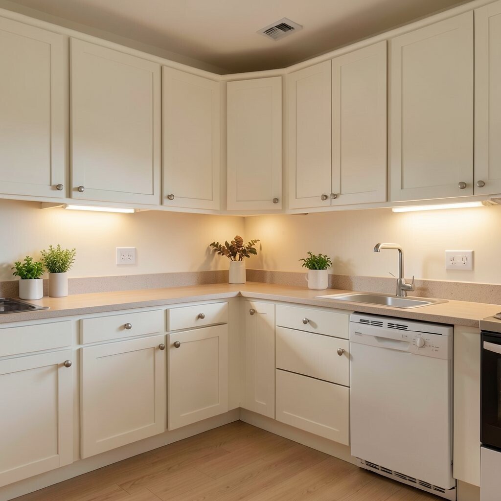
Paint your kitchen walls in a creamy off-white instead of a stark bright white. The result feels gentle, like morning sun on a tabletop.
Choose a warm bulb temperature so cabinets and counters look smooth, not bluish. This approach makes small kitchens feel bigger and makes wood tones look richer. For practical results, test the paint on a few spots near the light switch and under evening light.
2. Greige Cabinetry That Never Looks Dull
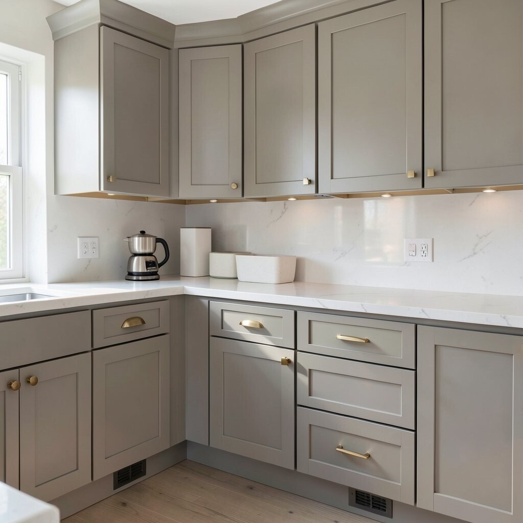
Greige cabinets sit between gray and beige, giving you a balanced neutral. They look tidy with both silver hardware and warm brass accents.
To keep greige from feeling flat, add depth with a soft sheen finish like satin. Pull drawers glide easier when you replace older hardware with modern, sturdy pulls. If your budget is tight, consider painting only the cabinet boxes and leaving the doors for last.
Personalize by adding a glaze effect on upper cabinets or by mixing two greige shades, one a touch lighter. Current trend favorite shades lean slightly warmer, so check samples in daylight before you commit.
3. Taupe Countertops Paired With Soft White Backsplash
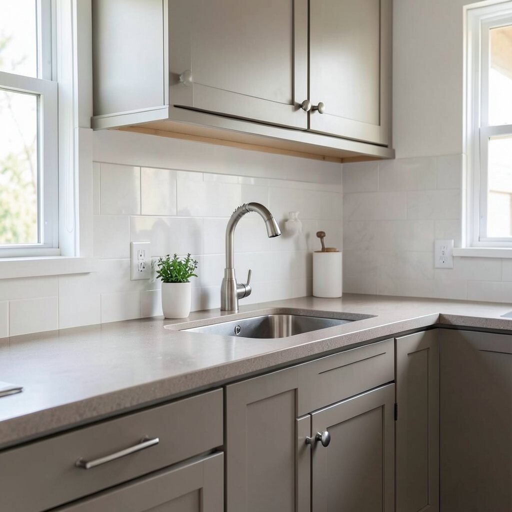
Taupe countertops add a cozy, grounded look without making the kitchen feel heavy. They hide everyday scuffs better than glossy light stones.
Pair them with a soft white backsplash so the whole room stays airy. Aim for subtle variation, like honed surfaces or stone patterns that look natural rather than busy. When you wipe, neutral tones also help stains look less obvious, which is great for busy households.
For a practical upgrade, choose grout that matches the lightest tone in your tile so lines feel clean. If you want personalization, bring in a single texture such as a matte ceramic or a micro-cement style finish.
4. Natural Wood Shelving for Everyday Beauty
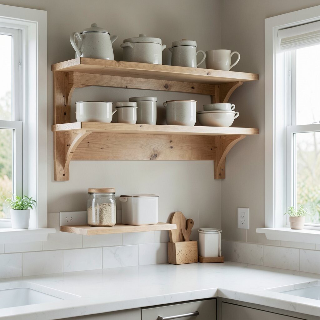
Open shelving in natural wood brings warmth to a neutral kitchen. You get a friendly look that feels lived-in, not staged.
Keep items visually calm by arranging essentials in matching containers and keeping the countertop clutter low. This design saves money because you can skip expensive cabinet doors and instead refresh shelving brackets and wood finish. Try a clear matte seal so the wood stays light and easy to maintain, and rotate what you display seasonally.
5. Stone-Look Tile in Warm Sand Tones
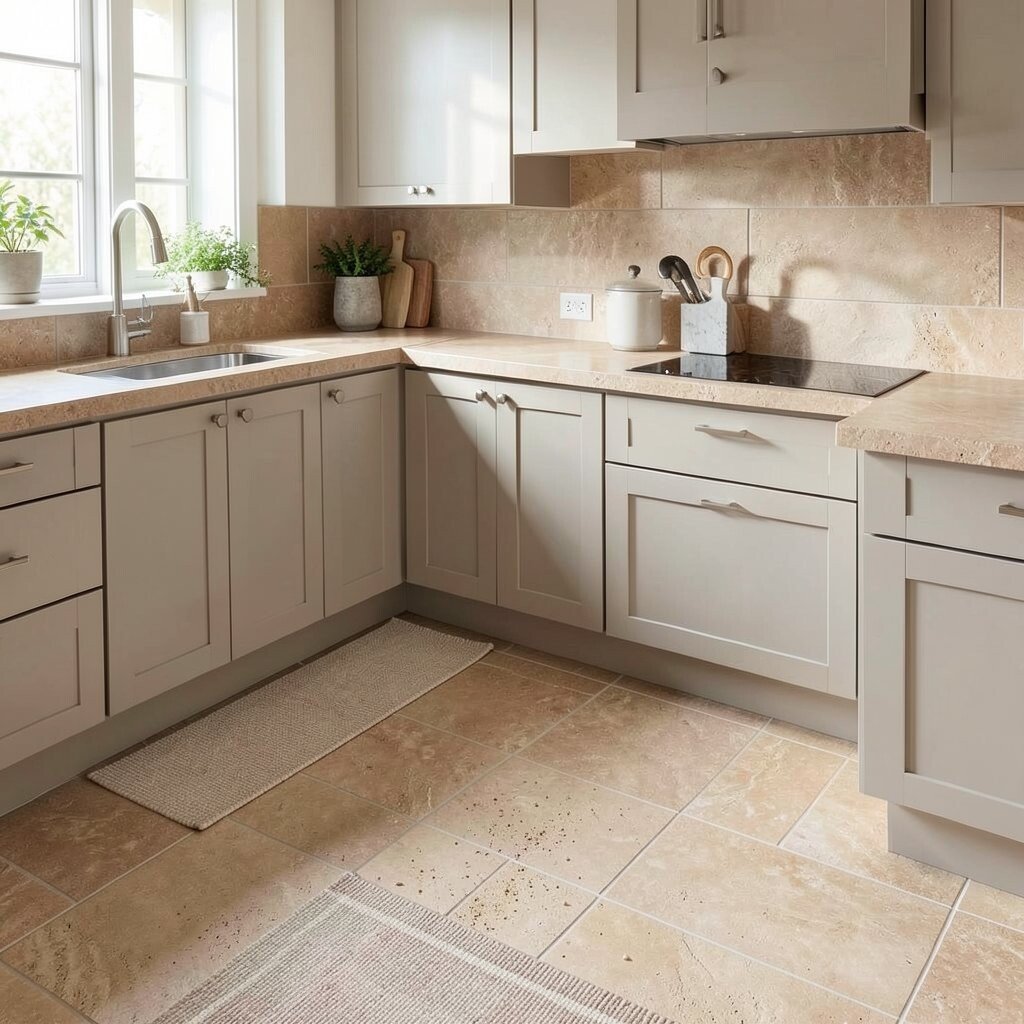
Stone-look tile in warm sand tones can make your kitchen feel like a spa. It adds pattern without taking over the color story.
Look for tiles with gentle movement so the floor hides tiny crumbs and dust. Smaller grout lines can also look more refined, especially in kitchens that see lots of traffic. For practicality, choose a slip-resistant finish if the kitchen is busy with kids or pets.
Personalize the vibe by adding a runner in a neutral stripe or a flat-weave texture. This is a current favorite look because it mimics real stone while often costing less.
6. Matte Black Hardware as a Sharp Neutral Accent
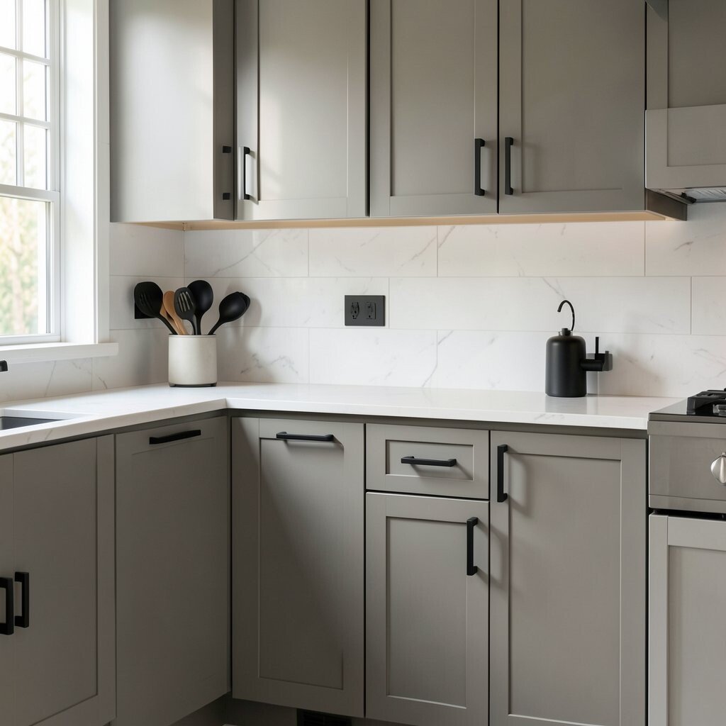
Matte black hardware makes neutral kitchens feel crisp and modern. It gives you contrast without needing bold wall colors.
Use it on cabinet pulls, drawer handles, and even a faucet for a matching set. The benefit is visual clarity, since black lines help define edges and make the room feel designed. For cost control, update hardware first before investing in new cabinetry or counters.
If your style leans softer, choose a black finish that isn’t too glossy. You can also add one black accent item, like a utensil crock or pendant, so the look feels intentional.
7. Warm White Islands With Seating-Friendly Details
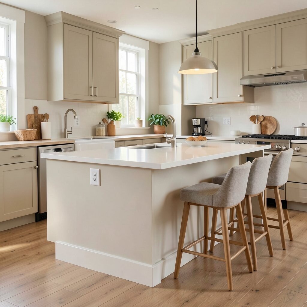
A warm white island creates a bright focal point, especially when the rest of the kitchen stays neutral. It’s a simple way to add function and style at the same time.
For benefits, islands help with prep space and make the room feel social. Add seating by choosing a durable overhang and comfortable counter height, then finish the edge with a clean profile. To keep the space practical, use an easy-clean countertop material and plan outlets for small appliances.
8. Textured Plaster Walls for a Soft, Premium Look
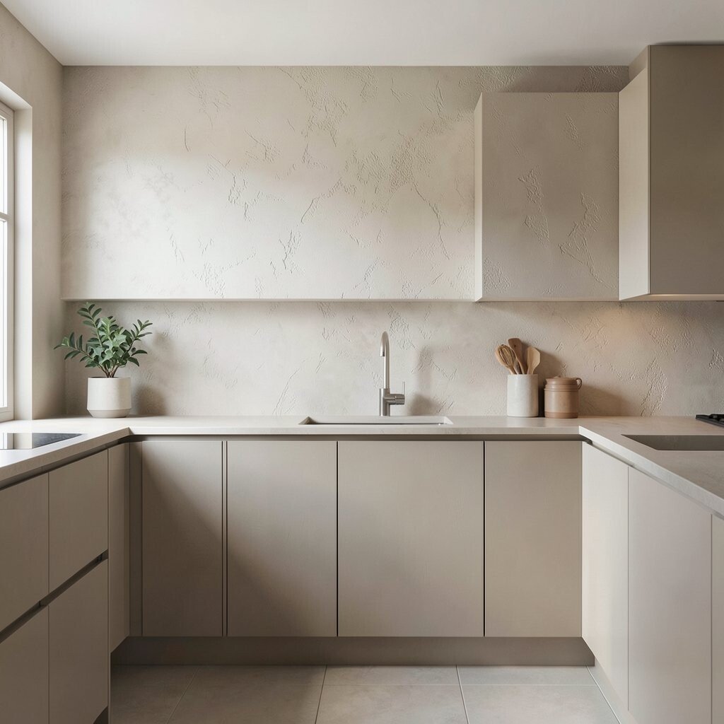
Textured plaster-style finishes make neutral kitchens feel elevated. Even with basic furniture, the wall texture gives your space personality.
This approach hides minor wall imperfections and makes light reflect in a flattering way. Choose a color slightly warmer than your cabinets so everything stays cohesive rather than competing. If you want an affordable option, consider paint additives or a textured roller method that mimics lime wash.
9. Cream and Beige Backsplash With Subtle Pattern
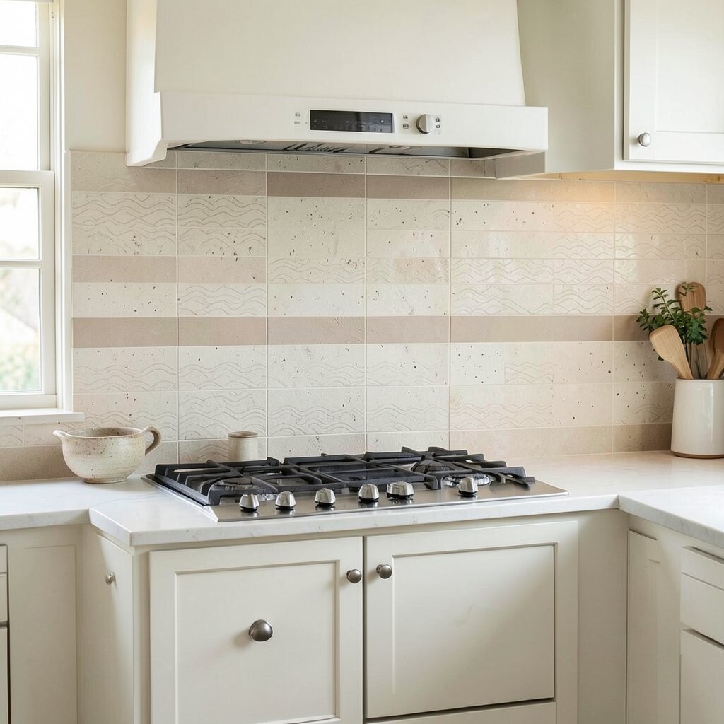
A cream and beige backsplash can add charm without turning your kitchen loud. Look for tile patterns that are small and rhythmic, like simple waves or tiny speckles.
One practical benefit is that warm neutral tiles show water spots less than cool whites. Keep grout in a matching warm tone so the whole backsplash feels seamless. If you like personalization, add a thin strip of a slightly darker beige tile to frame the range.
Current trend favorites include handmade-looking ceramics and uneven glaze effects, which add realism without needing bright colors.
10. Neutral Window Treatments That Let Light In
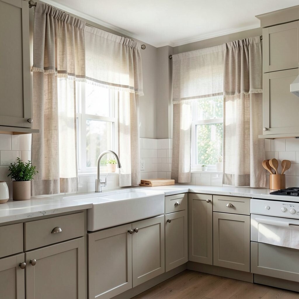
Choose linen-look shades or soft roller curtains in warm white or light taupe. They keep the kitchen airy while still offering privacy.
Let natural light do the work by hanging treatments higher than the window frame. This makes ceilings feel taller and helps neutral colors appear richer through the day. For a budget-friendly upgrade, swap hardware rings or rods first and choose washable fabric so maintenance stays easy.
If you personalize, consider adding a gentle fringe or a hidden blackout lining for comfortable nights.
11. Monochrome Neutrals With One Distinct Accent
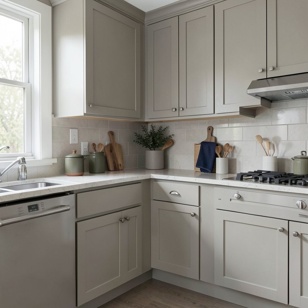
A monochrome neutral kitchen feels calm because most surfaces blend in the same visual family. You can still add excitement with just one distinct accent color.
Try a single tone such as dusty olive, muted terracotta, or soft navy, then repeat it in small places like a canister or a dish towel. This gives uniqueness while keeping the room relaxed. For practicality, pick durable fabrics and easy-to-wipe materials so accent items stay presentable even with daily use.
12. Flooring in Light Beige Vinyl or Laminate
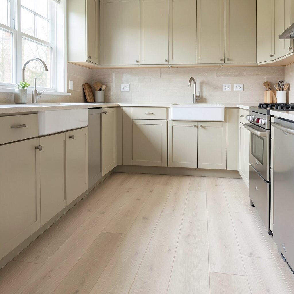
Light beige flooring keeps the kitchen bright and makes neutral design feel cohesive. If you want flexibility, vinyl or laminate can mimic stone or wood with less cost.
This choice helps with comfort underfoot and is often easier to clean than natural stone. Look for water-resistant options if your sink area sees lots of splashes. For personalization, choose a plank pattern that matches your cabinetry direction so the lines guide the eye.
Current trends favor warm, realistic texture and slightly varied color, which hides wear and keeps the look fresh longer.
13. Layered Lighting in Warm Neutral Tones
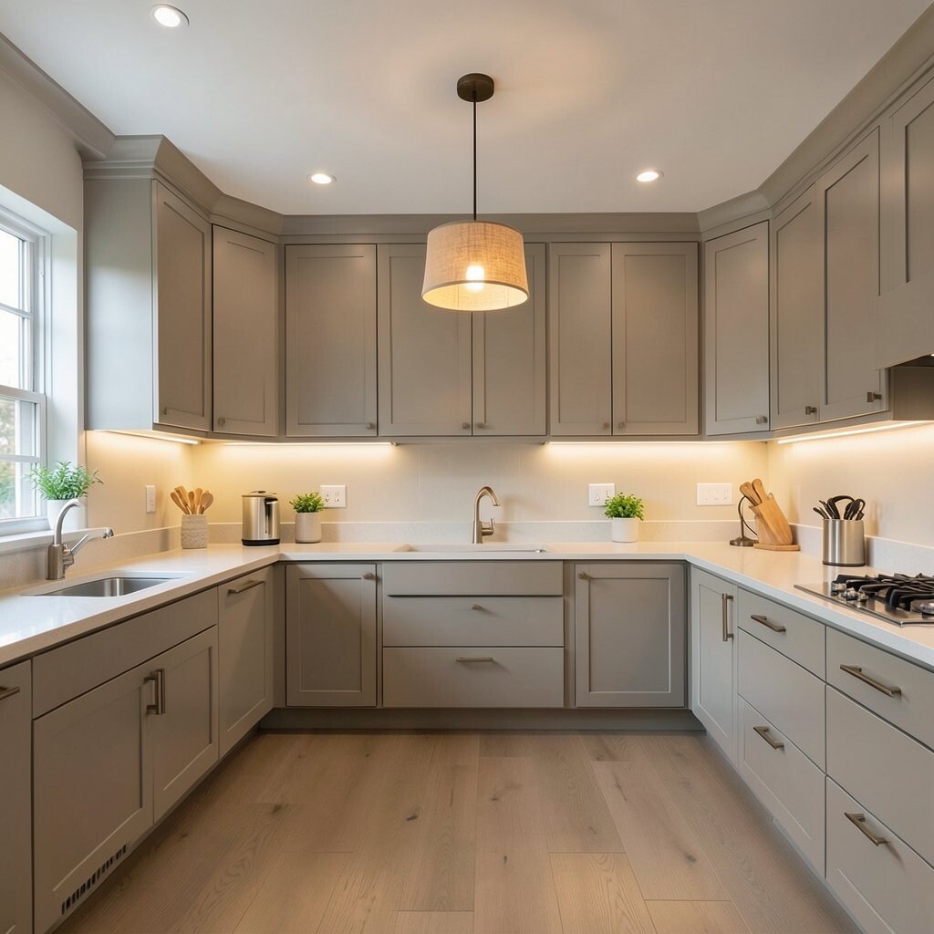
Good lighting is what makes neutral kitchens look rich instead of flat. Layer your light with under-cabinet LEDs, a warm ceiling fixture, and optional task lights.
Warm neutral bulbs bring out the undertones in greige, taupe, and cream so everything looks smooth. For practical planning, place lights to reduce shadows on the counter where you chop and prep. If you want cost control, start with under-cabinet strips because they make a big difference quickly.
Personalize with a pendant that adds character, like a simple glass shade or a matte fabric drum, while still staying within the neutral family.
14. Soft Neutral Decor Styling With Real-Life Storage
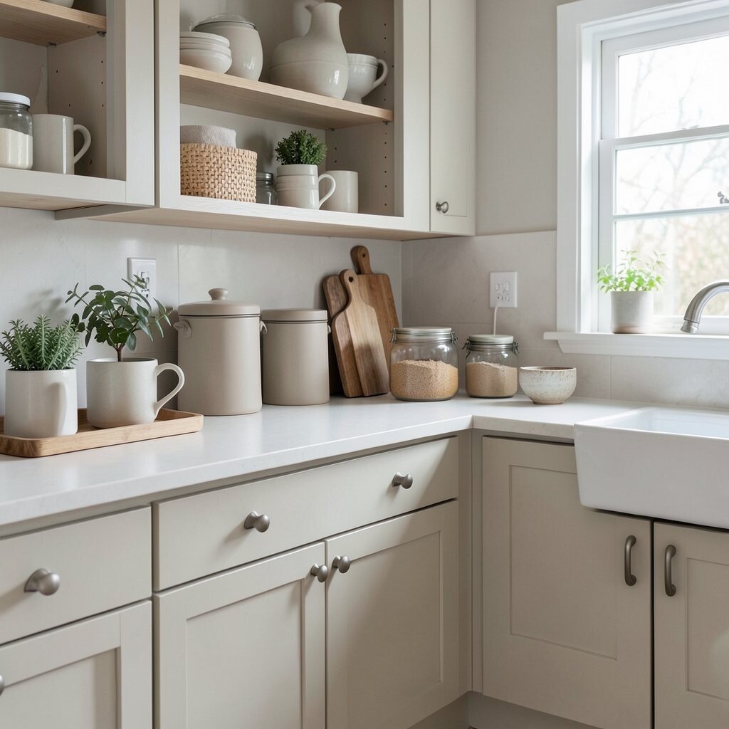
Decor in neutral colors looks best when it’s useful, not just pretty. Use matching canisters, trays, and jars to keep counters tidy while still showing personality.
Benefits show up fast because your kitchen feels organized during busy days. Keep the styling repeatable by sticking to a short list of materials such as wood, ceramic, and linen. For uniqueness, choose one slightly unexpected piece, like a handmade mug set in warm sand or a textured ceramic bowl, then let it anchor the room.
If you want a budget-friendly path, shop your home first and refresh only what’s visible in the open spaces. Current trends lean toward cozy minimalism, where every item looks intentional and daily routines stay smooth.