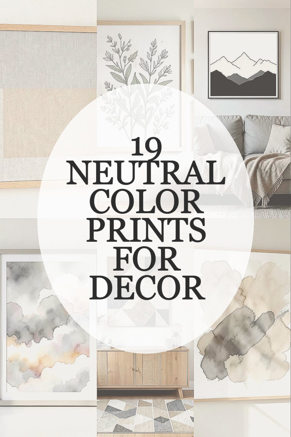
Something about neutral tones feels like a deep breath for a room. When prints stay gentle, your decor can look polished without feeling loud.
Neutral color prints do more than match furniture. They create a calm backdrop that helps everyday life feel a little smoother and more intentional.
1. Soft Linen-Texture Prints
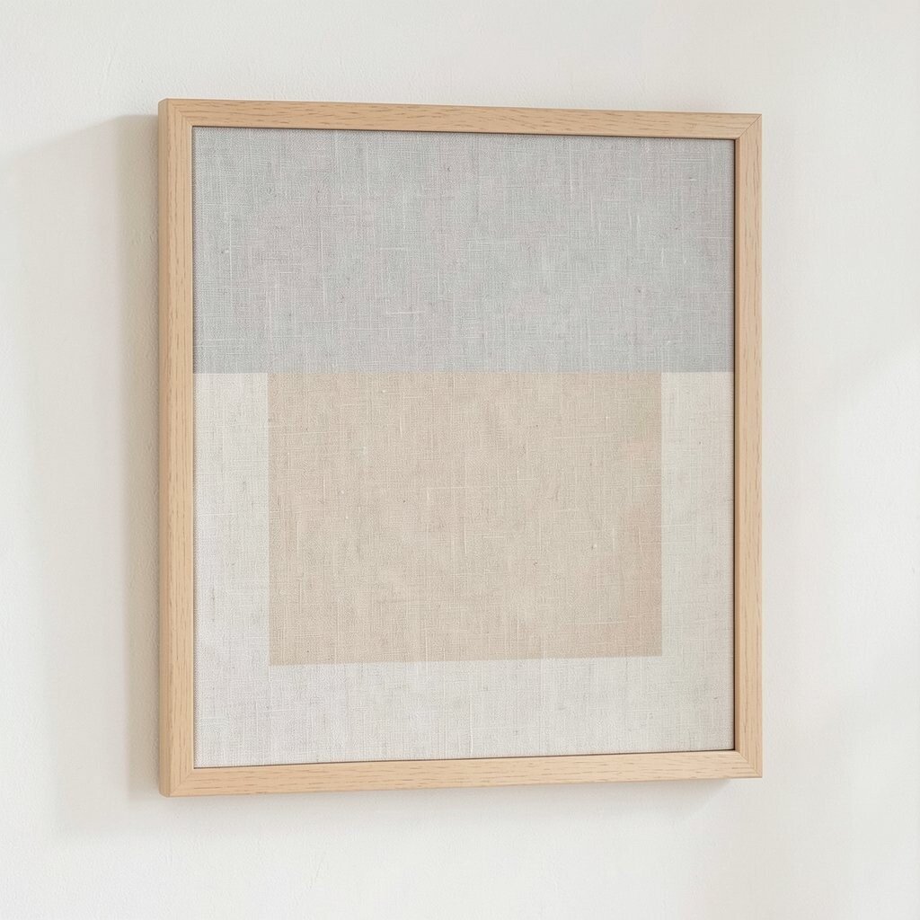
You can almost feel the calm in a linen-like print even when you just look at it. Choose a piece with warm beige, pale sand, and muted gray for an easy, cozy vibe.
These prints soften the edges of a space and make walls feel lived in, not bare. For practical results, measure your wall area and pick a size that leaves a little breathing room around the frame so the texture stays the star. If you want personalization, match the undertones to your throw pillows or curtains and keep the rest of the palette quiet.
2. Misty Botanical Line Art
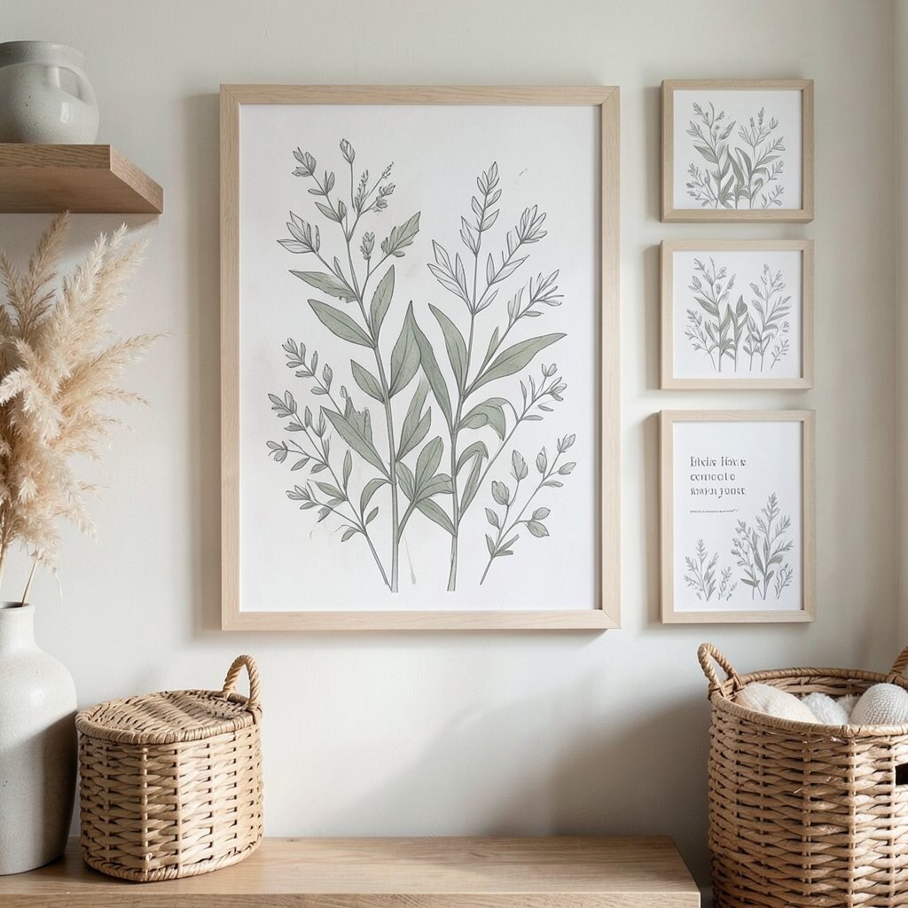
Botanical drawings in muted ink can bring a gentle garden feeling indoors. Look for sage greens, dusty taupe, and faded charcoal for a print that feels calm and airy.
Line art like this works well because it adds interest without heavy color blocking. Try pairing the artwork with natural materials like wood shelves or woven baskets, and you’ll get a layered look that still feels light.
To make it practical, hang one larger print at eye level, then repeat the same botanical style in smaller accents like coasters or a framed quote. For cost considerations, consider buying one main statement print and adding a matching smaller frame later to spread out the budget.
3. Minimal Mountain Silhouettes
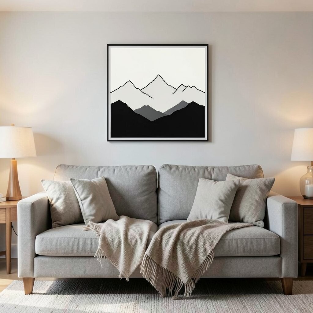
Low-contrast mountain silhouettes can make a room feel grounded. Pick prints with near-black lines on off-white backgrounds for a clean, quiet look.
Because the shapes are simple, these prints won’t compete with your furniture or rugs. A helpful tip is to center the artwork above a sofa or bed so the “horizon” lines up with the room’s layout and feels balanced.
For uniqueness, search for prints that vary the mountain layers slightly, even if the colors stay neutral. You can also personalize by matching the print style to your lighting, using warm bulbs to make the landscape feel softer.
4. Watercolor Cloud Gradients
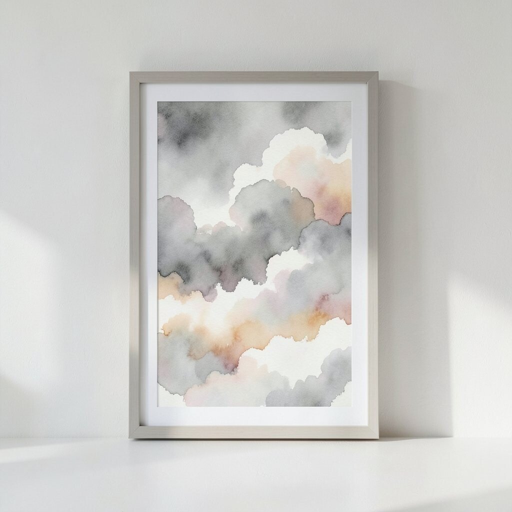
Cloud-like watercolor prints bring a slow, gentle mood to any wall. Choose grays with warm undertones and creamy whites to keep the feeling serene.
This type of artwork flatters modern and classic rooms because it blends rather than pops. If you want it to feel practical, frame it in a simple matte frame so the print’s softness stays in control.
5. Geometric Blocks in Stone Tones
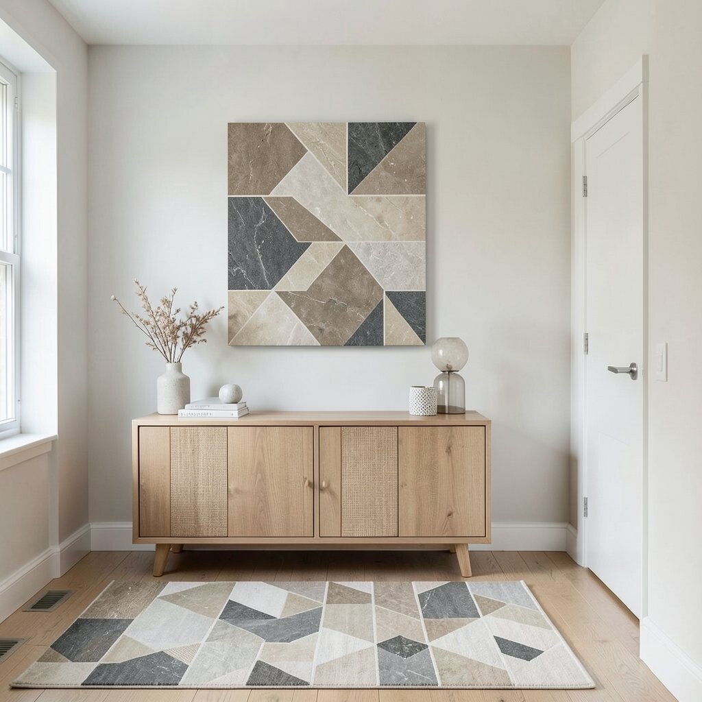
Neutral geometric prints can feel calm while still looking crisp. Look for shapes in limestone, oatmeal, and soft charcoal for a pattern that feels organized but not harsh.
Geometric designs help rooms feel structured, especially in spaces with lots of curves or textiles. A practical way to use them is to place one print where you want visual order, like above a media console or in a hallway with changing sightlines.
For personalization, repeat one of the geometric colors in a small rug or a single decorative pillow. When budgeting, consider prints on thicker art paper or canvas because they often look richer without needing an expensive frame.
6. Abstract Washes of Clay and Linen
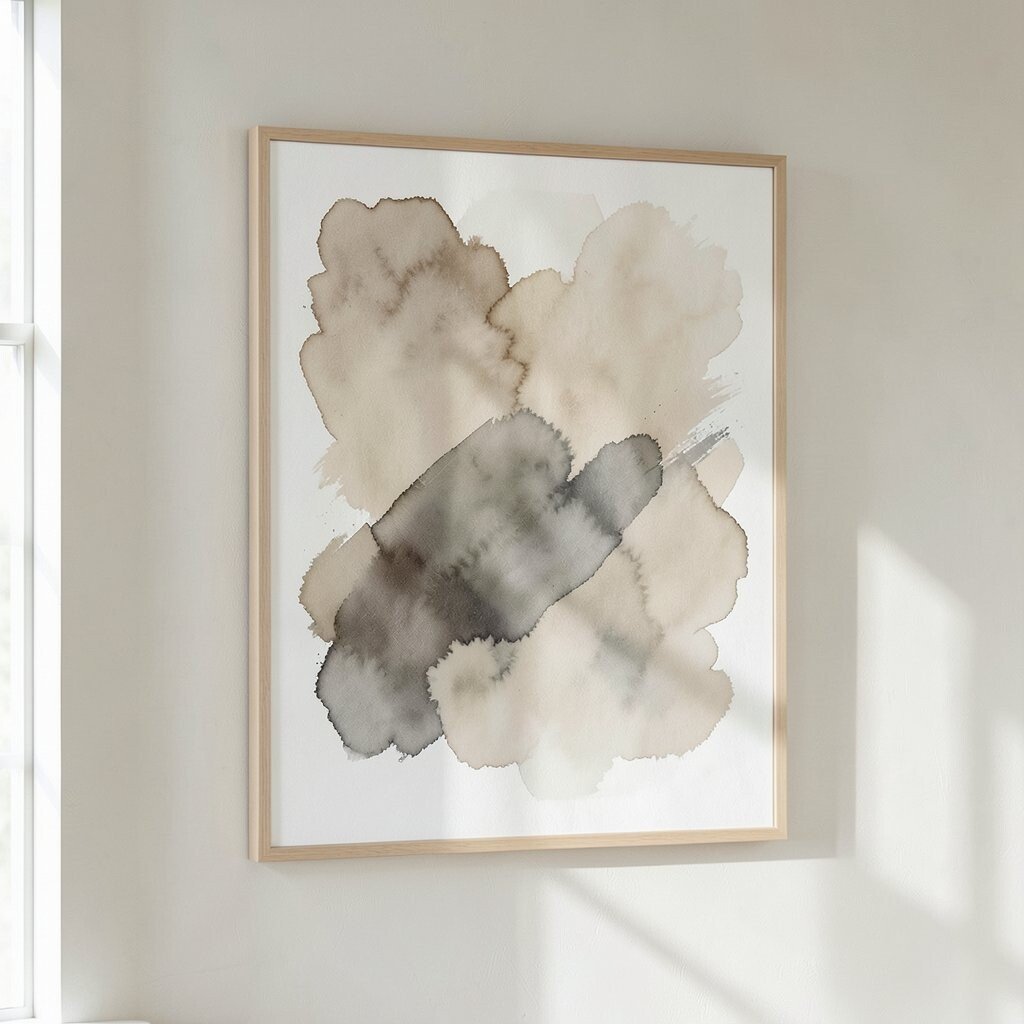
Think of these prints as quiet brush strokes with lots of breathing space. They often use beige, clay, and muted gray in ways that feel warm rather than cool.
Because the colors blend softly, abstract washes can make a room feel calmer right away. Try hanging the piece where natural light hits during the day so the texture looks different across morning and afternoon.
7. Quiet Character Pottery Patterns
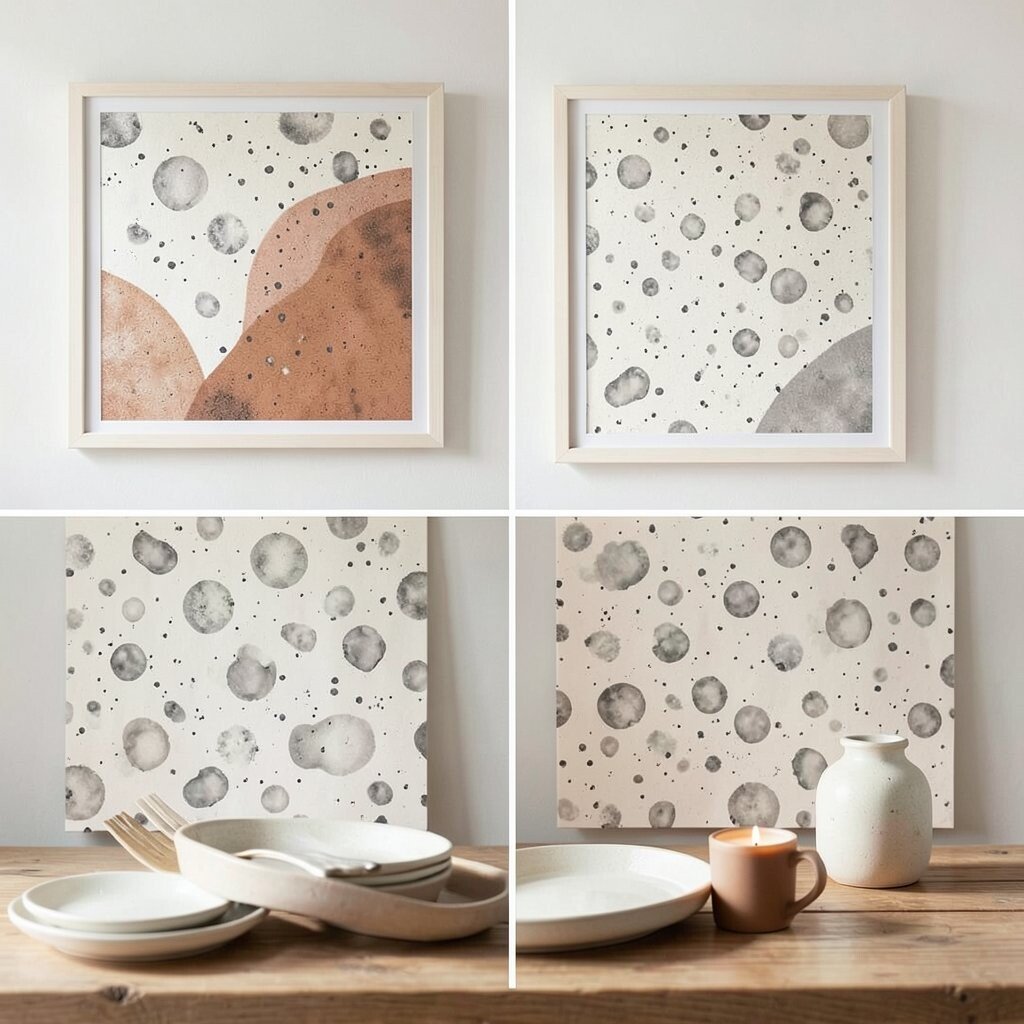
Pottery-inspired prints add a handmade look while staying neutral. Choose patterns that resemble speckled ceramics in pale cream and smoky gray.
This kind of print feels unique because it brings daily-life textures into your decor. For a practical approach, match the print’s “speckle” tone with your tableware color so the theme feels intentional across the room.
If you want personalization, choose a print that includes just a hint of one warm accent, like terracotta-brown, then echo it with a candle or a small vase. Cost-wise, ceramic-pattern prints can be budget-friendly because they read as detailed even with simple frames.
8. Serif Alphabet in Soft Ink
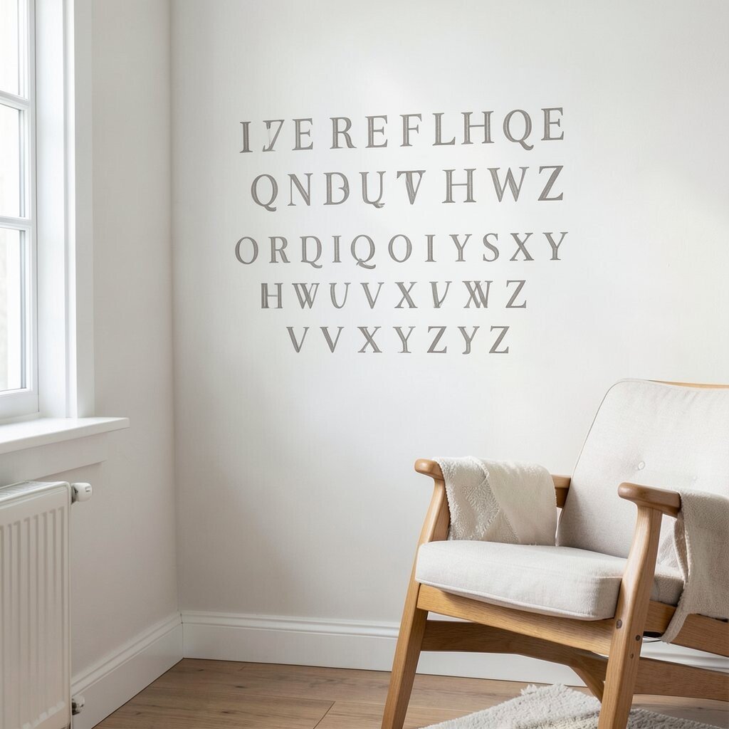
Minimal typography can look soothing when it stays small and gentle. Look for a serif alphabet in muted gray or warm taupe, with lots of white space around the letters.
Typography works like decor that never overwhelms. For practicality, place it in a home office corner or near a reading chair so it feels like a quiet companion instead of a focal shout.
9. Subtle Striped Serenity Prints
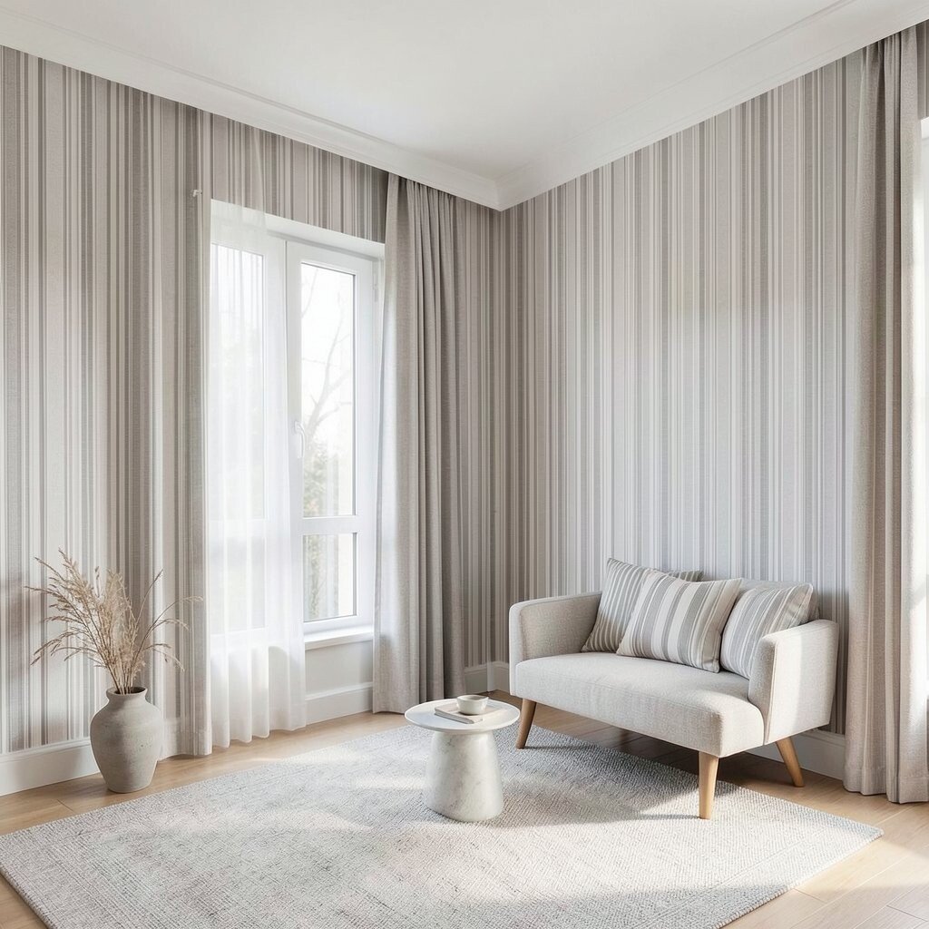
Stripes can feel calm when they’re thin and evenly spaced. Choose tones like oat, greige, and faint charcoal so the pattern feels like a soft rhythm.
These prints are especially useful in rooms where you want visual movement without high contrast. A practical tip is to match the stripe direction with the room layout, using vertical stripes to make ceilings feel a bit taller.
For personalization, coordinate the stripe thickness with other patterns you already own, like a rug weave or a curtain texture. If you’re cost-conscious, look for prints sold as sets, since a coordinated set can reduce the need to hunt for matching frames.
10. Botanical Silhouettes on Off-White
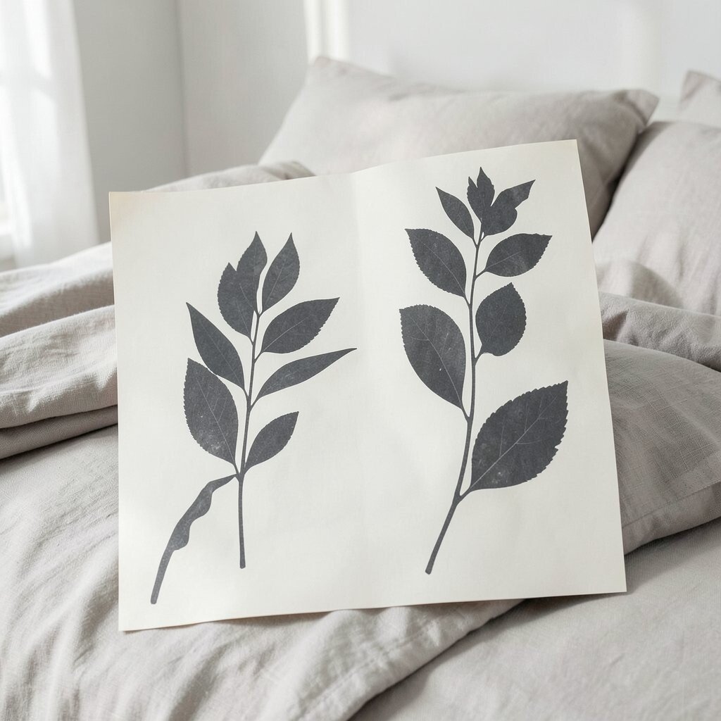
Some botanical prints are less about detail and more about calm shape. Try silhouettes of leaves in charcoal or deep gray on an off-white background.
These prints create a soothing, natural vibe without requiring bright color. They’re also easy to personalize because you can pair them with nearly any neutral bedding, from linen to cotton blends.
11. Abstract Waves in Taupe and Smoke
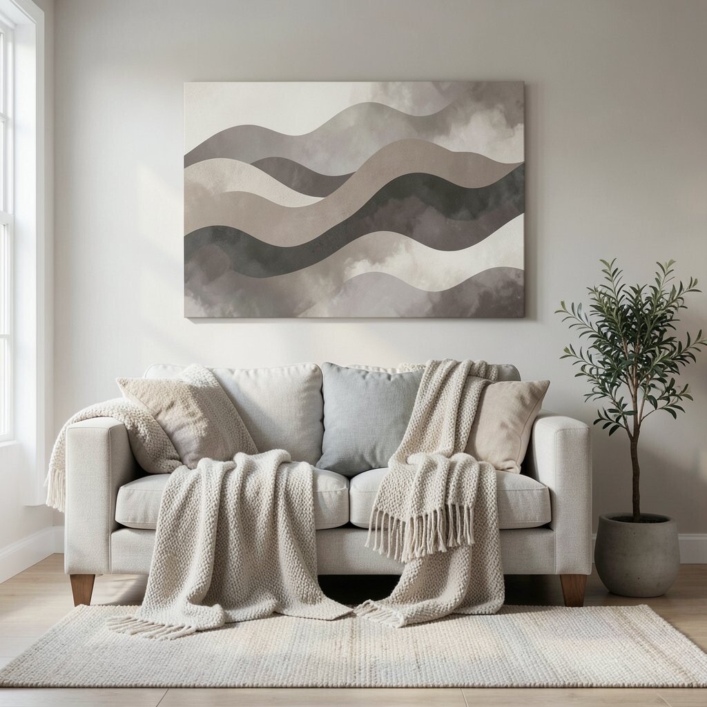
Wave-like abstract prints can mimic the feeling of gentle water. Pick a palette of taupe, sand, and smoky gray for a soothing, modern look.
The flowing shapes help soften the whole room, especially in spaces with straight lines like bookcases or cabinets. For practicality, use the artwork to anchor a seating area, then repeat the wave color through accessories like throws or ceramic planters.
Uniqueness comes from choosing a print where the waves feel irregular rather than perfectly uniform. That small variation makes it feel handcrafted, and it pairs nicely with cozy textiles.
12. Vintage Map Scraps in Muted Sepia
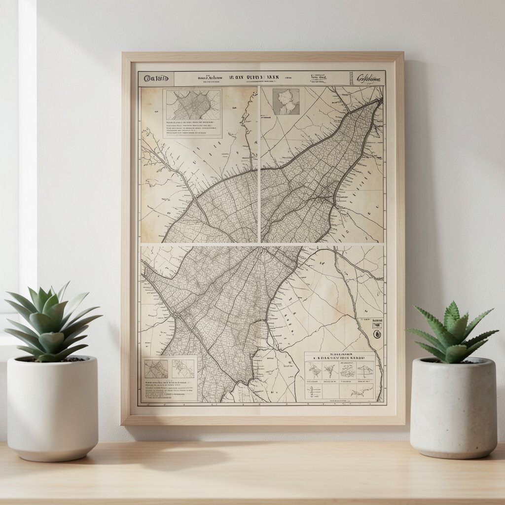
A faint, vintage map print can add personality while still staying neutral. Choose maps that use sepia, parchment cream, and soft gray so they feel aged, not busy.
Map art tends to spark conversation, but muted versions keep it relaxed. If you want it to feel practical, use it in a home office or entryway where you can enjoy it daily, and keep nearby decor simple so the map stays readable and not cluttered.
13. Oversized Polka Dots in Soft Gray
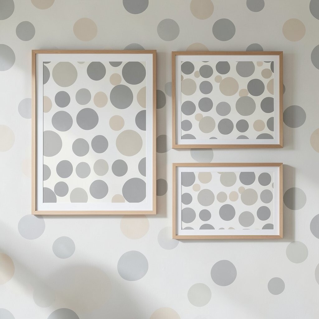
Polka dots don’t have to be playful and bright. Oversized dots in soft gray and pale beige can feel elegant and calming, almost like quiet pattern wallpaper.
This style adds charm without demanding attention away from your furniture. To make it actionable, choose one large framed print if you want a bold look, or two medium prints if you prefer a more balanced wall.
For personalization, match the dot color to a single item you already love, like a lamp base or a ceramic bowl. When thinking about cost, remember that bold prints can reduce the need for extra wall decor because they carry the visual weight.
14. Blurred Focus Still-Life Scenes
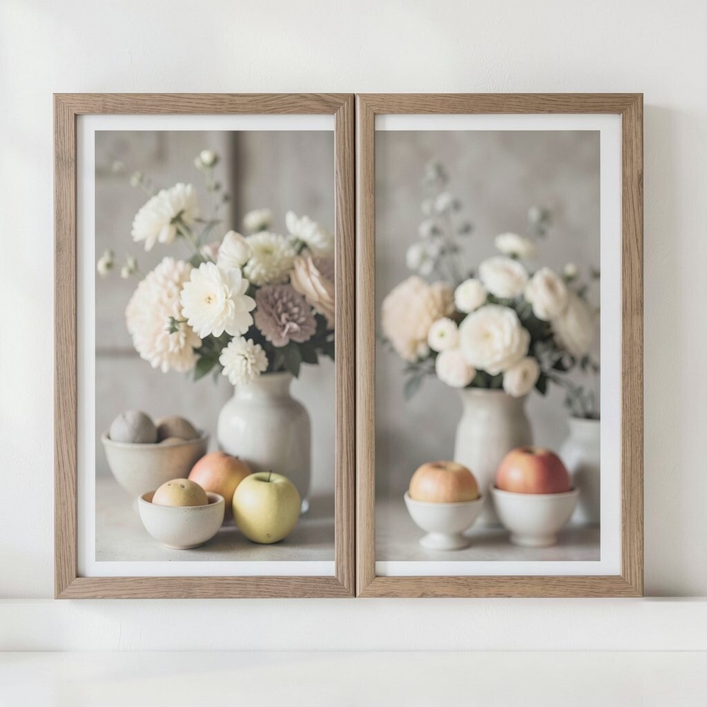
Soft still-life prints can feel calming because they look gentle and slightly out of focus. Find scenes with bowls, fruit, or flowers in muted creams and dusty grays.
These prints add warmth and texture to spaces that feel too clean. A practical tip is to choose frames that share the color of your wood tones so the art blends with the room rather than floating awkwardly.
15. Calm Geology Layers and Strata
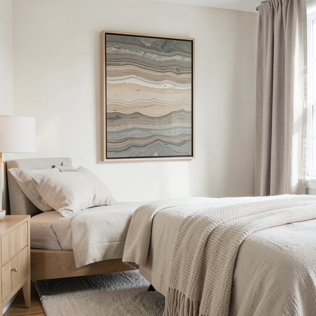
Geology-inspired prints bring a quiet, scientific beauty to decor. Look for layered bands in oatmeal, clay, and smoky stone tones.
The layered structure creates a soothing visual pattern that feels grounded and steady. For practical placement, try the print in a bedroom or hallway where you want a restful mood as you walk by.
For uniqueness, choose prints where the bands aren’t perfectly straight, since natural variations make the artwork feel more real. Personalize by pairing it with neutral bedding textures like textured knits or linen-look curtains.
16. Woven Basket Weave Patterns
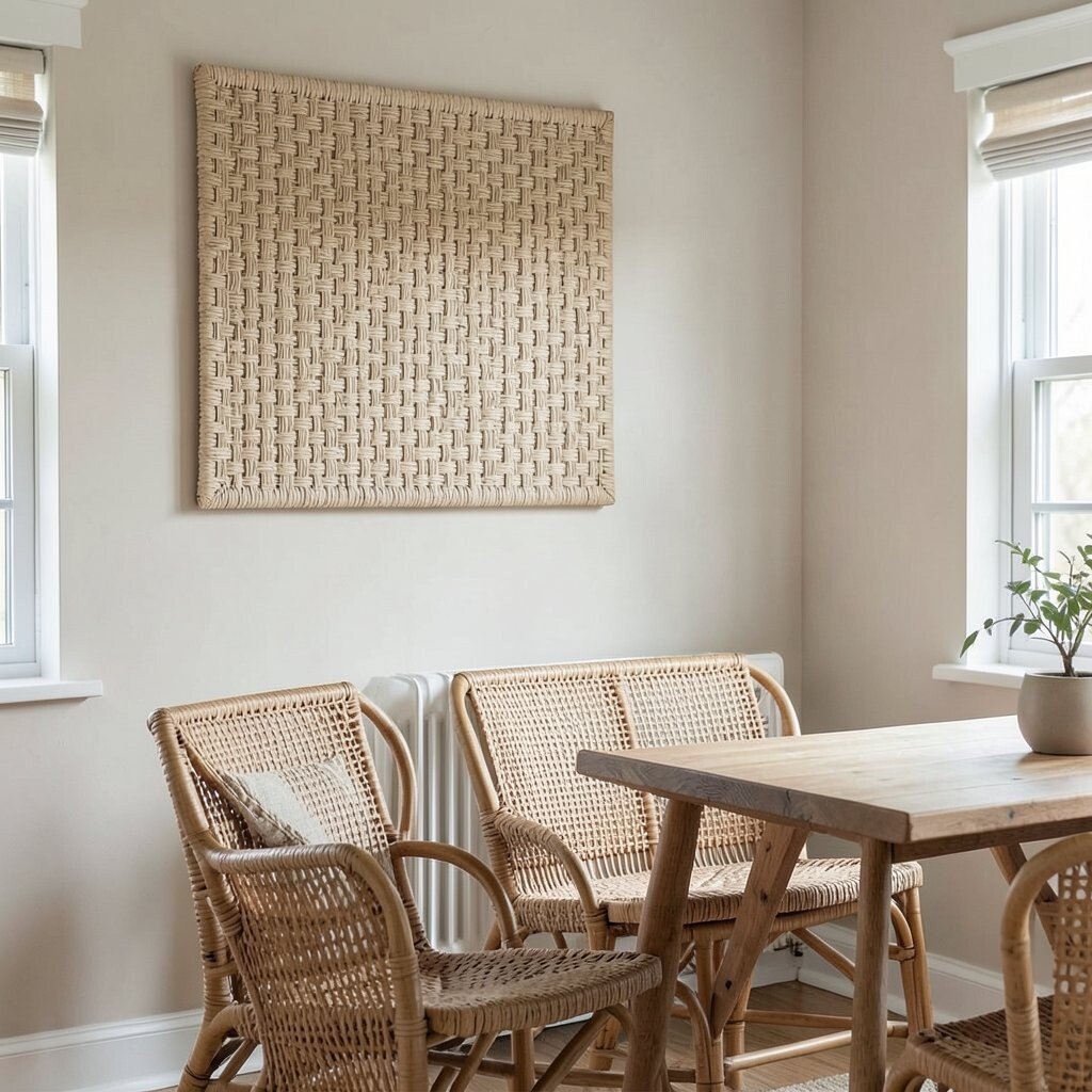
Basket weave prints can make a room feel tactile even when it’s a flat image. Choose muted beige and soft brown tones for a subtle, cozy effect.
This type of print adds warmth and makes neutral rooms feel more inviting. If you want practicality, hang it in a kitchen nook or dining area where the textured vibe complements natural elements like rattan and wood.
17. Minimal Framed Quotes in Neutral Ink
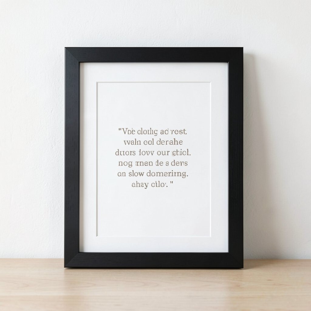
Some quote prints work best when the text is small and calm. Choose neutral ink shades like warm gray or taupe with generous white space around the wording.
Thoughtful words can make decor feel personal without adding color drama. For practical styling, align the text to the center of the frame and match the frame finish to your hardware, like brushed wood or matte black.
To personalize, pick a phrase that fits your daily rhythm, such as something related to rest, gratitude, or slow mornings. Cost considerations are usually friendly here, because many quote prints are widely available in affordable sizes, especially if you choose a simple frame.
18. Monochrome Animal Studies in Soft Ink
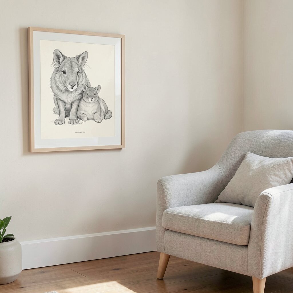
Gentle animal studies can feel surprisingly calming when they’re monochrome. Look for prints with soft charcoal lines or muted gray shading on a warm cream background.
These artworks bring a subtle sense of life into a room without turning it into a zoo-themed space. A practical tip is to place the print where you spend quiet time, like beside a reading chair, so it feels comforting rather than like background clutter.
19. Luminous Sunbaked Tints
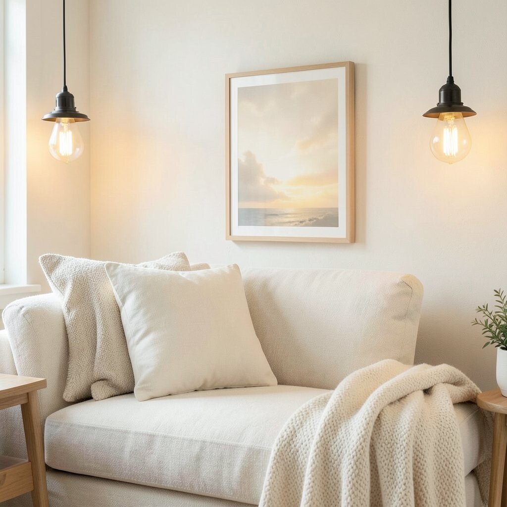
Sunbaked tint prints mimic light on walls, so they feel warm and restful. Choose palettes like pale honey, sand, and gentle gray for a soft glow effect.
Because the look is light and airy, these prints work well in rooms that don’t get much natural sun. To make it practical, pair the art with warm bulbs and cream-colored textiles so the whole space feels consistent.
For personalization, choose a print where the brightest tint matches one of your accents, such as a cushion or a throw blanket. If you want to manage cost, consider prints with simple designs and strong color fields, since they often look high-end even with standard frames.