The right neutral can make a room feel like a deep breath. Earthy tones soften the edges of everyday life.
1. Clay Beige
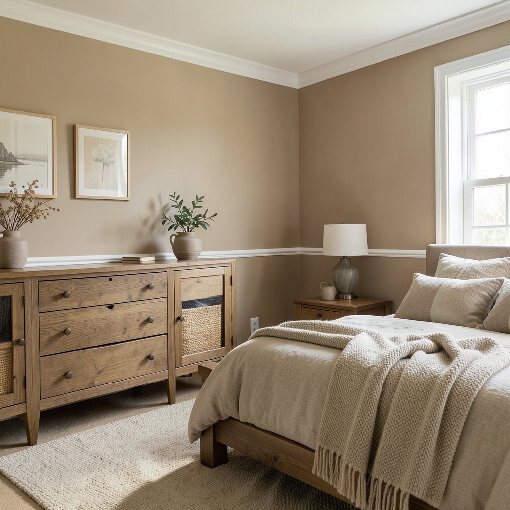
Clay beige looks like warm sand after rain. It sits quietly between beige and brown, so your space feels steady without looking plain.
Pair clay beige walls with soft white trim to keep things bright. In a living room, it makes wood furniture look richer and more inviting. For a calm bedroom, add textured bedding in oatmeal or stone so everything feels cozy to touch.
2. Moss Gray
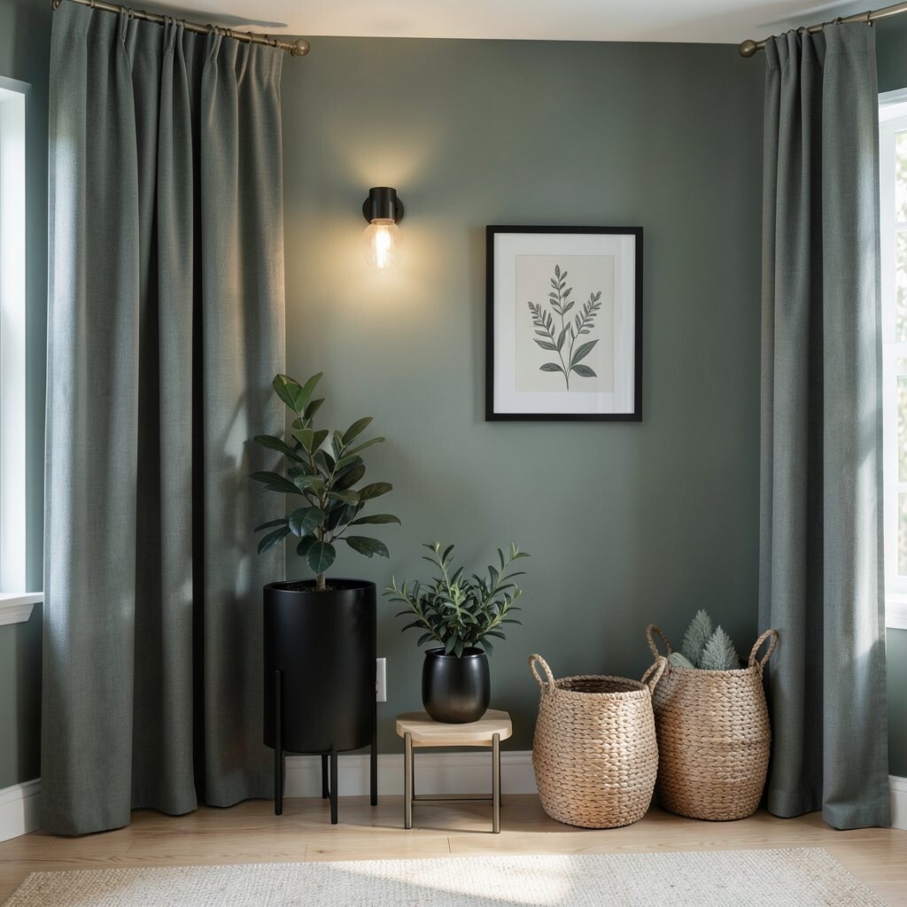
Moss gray has a muted green tint that feels grounded. It reminds you of shaded paths and quiet forest corners.
Use moss gray on one accent wall or on large pieces like curtains. It works well with matte black, brushed nickel, and light oak. To keep it relaxing, choose low-sheen paint and warm-toned bulbs so the room doesn’t feel icy.
For personalization, add framed botanical sketches or woven baskets that echo the green undertone. Small plants also fit naturally here, especially if you choose leaves in dark, steady greens. If you’re updating on a budget, start with paint for the biggest impact, then swap accessories one by one.
3. Sandstone Taupe
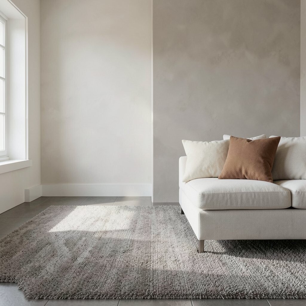
Sandstone taupe feels like sunlit stone at the edge of a desert. It’s soft, neutral, and always flattering in daylight.
It’s great for hallways and open-plan spaces because it doesn’t compete with everything else. Match it with creamy off-whites and warm grays for an easy, calm look. If you have darker floors, sandstone taupe can help the whole area feel smoother and more connected.
Try layering materials for comfort, like a taupe rug with a slightly shaggy texture. Add throw pillows in clay and cream to keep the palette from getting flat. For cost control, choose one hero surface, such as walls or a large area rug, then build around it with smaller decor.
4. Warm Greige
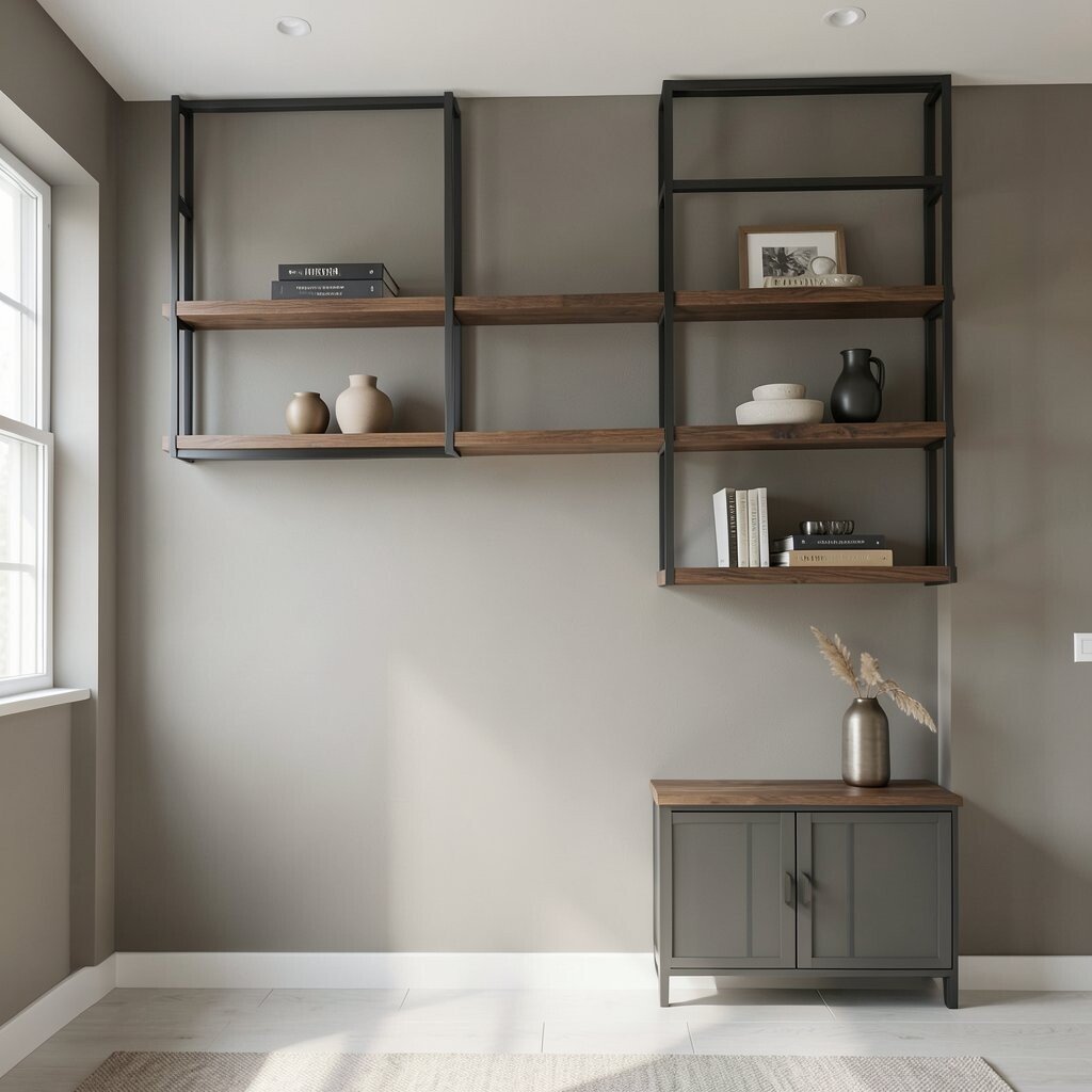
Warm greige blends gray and beige in a way that feels friendly. It’s the kind of neutral that makes a room look clean even when it’s lived in.
Choose warm greige for walls if you want a steady base for many styles. It pairs beautifully with both cool and warm metals, so you won’t need to change your fixtures right away. Add depth using darker accents like espresso wood, charcoal frames, and walnut shelves.
5. Smoke Olive
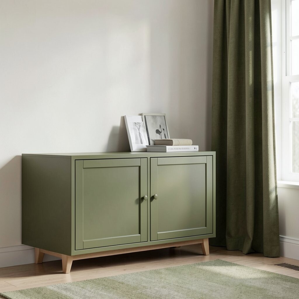
Smoke olive is a neutral green that feels smoky and calm. It has enough depth to feel stylish, but it still stays soothing.
Paint it on cabinet doors or use it as a wall tone in a reading nook. Olive can make natural light look softer, which is perfect for slow mornings. If you like a modern look, pair it with off-white walls and simple lines in furniture.
For a practical touch, choose olive textiles like curtains or cushions that hide small dust marks. That way, the room stays looking fresh longer. Budget-wise, olive is a great choice for smaller upgrades like a rug or bedding set before you commit to larger changes.
6. Linen Cream
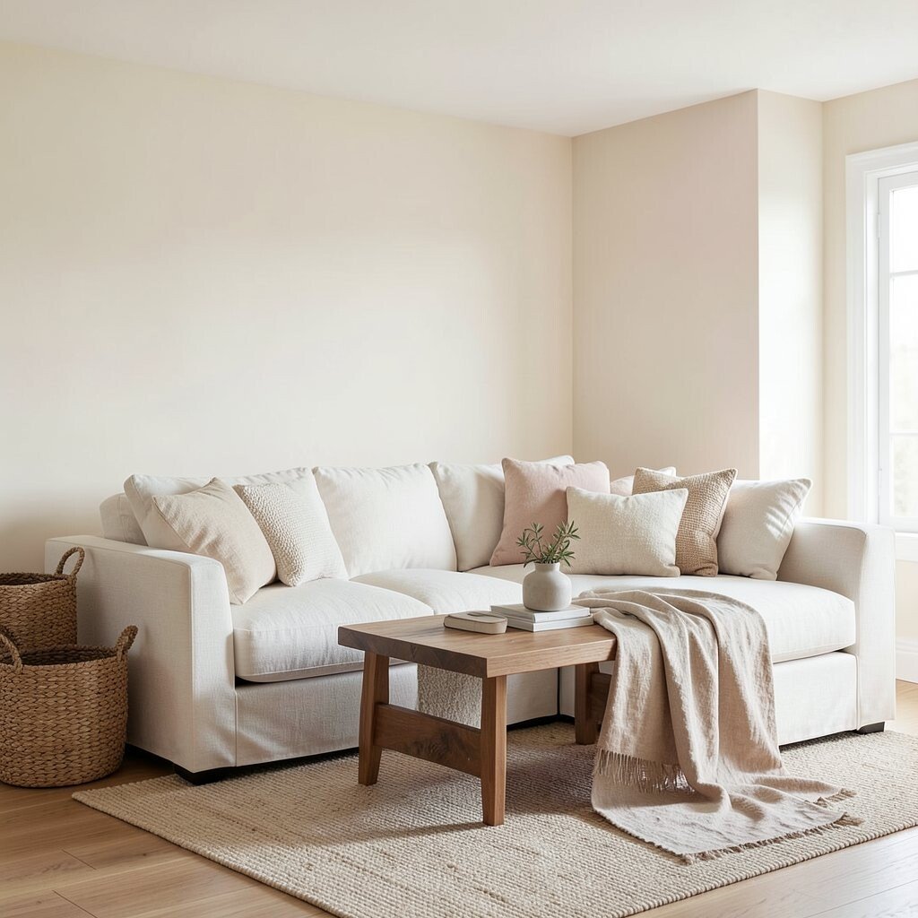
Linen cream feels airy, like fabric right out of a drawer. It gives a calm space the feeling of openness without being stark.
Use linen cream on walls, large furniture upholstery, or ceiling paint to brighten the room. It also balances darker tones such as walnut tables or stone countertops. To keep it from feeling too yellow, look for a cream that has a gentle pink or neutral undertone rather than a strong butter tone.
Personalize with layered neutrals like ivory, straw, and light sand. Add woven textures, such as jute baskets or a linen throw blanket, for that lived-in calm. For affordability, linens and woven decor often cost less than major furniture replacements, so you can get a big effect fast.
7. Weathered Charcoal
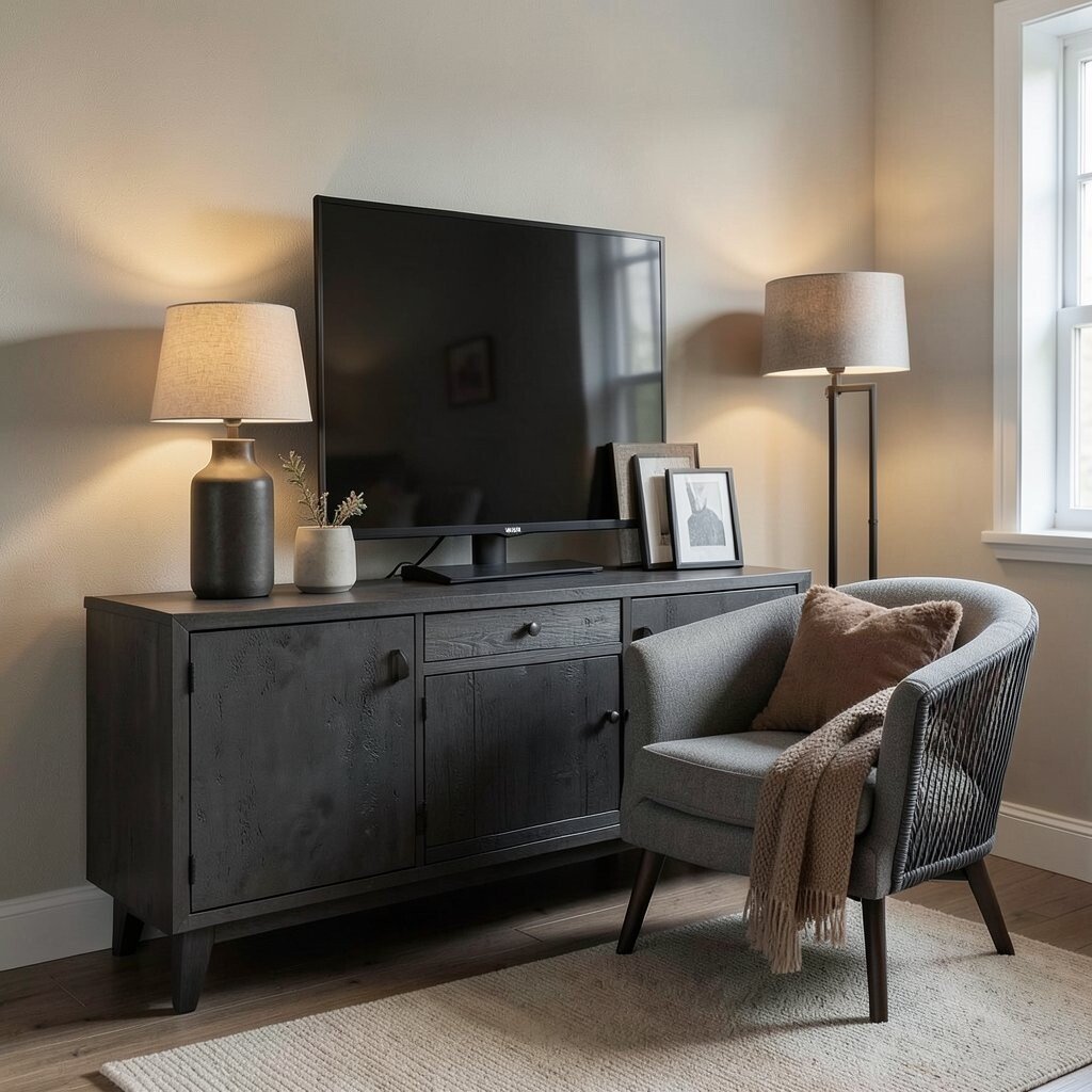
Weathered charcoal looks like aged concrete or drifted slate. It brings a grounded calm when used thoughtfully, not everywhere.
Try it as a front door color, a media console, or a chair that anchors the room. Dark tones can reduce visual noise by making patterns stand back a little. If your space feels small, keep charcoal to 10 to 20 percent of surfaces and balance with lighter walls.
For practical comfort, use charcoal textiles with warm fibers so the room doesn’t feel too severe. Add lamps with warm bulbs to soften the contrast at night. Even on a tight budget, swapping one piece like a lamp base or a set of frames can refresh the whole mood.
Uniqueness comes from mixing charcoal with softer colors like clay and sand rather than sharp white. That simple choice makes the palette feel modern, calm, and intentional.
8. Brushed Stone Gray
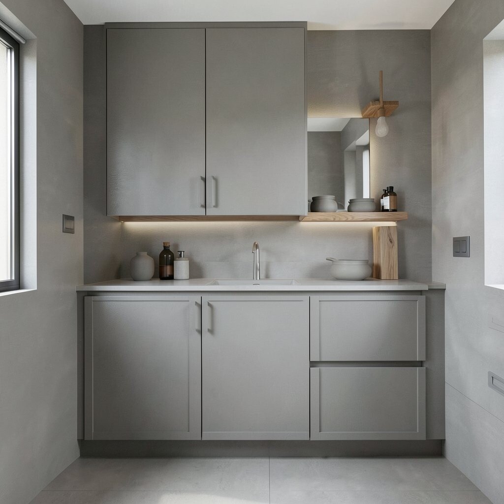
Brushed stone gray is a neutral with a gentle, cool softness. It looks natural, like rock that has smoothed over time.
Use brushed stone gray for walls or cabinetry when you want a calm, slightly modern feel. It works especially well in bathrooms and kitchens because it hides scuffs better than lighter tones. Pair it with warm wood and matte ceramic accessories to avoid a sterile look.
9. Terracotta Dust
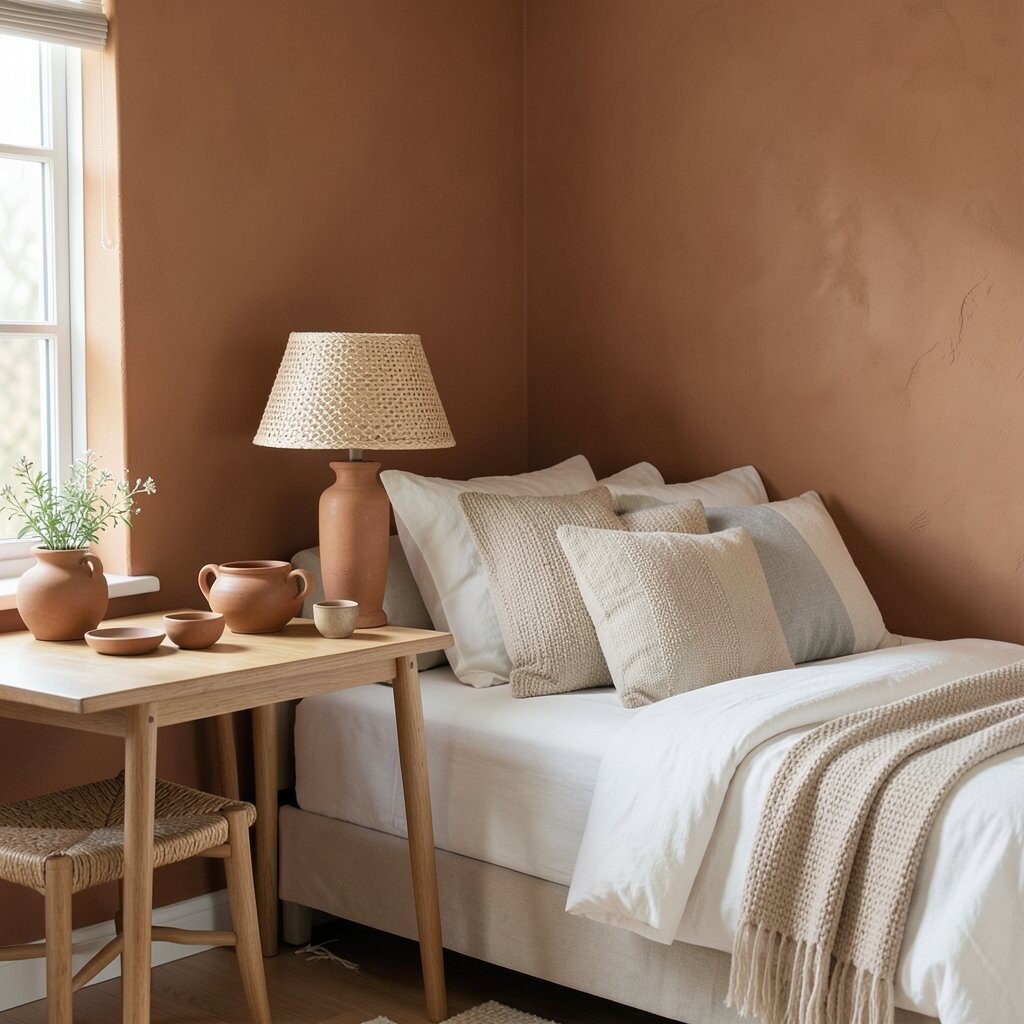
Terracotta dust brings warmth without shouting. It’s earthy like baked clay, but softened for calm interiors.
Consider terracotta dust in smaller spaces, such as a dining corner or a bedside wall panel. It pairs beautifully with creamy whites, oat textiles, and light gray accents. If you love warmer aesthetics, this hue can make the whole room feel cozy even in cooler seasons.
For personalization, add pottery, terracotta-toned ceramics, or a woven lamp shade that echoes the color family. Keep the rest of the decor neutral so the warmth feels balanced. If you want a cost-friendly start, use terracotta in paint on a single wall or in a throw pillow set first.
Current home trends favor warm earth tones used in restrained ways, so terracotta dust fits right into that mood. It gives you the trendy look without needing bold patterns.
10. Cocoa Bark
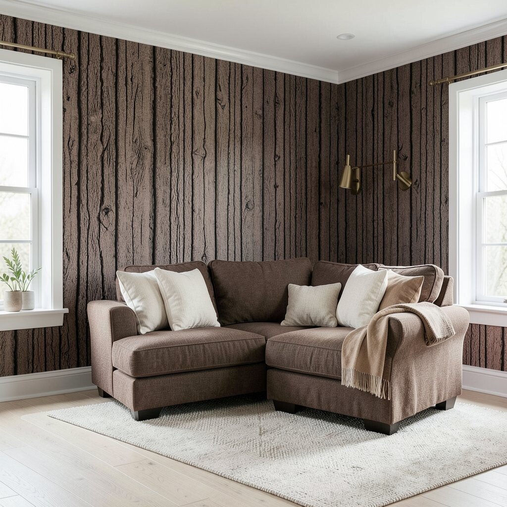
Cocoa bark feels like deep chocolate mixed with wood tones. It’s rich, grounding, and surprisingly calm when balanced with lighter neutrals.
Paint trim, build a feature wall, or choose a cocoa-brown sofa cover if you want a cozy anchor. In a living room, it helps hide everyday wear and can make other colors pop gently. Pair it with linen cream, camel accents, and brass or bronze hardware.
If you’re worried about space feeling heavy, use cocoa bark on vertical surfaces only and keep the ceiling bright. That trick keeps the room airy while still feeling warm. For budget considerations, choose fabrics that tolerate daily life, like tightly woven performance blends.
11. Chalky Putty
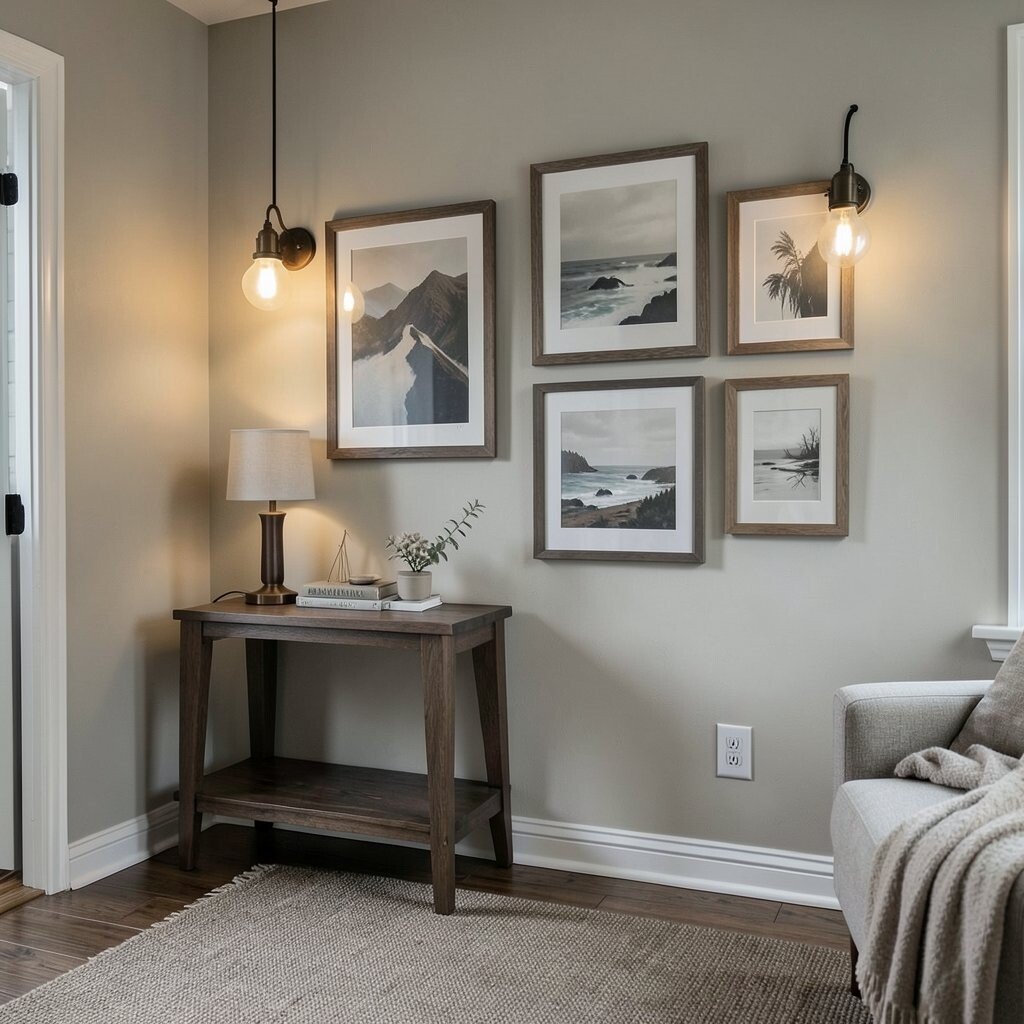
Chalky putty is a soft, muted gray-beige that looks like natural plaster. It feels calm and slightly vintage, without needing old furniture.
It’s ideal for walls because it creates a smooth, forgiving backdrop for art and shelves. Pair chalky putty with dark wood, taupe rugs, and simple textiles. To make the space feel personal, hang art in frames that match the wood tone, not necessarily the paint.
For a practical approach, chalky putty hides small imperfections better than glossy finishes. Choose a durable paint sheen like eggshell so the room stays easy to maintain. If you’re renovating slowly, update lighting first with warm bulbs, then paint when you’re ready.
Trends right now favor tactile, plaster-like finishes, and putty tones help you get that look. Even a matte paint can mimic that modern, soft texture.
12. Deep River Umber
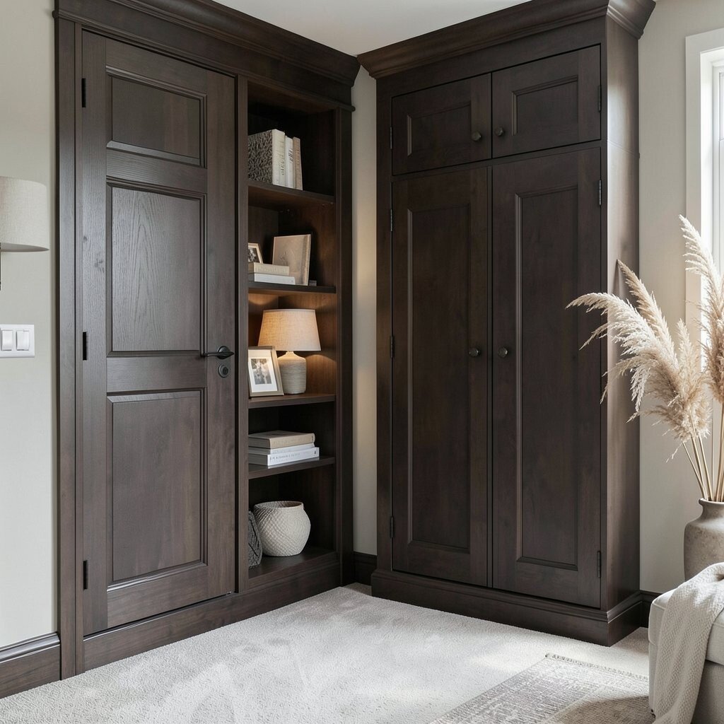
Deep river umber is a dark brown with a slightly cool edge. It feels like river stones and old leather, steady and calming.
Use it on doors, built-in shelving, or a wardrobe piece to add quiet drama. Dark umber can make light carpets and pale walls look more luminous. Add soft light-colored textiles to keep the palette gentle and not too heavy.
Personalize with lampshades in warm fabric, like oatmeal or cream, and add a few natural elements like dried reeds. If you want an affordable upgrade, choose umber in smaller items first, such as picture frames or a rug runner. That way you can test the mood before committing to larger surfaces.
13. Coast Sand
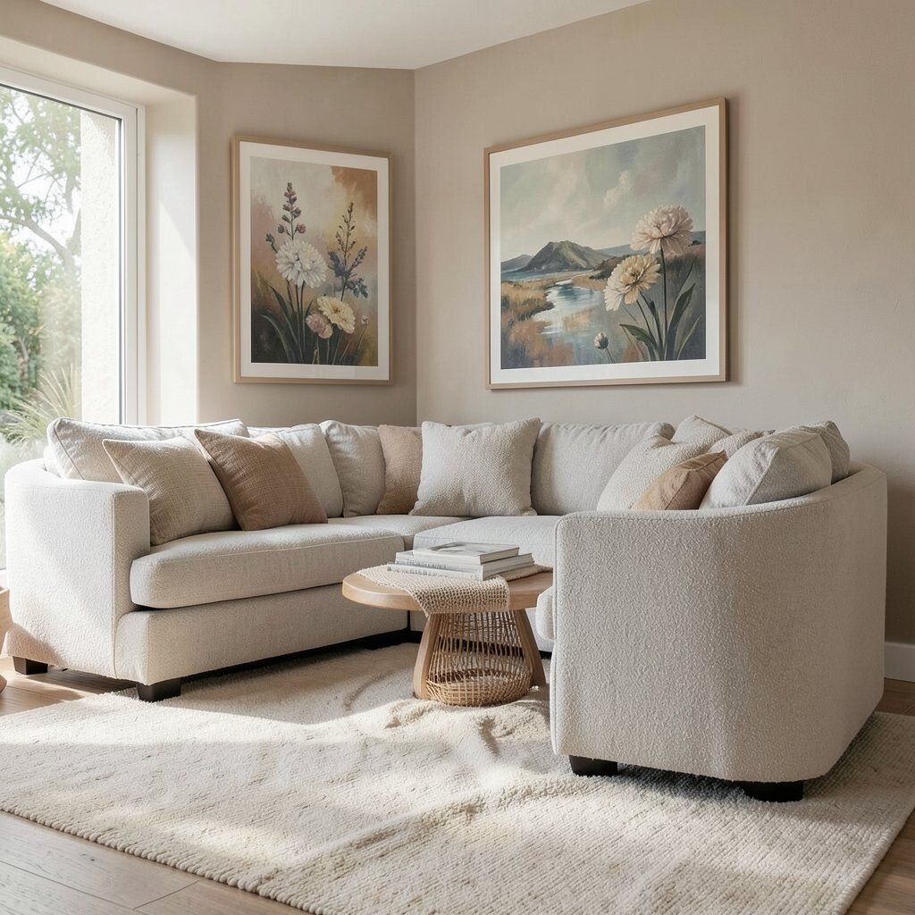
Coast sand is pale and warm, like a beach walkway after a calm day. It makes rooms feel open, relaxed, and easy to live in.
Use coast sand for walls or large furniture upholstery when you want a light base. It also works as a backdrop for colorful art because it stays neutral. Pair it with sea-washed grays, soft browns, and natural fibers for a gentle, coastal calm.
14. Mineral Oyster
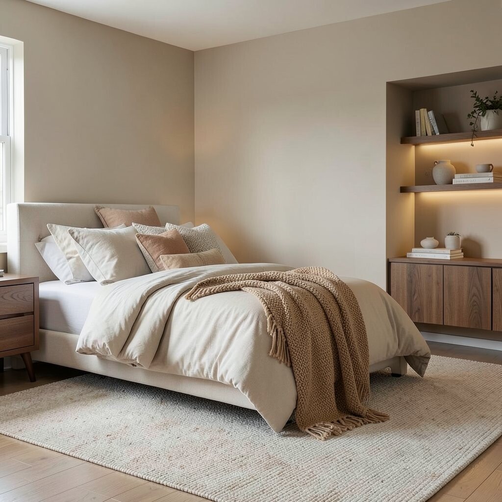
Mineral oyster is a soft, silvery beige that feels like quiet tide pools. It adds calm sophistication without looking cold.
This hue is perfect for bedrooms, offices, and anywhere you want a serene focus. Try it on walls, then bring in warmer accents like camel throws and walnut shelves. In current styling, oyster tones pair nicely with gentle curves and matte ceramics, so you can keep your look modern.
For personalization, mix in subtle patterns, such as a textured rug or a woven basket weave. Choose lighting with warm bulbs to keep the oyster tone flattering across day and night. If you’re watching costs, start with a large area rug in mineral neutrals, then add paint only when you’re ready to finish the look.
Using oyster with other earthy hues like clay beige and sandstone taupe makes a space feel cohesive and calming. It’s one of those palettes that never feels overstated, just comfortable.