
Soft interiors have a way of lowering the volume of everyday life. With the right textiles, calm can feel built in.
1. Oatmeal Herringbone Weave

Oatmeal herringbone looks like tidy footsteps across a warm fabric field. The V-shaped lines catch light gently, so the room never feels flat. Pair it with creamy walls and natural wood tones to keep everything soothing.
Choose a medium-weight fabric for curtains or a sofa throw so the pattern stays crisp. For a calmer feel, keep the contrast low by selecting shades close to each other rather than stark black and white. If you have pets or kids, consider a tightly woven herringbone that handles daily wear better.
2. Greige Basketweave Texture
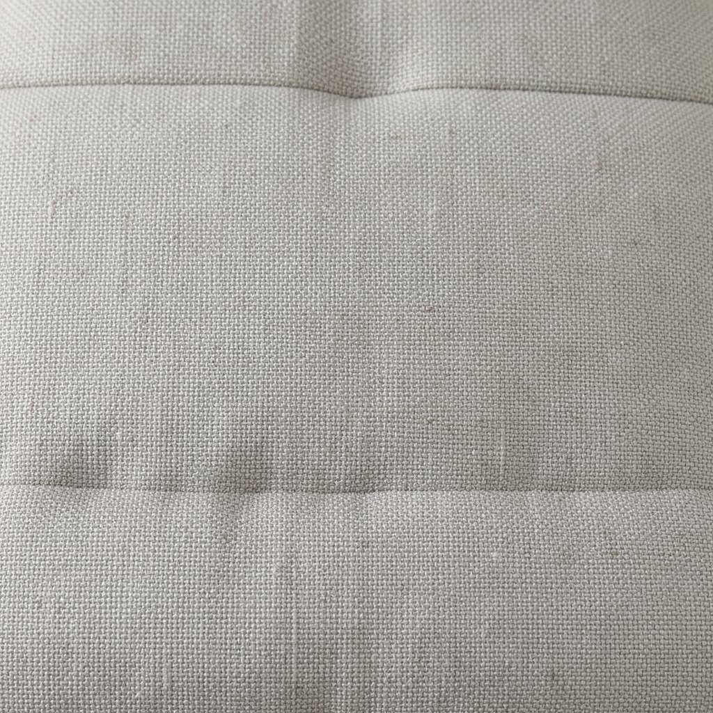
Greige basketweave adds a soft, rhythmic texture that feels handmade. From a distance, it reads as subtle waves, and up close you can almost see the little coils. This pattern works beautifully in living rooms where you want calm without looking plain.
Look for upholstery or pillow covers that highlight the raised weave, since texture is doing most of the work. A small scale basketweave can feel especially gentle, helping your space look neat and relaxed. To personalize, mix in one solid cushion in a sand or warm stone tone so the eye gets an easy landing.
For cost considerations, ready-to-ship pillow covers are often cheaper than custom upholstery. If you want big impact on a budget, start with throw pillows and a blanket rather than redoing larger pieces.
3. Warm Taupe Striped Linen

Warm taupe stripes bring order to a room in a quiet way. The lines look crisp on linen-like textiles, yet the earthy palette keeps them from feeling sharp. Horizontal stripes can make a small space feel wider, especially in seating areas.
Go for irregular or lightly uneven stripes if you want the pattern to feel more relaxed and less formal. Layer stripes with plain panels in oatmeal or parchment to avoid visual overload. If you love symmetry, try matching the stripe direction across curtains and upholstery for a tidy, calm look.
For practical care, linen blends can be easier than pure linen, depending on your household. Wash and dry according to the label, and consider a steam refresh for quick smoothness.
4. Sandstone Speckle Knit

Sandstone speckle knit looks like tiny flecks drifting through a warm neutral. It gives depth without heavy contrast, which is ideal when you want peace in your space. A knitted throw in this pattern instantly makes a couch feel inviting and quiet.
Use speckle fabrics for layers like blankets, seat cushions, or even a bedside runner. Choose a tight speckle spread so the texture reads calm rather than busy. If you personalize, pair it with solid pillows in the same base shade to keep the palette unified.
5. Soft Oattonal Dot Grid

Dot grid patterns can feel playful, but in neutral tones they become soothing. Soft oatmeal dots on a slightly different oatmeal ground look like a gentle constellation. This works great in bedrooms where you want visual interest without stress.
Pick a small dot scale to keep the pattern subtle, especially for larger items like duvet covers. Add one dot pillow and balance it with solid cushions so the bed still feels restful. If you like color but want calm, bring in a muted sage accent in one small textile item, like a chair pad.
For budget-friendly styling, buy one patterned sheet set and repeat the ground color in curtains. That approach spreads the look across the room without needing to reupholster furniture.
6. Ecru Scrollwork Jacquard

Ecru scrollwork jacquard has a refined look that feels calm, not fussy. The curving motifs hold steady in neutral shades and create a soft sense of movement. When the fabric catches light, the scrolls appear and disappear like a gentle whisper.
Choose jacquard for statement pieces like accent chairs, window panels, or a single headboard pillow. Keep the rest of the room simple with smooth textures, so the scrollwork becomes the star. For personalization, match the undertone of the scrolls to your wood finish, whether it leans honey or grayish oak.
If you’re thinking about cost, consider using jacquard for smaller items first. A couple of cushions or a narrow runner can give the elegance of the pattern without the price jump of full upholstery.
7. Putty Mini Geometric Tiles

Mini geometric tiles in putty tones can look like tiny paper mosaics. Each shape stays understated, so the pattern feels orderly and calming. It’s a smart pick for family rooms because the design can hide everyday scuffs on covers and throws.
Opt for tile patterns with rounded corners for a softer mood. Use them in alternating ways by pairing with plain fabrics on adjacent cushions or curtains. To personalize, repeat one tile color as a secondary accent in a vase or small lamp base.
If you have a busy layout, keep furniture lines simple so the textile geometry doesn’t compete. A muted rug under the seating can also help anchor the tile pattern into a calm rhythm.
8. Dove Tonal Waves

Dove tonal waves create a gentle ripple effect across the fabric surface. The pattern feels like a quiet breeze moving over water, yet it stays firmly neutral. This is one of the easiest patterns to use because it flatters both modern and traditional rooms.
Use wave textiles on pillows, throws, and light curtains where you want softness. For a practical benefit, wave patterns can reduce the look of wrinkles, since the texture provides natural camouflage. If you want a personalized touch, choose wave fabric that matches your room’s undertone, like cool dove or warm pearl.
9. Oatmeal Cable Stitch Throw

Cable stitch patterns feel cozy even when the colors are completely neutral. Thick rope-like ridges bring a strong, tactile calm to blankets and pillow covers. It’s the kind of texture that makes people want to sit closer.
Choose cable stitch for winter months on throws or for year-round use on durable accent cushions. A heavier knit can add warmth to a room with minimal color, so your space feels layered and lived in. To personalize, mix one cable pillow with one smooth pillow in a matching tone for balance.
If you’re watching cost, consider buying a cable-knit throw instead of multiple small pieces. One larger texture can do the work of several patterns without multiplying expenses.
10. Soft Linen Pinstripe Faint

Faint pinstripes in soft linen tones look crisp, but not intense. The barely-there lines give structure to calm spaces while still feeling light. This pattern is especially helpful when you want your room to feel tidy and airy.
Pair it with solid panels and avoid mixing with other strong graphics. If you love a gentle look, keep pinstripes only on curtains or one side of the bed rather than everywhere. For personalization, match the stripe spacing to your furniture vibe, with closer spacing for a calmer, more compact feeling.
11. Mushroom and Cream Subtle Plaid

Mushroom and cream subtle plaid brings a cottage-inspired warmth without loud colors. The check lines look cozy and grounded, like neutral conversation at the end of a long day. Use it in spaces where you want both comfort and a little structure.
Look for plaid with thin lines and soft edges, since it reads calmer than bold lumberjack styles. A plaid accent blanket on a sofa can add instant depth while staying neutral. To personalize, echo one plaid tone in a small decor piece like a frame or tray.
When considering cost, plaid throws and pillow covers are often more affordable than larger upholstery fabrics. If you want to go bigger later, keep your chosen undertones consistent so new pieces blend smoothly.
12. Chalky Ombre Gradient Weave
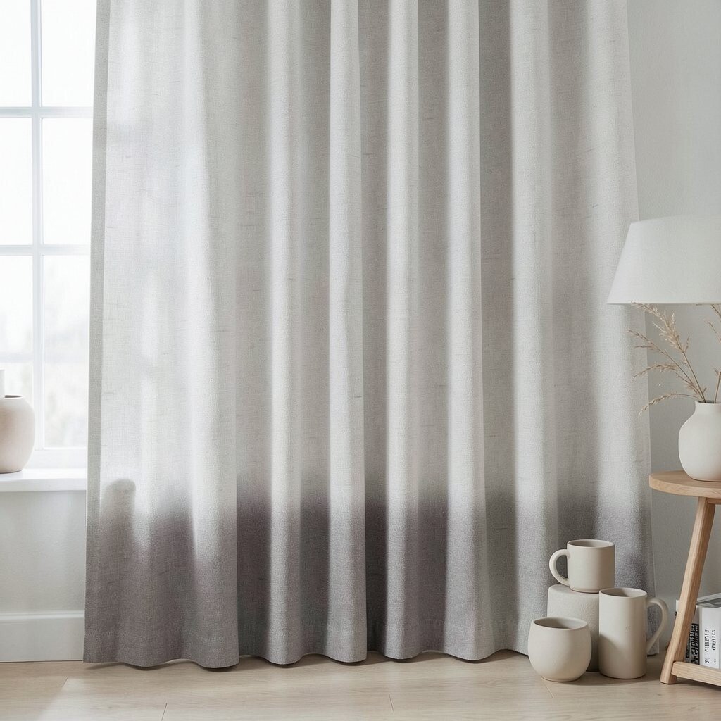
Chalky ombre gradient weave shifts slowly from one neutral shade to another. Instead of sharp patterning, it feels like light moving across fabric. This can make a room feel relaxed because the eye doesn’t hit hard borders.
Use ombre textiles on curtains, bed skirts, or large throws to create a calm backdrop. Choose gradual transitions for best results, especially in bedrooms and reading nooks. For personalization, pair ombre tones with matching ceramics, like matte off-white or soft clay mugs.
13. Taupe Botanical Sprig Print

Taupe botanical sprig prints offer nature feelings without bright greens. Tiny leaves and stems look gentle in muted ink and help soften hard furniture lines. It’s a great option for anyone who wants calm energy with a touch of organic charm.
Select sprig prints with lots of negative space so the pattern breathes. Use them on curtains or duvet covers, then keep pillows mostly solid for balance. To personalize, pick one repeat leaf tone and bring it into your palette through a lamp shade or wall art.
For practical care, check whether the fabric is machine washable if it’s in a high-traffic area. Choosing stain-resistant finishes can also help maintain the fresh look over time.
14. Mineral Marbled Striae Texture
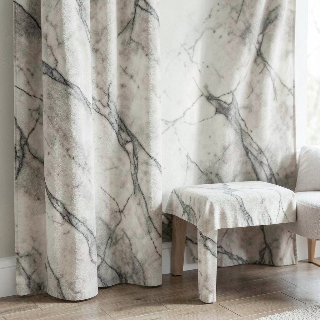
Mineral marbled striae looks like soft stone veins running through fabric. The result is elegant and naturally calming, because the design feels like something you’d find in nature. It works well for people who like pattern but want it to stay quiet and sophisticated.
Use marbled textures for larger surfaces like curtains or an accent bench cushion. Keep nearby textiles plain so the marbling doesn’t compete with other patterns. For personalization, choose a marbled shade that matches your floor or wood undertones to tie everything together.
15. Oat and Cream Microterrazzo
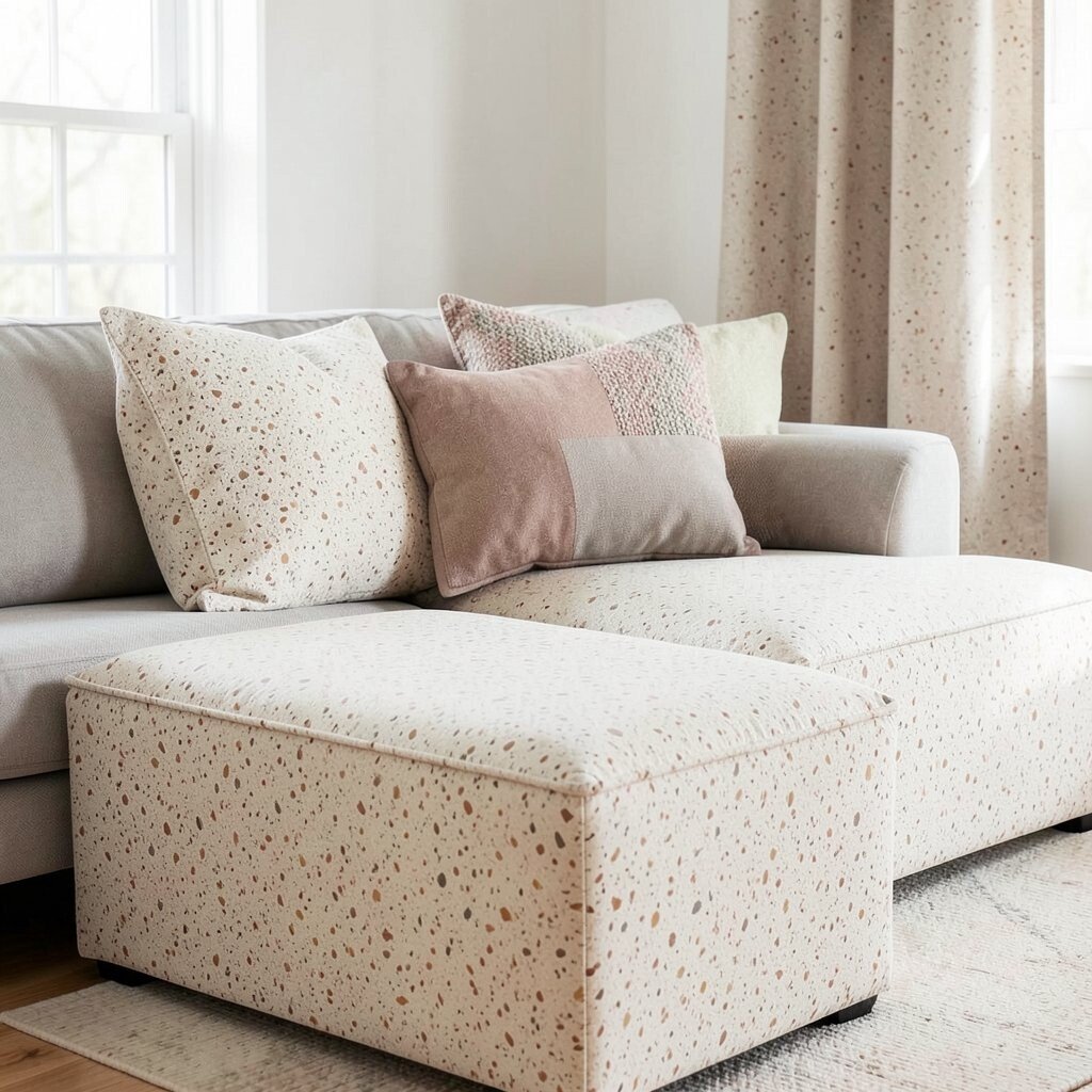
Microterrazzo is a modern neutral pattern that feels lively but still restful. Tiny specks and flecks create a smooth visual texture, almost like pebble-dust. It’s ideal for living rooms because it can hide minor marks and keep fabrics looking good longer.
Try terrazzo on floor cushions, ottoman covers, or throw pillows where you want durability. Choose a consistent speck size for a calmer look, since very mixed scales can feel busier. To personalize, combine it with one solid cushion in a dominant base shade so the room feels cohesive.
Cost-wise, terrazzo patterns are often available in ready-made pillows and throws, which makes them easy to try. If you love it, you can later expand to curtains once you see how it fits your space.
16. Porcelain Twill with Zigzag Inset

Porcelain twill with zigzag inset adds structure without loud contrast. The twill background feels stable, while the hidden zigzag makes the fabric interesting up close. This pattern suits calm spaces that still want a little character.
Choose twill for durable uses like dining chair cushions or small upholstered stools. Zigzag inset patterns can also help fabrics look less wrinkled because texture gives visual movement. For personalization, repeat the zigzag direction across two or three items to make it feel intentional.
17. Taupe Medallion on Low Contrast Ground
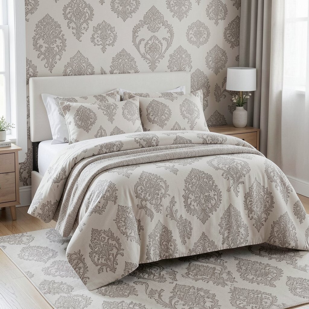
A low-contrast medallion pattern feels ornate, but neutral versions keep it soothing. The design forms a soft halo effect, which can anchor a room without making it heavy. In bedrooms, it can create a calm focal point behind pillows or on duvet covers.
Pick medallion patterns with muted outlines and small scale details for the gentlest result. Pair the medallion with plain linens so the pattern stays clear but not overwhelming. To personalize, let one medallion tone guide your accessory colors, like a matching throw or a coordinated curtain rod finish.
If you’re mindful about cost, focus on bedding or an accent rug first. Full-wall textiles are usually pricey, but even a single medallion duvet can change the mood quickly.
18. Pearl and Ecru Spiral Matelassé
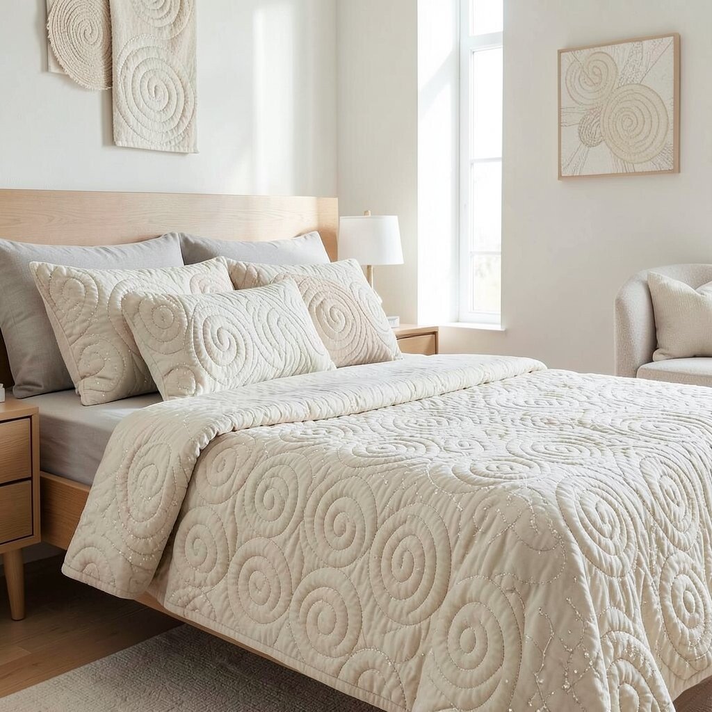
Pearl and ecru spiral matelassé brings soft quilting to the next level. The spiral stitch creates gentle curves that feel cozy and comforting. Because it’s raised, it adds calm depth even in rooms with simple furniture.
Use matelassé on bedspreads, window seat cushions, or decorative wall hangings. Quilted patterns are practical too since they often hold their shape well. If you personalize, coordinate the spiral direction with your room layout, like vertical on tall windows for a taller feel.
19. Ashen Gradient Check

Ashen gradient check blends classic check shapes into a calm, subtle look. The gray-beige transitions make the pattern feel soft and modern rather than strict. This is a great choice for people who want cozy structure without high contrast.
Choose an even check layout for curtains, and a smaller check for pillows so it stays gentle. Pair it with smooth fabrics like cotton sateen or simple knit throws to keep the overall texture balanced. For personalization, repeat one of the gradient shades in your art frames or ceramic decor.
In terms of cost considerations, look for check prints on smaller items like pillow covers and placemats first. When you know the undertones work in your lighting, you can confidently invest later in bigger pieces.