Great rooms start with a clear vision. These design inspiration boards help you shape that vision into something you can live with.
1. The Sunlit Neutrals Board for Warm, Calm Living
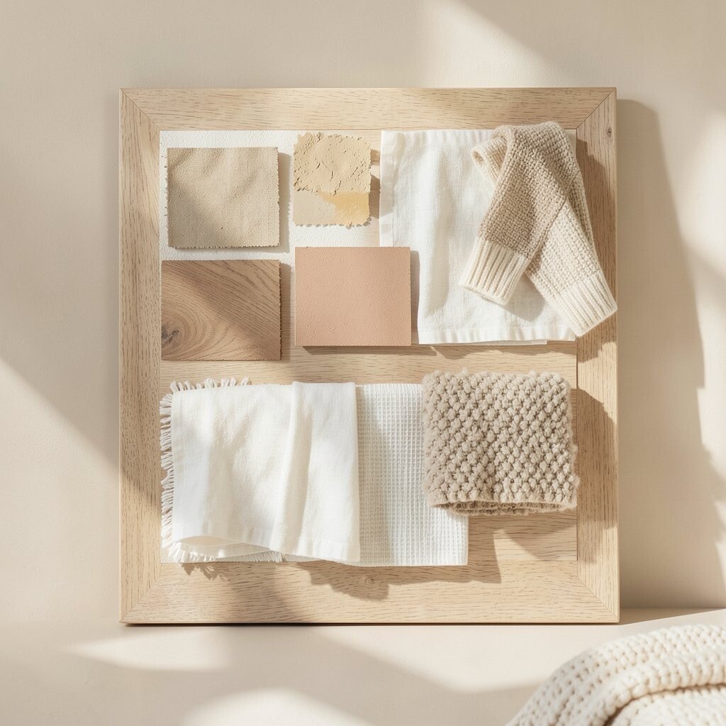
Picture soft beige walls, creamy linens, and gentle light spilling across your space. This board works like a cozy morning playlist, mixing warm tones with airy textures.
Gather swatches for sand, oatmeal, and warm white, then pair them with fabric samples like linen, boucle, and knit throws. Add a few color chips that feel like sunshine, such as pale honey or light terracotta, so the room never looks flat. For practical setup, choose one “anchor” material, like oak or warm plaster, and build everything else around it.
2. The Bold Black-and-White Contrast Board for Modern Edge
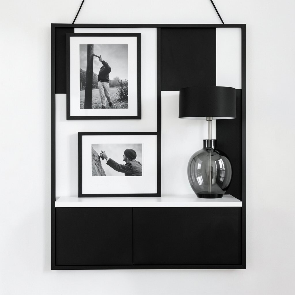
Imagine crisp contrast: matte black accents, bright white surfaces, and sleek lines that feel confident. This board is for rooms that want structure, drama, and an easy-to-style look.
Print simple layout photos and highlight where black should land, like door hardware, picture frames, or a slim console. Add a few grayscale art prints and one reflective element, such as a glass lamp or glossy vase, to keep the look from feeling heavy. Personalize by pulling a favorite pattern, like houndstooth or a grid, and repeating it in small doses for a cohesive vibe.
For cost control, use paint and removable wallpaper as your big changes, and keep furniture upgrades for later. Stick to a limited palette so every purchase feels intentional instead of random.
3. The Coastal Texture Board for Breezy, Beach-Like Comfort

Think of airy blues, sun-faded wood, and rope-like textures that remind you of sea air. This board makes a home feel relaxed without needing actual sand in every corner.
Collect images of light-washed furniture, textured throws, and ceramics with subtle speckles. Choose a “sea” color range that includes both pale blue and a whisper of seafoam, then balance it with warm whites and sandy tans. When you plan the board, decide on one texture story, such as linen plus rattan plus driftwood tones, so the room feels themed but not cluttered.
To personalize, add small nods that feel like you, like shell-shaped candle holders or artwork that matches your favorite vacation memory. Keep spending reasonable by shopping for affordable basics like striped curtains and updating lighting bulbs and shades for a high-impact feel.
Current trends favor natural textures and mixed neutrals, so this board stays stylish for a long time while still feeling fresh.
4. The Japandi Serenity Board for Clean Lines and Cozy Warmth
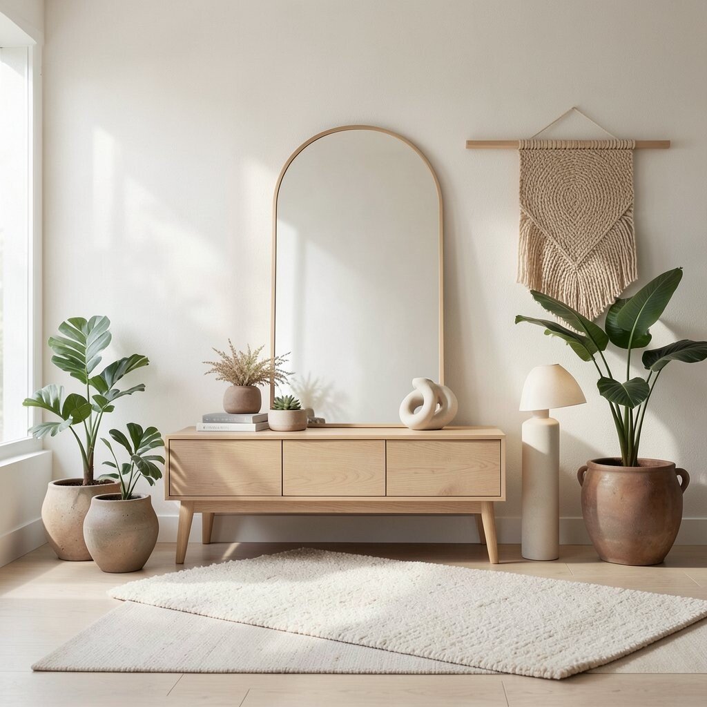
Picture calm spaces with simple shapes, low furniture, and soft, organic materials. Japandi style blends Japanese simplicity with Scandinavian comfort, making it feel peaceful and practical.
Create your board with a limited number of elements, like light oak, warm gray, and creamy off-white. Include a few plants in earthy pots and add a tactile layer such as a felted rug or woven wall hanging. Choose one statement piece, like a minimalist mirror or a sculptural lamp, and let it lead the design.
5. The Vintage Revival Board for Curated Charm

Imagine aged brass, patterned fabrics, and furniture that looks like it has stories. This board is perfect when you want character and a home that feels collected, not cookie-cutter.
Pin photos of flea-market finds and online listings you love, then note the repeating features you keep circling back to, like floral motifs or spindle legs. Build a color rhythm using warm browns, muted greens, and faded reds, and add one bold pattern to create energy. For practical tips, decide where vintage pieces will live first, such as a sideboard, a reading chair, or a gallery wall.
Personalize by mixing eras carefully, keeping one style line consistent, like mid-century shapes or Victorian-inspired details. Budget smarter by hunting for smaller impact items first, like lamps, frames, and throw pillows, then upgrading larger furniture later.
6. The Modern Organic Board for Soft Shapes and Earthy Color

Think flowing curves, rounded corners, and earthy shades that feel grounded. This board uses natural materials and gentle contrast to create a look that feels both modern and welcoming.
Collect images featuring stone textures, warm taupe, deep olive, and soft terracotta, then pair them with materials that show up in nature, like cork or clay ceramics. Add lighting photos that show warm bulbs and soft shadows, because this style shines when the room feels dimensional. To personalize, choose one “organic” theme, such as rounded mirrors or sculptural vases, and repeat it in at least three places.
7. The Maximalist Gallery Board for Art-Forward Personality

Imagine a home where walls act like a museum, with color, frames, and playful spacing. This board is for people who love to express themselves and enjoy seeing art every day.
Pin a mix of artwork sizes, frame finishes, and mat colors, then plan a rough grid on your board so the chaos feels intentional. Add textiles with patterns you already enjoy, like a bold rug or patterned curtains, so the room has layers. A practical move is to start with one wall you can commit to, then build outward once you see how the art feels in your space.
For uniqueness, blend different frame styles but keep a shared color family, such as warm woods plus cream mats. Keep costs under control by leaning on prints, thrifted frames, and DIY matting with simple supplies.
8. The Monochrome Luxe Board for a Sleek, Elevated Feel

Picture a room dressed in one color family, with shiny highlights, soft fabrics, and clean lines. This board creates a luxurious look that feels calm, even when the room is busy.
Choose your monochrome direction first, like charcoal, deep navy, or warm sand, then select multiple shades of it so the space doesn’t look flat. Add variety through materials, such as velvet, satin, metal, and textured plaster. For personalization, include one surprise element, like a metallic accent chair leg color, to keep the room interesting without breaking the theme.
Cost considerations matter here, because monochrome looks best when finishes match. If you can’t change everything at once, focus on paint, bedding, and curtains first, then align smaller accessories later.
9. The Scandinavian Simplicity Board for Light, Air, and Function

Imagine bright rooms with pale wood, cozy layers, and furniture that feels useful and clean. This board makes everyday life look tidy and inviting.
Gather images showing natural light, simple lines, and practical storage, like floating shelves or baskets that disappear visually. Include soft neutrals with one gentle color accent, such as dusty blue or sage green, to bring life to the palette. A practical tip is to pick a “holding place” for clutter in your plan, like a bench with a basket underneath, so the look stays neat.
For uniqueness, use a signature piece you love, like a particular ceramic bowl set or a patterned cushion, and keep the rest calm around it. Current trends often favor warm woods and simple textiles, so this board can stay modern as styles shift.
10. The Cottage Warmth Board for Layered Comfort

Think of gingham whispers, soft florals, and furniture that feels lived-in and loved. This board brings comfort to everyday corners, like the kitchen nook and the reading chair.
Pin images that show layered fabrics, such as quilts, chunky knit blankets, and curtains with gentle pattern. Choose a cozy palette with cream, warm beige, muted rose, and a touch of sage, then add natural wood details to keep it fresh. For practical tips, map your soft goods first, because these items change the mood quickly without major renovation.
11. The Industrial Loft Board for Raw Materials and Cool Style
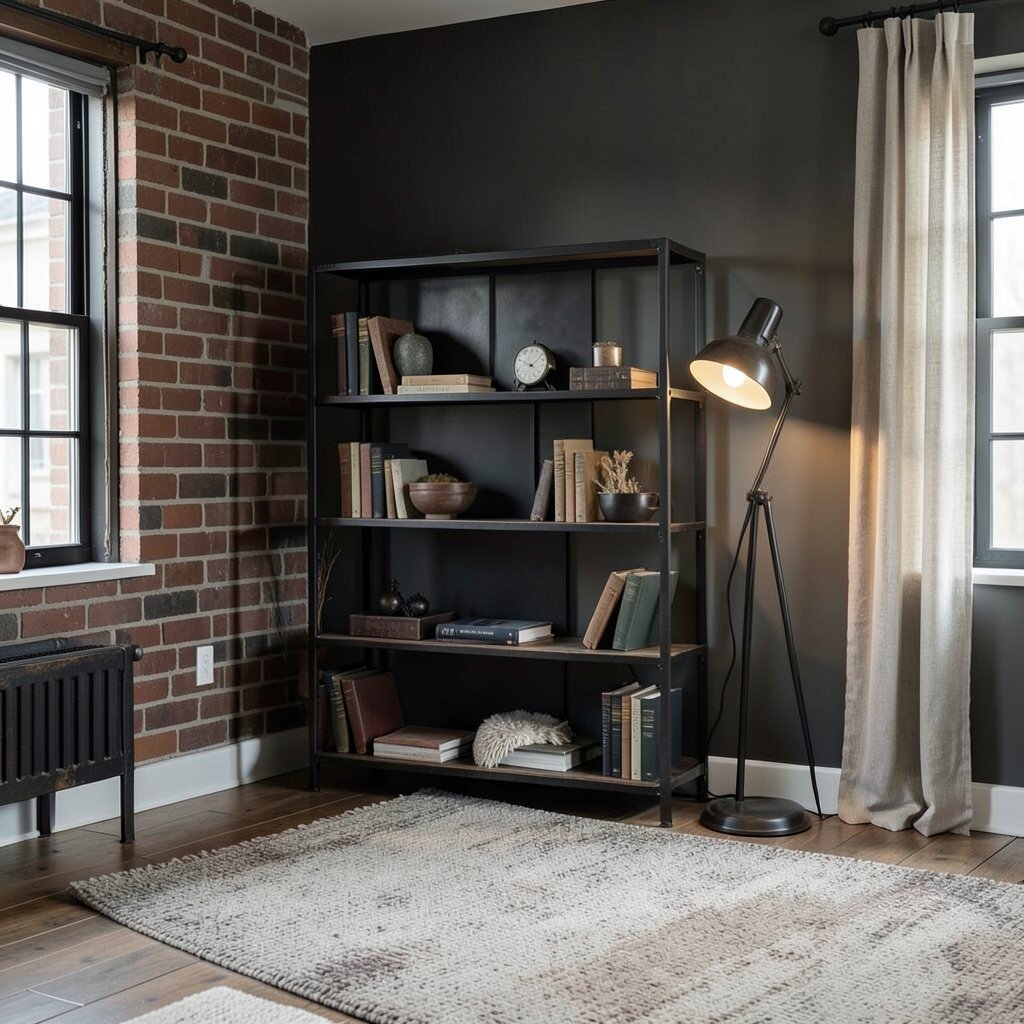
Picture exposed brick tones, dark metals, and furniture that looks sturdy and real. This board is for homes that love a bold look, with a mix of edge and comfort.
Collect images featuring iron, concrete, reclaimed wood, and warm lighting, then choose a color base of charcoal, brick red, and weathered brown. Add softness with textiles like thick rugs or linen curtains so the hard materials don’t feel cold. Personalize by choosing one industrial hero, such as a blackened steel bookshelf or a vintage-style floor lamp, and let it lead the room.
To manage cost, update lighting and hardware first, because they deliver a strong industrial feel fast. If you can add paint, choose a matte finish for walls and keep metal accents in a tight range so everything looks intentional.
12. The Color Pop Kitchen Board for Playful, Fresh Energy

Imagine a kitchen where simple surfaces are dressed up with one happy color moment. This board is great when you want your home to feel energetic, but you still want it to work every day.
Choose one vivid color, like teal, sunny yellow, or bold coral, then plan where it goes, such as bar stools, dish towels, a backsplash accent, or cabinet pulls. Add a neutral foundation with white, cream, or light gray so the color feels crisp instead of overwhelming. For personalization, match that color pop to your everyday items, like countertop storage labels or the color of your mugs.
Keep spending reasonable by using paint for a cabinet section, upgrading only a few small fixtures, or adding removable peel-and-stick tiles for a quick update. Current trends often lean into warm neutrals with bright accents, so this board stays fun while still feeling modern.
13. The Serene Bedroom Sanctuary Board for Sleep-Friendly Style

Picture soft layers, gentle lighting, and a calm color plan that helps your room feel like a retreat. This board makes it easy to pick bedding and decor that support rest instead of chaos.
Collect photos of warm whites, dusty blues, and muted greens, then choose fabrics that feel calming, like cotton sateen, linen, and thick curtains. Add one comforting texture, such as a plush rug or a chunky throw, so the room feels inviting when you wake up. Practical planning helps here, so decide on a bedtime routine visual, like where your reading lamp, books, and nightstand organizer will sit.
14. The Entryway Welcome Board for First-Impression Style

Imagine stepping into your home and instantly feeling organized and cared for. This board turns the entryway into a stylish landing pad rather than a drop zone.
Pin images showing hooks, benches, and storage baskets that look good and actually hold things. Choose a palette that matches the rest of your home, then add one eye-catching detail, like a mirror shape you love or a runner rug with a subtle pattern. A practical tip is to plan for shoes, keys, and bags before you plan for decor, because function keeps the look tidy.
Personalize by adding a small tray for everyday items and a seasonal display, like a simple vase or wreath. For cost considerations, focus on one big change like a mirror or wall hooks, then build the rest with affordable storage pieces and lighting.
15. The Family-Friendly Lounge Board for Cozy Togetherness

Picture comfy seating, durable fabrics, and a layout that makes gatherings feel easy. This board is built for real life, with style that can handle everyday messes and still look great.
Choose images of washable slipcovers, stain-resistant materials, and rugs that hide wear, then pair them with warm lighting and soft throws. Plan the seating around how you use the room, like movie nights, board games, or quiet reading corners. For personalization, pick a couple of colors you all like and repeat them in pillows, art, and small decor so the space feels coordinated.
To keep costs under control, start with what you already have and update the highest-visibility items, like curtains, throws, and lighting. Current trends often favor cozy neutrals with functional textures, so this board stays modern while feeling genuinely comfortable.
When your lounge board feels right, you’ll notice it guiding every choice from rug placement to where you store blankets, making your home feel more “you” every day.