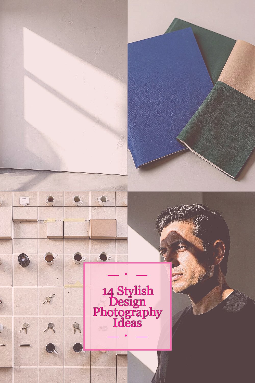
Design photography can make ordinary scenes feel like a magazine spread. When you play with style and structure, your eye starts noticing better stories everywhere.
Here are practical, stylish ideas you can try right away, with tips to keep them fun, affordable, and uniquely yours.
1. Shape First, Scene Second
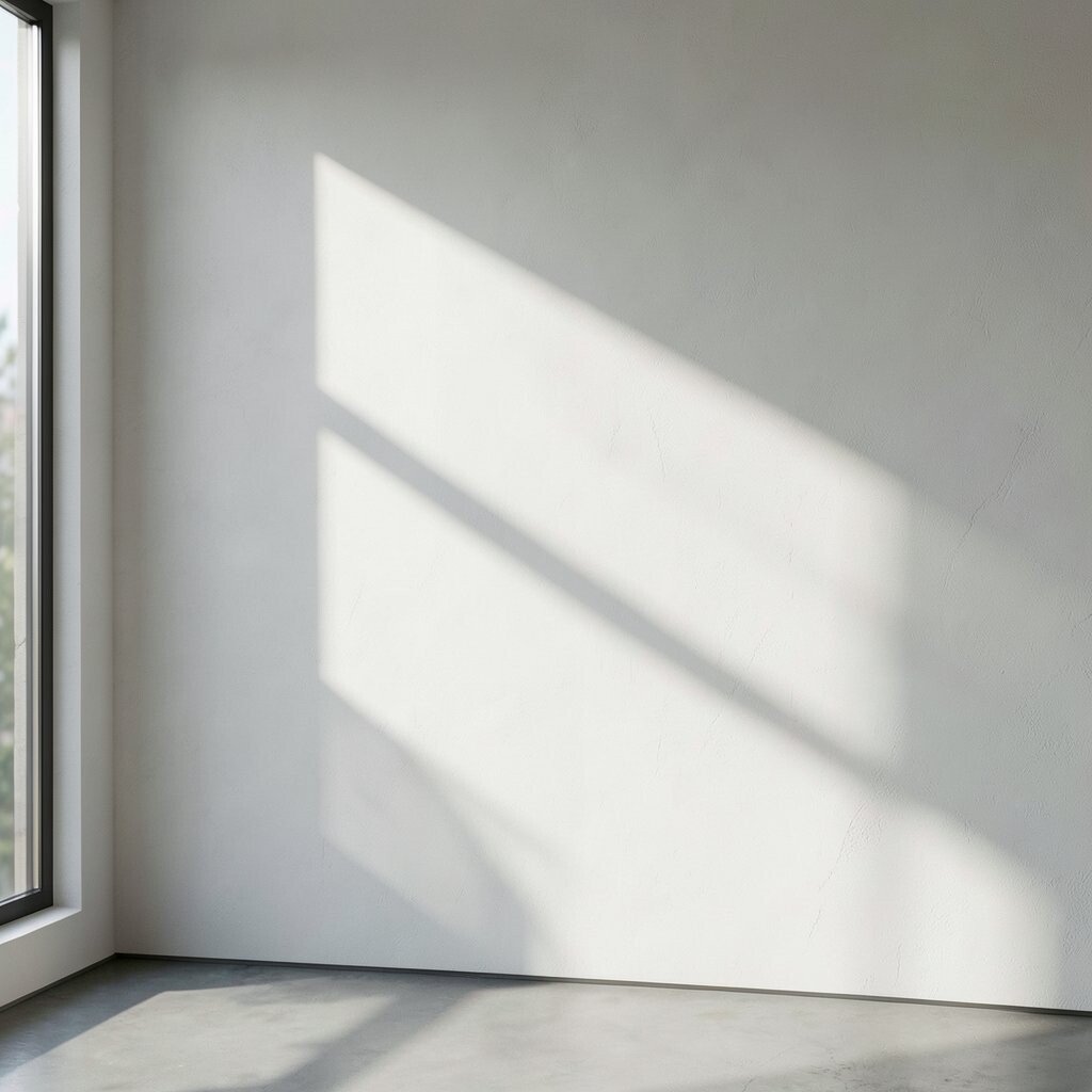
Start by looking for big shapes before you look for details. Think of a window as a frame, a shadow as a pattern, and a wall as a clean background.
Compose by placing your main shape off center, then use edges to guide the viewer’s eye. This helps your photos feel intentional and modern, even when the subject is simple. Try turning slightly, moving your feet, and waiting for the light to sharpen the shape.
2. One Color Story With Real Texture
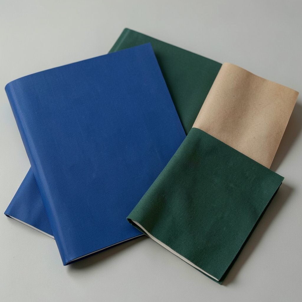
Pick a single color and build the whole photo around it, like cobalt, warm sand, or deep green. Then keep the color plan tight while still letting texture show through, such as fabric weave, paint chips, or paper grain.
You’ll get images that look stylish because your palette stays calm. Use inexpensive props like colored folders, wrapping paper, fabric scraps, or a thrift-store vase. Set your camera so the background stays simple, and let small textures carry the personality.
To personalize the vibe, choose a color tied to your daily life, like your favorite hoodie or a notebook cover. If you want a trend feel, go for muted tones and matte finishes that match today’s clean design look.
3. The “Grid” Photo That Still Feels Human
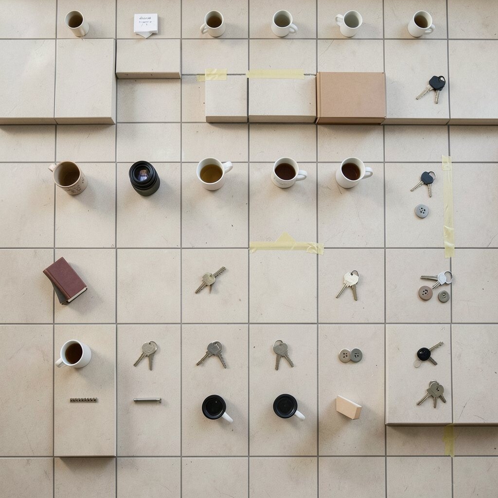
Design photography often feels neat, and grids are one reason. Arrange your scene so items repeat like squares, lines, or steps, but keep one element slightly imperfect.
Place objects in even spacing, then use a top-down angle or a straight-on perspective. This makes the photo feel organized and modern, while the tiny mismatch keeps it from looking cold. Try using tape marks on the floor to line up small items and keep your composition tidy.
For practical variety, shoot the same grid with different lenses or distances. Use what you have, whether it’s a phone, a basic camera, or a borrowed lens, because the grid idea does the heavy lifting. Keep costs low by using household objects like mugs, books, keys, and buttons.
When you want a current feel, pair the grid with soft lighting and gentle shadows, which look great in many design feeds.
4. Light Like a Graphic Designer

Instead of chasing bright light, chase controlled light. Imagine you’re creating a poster, where highlights and shadows are the main ink.
Try side lighting from a window, then position your subject so the shadow becomes part of the composition. This gives your photos bold contrast and a stylish, editorial look. Move the subject in small steps until the shape of the shadow looks clean and readable.
5. Shoot From Where Your Subject Lives
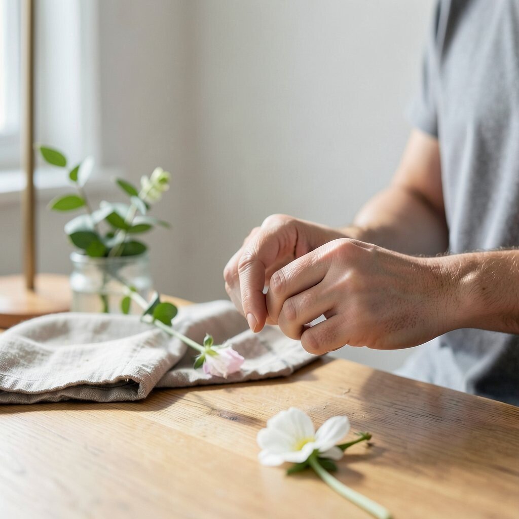
Get close, then shoot from the subject’s “world,” like the height of a plant, the angle of a tabletop, or the view level of a floor lamp. When your camera sits where the object feels real, the photo gains energy.
Try low angles for products and architecture, and try standing eye level for people’s hands doing something small. You’ll get a more personal connection and a clearer visual story. If you want the look to feel design-driven, keep the background simple and let negative space do the calming work.
To keep it practical, use masking tape to hide messy edges and keep the frame clean. Add one small styling element that matches your mood, such as a folded cloth or a single flower.
6. Negative Space as Your Best Styling Tool
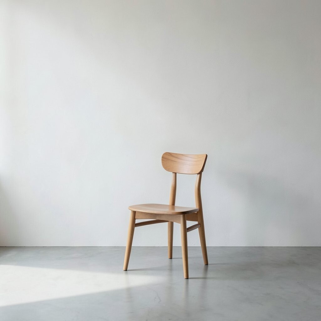
Leave room in the frame on purpose, like you’re giving your subject space to “breathe.” Negative space can make even a simple chair or spoon look premium.
Use a plain wall, an uncluttered floor, or open sky to create a clean background. Position your subject so it sits slightly away from the center, and keep the edges tidy. This style is popular because it feels calm, modern, and easy to scan quickly on small screens.
For personalization, let your negative space carry a subtle detail, like a soft gradient from window light or a faint texture on the wall. You don’t need special gear, just patience and a willingness to simplify.
7. Reflection Photography With Clean Geometry
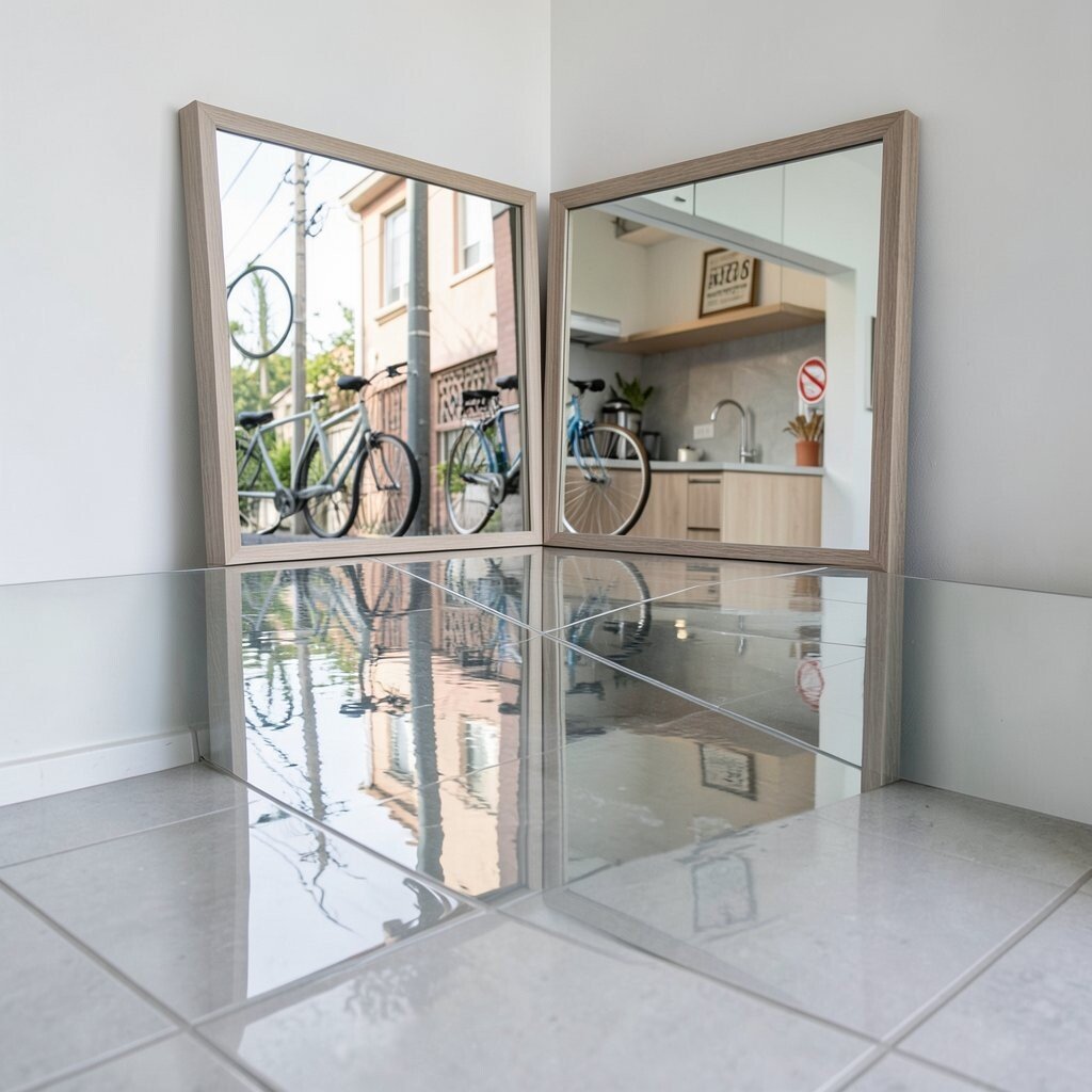
Look for reflections in glass, mirrors, water, or even polished tiles. Reflections can double your scene and create symmetry, which instantly feels design-forward.
Move your camera until the reflection lines up with the real world. Keep your background uncluttered so the reflection stays crisp and stylish. If you’re outdoors, watch for ripples and pick a calmer patch of water for better clarity.
To keep costs low, you can use a basic mirror or a cheap framed mirror you already own. Personalize by choosing a reflection source that matches your theme, like bike parts, street signs, or kitchen surfaces for a daily-life look.
8. Repeat a Pattern, Then Break It
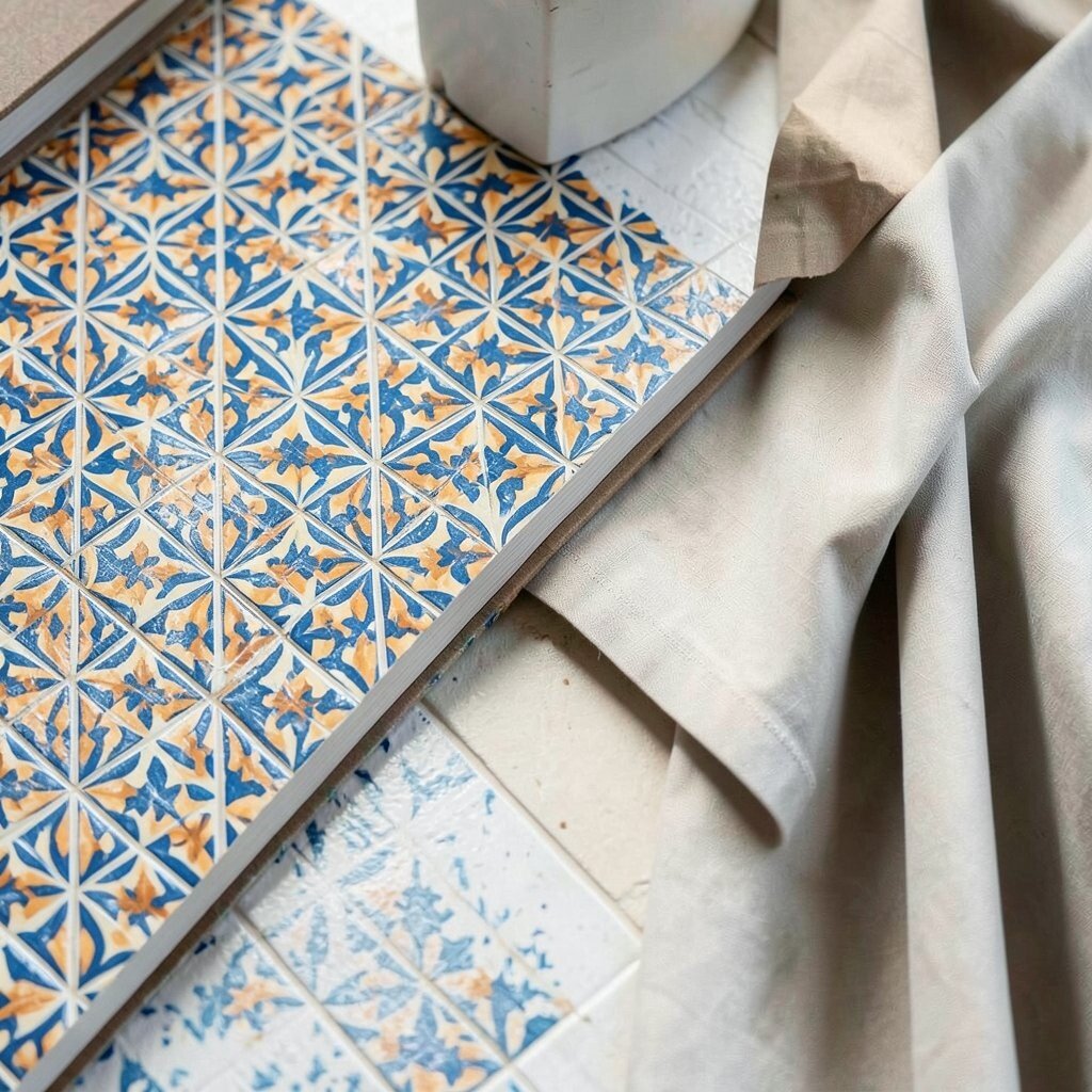
Find something that repeats, such as tiles, books lined up by color, fence slats, or curtain folds. Compose so the pattern leads into the frame and feels steady and rhythmic.
Then break the pattern with one surprising element, like a single bright color, a crumpled corner, or a different material. This creates tension, and it makes your photo feel like a thoughtful design story. Use small props you can carry, and keep the interruption intentional, not random.
If you want a current style, aim for honest materials and visible texture, since many design photos now feel grounded rather than overly polished. Try shooting in softer light to keep patterns from becoming too harsh.
9. Minimal Product Shots With One Bold Element
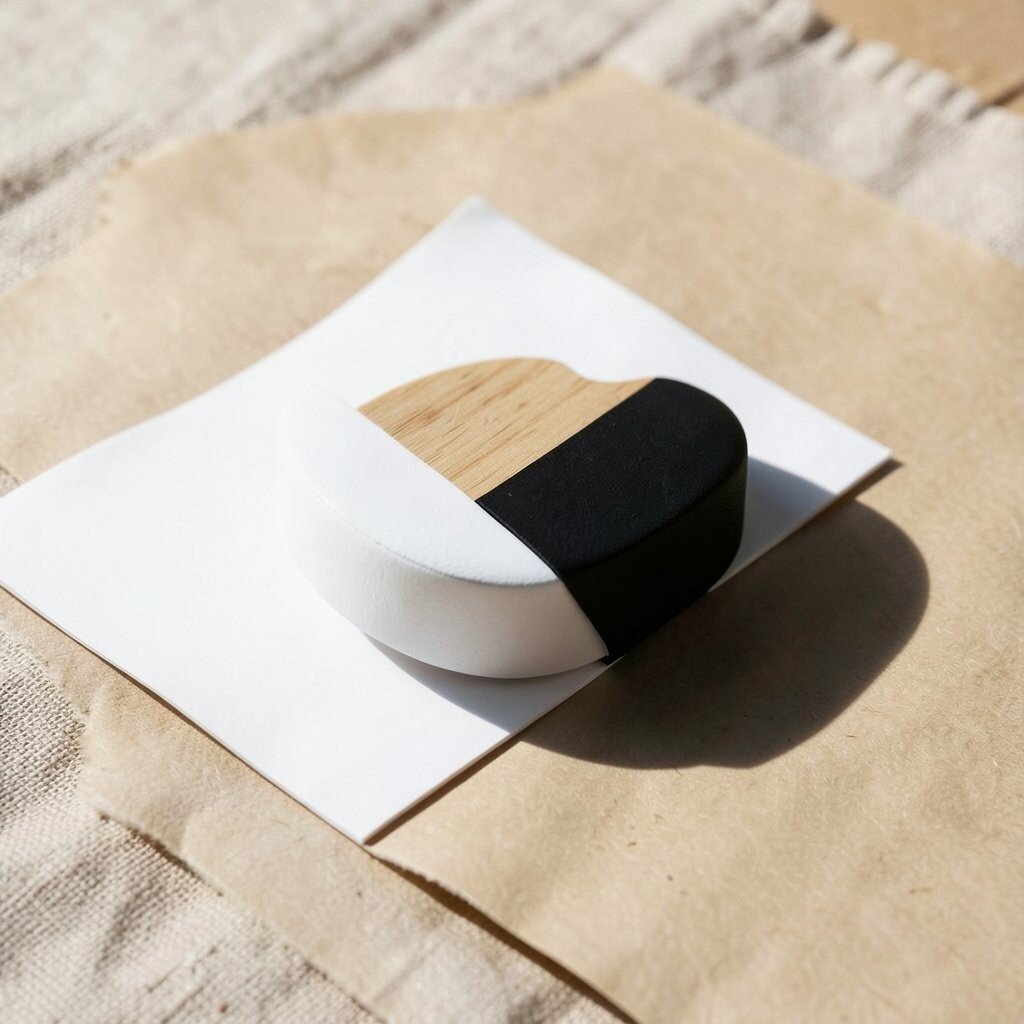
Pick a small object and give it a clean stage, then add one bold element that becomes the star. That bold element might be a dramatic shadow, a bright color wipe, or a single curved line of shape.
Use a simple background like paper, wood scrap, or a cloth sheet, and keep everything else out of the frame. This helps your subject look premium without spending much money. Try one light source, and bounce it with a white card so shadows stay smooth.
For personalization, style the scene to match your taste, such as using earthy props for a warm look or using sleek black-and-white for a modern vibe. If you’re following trends, watch for simple product photos that feel like interior design, not random flat lays.
10. Story Through Hands, Tools, and Small Actions
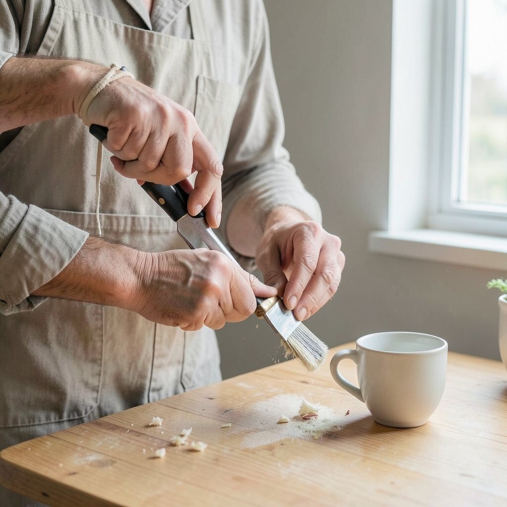
Design photos feel alive when there’s a human touch, even if the subject is a room or object. Hands and tools add meaning, motion, and texture that feels real.
Photograph a process, like arranging flowers, tightening a strap, wiping a table, or holding a cup near a window. Keep the background simple and let your action create the composition. This approach also helps you practice timing, which makes your work feel sharper over time.
To make it stylish, choose one consistent color for clothing or props, and keep the rest neutral. Costs stay low because you’re using everyday materials and capturing what you already do.
11. Architectural Lines With a Slight Tilt
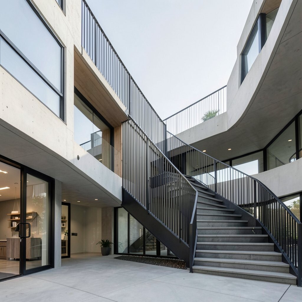
Look for strong lines in buildings, staircases, shelves, or bridges. Straight lines can feel strict, so try a slight tilt to add energy while still keeping the scene readable.
Use a wide shot if you want dramatic scale, but don’t forget clean framing. Step back and check the edges so they don’t distract the eye. When you want a design vibe, keep people out of the frame or place them far away, so the lines stay the main story.
For personalization, choose a viewpoint that matches your daily movement, like shooting from a standing doorway or from a stair landing. This makes your architecture photos feel unique to you, not copied from generic angles.
12. Typography in the Real World
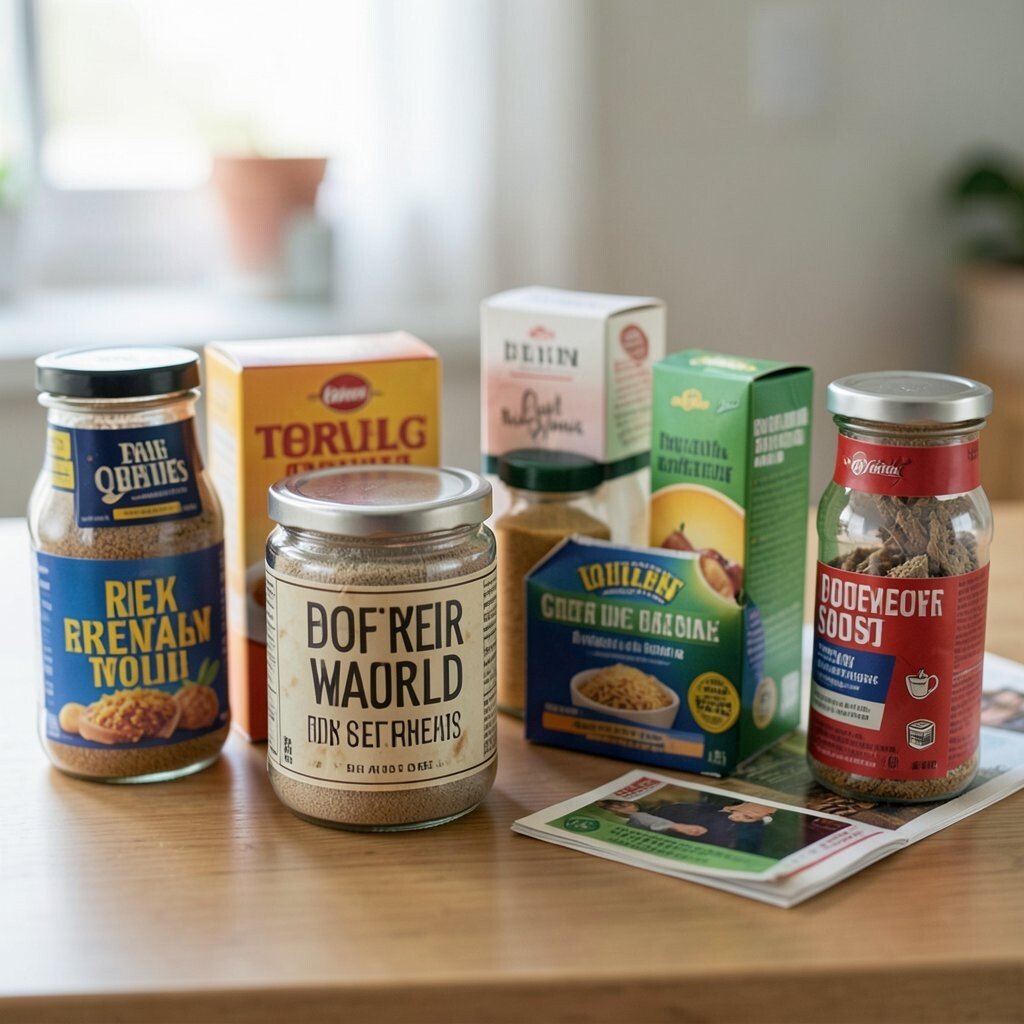
Letters aren’t just for signs, they’re part of everyday design. Look for type on packaging, street posters, books, labels, or even printed instructions.
Compose so the text becomes a visual shape, not just something to read. Use shallow depth of field to blur distractions, and keep one word sharp if possible. This makes your photo feel like graphic design while still being a real scene.
To keep it affordable, use things at home, like spice jars, cereal boxes, greeting cards, or old magazines. Personalize by photographing labels that match your hobbies, such as music, art supplies, or travel receipts.
13. Make a Color-Coded Still Life
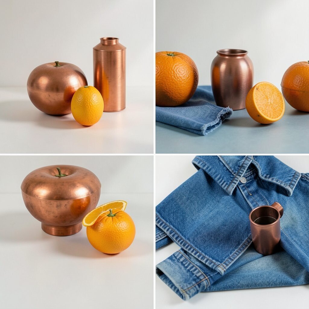
Create a still life where each item supports the same color idea, like warm oranges with copper, or cool blues with denim. Arrange items on a surface that complements the colors, then keep the background quiet.
Rotate objects until the shapes look balanced, and watch how the light hits each surface. This gives you a stylish, designer look with clear visual order. Try using small gaps between objects so the negative space still shows up.
For practical tips, shoot multiple angles quickly and compare them on your phone. If you feel stuck, limit yourself to a small set of items so your decisions get easier. Trends right now lean toward natural color palettes and realistic materials, so embrace what you can actually find.
14. Texture Collages From Everyday Surfaces
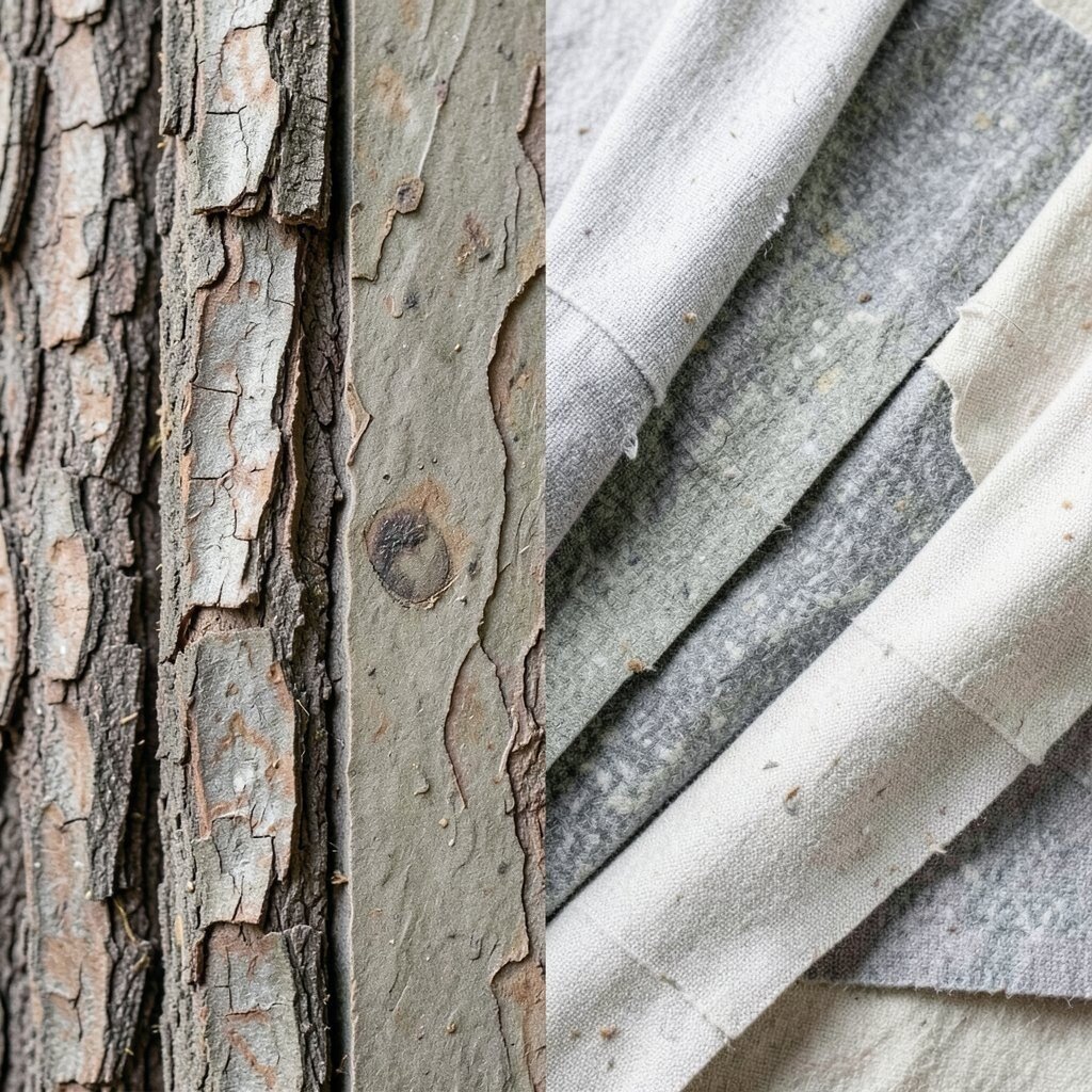
Turn your camera into a texture collector by photographing surfaces up close, like bark, stone, fabric, plastic, or paper. Then combine textures in a single frame by using layering and framing.
Compose by stacking textures in the same direction, like vertical strands, diagonal cracks, or layered fabric folds. This makes the photo feel artistic because it becomes a design pattern. Keep the lighting gentle so details don’t wash out, and wipe your lens if you notice haze.
To personalize, choose textures tied to a memory, such as a childhood blanket, the feel of your favorite mug, or the grip on a worn tool. Costs stay minimal since you’re using objects you already own, and the result will feel completely yours.
When you want a current feel, look for images that celebrate honest wear, like scuffs, grains, and natural imperfections.